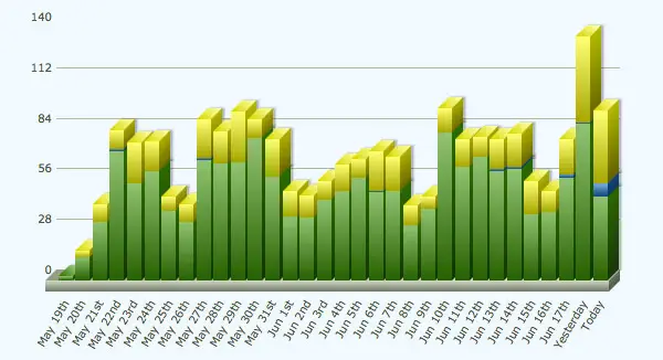
A few weeks ago I explained how I migrated my Feedburner email subscribers to a newsletter service. Since then I’ve been busy experimenting and optimising my new mailing list to continue growing my sites into the future. After implementing a couple of popular techniques I saw my daily subscribers dramatically rise from around 10 per day to a healthy 100 per day, so I thought I’d share these tips to help others grow their audience.
A little background…
I own and create content for two design blogs. The first, Blog.SpoonGraphics is home to my Illustrator & Photoshop tutorials, as well as a range of inspirational showcases and free design resources. You’re reading my second blog right now here on Line25, this site has a specific focus on web design and is home to HTML/CSS tutorials and roundups of cool website designs and trends.
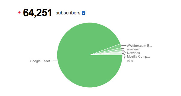
As I described in my Feedburner to newsletter post, I wanted to begin growing my subscribers beyond RSS due to the demise of Google Reader and the possibility that Feedburner will follow a similar fate. I signed up with AWeber and spent many hours creating my custom email templates, which was actually one major advantage of a newsletter service as opposed to Feedburner. Customising the appearance and content of your emails not only improves the user’s experience, it also results in more click throughs and engagement in your broadcasts.
At first I just switched over my Feedburner email subscriptions signup link to an AWeber form and saw my daily subscriber rate average at up to 10 per day. It wasn’t until after I had a chat with fellow design blog owner and all round nice guy Tom Ross that I realised I could drastically improve this figure. Tom gave me some fantastic tips and techniques and after implementing them I saw that 10 subscribers per day figure rise to between 80-100 per day! If you’re looking for some email marketing consultation of your own I’d definitely give Tom a recommendation, otherwise I know he has some great projects of his own in the works, so give him a follow on Twitter to keep up to date with his online ventures.
Sign up form placement
Initially I only had a sign up form on my subscribe page, but one obvious step to increasing the number of sign ups is to put your form right in front of your users in various places on your site. I created 3 more sign up forms and placed in them in the following areas:
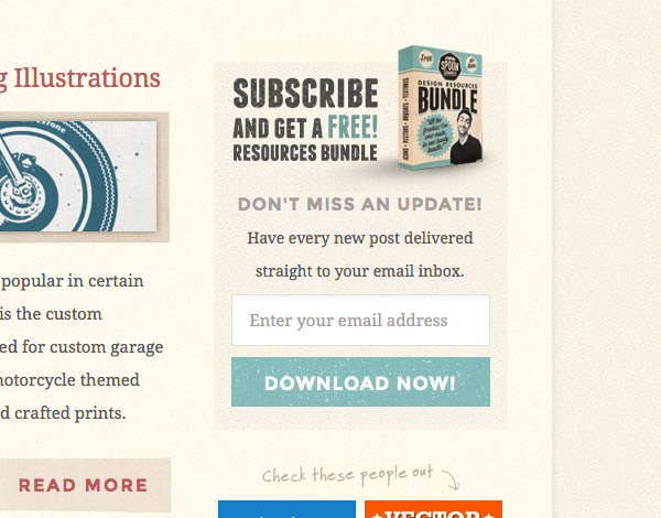
Sidebar signup form
Despite having a link for users to subscribe by email right at the top of the page, I didn’t have an actual complete signup form visible on the page. Tom recommended I revised the layout of my sidebar menu and use the prominent space for an eye catching form to greet new visitors.
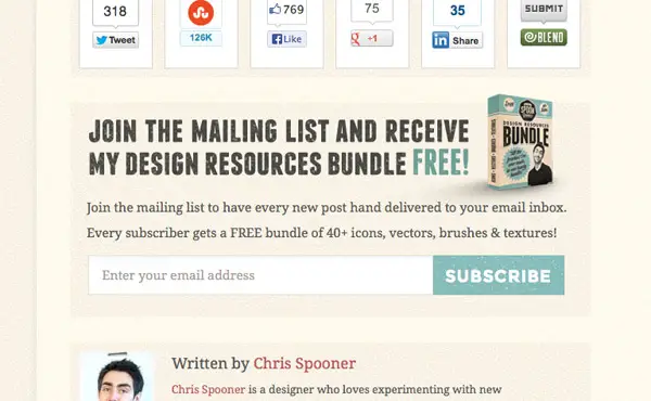
End of post signup form
One of the forms that has proved really effective on my sites is the placement at the end of every post. New visitors who have stumbled across your content and made it all the way to the end of the article have a high potential of wanting to stick around for more, so it makes sense to prompt them with the option of subscribing with a conveniently placed signup form.
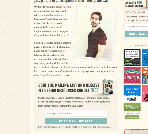
About page signup form
Your about page is probably one of your least trafficked pages, but those who are browsing it have a particular interest in you, your website or your company. A strategically placed signup form slap bang in the middle of your bio is really effective to recruit those interested to receive more of your content. Despite having much lower display rates, my about page signup forms have amazing conversion figures (30x higher than the other forms!).
Free gift incentive
The additional sign up forms on my site no doubt prompted a decent number of readers to sign up, but the one technique that really boosted my daily subscriber rate was the creation of a free gift. Everyone loves freebies, and the offer of a gift to every new subscriber is enough to grab the attention of the average viewer and give them the incentive to subscribe for more. Sure, some people will sign up just to get their hands on the free goodies and have no interest in your new post notifications, but every day you’re growing your audience with people who had an interest in your site, who would have otherwise left and never returned again had it not been for the free gift hook.
My Blog.SpoonGraphics site has been around since 2007 and during that time I’ve posted numerous freebies such as Photoshop brushes, textures and vectors. It would take a visitor ages to dig through the archives and download all this stuff, so I used this as an opportunity and created a bundle of my design resources as my free gift. For Line25′s free gift I was a little stuck for ideas, so I browsed the stock resources websites and gained inspiration from the most purchased items lists. Presentation is key, so I spent time mocking up the products and creating eye catching banners to tie the free gift promotion to the sign up forms.
How to set up a free gift download with AWeber
After all the hard work of creating your free gift and its promotional material the actual process of adding it to your mailing list is pretty simple, you essentially just create a special page on your site containing a download button and set this page as your mailing list’s opt-in success page.
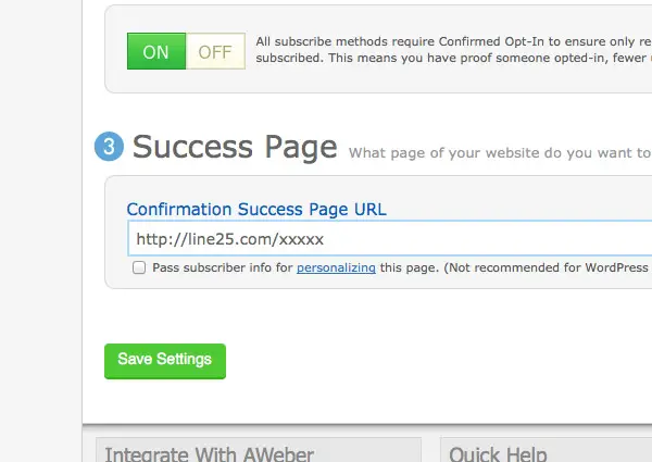
In AWeber, this option is found under List Settings > Confirmed Opt-In. It’s the Success Page field right at the bottom of the page. Users will be automatically sent to this page once they’ve clicked the activation link in their email.
Button wording
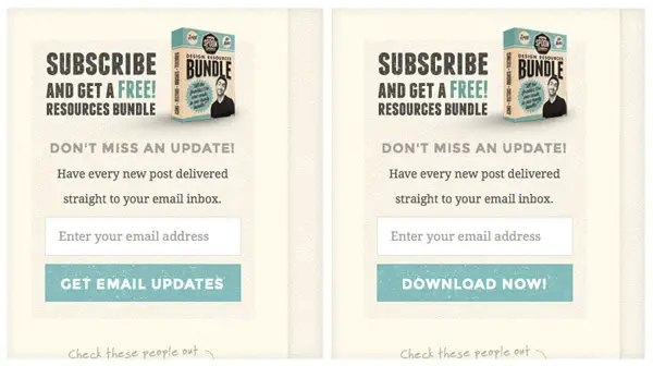
Recently I’ve been playing around with a split test of one of my signup forms. With the free gift being featured alongside the ability to receive new posts by email I wondered if there would be any difference in performance between the words “Get email updates” and “Download now!”. I expected the “Download now!” button to be more effective at attracting signups purely for the free gift, but the results were pretty extraordinary! The split test was run for around 40,000 impressions and during that time the “Download now!” button achieved 3 times more signups than the words “Get email updates”. It would be interesting if there’s any way to keep an eye on unsubscribe rates relative to each form to compare the quality of subscribers, but at the end of the day it’s 3x more people who are potentially viewing your content.
Final words
These tips are really just scratching the surface when it comes to growing an email list, but they’re all effective techniques that could be implemented by any website owner to optimise their email subscription signups. Most importantly these techniques aren’t deviant or intrusive, and help grow your mailing list with true followers who have a long and happy experience receiving your free content. While newsletter services do incur monthly fees, the ability to convert this investment into additional traffic and readership is definitely worthwhile.
Source: http://line25.com/articles/how-i-increased-my-subscriber-rate-by-10x-overnight

No comments:
Post a Comment