The basic rules of web design are quite well-known in the community, so to speak. I mean, everyone knows (even people outside of the design world) that a good homepage is one that’s not cluttered, only contains essential info and is direct to the point. However, there are some specific tweaks/adjustments that you can take into account when working on the homepage of your next project to make it even better.
In the end, the whole game is about creating a website that is successful, not necessarily beautiful…although it would be nice if these two goals can go alongside each other.
1. Getting started section
Getting started sections are becoming more and more popular on many blogs, product sites as well as general business sites.
A typical getting started section features either a simple concise message or a short video. The whole idea of such a section is to take your new visitors by the hand and guide them through your site.
As it turns out, for many websites, new visitors are the majority of their whole user base. This can be checked through Google Analytics or other web stats app. This situation means that your first task as a website owner is to provide some clear instructions to every new visitor.
What about the returning visitors? They will stop looking at your getting started block naturally and move on to browsing your site freely. Hence, it doesn’t necessarily make their experience any worse.
The best placement for a getting started block is usually as high up the page as possible. Or even to hijack the whole homepage and make it one big getting started block.
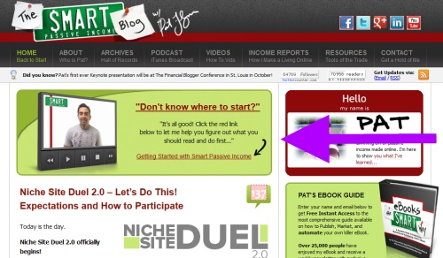
Here’s an example of getting started block that links to a video (on the Smart Passive Income blog – advice for anyone who wants to make money blogging):

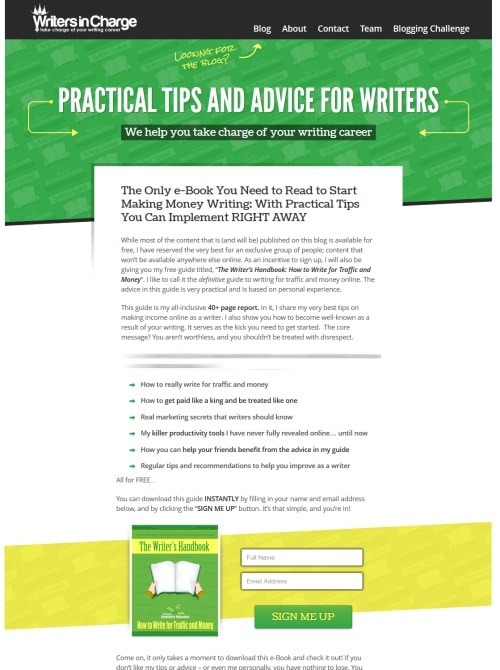
Here’s an example of a text-based getting started message (on a blog for freelance writers – teaching how to get paid to write):

2. Most popular content
The second block worth including on a homepage is the popular content/resources block.
The idea behind popular content is that it’s always easier to take something that’s already popular and make it even more popular than to do it with a completely new piece of content.
The popular content block is meant to do exactly this.
The simplest implementation is a basic list of 5-10 links. If your design allows you to do it, you can include some excerpts. But be careful, your popular content block should not become the main focus point.
Common placements are right below the fold or in the sidebar.
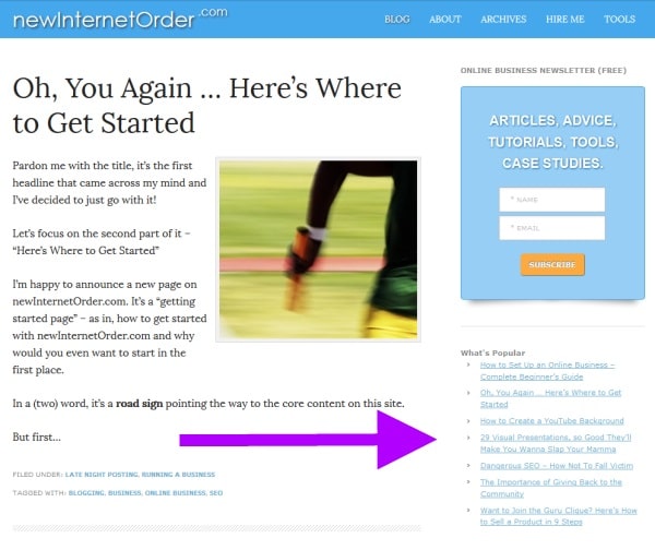
An example (newInternetOrder blog):

3. Trust elements
Everything that can make your offering/expertise more believable can be considered as trust elements.
For instance, if the site is meant to promote an author then display a badge saying something like “Published author” or “Featured on the New York Times bestseller list.”
For a design company, it can be logos of recognizable brands that they have worked with.
For a blogger, it can be a simple “as seen on” section.
The purpose of trust elements is to convince the visitor that they are dealing with a professional or an expert. The most common placement is near the top of the page (a narrow banner-like block) or in the sidebar.
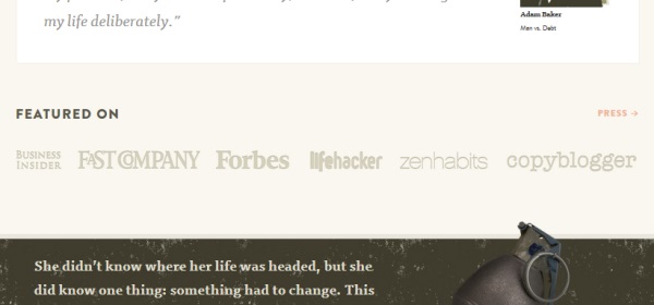
Here’s an example (Paid to Exist):

4. Small header
Currently, small headers are becoming a serious trend online. Most of the mainstream sites are using them already (TechCrunch, ReadWrite, Mashable).
Back in the day, the header was the perfect place to display some advertising, a big logo and other what-nots. But this has changed, mostly because header banners no longer generate any clicks (they fell victim to complete banner blindness).
Besides, the overall trend towards minimalism had to hit headers someday too.
As it turns out, websites don’t need big logos to be recognizable. Visitors don’t really care much for the headers and what’s in them. They are more concerned with content.
Here are some examples (ReadWrite and Mashable):


5. Direct links to products
This of course depends on the website itself. But if it’s any kind of a product site then it absolutely must display a set of product links on the homepage.
The form and style of these links is up to you. Because there are thousands of examples on the web, it’s hard for me to even point out the best approach.
Therefore, the rule of thumb is this: If the product on sale is the one guaranteeing someone’s livelihood then you should make it as visible as possible. Don’t even think about feeling bad for forcing it down the audience’s throat. However, if it’s just one of the side projects then it probably doesn’t need such a prime placement.
6. Good visible content
Well, I don’t want to play Captain Obvious here, but content really is the most important thing on every website. It’s the reason why people want to visit the site in the first place.
That being said, various websites understand content in different ways. Sometimes content means blog posts, sometimes it means videos, sometimes it means forum threads and so on.
No matter what the case is with the site you’re currently working on, you have to give your content a prominent placement.
How to do it? … The answer is minimalism.
Quite frankly, the less bells and whistles there are on a website, the easier the content is to digest.
If you take a look at a site like ReadWrite, you’ll notice that it features hardly anything else other than content. Actually, it’s difficult to even find any standard menu with some links in it.
7. Clear main element
Every homepage should have a main element. To put it simply, it’s the element that has the most relevance to the website and its goals. In other words, it answers the question: “What is this site about?”
Now, each of the things/elements discussed above can actually become the main element of your homepage. The choice is up to you, but you have to remember that the main element must be the most visible thing on the homepage.
In a nutshell, when a new visitor comes to the homepage, the main element is what they see first.
8. Subtle branding
If you take a look at some of the most popular sites online, you’ll notice that their branding elements are very subtle and as far from in-your-face as possible.
For instance, for TechCrunch, it’s essentially the color green that’s used to highlight links and as background for various boxes, elements, and bars.

For Mashable, it’s their small blue header that holds a fixed position at the top of the page.
But most importantly, these sites are consistent with their branding. There’s not one out-of-place element in their designs.
I encourage you to try a similar approach in your design. Just a logo and a good color scheme will be enough.
This concludes my list of eight homepage design tweaks to supercharge your website. I’m sure that there’s probably like a dozen of other things that would look good on this list, so here’s my question to you: Do you have any insights of your own on how to build a proper homepage?
About the author
Karol K. is a freelance blogger and writer. He considers blogs being the business tool of the 21st century. He writes and publishes posts about freelancing and writing for a living. If you want to find a way to get paid to write articles and blog posts yourself then feel free to pay him a visit at Writers in Charge.
via http://feedproxy.google.com/~r/LearnWebdesign/~3/G7ncSqIbQsI/8-homepage-design-tweaks-that-make-your-website-more-successful

No comments:
Post a Comment