20 School Website Design Examples for Learning Institutions

Thursday, August 29, 2019

Having a website for any business is very crucial for the online presence of the company. When it comes to having a school website, the site must be made in such a way that it can convince the visitors. Your website visitors will either be parents, students, or alumni. Your website is a digital asset for your school or institute, so make sure your website is user-friendly and provide aesthetic usability, interactivity, and creativity.

A school website should also have Appealing CTA’s, clear navigation, be mobile-friendly, have a news section, welcoming quotes, videos, images, adequate information regarding the school, an About Us page, and a part of information about current and past events of the school. A responsive school website design can bring more applicants and visitors to your site as your website creates the first impression of your school. So if you want a good impression of your school, then your site must have all those elements which are mentioned above. Here are some examples of fantastic school website design. The following school websites will definitely inspire you, and you can use these design as inspiration when designing a school website:

1. The Children’s Centre of Austin:
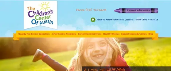
The Children’s Centre is a pre-school website. The website design is vibrant and juvenile. The quotes are inspiring. On the homepage, big and bold images are there that are shown using a slideshow. The site is straightforward. Once you open the site, all the essential information regarding the school is given, on the homepage itself. The site feels comfortable and suitable for any pre-school website. The color theme is beautiful, and so it enhances the site look. You can go to other links attached to the site like “Take a Tour” or any other link. For further information like the events, activities, other primary pages are also there. Overall, the site is responsive and mobile-friendly.

2. Little Dolphins:
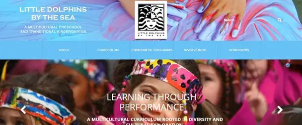
Little Dolphins website has done amazing work on their site. From aesthetic site design to the illustrative work, everything is done correctly. The site consists of many sections. Still, it’s not looking cluttered at all. On the homepage, images of different events have been shown through multi-media slideshow. The use of images is done creatively. The site look is vibrant and playful. The site has parallax scrolling, which is enhancing the look of the website. Plenty of information is featured on different sections of the site regarding the events and curricular activities, so one can quickly get all the information on the homepage itself. The CTA’s are big and bold. The site has a drop-down menu in the header section so one can quickly get whatever information they want. Overall, the site has correctly done many things. The site is engaging and attractive. Colors are playing an essential role in enhancing the site look.

3. Rochester Institute of Technology:
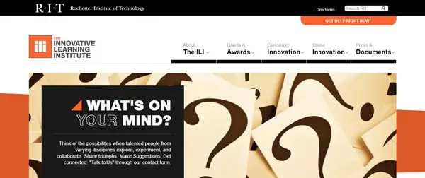
The website of Rochester institute has an intense look. The color theme is bold and eye-catchy. The site has a slideshow on the homepage which tells you why you should choose them. They have given all the necessary information. Also, the CTA on the top right side is big and bold so that visitors can quickly get in touch with them. The site consists of the drop-down menu so that visitors can get detailed information about the institute and classroom and regarding other things. One can easily find the contact details at the end so that visitors can connect with them easily. Overall, the site is simple.

4. Rhode Island:
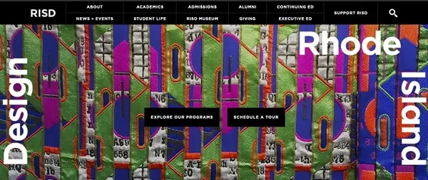
Rhode Island is a school of design. As it’s the school of design, the site design has to be attractive and visually appealing. The site has a black theme which makes the site look dark and intense. The images used are colorful and complementing the black color scheme of the website. The CTA’s are placed at the center so the visitors can not ignore them. The images are playing a significant role in the site as it is enhancing the site look. A different section of the site consists of important information regarding upcoming events, exhibitions, and portfolios. Other primary pages are also attached for detail information.

5. Scad:
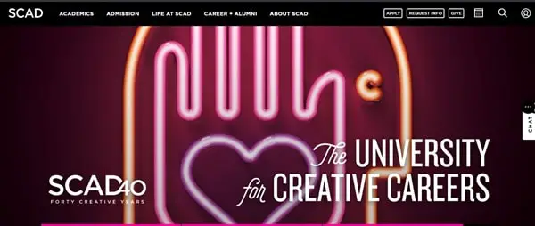
The Scad website has a creative background image on its homepage. The CTA’s are big and bold and are placed on the header section of the homepage. The site has a drop-down menu to give detail information about the university. The homepage has different sections where information regarding the upcoming events is provided. Overall, the site design is simple yet classy.

6. University of Coimbra:
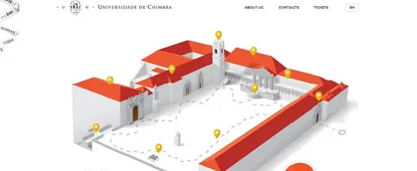
The award-winning website has an aesthetic design. One thing which makes this site different is the virtual structure of the university shown, and the point of interest of the tourists is shown on the homepage. On the top left side, the site has featured its achievements that makes a good impression of its university. A link is also attached to the right side of “play video” to have a look at the entire university. Visitors can have a virtual tour of the locations which is being shown in the header section of the homepage. Beautiful images are being featured on the site. The color theme is complementing the font style.

7. Our House:
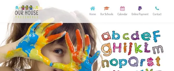
Our house is a pre-school website. The site design is juvenile and vibrant. The site has parallax scrolling, which is enhancing the look of the site. The font style is big and bold. The entire site has images of children. The different section of the site gives information about the school and testimonial section is also there to build the trust of the visitors. The site consists of other primary pages like contact, online payment, etc.

8. DE LA SALLE High School:
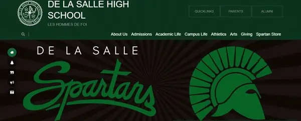
DE LA SALLE’s website has featured so many things on their site. The website design is excellent. The site has given information about the different activities of the school through multi-media slideshow. The content is good. Plenty of information is provided on the site. They also have a news section. One can quickly get to know about the mission and other detail information regarding the school. On the top right side of the site, the quick links option is there to get important details quickly. The site consists of other primary pages. The images used are big, bold, and high-quality.

9. Georgia Tech:
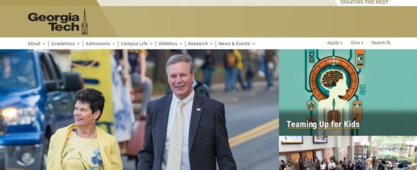
Georgia Tech’s site design is subtle and classy. The images are featured with the attached links. With just one click, visitors can get detail information about the institute. The site has a drop-down menu, which makes it easier for visitors to get information about different categories quickly. CTA’s are there on every section of the website. The news section is also there on the site’s homepage. The color theme is attractive. Overall, the site is designed simple yet effective. The navigation was correctly placed.

10. Stanford:
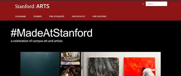
Stanford is an institute of art the homepage has a slow-motion silent video of an art piece. The video is attractive. On the homepage, the links are attached to the images of the different exhibitions held at the campus and links of many other topics related to art is also being attached to the photos. The #MadeAtStanfort page is excellent, and the page theme gives the site a dark and intense look. Moreover, the entire page consists of many pictures and videos. The other primary pages there for the students, faculty, and visitors. The search option is there on the top right side so that visitors can directly type and search for the information they want.

11. Austin’s Children’s Academy:
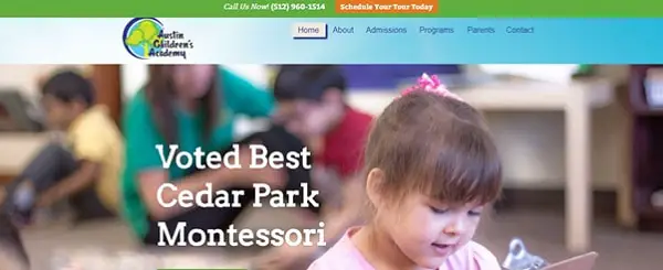
Austin Children’s Academy’s website design is lively and exciting. The site is very engaging. The navigation is clear. The color theme is enhancing the site look. The CTA’s are appealing and are placed on almost every section of the site. The design of the logo is going with the site theme. The site has used large and attractive images on its homepage. There is a blog, video gallery, and photo gallery section on the website to get more information regarding the activities and events happening in the school. The footer consists of four categories that show about their programs, Sign-up CTA for Newsletter and about the contact details.

12. Biola:
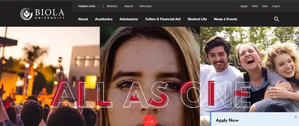
Biola university’s website is designed well. The site has made good use of images. The CTA’s are appealing and are placed on almost every section of the website. The site has parallax scrolling in it, which makes the site look decent. The images are playing a significant role on the website. The color theme is bright and attractive. The color theme and font style are complementing each other. It allows visitors to have a virtual tour of their campus. In the footer, all the links are present including about us, tuitions, News & events, and many more things attached for detailed information.

13. Hilliard Davidson High School:
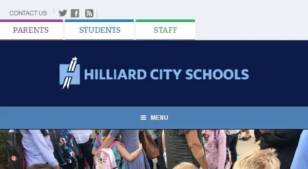
Hilliard Davidson School’s website has plenty of information on its website from Quick links to Upcoming events. Everything is given on the site. The site has a lot of content. A blog section is also there on the homepage. The good thing is they have a Daily Announcement section on the left side to keep their visitors updated. For more information, other primary pages are also there. CTA’s are placed on every part of the site.

14. Chapel Hill:
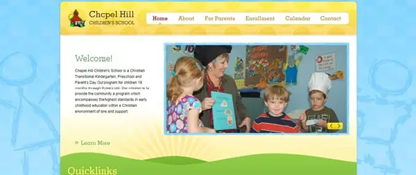
Chapel Hill is a children’s school. It’s a one-page responsive website. The website is straightforward. All the quick-links are attached on the homepage. Brief information is given about the school. The site design is joyful. And the images are shown through multi-media slideshow. The color theme is vibrant and delighted. The navigation is easy to use. For detail information, other primary pages are also there.

15. Queen Anne’s:
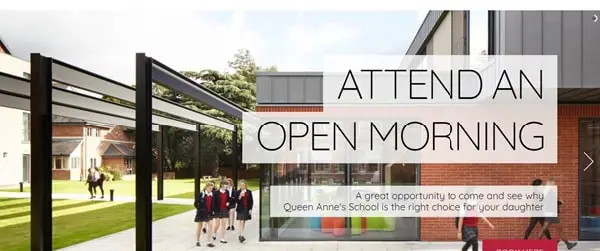
Queen Anne’s is a school for girls only. The site has a stunning design. Large images are shown through a slide show. The photos used are of high quality. The CTA’s are alluring and are placed on almost every section of the site. The images are playing a significant role in enhancing the site look. All the information about the school and its curricular activities is there on the home page itself. Videos are also placed to show the activities done. The News and Events section is also there on the homepage.

16. Matter De High School:
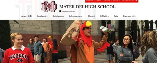
Mater Dei school’s website design is marvelous. The large images are featured on the homepage through a slide show. The site theme is lively and exciting. The color theme is enhancing the site look. The CTA’s are big and bold and are placed on every section of the site. On the homepage, there is a section where the number of students at their school is mentioned. Overall, the site is engaging and user-friendly.

17. Black Spine Circle School:
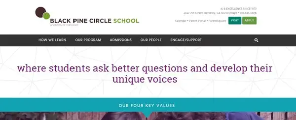
Black spine school’s website has done many things in the right manner. The site design is descent. The images are big and bold. The site has an adequate amount of information about the school. The has parallax scrolling, which enhances the site look. The CTA’s are big and bold. The testimonials are shown through videos. The site has given all the information about how they work and why one should choose them. Overall, the site is engaging and has an excellent user experience. The color theme is classy.

18. Westfield High School:
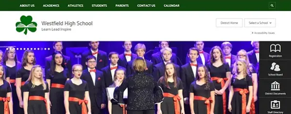
The Westfield school’s website has plenty of information on its site. The theme is bold and beautiful. The site design is going with the theme. All the other links are attached to the header section of the homepage. Site navigation is clear.

19. The Bush School:
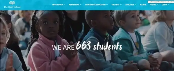
The bush school has a silent video on its website, which gives information about the curricular activities and other academics information about the school. For more information, the inks are attached for the information about summer programs, lunchtime, and many other things. The color theme is calm and pleasant.

20. New Hampton School:
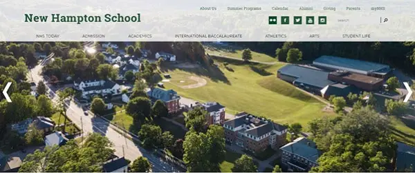
New Hampton School has featured many videos on its site for giving information about the school. The site design is astonishing. The site has a drop-down menu so that anyone can easily find the detail information.

Having a good design for a school website is very important as it will bring more applicants to your school and will build your school image. So take inspiration from these examples and create your unique school website.

The post 20 School Website Design Examples for Learning Institutions appeared first on Line25.


Source: https://ift.tt/2LgiHgv

Design your way

SEO Website Design – How SEO and Design Must Intertwine

Wednesday, August 28, 2019

We all have simple goals for our business. We can define those simple goals as sales. We try to do every possible thing in our hands to reach that one right customer in our surroundings. Back in the day, we used to go to every house and try to sell our products. Some decades later, we started to advertise in newspapers and billboards to reach that one perfect customer.

But in today’s age, we use digital platforms to reach our target customer. Therefore, even after knowing the ABC of the digital platforms, we still would need to dive in deep at the time of execution. This is where SEO comes to our rescue. It helps us reach our perfect customer in the best possible way. It is a no brainer that our website design plays a huge and essential role in gluing the audience to our website.

Beneath, we will discuss how an SEO-friendly website can prove to be more useful compared to a website that is not SEO optimized, and how two digital aspects like SEO and Graphic and Web Design can intertwine with each other and help us reach our target audience in real-time.

Generally, search engines like Google and Bing have web crawlers, who go through our web pages to analyze and sort our content. They understand our content through keywords as the users type in. They surely have limitations of language and jargon, but it does a fair enough job.

We, as a layman user, do not consider SEO too high in the form of conversion, due to a lack of technical understandings and other web-related issues. However, as a service provider, we understand SEO, as a medium between users and we, providers, who help us, identify the user queries to provide them with the best possible solutions. It helps generate leads through the website, which in turn helps us in earning more profits. An SEO-friendly website is carefully designed, keeping in mind the needs of the users as well as web crawlers. The language and tonality of content along with its interface, is taken care of. It is designed in such a way, that it is easily understandable by the web crawlers, as it would make it easy for them to index and show the required results. Every component on the website plays a substantial role in defining the services. It should reflect our offline services well, as it is considered as an online office build for our online audience. It gets equally essential to develop an online website as it is essential to have the right interior office representing our services in the best possible manner. Following are the few points the designer needs to consider to enhance the SEO of the website:

1. Domain name

Your domain name should be crisp and clear. It can be funky but not extreme. It should define your purpose as well as services. It is not necessary to include all your keywords in the domain name itself. Leave the keywords for content and use precise words that are needed. For example, Survey monkey website for conducting online surveys. The name itself defines its service as well as gives a funky and funny touch to it.

2. Hosting

A lot of people are fooled these days by cheaper rates of the server and end up with a slow website. First of all, you need to know your business in and out before jumping to take up a website. This will help you understand your requirements while purchasing the hosting plans. If you are providing E-commerce services and you end up making a plan which does not support E-commerce integration, then it would turn wrong. It is essential to design a website following the requirements and then host it on a platform that supports it technically without any harm.

The design of your website matters as much as the quality of the content you put on display. When you have to choose between content and the UI of your website, it is a sensible decision to go for valuable and in-depth content — but also taking a micro look at the design scenario. When you compare your website with your competitors, you will notice how the presentation of the same content makes a difference for them. And hence, it is safe to say that the way you present your content to your audience makes you stand out on the market. Depending on the type of your website, you need to figure out the hosting that you need. The server space, the bandwidth, and other server parameters play an important role in how your website will function.

3. User Interface v/s User Experience

Many of the significant SEO metrics are directly affected by the structure and overall experience of the user on your web page. If the navigational structure is well segregated and concise, the user won’t have to hassle through multiple web pages. Instead, it would help them invest their time on your content in a better way and make good use of it. As opposed to the scenario, when the website has unfortunate navigation scenarios and undefined sitemap, the user is frustrated in the first few seconds and ends up hitting alt+F4.

We definitely won’t like it to happen after such a hard word. It is necessary to make a smooth and user-friendly interface to give your users a shaven user experience while surfing your website. The website should be designed following the requirements of your target audience as well as web crawlers to justify their time on your platform.

The following parameters can be considered while designing the web page:

• Limit the number of objects on the first page.
• Keep the home page or landing page aesthetically pleasing
• Limit the number of redirects on the website
• Keep the main menu visible and comfortable to access
• Add a search bar to help the user find the relevant information
• Make sure that the URLs are clear and concise for each page
• Instead of displaying the https links, try using a descriptive text
• Hyperlink the web pages on your website.
• Create websites that are user-friendly and intuitive.

4. Redirection


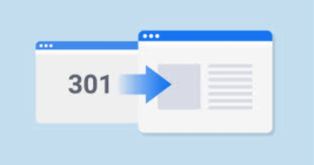
When a prospect visits your website and finds a broken link, there are 100 percent chances of him or her not returning to your website again. It is one significant factor to be considered while maintaining the website. This ignorance leads to dismissing of the prospective customer from becoming a regular customer. Ensure that all the web pages are correctly working; all the navigations lead to the correct page and all the audience land up to similar pages. In case of broken links, make it a priority to fix them immediately and redirect the user to another page. The following parameters have to be considered for redirection purposes:

• Avoid using generic designed pages for your website
• Be creative and design your own 404 page that is interesting enough and works as an attention grabber.
• You can also add another search bar on the 404 pages, giving your users another opportunity to go through your website.
• List down the critical pages on 404-page display, to encourage the visitor to have a look at them before leaving the website.

5. Images, Image Size, and Alternative Text

It is essential to showcase a vital message through an image format. The image should be high resolution for clarity purpose but should also be compressed, keeping in mind the loading speed of the web page. A small image with proper resolution works the best in most scenarios. In the case of audio and video media, it is advisable to use an appropriate media compressor that reduces the size of the file without losing the quality of the data. Here, are some of the essential things that you should consider for web page images:

• Instead of giving a generic name to images, use relevant keywords as the nomenclature of the images. Crawlers also pay attention to the keywords that are used for the images.
• You can also use an alternative description for the image that includes the keyword. This trick will help the keywords to get listed in the results even when the user searches for images only.
• Reduce server load as much as possible by using compressing software.

6. Loading Speed


When we put a high-resolution media on a slow server, our website will naturally take longer time to load. This encourages the user to move on to the next. The ideal time for loading a website is one second. Following points can help you decrease the loading time:

• Minimize your CSS and JavaScript files.
• Trim down unnecessary files and codes.
• Always use the best web hosting providers that have a high in-built server.
• Try to use a high cache solution
• Reduce the number of redirect links on the page
• Lower down HTTP requests.
• Make good use of CDN
• Use compressed images that are smaller in size but have a proper resolution

7. Pop-Ups:


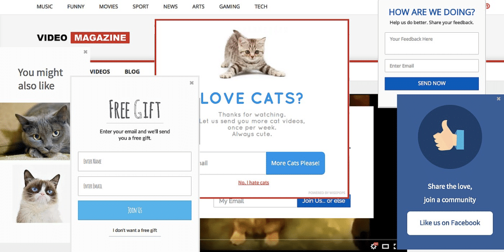
As a user, we know how annoying the pop-ups can be at times. The pop-ups appear either as soon as the user lands on the page or within a few seconds from then. The first impression is the last. You can lose credibility when the pop-ups and ads show even before your user has read your title. It is necessary to give them time to understand your purpose and services. If the pop-up appears too frequently, the user might find it irritating and would leave your website out of sheer frustration. Here are some essential things to consider:

• Minimize the pop-ups.
• You can use the exit intent pop-up. The pop-up evokes when the user is about to quit the website.
• Place your pop-ups in such a way that it interests the user to click and know more about your product.

8. On-Page Experience:

Google analyses your website based on the number of visits and the amount of time spent by the user on your website. An excellent way to attract more users to spend time on your website is by putting out great content and appealing designs. It increases the chances of getting high ranks on search engines. For ranking, it is essential to use correct keywords with all the relevant information required by the user. It is also crucial to place the backlinks wisely as there are high chances that the customer would follow the backlinks and land up to the desired page, thus helping you earing the crawl budget for your website.

All these practices seem dumb at first, but if practiced regularly, it helps in achieving our ultimate goal of appearing on the very first page of search engines. Also, giving your users a clean and delightful web experience is equally important to bring them and turn them into a loyal customer. Here are some essential tips to consider while creating a seamless reading experience for your user:

• Choosing a light background makes it easier for the reader to read your content.
• Do not overcrowd your page.
• Make good use of white space
• Make use of Heading tags and Title tags.
• Do not write long paragraphs; instead, divide the entire content into sections.
• Add several sub-headings, bullet points, and images whenever necessary.
• Try to convert your text to videos and infographics as visual effects appeal more than words.

In the digital era, your website works as your digital identity. As per the research, about 92% of search queries run on Google, and a good chunk of organic traffic also comes through” Google Search Engine.

Now, you know the reason behind such a massive buzz for getting the SEO done? As per Google Search Insight Report, there are more than 60 trillion web pages on the portal. What are the chances of your website being in the results list? Here comes the meaty part of the content — the Keywords. Keywords help Google’s algorithm to identify the relevance of your content. Once the content part is sorted, the next important thing which comes up is the design factor. As said earlier, content is not everything. You have put up a well-researched content. But how will your potential user reach your website? And if landed, how will you attract the user to stay on your website for a longer period to explore tour services?

The UX/UI part of the website is everything. If the content is the heart of the website, UX/UI is the face and personality of the website. This is the factor that allows the user to enter and stay on your website to make use of your content. This is how the design and SEO work together. They are not just intertwined but go hand in hand. The user won’t land until the design is appealing and would quickly quit of the content is not informational enough. SEO would let the user land on the correct web page and loading speed while the user experience would give the users that comfort to relax and make use of the information in real-time. If one of them is not followed correctly, then it can either make or break your online business. It is advisable to follow specific SEO guidelines, if not all while designing your website. The results would be mesmerizing and optimum.

The post SEO Website Design – How SEO and Design Must Intertwine appeared first on Web Design Blog | Magazine for Designers.


via https://ift.tt/2ZuPDet

Design your way

Anyone who has had to make a digital presentation knows PowerPoint. Since 1987, when it was launched, it has been crowned as the undisputed leader to make all kinds of digital slides in an attempt to eliminate large paper portfolios. However, many people do not know about the existence of PowerPoint alternatives.

Microsoft has managed to keep its program as the most popular thanks to its constant updates, so for at least 3 decades, it has been the choice of most users.

However, PowerPoint is also the choice of many due to its easy interface with multiple options. Almost any computer user knows how to use PowerPoint today, so it is easy to create flashy presentations in a short time.

The problem with PowerPoint is that its license is somewhat expensive, and many companies cannot afford to acquire it. However, there is no need to be alarmed, since there are many alternatives to PowerPoint that try to position themselves before this giant of presentations.

We all know that when we present a product or project, the appearance is important. Without a good distribution and highlighting of the elements, the idea that we want to expose will not be clear, and we will not be able to specify the sale to the public. And although PowerPoint practically gives you the possibility of getting these dream presentations on a silver tray, the PowerPoint alternatives in the following list also do it, and sometimes even overcome it.

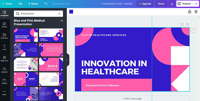
Canva – Perfect for the beginner

canva-700x355 PowerPoint alternatives: What you can use for presentations

Canva is a popular option that allows newer users to make all kinds of high-quality presentations by using one of the 8,000 free templates.

Of course, this alternative to PowerPoint also has a paid subscription, but even in its free version, it has all the tools necessary for newbies to stand out in their presentations. Although it should be made clear that certain PowerPoint functions, such as transitions, are not found in Canva.

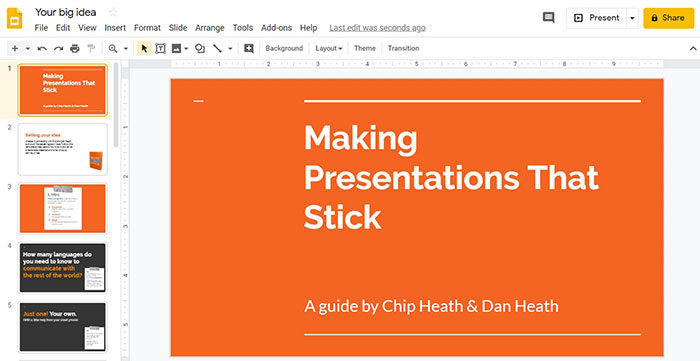
Google Slides – The Google Alternative

google-700x361 PowerPoint alternatives: What you can use for presentations

Google has been responsible for not only having the most popular browser in the world but also several online tools that seek to replace those of Office. Google Slides is their PowerPoint alternative, which includes many options for all types of presentations, from business to student.

Google Slides comes free when creating a Google account, so in addition to enjoying the program, we can complement it with other tools of the company, such as Drive.

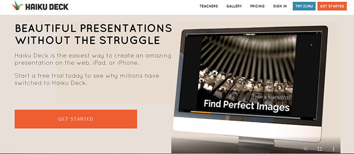
Haiku Deck – For Apple users

haiku-deck-700x306 PowerPoint alternatives: What you can use for presentations

PowerPoint alternatives are not only limited to computer tools. Haiku Deck is an alternative to working in the cloud from our iPhone or iPad.

This Prezi and PowerPoint alternative includes 27 templates, and a gallery of 35 million photos to create presentations quickly. It also includes an AI assistant that can create slides automatically. The only drawback is that it is not available for Android.

Emaze – Receptive templates

emaze-700x350 PowerPoint alternatives: What you can use for presentations

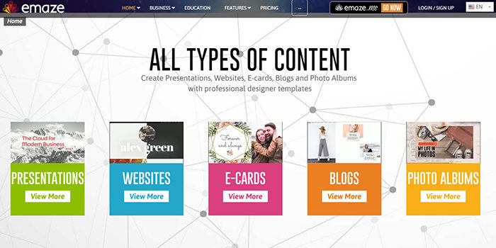
The internet has served to create a large number of tools. Emaze is one that offers us free receptive templates with which we can create presentations that adapt to all types of devices, whether large or small screens.

These templates only need to be completed by images and information, but everything else is already prepared. Emaze also gives us an important option, and that is that presentations are made in HTML5 format, which, among other things, guarantees compatibility with phones. Of course, there is no need to work in HTML5 format, since this is simply the result with which the Emaze presentation is saved.

Visme – Easy to make infographics

visme-700x410 PowerPoint alternatives: What you can use for presentations

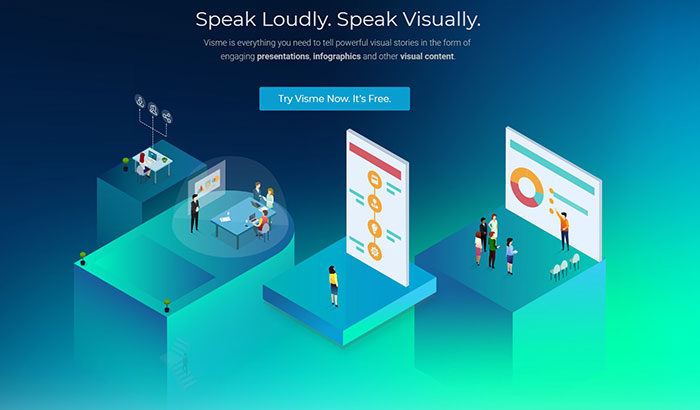
Thanks to the drag-and-drop functionality, Visme is positioned as one of the easiest-to-use PowerPoint alternatives. Not only can we create presentations, but it also works perfectly for infographics, tables, among other formats.

LibreOffice Impress – The alternative for Linux

ibreoffice-700x389 PowerPoint alternatives: What you can use for presentations

Open-source programs are gaining high popularity among users, especially if they are Linux operating systems. LibreOffice Impress is the option that seeks to dethrone Microsoft Office. What started as a humble project has become a worthy rival.

The program is multiplatform, so we can use it in almost every PC. The best thing is that it has all the advertising alternatives we might need from PowerPoint, such as creating brochures for printing on paper.

Prezi – Forgetting the multi-slide format

prezi-700x326 PowerPoint alternatives: What you can use for presentations

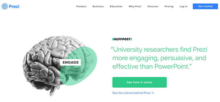
Prezi could even be considered better than PowerPoint by many, as it abandons the classic multi-page format to create a single slide where the information is zoomed.

Prezi is an extremely popular alternative for its cloud features, which allows us to review our work from any device. However, this has a cost, although we can try it free for 30 days.

SlideBean – A tough competitor for Microsoft

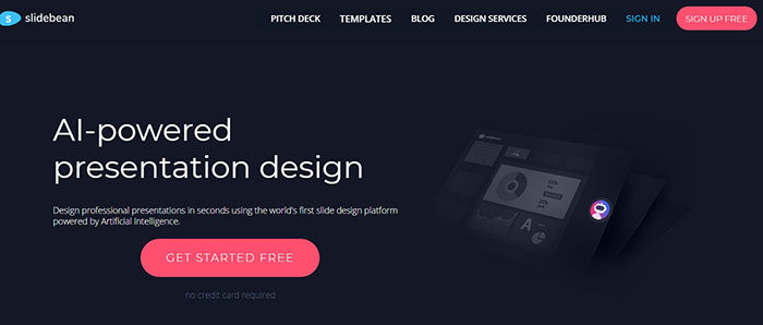
slidebean-700x298 PowerPoint alternatives: What you can use for presentations

Microsoft’s competition is tough, and SlideBean proves it. An alternative to PowerPoint that, for only $24 per month, offers presentations almost automatically in its design. We only place the information, we assign the images and the program will arrange them for us.

The quality of the presentations is high, and with the advanced version of the program, an analyzer is even included to determine if the presentation is ideal. When we have little time, or if in the company where we work they demand an impressive presentation, SlideBean can get us out of trouble.

Keynote – Apple Flavored Slides

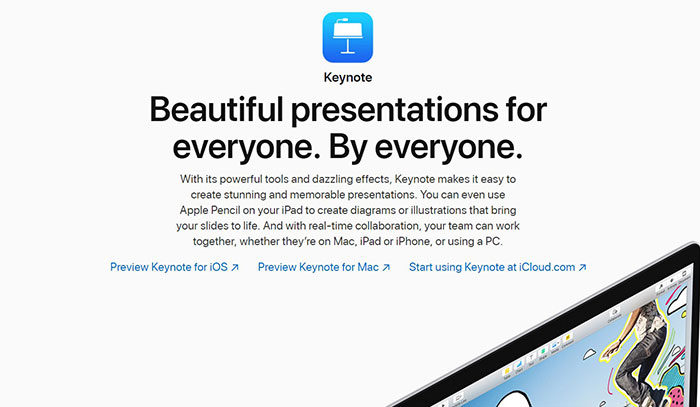
apple-keynote-700x407 PowerPoint alternatives: What you can use for presentations

Apple would release its version of the most famous slide show. Although we can ironically get Office on Mac systems, Keynote is Apple’s foray that includes its character.

Sophisticated and intuitive, it is all that a program for Mac should be in terms of power of work functions. With it, we can create interactive graphics, reflections, frames, and all the options we can think of PowerPoint with additional aggregates. Even the transitions are improved to offer us something more cinematic.

Additionally, Keynote works great with the iPad Pro and Apple Pencil, which makes it even more intuitive. We can store the presentations directly in iCloud, Apple’s cloud service, so we can see them anywhere.

Renderforest – When an image is not enough

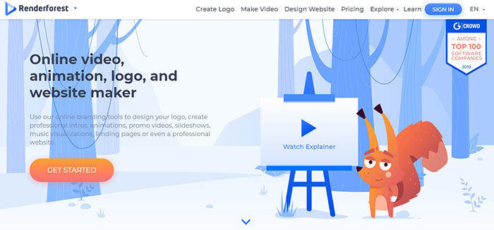
render-forest-700x326 PowerPoint alternatives: What you can use for presentations

There are multiple ways to stand out when it comes to creating presentations. The videos are one of them. Although they don’t always work for formal events, a video is a creative way of doing a job. Renderforest is the only alternative on the list that allows us to work with them natively.

As simple as selecting the video, adjusting the colors and placing background music if we want it. Once finished we can publish the result on YouTube or Facebook, or simply export it as an MP4 file.

Focusky – Animated vectors

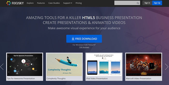
focusky-700x352 PowerPoint alternatives: What you can use for presentations

Working directly with HTML5 is the best when we want compatible presentations on all possible devices. Focusky not only offers us this compatibility but also has a gallery of more than 5,000 animated vectors in Flash to make more educational presentations.

Swipe – Let the public participate

swipe-700x508 PowerPoint alternatives: What you can use for presentations

For Swipe, public participation is important. With this tool, you will be able to know if your presentation has been relevant to the spectators, since it offers data on how long each sheet has been read, in what order they saw it, which was the most relevant, among other things. It is a very important option for companies that want to analyze their advertising strategies.

SlideDog – The Direct Option

slide-dog-700x479 PowerPoint alternatives: What you can use for presentations

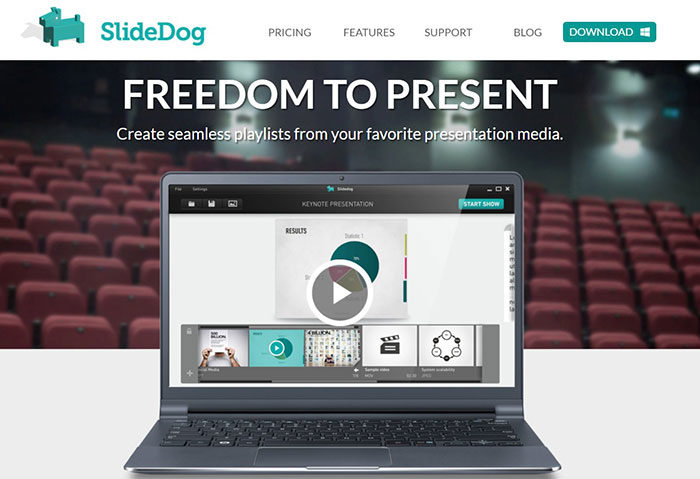
If PowerPoint and the like seem suffocating, you can always deal with SlideDog. This application is a compilation of the different formats used to create presentations (images, videos, web pages, PDF, PPT, among others) and allows you to manipulate them easily and quickly. All complications are eliminated with this simple application.

Moovly – Let your imagination fly

moovly-700x287 PowerPoint alternatives: What you can use for presentations

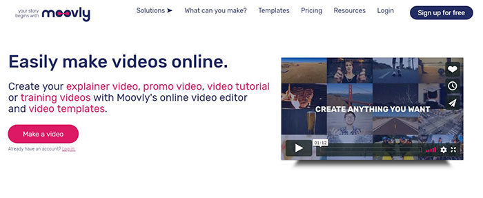
When we need software that allows us to show our full creative potential, Moovly emerges. The number of animations and options (totally free and in our browser) make PowerPoint seem like a basic tool.

Although it is still at an early stage, Moovly launched a video generator to gain more insight into this list of PowerPoint alternatives, as it allows the creation of video presentations quickly for businesses.

Slides – A simpler alternative

slides-700x312 PowerPoint alternatives: What you can use for presentations

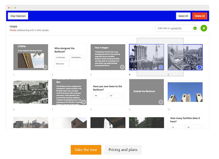
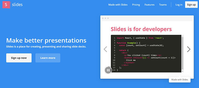
Slides offer only the basics for editing presentations. The workspace allows us to easily edit some options, such as the background image or the location of the elements. Thanks to its 10 templates, we can get fast results. Besides, it has the option of working together with other people through the internet.

Zoho Show – Internet dominates the market

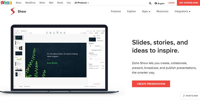
zoho-700x356 PowerPoint alternatives: What you can use for presentations

Another alternative that comes from the cloud is Zoho Show. This is part of a line of applications called WorkPlace Bundle and offers a solid alternative to PowerPoint to edit your slides from any device with internet.

Powtoon – A lively touch

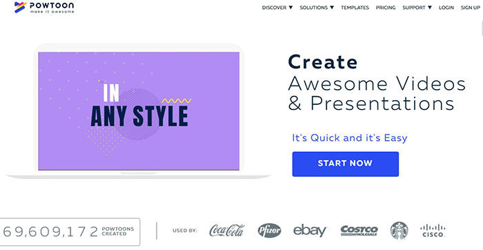
powtoon-700x362 PowerPoint alternatives: What you can use for presentations

As one might expect by the name, Powtoon strongly advocates animation, leaving inert texts in the background. This free alternative to PowerPoint allows us to explain things through animations.

Sozi – A single canvas for everything

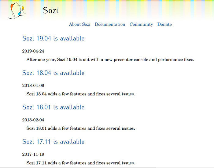
sozi-700x548 PowerPoint alternatives: What you can use for presentations

Very similar to what Prezi offers, Sozi gives us a single canvas on which we will capture all our ideas. We can draw or embed the content, and it will simply move from one area to another to be seen.

SlideCamp – Using the prefabricated

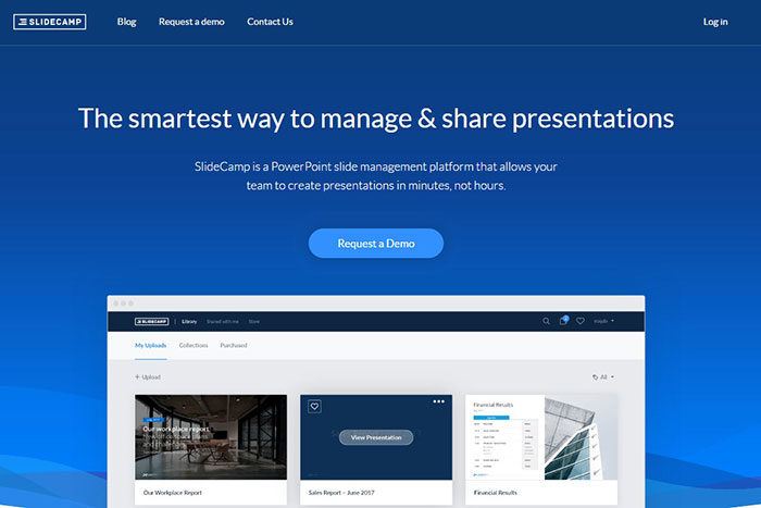
slidecamp-700x467 PowerPoint alternatives: What you can use for presentations

SlideCamp is not an alternative as such since what allows us is to get presentations ready to be opened in PowerPoint. Most offer fairly simple and attractive designs, which are not exaggeratedly striking.

Currently, getting an alternative to PowerPoint is relatively simple. What is not achieved in one program is present in another, and with the use of several, we can create true works of art. There are even free options that are better than the Microsoft program. Do not be afraid to use any of these, and discover that making presentations is possible in many programs.

If you enjoyed reading this article about Powerpoint alternatives, you should read these as well:

The post PowerPoint alternatives: What you can use for presentations appeared first on Design your way.


Source: https://ift.tt/2NBdnY0
 

The Cash Box Blueprint

Most Reading