From the first known color used in art, red ochre, found in prehistoric cave paintings, to the gambit of paints available at your local craft store, color has always had its place in the world of art and design. In design, we use color to add emphasis, evoke emotion, and communicate meaning.
The subject of color is very broad and there are actually many theories about how color works and its application. But in the world of art and design, there is a generally accepted idea of basic color theory. If you’re interested in design or other visual arts, you need to know these basics. Understanding the color wheel, using black and white with color, and color schemes, you can greatly enhance your ability to create meaningful and aesthetically pleasing works.
The Color Wheel
In 1704, Sir Issac Newton created the first “color wheel,” or as he called it, “color circle.” This circle actually had no color on it at all – only writing. Interestingly, his studies in color notation were directly correlated to his study of music notation, and so included in his rough wheel of color were musical notes. Using Netwon’s circle, Moses Harris, an English entomologist and engraver, expanded on color theory, writing a book in 1776 called Natural System of Colours, in which he showed how many colors can come from just three.
Moses Harris’s ‘Colour Wheel’
Since then, much progress has been made on the modern-day color wheel and its application. The modern color wheel usually consists of three primary colors, three secondary colors, and six tertiary colors. Today’s wheels oftentimes include tints of all twelve colors.
Today’s Color Wheel
Becoming familiar with primary, secondary, and tertiary colors will help you to better understand how to combine colors and how they can work in harmony to create masterful designs.
Primary Colors
As in Moses Harris’s early Colour Wheel, primary colors consist of red, yellow, and blue. These colors are called primary because in their pure hue, they are the only colors that cannot be created by mixing other colors together. Think of them as the three parents of all the other colors.
Secondary Colors
Secondary colors are green, purple, and orange. They are called secondary because they are created when primary colors are combined. Therefore, two primary colors, blue and yellow, make a secondary color: green. Blue and red are combined to make purple, and yellow and red are combined to make orange.
Tertiary Colors
Finally, there are the tertiary colors. These colors may not appear in some wheels, but are important to know. Tertiary colors are the product of mixing a primary color and secondary color. There are yellow-orange, red-orange, red-purple, blue-purple, blue-green, and yellow-green.
The colors found on the color wheel are also known as hues.
Black and White
You may have noticed the absence of black and white on the color wheel. Perhaps you’re thinking “what about black and white? Those are colors, right?” The answer to that question is a little more complicated than you’d think. There are still debates about whether or not black and white are colors. Some say black is a color and white is not. Others say the exact opposite.
It all depends on how you mix it. For an artist, black is the combination of all colors, while white is the absence of color. Test this out by mixing an equal amount of all three primary colors together – you will come out with black. Therefore, black is considered a color and white is not. This is called Subtractive Color Theory.
Subtractive Color Mixing
Science, on the other hand, has what is called the Additive Color Theory. This theory focuses on light and states that black is the absence of color. An example of this is going into a dark room – there are no photons of light, therefore you cannot see any color. This theory also states that white is the combination of all colors. This is proven by using a prism to bend a white ray of light to create a rainbow.
Additive Color Mixing
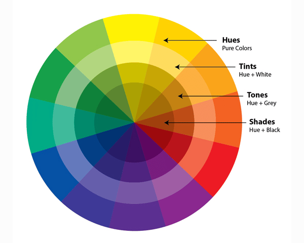
Saturation, Tints, Tones, and Shades
Now that you understand how black and white interact with colors, you can begin to understand saturation, and the tints, tones, and shades in relation to hues. Remember, when we say ‘hue,’ it means a color on the color wheel.
Saturation
Also known as chroma, saturation is the intensity or purity of a hue. Saturated colors are more bold and bright, while desaturated colors are dulled. It might make it easier to remember if you imagine a scale that goes from 0% to 100%. A hue at 100% saturation is in its purest form, meaning that there is no grey or white mixed in. If the saturation is at 0%, the hue appears to be a dull.
Saturated vs Desaturated
Tints
By adding white to a hue, you create a tint. This desaturates the hue, making it lighter. Tints can create a variety of different colors, depending on the ratio of white to hue that you use. These colors are often referred to as pastel colors.
Red Hue vs Red Tint
Tones
To achieve a tone, you simply mix both black and white into a hue. This process desaturates the hue, though, depending on the black to white ratio, the tone could appear lighter or darker than the original hue.
Red Hue vs Red Tone
Shades
Adding black into a hue creates a shade. This creates a darker color. In digital work, this usually creates a richer, more intense color, though you should be careful in painting and other traditional mediums, as adding black can lead the color to look muddied.
Red Hue vs Red Shade
Color Schemes
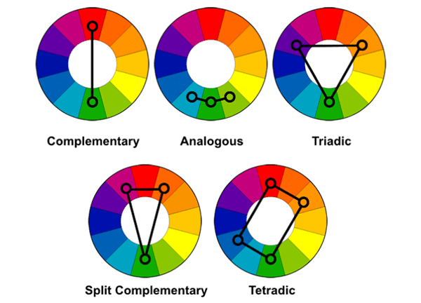
Let’s go back to the color wheel to talk about color schemes. This is where the fun begins! When we work with color, it’s important to know how to expertly match colors together for an attractive outcome. There are six basic color schemes “rules” that we know work well together.
Monochromatic
You’ve probably heard of this one. Monochromatic is simply choosing one hue from the color wheel and using that, along with various tints, shades, and tones. Some might think of this color scheme as boring, but actually, it’s quite sophisticated. There are so many colors to choose from. For example, a pure orange can make a dark brownish color, or a pale peach.
An example of a monochromatic color scheme, Royal Dutch Airways
Analogous
You can create an analogous color scheme by choosing three or more hues that are next to one another on the color wheel. To achieve this, pick any hue from the color wheel to be your mother color. Then choose a couple of colors on each side of that color. The similarities that these colors share will foster harmony and create a gorgeous scheme. Don’t forget to try using different tints, tones, and shades!
An example of an analogous color scheme, Alexandra Zutto
Complementary
To achieve a complementary color scheme, choose one hue from the color wheel and it’s complement, the color directly opposite of it on the wheel. These color schemes tend to be intense because the two hues are so different. This is perfect for if you wish to create a loud statement. If you’d like a subtler complementary color scheme, try experimenting with different tones, tints, and shades. One interesting fact about complementary colors is that they neutralize one another, meaning that if you’d like to tone down a bright color, simply add a bit of its complementary color to make it more neutral.
An example of a complementary color scheme, Rosalina Atanasova
Split-Complementary
By knowing how to create a complementary color scheme, you can create a split-complementary color scheme as well! Choose a color on the color wheel that you would like to use, then find it’s complementary. But instead of using the complementary color, you will use the two hues on each side of it. So, as we know, red and green are complementary. To create a split complementary with the color green, you would work with red-purple and red-orange.
An example of a split-complementary color scheme, Michael J. Hildebrand
Triad
This color scheme takes the name “triad” because there are three hues in the color scheme, each separated by three other hues. In other words, when creating a triad color scheme, you will choose every fourth hue on the wheel. This could be the three primary colors: red, yellow, and blue, the three secondary colors: orange, purple, and green, and so on with the tertiary colors. It may seem complicated at first, but really it’s quite simple and extremely versatile. Many artists work with triad colors the majority of their career because there are so many variations that can come out of the triad color scheme.
An example of a triad color scheme, Bobby Doherty
Tetradic
The tetradic color scheme is the trickiest of them all because with so many colors, designs can be overwhelming to the eye. But that doesn’t mean that it is without merit. There are a couple of different variations on the tetradic color scheme, but the most commonly used is the rectangle tetrad. It is called a rectangle because you are essentially creating a rectangle on the color wheel. You achieve this by choosing one hue on the color wheel, skip a color, and then choose the very next color. After you have these two hues, you will then choose their complements. Essentially, you’re working with two sets of complementary colors. This can be difficult to juggle, but it can create beautiful results.
An example of a tetradic color scheme, Lynne Mapp Drexler
As you begin to work with color schemes, it is best to first choose a dominate color for your design and use the other colors as accents. And remember, with each color scheme you can create subtlety or drama by mixing colors and experimenting with tint, tone, and shade.
Color is one of the most important elements of design. Knowing how to make color work for you, rather than against you is vital. As you work with color, keep in mind these basics, and you will surely create more attractive, aesthetically pleasing designs.
The post Color Theory 101: The Basics appeared first on Line25.
Source: http://ift.tt/2htqWVC


No comments:
Post a Comment