Coca-Cola turned 133 years old on 8th of May 2019, and the prominent and very easily identifiable Coca Cola logo has evolved along with the brand.
The Coke logo has changed over time but remains incredibly powerful and a firm favorite with fans. Although the Coke label is internationally recognizable and appeals to a global market, this was not always so.
The Coca Cola logo has changed over time, transforming and evolving until it has become a world famous mark. Let’s explore these changes in context, looking at the development of the Coca-Cola brand.
Advertising Strategy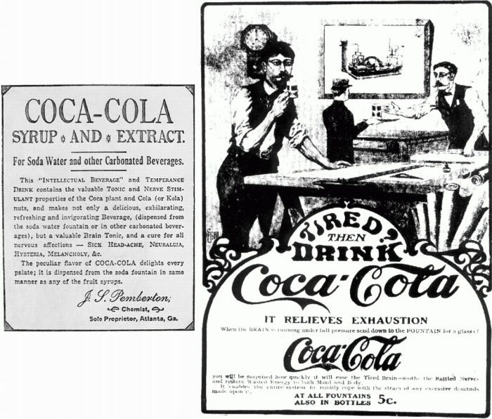
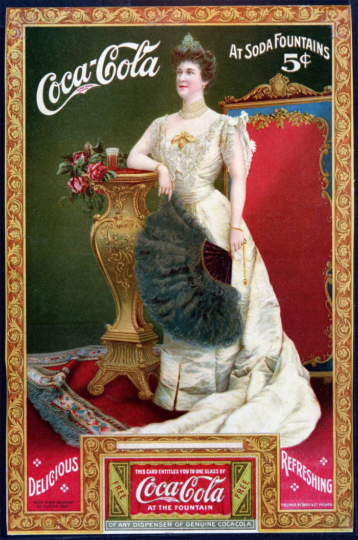
When Coca-Cola first began in 1886, it used samples and promotions, offering customers a taste of this incredible product. In 1892, the company was purchased by Asa Chandler. Chandler began to introduce an advertising strategy. With $11,000 he introduced items such as calendars, napkins, soda fountain urns, clocks and Wall signs to market the Coca-Cola brand.
His advertising campaign began to grow! Coca-Cola began its magazine advertising campaign in 1904. By 1911 the company was thriving and the advertising budget had increased to over $1 million.
By the 1920’s Coca-Cola has added billboard advertising campaigns and radio program sponsorships to its advertising campaign. The Coke logo was becoming increasingly powerful.
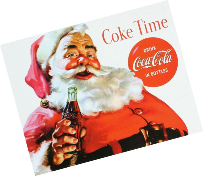
Coca-Cola began its Christmas advertising campaign in 1931, showing Santa Claus enjoying a refreshing Coke. Santa has been associated with the red and white colors of the Coca-Cola logo ever since.
During the 1950s television became increasingly popular and Coca-Cola was not to be left out. Coke ran their television advertising campaign for the first time on Thanksgiving in 1950.

The Coca-Cola logo has been associated with some remarkable campaigns, including the 1993 ‘Northern Lights’ advertising campaign which showed the Coca-Cola polar bears.
The Coke Logo has helped to build the brand, taking it from strength to strength. Let’s have a look at the Coke logo and how it has changed and evolved over time.
The Coca-Cola Logo history
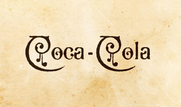
1886 – What’s in a name?
![]()
The original Coca-Cola logo began with the formation of the company name. Coca-Cola was named by company bookkeeper Frank M Robinson, who believed the double C’s in the brand name would add a special ingredient to the company’s marketing campaigns.
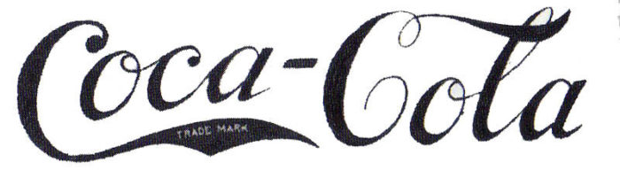
He also shaped the world famous Coca-Cola logo by experimenting with font. Using the popular Spencerian font, he wrote out the company name, shaping what would later become the very attractive Coca-Cola logo.
However, there were still changes to be made! The Coke logo first appeared in 1886 in the Atlanta Journal Constitution. At this time, the Coca-Cola symbol appeared in both sans serif and in block serif. It was only in 1887 that the Coke logo began to take shape, settling on a single font style.
The Coke logo initially started out in black and white, and the red and white colors so familiar to the Coke brand were only introduced in the 1960s. While the font has barely changed over time, the red and white colors of the Coca-Cola logo added instant appeal.
1887-1890s – The Coca-Cola trademark
The Coke logo was given a trademark in 1893. The words ‘Trademark’ were written. On the tail of the first ‘C’.
The swirled effect
For a year, between 1890 and 1891, the Coke font was given flourish. Swirls were added to the logo, with dramatic effect.
These first ten years were the experimental years, and The Coke label showed up in different styles and formats until the company was completely satisfied with the results. It was only between the 1930s and 1940s that the Coca-Cola logo gained consistency.
1941-1960s – Tail tweak
Once the Coke logo was consistent, the company began to make some tweaks. The ‘Trademark ‘ was moved outside of the Coke logo, and placed below it.
With the logo consistent, it was time to register the modern version of the Spencerian script. This registration took place in November 1947 in Australia.
In 1947, the Red Disc became a popular means of advertising the brand. This button Coke Logo became a familiar form of outdoor advertising.
During 1948, these discs began to appear inside as well. Businesses used them for both advertising promotions and for decoration. This practice continued until 1960.
1958-1960s – Something fishy
During 1958, the Coca-Cola logo included a fishy shape. This fishtail shape was known as the Arciform and within a year, this fishtail shape became used in all the company’s branding material. The Coke logo was evolving in form.
It was in the 1960s that advertising manager Lippincott Mercer added a wave to the Coke logo, aiming to make the brand identity more consistent in form.
In 1965, the company returned to the button style Coke logo. Coca-Cola decided that the red button had become the most familiar means of identifying the brand.
1969 – the white wave
During 1969, a square logo was introduced. The Coca Cola Logo was placed in a red box and underlined with the familiar white wave. This new Coke logo wave of transformation represented two Coke bottles in contour and is still used today.
1982 – Diet Coke
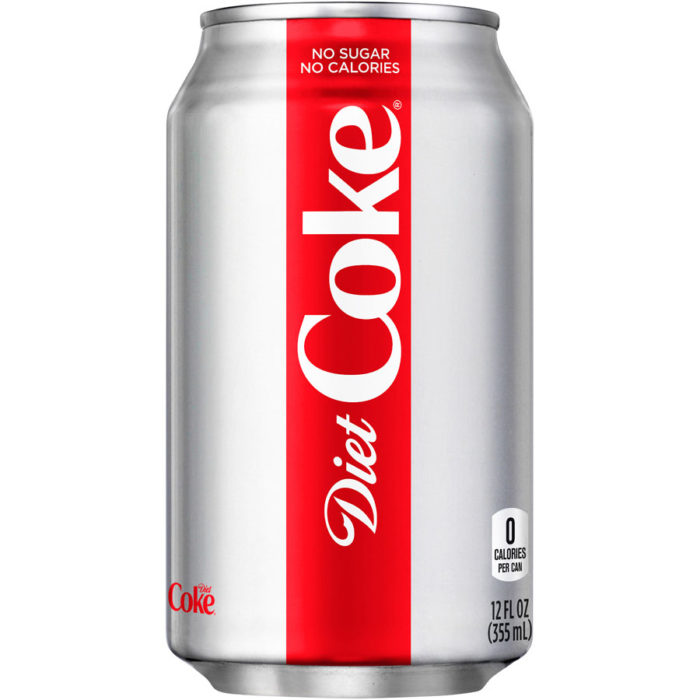
The 1980s were a time when Coke thrived on sharing slogans. Popular slogans such as ‘Coke is it!’ ruled the airwaves. Coke was so popular that the company introduced a second drink. Diet Coke was introduced in 1982 and extended the company trademark.
The original Diet Coke logo has a slab serif font and used red writing which stood out vividly against a white background.
This was the time when the Coca Cola logo began to develop further. The brand identity was becoming stronger and stronger. The wave shape in the Coke logo was adjusted and the Coke logo went through some subtle changes.
2003 – Keeping it real
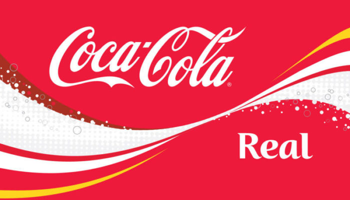
During 2003, Coke launched the keeping it real campaign, and this symbolized a time for a change. A dash of yellow along with some floating bubbles was added to the Coca Cola logo. These changes lasted only a few years and were taken away by 2007.
2007 – A classic design
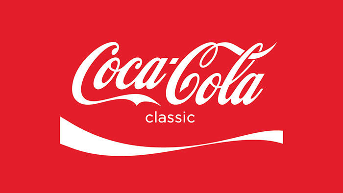
In 2007, it was time to make changes again. The Coke logo became bolder and a single white ribbon was used to underline the Coke font.
2011 – 125 years of happiness

Coke turned 125 in 2011 and it was time to celebrate the bubbly joy Coke brought to the lives of its fans. The company drew on the classic contour bottle bursting with bubbles. This birthday Coca Cola symbol represented the past, present, and future.
2013―2014 – Your name, that classic font
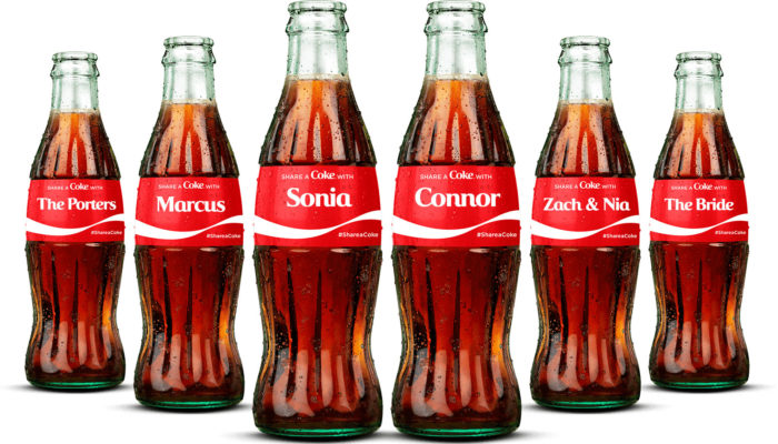
What could be more exciting than seeing your own name in a bottle of Coke? The share a Coke campaign changed the Coca Cola font to the names of its fans. All you had to do was pick your name from the selection in front of you, and you were ready to take part.
This awesome idea originally used names printed in the classic Spencerian Coke font. However, this proved to be complicated and Coke used a new typeface which was inspired by the classic Coke font.
This typeface was named ‘You’ because it was about you, the customer, rather than the company or brand. This campaign was one of a kind, leading the way into a new form of branding. It began in Sydney in 2011 and has since spread to over 70 countries throughout the world.
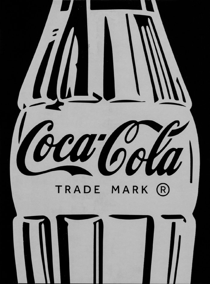
The essential shape
The Coca-Cola branding campaign has. not only relied on the classic Coke logo, but also on another unique form, the Coke bottle. The shape of the Coke bottle has become a classic symbol in itself.
The Coca Cola bottle has remained a classic and hasn’t changed its shape for over a century. Coke can be easily identified by the shape of its bottle, making it a classic Coke symbol. The Coke bottle was designed to set the drink apart. A prototype design was created as far back as 1915, inspired by the Cocoa bean. The shape of this bottle is now so familiar that it can be recognized around the world simply through touch.
The Coke symbol, as represented by the bottle shape, has even been designed in limited edition, with top fashion designers making a contribution. Designers such as Moschino, Fendi, Roberto Cavalli, Versace, Karl Lagerfeld, and Nathalie Rykiel all made a contribution.
Ending thoughts on the Coca-Cola logo
Has any other brand managed to change and evolve for over a century, becoming increasingly popular around the world? The Coca Cola logo is both nostalgic and hopeful, pointing towards a positive future. This is largely due to the success of the Coca-Cola logo, which is easily identifiable to fans.
The Coca-Cola logo has gone through numerous transformations. However, it has adjusted with the times with a positive effect.
The Coca Cola logo is simple and easily recognizable. It lets us know that every time we reach for a bottle of Coke, we will be enjoying that classic taste. In fact, the Coca-Cola logo is so easily identifiable that the classic red shade often reminds fans of the drink itself.
The Coca Cola logo is so familiar and so popular that it stands out from the competition. Coke has become one of the leading cool drink brands in the world.
If you enjoyed reading this article about the Coca Cola logo, you should read these as well:
- Logomark Vs Logotype: Understanding the Difference
- Superhero logos: The symbols of the comic book universe
- Learn About The Apple Logo: The Tech Giant’s Branding
- The Disney logo: All there is to know about the Walt Disney brand
The post The Coca-Cola logo: Over a hundred years of logo evolution appeared first on Design your way.
Source: http://bit.ly/2WVJEe4

No comments:
Post a Comment