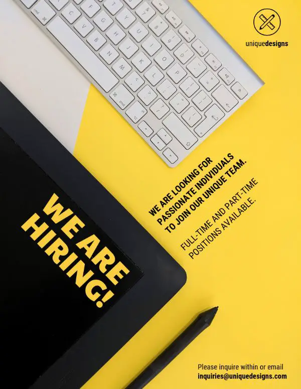
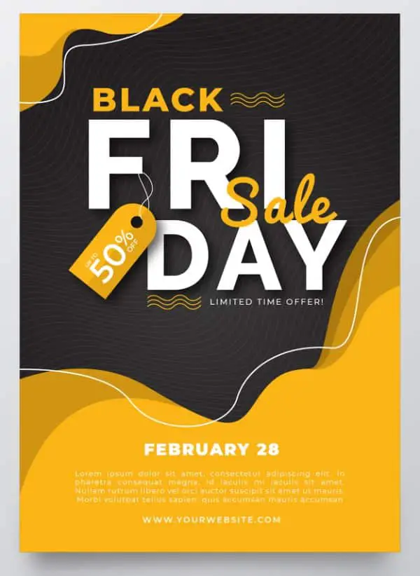
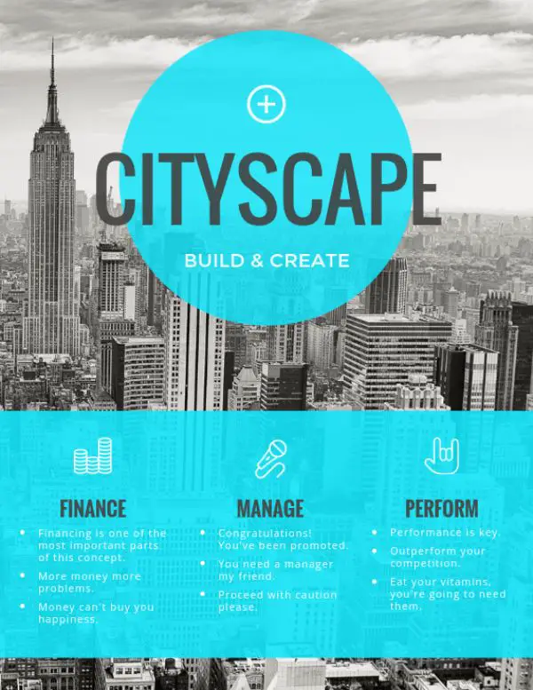
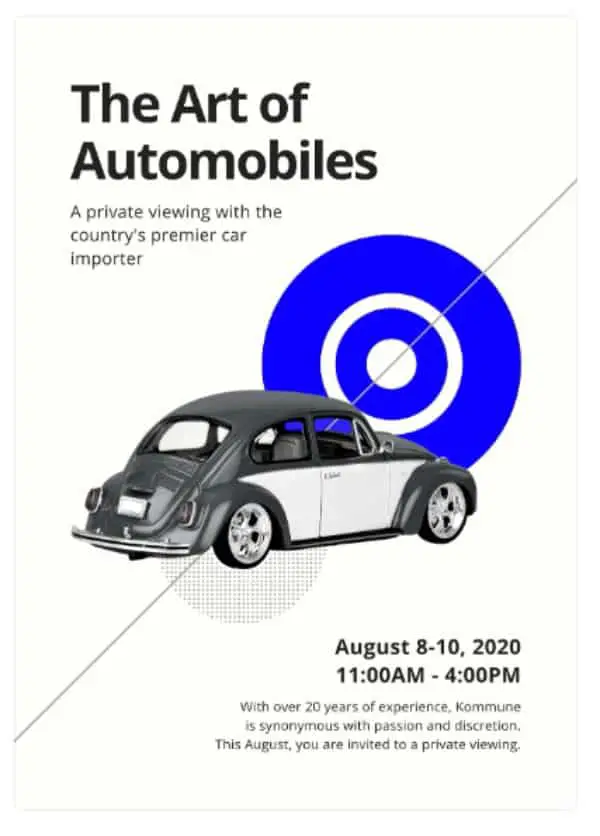
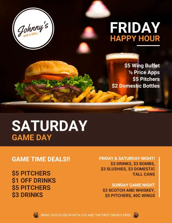
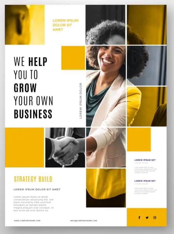
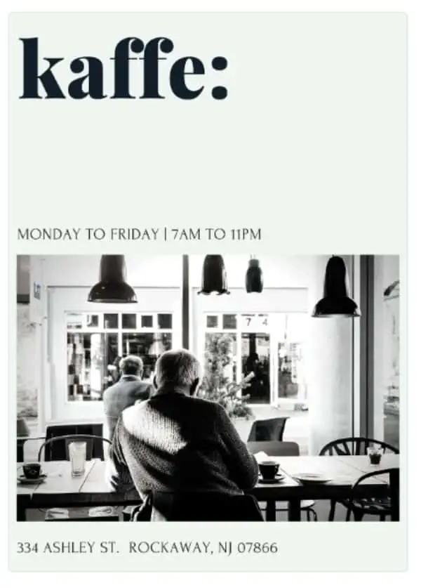
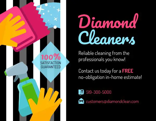
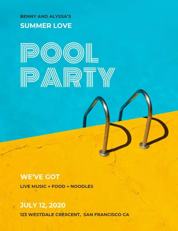
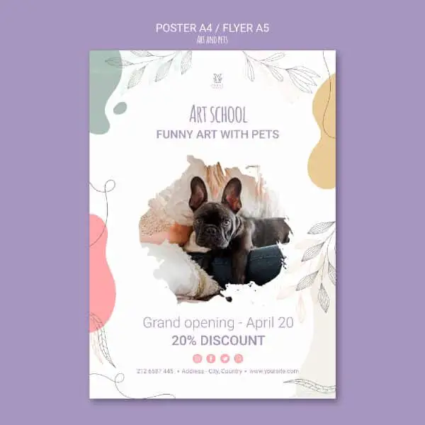
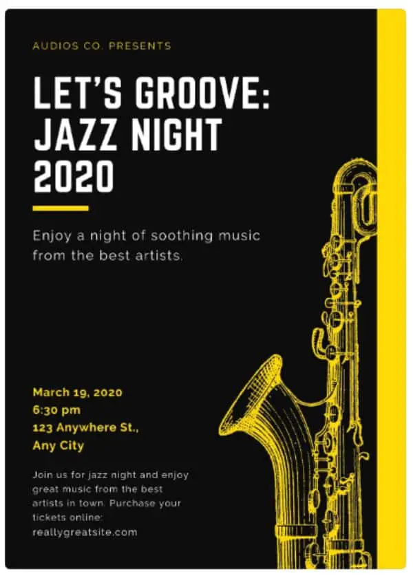
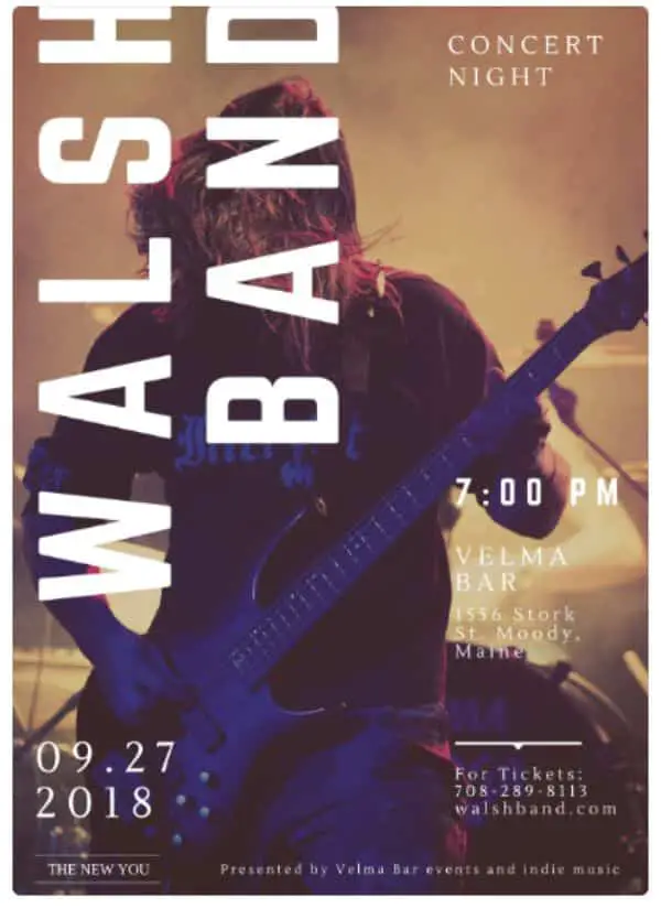
Designing a poster is always a creative activity for a designer. An advertisement should be unique and thought-provoking. There is a possibility that a sign may or may not hit the right target, but when a poster is successful, it is a thought-provoking art. Poster design for advertisement and promotional events came into existence around an era of the 1870s.
Initially, posters were black and white in color, along with a lot of textual elements. Later on, artists came up with colored posters with striking designs and minimal text on it. In this blog, we look at the exhibition posters that are unique in designs. This blog consists of modern poster designs that have stood out along with the traditional ones. The classic poster designs have stayed successful throughout the test of the time. Let us go through each of the unique poster designs.
1. Alva Skog:
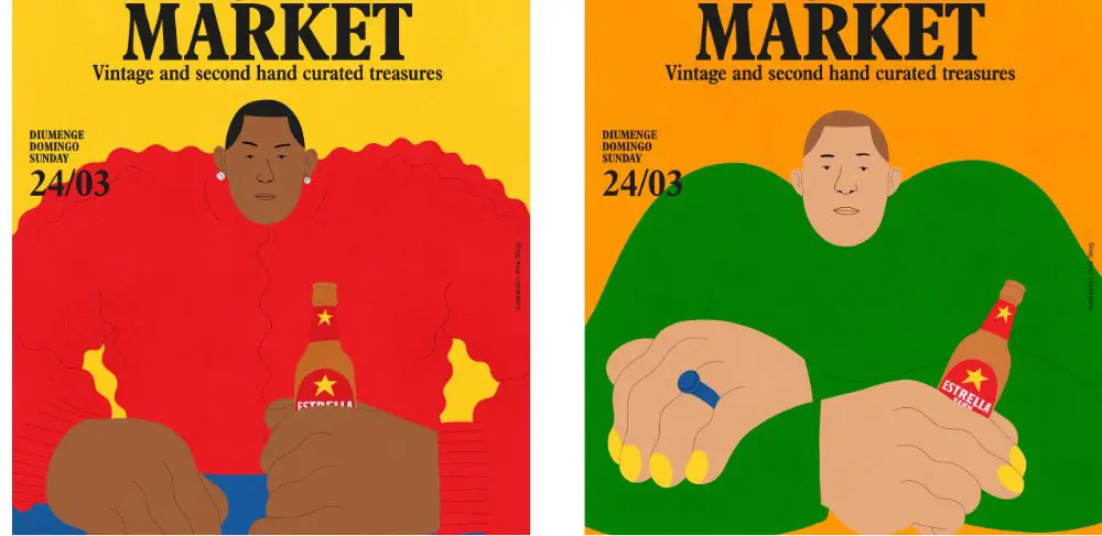
Alva Skog is a Swedish designer and Illustrator who had to create a unique poster that would show a man and a woman drinking Estrella beer. The poster was for a commission by a Lost and Found market. As mentioned earlier, he had to create a man and a woman wearing something that they had bought from the market. She drew the characters in a way that you cannot tell which man from a woman is.
Her poster’s unique property was that she made one character wear a ring and have nails painted. And the other character is seen wearing earrings. Hence, the poster diminishes gender differentiation. This lack of gender differentiation is the underlying message. It says that men and women are equal.
2. Ailsa Bay:
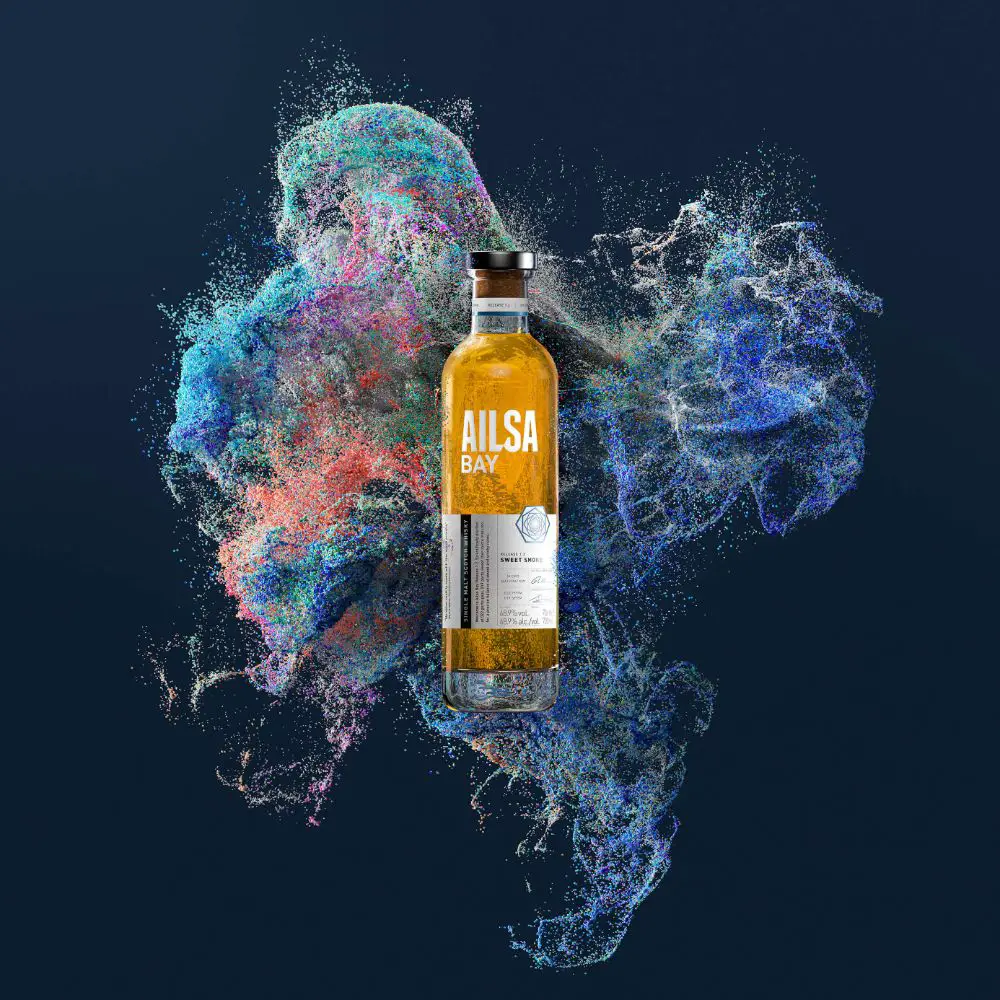
The poster design for Ailsa Bay has a very eye-catching design. Ailsa Bay is a distillery that is run by chemists. The poster design that we are talking about is available for Ailsa Bay. The distillery is technologically advanced that generates data based on the process of distillation. Poster design for Ailsa Bay is unique because it was created by mapping the data and making a visual out of it.
Purple Creative designed the Ailsa Bay poster, claiming that the design of this poster was challenging. They used the data to generate the poster and created a very vibrant poster out of it.
3. Stamma:
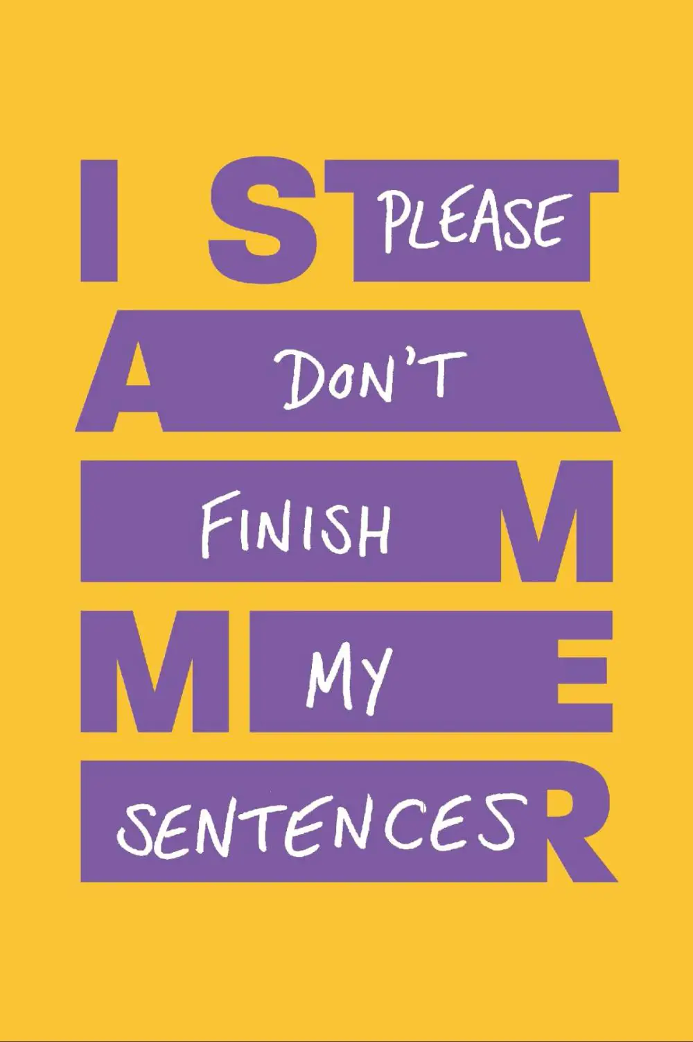
Poster design for Stamma was created by Zag, who ran the campaign for the British Stammering Association. This association worked to improve the understanding of the condition of the people who stammer. The organization changed its name to Stamma to reach the people who used to stammer or still do. The design of the poster is unique and shows the stammering phrase with an extended text. Within the extension is written, “don’t finish my sentences.” It displays the frustration and annoyance of a stammering person when people try to finish their sentences.
The poster has a design with an aim to remove the misconceptions around nervousness. Among many mistakes, one of them being that the nervousness causes stammering. Another being that the people need someone to finish their sentences because of the stammering.
4. Rock the Farm:
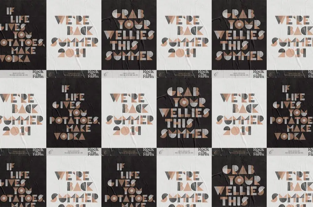
Shoptalk created the unique poster design for Chase distillery. The poster design has unique typeface fonts explicitly designed for branding. Chase distillery specializes in the production of gin and vodka through their Hertfordshire-grown produce. The unique typography in the poster design has the use of the potato prints.
James Wood, the co-founder of Shoptalk, took the typeface inspiration from stenciled potatoes to create the customized prints. Eventually, the refined potato prints generate spud typeface that is for use on posters, lanyards, digital platforms, and more.
5. Superunion for Shakespeare’s Globe:
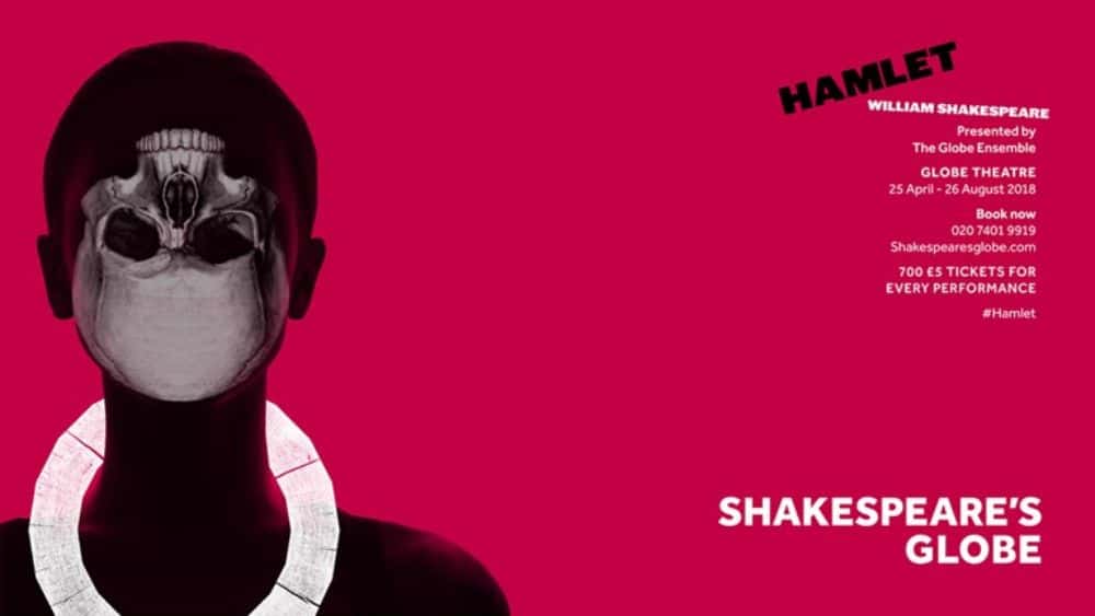
A radical rebranding of Shakespeare’s Globe in 2018 created a striking poster design. The poster design seems to be a complicated design example, along with a bold design. A symbol with 20 sides was for use in different ways on the posters, which itself represented a Globe. The Globe was available from rubbing an original piece of wood. With complicated reasons, the color and the font selection has featured.
The poster design features the classic design for Hamlet, which shows a skull turned upside down. With a tribal theme, the poster won several awards and appreciation around the world.
6. Pronomade:
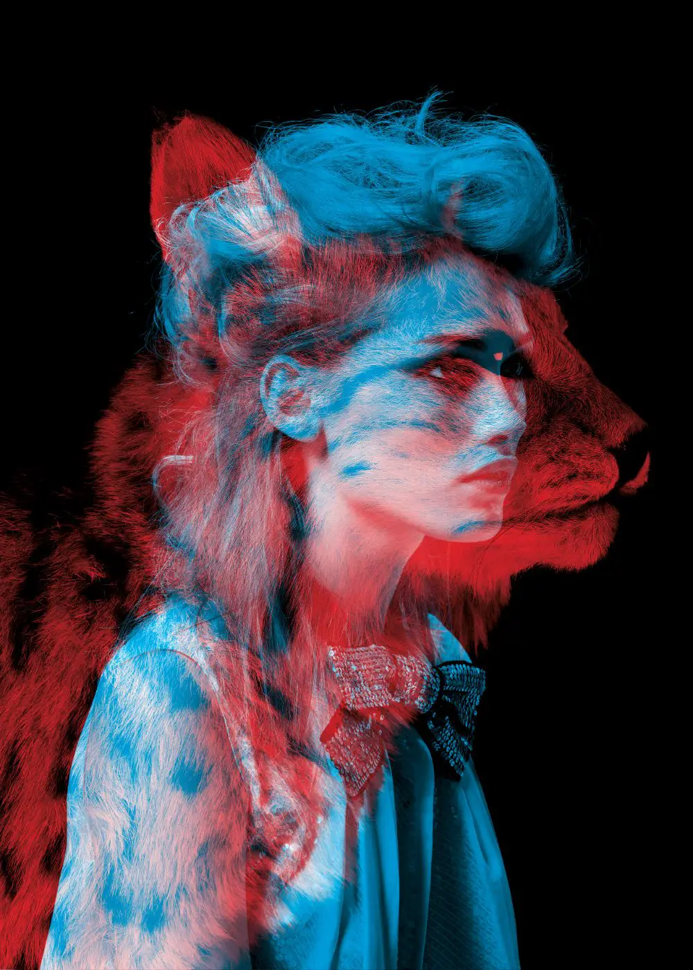
Helmo, a design team, created a series of poster designs for a fashion-related event in Paris, based in Galeries Lafayette. The poster signifies the comparison between animal instinct and fashion instinct. For marketing before the game, large-sized posters put over the windows, and the dome of the fashion store changed the visuals.
7. Knochenbox Gig Poster:
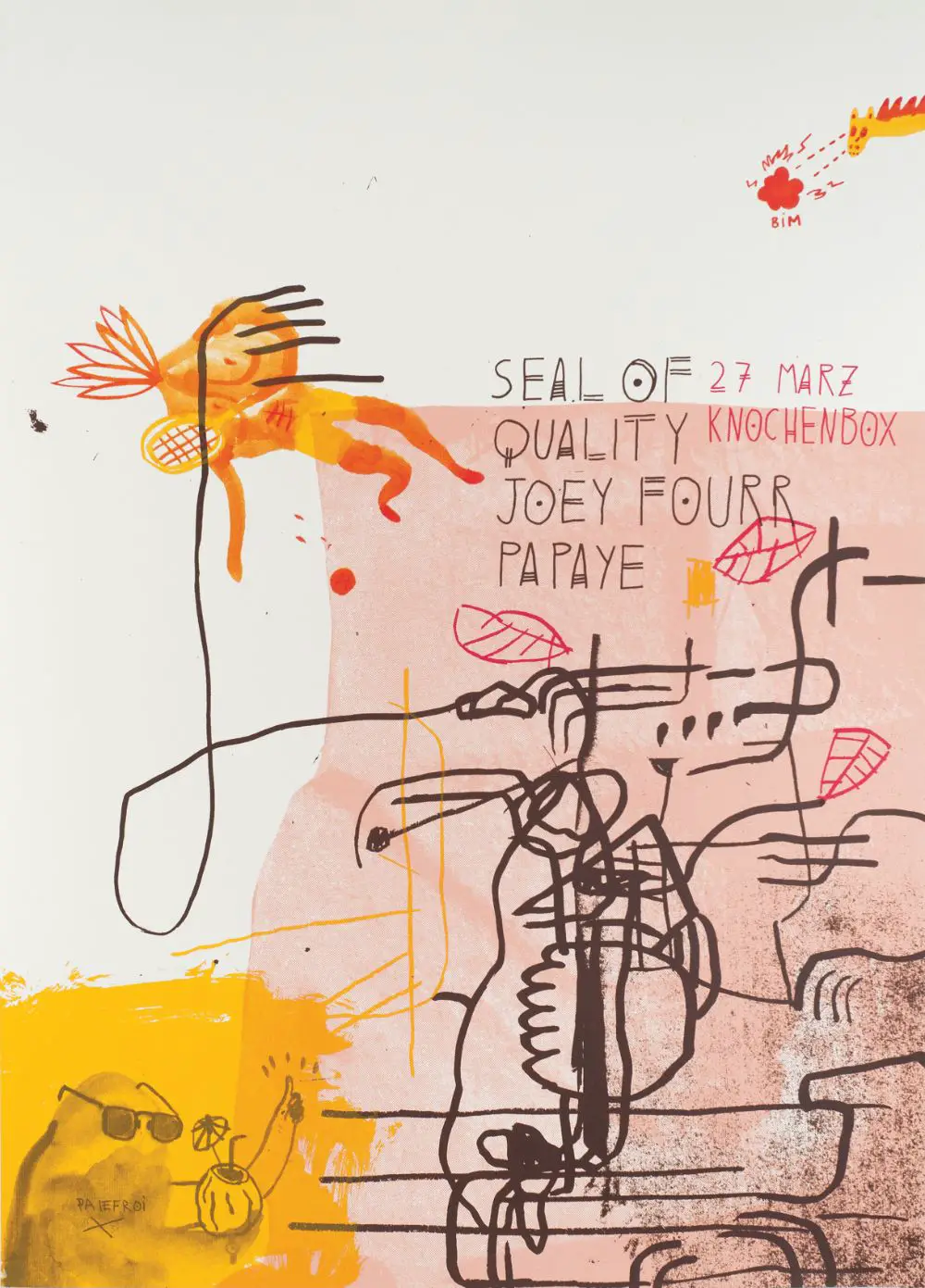
Knochenbox, based in Berlin, is known for its out of the box creativity and experiments when it comes to music venues. It is a crypt place under a chapel. Hence, while being extraordinarily eccentric, the gig poster is an example of their unique poster design idea. Palefroi, who is a Berlin-based French design, created this limited edition poster. The poster has a very complex and hard-to-understand design concept with black haywire stripes and chromatic design.
8. Noise x GIF Fest Identity:
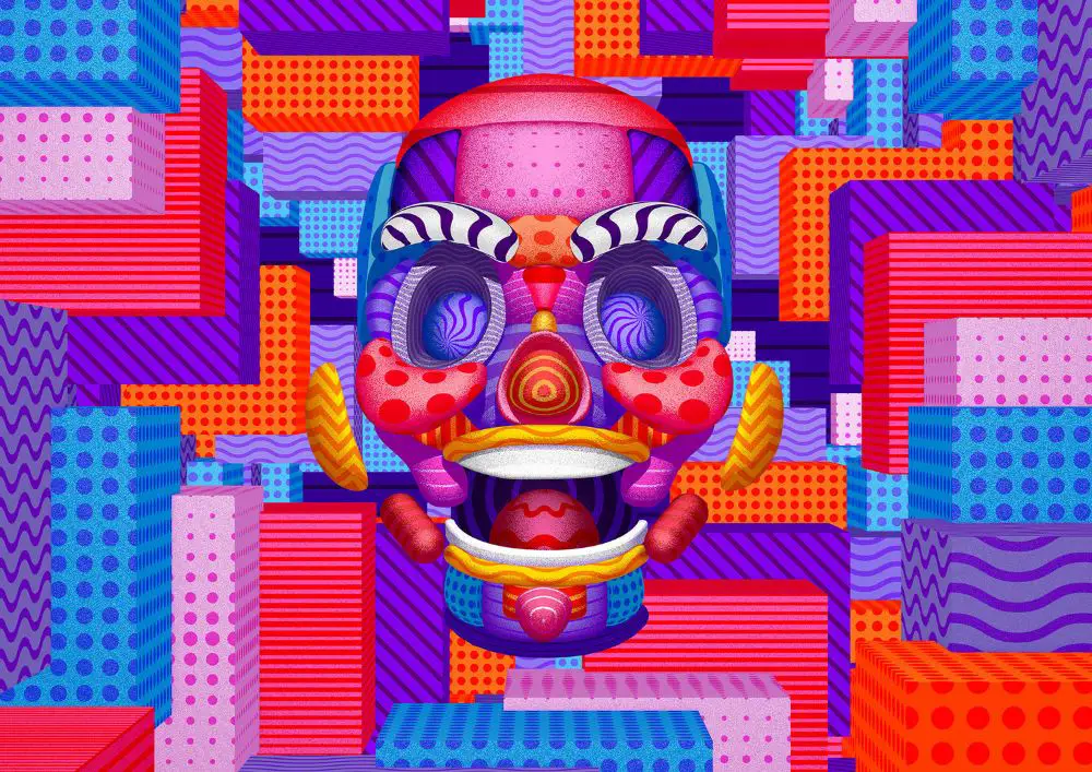
Singapore conducts the Noise x GIF festival that is one of the biggest GIF festivals. BURO UFHO is a local studio that designed the poster for the festival based in Singapore. They combined the static and animation aspects of the poster.
The poster is unique in its way because the design team created 13 different logo designs. When these logo designs played in a sequence, it created an illusion of movement as if it was animated. The textures moved with each other on the poster to create an illusion of depth and animation. A face in 3D played on GIF loop to match the concept of the festival.
9. The Evil Dead:
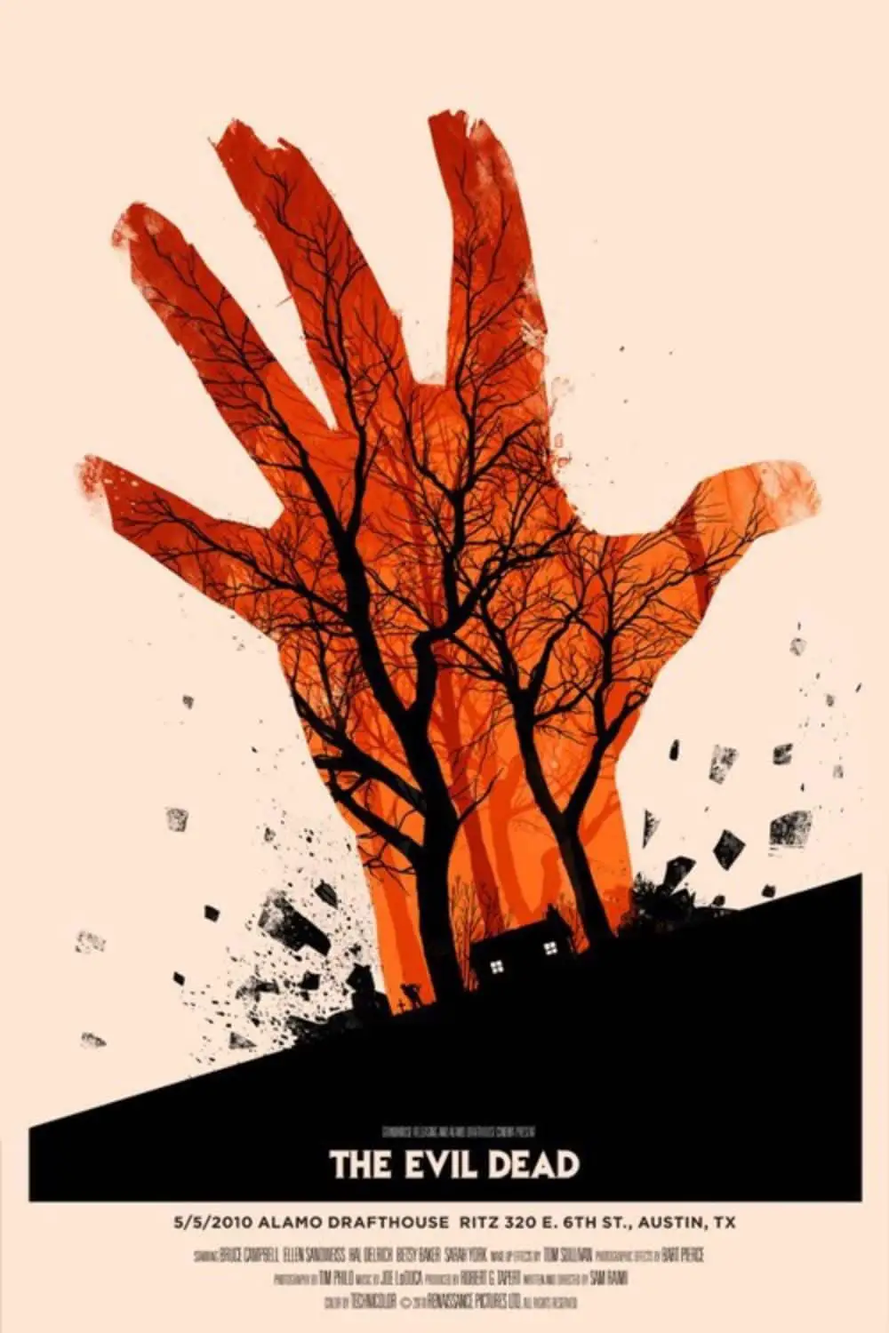
Olly Moss created the poster design for The Evil Dead. He is known for designing brilliant, mind-bending, and minimalistic designs for the posters. Olly has designed posters for Harry Potter, The Jungle Book, Star Wars, Frozen, and others. This poster has an official license of the poster for the 2010 screening of The Evil Dead. The poster shows a hand emerging from the ground, showing the silhouettes of trees inside the orange hand. Interestingly, the fingertips of the hand shown in the design appear broken, pointing to weird things.
10. Stranger Things:
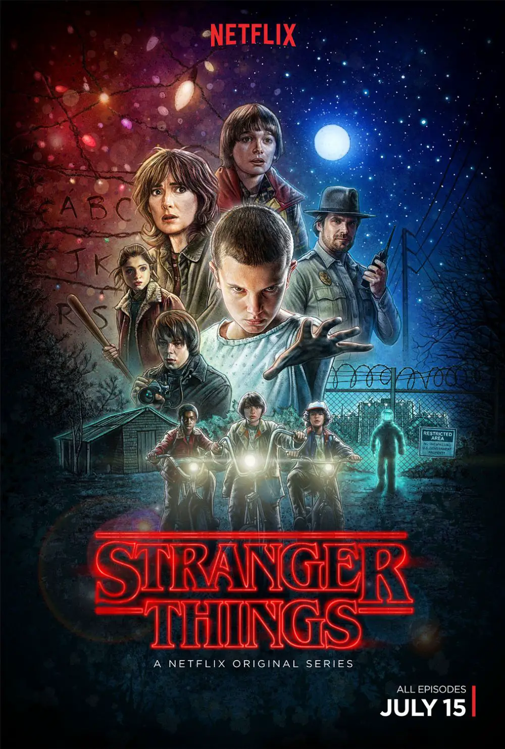
Kyle Lambert designed a stunning poster for one of the biggest Netflix shows called Stranger Things. The series received a lot of attention, and the poster design played a crucial role in mustering the love from the globe. Stranger Things is a gripping, supernatural story with stunning visuals and eye-grabbing poster designs. Kyle created the poster using iPad Pro and Procreate. He had to have all the characters in one image that would communicate the story.
11. It follows:
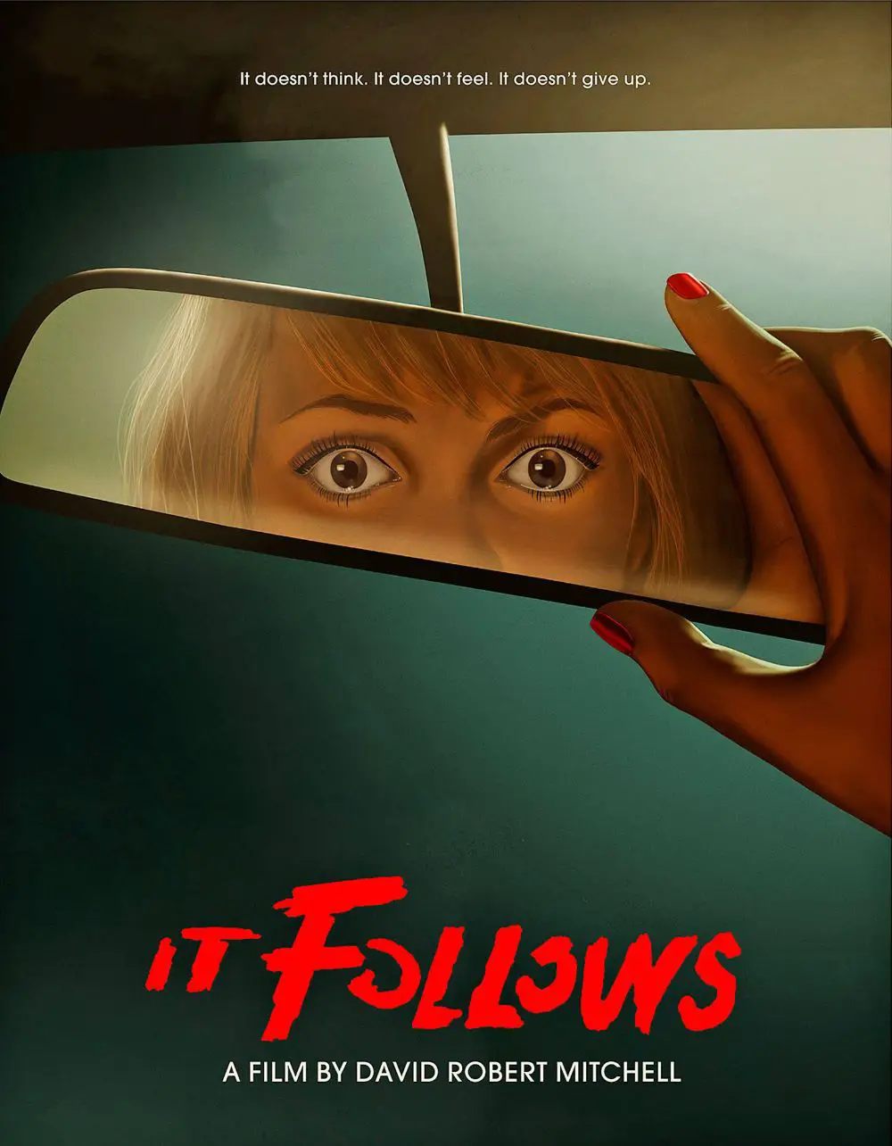
A character that stares out of a poster is a sure way to muster attention from the audience. And a poster design for a horror movie cannot have a better model than a character staring out of the poster, with an incredible sight. Akiko Stehrenberger designed the poster design for It follows for release of the movie in 2014. The poster’s conception shows a character staring at you through the rearview mirror of a car. Stehrenberger is famous for his stunning poster creations for other movies, and he is in demand.
12. The Lure of the Underground:
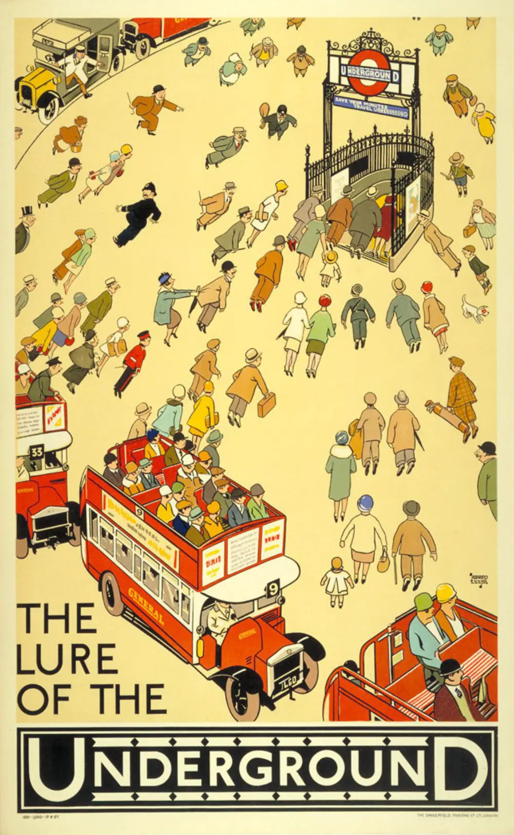
The Lure of the Underground poster design has a fascinating concept of promoting the underground tubes in London. Alfred Leete was a comic illustrator that created this poster design. It shows people drawn to the tube instead of traditional railways and other modes of transport. The poster design also is a creation between the old as well as the modern poster design techniques. Its styling represents an era of the 1920s.
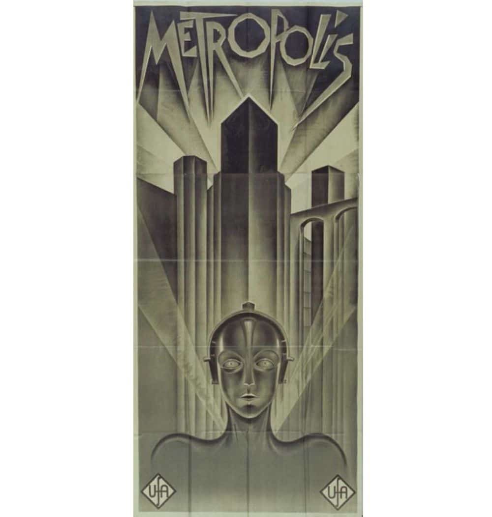
13. Metropolis:
German graphic designer called Heinz Schulz-Neudamm designed the poster for the movie Metropolis in the year 1927. It was available for a Fritz Lang’s groundbreaking, sci-fi movie. Only four copies of the poster are available, one of which is the most expensive copy ever sold in London in 2005.
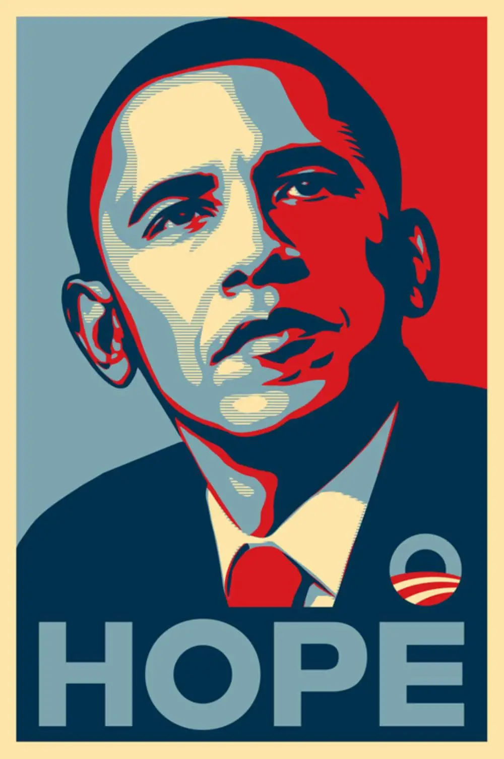
14. Hope Poster – Barack Obama:
Shepard Fairy created this poster that features a four-colored portrait of Obama in red, beige, light, and dark blue. The sign came in with other names like Progress, Be the Change varieties among the others. Fairy came to global recognition after the creation of life-sized posters of Obama during the 2008 US elections. The design took the nation by storm and went viral immediately in the USA and the rest of the world. The influence of the poster was enormous during the election campaign in 2008. “Andre the Giant” was created by Fairy, and he earned a name by this poster initially.
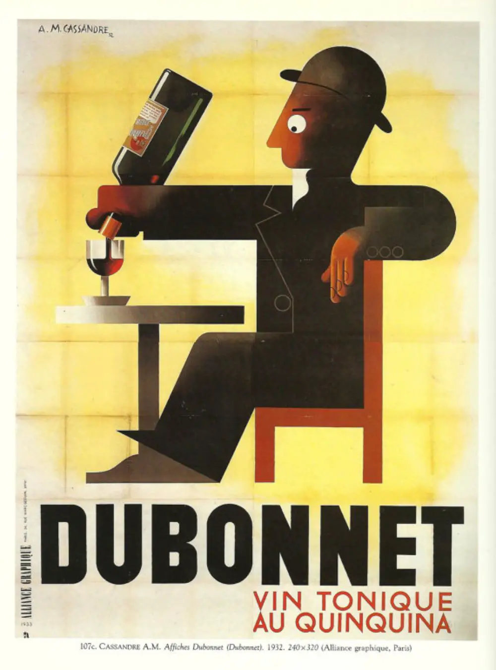
15. Dubonnet:
A.M. Cassandre was a French artist and typographer that gained fame because he created the commercial poster design in the era of 1920s and 1930s. This poster, called Dubonnet, was created for a wine company. In this poster, the man appears to pour wine in a wine glass. The founder of Bruce Duckworth, Turner Duckworth, has a typical liking for this poster. He claims to love the poster tirelessly and would even jump in the fire to salvage it if his house ever catches fire. Duckworth bought the supersized poster in the year 1990 from New York.
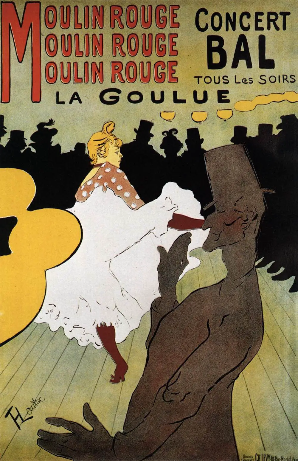
16. Moulin Rouge:
The poster for Moulin Rouge was a creation by a French Artist called Henri Toulouse-Lautrec. He had to create a series of posters for the cabaret, but this poster mustered the visitors’ maximum attention. The poster features the Moulin Rouge dancer La Goulue with her dance partner Valentin le Desosse. Henri managed to capture the daunting and provocative dance moves of Goulue and Valentin’s lanky frame.
17. TWA:
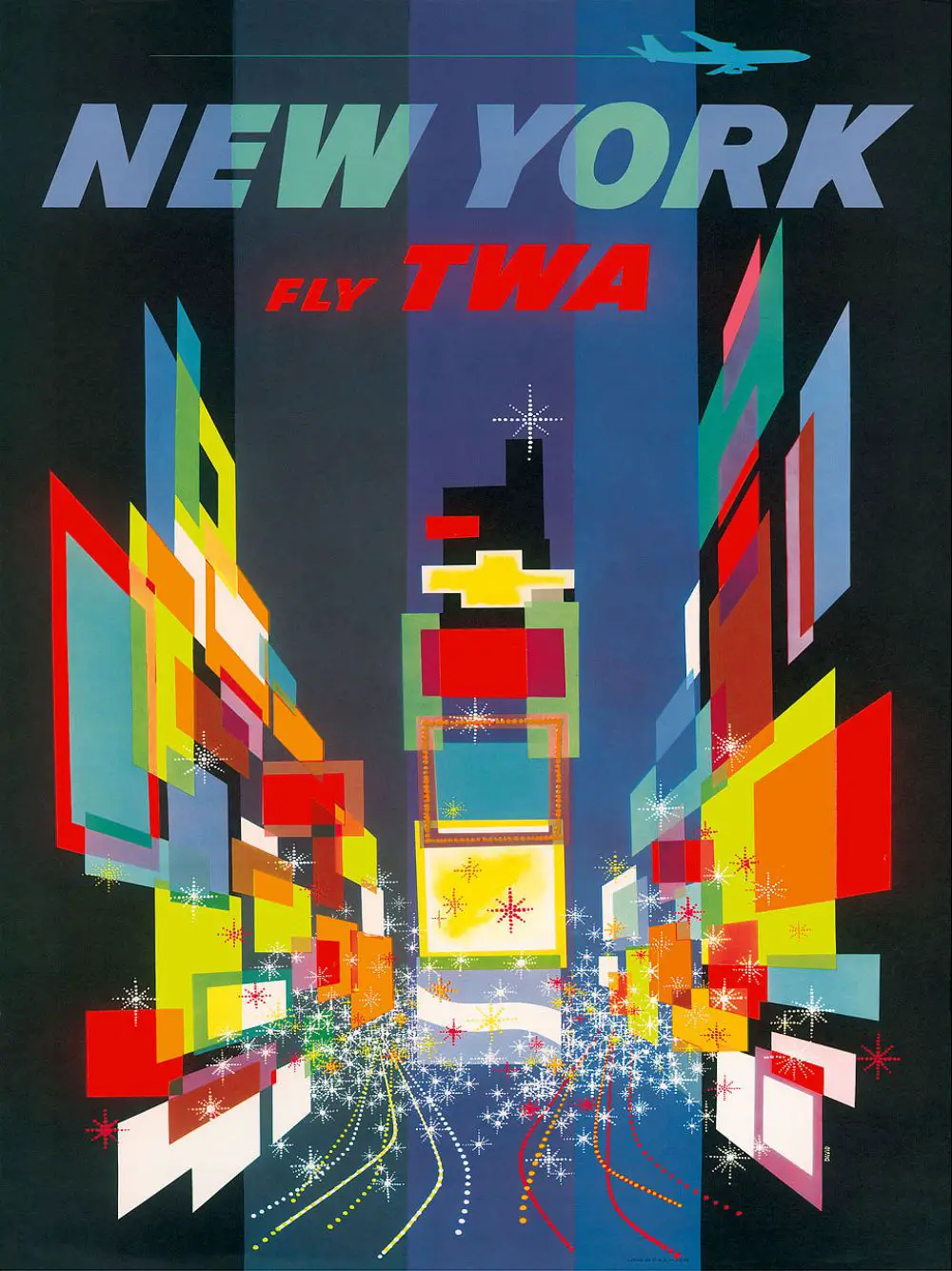
TWA stands for Trans World Airlines. David Klein was an American Artist who designed numerous posters for the airlines in the era of 1950s and 1960s. In 1957, the sign was picked up by MoMa (Museum of Modern Art) permanently. MoMa is located in NYC.
The poster design features the use of vivid, vibrant, and bright colors and shapes in the form of abstract art. It depicts famous landmarks and scenic places of the city around the world. David’s work is influential in the field of travel advertising and is imitated around the world to understand his iconic poster designs.
18. Berlin 1936 Olympic Games:
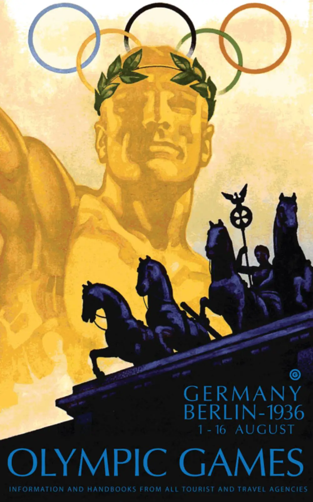
The 1936 Olympic Games were dominated by Adolf Hitler’s propaganda to promote the Nazi line of Aryan superiority. But, Jesse Owens, a black athlete, won four gold medals to make Hitler stupid. Amongst these events, the poster design for the Olympics had Franz Wurbel for its design. His poster design managed to promote and showcase the Berlin event brilliantly. The poster captured the famous landmarks and made its designer, Franz, popular.
19. Home Alone:
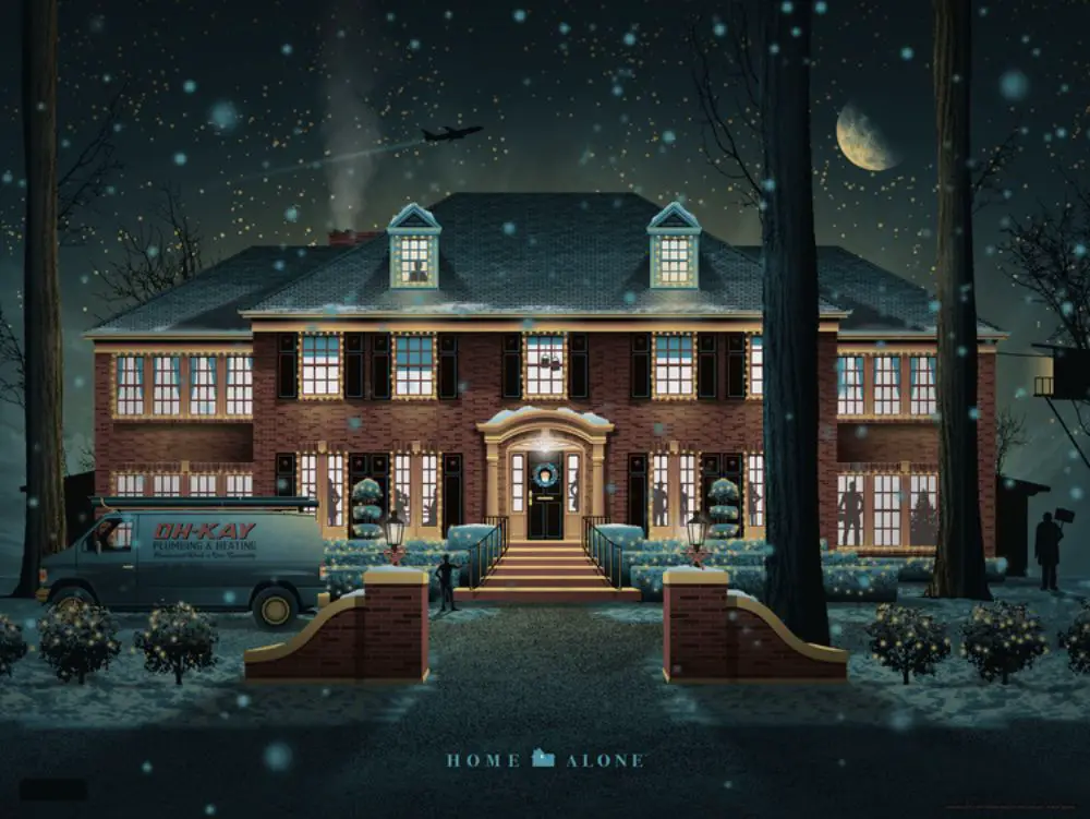
A Home Alone movie, a movie that everyone loved, has an exciting poster design for its promotional events. The poster design dates around 2014, where they have used a four-color designing strategy that looked interesting with halftones. It was printed on metallic paper to give the snowfall and snow on the earth, a subtle sheen. The poster design by DKNG group and illustrated the tiniest details to capture the realistic effect of the poster. They have encapsulated the exterior of the house, the plumbing van, and knocked bronze statue very clearly.
20. Marvel Heroes:
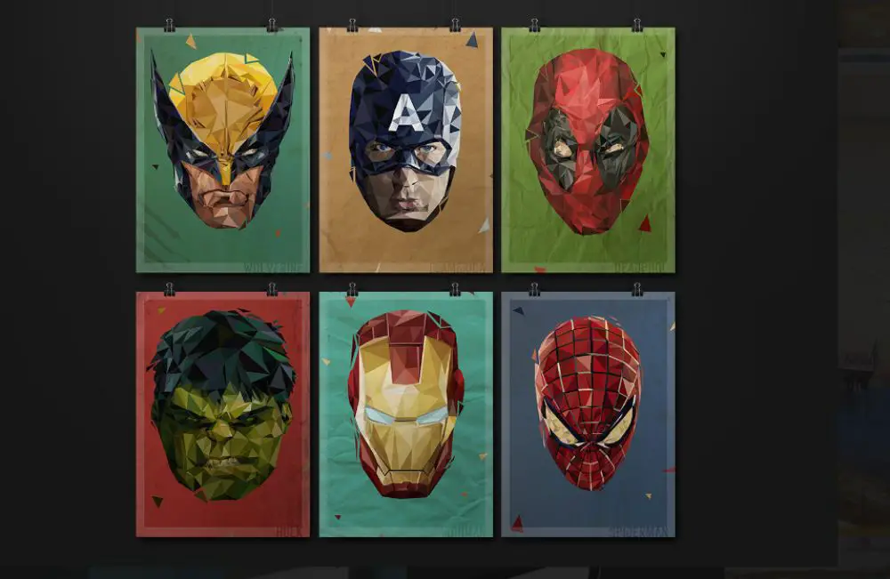
Marvel Heroes have been a very famous portrait among youngsters since its first release. This poster design features the polygonal model of marvel heroes. The designer Christos Ellinas has designed the unique poster in low-poly format. Being an individual design poster, it features 6 Marvel heroes with their unique masks from their costumes. Christos Ellinas is a graphic designer with expertise in Illustration, Video Editing, Web Design, and Painting.
Conclusion:
These posters are brain-child of the ordinary designers that captured modern as well as the ancient art of graphic design. The changing era saw the changing designs that were more refined. All these posters are unique and caught the eye of the passers and managed to muster a lot of attention. Some of the posters are also said to influence the world in so many ways. Modern posters encompassed the use of digital tools, while the ancient designs saw the influence of hand painting and other creativity. The old posters were more text-emphasized, and the modern posters tried to depict meaning through just images. Each of the posters here is a well-designed piece of art, and their designers have gained a lot of popularity with their state-of-the-art designing capabilities.
via https://ift.tt/2Vxiewq
