As a graphic designer, a major aspect of your job is to expand your creativity all the time and deliver all the projects as your best work. But you know that is not the end. After creating your beautiful craft, you have to showcase it to the client in the best way possible. Not everyone is excellent at presenting a project, but this can be learned through experience. No one can teach you how to increase your confidence and find out your presentation style. There are some things that you must do and some things that you must avoid in during the presentations. Here we will be talking about things that you should not do while presenting your graphic design project to your client. These are things that can ruin your presentation, and things that you can take care of to showcase your hard work at the time of the presentation.
We have listed ten common mistakes here that you should avoid and try not to do while presenting your design project to the client.
1. Imbalance of information:

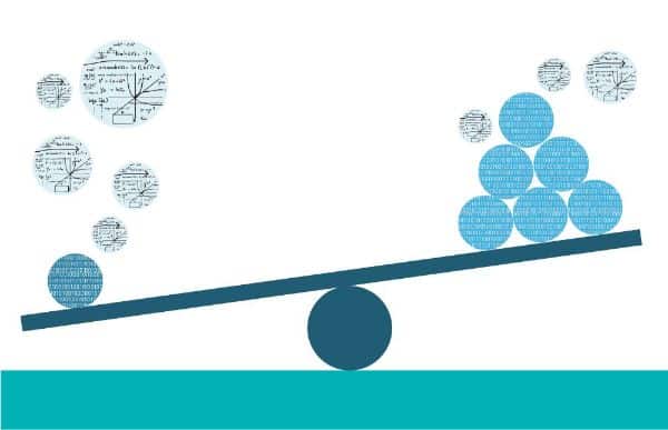
A straightforward mistake any designer can make is the mistake of making the presentation. In whichever format you are presenting your work, it has to be justifying your work. If your presentation is full of information, text, and unnecessary images, then it can take all the charm away in just first glance. Or if it’s the complete opposite case, your presentation lacks all the necessary information, text, and images; then it can be not very pleasant to your client.
Nobody wants to read too much information, and nobody wants to have incomplete information. You need to keep all the necessary information, data, and images in your presentation, required for your project, but in a very balanced format. You don’t have to mention every word, and every detail in your presentation keeps the primary and essential points with positive and informative images and content. If it is fully loaded with information, then your client might get distracted from your actual work. And if there is not enough information available for him, he might get disappointed and misjudge your potential and capabilities. So make sure you keep this in mind.
2. Too many or too few options:

In graphic designing, it is very common that the designer presents more than one option of designs. By this, clients can select any of them which suits their needs perfectly, and the designer gets to showcase his art and ability in a wide range. So while presenting your project, if you are giving too many options to your client, he is more likely to get confused and misguided. More than the required options can even stretch your presentation duration also. Your design should not have more than three options, and you can make them in an easy yet effective way like one is as per your perspective, the second one is as per the client’s choice, and the third can be completely different and worth consideration kind of an option. Showcasing less than three options is also not advisable. Two options are not adequate and not serving any purpose.
You can make two options only in some cases, but these options can also affect your impression in the client’s mind. As he might not like any one of them, and there is nothing he can choose from. So your client might get disappointed that you have not given enough effort to his work. You should give at least three options and try not to give more than that. Balance is a vital key. Otherwise, things can go wrong unexpectedly.
3. No proper answer:

If your client is asking you questions about anything, you must answer correctly and perfectly during a presentation. If he is not satisfied with the answer, it is your responsibility to make him understand and then move ahead with the presentation. Delaying the question by saying, let’s discuss this at the end can also create more confusion in his head, which can fail your presentation. You are a designer. You know everything, but your client might not. So you cannot expect him to understand even the little and apparent things as per your perspective. So don’t run away from facing questions but prepare yourself with all the answers and knowledge you may need at the presentation time.
4. Not showcasing the foundation:

Your work is an art that you have created with all your hard work and creativity. You must have created it with some idea and some thought process that your client may not know. Your presentation should not be only about the end product you are delivering, but you should also include storytelling to insert creative and emotional touch to your presentation. Like what was your idea behind it, how you have created it, what inspired you to make it like this, what are the hidden elements in your design, what your design is trying to portray, and in which manner. This kind of a story format from the beginning to the end of your design can quickly help you make a bond with your client. Your presentation can go flat without this, and the client may not associate himself with your design. This is something that can make a mark in your client’s head, and he can remember your design and your idea for a more extended period.
5. Not showing progress:

While you were doing your project, you must have gone through many tried and refused copies that were not satisfactory. It would help if you did not hide the hard work of conceptualization, design, and implementation. It would help if you showcased it in your presentation. If you do not show the different progressive stages of the design, your client can never know how many stages were there and how much hard work you have done. This is very important to do to make an impression and trust-building. You can keep some snapshots of the design from the beginning in various stages of development. This can also help you to present your story behind the design and let you graphically showcase your hard work.
6. Not showing the print version:

You may feel the presentation is enough to showcase the design to your client and many designers do the same. But some prefer to print the design on paper and showcase it in the presentation. If you do not include the design’s print version, it can be a little unfair to your client because the design, which is visible on-screen, and the paper’s design are two very different things. If the client has any thoughts of using that design on any print medium, he should look over it in the presentation session itself. So that if there are any changes that he wants to make, he can show them to you then only. Physical copy gives a perfect idea of size, color, and looks. That is why when the client takes that paper in his hand, he can take a closer look, and he can give his excellent feedback.
7. Not including a 3D mockup:

Nowadays, multiple options are available to use 3D mockups for your design. If your presentation does not have various 3D mockups, you can get into a difficult situation to explain the different usages. Using any other option or not even considering showcasing this aspect can make your presentation dull and incomplete. 3D mockups have a unique way of showcasing your design in a 3D way on different templates. Inserting a few 3D mockups of your designs can make your presentation innovative and impressive. It can help your client to understand how your design can look at different objects and from different angles. Not adding them by choice is not a wise decision, and you should avoid it for any reason.
8. Becoming defensive about your design:

The presentation is mainly about the design and the client. You have done your work as per the client’s need and created a design as per his purpose, so he knows better than you when it comes to the application of design. At any time in the presentation session, if you are losing your patience due to the client’s feedback and remarks, you are most likely to lose the project and the client. You are right about your design, but the main aim of making this design is not yours. The client decides the design’s fundamental goal, and you are just providing your creative service to him.
Thus, it does not matter what your perspective is and how correct it is. If he feels that some changes you should do then you should follow them. You can put your point, and you can try to make him understand your perspective, but you cannot force it upon him. You should not get aggressive and use a defensive tone in your conversation. You both can come to a mutual place through a professional discussion, but in the end, it should be a designer who backs down.
9. Focusing only on the aesthetic:

If you are aesthetically presenting your design, only your design’s beauty is going to shine. The perfect design is a work of art that is beautiful, informative, eye-catching, unique, and fulfilling the purpose. So your presentation should highlight all the points and not only the aesthetics of your design. If you are focused only on the beautification part, your client can lose interest very quickly, and he can even judge your intelligence and ability right into that moment.
If only a few or none of the pages or slides contains the required information, then that presentation can become an enemy to your creative design. To give complete justice to your design and satisfy the client’s expectation, make sure you talk about the aesthetics and explain how much it is fulfilling the purpose.
10. Not having complete clarity about each detail:
This applies to all your presentations. You are the one who has made the design, and you are the one who is presenting it. So you must know every small and extensive detail about your presentation. Any question can come from anywhere, and you are expected to answer it correctly. Not having an answer about your work or work area can put you in an embarrassing situation. So to avoid it, ask yourself questions before presenting, like, why this line is here? Why is this pattern small? Why this font? Why only these colors? Etc. Through this technique, you can think of unlimited possible questions and answers. And this can prepare you enough for the presentation.
Conclusion:
In the end, your work is the king, and no one can take that away from you. But a good work can also come out as ruined and messed up if it’s not presented in an appropriate way. So while you are making sure all the things you want to include and want your client to approve for the same, you should also take care of some unintended mistakes that can ruin your presentation. Even though your work is excellent and impressive, clients can leave with a bad experience because of the things mentioned above. The presentation’s unpleasant experience is not something you want for your project, and the client wants to receive after spending their money and time. So take some time before you go up there and make sure that your presentation is clean, clear, enough explaining, filled with prompt content, and successfully delivering the end motive of the client and your work.
The post 10 Things Not to Do While Presenting Your Design Work to a Client first appeared on Line25.Source: https://ift.tt/2LeXGqN

No comments:
Post a Comment