When you’re directing visitors to a specific page on your website, you want it to stand out.
Your landing page reflects your brand and is your chance to get new sign-ups, sales, and followers. You want to make a good impression and give your audience exactly what they want.
But what makes a good landing page? While the answer will vary slightly depending on the type of business you’re in and the outcome you want, there are a few design tips that everyone should follow.
To help you get started, we’ve created this useful guide featuring landing page design tips. Read on to learn more.
What is a Landing Page?
Let’s start with the basics. A landing page is an interactive webpage designed to turn anonymous visitors into quality leads. It includes a call to action such as a sign-up form or a free trial download.
When you create a digital advertising campaign, you’ll want to link it to your landing page. It’s more targeted than your homepage, and when you get it right, your brand will grow.
Top 11 Tips for Your Landing Page Design
If you need a landing page or your existing strategy isn’t working, it’s time to get creative. With a few key strategies, you could get a landing page that converts.
Get ready to grow your database with these top 11 landing page design tips.
1. Stay True to Your Brand
Your landing pages should be consistent with the theme of your brand. You should use the same colors, logo, and fonts as the rest of your website.
Successful companies know brand recognition influences customer loyalty. For example, Coca-Cola is easily recognizable with red and white, while Nike is known for its iconic tick. Brand familiarity can influence trust and purchasing decisions, so pick a style and stick to it.
Let’s take a look at two different pages from this email verifier. As you can see, the pages are consistent with the brand’s style. You immediately know they are from the same company.
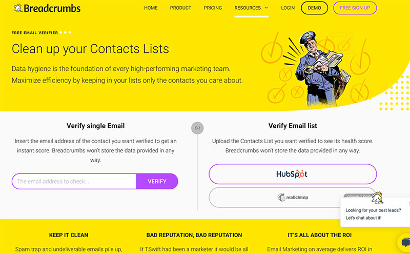
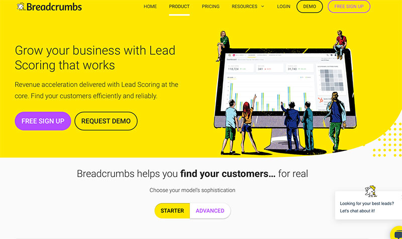
Both pages have a color scheme featuring bold yellow with hints of purple. The designs have splashes of white and rounded buttons. Whether someone is visiting for the first time or the hundredth time, the website appears to be memorable, professional, and trustworthy.
Besides their daring choice of colors, Breadcrumbs feature on-brand comics across their website and social media accounts.
Over time and with repetitive viewing, users will associate this theme with Breadcrumbs.
2. Keep it Simple
When your visitors reach your landing page, you only have a small window to get their attention. Keep content simple, show some personality, and make your message clear.
Your landing page should make sense to those who are familiar with your brand, as well as those who are visiting for the first time.
This blog is a good example of connecting with your audience and giving them what they expect. Massimo Chieruzzi wants readers to know he’s approachable, knowledgeable, and straightforward.
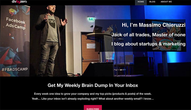
There’s a quick introduction, a witty tagline, and a clear call to action. Visitors aren’t bombarded with information, advertisements, or a heavy sales pitch.
3. Teach Them Something New
When visitors come to your site, they are more likely to stay if you teach them something they don’t already know. It’s worth taking the time to share your knowledge because it shows that you’re an expert in your field.
An educational landing page can be particularly beneficial for those with eBooks, online courses, and other resources.
For example, this page provides useful information for any site visitors who want to learn about edge computing.
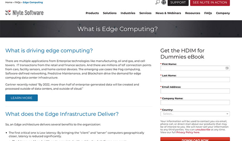
This informational page includes relevant information, statistics, and quotes. Nlyte has made the most of this space and created an opportunity for lead generation.
On the right is a form users can submit to receive a free HDIM for Dummies eBook. To download this eBook, visitors have to consent to email marketing, phone calls, and direct mail.
4. Make it Mobile-Friendly
There are over 274 million mobile phone users in the U.S. More than 50% of web users access the internet via their smartphones.
What does this mean for your landing pages? Unless your web pages are mobile-friendly, you could lose half of your potential leads.
Before sharing your landing page, make sure it’s clear and easy to read on various devices. Images should be crisp and not stretched or pixelated, and you should be able to scroll smoothly.
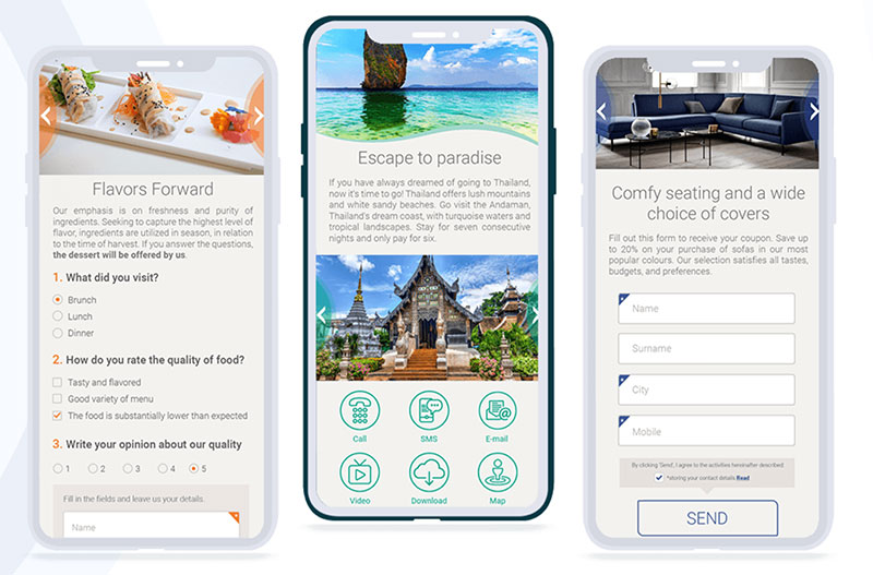
Don’t forget to complete any signup forms to make sure they work seamlessly on smartphones and computers.
5. Get Customized
The goal is to create landing pages that convert. If you’re serious about your landing page, consider customizing it with automation, chat, and personalized forms.
There are different tools available, but we like Active Campaign. It’s a platform that makes designing a landing page simple.
You get customizable templates plus it’s a drag and drop interface. Even non-designers can create something that looks professional.
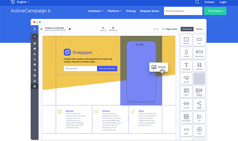
You can create multiple landing pages to give your readers a unique experience and allocate consultants to follow up and secure sales.
You can also learn more about your user’s intent as soon as they arrive. For example, your business may sell candles and candle-making supplies. Your advertising campaign could be broad, targeting anyone who searches for candles in your local area.
Your landing page could feature two options with “I want to buy candles” and “I want to make candles.”
The option they choose would lead them to their preferred shopping category.
If you want quality leads and high conversions, don’t underestimate the power of personalization.
6. Reduce the Bounce Rate
If you want your visitors to stick around and browse your site, you need to reduce the bounce rate. But how can you make your landing page more appealing and keep your audience engaged?
Install a website tracking tool like HotJar. This will give you insight into your users’ behavior. Then, have a look at the layout. Is it easy to navigate?
If you are using a pop-up form, be conscious of the design, and make sure your landing page is free from clutter. On the contrary, you can also use exit-intent popup software to show the popup only when the user is about to leave your website.
The goal of this page is to convert. You want it to be informative yet simple. Any content you use should always be relevant.
Buzzsprout’s “how to start a podcast” landing page is a good example of how your information can be accessible without being overwhelming.
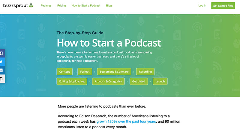
This page is designed to educate, so there’s a lot of content offered. To keep the landing page organized, Buzzsprout has added convenient bookmarks at the top of the page. This way, users can skip to relevant content, reducing the bounce rate.
Readers won’t have to sift through extensive content to find the information they’re looking for.
7. Check the Page Speed
As humans, our patience is limited. If your landing page takes too long to load, your visitors will quickly lose patience and forget that your brand ever existed.
Google has a suite of products, including Google Analytics and PageSpeed. They can help you understand why your pages aren’t as fast as they should be.

If you optimize your graphics, it can have an impact on page speed. For example, when you reduce file sizes and choose JPEG over PNG and GIF, it can improve the loading time for your pages.
Ads, auto-play videos, Java, Flash, and popups can also make your landing page slow. Make sure your code is free from errors, and update any software regularly to improve performance and security.
8. Make it Easy to Connect
Every landing page should have a clear purpose and your visitors should understand why you sent them there.
And it should be easy for them to take the next step. For example, you may want them to follow your brand on social media, sign up for your email list, or buy a product from your store.
We know that a good landing page should give your visitors exactly what they expect. It should also be easy to convert.
Now, let’s have a look at Preply. The landing page for online Italian tutors is a great example of what a quality landing page should look like.
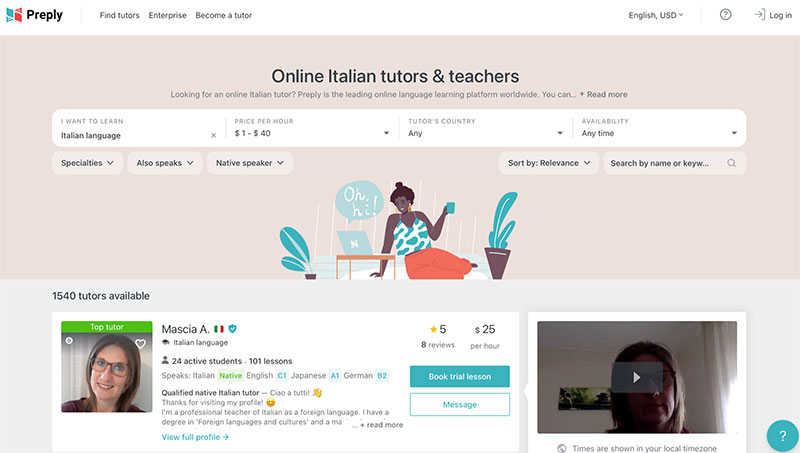
When visitors arrive, the first thing they see is a list of available tutors. To get started, it only takes a quick sign-up through Facebook or Google to begin contacting them.
The navigation is sleek, with a focus on the tutors and teachers, along with a search bar.
9. Optimize for Google Ads
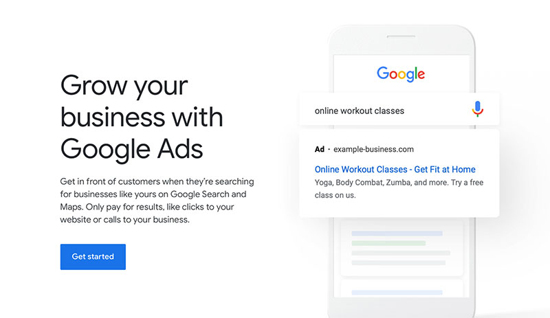
Depending on the type of landing page you want, it might be wise to invest in GoogleAds as a means of bringing more visitors to your website.
If this is something you’re thinking about, your landing page may need to be optimized.
When optimizing landing pages for Google Ads, you should run performance tests to find the best design. This can be done by running ads through different URLs, using Google Optimize, or using a third-party platform.
These tools will help you improve your content, giving you insights into what keywords should be included.
Your site should look professional, and your headings should be similar to the headlines of your Google Ads.
10. Encourage Conversions
You may have their interest, but how do you convert your potential leads into customers? What if you are an affiliate site that works with third-party companies to generate income?
You should always be transparent and never try to confuse readers. They’ll be more likely to trust your partners if they trust you. Write informative content or comparisons, and be upfront about pricing, terms, and conditions.
Here’s an example from Simple Money Lyfe. The goal of this affiliate marketing landing page on the top credit repair companies is for customers to sign up for one of its partner sites.
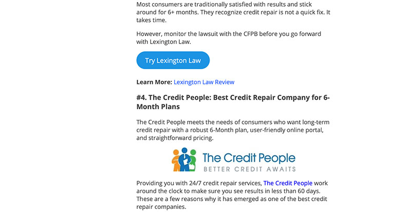
The page is targeted at people looking for a good credit repair company. They’ve used reviews to compare different brands side-by-side. The links under each listing take the visitor directly to the company’s sign-up page.
The rounded blue call-to-action buttons break up the text and are easy to spot. They’ve included logos, statistics, and benefits to show that they’ve done their research.
11. Be Mindful of Your Text
If your visitors can’t read it, they won’t click it.
Landing pages should use the same rules as the rest of your website, with legible fonts in colors that are easy to read.
It’s recommended you stick with sans serif typefaces. They might not be as fancy as their serif alternatives, but they’re more user-friendly.
What’s sans serif? It literally means without (sans) any extra pen strokes. They’re minimalistic, clean, and modern.

Examples of sans serif typefaces include Arial, Montserrat, Roboto, Helvetica, and Verdana. If you’re working in Google Docs, you may even add fonts to Google Docs.
It’s not just typefaces that you need to be mindful of. Text that’s too light, too dark, or too big for your background can be a turn-off for readers. Check your alignment and make sure there are no spelling or grammatical errors.
The Top Landing Page Design Tips You Need to Know
Get ready to create a quality landing page with our top design tips. We gave you a list of 11 areas to focus on and showed examples of landing pages that work.
Stay true to your brand and use consistent themes. Remember to keep it simple. Teach your visitors something new, and test your page to make sure it’s mobile-friendly.
Customize your landing page with segmentation, and reduce the bounce rate with a user-friendly design. Check your page speed, optimize for ads, and make it easy to connect.
Don’t forget to encourage conversions and use sans serif fonts that are clear, crisp, and easy to read.
With these simple tips, your landing page will be appealing to your target audience and more likely to generate leads or sales.
What are you waiting for? It’s time to mix things up and take your landing pages to the next level.
About the Author
 Vikas Kalwani is a product-led growth hacker and B2B Marketing Specialist skilled in SEO, Content Marketing, and Social Media Marketing. He works at uSERP and is a mentor at 500 Startups.
The post 11 Landing Page Design Tips You Should Follow Today appeared first on Design your way.
Source: https://ift.tt/2SrfZMS

No comments:
Post a Comment