Design breathes life into many aspects that surround us.
People design their houses to live in a comfortable shelter that delights the eye. Business owners design their brand to stand out from the crowd of competitors.
The same happens with website design – everyone wants to create a visually appealing site that catches the eye of potential customers.
Content design is not an exception to the rule as well. Especially, when it comes to designing presentations.
If you want to find the best font for your future presentation, you should keep on reading!
In this guide, you will get familiar with the ten best fonts for presentations that rock in 2021.
Let’s start!
Presentation Fonts You Should Stick to in 2021
Fonts are a core pillar of graphic design. Every graphic designer uses them in practice. Some of them are outdated. Some are less popular. But you can never find bad fonts that no one uses at all.
Why?
Because everyone’s different. That means their tastes differ.
Designers continually create new fonts to keep abreast of the times. Those fonts that were in trend last year don’t spark interest today.
That’s why you must always be kept up-to-date on the latest font trends.
Dosis

If you are a part of the tech industry, this font is for you! It is a very simple, round and minimalistic font. It’s nice, balanced and perfect for presentations. With Dosis font, you will be able to create technical presentations easily.
Like this example of the presentation available in the mobile app.
Dosis is a kind of sans serif font that has rounded edges and thin letters. It will be a great addition to your presentation if you want to make it look more futuristic.
Roboto

Roboto is another sans serif font. It has a dual nature that allows letters to give a more natural reading rhythm to it. You can apply it in your presentations created for different types of industry. Even though this font has a mechanical skeleton and the forms are geometrical, it looks pretty friendly!
It is the perfect choice for creating a body text, as shown in the example above.
Libre-Baskerville
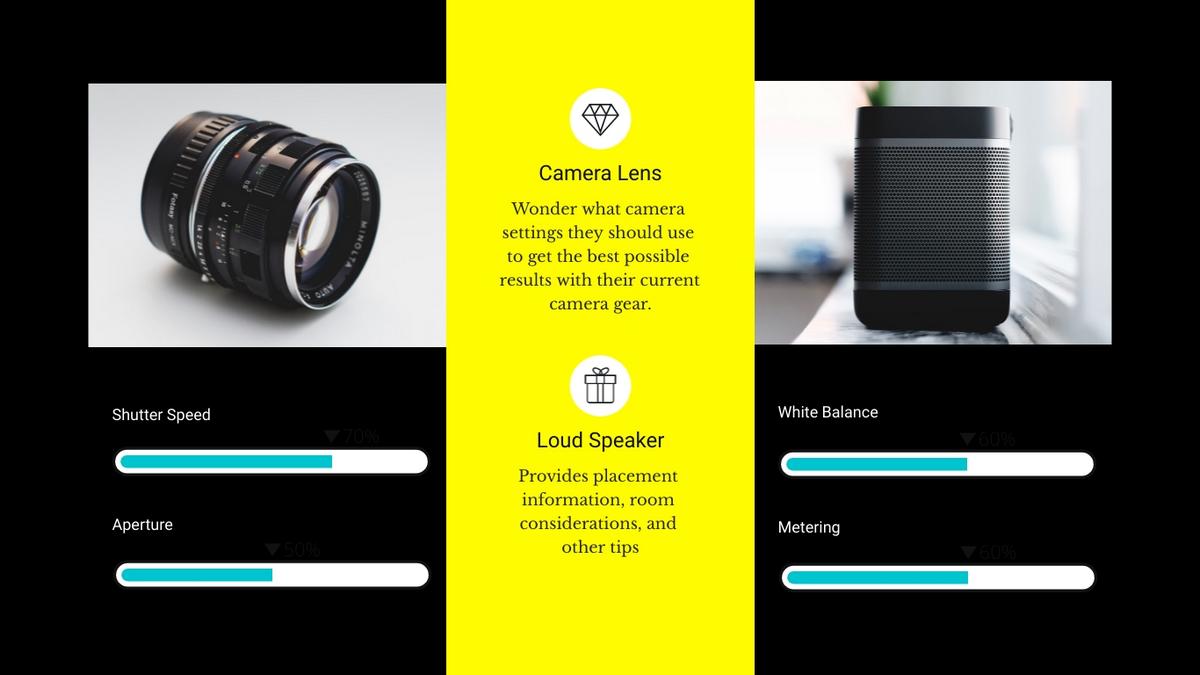
Libre-Baskerville is a quality PowerPoint font creating presentations. It’s character set covers 103 Latin languages.
The best part of this font?
You can pair it with other fonts and color schemes! You can also use it in body paragraphs and never worry about the readability of the presentation.
Libre-Baskerville is a classic font that will always be in trend.
Lato
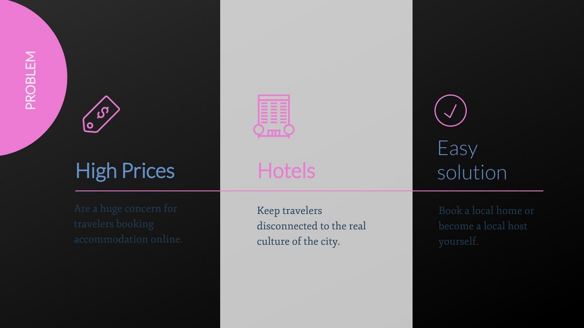
Just like Times New Roman and Ariel, Lato is a standard font. Designers tend to choose it by default all the time. Despite this, Lato can be considered as a modern sans serif font that will be the right choice in 2021.
You can use Lato in different ways and combine it with other fonts easily. Furthermore, this font is available in a variety of weights you can work with – thin, light, bold, and many more.
Lato is a font for those designers who prefer old-school things. But it will be a nice choice even these days.
Abril Fatface

When it comes to creating eye-catching headlines for the presentation slides, Abril Fatface font is number one. This bold font attracts attention in a blink of an eye!
You can mix it with other fonts that have a thinner serif like Palatino or Georgia. Don’t use this font for designing paragraphs or long sentences. It will be hard to read them.
Montserrat

If you need to create a marketing or business presentation, Montserrat font is what you need. This font can remind something related to a modernist style of the early 20th century. However, it looks less formal and can be applicable today.
You can use Montserrat for the heading on your PowerPoint slides. Rest assured, it also mixes well with a variety of other fonts!
KoHo
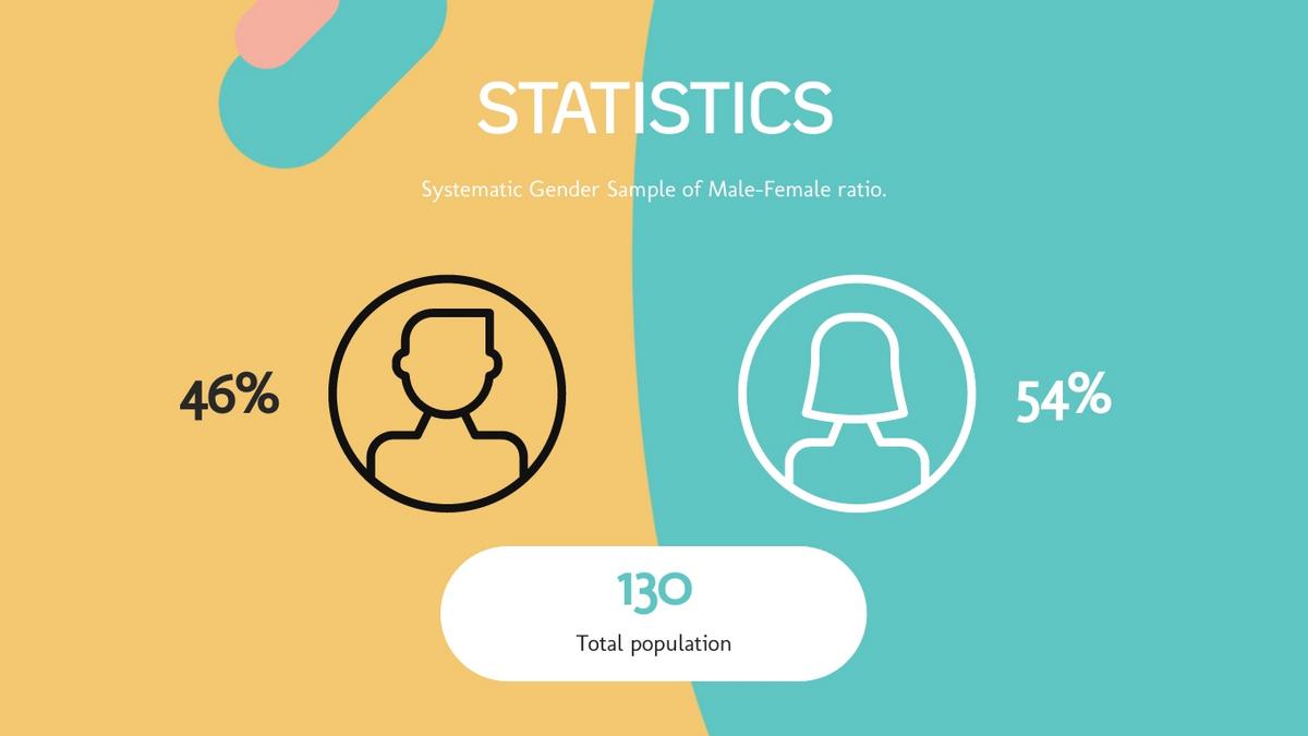
KoHo font is inspired by geometric and humanist san serifs. This is a unique sans serif font that you can use in playful presentations.
For example, if you need to create a school presentation for the kids, KoHo is the font you should work with. You can even utilize this font for a video presentation, especially, if you want to make text animation more delightful.
Note: Don’t use this font in your business presentations. It won’t be a good fit.
Open Sans

Open Sans is a basic sans serif font that is widely used for creating body paragraphs in presentations. You can visualize a large piece of text and include it in your presentation slide.
Likely, Open Sans font shouldn’t be considered as a paragraph typeface only. You can use it to create outstanding headings as well.
Other than that, Open Sans helps you design a presentation that would be easy to read.
Fira Sans
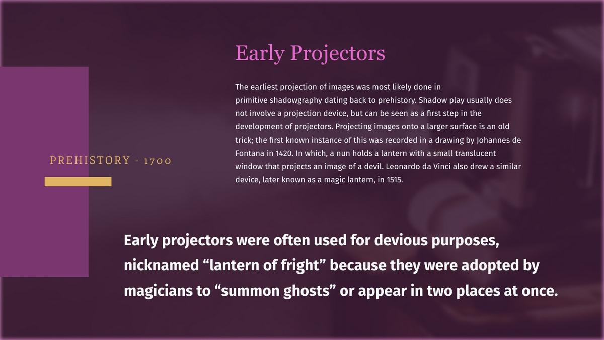
If you need a flexible type of font, Fira Sans is what you’re looking for. You can mix Fira Sans with the other fonts creating a contrast. In this case, Fira Sans will look like an accent font that draws attention the most.
You can use Fira Sans in bold, italic, underline, and more variations. It is a very practical font to use in your presentations.
Bentham
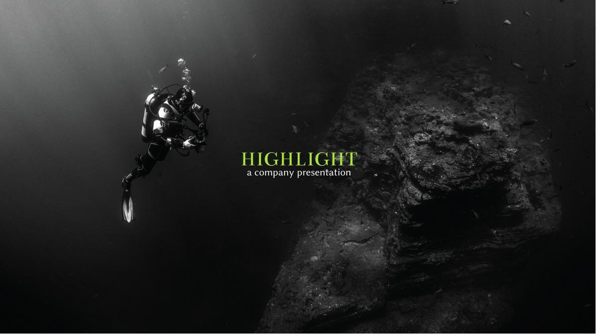
There is no better header font for your business presentations than Bentham. This font makes the headers easy to read and shapes the presentation in a more traditional look.
There are a few variations of using this font – uppercase, lowercase, and title case. It depends on your design angle with which variation you prefer.
To Sum Up
2021 has brought lots of new design updates. These fresh trends have given business owners more opportunities to make their business more visually appealing.
No more problems with designing presentations!
You can now apply these 10 fonts to make your presentations look fresh and unique. Each font will complement any kind of presentation individually.
Let us know which of the mentioned fonts is your favorite!
If you think that this post lacks other up-to-date fonts, feel free to share your suggestions in the comments!
Author Bio
 Mariya is an SEO consultant and she loves to write attention-grabbing content, when not writing you can find her playing her guitar
The post 10 Fonts That Will Be In High Demand Among Designers In 2021 appeared first on Design your way.
Source: https://ift.tt/3epsgJD

No comments:
Post a Comment