Design your way

Friday, October 29, 2021

Influencer marketing is about to rise to $13.8 billion in 2021, and the growth trend isn’t going to stop anytime soon. That makes this form of marketing amazing is that you don’t need to spend a fortune to get to the target customer base, at least if you avoid the 3 common mistakes many brands make when working with influencers.

Mistake #1: Falling for fake numbers

The biggest influencer marketing mistake is choosing the wrong people to work with. Making the decision based on the numbers alone is a huge mistake, as you can end up working with a fake influencer who bought followers, comments, and likes.

Instagram influencer search tools will help you find influencers without fake followers. While you can (and should) go through the profiles manually, Instagram search tools will speed up the process and analyze the follower base demographics for you.

Through the information that search tools collect, you will be able to determine if the profile has fake followers but also see if the followers are your target audience. As you are about to see, even if an influencer has a significant number of real followers, that doesn’t automatically make them a good fit for your brand.

Mistake #2: Focusing on numbers alone

Separating fake from real influencers is important, but that’s only the first step. Even if the numbers are real, they shouldn’t be the only factor – making sure those followers fit your target customer group is key.

When obvious isn’t the best choice

If you run a bicycle rental company, for example, targeting local cycling clubs and reaching out to professional cyclists is probably not the best idea.

People who are into road cycling usually spend lots of money on their own bicycles. Plus, they are interested in long rides, not just strolling around a local lake on weekends. Even if a local Lance Armstrong has a large follower base, you will probably waste time and money trying to make him promote your brand.

A local tour guide, on the other hand, is an entirely different story. Not only can they actually take groups of tourists with them to your rental place, but they will also inspire people to start enjoying the area from their bicycles. This means that even locals who follow the tour guide on Instagram will want to visit those places, which they can do anytime with their friends and family – if they rent one of your bikes.

So, even though the tour guide has a fraction of the following that professional cyclist had, their impact on your potential customer base is so much more significant.

Understand your ideal customer, and you will find your ideal influencer

You could see how working with a professional cyclist wouldn’t be a good idea if you rent bikes. But, it would be a completely different story if you would make bicycle helmets, right? In that case, working with a local tour guide wouldn’t make much sense.

Therefore, before reaching out to anyone, you need to fully understand your ideal customer and their needs. That is why creating a buyer persona is an essential part of marketing. If you know what you sell and who you are selling it to, you will know which type of influencer has the attention of your ideal customers.

Mistake #3: Only going for hard sells

There are many “professional” influencers who would promote just about anything and have a big following. What’s more, working with them isn’t that expensive, so why not give them a go?

Well, the reason why those “promote everything” influencers don’t cost a fortune is because you will get no exclusivity and trust. If they promote a new brand on a daily basis, everyone will know they do it just for the money, and nobody will care.

Even if your products do get noticed, the publicity you get from this type of influencer will not do anything positive for your brand integrity. It will mean you are open to hiring just about anyone to recite a few fake praises about your brand, without being an actual user.  

Also, all the products will usually be completely unrelated to one another – we often see fat-loss teas, mobile phone accessory stores, gym apparel, phone apps, fashion labels, casinos, all promoted by the same person. Even if you pay them to promote your brand, it will get suffocated amongst all others and will be forgotten after a single day if it even gets noticed.

However, if you focus less on sales and more on improving brand recognition over time, you will likely stay off those “promote everything” influencers.

Build your brand presence instead

Let’s say your company makes premium power drills. Instead of finding an influencer who will praise and hard sell your drills, look for someone with integrity who doesn’t sell their opinion.

Send them one of your drills, and ask them to test it for a whole week, leaving a daily update on their profile. On the seventh day, ask them to leave the final verdict. But, give them total freedom to discuss your product and use it how they want to – if your drills are good, there’s no reason why they shouldn’t like them.

If they happen to love the drill, you can offer long-term collaboration. They don’t even need to praise it from thereon constantly. Because it’s a tool, the audience will see your drill around the influencer’s workshop all the time, in use.

All it will take is for the influencer to leave a few tags and hashtags here and there without even praising the tools you make. If the influencer uses them in their own workshop, their trusted fanbase will think it must be good, improving your reputation.

To make sure that things continue to go as planned as time goes by, it’s a good idea to have everything agreed in writing, which will keep both parties protected. Contract management software will keep all of your contracts on the same page, literally. You can easily stay on top of any situation that comes up, ensuring that your influencer partners are building your brand presence as previously agreed.

Conclusion

Avoiding fake influencers, not falling for the numbers alone, and choosing to play the long-term game will help your brand stand out and attract a new audience and a steady stream of potential customers to your online store.

Don’t just look for a quick way to promote your new product. Instead, look to raise your brand reputation. The person that will help you with that isn’t just an influencer – they will become your business partner. Avoiding the 3 common mistakes we talked about will make sure you choose the right one.

About the author:

image4-1 3 Common Mistakes to Avoid When Working With InfluencersAndrii Kalashnyk is the CMO at trendHERO with 9+ years of experience in digital marketing. He started out as an email marketing manager, moving on to copywriting – and for the last three years has been focused on analytics and influencer discovery.

The post 3 Common Mistakes to Avoid When Working With Influencers appeared first on Design your way.


Source: https://ift.tt/3Emvrfm

Design your way

Online customer reviews are still essential in building trust with brands since 19% of visitors trust them. That means that every fifth person on your website will trust a customer review if there is one.

That’s why adding your client’s testimonials to your website can help you achieve more sales. Adding it will help you build more trust with new visitors.

Benefits of using video testimonials

Customer video testimonials play a vital marketing role for businesses in various niches. They’re one of the best ways to showcase the effectiveness of your service or product. You can use them to depict what your business was able to do for someone else.

The concept is simple, having a customer saying great things about your product builds trust between your brand and another potential customer. Customer testimonials are a digital version of word-of-mouth marketing. Therefore, the primary benefits come down to:

  • Making great first impressions
  • Building trust with customers
  • Publicity potential

Each of these benefits heavily impacts your business positively. Making great first impressions means that you’re building a likable brand image, as more people will want to learn more about it.

Building trust from the moment a visitor lands on your website will affect your conversions.

Every testimonial video you create carries the potential of going viral.

So, the question isn’t whether you should make video testimonials, but how to make video testimonials and use them to make more sales. Let’s explore a couple of vital ideas.

1. Create relatable video testimonials

word-image-20 How to Use Video Testimonials to Close More Sales

Image Source

Video testimonials are about telling a story that people can relate to. That means you’ll have to figure out the right approach for making a captivating testimonial. The process is not complicated, but it requires taking the proper steps along the way. Here’s what you could do:

Find the right customer

By the moment you start thinking about a video testimonial, you’ll already have numerous customers. Your goal is to find those who already made the effort to say great things about your product to you or your business representatives.

When you create a list of such customers, reach out to them asking whether they’d be willing to participate in video testimonial shooting.

Working with clients who’ve already expressed that they’re happy with your brand is a great way to capture an authentic opinion without creating a script they should follow. The video will look more natural.

Ask good questions

The next part is asking the right questions. Every question you pose needs an answer in the form of a brief story. Avoid asking any Yes/No questions, as those will kill the conversation quickly. You want to get short stories that viewers can relate to.

Therefore, some of the questions should be:

  • What was the challenge the customer had?
  • Did the customer have second thoughts about your product and why?
  • How did your product solve the issue?
  • What’s the feature that the customer would like to point out?
  • Who would benefit from using the product?

Use these as guidelines to formulate your questions that would create a narrative about your product. Send them before you shoot the video, so the client has enough time to prepare the answers. If they ask for assistance, help them craft their responses.

Edit to perfect the video

Creating a video is like having all the puzzle elements that you need to piece together. Video editing will play a key role in how your video testimonial will look in the end. Key points to focus on:

  • Video duration — Keep the video under 120 seconds. It’s more than enough time for your clients to tell the story.
  • Audio — Aside from using high-quality equipment for the interview, don’t forget to add some background music to set the tone of the whole video. Use lively tunes that symbolize excitement throughout the testimonial.
  • Storyline — The final video should tell a story by going from one segment to another. Pick the right angles and transitions to create a gripping story that captures attention.

After taking all these steps, the resulting video will be an authentic testimonial video that can help you make more sales in the long run.

2. Incorporate them into your marketing strategy

word-image-21 How to Use Video Testimonials to Close More Sales

Image Source

Now that you have a video testimonial, it’s time to implement it into your marketing strategy. There are several ways in which promoting your testimonial video looks natural. You can promote it on:

  • Social media — Sharing video testimonials on your social media account is a great way to show it to your existing customers. But more importantly, you can create a social media PPC strategy to attract new customers to your brand.
  • Advertising campaign — There are plenty of advertising opportunities outside of social media. YouTube is a great video platform where you can use Google ads for promoting your videos. A great example is Grammarly, who have used this approach heavily to promote their product.
  • Newsletter/email list — Every new video testimonial is big news for your brand. Given it’s newsworthy, you should share it with all your email subscribers.

While you should focus on promoting your video testimonials, you should also focus on making plenty of them. That’ll show that there are plenty of happy customers on your side, further growing your brand’s authority.

3. Place them naturally on your brand’s website

word-image-22 How to Use Video Testimonials to Close More Sales

Image Source

Actively promoting your video testimonials on social media is a great approach. However, there are more ways of including them in your marketing strategy. For example, your brand’s website already has a certain amount of visitors.

Adding your video testimonials across your website is a great way to promote your business.

It’s a natural way to show your visitors that clients are pleased with your products and services. That can help improve sales as your visitors build higher trust from the first moment they visit your website.

Good locations for video testimonials are at the bottom of your main page and on the about us page. A good example is Shopify, which features the success stories of its platform near the bottom of the main page.

Concluding thoughts

Using video testimonials is a great way to close more sales. Building trust with your target audience has a significant impact on high conversion rates. Given how helpful testimonials are, make sure that you include them in your marketing strategy.

It’s essential to keep track of the effectiveness of your marketing approach from the moment you deploy video testimonials on your site. Use rank checking software to see how your website performs and analyze the data to follow your progress.

Keep in mind that it’s an ongoing process that requires a lot of dedication and persistence. But with the right strategy, patience and authenticity, you will close more sales.

About the author:

Sam-Avatar-2020 How to Use Video Testimonials to Close More SalesSam Shepler is the founder and CEO of Testimonial Hero. 150+ B2B revenue teams at Google, UiPath, Medallia, InsightSquared, and many others use Testimonial Hero to easily create customer videos that engage prospects, reduce friction in the sales cycle, and drive more revenue faster.


The post How to Use Video Testimonials to Close More Sales appeared first on Design your way.


Source: https://ift.tt/3jNYoZM

Design your way

The legal profession may be fiercely competitive, which is why your firm must stand apart. Creating a website for your legal or law firm and demonstrating that you have the abilities and expertise to take on their case and win is a great first step in ensuring that potential clients see you.

Creating legal company websites is simple, thanks to hundreds of themes created just for attorneys. Nevertheless, if you want to grab attention, you must go above selecting a basic pre-made theme. As a result, you’ll find the best law firm web design advice in this post, which will enable you to build a unique and exciting website for your Law Company or legal practice.

Begin By Developing a Well-Organized Website

When building a law firm web page, you should first think about designing a well-organized design. Visitors to your website are more likely to deal with legal difficulties and seek help from top law firms. Having a well-organized website for your legal company demonstrates your firm’s professionalism and credibility.

Your guest ought to be able to quickly browse different pages and obtain the information they need from your website if it is organized. There’s a good possibility that a potential customer who visits your website doesn’t know much about the law.

You may provide them with conveniently available information if you have a well-organized website, which you can acquire from vendors such as an internet marketing company. To put it another way, your website will be capable of providing a well-organized, straightforward, and easy-to-navigate surfing experience.

Create The Perfect Logo for Your Site

When it comes to developing brand recognition, it is recommended that you select the best logo that will help potential clients to recognize your law business across many platforms. They will be able to recognize every message or advertisement they come across, both online and offline.

An internet marketing agency proposes that you use the full name of your law business instead of symbols and signs and that you tinker with the letters utilized inside your logo. Aside from that, you can include your company’s name and the practice area name in the URL.

Make A Website That Is Both Fast and Responsive

Your potential customer may view your website via various devices, including smartphones, tablets, and desktop computers, so make sure it’s mobile-friendly. You may expect more site traffic from mobile phones as the usefulness of mobile devices improves.

People nowadays want to get information from devices close to them, and mobile displays are always in the user’s hand. However, many sites refuse to load on smartphones or tablets, resulting in a high bounce rate. Suppose you don’t want a prospective customer to go to a competitor’s legal practice. After all, they couldn’t access your website because they waited too long to see your material and other components. Then we propose increasing the speed of your website while prioritizing responsiveness.

Your site and web page should be able to resize themselves depending on the size of the display or the gadget on which they are being viewed. In this manner, regardless of display size, your guest will be able to view and interact with content and other features. Apart from that, ensure that your website loads quickly on all devices.

Make Advantage of a Variety of Call-To-Actions

Because a lawyer’s website is comparable to a typical service-based website, the objective of any legal website should be to inspire visitors to take action. Requesting a consultation, a callback, and other activities are examples of these acts.

To guarantee that people who come to your legal website take the necessary action, you should have several call-to-action buttons on the page. This is a crucial aspect of law firm digital marketing.

This way, you’ll be able to direct them to how they may contact you or book a session. When it pertains to CTA design, it is advised that you choose the correct colors and keep them consistent so that people can understand what the button is about. The CTA should stand out in a crowd so that it may be easily identified.

Make that the CTA on your homepage and other action-driven pages leads people to additional pages such as the practice area page, reach us page, sub practice area page, about us, and more. You may also use the CTA on the sidebar, on a blog page, or in a separate blog post.

Remember that the website design you provide should not be restricted to highlighting the features of your legal business and other services. It should be developed with a goal in mind and should also assist site users in achieving that objective. That is why you should engage the best law firm web designs agency to assist you in developing a research-based and goal-focused site design.

Now you understand why your legal business requires a website and what pages it should have. The tips in this post have highlighted some of the most important website design considerations to keep in mind while creating a legal website for your business. This is also regarded as excellent practice for digital marketing for law firms.

The post Exciting Law Firm Website Design Tips appeared first on Design your way.


Source: https://ift.tt/3pKqf13

Design your way

Thursday, October 28, 2021

Email marketing is a great way to promote your business and get the desired results. It’s also an easy way for potential customers to learn more about your company, products, and services. Small businesses often overlook email marketing because they don’t think it will work for them or they can even afford it. This blog post will show you how email marketing campaigns are designed so that you can start using this strategy to boost your business.

Designing an effective email campaign starts with choosing the right subject line. A good subject line should be catchy while still being relevant to what the content of the email will be, meanwhile not including any words like “buy” or “subscribe.”

Do you want email marketing to be one of your key sales channels? Or are you just getting started with email marketing and would like to use some email design inspiration?

Whatever the case may be, email is an effective marketing channel for many businesses. But not all emails have an equal impact. Did you know that certain email colors make recipients feel more compelled to open, read and click email links?

In this article, you’ll learn about email design best practices, email marketing statistics that matter, and email design inspiration. And most importantly, you will learn that everyone can be a designer when it comes to email marketing!

word-image-7 How to Design More Effective Email Marketing Campaigns

Tips on How to Design Email Marketing Campaigns

Here are email marketing tips that will help you design more effective email campaigns.

Keep email content short and concise

Excessive email content can be boring to read, which will lead to high bounce rates. To make email marketing more effective, keep your email content short and concise (between 100-250 words) because most online customers are already bombarded with too much information on email.

Use high-quality email images and opt-in forms

Design email images that are related to your email content to make email campaigns more effective. If you send email campaigns regularly, use the same branded image for familiarity purposes. Make sure your opt-in email form is attractive and noticeable, encouraging email subscribers to sign up for email newsletters.

Use email marketing templates and email newsletter content calendar

Email templates are available in email marketing software, which you can use to design email campaigns easily. To make email campaigns more effective, create email content ahead of time using email newsletter content calendars because email contents need to be well planned.

word-image-8 How to Design More Effective Email Marketing Campaigns

How to design email marketing campaigns

So let’s begin the email design journey!

The email design process

When email marketing first emerged as an online channel, marketers didn’t have many email standards to follow. That’s why email designs have been very diverse for a number of years. There were no best practices to follow, and the only rule was: make sure you align with what email clients will display.

The email design process did not require any special attention either. You just had to look up the email template of your email marketing platform and adapt it for your email campaign, keeping in mind email client standards.

Thankfully email marketing platforms have evolved over the years, so marketers can focus on email content instead of email designs too. As email marketing has evolved, email designers have started to follow email design best practices.

Applying email design best practices

There are several email design best practices you can follow:

  • Use a single column layout for your email
  • Ensure your email is mobile-friendly
  • Ensure your email photos and text aren’t too small or too large
  • Make sure email links are clear and don’t blend in with email backgrounds
  • Use email design elements sparingly, so the email is not overcrowded

Applying email design best practices will help you create a user-friendly email, ensuring your email marketing messages receive better engagement rates from recipients.

Email statistics every marketer should know

Before we look at email examples, let’s explore email statistics that can indicate email marketing is an effective channel for you. For example, email open rates are estimated to hover around 25%, with some email marketers reporting even higher email open rates. That means one in four emails get opened!

Then there are email click-through rates that keep marketers on the edge of their email marketing seats. Email click-through rates depend on email design, email subject lines, and email content, but 0.5% is considered an average email click-through rate.

The email list size is another email marketing statistic that marketers should know: the larger your email list, the better your open and click-through rates will be due to email list segmenting.

word-image-9 How to Design More Effective Email Marketing Campaigns

Email best practices for email designers

Now that we’ve covered email design statistics and the email design process let’s go over email designs! We’ll start with email examples and move on to email template downloads.

  • Email designs – email inspiration: These email design examples will inspire you and help you get started with your email designs.
  • Email templates – email templates for email marketers: And if you’d like to create email templates yourself, use these email templates https://saasemailtemplates.io/templates/marketing that will surely increase your click through rate..

Can everyone be an email designer?

Well, email design is not as complicated as a website or mobile app development, so anyone with good knowledge of Photoshop and basic HTML/CSS code can create professional-looking emails. Like with any email marketing campaign, email designs also need to be tested.

Benefits of email marketing

The significant benefits of email marketing are as follows:

Email marketing campaigns feel like a no-brainer

It’s free to set up, and email providers make it easy to create email campaigns with emailing service providers that are simple to use. Even though email campaigns don’t require a lot of money or technical skill, they can be incredibly effective when implemented correctly.

Email Marketing is Cost Efficient

You can email your customers for free through email providers like Gmail, Yahoo Mail, Outlook, etc. Additionally, email service providers let you send email campaigns to a list of email addresses that you can rent or purchase for minimal cost. This makes email marketing cost-efficient and affordable to implement.

word-image-10 How to Design More Effective Email Marketing Campaigns

Campaigns Reach a Large Audience

Email marketing campaigns can reach a large audience very quickly and easily. Email service providers let you email a massive group of email addresses in one email campaign, allowing you to make a big impact with your email marketing messages. Additionally, email marketing campaigns can spread like wildfire if an email recipient forwards the message to someone else.

Email is Personalized and Direct

Custom email messages are more personal than other forms of communication. Emails go directly to individuals rather than shared within a group.

Bottom line

Email marketing is a great way to reach out to your customers and grow your business. Digital marketers can use email campaigns in order to get more people on their mailing list, create buzz around new products or services, promote sales events, or any number of other things!

When designing an email campaign, you must keep the following tips in mind:

  1. Personalize each message for recipients
  2. Include images when possible
  3. Provide links, so readers don’t have to click away from the page they’re viewing
  4. Be clear about what’s expected after clicking on a link (like newsletter sign-up)
  5. Follow FTC regulations regarding unsubscribe requests.


The post How to Design More Effective Email Marketing Campaigns appeared first on Design your way.


Source: https://ift.tt/3EoF0L4

14 Awesome WordPress Themes for Colleges & Universities

Colleges and universities need a solid online platform where they can provide significant data of information to serve students, teachers, and a wider audience. That’s why it’s necessary to build a robust website that is not just portraying brand identity but also serving all business purposes. If you are a director or president of your college or university and want to design a website, you don’t necessarily have to get professional help to do that.

With powerful premade WordPress templates, you can develop a perfect website within a few steps and minimum time. We have collected 14 awesome WordPress themes for colleges and universities in this post to help various professionals to get an ideal website related to the education sector. All the themes are described well so that you can choose as per your requirements. So let’s understand the details of every theme.

1. Cedar High – University WordPress Theme:

Awesome WordPress Themes for Colleges & Universities: Cedar High

Cedar high is a powerful multipurpose WordPress theme for various educational institutions. It has a clean, sophisticated and confident layout with mobile responsive design and valuable pages.

You get a pack of jet plugins from this theme to make your customization process more streamlined and accessible. Moreover, with smooth transitions, free stock images, and a unique video banner, this theme looks more innovative and functional for universities and colleges that offer various educational services.

So overall this beautiful WordPress theme has various valuable features to offer for professionals looking for a simple and fully editable template to build a solid college or university website.

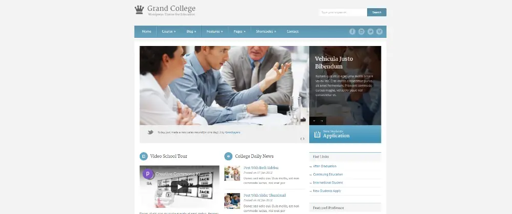
2. Grand College – WordPress Theme For Education:

Awesome WordPress Themes for Colleges & Universities: Grand College

This highly recommended WordPress theme has multiple attractive features for schools, colleges, universities and training centres. Grand college has a decent, minimal and straightforward design that gives a classic look.

It has a robust admin panel to provide you with total access to every element. This theme is SEO friendly and fully responsive to suit the modern requirements of your business. Moreover, you get four blog styles, six-footer layouts, a drag and drop page builder, fifteen background patterns, six custom post types, social media link integration and many more creative functions with this WordPress theme.

Grand college is very much suitable for experienced and well-managed colleges and universities to work digitally through a perfect medium without any hassle.

3. Eikra – Education WordPress Theme:

Awesome WordPress Themes for Colleges & Universities: Eikra

Eikra is a complete package of the education sector. This WordPress theme is a multipurpose theme that offers various designs and features for schools, universities, colleges, classes and other learning institutes.

It offers fourteen versatile and beautifully designed home page demos and support of a learning management system. In addition, it is a mobile-friendly, SEO compatible, fully customizable theme that has many page layouts, profile settings, and unique custom addons to provide you with an excellent website.

You get a fully editable and powerful theme pack with various designs and creative options to include your essential pages, data and links for large educational service purposes. So try this easy and effective theme and give your college or university a robust online platform to lead the market.

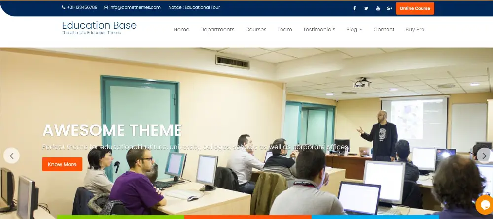
4. Education Base: Education WordPress Theme for all Educational Institute:

Awesome WordPress Themes for Colleges & Universities: Education Base

Education Base is a stylish, modern and flexible WordPress theme that provides you with a number of excellent and helpful features to make an interactive and seamless website. Any college, university, or school can use this theme for free as well.

A fully structured header and footer are available with this responsive theme. Moreover, you get custom widgets, a one-page menu, child page, blog section, header image, colors options, layout control, social media integration and search placeholder with this theme.

This WordPress theme can be a terrific choice to develop an innovative, classy and informative website to serve various educational purposes. You can use this theme without any coding knowledge and however, you want for your brand name.

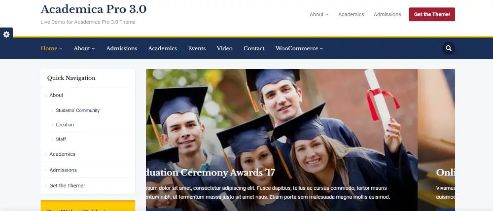
5. Academica Pro 3.0:

Awesome WordPress Themes for Colleges & Universities: Academica Pro

Academia Pro 3.0 is an updated WordPress theme to support various colleges and universities. It has vital customization flexibility and professional features to save time and effort in making a website from scratch.

This WordPress theme has four home page designs, a three-column layout, WooCommerce support, event integration, parent page template, breadcrumbs feature, powerful header and responsive structure to offer website professionals and business owners.

Academia 3.0 has numerous exciting functions for stylish, attractive and powerful websites packed with essential pages and information so that every university or college can run their online business activities. So if you want to have an adaptive and supportive WordPress theme for your institute, this would be the best choice.

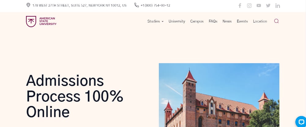
6. American State University – University WordPress Theme:

Awesome WordPress Themes for Colleges & Universities: American State University

It is an extended WordPress theme that offers a bold, smooth and dynamic design for your website needs. Any university and college can use this theme to build a solid website with few easy steps and minimal customization effort.

American state university WordPress theme is built with Elementor page builder, allowing you to make creative customization easily. The Jet plugin pack and free stock images are also a part of the bonus that you get from this theme.

This theme is a fun and creative option for various exciting colleges and universities. It has an exciting video banner, fully customizable header and footer, social media links and animated menu option to make this a perfect WordPress theme for the education organization.

7. Kingster – LMS Education For University, College and School:

Awesome WordPress Themes for Colleges & Universities: Kingstar

Kingster is a beautiful and perfect WordPress theme that is designed for sincere and passionate education institutes. Any large university or college can use this theme to build a sustainable and modern website for their helpful information.

You get a fully customizable website template powered by a learning management system. It has high-quality demos, a drag and drop page builder, 19 header styles, a robust admin panel, six gallery layouts, a genius wrapper system, and a mobile responsive layout to help you with your unique and professional website.

Your college website should be youthful, formal, connecting and easy to manage all the useful services from your end. This smartly designed theme has all the technical and flexible features to save your time and energy and provide you with a desirable website.

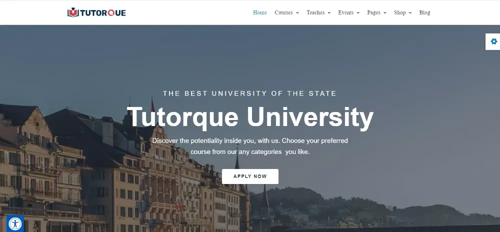
8. Tutorque- LMS WordPress theme:

Awesome WordPress Themes for Colleges & Universities: Tutorque

This comprehensive package of themes has multiple attractive themes for many different education and learning organizations. In addition, it has so many creative design elements and practical features for a large brand dealing with multiple educational services.

Tutoque is powered by the most popular LMS plugins, and it has incredible design freedom from the Elementor page builder. The WooCommerce support, responsive design, mobile-friendly structure, multilingual support, multiple header options, number of professional plugins and lovely designs make this theme one of the most loved ones.

So overall, it’s a fantastic set of themes to have if you want to get numerous creative options and pre-structured features from a single download for your university, college, school or any other education business.

9. Phoenix WordPress Theme:

Awesome WordPress Themes for Colleges & Universities: Pheonix

Phoenix is a unique, impressive and contemporary website theme packed with many fantastic benefits for strong and cheerful colleges and universities. The elegant and straightforward design of this theme is what makes it more attractive and versatile.

This WPML ready theme has a mobile responsive design, portfolio options, SEO compatible structure, Bootstrap support, animated menu style, and fully functional footer and header to fulfil your various technical and creative needs.

With the Phoenix WordPress theme, you get to experiment with styles, elements and colors however you like to develop a beautiful and robust website to serve your students and faculties with your multiple educational services.

10. Buntington – Education WP Theme:

Awesome WordPress Themes for Colleges & Universities: Buttington

Buntington is a beautiful, minimal and stylish website theme that can be an excellent choice for colleges, universities and schools. It is a creative, professionally designed and flexible theme to suit your multiple website needs.

It has a customizable footer, cinema header, WooCommerce support, responsive layout, child theme, SiteOrigin page builder, well-organized documents and hundreds of google fonts to offer you excellent support for your website.

The plenty of widgets and live customizer makes this theme extremely flexible and innovative. So try this brilliant and smooth theme for your courses, classes and teaching services.

11. University Education WordPress Theme:

Awesome WordPress Themes for Colleges & Universities: University Education

This WordPress theme is exquisite, sleek and smooth. It offers you a modern and impressive layout with unique transitions and professional functions so that any college or university can build a powerful website within a few simple and practical steps.

The red tone, wide banner area and attractive content options make this theme one of the most recommended ones for education institutes. It is built with a cherry framework that holds all required features integrated into plugins.

It is SEO ready, fully responsive, WPML ready, and has a fully customizable theme. So overall, it’s a wonderful WordPress theme that carries subtle design and practical features in a perfect package for your institute.

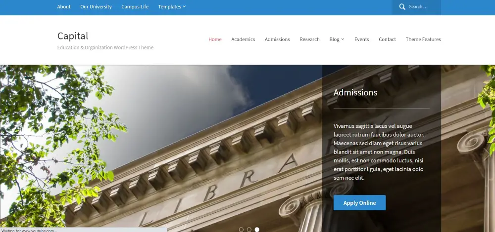
12. Capital:

Awesome WordPress Themes for Colleges & Universities: Capitol

Capital is also a very smart and sophisticated WordPress theme with essential features and creative feasibility. You can beautifully customize the homepage layout however you like with its multiple widgetized areas and support of built-in WPZOOM widgets.

Visual customization, WooCommerce support, SEO ready layout, responsive design, block editor, easy installation, and event integration are some of the key features of this theme to make your experience smooth and effective.

Your college or university can present its applicable dates, links, events, programs, blogs, pictures and other information in a very dynamic manner with this theme—so overall an excellent choice to build a modern and connecting website.

13. Sayidan – University Alumni WP theme:

Awesome WordPress Themes for Colleges & Universities: Sayidan

Sayidan University alumni theme can be very helpful in managing college notice boards, essential links, student activities, upcoming events, online seminars, and many other crucial things.

Gallery, news, blogs, event countdown, career opportunities, registrations, directory, profile management, confidential material and fully functional header and footer are some of the highlights of this theme.

You can customize this fully responsive theme however you like without any strong coding skills. It is mobile friendly and designed with valid codes. So you can definitely use this WordPress theme to build a market-ready website for your college or university.

14. University WordPress Theme:

Awesome WordPress Themes for Colleges & Universities: University Theme

With this theme, you get a tremendous color pallet and unique layout design to portray your institute name creatively. It is a lively, modern and clean WordPress theme packed with helpful features for website professionals or non-professionals to build a stylish website with minimal effort and time.

It is built with a cherry framework to provide you with an excellent customization experience. Moreover, it is a fully responsive, SEO friendly, WPML ready, Bootstrap-powered theme that offers smooth transitions and animation for the banner, menu and other content blocks.

You should definitely try this university WordPress theme that shows a different layout and attractive colors to create a strong impression for your education institute brand. It has everything for students, management, faculties and other audiences, which makes it a perfect theme to work on.

This list has professionally designed WordPress themes with all the necessary and attractive features to give you easy and effective customization for your desired website. You get decent and reliable designs that can save a lot of time, money, and energy that you may need in designing from scratch.

With this collection, your university or college can get a sustainable online presence to provide students and teachers with essential, present, and future information. In addition, you get a number of editable and valuable pages to create valuable sections of your institute like history, placement, programs, downloads, faculty, and many more.

All the WordPress templates are easy to manage and edit for professionals with minimal or no coding skills to get a market-ready website without any hassle and delays. So choose the best theme for your education centre and create a solid presence for your numerous business activities.

The post 14 Awesome WordPress Themes for Colleges & Universities first appeared on Web Design Dev.


via https://ift.tt/3nFzoFk

Design your way

Wednesday, October 27, 2021

Product development is a process with multiple stages, which in turn creates pain points at which problems can arise and issues have to be addressed.

This is where application testing comes into play, as with the right strategy and tools you can smooth out snafus and improve the quality of the finished article.

Here is a look at what application testing involves, what benefits it brings to the table and how it can be harnessed by modern developers.

The basics

Application testing is aimed at rooting out issues and inconsistencies not just in the final stages of the project, but throughout. This allows you to identify bugs and imperfections as you go along, rather than being overwhelmed by them all further down the line and having to spend ages unpicking errors.

Another advantage of modern technologies and methods is that they can be used to take the heavy lifting out of the process. For example, with app testing automation you can offload many of the tasks which would otherwise have to be done manually to a solution that takes care of them for you.

So in short, testing apps thoroughly is both simpler and more effective than ever at the moment, so there is no excuse to take half-measures.

The benefits

First and foremost, application testing is advantageous because it means you can work towards releasing a product of a higher quality.

There are important lessons to be learned from organizations which have attempted to rush products out and be the first to market with some new innovation, only to find that the lack of polish and subsequent issues leave them out of pocket. Meanwhile rivals that took a little more time to test products and iron out creases could then capitalize on demand without risking the ire of frustrated customers.

First impressions have a lasting impact on users, and your brand’s reputation hangs in the balance during the early hands-on time had with an app. Testing lets you give the best possible showing at this stage, and will save you time and money in the long run.

Of course there are examples of apps and software that have launched in a buggy state, creating critical consternation, only to eventually pull it back and meet expectations later on. However, this is only possible with significant financial backing, which for most developers is not guaranteed.

The methodologies

While we have previously touched on the role that automation now plays in application testing, it is worth pointing out that this is just one piece of the bigger puzzle.

Rigorous planning and documentation of the methodologies involved is also key, and of course the involvement of humans in the testing is essential, especially as they will be the ultimate audience for most apps. For example, if the UI design is not user-friendly, the underlying technical proficiency will be irrelevant.

Your planning should also involve the setting of targets and the definition of the goals you hope to achieve through testing. This will give more focus to your methods, and improve efficiency once a project is underway.

Budget is another consideration at this point. You need to know how much cash you have available to commit to testing, along with the subsequent revisions and changes which may be necessary depending on your findings.

Setting a schedule and implementing deadlines is also worthwhile, as all of these parameters will keep your application testing on track and ideally prevent unwanted delays.

Wrapping up

Testing is crucial to creating quality products, not only in app development but in all industries and contexts.

A consistent, well-documented approach backed up by modern tools will lead you towards the results you want.

The post Learn About Application Testing and How You Can Improve Your Product Quality appeared first on Design your way.


Source: https://ift.tt/2XQMjeT
 

The Cash Box Blueprint

Most Reading