User engagement is so important for your website. Whenever a user lands on your page, you want them to stick around for a while. However, visitors will only absorb content and remain loyal to your brand if it’s engaging enough to capture them the first time, within seconds.
There are subtle, smart design choices you can make to improve user engagement on your entire website. Of course, there are different types of website user engagement methods, and what matters most to you depends on the mission of your site.
>>> Editors Note <<<
There is a term User Experience or UX which may be considered by some to be synonymous with User Engagement. All though, there is a difference. The way to look at it is if the user had a good experience (UX), then your website was designed well enough to get users/visitors to “engage” with your content, through the design features and functions.
“Good user experience by design will result in effective user engagement”
It’s safe to say that most websites want site visitors to consume their content resulting in a conversion of some kind. If you’re reading this, you most likely want to improve your website visitor engagement for the purpose of a positive end result where users are regularly:
- Joining your newsletter or membership
- Participating in online discussions
- Downloading your digital product
- Clicking on an affiliate link
- Purchasing your product.
Whatever the case may be, focusing on better user engagement can help you reach your goals quicker. Here are some things you can do right away.
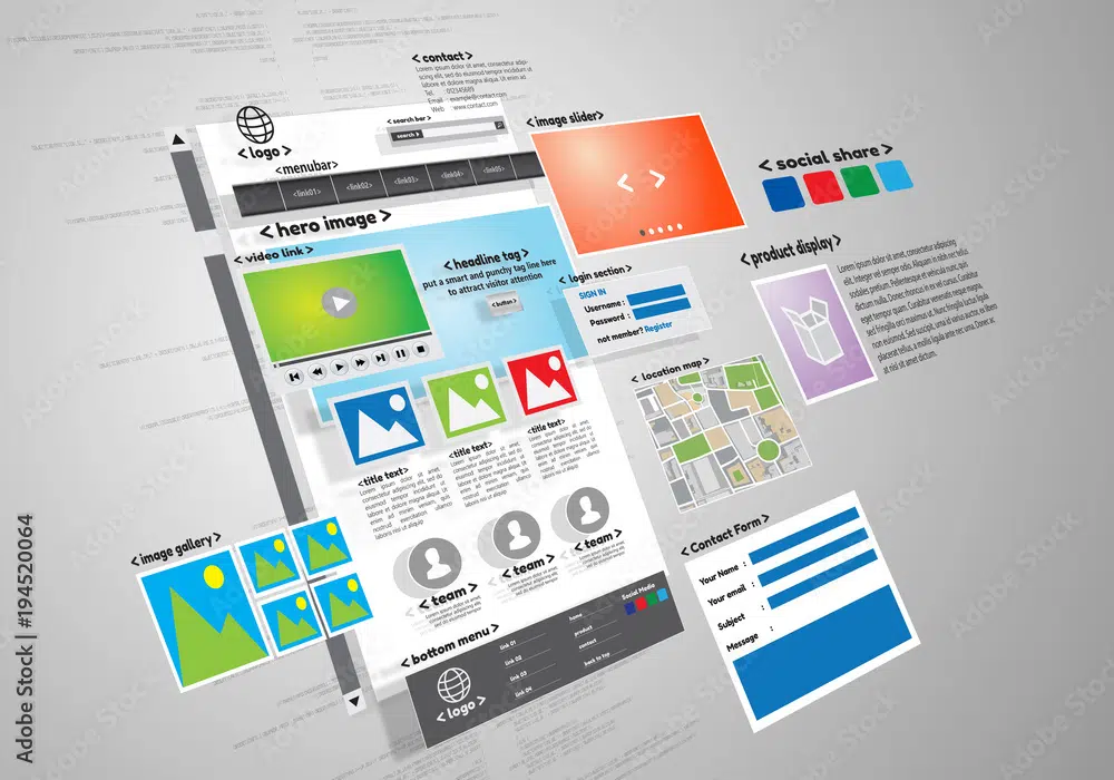
1. Easy To Read Content Layout & Flow
(Like this image? Download it for free plus 10 more like it at Adobe Stock)
No user wants to see chunky blocks of text on your web pages. Your layout—and how your content works within that layout play a crucial role. Be sure to break up your content as much as possible for easier readability.
There should also be plenty of white space between and around content, making it easier on the eyes. It’s also good to bold certain text for highlighting if you want the reader to notice. It makes it easier to pick out the important points, words, or phrases if they are skimming the page quickly.
Use headings and subheadings with great typography that’s easy to read. It’s wise to incorporate bullets and lists where possible. These are great for quick references, topics, and important points you’re trying to get the user to quickly remember or understand.
Here we’re covering easy to read content elements to improve user engagement such as:
- Breaking Up The Content
- Providing White Space
- Highlighting or Making Words Bold
- Using Headings & Subheadings
- Using Bullets & Lists
When creating your content, it’s important to not only write persuasive and interactive/engaging content, but it’s important to write your content for being actually noticed. After all, if no one knows your website even exists, then user engagement is a moot point.
So, let’s take a look at the next critical copywriting element that all website owners need to focus on along with user engagement. This would be search engine optimization.
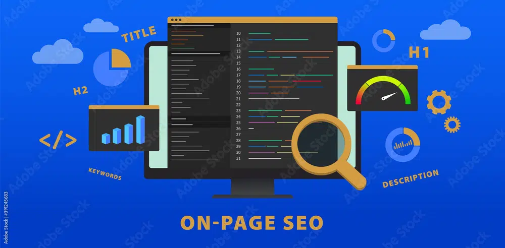
2. How SEO & Quality Content Improve User Engagement
(Like this image? Download it for free plus 10 more like it at Adobe Stock)
There is a balance to how many words your content should contain for SEO (search engine optimization) purposes and also keeping your visitors engaged with your content. With too much content you may risk disengaging the reader and they might fall asleep.
On the other hand, the content may not be long enough to provide enough data to prove it’s relevant for the reader and worthy of being indexed by search engines. Therefore, it’s good to have a general understanding of how UX (user experience) design affects your webpage SEO.
Studies show that word count can make a difference and possibly 1447 words is the sweet spot, especially for bloggers. However, there are many factors that go into SEO copywriting that need to be considered. As with many things in life, there’s a balance.
Generally speaking, shorter content is almost always the better way to go to keep users from getting information overload which will discourage user engagement. However, there are reasons long-form content is preferred such as with sales letters and for SEO optimization.
Quantity vs. Quality
The richer, more in-depth, quality content there is the better chance of showing both users and search engine bots (ie; Google, Bing, Yahoo, etc.) that your page has valuable keyword-relevant information. When this happens, users are more likely to stay engaged with your content.
Again, if you publish content to please both users and search engines, the quantity of words is not as critical as a well-balanced web page with high-quality, engaging content that includes:
- Relative Keywords
- Relative Images
- Informative & Helpful Resources
- Interactive Elements Such As Video
- Quality Links – Pointing Within and Outside Your Site
Regarding sales copy, direct response advertisers have found that long copy outsold short copy during split test trials, but the copy has to be well written and persuasive to win the long-form content challenge.
3. Use Captivating Images, Infographics, Audio & Video
(Like this image? Download it for free and 10 more like it at Adobe Stock)
The majority of site visitors will attempt to skim your page rather than carefully read it, and your messaging should help them achieve that goal fast.
After all, numerous studies have shown that the average human attention span is getting shorter and shorter; this would indicate that you need to capture your reader’s attention as quickly as possible.
Consider how news websites utilize images, video, and audio to quickly capture users’ engagement. A good mix will provide an entertaining and curious atmosphere.
Users want to be entertained. Providing a good mix of images, video, audio, and infographics makes the content more engaging and enjoyable to read. When was the last time you read an article that was just all words and did not have one or more of these media elements?
Speaking of infographics, in a survey conducted by Venngage, 32.5% of marketers surveyed in 2020 use original types of graphics like infographics on a more frequent basis.
Venngage also discovered that 41% of marketers stated that infographics had a better stronghold on engagement than any other type of visual content.
If you’re not sure where to find quality images, infographics, and videos (both free and paid), here’s a list of top quality recommended media assets:
Combine static JPEG and PNG images with GIF images that grab users’ attention. The motion of a .gif image will be a sure way of getting the user to be curious about what the image is actually doing. A great way to do this is to include entertaining optical illusion images and guessing game images where the user will need to click a button to add their answer. Curiosity is the key here for getting more engagement.
Having an audio transcript embedded in your webpage is a simple way to give the user an option to listen to the content while reading it at the same time.
4. Metrics & Tools – How To Decrease Bounce Rate
You can see some data that will tell you how long users are actually staying on your site and where their going, which will give some indication of engagement.
Remember, the longer they are on your website the better chance that they are getting useful information that they actually want and clicking, scrolling, or interacting with some element of your site.
Bounce Rate
One indicator that will help determine if there is user engagement is what’s called “Bounce Rate” in Google Analytics. If the user is not bouncing away from your site quickly, that’s good news. Now if the data shows a high bounce rate, then they are bolting fast away from your site. They found no reason to stay and smell the roses.
There are some simple methods to reduce your bounce rate and keep website users more engaged with your content. Neil Patel put together a very useful and practical video above that will make the difference in reducing your bounce rate.
Heat Mapping
If the user is not bouncing off of your site and engaging, that’s great, but if you’re not getting the results you want (ie; sales, signups, downloads, etc.) then the next question would be to figure out what are they actually doing?
Here’s where you can start digging deeper into tools like HotJar which is a website heatmap. This is a tool that will show live user behavior. You can have a visual of where they are moving around and clicking the most.
This can be useful to determine how to improve the user’s engagement or lack of it, by learning the parts that receive the most engagement with a heat indicator. Hot points show where most users are going. Cold areas show little engagement.
If you’re on the content management platform WordPress, a popular site-building tool called Elementor put together a WordPress heatmap plugin comparison to see what options are available.
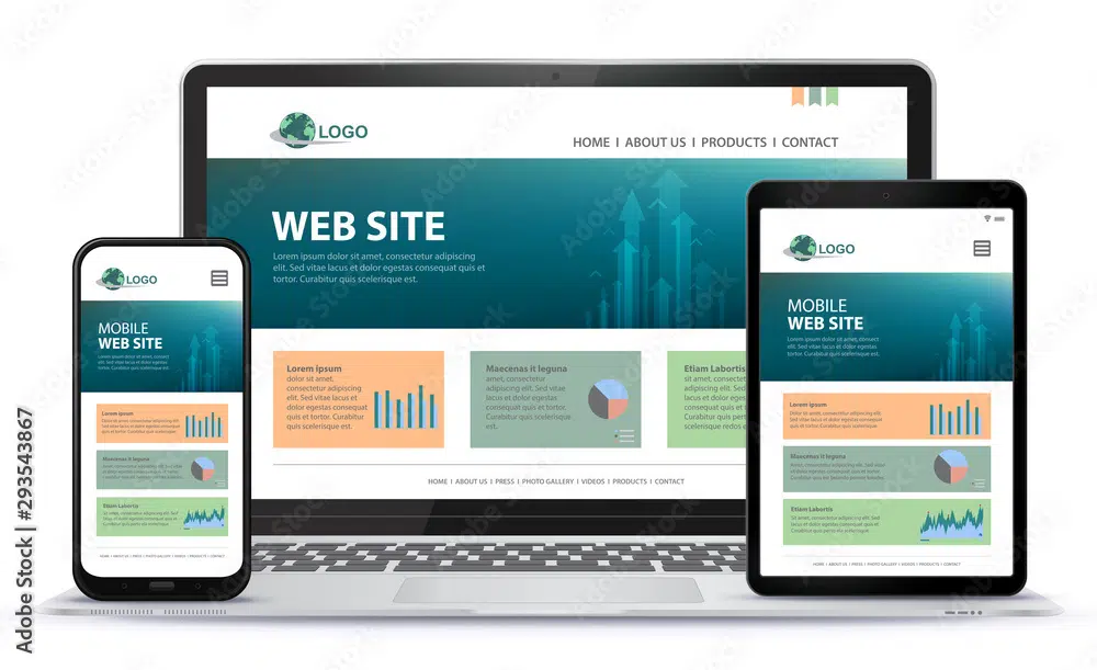
5. Make Sure Your Site Is Mobile-Friendly
(Like this image? Download it for free and 10 more like it at Adobe Stock)
Today’s website designs need to be mobile-friendly in order to compete. After all, the majority of today’s searches are being conducted on mobile devices vs. desktops. A responsive, mobile-friendly site is easily accessed from any device or screen size, making it simple for users to navigate through your pages. Without a mobile-ready site, you could easily lose a large portion of your readership.
Many people are unaware that a responsive design is also a ranking factor. Look no further than the plain text on Google’s website: “Responsive design is Google’s recommended design pattern.”
Google’s mobile ranking system—dubbed as Mobilegeddon—is a clear example of this. In 2015, the search engine giant reinvented its algorithms in favor of a mobile-friendly strategy designed to boost mobile-friendly pages in algorithms.
At the same time, Google’s team also developed a Mobile-Friendly Test Tool, where users could easily test the mobile-friendliness of their own websites. This learning tool will help you become aware of what necessary changes you’ll need to make that will not only improve your website’s mobile capability but will ultimately improve user engagement.
While Google was in the process of pushing mobile-favored algorithms, another study from Appticles was conducted during pre-employment to see how non-mobile sites would fare upon launch: they found that 4 out of 10 websites would be negatively impacted by the release of a mobile-friendly algorithm.
Many people were quick to catch on: within eight months, 25% of sites that weren’t mobile-friendly had made the transition. Ecommerce businesses were the quickest to adjust their websites. And today, responsive mobile design is even more important than ever.
>>> Editors Note <<<
If your current website theme and CMS (content management system) are not advancing with technology and providing you with mobile capabilities, it’s time to make some big changes.
Below is a list of website builders that are ready and capable of helping to take your site to the next level of modern technology.
All-In-One Website Creation Platforms:
WordPress Website Creation Resources:
6. Incorporate Gamification Methodology
(Like this image? Download it for free and 10 more like it at Adobe Stock)
There’s plenty we can learn from video games about design, but did you know we could also improve our design and engagement by incorporating core elements of a video game?
Gamification is a technique where web and mobile developers apply elements commonly found in games to non-gaming initiatives. This is a strategy that’s found in many marketing techniques today.
You can implement gamification techniques in a variety of ways. Anything that involves some level of interactivity can be referred to as a game, for all intents and purposes when it comes to design. You can achieve this with:
- Mini-games
- Quizzes
- Online Competitions
- Giveaways
Part of the reason why gamification is becoming increasingly popular is that it creates an easy, natural way to encourage engagement. When you add gaming components to non-game contexts, you’re able to capitalize on an increased level of interest.
7. Start A Blog & Encourage Users To Comment
(Like this image? Download it for free and 10 more like it at Adobe Stock)
Content is one of the best ways to connect with your readers. And regardless of the reason why they came to your site in the first place, chances are there’s content that would appeal to them.
For example, if you own a marketing business, a useful blog that publishes all things marketing would be interesting to anyone hiring a marketing agency.
Blogging is a great way to connect with users. One way is to activate the comments section. People like to share what they’ve learned, liked, and even disliked about your post. It’s all a part of the user engagement process. Ask users to leave a comment and share the post.
Speaking of, please take a moment to leave a comment below and share this post – Thanks!
Not only are blogs incredible resources for connecting with readers, but useful for search engines. And according to the Content Marketing Institute, businesses with blogs receive 126% more leads than those that don’t.
According to a recent survey of 1067 bloggers in 2021, OrbitMedia found that blogging is still very effective, but like any valuable asset, it will have its challenges. Overall, 77% reported that blogging still yields results.
Think about your target market and what they would be most interested in. You can check out leading blogs in your industry for inspiration. You should also mix up the components of your blog posts; add images, video, polls, quizzes, infographics, and other elements where possible.
8. Check Your Website Speed – It’s Vital For Users & SEO
(Like this image? Download it for free and 10 more like it at Adobe Stock)
One of the most frustrating aspects of a user’s experience is reaching a website only to discover it’s time-wasting slow. You may not realize it, but speed plays a much more important role in engagement than you think. According to Google, sites that load in under five seconds have 70% longer user sessions than those that don’t.
And other studies have found that a minimal 100-millisecond delay could cause conversation rates to drop by 7%. As you can see, you can’t afford to skimp out on speed.
For these reasons, search engines will reward websites that load faster. On the other side of this coin, there is an indication that search engines like Google will penalize slow-loading sites. It’s worth it to learn how to make your site load fast. Here’s a small list of changes to start making:
Use free website speed tools to gain a better understanding of where your website stands. These free tools will also help you learn more about what actions you can take to improve your speed.
Conclusion
When it comes to keeping your website users engaged, it doesn’t come down to just a list of absolute design elements. However, it comes down to you as well. People follow people and want to engage with people. When you provide genuine quality content that is reflective of your style and personality, this will also attract your website users and help to build engagement.
The combination of implementing your personality, using the tips above, and writing content to please search engine bots will surely help to improve both human and bot user engagement on your website.
To Your Success!
<p>The post 8 Best Tips How to Improve User Engagement On Your Website first appeared on Web Design Dev.</p>
8 Best Tips How to Improve User Engagement On Your Website was first posted on January 31, 2022 at 4:03 am.
©2022 "Web Design Dev". Use of this feed is for personal non-commercial use only. If you are not reading this article in your feed reader, then the site is guilty of copyright infringement. Please contact me at jc@ventureupwards.com
via https://ift.tt/E5WH1ViCf


No comments:
Post a Comment