Our brains take about 150ms to process an image and twice as long to process and understand words.
The math is clear – people are highly visual creatures.
So, if you want to communicate any message to your audience, you’d better do that with lots of visually-oriented content. That’s why photos and illustrations are essential elements of your website content and copy.
However, the question isn’t whether you should use photos or illustrations on your website, but which of the two mediums performs better and in what situations.
Let’s discuss both from the perspective of their advantages, as well as see how to best implement them for engagement and conversion purposes.
When to Use Illustrations
We’ll first make a case for illustrations and discuss their benefits for website design.
To Boost Brand Awareness
Standing out in a crowded marketplace can be very challenging.
That’s why you should distinguish yourself from your competitors and create a memorable first impression with the help of custom illustrations.
If your blog posts, landing pages, and social media posts feature personalized illustrations that reflect your brand’s identity, message, and values, it will be easier for your visitors to establish an emotional connection with it.
In other words, your potential customers will be able to recognize your illustration the moment they see it. So, it’s an effective tactic to stay top of mind.
Plus, with custom illustrations, you can control how your target audience perceives your brand.
The trick is to stay consistent and unique.
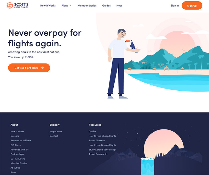
Scott’s Cheap Flights is a great example of a site that makes the most of custom illustrations. By embracing modern flat artwork, pastel colors, and a cool, playful, easygoing style reminiscent of traveling and adventure, it effortlessly showcases what the brand is all about.

Source: Scott’s Cheap Flights
To Present Complex Concepts
Photos don’t work well when it comes to presenting complex or abstract subject matters. Moreover, companies that offer software or services often find it difficult to produce a photo depicting their solution.
Quite the opposite, this format tends to additionally complicate the message with too much detail. Such photos are either hard to comprehend or cluttered and thus unappealing.
Illustrations fit this purpose much better since they can explain how a particular process, service, or another intangible concept works without overwhelming your audience.
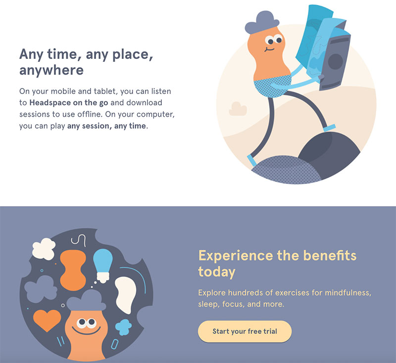
Headspace is a mindfulness app that helps people to meditate and relax. The brand uses illustrations to showcase their app and highlight its benefits.

Source: Headspace
To Increase Emotional Appeal
When you’re creating custom illustrations, you’re in full control of the emotion you want to elicit.
You can use colors, shapes, curves, lines, and their mutual dynamics for this purpose.
In addition to that, illustrations have the power to create clear visual metaphors more easily and prevent wrong associations using the combination of all these elements. Thanks to all these minuscule details, you can leverage illustrations to support your copy and set the tone of your message.
Toggl, a time-tracking tool, uses mellow colors and playful fonts to soften the idea behind employee time tracking. These simple illustrations and overall design communicate the message of productivity and happiness, just as mentioned in the copy.

Source: Toggl
When to Use Photos
Photos are a staple when it comes to visual content.
Here are situations in which they’re a better option than illustrations.
To Humanize Your Brand
Building rapport and establishing meaningful connections with your customers is essential for the success of your brand.
But, since brands are organizations and not humans, it’s hard for customers to connect with them on a deeper level. That’s why humanizing your brand and showing that there are real people behind it can do wonders for customer trust and loyalty.
You can achieve this by using photos of your staff.
Just make sure you hire a professional photographer because quality is what matters if you don’t want to hurt your brand reputation.
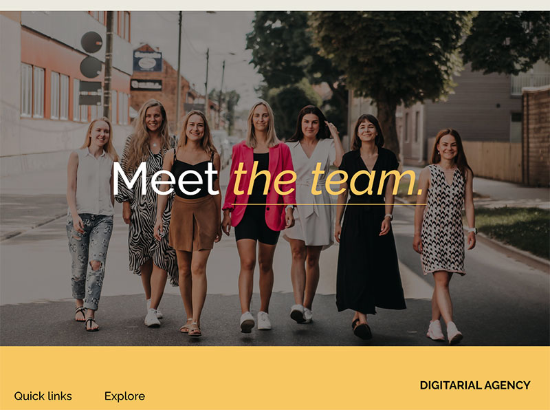
The “Meet the team” photo on Digitarial Agency is a great example of this tactic. The company’s home page features two high-quality photos of the team. If you click on the photo, you’ll be taken to a dedicated page with the team’s headshots and short bios. Nothing beats showing the human side of your brand, like putting a face to the name and presenting your employees.

Source: Digitarial Agency
To Establish Trust and Credibility
75% of customers form an opinion about a company’s credibility mainly based on its website design.
This also includes your photos.
As we’ve mentioned, professional photos are a surefire way to show your customers that your company is trustworthy. However, in some cases, it’s not possible to use custom-made photos due to the subject matter and structure of your website.
The next best thing is finding relevant stock photos that match the topic and context of your content.
The website of MarketBeat, a company offering stock research tools and providing stock market news, displays real-time financial data and publishes accurate market analysis. It’s also packed with all kinds of relevant resources for investors. In such an industry, credibility is everything, but picking the right photos capable of instilling trust can be a difficult task. MarketBeat does a great job of making stock photos work.
They picked photos that complement their news but don’t distract readers. In cases like this one, the simplicity of stock photos turns out to be the best solution.

Source: MarketBeat
To Show What Something Looks Like
Photos are an obvious choice when you want to present your actual product or show what something looks like.
People perceive actual representations of objects, places, or persons as more accurate and trustworthy.
Let’s say you want to promote a restaurant menu. The logic is simple: you want to stimulate your prospects’ appetite. Using mouthwatering photos of your menu items is much more effective since your customers will assume that it’s exactly how the food will look when they order it.
This accuracy is also a great asset when you have to educate your audience.
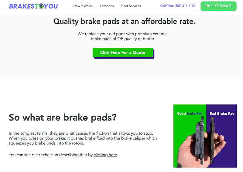
Brakes To You is a company offering mobile brake repair services. While what they’re providing can’t be captured by a photo, the company cleverly uses this format to show their prospects how to recognize whether it’s time for a repair. For example, many people aren’t familiar with what brakes actually look like, let alone able to distinguish between good and bad brake pads. So, in this case, the saying “a picture is worth a thousand words” really hits home.

Source: Brakes To You
Final Thoughts
Both photos and illustrations are great mediums for getting your message through to your audience while making your website more visually appealing. These tips can help you figure out how to choose between them to best fit your needs and brand image.
The post Photos or Illustrations: Which Is Better for Your Business Website and When (+Examples) appeared first on Design your way.
Source: https://ift.tt/rGWdpf8

No comments:
Post a Comment