Designing a website that will truly resonate with your target audience can be quite a challenge. After all, with so many options out there, standing out has never been more difficult. Since the average digital customer sees up to 10.000 ads a day, you need to take some time to get to know your own audience if you truly want to grab their attention.
Here are our seven tips for designing a website that will truly resonate with your target audience, along with examples of how other brands have done it effectively.
Focus on the Audience, Not on Yourself
Designing audience-centric websites means that you actually, actionably, need to put your audience first. This means speaking about them and their needs rather than about yourself, your product or service, and what you do.
Aim to sell the benefits of doing business with you, and not the features you’re able to boast. Benefits will play on the emotions of your audience, while features are, to be perfectly honest, not at all important. Your audience wants to know whether you can solve a specific problem, and they don’t really care how you do it.
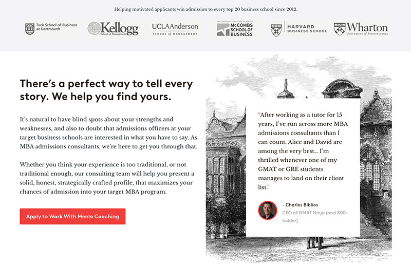
Menlo Coaching does this very well. They focus on their clients and what they may be lacking and looking for. They show you what you will get: 1-on-1 coaching, insight into the MBA application program, and so on.
Source: menlocoaching.com
They have clearly highlighted the benefits, and they speak of their experience and happy clients only in passing.
Show Off Your Reviews
Your audience will also want to know if you can be trusted. If they’ve never heard of your brand before, they will instinctively look for trust signals on your website. If you don’t have any, they are not likely to stick around.
Which type(s) of social proof you choose to include on your pages is up to you. Reviews and testimonials work very well in every industry, as do media mentions and user-generated content. Consider what would sway your audience the most. Do they want to hear from an expert, or would they rather see what people just like them have been able to do with your help?
Take a look at ATH and how they have managed to include several great trust signals. First, there are review stars accompanying their products. There are media mentions and user testimonials. On top of that, there are the four logos that add an extra layer of credibility to the brand.

Source: athsport.co
Make It Bright
The design of your website needs to match your brand voice and the nature of the product or service you are offering. A dull website prompting a fun product will not resonate nearly as well as a colorful design solution would.
Carefully consider your color scheme and take a look at as many competitor websites as you can. See what they’ve done well and what the underserved design solution in your niche may be. If you do something different, your audience will remember you.
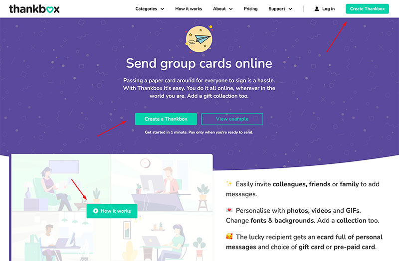
Let’s take Thankbox as our example. Their pages are bright purple and green, with vibrant green CTAs. The combination sends the right type of message: this is a fun service we offer, and we make your friends and family feel great with our group cards.
Source: thankbox.com
Make sure to work with a designer who has plenty of experience working in different niches, not just yours. You want someone who is interested in conveying your message, as opposed to someone who will just apply a cookie-cutter theme and call it a day.
Make It Move
Adding a touch of movement, interest, and interactivity to your pages can be a great way to hold onto the attention of your audience. You can do it with video, you can do it with audio, or you can do it with the layout of your pages.
Your goal is to do something a bit more than create mere static, simple pages. Simply by making one element dance or drop in from the bottom of the screen, you can instantly make the browsing experience better.
Be careful not to overdo it, though. You don’t need every single element to move, as that can quickly become too distracting and overwhelming.
Take a look at Will Ventures and how they’ve managed to shake things up without going overboard. You can argue that the homepage is difficult to navigate and that there is too much movement, but the website is certainly more dynamic and more appealing than others in the same space.
Show the Product
In order for your pages to resonate with your audience, you need to ensure you give them what they want as soon as possible. That often translates to showing your products (or at least some of them) on your homepage.
You don’t want to make your audience click through several pages or have to navigate a complex menu to find what they are looking for. Even if they’re just browsing and don’t have any intention of converting, they’ll want to see what you are selling right off the bat.
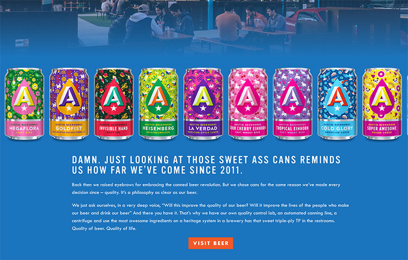
Austin Beerworks did a great job. They show you their different cans on the homepage, and you can explore their entire collection from there. The page itself is not just about the product, though, so they have managed to find the right blend of informative and promotional.
Source: austinbeerworks.com
Keep It As Simple As It Needs To Be
When designing your website, remember that you don’t need to be adding any superfluous bells and whistles in an attempt to make it more interesting or appealing. Modern web design is simple for a reason.
Most audiences don’t want to be overwhelmed with a bunch of different fancy elements. They have come to you with a purpose, and the sooner you are able to fulfill it, the better.
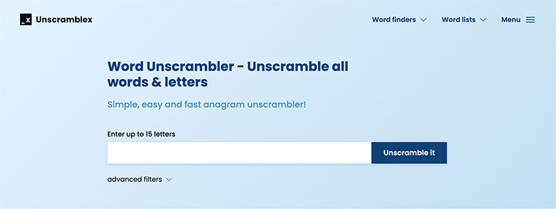
Take a look at UnscrambleX. They give you access to their unscrambler as soon as you land on the website. There is a lot of text on the page, yes, but you don’t need to read any of it. You can just solve your anagram or figure out what to do in your Words With Friends game and move on.
Source: unscramblex.com
Add a Human Touch
Your audience will want to know who they are working with. By adding a human face to your brand, you will make yourself much easier to identify with. By seeming less like a faceless corporation and more like a collection of individuals, you will become much more relatable.
You can have an About Us page or a Team page that showcases your staff. Or, you can add the human touch to your homepage to make it extra effective. That’s what KlientBoost has done. They’re instantly more relatable than most other marketing agencies. That’s because clients know who they will be working with and can determine whether the faces they see seem like someone they want on board.
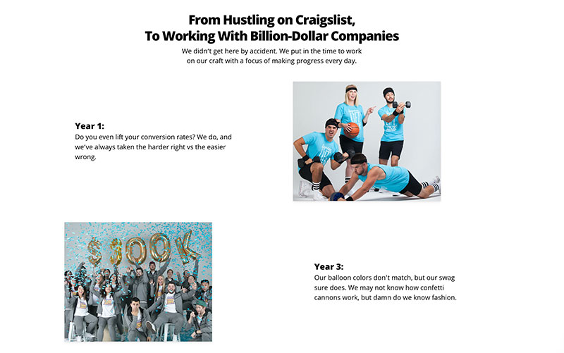
Source: klientboost.com
Wrapping Up
With these design tips and examples in mind, take a moment to reevaluate your own digital presence with a fresh set of eyes. You may notice there is room for improvement – or perhaps discover that you’ve already done everything right.
The post 7 Tips for Designing a Website That Resonates with Your Target Audience (+Examples) appeared first on Design your way.
Source: https://ift.tt/SLBFOUM

No comments:
Post a Comment