Twitch is a platform that allows gamers of all ages to find new games, and get tips on how to play those games. Not only that but to also interact with gamers their age and in their community, to follow gaming personalities and so much more. Twitch also allows users to interact with their favorite games, watch their streams, and so on.
Twitch is a company that launched in 2011. This company was, in a way, a spin-off from the old streaming platform Justin.tv. It quickly outgrew it. In 2014, it was bought by Amazon. In the beginning, the main goal of Twitch was video games only. The users were able to watch their favorite gamers play games; they were able to interact with other viewers and users. They were able to stream their own gameplay and so much more.
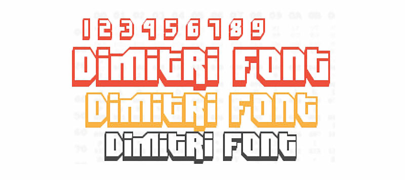
Twitch Logo font: Dimitri
For the logo of Twitch, a techno font was used. It was released first by Ben Balvanz through the Fontalicious Font Family. It is most known as Dimitri Font. When this font was created, the main goal was to create a font that is original and functional at the same time. This font was planned to be used in various projects such as print or some other screen projects.
This is a font that has two peculiar font styles. These styles are Regular and Black. The Dimitri Font is made of exactly 237 characters that are clearly defined with 94 special glyphs. Twitch’s logo is made of two parts. The first one is a wordmark. This is most often used as a logo itself.
The second part is a small logo that stands above the wordmark. It is a much smaller icon that is barely noticeable. This wordmark consists of the text “twitch”. It is written in lowercase and has a purple outline. This makes it seems like it has some 3D effect.
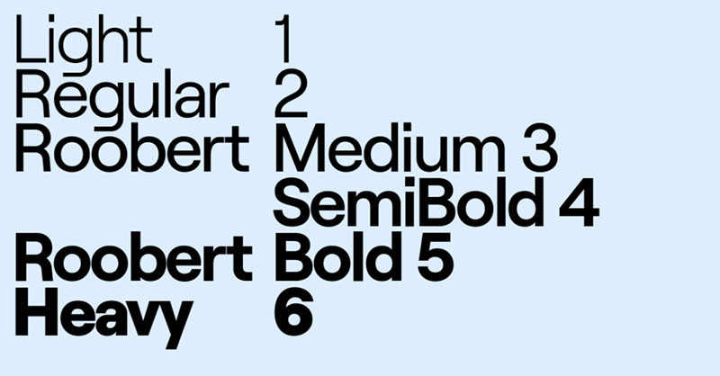
The Twitch main font: Roobert font
In 2019, Twitch presented the world a new design. This happened on the eve of TwitchCon 2019. The design wasn’t completely changed, though. But there are some noticeable differences. Twitch began using a completely new font called Roobert. This font has several characteristics that make it unique. It is mono-linear and geometric. It comes from a sans-serif font family that is smooth, pristine and novel.
This font was created in order to celebrate the legendary Robert Arthur Moog. He was the legendary inventor of the first commercial synthesizer.
Roobert is a sans-serif typeface designed by Martin Vácha and published through Prague-based foundry Displaay in 2018. The family is available in six weights with matching italics.
This Roobert font is now all over Twitch. It is most noticeable in Twitch’s chat.
Fonts similar to Roobert
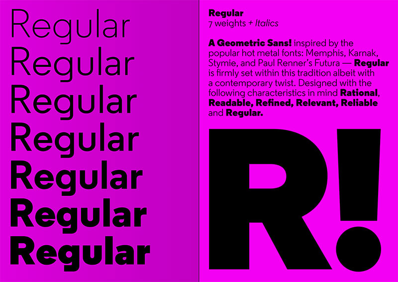
Regular font
Regular is a geometric sans-serif typeface. It was created by Henrik Kubel. And, it was freed through London-based foundry A2-Type in 2013.
This font’s typeface was first a slab-serif design. Over time, this design was created into a sans-serif one. This happened because Kubel took inspiration from the letter G, which was written in a peculiar way on a faded sign on a wall.
Regular has seven weights ranging from light to black. They all have matching italics. It has been specifically designed to work in both screen and print. For instance, in both large and small print, this font is easy to read and is quite distinctive.
Acumin font
This is the most versatile sans-serif font. It is intended to have a balanced and rational quality. Solidly neo-grotesque, it performs beautifully at display sizes but also maintains an exceptional degree of sensitivity for text sizes.
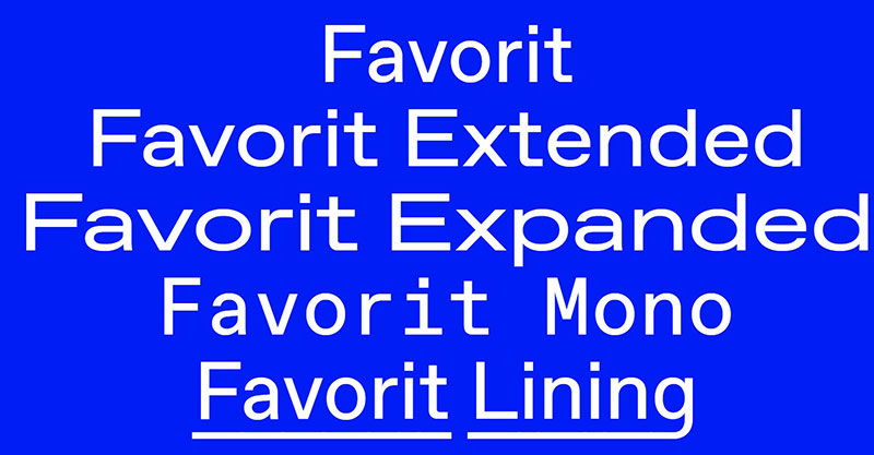
Favorit font
Favorit is a sans-serif typeface designed in 2013 by Johannes Breyer and Fabian Harb of the Swiss foundry Dinamo. The design feels like a standard neo-grotesque but features distinctive tails on the t, j and y that end at right angles. The family is available in four weights with matching italics.
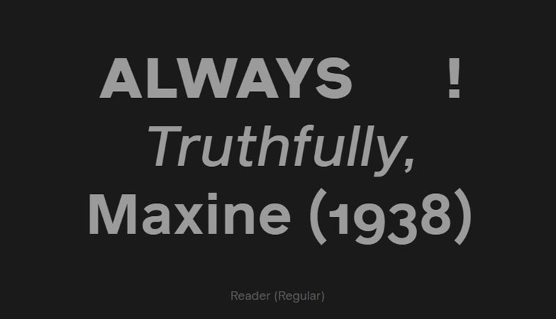
Reader font
Reader is a sans-serif lettering made by London-based foundry Colophon. The design was enthused by an unfamiliar font set up in a Royal Society for the Protection of Birds letter dating from 1972. Reader is accessible in four weights with identical italics.
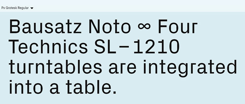
Px Grotesk font
Px Grotesk is a sans-serif typeface produced by Nicolas Eigenhee. it was later advertised by the Swiss foundry Optimo in 2013. The idea was caused by the way written hooks get pixelated on screens. The letters a, f, j, r, and y have well-defined elongated designs. They are unlike any other surrealistic typeface I’ve seen. Px Grotesk is free in three weights with coordinating italics plus an extra “pixel font” version.
Best Font Pairings for Roobert font
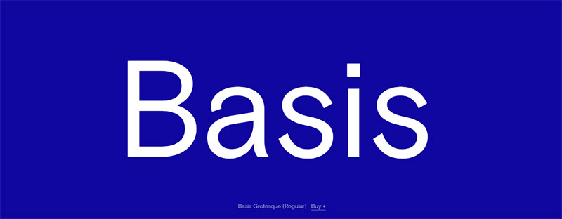
Basis Grotesque font
This is another sans-serif typeface. It was designed by both Edd Harrington and Anthony Sheret. They come from Colophon Foundry. Originally, this font was designed in 2012. It was first a custom typeface for Hotshoe, a photography magazine. But then, in 2015, it was expanded and used as mostly a commercial font.
Basis Grotesque is accessible in five weights with matching italics as well as a monospaced version.
Reckless font
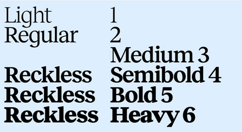
This is once again a serif typeface. Designed by Martin Vacha, it was later published via the Display Type Foundry. This happened in 2017. The inspirations for this font were the fonts Times New Roman and Plantin. This is a family of fonts that has six weights.
There was another version of this font. This version had a higher contrast. It is known as Reckless Neue.
Surt
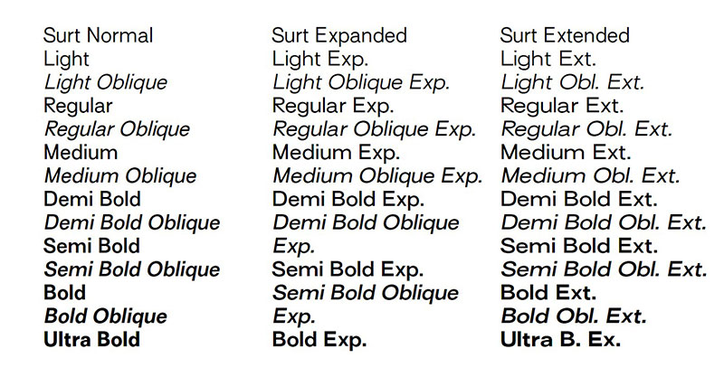
This is a font that was inspired by Scandinavian Architecture and Norse mythology. It was created by Matthieu Salvaggio and then published in 2017 through Blaze Type. This font family has a wide range of styles and weights.
Bianco Serif
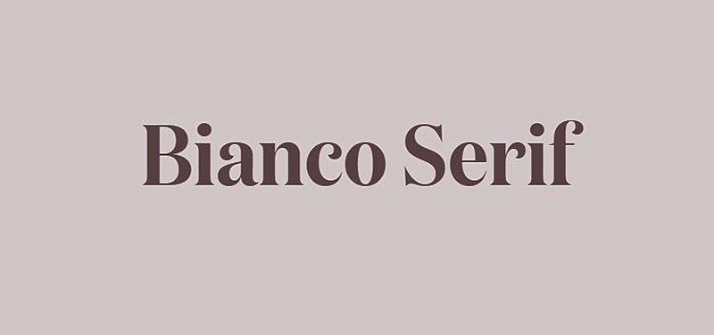
This is a serif typeface that was created by AlfaType. The design consists of triangular serifs, a large x-height, and a low stroke contrast. This font comes with four weights. They all have complementary italics and a sans-serif version of it.
Twitch’s previous font: Helvetica Neue
Helvetica Neue
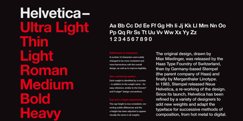
Helvetica was designed by Max Miendinger. It is a sans-serif typeface that was released in 1957 by the Haas Type Foundry. The inspiration for this design was Akzidenz Grotesk. First, Helvetica was named Neue Haas Grotesk. However, later it was renamed Helvetica, meaning Swiss in Latin.
Twitch has gone under a major reconstruction in its design. This was the first remodeling and rebranding for Twitch since it was first established. It used a completely new scheme of colors and a new color palette. The letters have become blockier and the mascot has been polished and improved.
As Twitch continues to grow and take over the world, it won’t be a surprise if some major design improves.
If you enjoyed reading this article on what font Twitch uses, you should read these as well:
- How to add fonts to Paint.NET quickly and with no effort
- How to add fonts to GIMP (Fonts installing guide)
- How to add fonts to InDesign and use them in your projects
The post The Twitch font: What font does Twitch use? appeared first on Design Your Way.
Source: https://ift.tt/dZRioea

No comments:
Post a Comment