Design your way

Tuesday, September 3, 2019

It is used by many people because it is not intrusive, being simple and sophisticated at the same time. It is also one of the most convenient typefaces for conveying different messages.

It has developed a certain image through many years of its existence, and that is one of simplicity, efficiency and it has become the golden standard for many written pieces. In this article, let’s take a look at fonts similar to Times New Roman.

Font choice is one of the most important choices for a graphical designer

Why is that so? Because a font is a part of the graphical design of your piece and it conveys a message of what the identity of your brand is. Whether it is a more playful style or a more reserved and formal style, all of this can be conveyed through font choice.

You want to choose a font that will attract people and one that will go hand-in-hand with the image you are trying to present. If you choose the wrong font, the whole image might be ruined.

What are the most common fonts?

Fonts are generally put into categories to distinguish them easier.

There are serif fonts and sans-serif fonts.

Serif fonts are the classical and more serious fonts that are characterized by the serifs – or the feet on the edges of the letters.

Sans-serif fonts, on the other hand, are a bit more modern fonts that can be used more freely. They often feel smoother and more informal. Some examples of sans-serif fonts are Calibri, Helvetica and Open sans.

While serif fonts are more popular informal settings, sans-serif is becoming more and more popular recently. Serif fonts are usually chosen over the sans-serif fonts due to better readability, but the latter have improved massively in this aspect recently.

Best fonts similar to Times New Roman

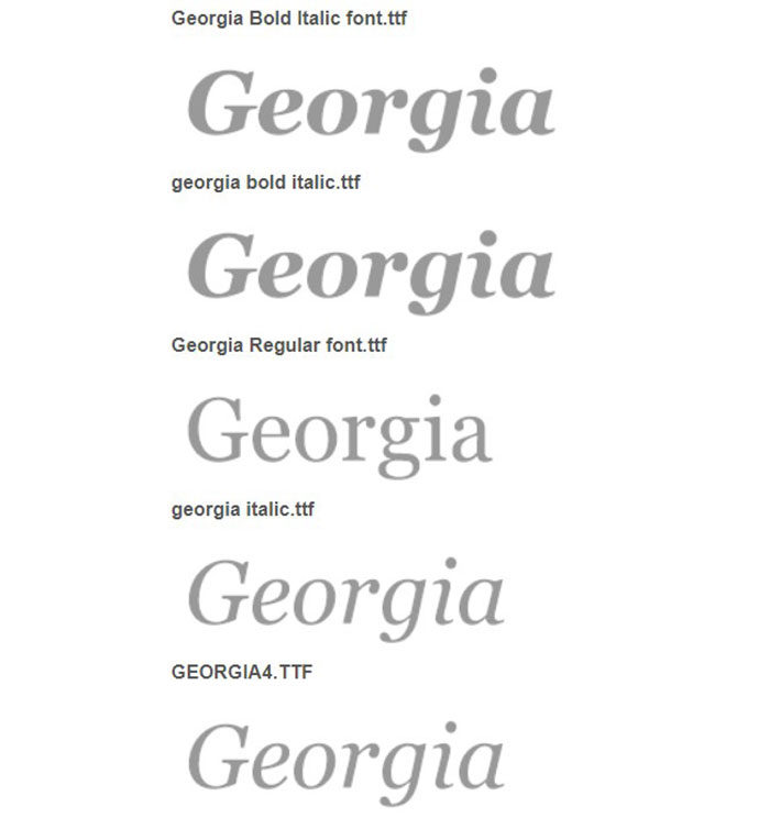
Georgia
georgia-1-700x744 Fonts similar to Times New Roman: Alternatives to use

As a serif font, Georgia is one of the fonts that can easily replace Times New Roman. It was designed in 1993, and it was meant to bring readability and elegance to low-resolution screens. Nowadays, it is still quite popular, especially in formal settings. It is based on many formal 19th century typefaces, and you can see that in its design.

It is a perfect typeface to replace Times New Roman because it can be used in so many different instances, which is a quality that Times New Roman has. It is easy to read, looks quite formal and can be used for display use or to achieve great readability on printed texts.

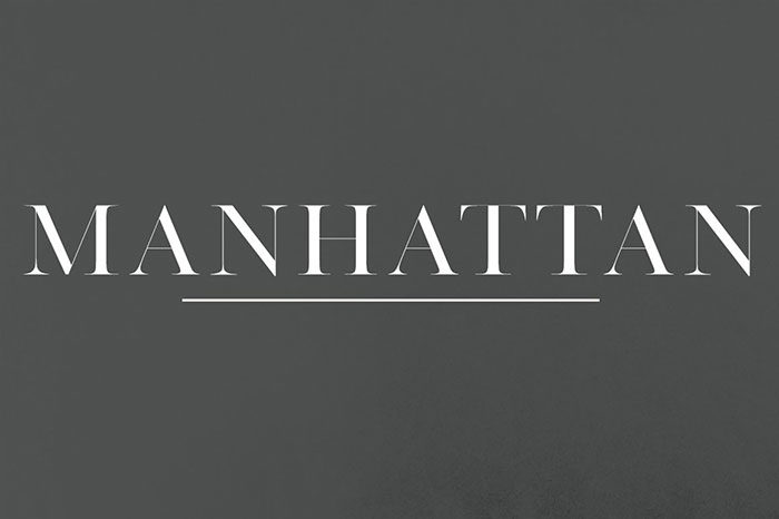
Manhattan – A High-Class Serif
manhattan-700x466 Fonts similar to Times New Roman: Alternatives to use

The manhattan serif font claims to be a classy serif, but it is very simple in essence, which is probably a quality that makes it classy in the first place. This is one of the best fonts similar to Times New Roman because it can be used in many cases and is compatible with many other fonts.

Arno Pro

arnopro-700x123 Fonts similar to Times New Roman: Alternatives to use

Arno pro may be inspired by the Venetian typefaces, it is certainly a modern-looking font. Its functionality and a contemporary look make it a good alternative to the Times New Roman.

The Arno pro is a font that is available in Adobe, and it is one of the most versatile fonts in that environment. It offers support for a great variety of European languages, and even support for Cyrillic polytonic Greek. This font looks good and has plenty of uses, which makes it a good font to replace Times New Roman.

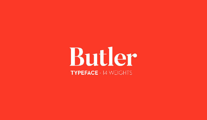
Butler
butlet-700x408 Fonts similar to Times New Roman: Alternatives to use

This font is a mixture of the dalafloda and the Bodoni font family. It is designed to bring a modern touch to the old serif fonts by adjusting the curves of the dalafloda and the Bodoni font family. It is also free to use by anyone, so that is a big bonus.

The butler font is suitable for many purposes – posters, big titles, books and as the body font. It has a great variety of characters at its disposal – 334 of them. These are some good reasons to consider butler as a replacement for the Times New Roman font.

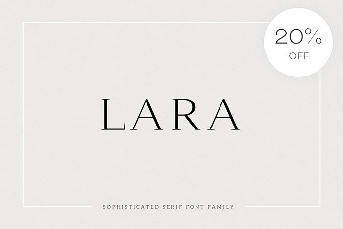
Lara – sophisticated serif typeface
lara-700x467 Fonts similar to Times New Roman: Alternatives to use

Lara is a classic typeface that is similar to Times New Roman. It includes all Latin characters and numbers as well. It is one of the best fonts similar to Times New Roman.

Palatino
palatino-700x255 Fonts similar to Times New Roman: Alternatives to use

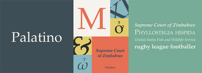
Palatino is a very interesting font. It is designed as a mixture of classical Italian renaissance typefaces and some more modern fonts. This works great, and it looks great. It is quite a wide typeface, so it enables comfortable reading.

Giveny – Classy Serif Font
giveny-700x467 Fonts similar to Times New Roman: Alternatives to use

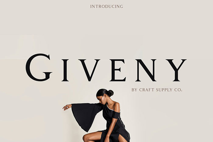
The giveny serif font is a classy font that is designed from the more transitional serif fonts. It has a businesslike nature with its square edges and rounded letters.

Giveny was made with the reader in mind. It is built with a structural logic and it combines geometry and optical balance. It makes it suitable for logos, various cards, branding means, posters and so on. Its versatility is what makes it a fine choice as an alternative to Times New Roman.

Minion Pro

minion-pro-700x125 Fonts similar to Times New Roman: Alternatives to use

Like some other fonts similar to Times New Romanon this list, the minion pro is inspired by classical typefaces of the Renaissance times, and it combines them with more functional and readable modern typefaces. This font makes the text easily readable. The minion pro is flexible and versatile due to its design.

It offers support for a wide range of Western languages, and also three weights and support of Greek and Cyrillic. It is ideal for books and packaging.

Antique – Luxury serif typeface
antique-700x467 Fonts similar to Times New Roman: Alternatives to use

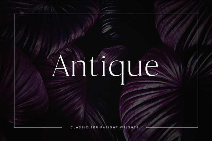
This font has an interesting personality. It is a classic typeface that is curved a bit, so it is a bit unique. The antique luxury serif typeface is a good choice as an alternative for Times New Roman.

Garamond Premier Pro
garamond-700x146 Fonts similar to Times New Roman: Alternatives to use

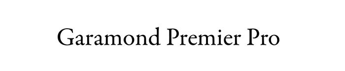
The Garamond font originates from the 16th century. It offers a perfect balance between practicality and visual beauty, which makes it stand out amongst the crowd.

It also contains plenty of characters from Central European languages and also Cyrillic and Greek.

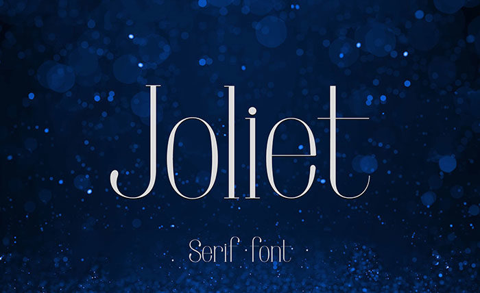
Joliet
joliet-700x428 Fonts similar to Times New Roman: Alternatives to use

This font is perfect to use in combination with sans-serif fonts. Can be used for headlines and logo design and it offers elegance and is easy to read.

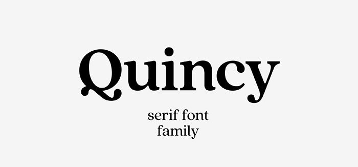
Quincy CF: vintage serif font family
quincy-700x326 Fonts similar to Times New Roman: Alternatives to use

Quincy serif font offers a vintage font that will do well as a replacement for the Times New Roman font. It has a similar style to it, with some human touches added. Those add some character and charm to it, and the whole outlook of this font is very smooth and readable.

Ending thoughts on fonts similar to Times New Roman

These are some of the best fonts similar to Times New Roman font that every designer should use. Some of the do present an investment, but those will be worth over time because the fonts on this list will be seen as classics in the long run.

If you enjoyed reading this article about fonts similar to Times New Roman, you should read these as well:

The post Fonts similar to Times New Roman: Alternatives to use appeared first on Design your way.


Source: https://ift.tt/2HGDzfR

7 Trending Cool Fonts for Your New Website

Monday, September 2, 2019

When visitors come to your website, they go through your text as it is the primary source of information. So while creating content, you should consider using innovative fonts that encourage people to stay and explore on your website. Fonts can also bring out the overall aesthetic value of your content. They make it easy for you to communicate with your users because certain fonts can decide the tone of the website.

Visitors can easily understand what your website or business is about by looking at your content if the fonts are used properly. Fonts also establish information hierarchy on the site, so visitors know what is essential and what can be skipped. Specific fonts attract users’ attention while making the information prominent. Here are seven trending, cool fonts that will make your website look attractive:

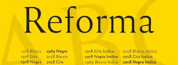
1. Reforma:

PampaType designed Reforma for Universidad Nacional de Córdoba in Argentina which a 400-year-old educational institution. Reforma consists of 3 subfamilies namely Reforma 2018 (a modern sans), Reforma 1918 (a classic Serif) and Reforma 1969 (an intermediate hybrid) that integrates the qualities of the other two.  All of these come in 3 weights along with matching italics. This is a straightforward font that works well with a wide range of bodies. If you want to use it for body text, you can pair Reforma with its serif counterpart. However, if you want something unique for your title, you could use it with another creative serif.

2. Gangster Grotesk:

Adrien Midzic designed Gangster Grotesk. It is a modern grotesque with angled strokes that are curved inwards. Because of this quirky design, the fonts bring significant attention to headlines and posters if used in large sizes. It is excellent for giving a creative twist to a professional website. Its condensed width and low contrast make it an excellent choice for body text as well as other small size texts. The typeface comes in 3 weights with stylistic alternatives. For using it in titles, you can use Gangster Grotesk with low x-height serifs such as FF Atma. On the other hand, if you want to use it for body or small-sized text, you can pair it with Le Murmure.

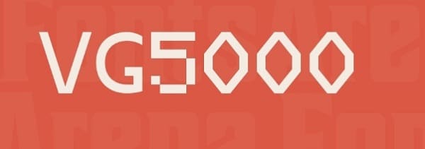
3. VG5000:

VG5000 is named after a computer that was created in 1984 by Philips. It is a mixture of old and new digital shapes. VG5000 combines pixelated line and curved strokes. It also comes with early pictograms and emojis from its original set, offering unique combinations. Furthermore, this typeface includes gender-inclusive characters such as “iel” for the French language. Because of the pixelated details in VG5000, you need to be careful while pairing it with other usual fonts. You can pair VG5000 with a monospaced font like League Mono. You can even pair it with a serif or sans version of input such as ETC Trispace.

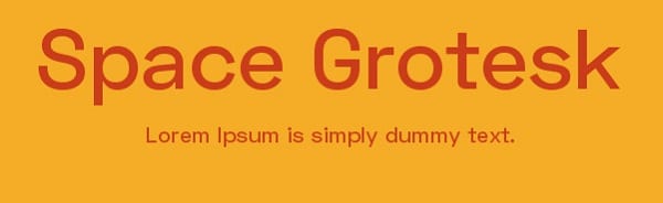
4. Space Grotesk:

Florian Karsten found Space Grotesk, a geometric sans serif. It is derived from Space Mono that is a monospaced typeface that was designed by Colophon Foundry in 2016 for Google Fonts. Space Grotesk is a well-spaced font that comes in 5 weights. Along with five weights, it also has five sets of alternate letters, namely Light, Regular, Medium, SemiBold, and Bold. The 3rd one is great to create distinctive headlines. Space Grotesk can be used for bold headlines as well as body text depending on how you pair it. The most obvious pairing of Space Grotesk would be with Space Mono as it is derived from this font. Apart from this font, you can also pair it with pointy serif with sharp details like Wremena or Fortescue.

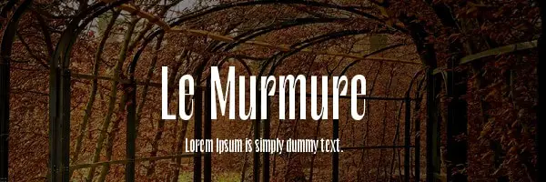
5. Le Murmure:

The Type Directors Club recently awarded Le Murmure a Certificate of Typographic Excellence. It was created by a French design agency called Murmure to renovate its brand image. It is a condensed sans serif with angled strokes at the terminal. It has an exciting mismatch between each character, making it distinctive for large sizes. You can use Le Murmure to display creativity and convey notions of experimentation as its height and singularity of shapes provide elegance. Le Murmure has a stylistic set that randomizes the alternatives. For titles, you can use Le Murmure with sans serif that has warm curves such as Standard CT or a font with more pronounced irregularities such as Dinoma’s Prophet.

6. Wremena:

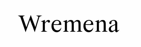
Roman Gornitsky designed Wremena. It was issued by Moscow based foundry Typefaces. It is a serif typeface that was developed based on a typeface called Vremena. The design was modified to add sharper angles and more pronounced triangular serif that are more visible in heavyweights. It is available in three styles, namely light, regular and bold with support for Cyrillic and Latin scripts. This font is very similar to Times New Roman, and so it can be used as a more contemporary alternative. You can use Wremena with Nowie Vremena as they both are sans serif. Also, it can be paired with Steinbeck that has intentional irregularities for titles.

7. Syne:

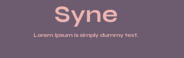
Syne was designed in 2017 by Bonjour Monde for the art center Synesthésie close to Paris, France. It has five distinctive styles, namely Syne Regular (a geometric sans), Syne Extra (wide and heavyweight), Syne Bold, Syne Mono, and Syne Italic. You can use Syne Extra for headlines as it is wide enough to catch visitor’s attention. Similarly, you can use Syne Regular for body text, making the text readable for the visitors. This typeface can be paired with various styles depending on the style you choose. However, make sure you balance the width and weight while pairing fonts.

All of these fonts are free, so they are perfect for a web developer with low or no budget. However, you should consider the distinctive styles for title and body in your content. Some fonts work well with others, but some create a bold statement alone. Hence you should pair fonts carefully to make the text stand out. An excellent tip to effectively match fonts is to look through the library of a typeface created by the same designer.

The post 7 Trending Cool Fonts for Your New Website appeared first on Line25.


Source: https://ift.tt/2NNEu1R

Design your way

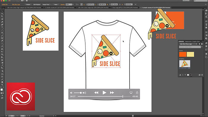
The Adobe Creative Suite has various software pieces with three of the largest software packages being InDesign, Illustrator, and Photoshop.

A good designer should know which one of the three is the best in what circumstances.

This article will be concentrating on the differences between Illustrator vs InDesign.

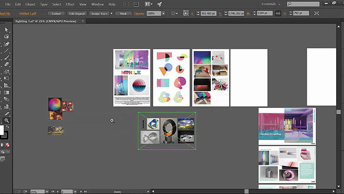
A frustration many creatives have is when the wrong piece of software was used to create a file and they need to decipher it. This could be using InDesign instead of Illustrator for a logo or a print layout that was created using Photoshop.

Adobe-InDesign-700x389 Illustrator vs InDesign: What's the difference and which is better

Professional designers and artists might be aware of the differences between Illustrator vs InDesign or Photoshop. Beginner designers or individuals that are not constantly using these apps might not be aware of which one to use in what circumstances. Every program has its strong points and has better tools for different applications.

illus-700x439 Illustrator vs InDesign: What's the difference and which is better

When you understand the dynamics of InDesign software and the purpose of Adobe Illustrator then you will be able to let the creative juices flow. In the Illustrator vs InDesign comparison, you will notice each has benefits and unique tools. Our comparison will make it easier for you to understand the dynamics of these apps.

Illustrator vs InDesign: Which one is better?

What is Adobe InDesign?

indesign-700x467 Illustrator vs InDesign: What's the difference and which is better

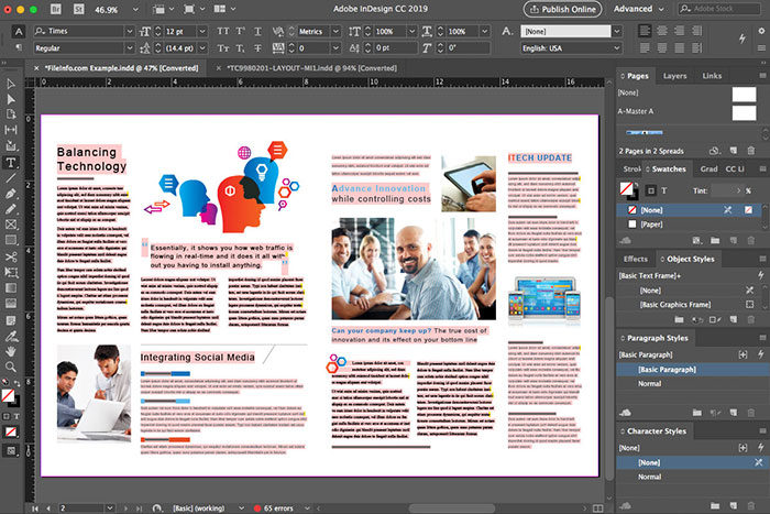
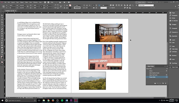
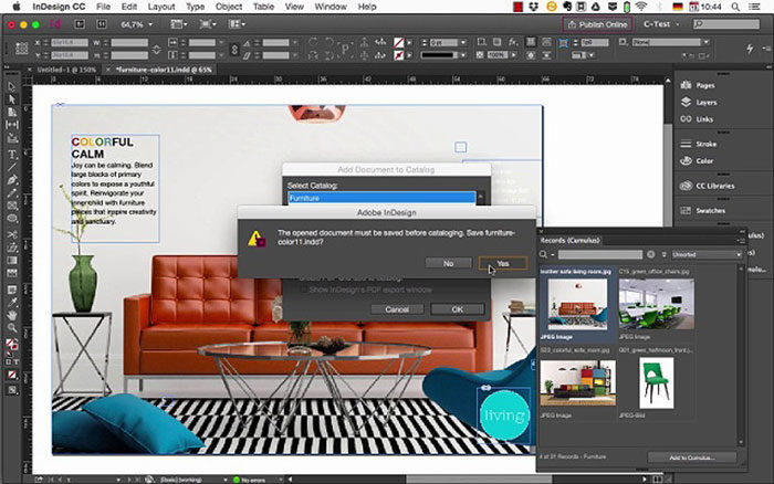
Adobe InDesign is a publishing software for desktops. It is a sophisticated design program that enables users to create multiple pages without the need to have separate files for every project. It is feature-rich including pre-flight tools that ensure your document is perfect for printing.

In addition, InDesign can also gather the required files with their packaging feature. This allows the user to have the files together. A top feature that InDesign has too is combining artwork from both Photoshop and Illustrator to create multiple layouts and page spreads.

InDesign is typically used for PDF presentation, multiple-page documents, and larger file types.

What is Adobe Illustrator?

illustrator-1-700x394 Illustrator vs InDesign: What's the difference and which is better

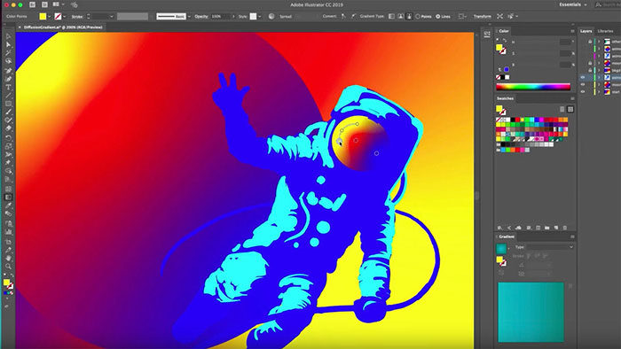
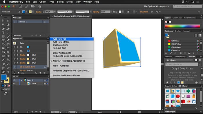
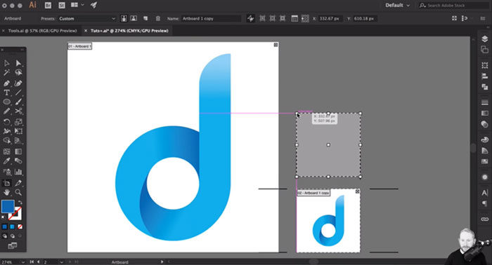
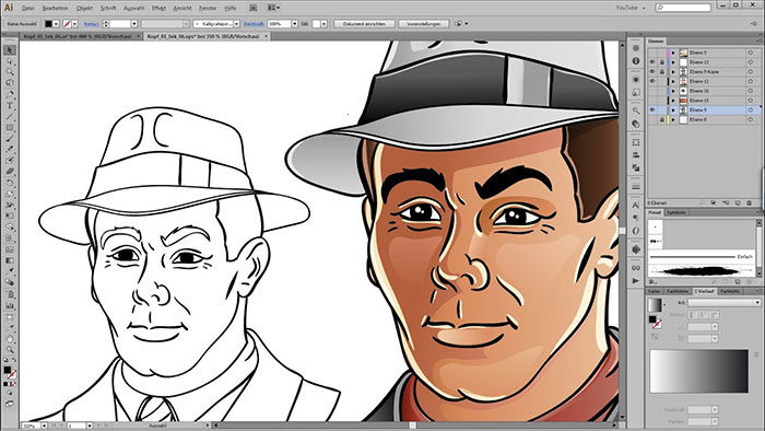
Most newcomers wonder “what is the difference between InDesign and Illustrator?” Illustrator is a vector artwork Illustration software. It works with simple layouts without the need for multiple color spaces and it is excellent for graphic images, managing and creating logos.

It has a great collection of tools that give the user excellent control over strokes and paths. It also uses perspective grids for more complex artwork. It allows a user full manipulation of links and text when working with external artwork. While it has top features in its own, it is not quite what it was designed for and should you avoid working on multiple page-layouts.

illustration4-700x394 Illustrator vs InDesign: What's the difference and which is better

Illustrator is a powerful software when you want to create adverts and flyers, but users should keep in mind that this software is designed to create single-page files. For every new file that you want to create, you would need to create new pages.

Considering this, it is known that Illustrator is not very consistent. When you use this program, you do not have a master page for example when you create a document that requires hundred of pages, like a magazine. It is a painstaking job when you need to create each page individually while keeping a uniform design.

When to use Adobe InDesign

adobe-design-700x401 Illustrator vs InDesign: What's the difference and which is better

The purpose of Adobe InDesign is laying out printed materials. It could include a wide spectrum of projects ranging from books, business cards, ads, newsletters, and brochures.

You can use it for any design project that contains a combination of artwork, photos, and text blocks  The purpose of Adobe InDesign is to take the elements created in Photoshop and Illustrator and put it in one place.

When to use Adobe Illustrator

illustrator1-700x394 Illustrator vs InDesign: What's the difference and which is better

It is important to compare InDesign vs illustrator and see that the name Illustrator which already tells you what it does. It creates and edits vector-based images like branding and logos, among others.

Logo creation and manipulation

logo-700x378 Illustrator vs InDesign: What's the difference and which is better

You can use Illustrator for logo creation, as these images are ready to suit all sizes and maintain its quality.

Illustrator has another valuable feature that blends well with logo manipulation and that is its typesetting features. This feature enables the software to shape text to an organization’s preference. Comparing Illustrator vs InDesign, InDesign is good in text-related projects, while not quite up to the level of Illustrator.

Single and multi-page projects

multiple-pages-700x394 Illustrator vs InDesign: What's the difference and which is better

Comparing Illustrator vs InDesign, you will see they both handle multi-page and single-page projects. Therefore, it is important to make the best decision and weigh the benefits of each. Illustrator has the upper hand when it comes to print projects and single-page documents.

When you use Illustrator, posters and business cards are excellently designed as it manipulates text size and image size. The visual features are perfectly handled with Illustrator. While you can create multi-page jobs with Illustrator, InDesign is the go-to software for multi-page jobs.

singelpage1-700x369 Illustrator vs InDesign: What's the difference and which is better

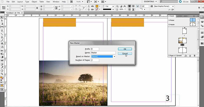
It is largely because it features a Master Page feature, which enables individuals to edit multiple pages without the need to do individual editing.

InDesign is thus your go-to software when you have more than one page and large jobs as your pages will be numbered automatically.

Beneficial Integrations

dam1-700x438 Illustrator vs InDesign: What's the difference and which is better

Another main aspect that you need to consider when choosing your software is to see how it syncs with other programs. As far as integrations are concerned, Adobe InDesign blends well and works perfectly with important systems. An important integration is that of Canto DAM with InDesign.

dam2-700x383 Illustrator vs InDesign: What's the difference and which is better

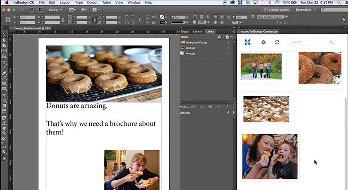
DAM is a comprehensive file storage program and features a centralized location where all assets are stored. It connects to InDesign and enables you to access images via InDesign’s media library. This is an important feature especially for businesses and industries that uses cloud storage and InDesign.

Comprehensive Drawing Features

drawing-700x394 Illustrator vs InDesign: What's the difference and which is better

You might have noticed now that Illustrator offers better drawing software, but it is still important that you understand the deeper differences when comparing Illustrator vs InDesign. You need to know where Illustrator lacks too.

Choose Illustrator when you want to create enhanced and creative designs. It incorporates various options that give you more than enough space to create crisp and clear designs.

indesign-drawing-700x394 Illustrator vs InDesign: What's the difference and which is better

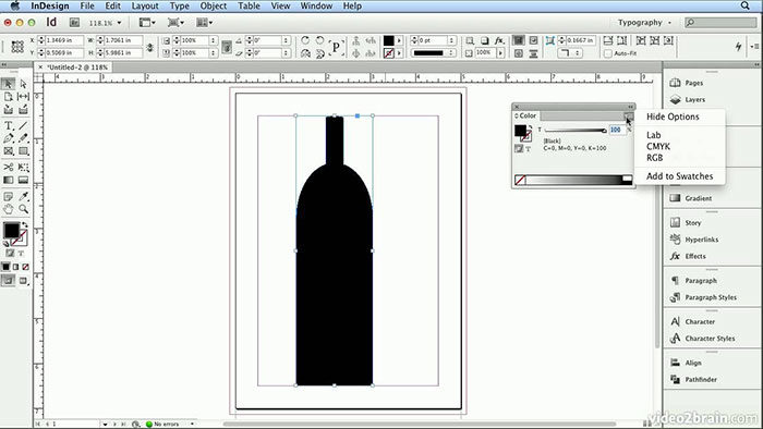
InDesign, on the other hand, has drawing options like a pencil tool as well as lines and shapes drawings. When you create a drawing in Illustrator, you will be able to import it to InDesign. This is a great feature as it allows for multiple page projects to be completed in InDesign instead.

Ending thoughts on Illustrator vs InDesign

Professional designers know and understand the differences between Photoshop vs InDesign vs Illustrator and use all three to their full advantage. When you only want to design a small pamphlet, use Illustrator as it has loads of tools and art brushes. When you have a project with multiple pages, you need to use InDesign.

  • InDesign creates multiple pages, Illustrator can only make one page per file.
  • Illustrator does graphics editing, InDesign has numerous editing tools, except for vector graphics.
  • Illustrator creates single-page projects like posters and flyers. InDesign collect multiple pages in a single file and create great brochures, newsletters, and multi-tiered publications.

If you enjoyed reading this article about Illustrator vs InDesign, you should read these as well:

The post Illustrator vs InDesign: What’s the difference and which is better appeared first on Design your way.


Source: https://ift.tt/2Lfwrcx

Design your way

Sunday, September 1, 2019

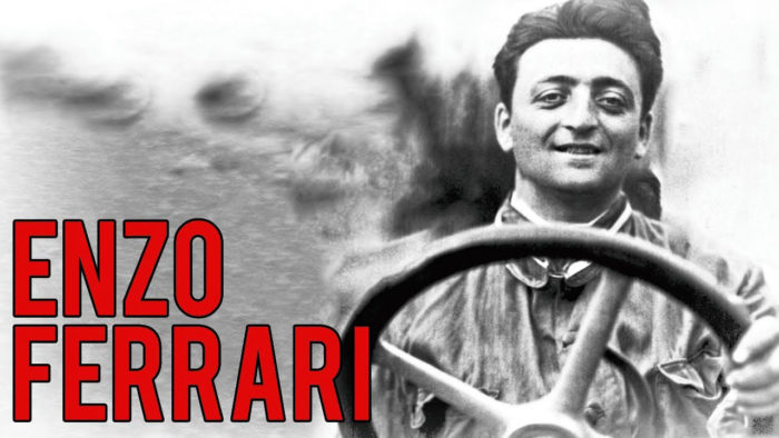
Enzo Ferrari, the founder of Ferrari was a race car driver during the 20th century. For many years he drove for various companies but in 1929 he created a racing team called Scuderia Ferrari. He pushed himself further with the design of the machine and created the Auto Construzioni S.P.A.

This same company was to become the modern-day Ferrari brand. The original Ferrari factory was established in Maranello and also the headquarters. The first Ferrari was built in 1940 with the first Ferrari Logo appeared on Enzo’s cars in 1947.

enzo-700x394 The Ferrari logo and the history behind its design

Ferrari under the ownership of Fiat motor group continued and grew even stronger even though its founder passed away. Even today decades after the death of Enzo Ferrari, it remains one of the world’s most successful car. Ferrari split from the former parent company, Fiat Chrysler at the beginning of 2016.

Ferrari: the world’s most powerful brand

ferrari-700x383 The Ferrari logo and the history behind its design

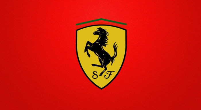
The simple prancing horse logo is certainly one of the world’s most iconic and recognizable logos. The black horse logo is the trademark symbol of one of the best cars in the world, the magnificent Ferrari.

These vehicles are the embodiment of power, style, class, and luxury. Every element behind the Ferraro logo has a meaning ad significance to the empire’s founders. During the time when the founder of Ferrari met the people behind the Ferrari logo and the prancing horse, Enzo Ferrari just won a race at the Savio track in Ravenna.

Ferrari’s Contribution to Motor Sports

ferrari-sports-700x350 The Ferrari logo and the history behind its design

Throughout history Ferrari has played an important part and contributed largely in racing and motorsports. The most successful racing team in the history of Formula One which holds the most wins and the highest number of winning drivers is Ferrari.

The Ferrari emblem has been part of 16 world championships and produced fifteen winning drivers. That is no wonder that everybody connects wealth, luxury, and speed with Ferrari.

The Popularity of Ferrari

instagram-700x516 The Ferrari logo and the history behind its design

Ferrari grew in strength throughout the decades even though the factory in Maranello was destroyed during World War II bombings. It certainly had its fair share of setbacks but that didn’t deter the team and Enzo.

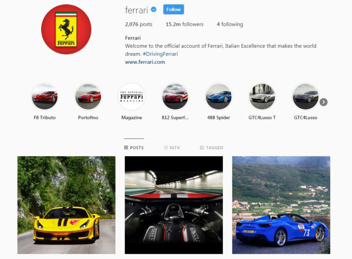
It has since been reinstated and renovated and remains the Ferraro headquarters. Ferrari is a global brand and recognized throughout the world. They have a strong social media profile and thousands of Ferrari-only pages for fans. the Instagram profile of Ferrari has more than 4.4 million followers.

Ferrari continuous to participate in the racing world. It is hugely popular in Formula One with fifteen winning drivers and having won 16 championships.

The story of the prancing horse

prancing-horse-700x500 The Ferrari logo and the history behind its design

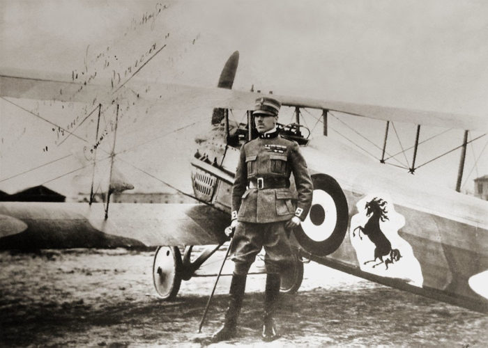
Enzo Ferrari met an airman’s father who fought in the first world war in 1923. The father was Enrico Baracca and his mother were countess Paulina Baracca. They told Enzo that if he wants good luck, he should put the prancing black horse that was painted on the son’s airplane on his cars. At that time, and today still the prancing horse was black. The yellow of the Ferrari logo comes from Enzo Ferrari’s birthplace, which is the color of Modena.

The Ferrari logo

ferrari-logo-1-700x257 The Ferrari logo and the history behind its design

During the First World War, the European skies saw a specific logo featuring a prancing horse. This prancing horse was on the fighter plane of count Francesco Baracca. It was a dark stallion that struck fear into the hearts of the enemy on the ground. This same black horse logo was the grim reaper to the enemy; however, it was part of the family crest of the Baracca’s.

Today and throughout history, the prancing horse and Ferrari emblem remained one of the most recognized logos which became the magnificent Ferrari trademark symbol. These vehicles are the embodiment of power, style, class, wealth, and elegance.

The Ferrari logo itself might have an appearance of the utmost simplicity, however, the history behind it and where it originates from is a story worth repeating. Each one of the elements of the Ferrari logo has a meaning and significance for the empire’s founders.

The Ferrari Logo Description

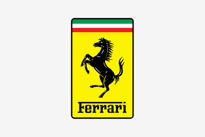
The Ferrari racing team and the car are immensely famous with its yellow army of coats and black prancing horse. It has an S F inscription that stands for Scuderia Ferrari with its stripes of red white and green at the top of the Ferrari horse. At the center of the Ferrari, the badge is the Ferrari title. It has an effective and stylish font that highlights the manufacturer’s brand features.

The shape of the Ferrari Symbol

pracinghorse1-700x467 The Ferrari logo and the history behind its design

If you refer to the Ferrari symbol it is that of a prancing horse in a square. It is a horse that brought the company great flourish. The Ferrari prancing horse meant something different to the Baracca family though.

The most notable difference of the current Ferraro logo and the Baracca horse is that previously the horse’s tail was downward, while the Ferrari horse’s tail is upward. The first time that the world saw the Ferrari horse logo, was on the Alfa Romeo 125S which was a rectangular shape.

A representation of admiration and bravery

ferrari-logo-700x394 The Ferrari logo and the history behind its design

The canary yellow that Ferraro added as background for the black horse, was meant to symbolize his home country, Modena. The letters S F were also added which represents Scuderia Ferrari. the entire symbol of Ferrari has great significance as the person after which the logo was designed, was Francesco Baracca who died at a young age.

This young count led various battles for the Italian air force with his airplane which also carried the prancing horse. His plane was shot down by the enemy in World War 1 after 34 missions. He had a great reputation as a hero and a brave pilot.

Color of the Ferrari Logo

ferrari1-700x394 The Ferrari logo and the history behind its design

The prancing horse on the airplane of Francesco Baracca was red on a white background with the background shaped like a cloud. Ferrari, however, decided to have a black horse instead of red. After Baracca’s early demise, black was more fitting as a form of grief.

Enzo also decided instead of the white cloud to use yellow for his birthplace. The crown of the Ferrari logo is stripes of red, green, and white which symbolizes the national colors of Italy.

Logo Appearance and font

sports-car-700x394 The Ferrari logo and the history behind its design

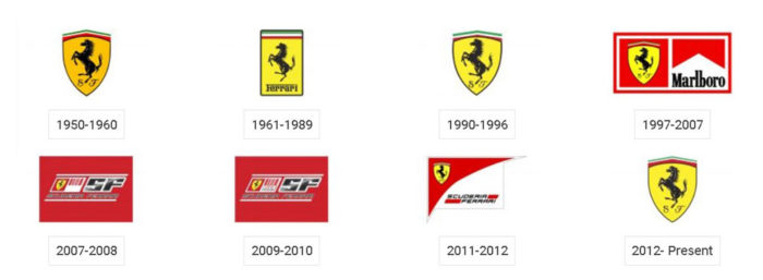
Pierluigi Cerri consolidated the visual identity of Ferrari with an official handbook for fans in 1994. The Seidlcluss agency completed the restyling and touched up the eye of the stallion as well as the position of the stallion’s legs. The logo letterings were changed to place a rectangular dot on the I of Ferrari.

The family name was designed with the font of serif more spaced out and used to restyle the logotype. In previous designs, the hoof of the horse touched the upper part of the F.

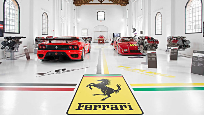
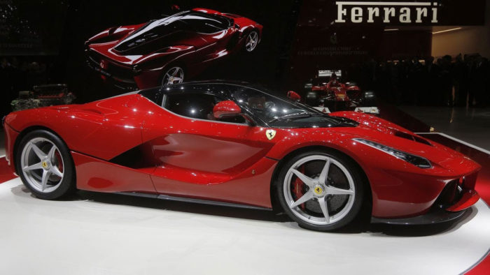
When you look at the car Ferrari and the logo, you are reminded that this is a car that represents fantastic sports cars with tremendous speed.

If you enjoyed reading this article about the Ferrari logo, you should read these as well:

The post The Ferrari logo and the history behind its design appeared first on Design your way.


Source: https://ift.tt/2LcW6mm
 

The Cash Box Blueprint

Most Reading