Design your way

Wednesday, June 29, 2022

Right now, blogging is one of the most lucrative online business models.

Not only that, but it’s a great way to make money almost on autopilot.

But, how do you go about it if you’re a beginner?

How do you overcome the hurdles and make your way to the top?

In this guide, I’ll tell you how to start a blog and make money the right way.

Let’s get started.

How to Start a Blog and Make Money?

Pick a Niche

There are two things you need to consider while choosing your blogging niche:

  • Your interests
  • Profitability or potential

If you’re going to write yourself, you need to pick a topic that excites you.

Otherwise, you’ll lose interest over time, and probably end up leaving it mid-way.

However, if you’re going to outsource your blog posts, your interest won’t matter much.

But, even then, it’s a good idea to have at least the basic knowledge of the niche you’re going to work on.

Here’s what you need to look for while hunting a profitable blogging niche.

Go for a Small Niche

Keep in mind that your new blog won’t stand a chance against the established, authority blogs in the industry.

For instance, you can’t expect to outrank WebMD for health-related topics.

The right way would be to go for a smaller section of that niche, say the keto diet.

That way, there would be fewer competitors to compete with, allowing you to rank for your target terms quickly and easily.

Check its Monetization Potential

Before finalizing a niche, make sure it has enough products you can promote as an affiliate.

Also, check to see if it can be monetized using ad networks like Google AdSense.

Other monetization strategies are:

  • Online courses
  • Photography
  • Print on demand
  • And more

Find Enough Keywords

Keyword research and niche selection go hand-in-hand.

If a niche doesn’t have enough keywords, working on it would be a waste of time and energy.

Here are the top tools you can use to find highly profitable, low-competition keywords in your niche:

  • Google Keyword Planner (Free)
  • Ahrefs (Paid)

You can also use Google autosuggest, people also ask box, and the related searches section to gather a list of keywords.

Get Your Blog Online

The best thing about starting a blog is that it requires very little investment.

To get your blog up and  running, you only need to invest in a:

  • Domain name (around $10 per year)
  • Web host (around $20 per year)

Register Your Domain Name

Once you finalize your blogging niche, it’s time to hunt for a suitable domain name.

Here are a few tips:

  • Shorter is generally better
  • Go for .com (More credible)
  • Partial match domains are relatively easier to rank for and are generally more scalable. A particle match domain has your main keyword/niche plus a generic word/phrase. For instance, (gamingxyz.com)

Host Your Blog

The next step is to find an excellent hosting service and get your blog online.

A host is where all your website’s files are stored and managed.

A couple of reliable and cost-effective hosting services are:

  • Bluehost
  • Namecheap

The customer support of both hosting companies is great, so you can always get their help should anything come up.

Configure WordPress

WordPress is the most popular CMS currently hosting over 455 million websites around the globe.

Once you log into your hosting provider’s dashboard, install the WordPress CMS on your site.

Next, you can configure WordPress and install your theme and a few important plugins.

Install the Right Theme and Plugins

Your WordPress theme decides your blog’s look, navigation, and to some extent, its SEO.

If you don’t have the budget to buy a theme, you can get started with a free one like GeneratePress or Kadence.

GeneratePress has been around for a while, so you’d find a bigger online community around it.

As for the plugins, less is better.

More plugins mean you’re adding extra code to your website, which can slow it down.

You don’t want that, especially because site loading speed is now an official Google ranking factor.

Here is a list of essential WordPress plugins you want to stick to:

  • Yoast SEO (For on-page & technical SEO)
  • W3 Total Cache
  • Schema – All in One Schema
  • UpdraftPlus (For backup)
  • Sucuri (For security)
  • Smush (for image optimization)

Create SEO-friendly Blog Posts

Now, to make money with your blog, you need to publish Google-friendly content.

Here’s how you can create the type of content that can drive enough traffic.

Use Keywords Smartly

You should include your target keyword in the title (H1 heading), and a few times within your content.

But, don’t stuff your blog posts with keywords.

Google’s algorithm is now smart enough to catch and penalize such black-hat SEO practices.

Use Headings

Keep in mind that many of your visitors just want to scan your post.

They won’t read every sentence on it.

Headings make your blog posts easier to skim and scan.

Use Simple Language

The goal of a blog post is to educate and eventually persuade a target audience.

You can’t do that with fancy and difficult-to-understand words.

So, always use simple language to make sure all your readers get your message.

Improve Your CTR (Click-through rate)

Ranking blog posts on the first page of Google is awesome, but you need to get people to click on them, too.

Using your target keyword upfront can help you do that.

Plus, your blog post’s meta description tells users what your web page is all about.

It’s a perfect opportunity to get more people to click on your link.

Promote Your Blog

As soon as you start posting content on your blog, spread the word on social media and online forums.

Create social media profiles or pages of your blog and start sharing your posts.

Don’t worry about followers; they’ll come with time.

Build Backlinks

A backlink is when a website owner links to one of your web pages.

It’s like a vote of confidence that your content is worth sharing.

That’s why backlinks from high-authority sites can work wonders for your organic rankings.

However, it can also be a little overwhelming.

Keep in mind that results don’t typically come quickly in blogging.

As your blog’s authority and traffic grow, people will notice you.

You can then approach fellow bloggers, build professional relationships, and get high-quality, relevant backlinks.

Some tried and true link-building strategies are:

  • HARO (help a reporter out)
  • Guest posting
  • Broken link building
  • Niche edits
  • Forum backlinks

Build an Email List

You don’t have to rely on organic search engine traffic to make money with your blog.

Email marketing can also be a source of high-quality traffic.

But first, you need to build an email list, which can take time.

The good thing is your email list is an asset you can leverage any time you want.

For instance, let’s say you have a limited-time offer you want to communicate with your audience.

You could just send an email to your list and generate quick results, without having to wait for search engine rankings.

Here are a few effective list-building strategies you might find helpful:

  • Facebook ads landing page
  • Opt-in form on blog posts
  • A freebie for the email address
  • Gated content
  • Social media

Wrapping Up

There’s no limit to how much you can earn as a blogger. But, your decisions during every stage of your blogging journey will determine your success.

For instance, it’s crucial that you pick the right niche.

Decisions like using black-hat SEO tactics just because they temporarily work can get your blog penalized for good.

Plus, know that SEO takes time to work, but if you remain patient, it can make you rich.

The post How to Start a Blog and Make Money? appeared first on Design your way.


Source: https://ift.tt/V5GQNs9

Design your way

Monday, June 27, 2022

Typography is everywhere we look. Just look around; you will find different text written in different fonts with different shapes, sizes, and dimensions.

But what exactly is Typography?

Simply put, Typography is the style of a text. There are different styles that can be used to create text and give its appearance. You can even say it is an art – The art of creating a different appearance from the same text.

Yes, it is something that we do all the time subconsciously, like working on a project, school work, and other activities that require you to write texts.

Fonts That Give Life To Your Graphic Design

Graphic designers need to use fonts for the design layout. In fact, fonts play an important role in the overall design of the website.

Each font has its own feelings and attributes. The font choice will depend on what we are looking for in our design and how you want its aesthetic to feel.

If you need long texts, you will look for good readability. However, if you need text for the title and small pieces, you need a font for aesthetics.

Nowadays, there are a variety of options available. You can go with different fonts to achieve different visual appeal. With a plethora of options available, it becomes hard to choose one font for your design.

That is why we have made a section of top fonts used by professionals for graphic design.

1. Futura

The Futura font is inspired by different shapes like circles, squares, or triangles. Furthermore, it follows the Bauhaus ideology. This iconic belief has made Futura one of the favorite fonts for designers.

Most experts believe that Futura is the most versatile font out there to work with, as it makes your design layout look modern and contemporary.

Futura font is one of the most versatile fonts because of its different fonts and weights that help Futura adapt to any kind of design project.

2. Didot

Firmin Didot in Paris is considered the fathers of the Modern and Neoclassical classification of fonts. Didot font has a higher stroke contrast with vertical stress and flat serifs.

These attributes make Didot’s font perfect for titles or big headers. However, it is unsuitable for body copy due to the high contrast level.

The Didot font is perfect if you want to make your graphic design layout look elegant. In fact you make use of neon font to add presence to it.

3. Gotham

The Gotham font is made up of geometric shapes and curves. It is made up of a combination of different shapes and curves. It is a bold typeface design that establishes its strong presence making it suitable for headers and titles.

If you are creating a design that will be printed, Gotham font works really well in Prints and digital surfaces.

4. Univers

Univers fonts are based onAkzidenz-Grotesk fonts. The fact that Univers fonts lack superfluous features is what makes this font versatile.

After using this font, we have concluded that this font offers distinctiveness and adaptability to any kind of graphic design project.

The best part of this font is that It’s a clean, functional, and very legible font. No matter what design you are working on, Univers really can be used in different design layouts and graphic design projects.

5. Rockwell

Rockwell is a Geometric Slab Serif font that is constricted by straight lines, perfect circles, and sharp angles. The calculative strokes give this font and strong presence in your graphic design.

The strokes are powerful and make the text look heavy. This is why Rockwell fonts are mostly used for titles, typewriting, and taglines.

Conclusion

We hope this discussion may have helped you understand the top fonts used by professionals to create their masterpieces. You must know that fonts play an important role in giving an identity to your brand.

Therefore, you must contemplate carefully which font needs to be used to convey your brand message. By finding the right blend and the type, the brand can communicate the story and engage with its audiences.

The post Top 5 Fonts Used By Professionals In Graphic Design appeared first on Design your way.


Source: https://ift.tt/9Zps6BX

Design your way

Friday, June 24, 2022

A visual artist uses the principles of art and its elements for creative work. These visual design elements also help us understand and value the art. So how can define the principles of design art? It can be said that they are criteria’s that explain how different visual elements are arranged and their impact on the overall art both to the artist and for the viewer’s eye.

Artists will always use these elements differently, which is a key factor that differentiates each work. They can also change with time. For example, iconic contemporary artists and the greats of yesteryears like Vincent van Gogh and Picasso have often used these tools or principles in different ways but still with amazing results.

Different design events are held throughout the world that can raise your LEVEL of understanding so you can appreciate art better. Understanding the principles is a critical first step in this journey. Understanding the elements of art and principles of design will also give you insights into the works and lives of the greatest creators.

The Basic Principles of Design

Rhythm, pattern, unity, variety, design, balance, contrast, focal point, proportion, and scale are some of the most important art design elements. Let’s take a closer look at them.

Emphasis

Also called ‘hierarchy’ or ‘dominance’, this refers to an element in the work where the artist wants the viewer to focus on. As a result, it is the element where our eyes tend to first reach. Ask yourself – What is the key part of the picture? If there is more than one, then usually, there will be a hierarchy of importance. An artist will often achieve this through contrast. Color, proportions, and space are also used to achieve the desired result.

Balance

Principles of balance refer to the arrangement of subjects in the scene and also how everything is distributed. Sometimes, this is referred to as ‘visual weighting’. Often, the weight within the work is balanced, which goes together with space. Balance is used for creating good compositions.

However, it is important to remember that there can be different types of balance, such as –

  • Symmetrical balance – Here, both the sides have the same elements, making it look like a mirror image.
  • Asymmetrical balance – An element’s contrast makes the composition balanced here.
  • Radical symmetry – In this art work, there will be a central point and the elements will be spaced equally from this.

Alignment

Alignment means how various design elements or items are arranged in relation to the edges of borders. It can mean the lining of the text and graphics relating to the various edges in the canvas.

Each design element can have its own weight, which can vary depending on the size, color value, or texture.

Proportion

This is also one of the key art design elements. Proportion refers to the weight and size of the objects and how they relate to each other. They also show perspective and depth. Proportions are very important because they make the illustrations believable and realistic. But not always for the cartoonists! They will often add extra style elements in their artwork. The crazier the proportion, the less realistic it will become, but this is what makes the work attractive.

Contrast

ar2 10 Principles of Art in Design

Contrast plays an important role in elements composition. It creates a focal point and variety by using opposite elements. It could be through the use of texture, shape, color, or other things.

There is always low contrast and high contrast.

  • High contrast – When the subjects are nearly or completely opposite like green and red colors or a rough and smooth texture.
  • Low contrast – When the subjects are similar like oval and circle shapes or two shades of blue that are slightly different.

Movement and Rhythm

This relates to how you see the work. Skilled artists will create sections in such a way that will determine how the eye of the viewer will travel. Artists will create action lines for emphasizing movement in their figures. Rivers and roads can also portray the image of rhythm and movement. You will find many design examples where this has been done really well.

Repetition

This means repeating the same elements within the piece. This provides cohesiveness to the whole illustration. Artists like Keith Haring and MC Escher have used repetition very effectively in their art works. You will see them reusing the same elements again and again. Repetition will often create patterns, like, for example, a tiled bathroom or a striped wall.

Brands too use repetitions in their assets and merchandise to establish themselves. The repeated use establishes the company name, logo, brand color in the eye of the consumers.

White Space

inter 10 Principles of Art in Design

Also called ‘negative space’, this is a design area where there are no elements present, which means, it is an empty space. Beginner artists will often try to fill the canvas completely, without realizing the importance of white space within the work. The white space is very important because it allows the design to breathe, without crowding the canvas too much.

The presence of too many elements may distract the eye. The viewer can get confused if there are too many focal points.

Pattern

Patterns refer to repeating the art elements or their combination in a uniform way. You can turn anything into a pattern by repeating. Grids, weaves, and spirals are all classic patterns.

Unity/Variety

This too contributes to make the piece look interesting. This works by juxtaposing the subject matter, which means placing different objects together and creating a contrasting effect. For example, you can draw a bright blue sky next to a rain cloud. Variety will often work with different elements to create visual interest.

How to Use the Principles of Art in Design

Artists use different elements to greatly influence their work. You will see many examples that reveal its effectiveness. Follow the basic principles and you will be able to create composition that will always work. But sometimes it is good to break the rules. This is how new ideas are born.

The post 10 Principles of Art in Design appeared first on Design your way.


Source: https://ift.tt/JMWZ7A4

Design your way

How to choose a quality link-building provider? How to find a specialist who will not publish toxic links that harm the site? To do this, you need to check 10 things that the best link building services must guarantee.

Are Sites Indexed by Google?

One of the main signs that something is wrong with the website of the provider is its absence in the search engine index. As a rule, this indicates that the platform was penalized by search engines. In turn, links from such a resource will be unsafe for your company.

Is There Contact Information on the Website?

You don’t have to know where the webmaster or blogger lives. However, what about those situations when it is impossible to find even a contact email? As a rule, this indicates a low-quality PBN from which they are going to sell links to you.

Content Quality

Of course, the website must not have amazing content. At the same time, articles of 300-500 characters with obvious grammatical errors, lack of formatting, or machine rewriting indicate the low quality of the content and, as a result, the low quality of the website as a whole.

Does the Website Have Content on Instant Loans, Farming, Gambling, etc.?

If there is such content on the site, and its share is 50% or more, we do not recommend using it to get links.

What Does Traffic Look Like?

The best option is a gradually growing traffic schedule or stable performance for a long time. PRposting — link building platform — demonstrates this value. Sudden jumps, growth, or decline in traffic may indicate that transitions to the website are carried out from unreliable sources.

Are Links from the Website Openly Sold?

Some websites openly sell links, and webmasters do not care about the quality of the acceptor and easily accept high-risk websites. Wouldn’t you like to have links to unreliable sites next to you?

Has the Website Been Attacked?

The website may have injections with search phrases in the site code, which leads to the appearance of the resource in irrelevant search results.

Is the Website Unique or Content Is Duplicate?

If the site is a clone of another, or the content on it is copied, there is a high probability that this website will soon get penalized by search engines. And in this case, links from such a resource will also not be useful for the platform for which you are building a link profile.

Do Users Interact with the Website through Social Media?

We are not talking about a million-strong audience on Facebook or Instagram, but having social networks and live communication on them guarantees improved click-through rates for your link.

Is Your Link Suitable?

Last but not least is the relevance of the link to the content of the site. At the same time, when analyzing the link mass, Google takes into account the clickability of the link and its popularity among users – the higher these indicators, the better for the donor.

This is a basic list of questions you should ask yourself and your link-building provider before buying links from them.

The post How to Find The Best Link-Building Services appeared first on Design your way.


Source: https://ift.tt/E8PMAUr

Design your way

We all have a device of some form in our households. Technology has become so advanced that we can pack incredibly powerful systems into small packages. Between laptops, smartphones, and tablets, there’s likely to be at least one device in every household.

However, amongst all the advancements in technology and the progress that has been made in technology, cybercrime has also flourished. It’s something that not many people pay attention to, after all, how much damage can someone do with your smartphone right?

The answer is that they can do a ton of damage, and if you simply believe that it will never happen to you, then you are putting yourself even more at risk. Unfortunately, cybercrime is dangerous, but what’s truly holding us back is the fact that we think that cybersecurity is a complex subject — that we need to be IT experts to understand. Luckily that’s not the case, we’re going to show you the basic cybersecurity tools you need to have down below!

Why is Cybersecurity so Important in 2022?

Cybersecurity is more important now than ever before. According to the latest studies, there has been a drastic rise in the frequency and the success of cyberattacks in recent years — more specifically in the past two years. Two main factors have contributed to this sudden spike in cyberattacks.

The first reason why cybercrime has become more popular in recent years is that more and more people have access to devices. Whether it’s a laptop for school, a smartphone to keep in touch with friends and family, or a tablet to work from anywhere, having a device of some form is crucial in this day and age.

Let’s take a look at smartphone numbers. It’s a small pocket-sized device that can do just about anything you need it to, and some are even more powerful than lower-end laptops, which makes it a good baseline to look into. It’s estimated that there are more than 6.648 billion smartphones in use worldwide — in other words, 83.72% of the world’s population. That number is estimated to increase by one billion units year on year until 2025.

The second reason why there has been an increase in cyberattacks is because of the lockdown caused by the Covid-19 pandemic. As the majority of the world’s population was unable to leave their homes, they had to find ways to keep themselves entertained while staying inside the house. Many office jobs became remote jobs as people took virtual meetings and started working from home. More people were keeping in contact with their close friends and family too as they wanted to be sure that they were still safe and healthy.

The link between these two causes is that there is an increase in screen time. With more people spending time on their devices, more opportunities were created for cybercriminals to move in and breach the relatively low security that people had on their devices. This made it much easier for cybercriminals to take advantage of people — especially those who are new to owning a device and are unaware of the dangers they face online.

Luckily though, protecting yourself online is not as difficult as you might think it is. You might feel overwhelmed by the choices that you have in cybersecurity tools, but we’re here to simplify and streamline that process for you by explaining what each one is and why you need it.

One of the most important cybersecurity tools you can invest in is premium antivirus software. This is an important tool to use because it will constantly scan your devices for any viruses or other forms of malware. If any malware has been detected on your device, the antivirus software can take action to remove it. You can find antivirus software for any device, including your smartphones and tablets.

A virtual private network — perhaps better known as a VPN —  is a handy tool to have if you’re travelling. A VPN will create a secure connection that will mask what you’re doing on your device as well as your physical location. This is done by connecting you to a secure server in another country. Using a VPN will protect you from cyberattacks that are common when using unsecured networks (public WiFi hotspots at hotels, airports, and restaurants), and it will give you the ability to bypass geo-blocking or internet censorship.

One thing that compromises many people’s security is weak passwords — using information that relates to you such as your name or date of birth. This gives the hacker an easy way to break into your account if they find the correct information. Many people also use the same passwords for multiple accounts — if you fall victim to a phishing scam that steals your passwords, all of your accounts will be at risk. The solution is a premium password manager that is secured with a randomly generated master key. This will act as a virtual vault for all of your passwords, and only you have access to it.

What to Keep in Mind With Cybersecurity

There are some important things to keep in mind when it comes to cybersecurity. These are elements that are often overlooked, but they could put you at risk if you don’t pay attention to them.

The first is to ensure that you always use premium cybersecurity tools rather than free ones. Free cybersecurity tools often have a lot of drawbacks that can put your devices even more at risk. For example, free VPNs slow down your internet connection, bombard you with ads, give you daily data limits, and even offer fewer global servers to choose from.

You also need to ensure that your software is always up to date. Whether it’s your device’s operating system or the antivirus software, these updates are sent out and they are usually very important. Software updates are often used to fix flaws that have been picked up in the software, and sometimes they can be used to add extra security features to help against new strategies used by cybercriminals.

The post Your Crash Course on Cybersecurity appeared first on Design your way.


Source: https://ift.tt/kPQsl9J

Design your way

Once considered as an interesting benefit offered only by certain organisations, having dedicated remote teams has become more common. According to a recent report, remote work has grown by 44 percent in the last five years, even if the effect of the pandemic is taken out.

Heading into 2022, knowing how remote work will feel as the new normal will be interesting. With hiring challenges continuing in 2022, a dedicated remote team is going to be great for businesses. But, leading a remote team can seem daunting. You may have faced the challenge of managing remote teams and have likely discovered that new approaches need to be cultivated to ensure success.

The culture of a remote-first business revolves around transparency, communication, and trust. With trust comes community building, which is key for maintaining good relations. Having a good relationship with your remote team is essential for engagement and productivity. Here, we will guide you through six practises that can help ensure that your dedicated remote teams stay productive.

Track Time and Employee Activity to Boost Productivity

One thing you can count on from your dedicated offshore team is increased productivity. Productivity is a key variable, and you’ll need a way to measure it if you want to improve it. Especially in current times, monitoring and maximising productivity is more essential than ever.

Thanks to technology, there are many ways you can do it. Time tracking tools are great for knowing how much time it takes to accomplish tasks. Also, by using tools like a remote desk, you will be able to monitor your remote team’s digital activities.

Establish Ground Rules for Communication

One of the biggest challenges during the current remote working setup is communication. If unchecked, this can result in a disengaged remote team. Communication in remote teams can’t happen as easily as in a conventional office setting. Using the right tools for internal communication is paramount to team efficiency.

Business leaders need to identify the best communication technologies to invest in. The dedicated remote team must be aware of the most appropriate channels for different forms of business communication. The only way of overcoming this barrier would be to encourage employee questions, maintain open lines of communication, and deploy best communication practises.

Hold Frequent Check-ins and One-on-ones With Your Team

Given the current scenario, you must have an effective employee check-in strategy in place. Frequent performance check-ins are one-on-one conversations between managers and remote teams about their objectives and their performance strategies.

Effective organisations use check-ins to gain insight into how their remote teams work, what works for them and what needs to be revised. Check-ins require you to acknowledge the issues addressed and act on them immediately.

Encourage Social Interaction to Boost Team Chemistry

Humans are social beings that depend on communication and collaboration to thrive. While working remotely, many miss out on significant team-building opportunities. But, there are ways to promote team-building activities and help remote teams engage better.

To help the dedicated remote team develop healthy relationships at work and stay motivated, it’s crucial to encourage them to communicate with each other and promote team-building initiatives. You can create virtual break rooms for taking virtual coffee breaks with the team and host fun and interactive events in them.

Video conferencing facilitates both real-time collaboration and fun. When used correctly, it can be an antidote for disconnected remote teams.

Listen to Your Employees and Support Them

Employees always wish to be heard, and hearing what they have in mind will help the business progress and innovate. Businesses should be proactive in seeking out opinions, and look for ways to include remote teams in the idea process and bring them into implementation.

Choosing effective digital tools in the new remote world is vital for delivering this. This needs a deep understanding of remote teams through communication platforms and survey software to gather and analyse feedback.

Build Trust and Avoid Micromanaging

Building and maintaining trust in conventional workplaces is not easy. It is even more challenging in the case of remote teams. Here, organisations need to be deliberate about how they build and maintain relationships to nurture trust.

Remote teams cannot have organic conversations. So, employers have to be intentional about developing interactions to help people build trust. The time remote teams spend on social channels should not be considered a waste because it assists them to get to know each other.

The fear that remote teams will not be productive without one looking over their shoulder makes the manager tend to micromanage the team, and employees tend to overwork to prove they are effective. So, the answer to both these issues is developing a culture of trust.

The post How To Lead Remote Teams In 2022 appeared first on Design your way.


Source: https://ift.tt/vh9lkpE

Design your way

Wednesday, June 22, 2022

If you enter a physical store and purchase a product, you likely have a person to guide you through the process. Even at the cash counter, they have a person to ask you for your preferred method of payment and take it accordingly. Similarly, you need to build a system that guides your customer from checking-in to your store to checking out.

Whether you have an e-commerce online store or any other online business running, you need a proper order form to guide your customers into purchasing your product. How else do they purchase your product, right?

While there are many ready-made online order forms, you can even customize your own depending on your requirements with a little know-how. However, before directly jumping on to creating order forms, you first need to be clear on what it is that you want to sell, what are the fields that you will require, how can you ensure data security while asking customer information, etc.

i1 5 Steps to Create a Proper Order Form for Your Product

Source

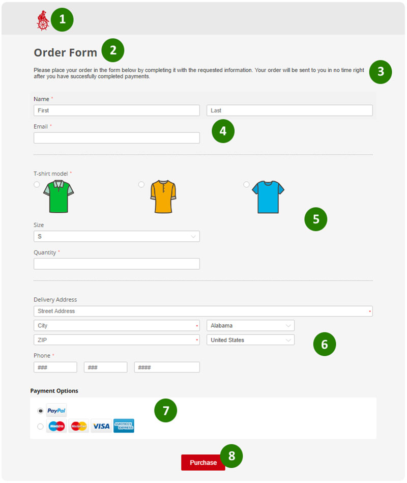
As seen in the image above, the order form of this brand has small-sized t-shirts as radio button options. This entices a customer as visuals are easy to choose than text. So, try to add visual elements as options to make your order page more engaging.

Security is another essential point when it comes to dealing with data. Since customers give their personal and financial data to you, it is your job to ensure that their data is dealt safely. After all, you want to be creditable as a business( whether small or big) if you want your customers to trust you.

In this article, we will look at five steps to create online order form for your product:

5 steps to create an online order for your product

From the form’s design to which fields should your form have, there are many aspects to consider before starting to build one. Following are the steps that you need to take in order to create a proper online order form. Take a step-by-step approach towards creating a form that works for your product.

1.  Know what you want to sell

Needless to say, you first need to know what is your product for which you need to create an order form

As a business owner or entrepreneur, you must know the significance of keeping records of your customers in an orderly manner. So, it is the first step to identify what type of service you are willing to offer to your customers, only then you can step into their shoes and give them what they need.

The reason to know the type of product for which you want to create a form is simple–you can bridge the gap between what the product requires and what your customer’s expect out of the form. Also, different products may have different form requirements. So, once you know the product, you can begin the process of creating the form by asking following questions:

  • What is the product?
  • What does it need from the customer?
  • Which fields does the form require to fulfill customers’ needs?
  • How long do you want the form to be?
  • How do you intend to design the form? Do you want to include your brand logos? If so, how, where? etc.

Asking the above questions will help you gain clarity to know what you want out of your order form and take steps to create one.

2.  Choose a template and customize as per your wants

As mentioned earlier, there are tons of online form templates available today. You can either use the available ones directly or customize your own for as per your business needs.

  • What information do you need from the client?
  • What do you need to know about the order or the service?
  • What can you do for the customer?

Remember to only collect relevant information from the customers. Unnecessarily lengthy or ambiguous questions can be a huge turn off for customers and they may choose to discard placing the order altogether. Hence, choosing the fields that only ask for the necessary information is crucial.

A well-formatted order form should have the below-mentioned points:

  • It should be neat and showcase your products with nice pictures
  • The form should have group products by categories to make it look well-structured
  • The form fields should be easy to navigate through
  • It should allow the customer to view their cart, view the total amount and delivery fees
  • Give them multiple payment options like credit card, debit card or e-wallets

3.  Use your brand logo and images

You might have seen online forms of big brands. One thing that they have in common in these forms are logos. Adding logos to your forms does two things:

  1. It helps in instilling trust among your customers
  2. It helps in brand building

While building trust is important for any business, brand building is also important to increase conversion rates. Uploading a logo to a form immediately gives a professional touch and improves the trustworthiness as a brand.

Well, you can also upload images of your product to boost form conversion rates. As per a study at Jotform, including images boosted form conversion by 80 percent. Adding images makes your form visually appealing and it also helps you generate more revenue.

However, which images you should use depends on the type of service you offer. If the service you are offering doesn’t allow embedding pictures, do not worry. You simply need to ensure that your customers know what you are offering via other methods.

For example, you can include some client testimonials in the form. This could gauge the customer’s attention and improve your brand image.

4.  Set up a payment processing system

This is one of the most important steps in building an order form. Also, this is the step when security comes into the picture. After all, you should get paid for the service you’re providing, right? To do so, you need to choose a payment system you trust.

Choosing a payment processing system is an important one. You need to set up a secure payment gateway to accept the funds. Which payment processing system is the best for you depends on your target demographics.  Some of the most popular payment gateways include paypal, Authorize.net, etc.

There are several online services for payment. You can even prefer to provide bank deposit or credit/debit card deposit. Decide the system that is the best for you and embed it to your order form.

5.  Create an order confirmation page at the end of the form

i2 5 Steps to Create a Proper Order Form for Your Product

Source

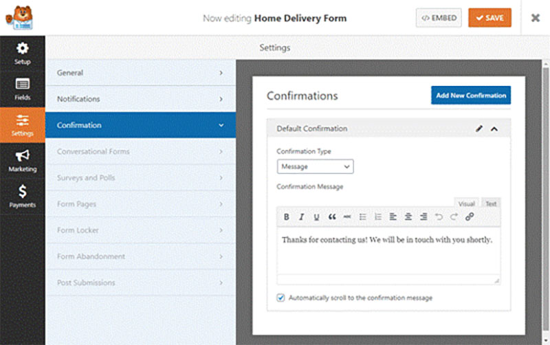
Once the customer is done placing an order by filling the form, s/he expects a confirmation page at the end of the process. So, your last page should be a ‘thank you’ page to express gratitude to your customers for choosing your product. You can use this page to share some information on what the customer should expect next to happen.

For example, if you are a non-profit organization, you can set up a smooth process for customers where they can submit necessary details which can increase the chances of your success. Or if you are an ec-mmerce store, you can even add a sentence or two letting the customer know when they can expect their product to be delivered.

While you want this page to be simple and concise, don’t shy away from spicing it up with your unique brand voice. The customer should feel the appreciation you show as a brand. So be as creative as you can while keeping the page design neat and clean.

Wrapping up 5 steps to create a proper form for your product

Whether you are a small business, an established one or an NGO, creating a well-thought order form not only helps customers know about their order but also boosts conversion rates. From the logo you design to the number of fields your form contains to the way you have put these fields in the form, the smallest of things matter. So design a unique form that speaks to your customers.

To sum up the article, you first need to know your product well before planning an order form since the process of placing an order comes much later. So, try these steps to create a proper order form and see how it works for you! Also, don’t forget to keep experimenting with the templates as visuals do play a significant role in boosting conversion rates.


Author Bio:

pr 5 Steps to Create a Proper Order Form for Your Product

Parita Pandya is an Engineer turned Writer. She usually finds herself writing for businesses.  When she is not writing, she is either strumming her guitar or penning her thoughts down on paritapandya.com.

The post 5 Steps to Create a Proper Order Form for Your Product appeared first on Design your way.


Source: https://ift.tt/Jocz98e

Design your way

Every so often, a new ‘trendy’ phone case is launched that becomes a staple for everyone. For this very reason, we’re going to discuss budget-friendly methods you can use to vamp up your phone.

1. Use Glitter or Nail Polish

There are countless ways through which you can design your phone cases, such as using some glitter sprinkled on all-purpose glue. This is one of the easiest ways to revamp your phone case. All you need is some glue, a transparent silicone gel cover, and some glitter in the color of your choice. First, apply the glue in whatever pattern you desire (or you can go overboard and spread glue all over the phone case). You can use tape to create patterns or protect the edges from glue for a neat look. Before the glue dries out, sparkle a hefty amount of glitter and wait for the glue to dry. For a polished finish, use Mod Podge to seal.

Another DIY idea is nail polishes. Around 2015, ‘Marble Nail Polishes’ started trending. Now, Tech and nail art enthusiasts have incorporated the best of both worlds to use this idea to create a new style of phone cases. As for the nail art, take a big container filled with water (enough to fit your phone case in) and slowly drip different colors of nail paints in the container. Keep repeating the process until you are satisfied with how it looks, and then dip the phone case in. Wait for it to dry, and seal it with sealing glue. You can use a combination of white, gold, or black nail polish to create a marble look. Try making patterns like flowers or shapes in the water with different colored nail polishes.

2. Use Stickers

An easy way to glamorize your phone case is by using stickers. This is a more sought-after approach by today’s teenagers as a trendy and aesthetic form of self-expression. Young adults today tend to use customized stickers to decorate their phone cases. These stickers can range from their favorite TV show, band, food, or even their favorite subject at school. This way, their phone looks cool and depicts all the things they like.

Using a graphic designing tool, you can create custom designs and base your stickers of your digital artwork. You can use Adobe Photoshop or Illustrator to turn your imagination into artwork, or you can use Pinterest or Tumblr for some inspiration.

3. Use Dried Flowers

Another easy way to revamp your phone is by using dried-up flowers in a transparent phone case. You can pick out flowers of your preference and customize your phone case. You should ensure that the flowers are not too big in size. You can use a parchment sheet on which you can lay out your flowers on, and wait for about 8-12 hours until your flowers are completely dry. You can then place the flowers on a silicon phone case on the inner side of the phone case, pour in some resin (or clear glue), and you can wait for it to dry. This method can make a great activity for the weekend and help you end up making an incredibly beautiful phone case at nominal pricing.

4. Add Photos

A clear phone case is like a clear canvas and can allow you to make your phone case extremely personal. You can take printouts of your favorite picture with your friends and family. You can even take a polaroid on your upcoming vacation. These pictures can be easily slid into a transparent phone cover and can appear as a customized phone case from the outside.

It is important to get a picture of something that is meaningful and important to you, like a photo of your family, your friend group from high school, your pet dog, or your favorite quotation. You must ensure the right size of the printout as it is important for it to fit the case. It is not essential to use any glue to hold the picture in place. Not using any glue or adhesive will also ensure that you can change the picture anytime at your convenience.

You can also use your artwork and slide it into the transparent case to give your phone case a unique and personalized look. This gives you the creative freedom to create anything you can imagine and take it along with you wherever you go. You can add neon and fun patterns and pour some paint or sparkling glitter on top of them to add to the vibrance or a pop of color.

5. Colored Tape

You can also use strips of painter’s tape and make bright patterns all across the phone case. It can add a vibrant and colorful personalized touch to your phone. You can create horizontal, vertical, and diagonal lines all at once to create a funky design. Use tools like an Exacto knife to cut out the openings for earphones or charger ports. You can even use an Exacto knife to create smooth edges. This technique can help you revamp your phone case in an easy and extremely affordable way, letting you turn your old dull phone case into a vibrant one.

You can create these patterns by yourself and your creative bone, or you may search for inspiration from Pinterest or Tumblr. These websites will enable you to explore modern and easy-to-create designs, letting you find the ideal design per your liking.

Endnote

Whichever style you choose to revamp your transparent phone case,  you can always add the customization and personalization you want affordably. You can use custom-made stickers, dried flowers, pictures of friends and family, and old polaroids to make your phone case more stylish and modern. Use DIY techniques, vibrant colored nail polishes and glitter to create custom designs that will not wear off with time.

You can find cheap clear cases online for both Android and iPhone devices on Amazon and Etsy. Decorate these according to your style to give your phone a brand new look. The front of your phone should not be ignored either, and you must add a water-resilient screen protector to secure the look. This will shield your phone against any damage from water or accidental breakage. You can save yourself repair costs of hundreds of dollars by just investing in an affordable screen protector and a durable phone case.

The post How to Revamp Your Phone Case appeared first on Design your way.


Source: https://ift.tt/Vvj9OrL

Design your way

The best logos are highly recognizable, distinctive designs. After all, that’s what makes them work! The more enduring the logo, the more iconic its associated brand becomes.

Some logos made such a lasting impact that they’re now fixtures of pop culture. What gives a logo this iconic status? Is it a matter of great design, effective marketing, or something more?

To discover the answer, let’s explore 20 memorable logos that have passed the test of time.

word-image-41329-1 20 Logos That Have Withstood The Test Of Time

(Image source)

Stella Artois

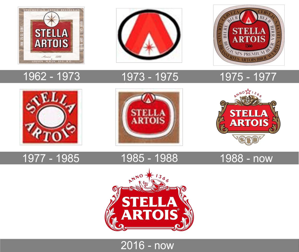
One of the world’s oldest logos, Stella Artois’ sophisticated emblem represents a long history of brewing. The brewery itself pre-dates logos, tracing its roots back to mid-14th-century Belgium! In the 20th century, though, Stella Artois achieved an international audience. Its distinctive red-and-white emblem proudly declares “Anno 1366,” referring to the year it was founded.

The Stella Artois is quite intricate compared to many modern logos, but customers definitely don’t mind. The decorative frame, adorned with a cornucopia and a timeliness typeface, perfectly captures this beer’s artisan taste and ancient history.

Coca-Cola

Coca-Cola’s wordmark features a distinctive red-and-white design that’s both eye-catching and recognizable. The script typeface and bold vermillion hue give this widely beloved soft drink quite the visual presence. Coca-Cola’s fans adore this logo so much that the company has released official merchandise — everything from t-shirts to keychains to household decor. Coca-Cola’s logo is so iconic that it can be recognized in any language — even alien ones!

word-image-41329-2 20 Logos That Have Withstood The Test Of Time

(Photo by author)

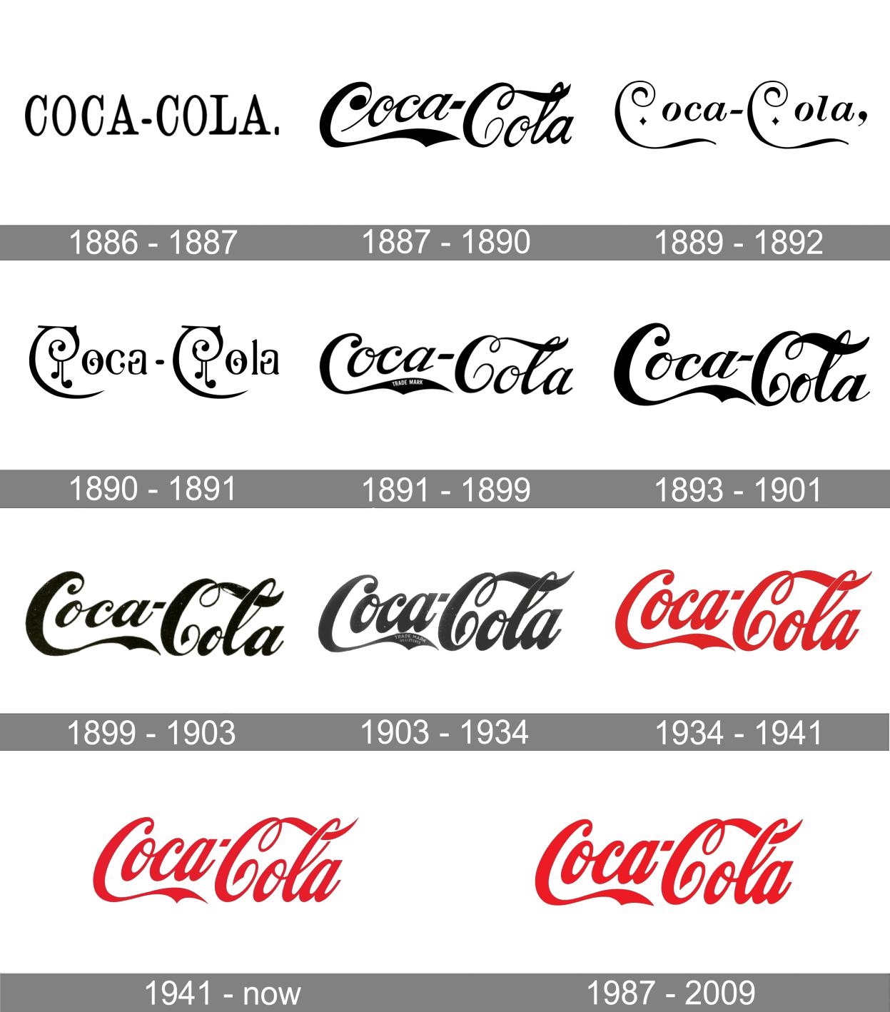
While Coca-Cola’s classic font may seem timeless, the logo has actually changed a lot over the years.

Coca-Cola’s creator John Pemberton was stuck on names for his invention, so asked his bookkeeper, Frank Robinson, for ideas. Robinson hit it right on the mark, suggesting “Coca-Cola.” He added, “the two C’s would look well in advertising.” Clearly, Robinson was a smart guy. Throughout the Coca-Cola logo’s evolution, the two C’s have always stood out.

word-image-41329-3 20 Logos That Have Withstood The Test Of Time

(Image source)

The original wordmark was a plain serif — not very memorable. In 1887, though, the new logo featured a bold, embellished script typeface. The first “C” had a waving pennant that underscored “Coca.” The second “C’s” tail coiled once before passing through the loop of the “L.” These design elements make the wordmark highly recognizable even as the typeface itself became slimmer and tighter.

word-image-41329-4 20 Logos That Have Withstood The Test Of Time

(Image source)

Chanel

Speaking of “Cs,” Coca-Cola isn’t the only brand to leverage double-Cs in its branding. Chanel’s logo features two interlocking Cs — the initials of founder Coco Chanel, who also created the logo. The image suggests sophistication, luxury, and the linkage between the two.

The design is so iconic that it has become a fashion element itself, appearing on Chanel’s bags, apparel, shoes, and accessories. It has remained unchanged since the company’s debut in 1925.

word-image-41329-5 20 Logos That Have Withstood The Test Of Time

(Image source)

Mercedes-Benz

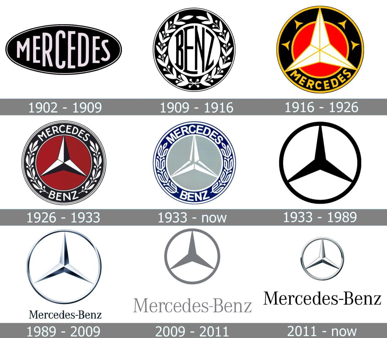
Mercedes-Benz is one of many automobile companies that relies on a symbol rather than a wordmark. However, their iconic three-point star is arguably more recognizable than many other insignia.

Founder Gottlieb Daimler drew the star over a picture of his home, wishing prosperity for his family and business. His wish clearly came true, as Mercedes-Benz is now a world-renowned luxury vehicle company. The star has appeared in every logo iteration since 1916, from the intricate seal to the streamlined symbol we see today. word-image-41329-6 20 Logos That Have Withstood The Test Of Time

(Image via @artistmac with CC BY-SA 2.0)

McDonald’s

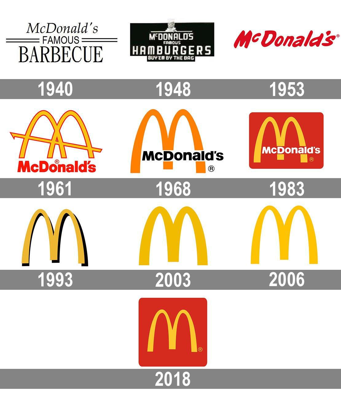
It’s hard to believe now, but McDonald’s started out as a barbecue restaurant. The original logo was little more than a wordmark, although a friendly chef character accompanied it for a while.

Everything changed, though, when the company built a new location with dramatic yellow arches. The 25-foot-tall structure attracted many new customers — and McDonald’s had a powerful new symbol of its brand.

word-image-41329-7 20 Logos That Have Withstood The Test Of Time

(Image source)

McDonald’s incorporated the famous Golden Arches into its logo and never looked back. While the exact proportions, color, and shape of the arches have evolved, they remain so iconic that people can recognize the logo even if the company name is absent. This enduring logo design is proof that a simple visual concept is critical to a memorable brand.

word-image-41329-8 20 Logos That Have Withstood The Test Of Time

(Image modified from original)

Nike

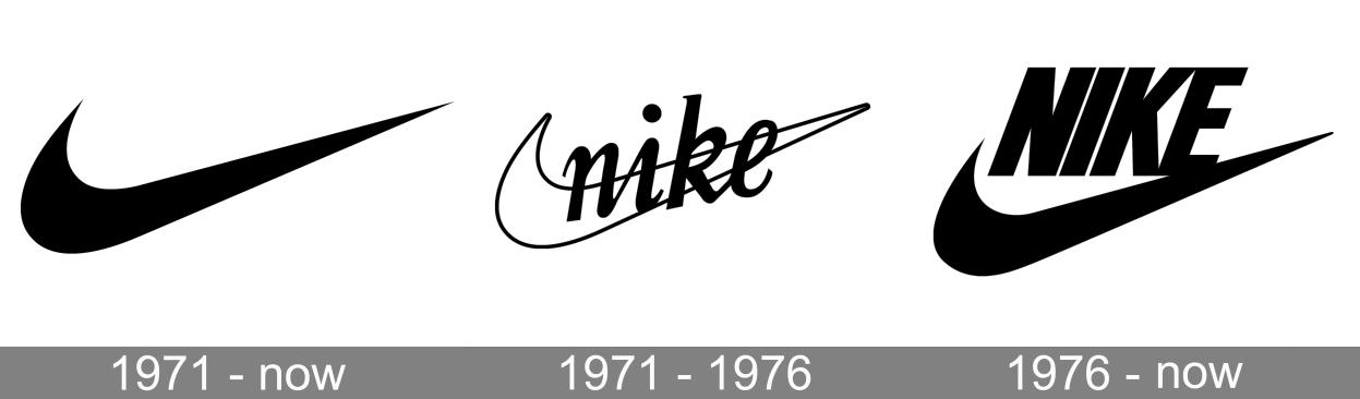
Commonly cited as one of the world’s most recognizable logos, the Nike swoosh is also the most enduring. A woefully underpaid design student created the swoosh in 1971. Since then, it has appeared in almost the same form in every logo iteration. Eventually, Nike dropped its name from the design and relied solely on the iconic shape to express its brand.

It worked. Designer Carolyn Davidson created the shape to convey both dynamic and upward movement, signifying ambition and achievement. The swoosh uses the mathematical proportions of the Golden Ratio, an aesthetic standard dating back to the ancient world. There’s a recipe for an enduring logo: go with what works well!

word-image-41329-9 20 Logos That Have Withstood The Test Of Time

(Photo by Raymond Kotewicz on Unsplash)

Shell

When your fuel gauge is on “Empty,” you’re desperately looking for the nearest gas station. A bold, recognizable logo stands out as you scan the area: a red-and-yellow scallop shell that promises relief.

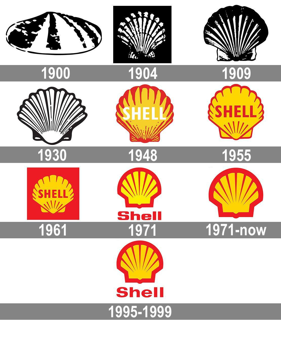
Shell takes a literal approach to their brand identity. Since the early 20th century, their logo has been a shell, referring to the ancient sea creatures that eventually become petroleum. The original design was a rather lackluster mussel shell. The company wisely switched to the dramatic scallop shape just a few years later.

word-image-41329-10 20 Logos That Have Withstood The Test Of Time

(Image source)

It wasn’t until the 1970s, the golden era of logo design, that Shell’s logo finally got the streamlined, vivid design we see today. The eye-catching combination of red and yellow attracted wayward motorists. As environmentalism grew throughout the ’70s and ’80s, the scallop shell also reflected the company’s commitment to (relatively) eco-friendly strategies.

word-image-41329-11 20 Logos That Have Withstood The Test Of Time

(Image source)

Apple

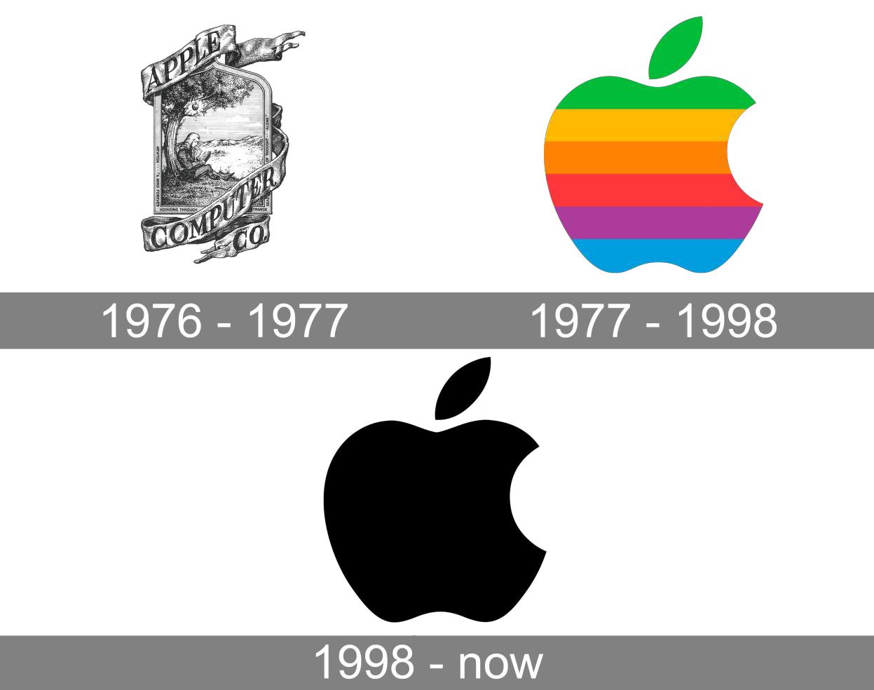
Another oft-cited iconic logo, Apple keeps it literal. Their logo is an apple, simple as that. The concept stemmed (pun intended) from founder Steve Jobs’ background as an apple farmer. Jobs found apples to be accessible and elegant, just like the personal computer he’d invented. He also appreciated the story of Sir Isaac Newton, who created his laws of motion when an apple fell on his head.

While the original logo was a complex drawing of that incident, Apple wisely switched to something simpler. The Apple logo was debuted in color to indicate the display quality, but over time, became a sleek, silhouetted apple that connotes knowledge and discovery.

Pepsi

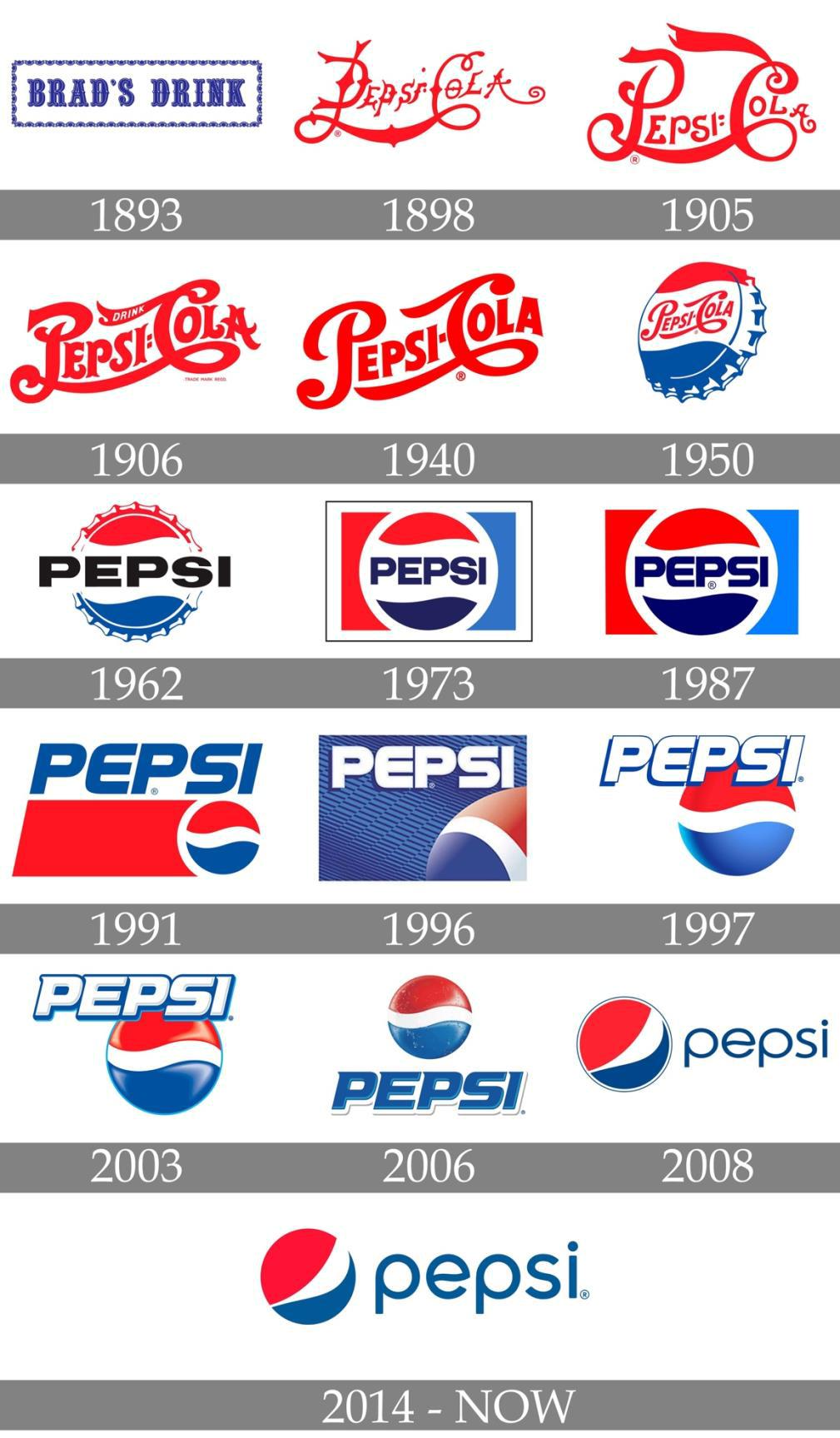
You may be surprised to see Pepsi on this list, as it has changed its logo more than 10 times over its 100-year history (with some disastrous results). But bear with us.

Pepsi’s earliest logo featured a sweeping script typeface, similar to a certain other soft drink company’s wordmark. However, that design endured for more than 50 years. word-image-41329-12 20 Logos That Have Withstood The Test Of Time

(Image source)

In 1950, the company positioned the wordmark on a bottle cap, sandwiched between red and blue waves. This striking design became so iconic that people could recognize the logo even if the word “Pepsi” was absent. While the typeface has changed over the years, customers can easily spot the “Pepsi wave” — even after it tilted in the brand’s 2008 redesign.

word-image-41329-13 20 Logos That Have Withstood The Test Of Time

(Image source)

Google

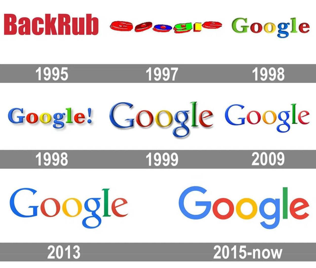
Google relies on its distinctive name for recognizability. Its logo has always followed suit, depicting the word in a multi-colored design. The search engine giant is also famous for rolling out customized versions of the logo for various holidays and historic events.

The basic wordmark, though, is more than meets the eye. Reportedly designed by Google co-founder Sergey Brin, the logo uses primary and secondary colors to signify the mix of information users can obtain. The letters appeared in alternating colors: blue, red, yellow, blue again, green, and red again. Brin deliberately defied the conventional ROYGBIV order because “Google doesn’t follow the rules.” While the typeface has changed over the years, the color scheme remains the same.

word-image-41329-14 20 Logos That Have Withstood The Test Of Time

(Image source)

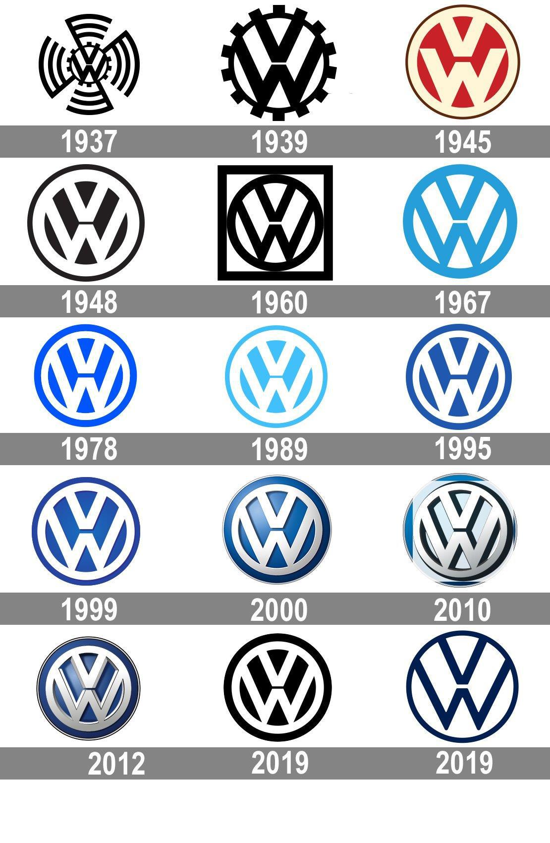
Volkswagen

Automobile companies tend to use abstract symbols as their logos, which doesn’t always boost their recognizability. Volkswagen smartly uses the initials “VW” in a visually striking way.

The original logo design was eye-catching, if a little busy. The bottom point of the “V” nearly touches the top middle point of the “W.” This creates a nice symmetry, especially when embedded in a circle. In early logos, the circle was a gear, symbolizing the company’s brilliant engineering.

Over time, the cogs were removed and the pattern was inverted. While the colors and gradients have changed, the iconic “VW” pattern has endured.

word-image-41329-15 20 Logos That Have Withstood The Test Of Time

(Image source)

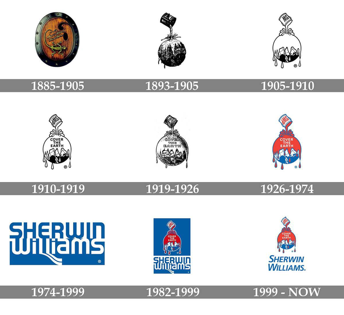
Sherwin-Williams

To say something is “like watching paint dry” means it’s boring. But paint company logos don’t have to be dull. Sherwin-Williams debuted their provocative logo back in 1893. Per their tagline, “Cover the Earth,” the illustration depicts a can of paint being poured over the globe.

Except for a couple of decades where they used a wordmark instead, Sherwin-Williams has retained this visual concept. After all, it’s anything but boring!

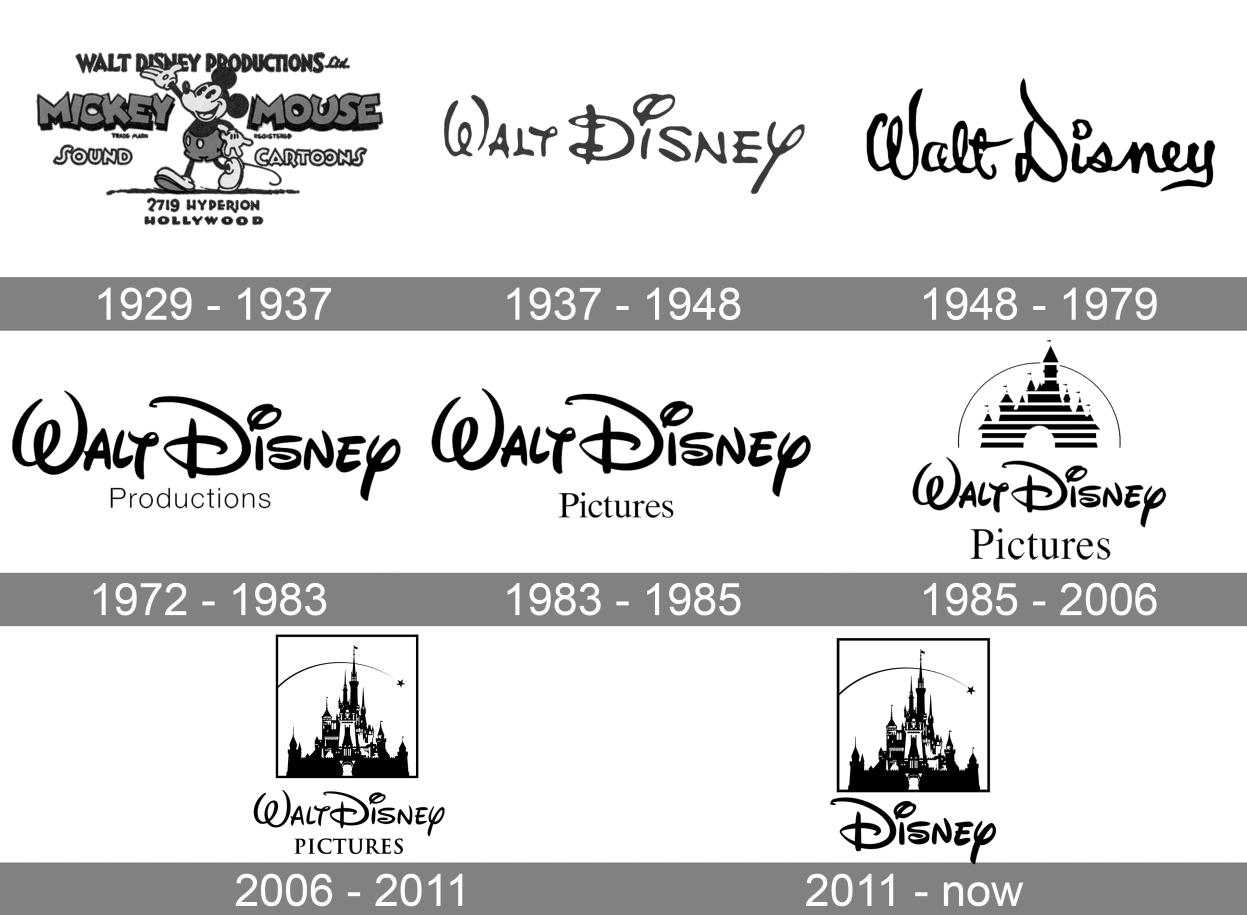
Disney

Disney’s massive influence on the entertainment industry cannot be overstated — and deserves an iconic logo to match. Thankfully, the company’s namesake, Walt Disney, had a famously whimsical signature. This inspired the highly recognizable wordmark with the “Disney font.” The “D” is so recognizable that it appears alone on some branded materials.

word-image-41329-16 20 Logos That Have Withstood The Test Of Time

(Image source)

In 1985 as part of the “Disney renaissance,” the company added Cinderella’s castle to the logo, complete with a shooting star a la Pinocchio. This design honors their classic films while ushering in a new era of magic. Plus, it was excellent cross-branding for their theme parks.

word-image-41329-17 20 Logos That Have Withstood The Test Of Time

(Image source)

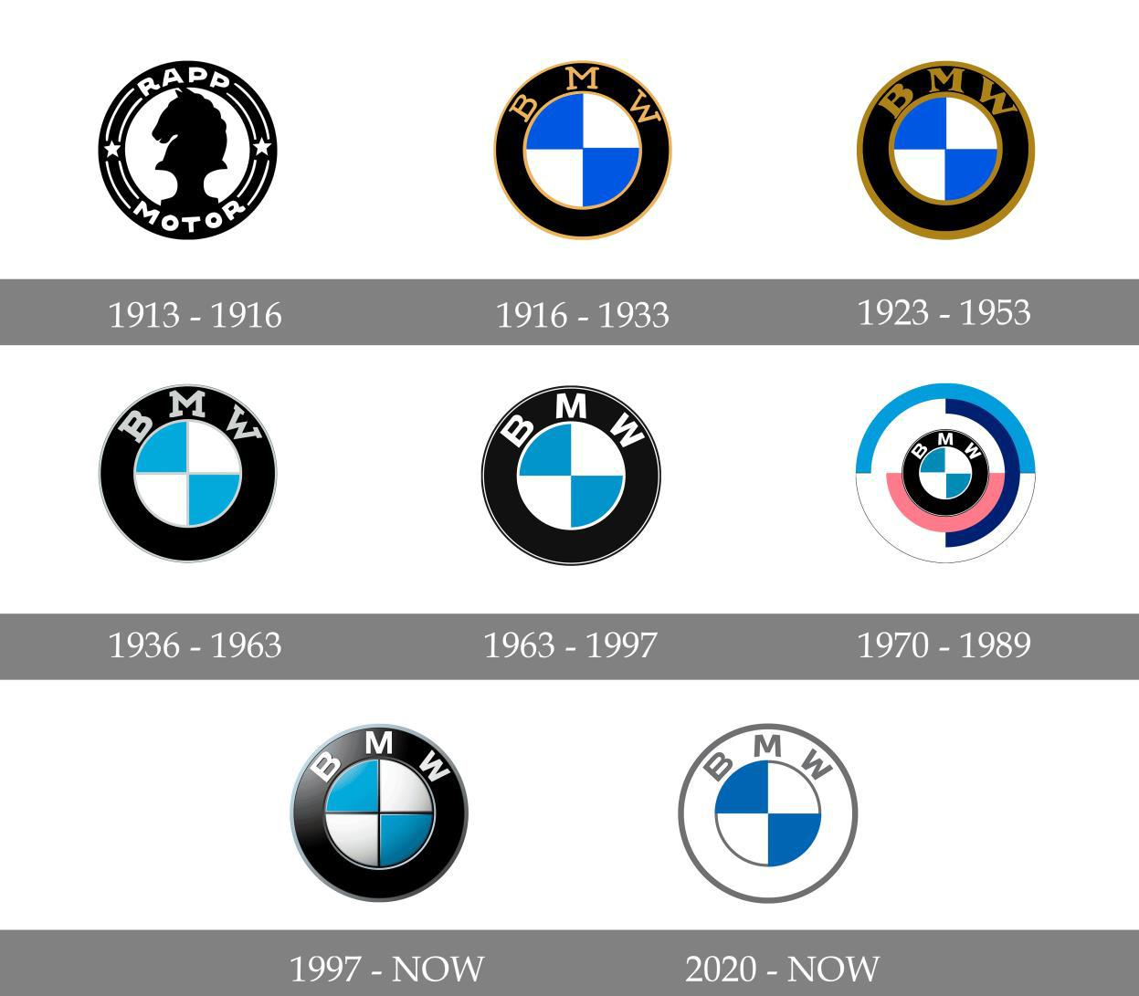
BMW

Since the early 20th century, BMW has used the same blue-and-white checkerboard in all iterations of its logo. These are the colors of the Bavarian flag, and the company was eager to express its national pride. The circular design symbolized propellor blades, dually representing the auto manufacturer’s origins and commitment to innovation.

Meanwhile, the initials BMW, for “Bayerische Motoren Werke,” appeared above the checkboard insignia. While the logo has evolved from a gold-trimmed emblem to a flatter, more modern design, the basic image is as iconic as ever.

word-image-41329-18 20 Logos That Have Withstood The Test Of Time

(Image source)

Girl Scouts

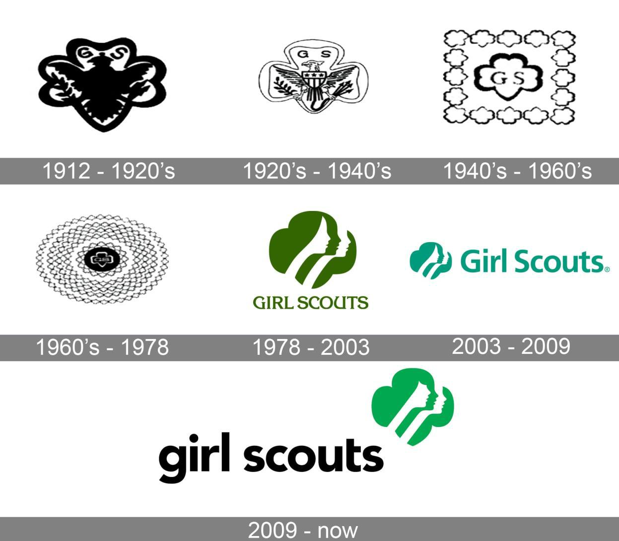
The Girl Scouts’ iconic logo may feature a four-leaf clover, but its lasting success is anything but luck. Esteemed graphic artist Saul Bass created this clever design, which combines several female silhouettes within the clover shape. At first glance, we see one girl, but then realize that her hair contains a second face, then a third. This illusory effect symbolizes the Scouts’ dual focus on teamwork and individual achievement.

While the 2010 re-brand changed the girls’ hairstyle and face shape, the overall concept remains the same. The Girl Scouts’ logo instantly connotes female empowerment and youthful aspiration — and of course, delicious cookies.

word-image-41329-19 20 Logos That Have Withstood The Test Of Time

(Image source)

World Wildlife Fund

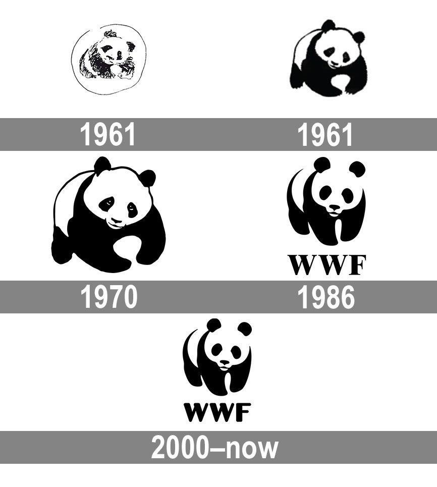
The World Wildlife Fund also appreciated the silhouette look. As one of the world’s top nonprofits, they needed a logo that instantly captured people’s attention — and made them want to give money.

What better choice than the adorable panda? This famously black-and-white animal lent itself well to logo design. Inspired by the London Zoo’s beloved Chi Chi, WWF created one of the most enduring brand images. The original 1961 design was highly illustrated, but over time, the design made excellent use of negative space to bring the panda to life.

word-image-41329-20 20 Logos That Have Withstood The Test Of Time

(Image source)

UPS

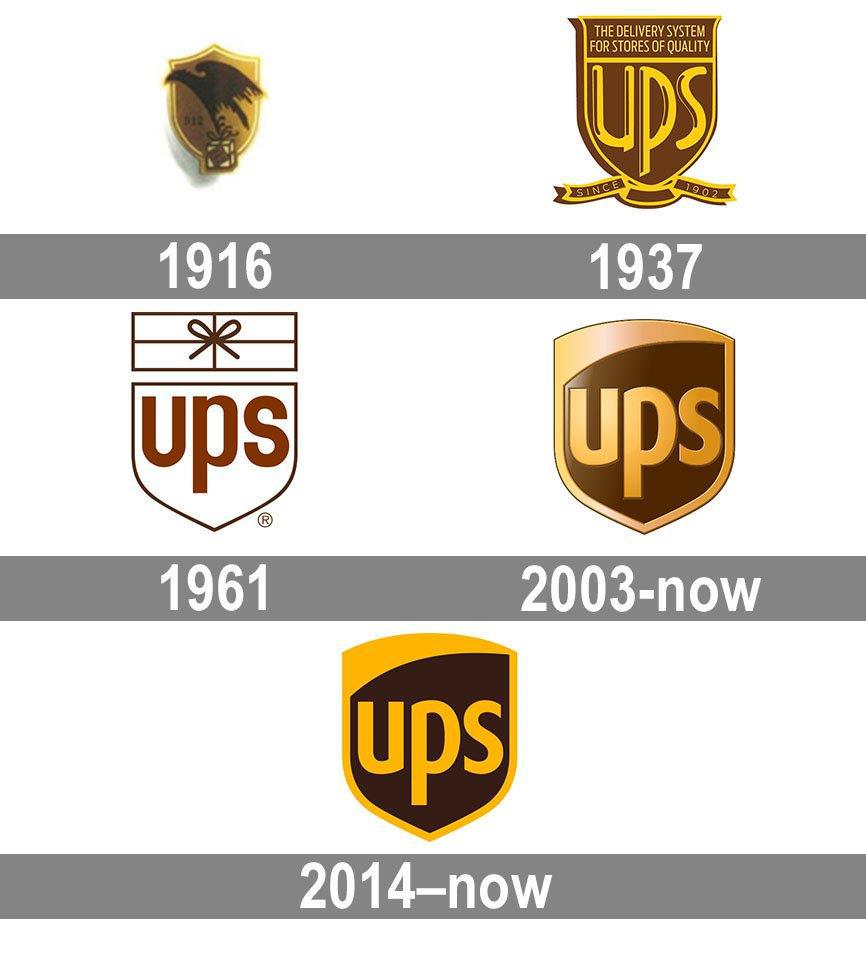
UPS was founded in 1907, and its logo evolution demonstrates a consistent aesthetic. The design has always incorporated a shield. The original logo featured an eagle to signify the courier’s speed and power. In 1937, the eagle was replaced by a lettermark. Over the years, the typeface and colors changed, but the overall design retained the initials “UPS” against a bold shield shape.

The message is clear: we’ll defend your package. The modern logo is flat and streamlined yet still has the classic colors and trustworthy look of the original design.

word-image-41329-21 20 Logos That Have Withstood The Test Of Time

(Image source)


Ford

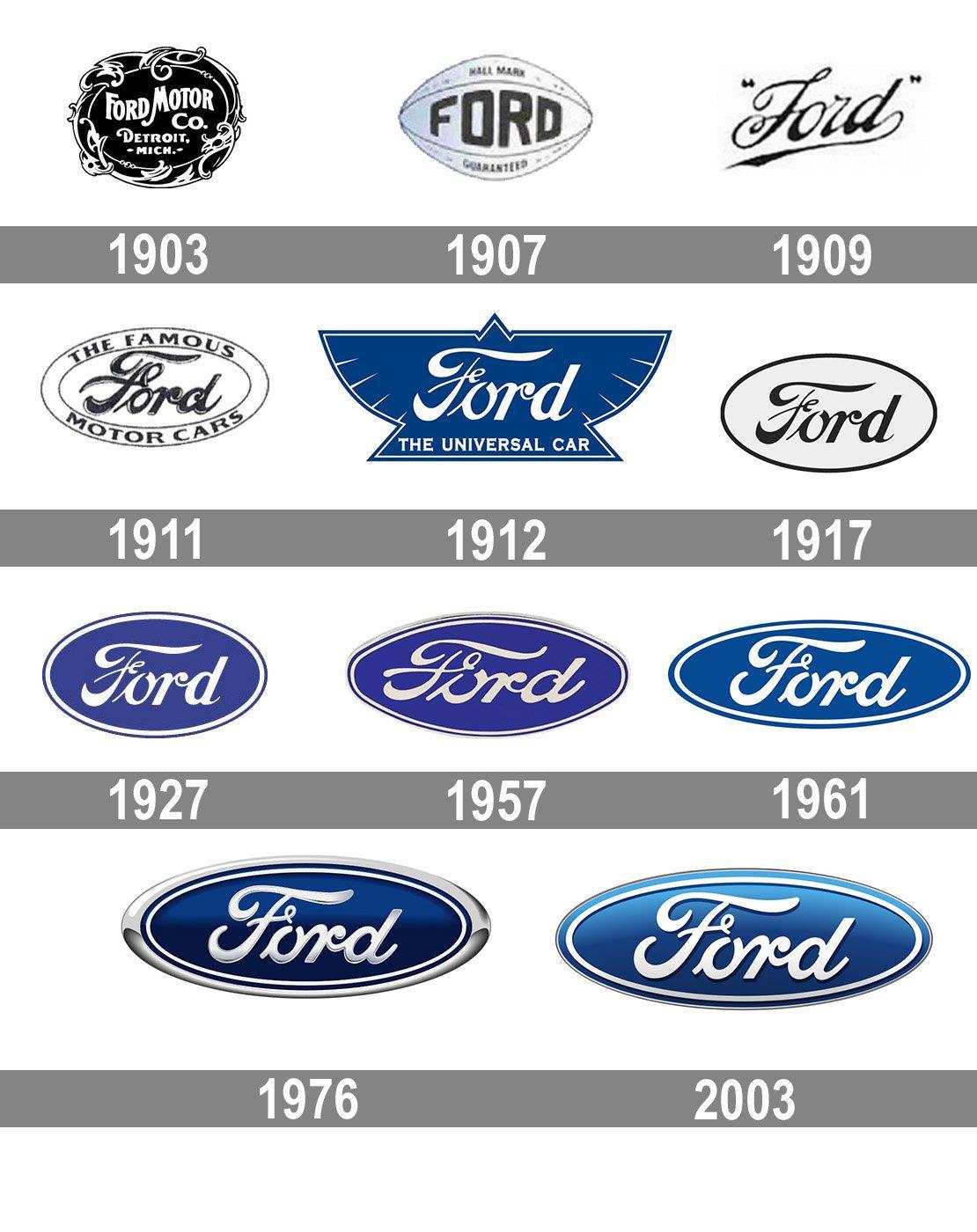
While many automobile companies rely on an abstract design to symbolize their brand, Ford keeps it literal. Their logo has always featured their name. After an early Art Nouveau design went out of style, Ford introduced a script typeface with a stylized “F,” and the wordmark has remained virtually the same ever since.

Ford’s wordmark is highly legible despite being in cursive, which certainly contributes to its success. Paired against a deep blue that connotes working-class America, the logo retains its old-school pride in modern society.

word-image-41329-22 20 Logos That Have Withstood The Test Of Time

(Image source)

IBM

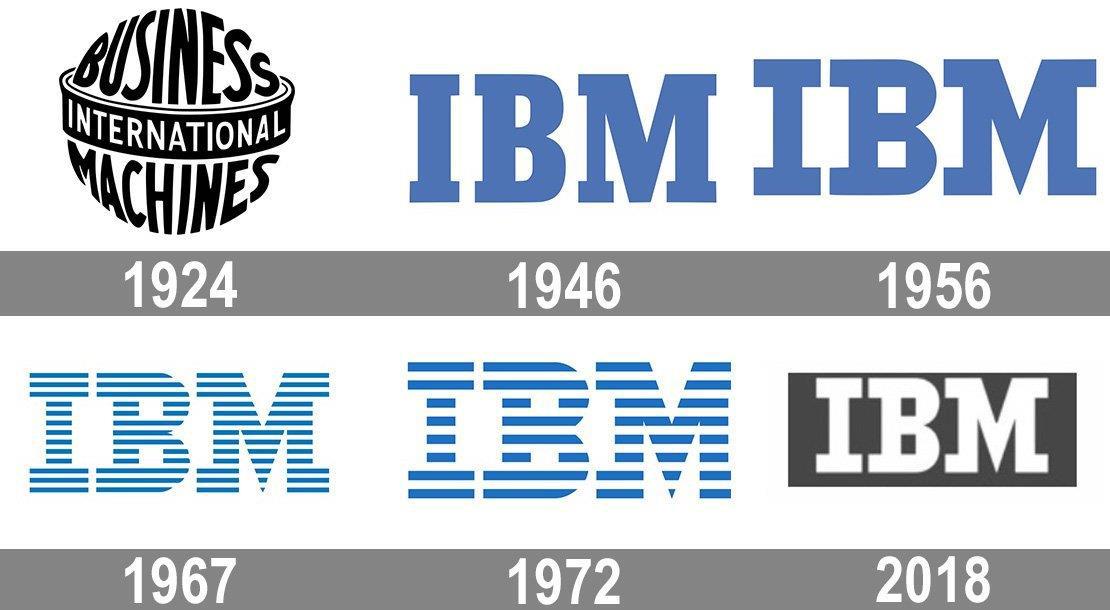
In the late 1960s, the International Business Machine company was rebranding. As a longtime innovator in computing and engineering, IBM needed a logo that truly captured their significance. Esteemed designer Paul Rand took on the task. His now-iconic lettermark depicted the company name as a series of parallel lines, meant to connote speed and dynamism.

Clearly, he succeeded, as IBM still uses this distinctive logo nearly 60 years later. While the number of lines has changed, the overall impression remains the same. People enjoy seeing letters made out of images, which has certainly helped this logo become so memorable!

word-image-41329-23 20 Logos That Have Withstood The Test Of Time

(Image source)

Starbucks

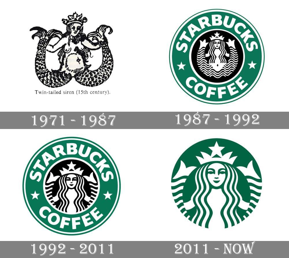
Who could have imagined that an obscure mythological creature would become the symbol of a global brand? That’s exactly what happens with Starbucks. Inspired by a 16th-century Norse woodcut depicting a siren, one of the Seattle coffee chain’s founders saw a compelling symbol. The port city was known for its maritime history, as was coffee itself. Plus, who hasn’t felt the craving for coffee as powerful as the siren’s song?

The original 1971 design was an ornate, NSFW illustration of the two-tailed mermaid-like creature. Over time, she became more clearly illustrated and extraneous elements were dropped. The current logo is much more streamlined with a deep green hue that signifies comfort and creation. However, the siren remains intact, holding her tails and gazing serenely upon the viewer. (Great, now we need some coffee.)

Wrapping Up

Each of these time-tested logos offers valuable insights into what makes a successful design. Which one stands out to you the most?

The post 20 Logos That Have Withstood The Test Of Time appeared first on Design your way.


Source: https://ift.tt/ElYZc7H
 

The Cash Box Blueprint

Most Reading