In today’s digital age, having a strong online presence for your business has become increasingly important. A big part of this is to have an excellent website, and this is something that can make a big positive difference to your business. Of course, you need to ensure your website is appealing, user-friendly, and provides value to your audience, which can be a challenge. However, you can find experts such as web design agencies to help you with all aspects of your website.
Once you have a solid and professional website, you can look forward to boosting business and attracting new visitors as well as retaining existing ones with greater ease. There are some key factors that you need to consider in order to create a user-friendly website with a good vibe for your audience. In this article, we will look at some of the key points of consideration when it comes to your website design.
Some Important Points in the Design of Your Website
There are a number of key points that you need to keep in mind when it comes to the design of your website, and this can make a big difference to everything from the bounce rate and conversions to your brand reputation and company image. Some of the top points are:
Consider the Speed of Your Site
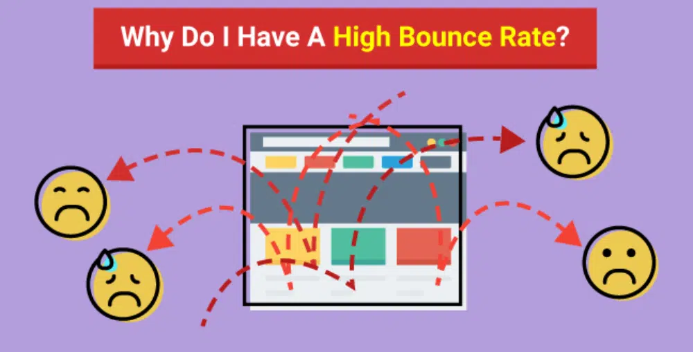
One of the things that you need to do is to consider the speed of your website, as this can have a huge impact on the user experience. The last thing your visitors want is to find themselves on a site where the pages take forever to load. Most people will lose interest and patience and will simply hit the close button and head to an alternative site. So, you need to look at the speed and efficiency of your website if you want it to be a success.
Presentation of Web Content
Another thing that you must consider is the presentation of the content on your website, as this can also make a big difference to the user experience. The last thing most people want to see is blocks and blocks of content with nothing to break it up or make it easy on the eye. The content needs to be easily digestible if you want your visitors to actually take notice of us rather than simply scroll through. Use bullet points and images to break up content, and make sure it is strategically placed on web pages.
Make Sure Web Pages Are Consistent
Your website visitors will also be looking for consistency on your website rather than ending up on a site that looks like it has been mashed together from a number of completely independent websites. This means ensuring that any themes, colors, fonts, and images are consistent throughout your website rather than being radically different from one page to another. This makes your website look far slicker and more professional, which will make users feel more confident.
Create a Responsive Website
One other thing to keep in mind is that a lot of people these days want to access websites on their mobile devices rather than on their computers. As such, you should ensure that your website is a responsive one that can be viewed and used effectively across all devices. This is something that can earn you plus points from major search engines as well as impress your target audience.
These are some of the key things that you need to keep in mind when it comes to creating a website that will appeal to users.
SEO is the most crucial factor in the success of any e-commerce business. It allows you to build an online presence optimized for search engines, which in turn helps drive traffic to your site.
Building a strong online presence is essential for any e-commerce business because it increases the chances that people will find you when they’re looking for something you sell. The more people who know about your company and its products, the more likely they’ll buy from you instead of going to a competitor’s site.
SEO also helps increase sales by improving the user experience on your website. When visitors can find what they’re looking for quickly and easily, they’re more likely to stay on your site longer and make a purchase. SEO also helps with brand awareness, which means that people are more likely to remember your brand because of its online presence and its higher ranking on search engines.
However, e-commerce businesses often make several mistakes when trying to optimize their platforms for search engines. This can negatively impact the business. So, to ensure that you don’t do the same here’s a list of the most common SEO mistakes e-commerce businesses make and why you should avoid them.
Slow Website Speed
Slow website speed can be a death sentence for your e-commerce business. The average site load time is two seconds. If yours takes longer than that, you’re losing customers. Slow website speed is one of the most common mistakes e-commerce businesses make. According to research, if your site takes more than three seconds to load, 40% of users will abandon it.
Also, if your site takes too long to load, it will not only frustrate customers but also make it harder for search engines like Google to index your site and rank it higher in their search results. So, you will have a harder time getting traffic from organic search, which can negatively impact your conversion rate and ultimately hurt your e-commerce business.
Duplicate Content On Your Website
Duplicate content is one of the biggest SEO mistakes e-commerce businesses can make. It’s bad for SEO because it dilutes your site’s authority, making it seem like multiple copies of the same content are being published on the same site. This is a big red flag to search engines that they’re not getting the most relevant results.
When content is duplicated across more than one page of your site, Google sees it as a sign that you’re trying to game the system and rank higher than you deserve. That will lead to penalties that hurt your rankings and visibility in search results, which means fewer eyeballs on your products or services.
Not Doing Enough Keyword Research
E-commerce businesses that don’t conduct enough website analysis or keyword research are missing out on opportunities to improve their search engine optimization. Many companies don’t realize how big of a role keyword research plays in SEO, but its influence on your page rankings is undeniable.
Without proper keyword research, you can’t optimize your site for the keywords you want it to show up for in search results, which could mean that potential customers won’t be able to find you when they’re looking for what you sell.
According to the SEO experts, such as those at Arcane Marketing, keyword research is what can drive the right audience to your platform or business. Without proper research, you’ll likely end up using keywords that are not applicable to the products or business, or you’ll end up using keywords that won’t cater to your potential customers’ queries.
Not Optimizing for Mobile Devices
If you’re an e-commerce business, you should know that the average user spends most of their time on the internet on a mobile device. In fact, according to one study, 73% of sales come through mobile devices. That’s why optimizing your website for mobile devices is so important for SEO.
If your site isn’t optimized for mobile devices, it will be harder to rank in Google’s search results. It could even get completely de-indexed if Google finds that it’s not a good experience for its users.
If users can’t access your site easily from mobile devices, they’ll bounce off of your site and go somewhere else. That’s bad news for your SEO and conversion rates.
Keyword Stuffing
Keyword stuffing is a major SEO mistake that can get your site penalized and hurt your search rankings. The practice of stuffing keywords into content to rank higher on Google has long been discouraged by the search engine itself, and it’s not hard to see why. When sites unnaturally use keywords, they tend to be less relevant and useful to their users.
This mistake is bad for SEO because it can make your website look spammy and unnatural. It can also hurt your rankings if the search engines think that you’re trying to manipulate their algorithms.
Almost 80-90% of e-commerce businesses fail to make it big. Only 10% or less can succeed in this industry. So, you must avoid these mistakes at all costs and ensure proper SEO for your platform. Otherwise, your business, too, will fail to succeed.
Online advertising allows you to target individuals who are likely to be interested in your services and products while eliminating those who aren’t. You may also see if those folks clicked on your ads. Online advertising also allows you to contact potential consumers who use a variety of devices, including desktops, laptops, tablets, and smartphones.
When we think about digital advertising, the first company that comes to mind is Google Ads. It’s primarily due to Google’s search engine monopoly. It enables you to reap the benefits of internet advertising by displaying your ads to the right people, in the right place, and at the right time.
Also, Google Ads have various advantages. The following are the most important.
Targeting Capabilities
Targeting allows you to show your ads to individuals who have specified interests, such as those interested in your products and services, and to show them relevant ads. Accordingly, Google Ads provide a variety of targeting options. Marketers and salespeople recognize the significance of high-quality leads. Finally, your marketing campaign should achieve your brand’s goals. With Google’s algorithms increasing by the day, you can be confident that you will reach your target audience. You might choose to bid on certain long-tail keywords or shorter ones. While the former helps you to target high-intent potential clients, the latter may provide you with greater traction while requiring fewer leads.
Keep Your Costs under Control
It’s hard to imagine, but marketers used to struggle to keep their marketing initiatives within budget. Placing billboards throughout town, conducting radio broadcasts, and handing out brochures are all unsuccessful marketing techniques.
Google Ads combat waste by providing you with complete control over how your money is spent. There is no set minimum. You may also decide how much you wish to pay each day, month, and for each advertisement. You will only be paid if someone clicks on your advertisement.
Calculate Your Success
If someone clicks on your advertisement, Google Ads will tell you. You may also see if they clicked on your ad and then did something useful to your business, such as buying your products, installing your app, or phoning in an order.
You may quickly decide where to concentrate in your campaign by seeing which adverts attract clicks and which do not. As a result, your return on investment may improve.
You may also see how much it costs you on average for advertisements that lead to online purchases or phone calls from your customers. You may also utilize analytical tools to learn about your customer’s buying behavior, such as how long they spend researching your goods before purchasing them.
Increasing Brand Exposure
The majority of digital marketing experts focus on lead generation, sales, and the reach of Google Ads. Despite this, they undervalue its brand-building potential. Every day, the average American spends more than three hours on the internet. It suggests that your ad will most likely be seen by the same people multiple times. They become acquainted with your brand and its offerings, whether they click on them or not.
Manage Your Campaigns
Google Ads also includes tools for simple account management and monitoring.
A My Client Center (MCC) manager profile is a useful tool that may help you save time if you manage a large number of Google Ads accounts. It enables you to manage and monitor all of your Google Ads accounts from a single location. You may also modify your Google Ads account offline by installing Google Ads Editor, a free desktop tool that allows you to make changes to your account fast and easily. You may save your account information, make offline changes to your campaigns, and then submit your changes to Google Ads using Google Ads Editor.
You can manage, edit, and see several accounts at the same time, copy or transfer objects between ad groups and campaigns, and undo and redo multiple changes while editing campaigns with the Google Ads Editor.
Quick Results
The days of waiting on your SEO managers to deliver you a wide range of online traffic are long gone. Domain authority is essential for organically boosting search engine page rank. It improves over time based on criteria such as the number of visitors to your website, backlinks, and content quality.
If you have the resources, you may use Google Ads to obtain rapid results. You can attract enough attention or sales in a few days if you have a product launch or an upcoming event. This is not to say that you should always rely on Google Ads. When you have enough organic traffic, you may shift your attention to search engine optimization (SEO) and discontinue utilizing sponsored advertisements.
In conclusion, Google Ads are perfect for you if they align with your company’s goals. Remember to structure your strategy, conduct thorough reviews of the data, and keep fine-tuning your technique.
Whether you’re just starting in graphic design or a seasoned pro, there’s a tool out there that’s perfect for you. In this article, we’ll take a look at five of the best graphic design tools available today. We’ll cover both software designed for beginners and more advanced options for those with rich experience and desires to have outstanding technical SEO results. So, you’ll find the perfect tool to help you create beautiful designs. Happy designing!
What Is Graphic Design Software?
Graphic design software is used to create visual content for both digital and print media. That is significant for both spheres, but the digital one might need extra work to facilitate quality checks for a SEO spider. Common features of graphic design software include creating and manipulating vector graphics and adding text, images, and other visual elements.
No matter what specific task you’re looking to accomplish, there’s likely a graphic design program that can help you do it. While design enthusiasts can use some general-purpose applications for graphic design, such as Adobe Photoshop or Illustrator, many specialized programs cater to specific needs. For example, programs like Inkscape or GIMP are often used for creating vector illustrations, while Sergio is a popular choice for designing logos.
5 Best Graphic Design Tools
As a graphic designer, you need to be proficient in various software programs. After all, your job is to create stunning visual images that communicate a message. While there are many great software programs, some are better than others. Here are our top five graphic design tools that you might want to consider using in 2022.
Software design tool #1: Adobe Photoshop
Overview: Adobe Photoshop is undeniably one of the best graphic design tools available on the market. It is suited for advanced users who are comfortable working with layers, masks, and other complex features. The software comes with pre-installed brushes, fonts, and filters, making it easy to create amazing artwork with just a few clicks. In addition, Photoshop gets updated with new features and improvements systematically, making it an essential tool for any graphic designer.
Best suited for advanced designers.
Software design tool #2: Adobe Illustrator
Overview: Adobe Illustrator is one of the best graphic design tools for creating vector graphics. Vector graphics are lines and shapes; you can scale them to any size without losing quality. That makes them ideal for logos, illustrations, and infographics. Adobe Illustrator also has a wide range of features, making it a versatile tool for both beginner and experienced designers. And because the system can open Illustrator files in Photoshop, you can easily combine the two programs to create sophisticated designs.
Best suited for vector graphics.
Software design tool #3: Sketch
Overview: If you’re looking for a graphic design tool that’s particularly fit for digital design, Sketch is a great option. It’s vector-based, so it’s perfect for creating illustrations, logos, and other types of graphics. And because it’s a drawing program, it’s easy to create detailed designs. Plus, Sketch has a wide range of built-in plugins and integrations that make it even more powerful. If you are on the first step of the graphic design path, Sketch is a great tool to learn. And even if you’re a seasoned pro, Sketch is still an excellent option for creating high-quality designs.
Best suited for detailed designs.
Software design tool #4: Inkscape
Overview: Inkscape is a great graphic design tool that is suited for vector illustrations and logos. It’s a free open-source program for Windows, Mac, and Linux. Inkscape has a wide variety of useful features. For example, it has a low learning curve, which is of great help to beginners, and advanced features, such as support for layers, clipping masks, and gradients. In addition, Inkscape is constantly updated with new features and improvements.
Best suited for free logo design.
Software design tool #5: CorelDraw
Overview: CorelDRAW is one of the best graphic design tools for several reasons. First, it’s extremely versatile and can be used for everything from simple illustrations to complex photo editing. Second, it’s user-friendly with a wide range of tutorials and online support. Third, it integrates well with other software programs. Lastly, its price is very reasonable, making it a great value for personal use.
Best suited for those making their first steps in graphic design.
4 Tips For Choosing Good Graphic Design Software
With so many graphic design tools on the market, it can be tough to choose the right one. Here is a four step-checklist to choose the graphic design tool for your business:
Consider your needs. Think about what you need from a graphic design tool. If you’re primarily creating static images, you’ll need something different than if you’re doing animation or video work. List your must-haves and narrow down the options.
Compare features. Make sure the tool has everything on your list, as well as additional features that would be helpful. Once you’ve determined what you need, look at the features of each graphic design tool and see how they stack up.
Compare prices. Prices for graphic design tools can vary widely, so it’s important to compare them and find the tool that fits your budget. Nevertheless, don’t merely fall for the cheapest option. Make sure it has the features you need before making a purchase.
Check reviews. Spare half an hour to read online reviews of graphic design tools before making your final decision. That can give you valuable insights into which options to avoid.
By following these tips, you can choose the perfect graphic design tool for your business and start creating stellar visuals that will help you reach your goals.
Wrapping Up
So, there you have it — our top picks for the best graphic design software tools on the market today. With such a wide range of features and prices, we’re sure you can find the perfect tool to help you create beautiful and effective designs.
Website navigation best practices are one of the most overlooked aspects of website development. All developers get so occupied with ensuring fancy functionalities and pixel-perfect stock images that they forget about website navigation. Yet, website navigation is one of the most critical (UX) user experience components. As the term suggests, it helps the user easily navigate through the website. If the navigation is not done right, the user will get confused and leave the website.
The very reason why a website is created is to offer a set of information to the viewer in a nice appealing manner. Of course, people would wish to serve all the information on the home page, but that is not possible. Hence, they follow a common classification of content in the form of products/services, USPs (Unique Selling Propositions), contact details, etc. As a website developer, you want to ensure that the website user can access all the information without getting lost in some way or the other.
The basic rule of website user experience is to provide maximum information in minimum clicks. You have to set up gateways using which the viewer will browse through different content. This varies from website to website, but the concept remains the same. However, we have observed that many developers ignore the basics. We have collated ten mistakes that you should avoid making with website navigation.
1. Providing Too Many Options in The Header Menu
In all forms of design, excess is always a problem. No wonder all designers are now gradually shifting to minimal and functional design forms. The same is the case with website design. While the content and other sections are seeing a lot of minimization, the website navigation is seeing this trend. However, certain designers get too anxious with empty space available in the menu and want to push more options there.
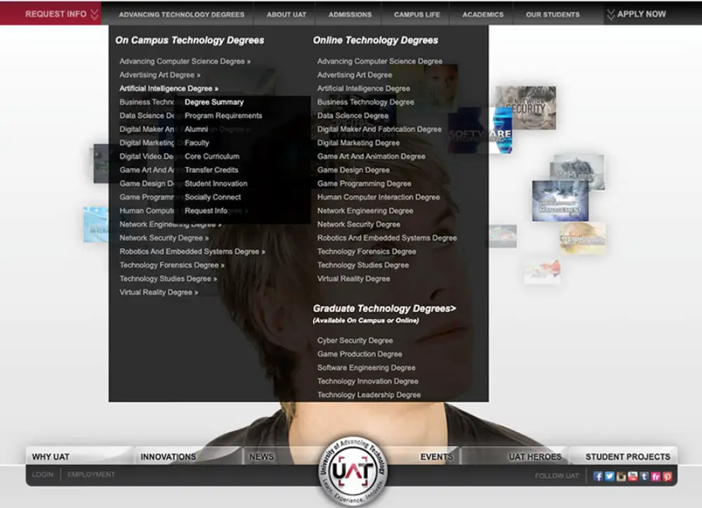
The website’s main header menu aims to streamline website navigation. The user will get the right direction from the menu. Ideally, it will make sense to have as many website navigation options as possible, but on a practical note, this works against the developer. The user will get overwhelmed seeing too many options. Hence it is advised not to mistake of providing too many options in the header menu. Rather break it down in a structured manner and make it comfortable for the user to move through the website.
2. Breaking the Industry Norms in Naming the Pages
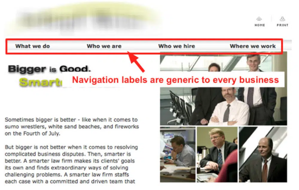
As a website designer, you would have visited thousands of websites. You would have observed that the header menu remains consistent in most. For example, there will be a home page, about us page, products/services, pricing, and contact us page. All these pages would have a place in the header menu, and conventional terms such as “About” or “Contact” would be used for them. This makes it easy for any user to understand what the page will be about.
However, many developers mistake naming these pages with very creative names. Breaking this industry norm makes it difficult for users to identify the pages. This may result in the user not going ahead, clicking on the pages, and leaving the website. Your website’s bounce rate will go for a toss, and so will your sales. Also, fancy terms may use more space in the header menu, making it skewed. It is advisable to stick to standard industry names for setting them up on the header menu to ensure streamlined website navigation.
3. Over Using Drop Down Menus
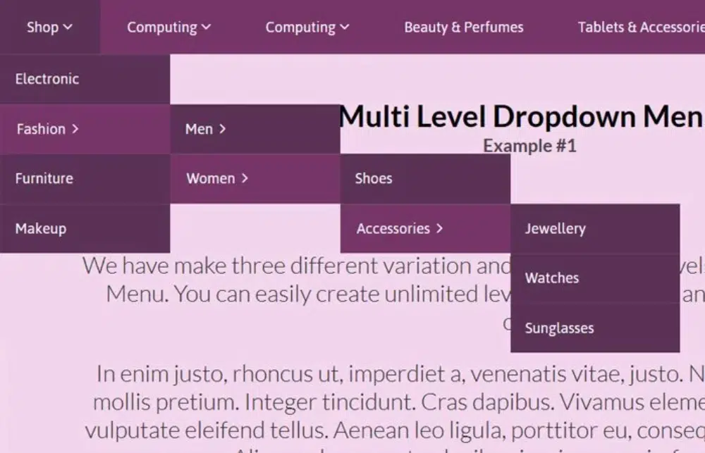
Drop-down menus have come in as a boon for developers who want to provide more details on the menu. However, some developers make the big mistake of overusing drop-down menus. Websites with more than two layers of drop-down menus will cause a lot of issues in terms of website navigation and also in terms of mobile responsiveness.
For websites with many product categories or classifications, it is always tempting to provide those details in the form of drop-down menus. However, you should stick to the rule of having at the maximum only two drop-down layers. You need to understand that the user will have to move their mouse on it and open it for each layer. Sometimes the top layer will get overlaid on the bottom resulting in website navigation issues.
4. Forgetting About Mobile Navigation
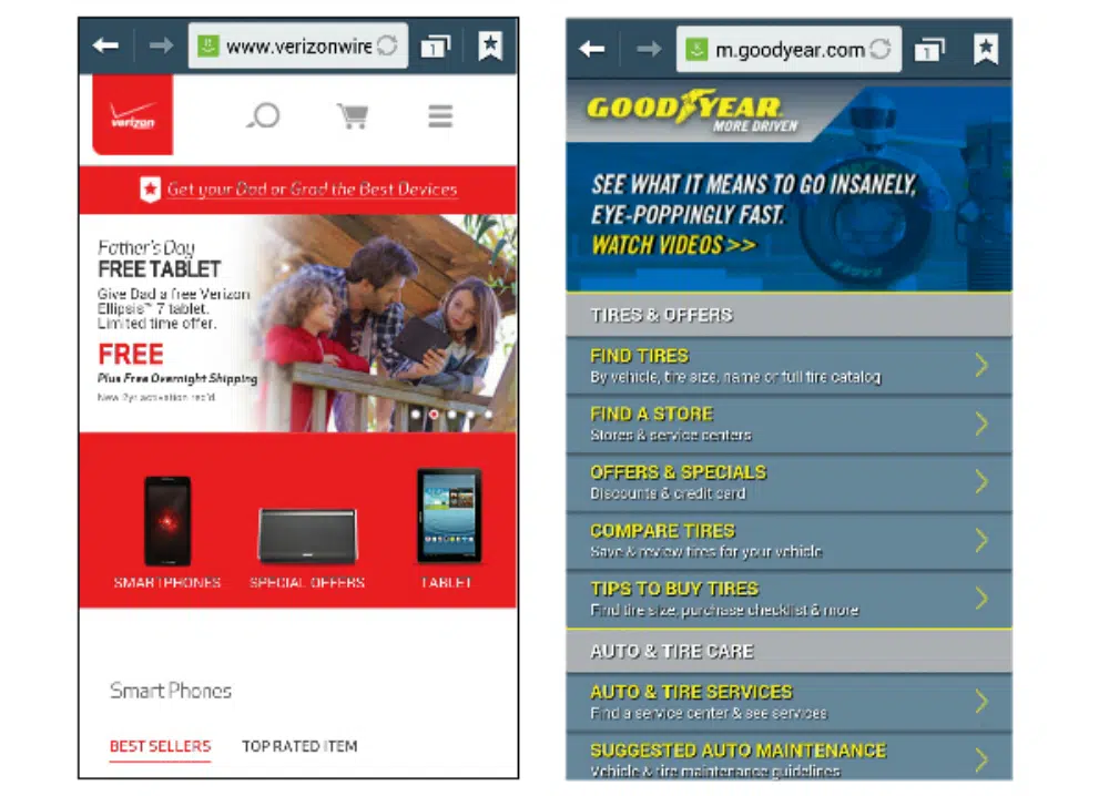
Today mobile compatibility has climbed to the top layer of the priority list of website developers. Hence this mistake of forgetting about mobile navigation has reduced a lot. Still, there are a few developers who do not take into consideration the mobile navigation part when designing the website. It will be a costly mistake if you forget that the website will behave differently on different websites.
The website navigation that you have planned may work flawlessly on the desktop version, but you need to check that it works well for other devices. Generally, mobile devices have hamburger menus. And not just menus; even your sections and buttons on the home page need to be easily accessible. Remember that the user will be using touchscreen devices and hence ensure that your buttons or links are big enough for the user to touch and open them. Otherwise, you will end up with really bad website navigation and a bad user experience.
5. Not Providing A Way Back
Website navigation is always a dynamic function. Users will move deeper into the website content, and at some time, they would also want to trace back their journey. Hence it is important to provide a way out for users to navigate the reverse path. Few developers argue that they have a home option in the menu for that, but it is possible that the user may not want to go directly back to home but some page in between his website journey.
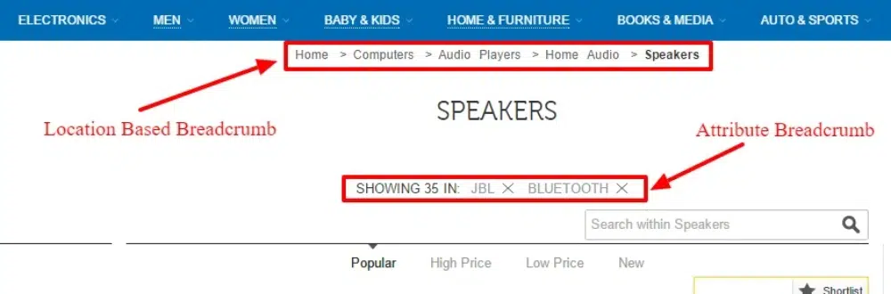
Breadcrumbs prove to be very effective in solving this issue. They provide an easy way back to the user and improve your website navigation by providing a sense of positioning to the user. If you are providing breadcrumbs or a back button, make sure it is easily accessible and not hidden in some corner of the webpage. This happens more in the case of mobile websites. Hence your website navigation plan should always feature a reverse path.
6. Having Too Many Dead Ends on the Website
Having a dead end on the website is a cardinal sin in website navigation. You can never afford to mistake of not providing users options to go to other pages. For any brand, websites have become a part of their marketing collateral. You need to make sure that the user moves around the website as much as possible and knows more about your brand’s products or services.
Today, there is cutthroat competition in SEO and digital marketing. As a result, getting more visitors to your website is getting more challenging. You cannot have website navigation where the user meets a dead end in such times. A good way to mitigate this is by offering navigation options at the end of the page, taking users to other products or services or even blogs. This way, the user will not leave the website, which will help you decrease your bounce rate.
7. Forgetting About the Sales Funnel
Setting up a sales funnel has become a norm for all brands. The advent of digital marketing has thrown up a lot of mediums for attracting sales, and websites are one of them. Websites serve the important function of being the gateway to your sales funnel. You attract users from social media, search engines, and other places and take them to your website. Over there, you showcase the best of yourself in terms of products, services, USPs, and everything. The website serves as an extended and dynamic sales pitch to convince your user.
However, some developers forget to put in the next step of the sales pitch, which is to enable conversion. Your website navigation has to ensure that once all the selling part is done, users can move ahead in the sales journey to buy the product or service. It is a good idea to sprinkle call-to-action sections at all parts of the pitch. This way anytime, the user is convinced about the brand, they can click on it and be directed to the sales page or contact us page. If this is not done, you will lose out on many potential customers.
8. Using Too Many Buttons
Have you observed that the use of buttons is on a decreasing trend? This is because buttons prove detrimental to your SEO score in more ways than you can imagine. First, they are hard to adjust in terms of mobile compatibility. They need to be scaled up and down as per the device. Also, the text inside the button is not read by the crawler resulting in further opportunity loss for SEO. Also, many developers use custom images for buttons which further loads up the website hosting provider.
Stylized texts are replacing buttons. They also stand out from the content, are readable in terms of SEO, and are easy to play with mobile responsiveness. However, many old-school developers still like to load their websites with too many buttons. Using buttons on bigger sections like the slider or header part is still acceptable, but using them across the website proves to be a turn-off for the users. Apart from SEO score and mobile compatibility, it will affect the website navigation, and the user will get confused.
9. Tempting the User for Too Long
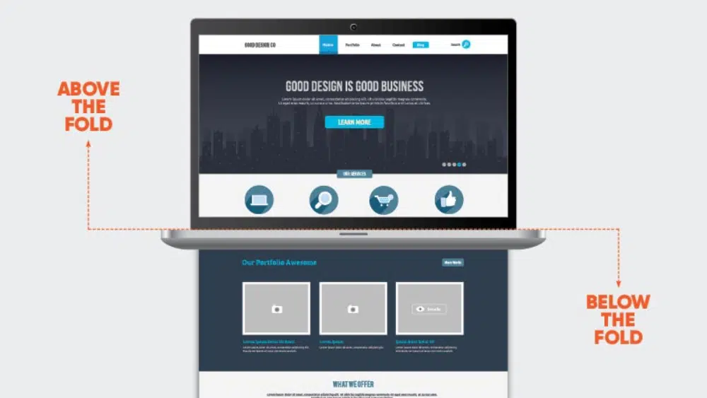
The basic purpose is to provide a certain set of information to the user who is looking for it. However, the attention span of users is continuously decreasing. If they cannot find what they are looking for quickly, then there is a good chance that they will leave the website. This is why the concept of above-the-fold and home page navigation has become so important. Even SEO experts believe in adopting a more direct and quick approach to communicating with users.
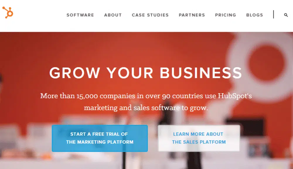
However, some developers mistake tempting the user for too long. They are not direct in communicating what the brand or website is about. Confusing the user will only lead to an increased bounce rate. Instead, you should ensure that your website navigation is planned so that the user gets the important information first with the least number of clicks. It is advisable to have the home page preview what the website is about. If you have products, then display some on the home page, or if you have knowledge articles or case studies, then better to create a section for that. This will satisfy the user’s curiosity, and they will not leave the website but browse the sections of their choice.
10. Not Putting Yourself In The User’s Shoes
Empathy is an important value not just in real life but also in digital life. As a designer, you should always put yourself in the user’s shoes and check out your design. This is true for all types of design, be it websites, print media, or product design. This approach of sitting on the other side of the table can sometimes make you realize many areas of improvement in your design. For website design, this approach can help you finetune your website in a better way.
Many designers are in a hurry to finish their projects and forget the last critical leg of the project – testing. You must test your website on different devices and browsers. You should have other people also test your website as their feedback can be valuable. Website navigation needs to be designed to keep the user at the center. You want to showcase the best of your website in the least possible time to the user. Hence whenever you are working on website navigation, think like the user, and this will help you create a better website navigation framework.
Conclusion
Untidy website navigation can prove to be very detrimental to your website’s bounce rate and even sales. The good part about website navigation is that it is not highly complicated. There are a few basics that you need to follow. But the problem happens when developers get super creative and deviate from the norms. This blog compiles ten common website navigation mistakes to avoid when designing and developing websites. By avoiding these mistakes, you can ensure that you will have smooth website navigation which will provide a positive user experience.
Are you looking for ways to digitize your menu board? If you’re like most restaurants, your menu board is crammed with text and images that are difficult to read. Not only is this design headache, but it’s also a major turn-off for potential customers. To increase sales, you must ensure that your menu board is easy on the eyes. This blog post will discuss tips for digitizing your menu board and making it more visually appealing. Let’s get started.
Include Video or Image
When designing your digital menu board, include an image or video relevant to your brand. This will help customers remember your restaurant and what you have to offer. For example, if you’re a pizzeria, you could include a video of your pizza being made from start to finish. Most digital menu boards have a video or image at the top of their homepage to make a strong first impression. Ensure that it is done in high resolution and of the right size, so it doesn’t appear pixelated or blurry.
When including a video or image, some factors you need to consider are the relevance of the video to your brand, resolution, and file size. You also need to focus on the aspect ratio. The standard aspect ratio is 16:09, which is the ratio for most HD televisions. However, you can use other ratios such as 21:09 or 32:18. The important thing is to ensure that your video or image fills the entire screen without cropping.
Use Contrasting Colors
When picking colors for your digital menu board, it’s important to create contrast. This will make the text and images on your screen easier to read. For example, if you’re using a white background, you could use black or dark gray text. If you want to use a colored background, make sure the text is in a light color, such as white or off-white. You can also use different fonts and font sizes to create contrast or make a mood board that’s visually appealing.
Some factors you need to consider when choosing colors are the background color, text color, and font size. It’s also important to ensure that the colors you choose complement each other and don’t clash. The best way is to create a color palette before designing your menu board. This will help you stay on track and ensure that all the colors you use work well together.
Make it Easy to Read
Your digital menu board should be easy to read, even from a distance. Use clear fonts and large text sizes. The background color should contrast with the text color to make it easier to read. For example, if your background is light, use dark text, and vice versa. You can also use different font sizes for different sections on your menu board. For example, you could use a larger font size for the section headers and smaller font size for the text beneath them.
Ensure your clients can read the menu at a distance by using clear fonts and large text sizes. Another way to make the menu easily readable is by contrasting the background and text colors. Using different font sizes for different sections is also a great way to maintain readability while still being creative with your design.
Take Advantage of Free Digital Content Platforms
There are many free digital content platforms that you can use to create and design your menu board. Canva is a great option for creating high-quality visuals without spending much money. With Canva, you can access millions of royalty-free images, videos, and fonts to use in your design. Another platform you could use is Adobe Spark, which is similar to Canva but also offers a range of templates and tools to help you create a unique menu board.
You can also use Google slides to create your menu board. Google slides is free presentation software that you can use to create digital menus. It’s easy to use and has a wide range of features, such as the ability to add images, videos, and animations. Ensure that your menu board is designed and easy to navigate so that your customers can quickly and easily find what they’re looking for.
Embrace Clutter-Free Designs
The best digital menu boards are those that are uncluttered and easy to read. When designing your menu board, only include the most important information. Too much text or too many images will make your menu board appear cluttered and difficult to read. Stick to one or two fonts and use simple graphics and icons to illustrate your points.
Also, ensure that there is enough space between the different elements on your menu board. This will make it easier for the eye to scan and find the information they’re looking for. Use whitespace to break up text sections and create a hierarchy of information. Lastly, it is important to proofread your menu board before publishing it. This will ensure that there are no typos or errors.
Use Large Fonts
Not all clients can see from a distance, so using large fonts on your digital menu board is important. A good rule of thumb is to use fonts that are at least 16pts. You can also increase the line height to make the text more readable. Another tip is to use all caps for your headlines and section headers. This will make them easier to read. Just be careful not to use all caps for too long, as it can be difficult to read.
Besides the large fonts, you shouldn’t apply much decoration to the text. The decoration could be a simple line under the headlines or between sections. Too much decoration will make the text harder to read. For instance, using calligraphy fonts or adding shadows to the text can make reading more difficult.
Digital menu boards are a great way to promote your products and services. By following these tips, you can ensure that your menu board is easy to read and navigate. You can start by using videos or images to add interest to your design. Also, take advantage of free digital content platforms such as Canva or Adobe Spark. Lastly, remember to use large fonts and embrace clutter-free designs. By following these tips, you can create an effective digital menu board that will help boost your business.
Setting up a business is an exciting prospect as each business owner aims to make their vision come true. This process comes with its ups and downs, so we provide you with our best tips and advice on how to succeed in this difficult process!
1. Write Down Your Goals
One of the most important things you can do to help manage your business is to write down your goals. This will help ensure that you are moving forward in the right direction and that you are making progress.
While writing your goals is important, it is also important to keep them flexible. This way, you can adapt them as you go along and make sure that they remain relevant and practical. Additionally, it can be helpful to set a timeline for achieving your goals. Doing this will help you stay organized and on track.
Finally, it is important to communicate your goals with everyone involved in your business. This way, everyone knows what they need to work towards and can help to support you in your goal-oriented journey.
2. Keep Up With Technology
With the prevalence of smartphones and other mobile devices, it’s more important than ever to stay up to date on the latest technology. This technology can be used to manage your business in a number of ways, from invoicing to tracking your sales figures. By using today’s technology you can streamline your operations and make your business run more smoothly.
3. Collect Feedback From Others
One of the best ways to improve your business is to collect feedback from others. This can be done through surveys, interviews, or focus groups.
By collecting feedback, you can learn what customers want and how you can improve your products and services. You can also find out which marketing strategies are working well and which ones need improvement.
When you collect feedback, it’s important to remember that you don’t have to take all of the opinions into account. Only take into account the opinions that are relevant to your business. By doing this, you’ll be able to make decisions that will improve your business overall.
4. Strive To Get More Contacts
Getting new contacts can be done through networking events, contacting business owners in your area, and mailing lists.
Networking events are an excellent way to meet new people and expand your network. They also provide you with the opportunity to learn about new businesses in your area and how they operate. Making connections at networking events can lead to profitable deals and new customers.
Contacting business owners in your area is another great way to get more contacts. By doing this, you can learn about their needs and find potential clients. Maintaining a relationship with these business owners can lead to referrals and future business opportunities.
Mailings are also a great way to get more contacts. By sending out informative letters, you can reach a large number of people quickly. You can also include tips on how businesses can improve their operations. Including samples of your work can help recipients see what you can do for them.
5. Automate Your Operation
One of the best ways to manage your business is to automate as much as possible. This will help to save you time and money.
You can automate many aspects of your business by using software programs. These programs can help you keep track of your finances, sales data, and other important information.
You also can use software to help you schedule your work hours, track expenses, and more. At Management Help, you can read different management tips and tricks to use with your own business. This will help you to stay organized and efficient in your operation.
6. Use Social Media Sites
To stay up to date with your clients and market your business effectively, you need to use social media sites. Here are four tips for using social media sites to help manage your business:
Use social media sites to keep in touch with your clients. You can use social media to communicate with your clients on a regular basis. This will help you keep them updated on what’s happening with your business and ensure that they know about any new products or services that you have available.
Use social media to market your business. You can use social media to market your business to potential customers. This will help you attract new customers and build trust with your current ones.
Use social media to create content for your website and blog. You can use social media to create content for your website and blog. This will help you attract more customers and build trust with the people who visit your website or blog.
Use social media as a platform for networking. Social media is a great way to network with other entrepreneurs and professionals in your industry. This will help you connect with potential partners and suppliers, and learn about new trends in your industry
Managing a business can be difficult, but it’s not impossible. In this article, we have outlined a few of the most important things that you should keep in mind if you want to manage your business successfully. So whether you are just starting out or you are looking to take your business to the next level, keep these tips in mind!
If you are a creative person with drive and ambition, there are various career options that you can consider. Finding the right career is important, as it enables you to unleash your creativity while doing something you enjoy and earning a good living. One of the careers you might want to consider is graphic design, and this is a career that can provide you with great prospects, an excellent income, and the chance to work on a diverse array of projects.
Of course, you need to ensure you take the right steps if you want to enjoy a career as a graphic designer. Like most other industries and jobs, there is a lot of competition for positions within this field, so you need to ensure you stand out for all the right reasons. There are a number of steps that you can take in order to boost your chances of getting into this type of career, and we will look at some of these within this article.
Some Steps to Help You
There are a number of important steps that can help you when it comes to getting into a career in graphic design. Some of the main ones are:
Get Certification or Relevant Qualifications
Depending on the job you apply for and the company you apply to, you might not need any specific formal qualifications for a graphic design job. Some companies are happy if you have prior experience instead, and some may even take you one without experience in a junior role where you are trained on the job. However, by getting some sort of formal graphic design certification, you can boost your chances of success considerably, so this is something that is well worth considering. You will find plenty of courses including online ones.
Create an Excellent Resume
One thing you will definitely need if you want to boost your chances of becoming a graphic designer is an excellent resume. Potential employers want to know that they are taking on someone with the right skills, qualifications, experience, and attitude, and this is where your resume can help. You can showcase your desirable qualities with greater ease and in an organized way with your resume. You will also find graphic designer resume examples that you can turn to if you want to ensure you create a polished and professional one.
Be Proactive in Your Job Search
It is important not to be complacent when it comes to looking for work once you have the necessary qualifications and a good resume. In order to ensure you do not miss out on potentially perfect opportunities, it is well worth registering with job sites so that you get automatic notifications when relevant graphic design jobs are advertised. You can also call local graphic design agencies to see if they have any vacancies or even to see if you can get some work experience.
These are some of the steps that can help you to get your foot on the first rung of the graphic design career ladder.
If you are looking for the best graphic design schools in the USA, you will most likely encounter a long list of colleges that claim to be the number one. The good part about learning graphic design in the USA is that there are many quality schools to choose from. The challenging part is finding the right one for you.
Graphic design has a wide range of applications in both the public and private sectors. Typical uses of graphic design include:
Advertising
Branding
Editorial design
Information design
Packaging design
Point of sale materials
Digital Marketing
The future of graphic design is rapidly changing. As new technologies emerge, the way that graphic designers work and create will change as well. Learning graphic design from a design school means keeping up with these changes and being able to adapt to them. This can be a challenge, but it also means that there are always new opportunities for those willing to learn.
One thing that is likely to continue is the trend toward more personalization and customization. With technology making it easier to create custom designs, more people will be looking for ways to make their mark. As a result, graphic designers who can offer this kind of service will be in high demand. But for this, you will need to have a strong foundation of design education which graphic design schools can offer.
Why choose a graphic design school in the USA?
The advent of technology has led to the globalization of education. Today, you can learn almost anything using the internet. There are excellent graphic design courses from reputed universities available online. In addition, some successful designers are offering short courses to harness your design skills. But these courses are suitable for designers who already have foundational knowledge.
Graphic design is a constantly evolving field, with new technologies and trends emerging all the time. Learning graphic design in a school in the USA can give you the skills and knowledge you need to stay ahead of the curve and be a successful designer.
Some of the benefits of learning graphic design in a school in the USA include:
Access to the latest software and technology: Graphic design schools in the USA have access to the latest software and technology, which means you will be able to learn about and use the latest tools and techniques.
Learn from experienced professionals: Graphic design schools in the USA typically employ experienced professionals as instructors so that you can learn from some of the best in the business.
Get a well-rounded education: Design schools offer a well-rounded education covering all aspects of graphic design, from theory to practice and creative personality development.
Network with other designers: Graphic design schools in the USA provide opportunities to network with other designers, which can be beneficial for your career.
Job opportunities: If you have completed a course from a well-reputed graphic design school in the USA, you are more likely to land a high-paying job at a premier design studio.
If you are interested in pursuing a career in graphic design, studying at a school in the USA can be a great way to get started. With the advantages mentioned above, you will get a quality education that will help you succeed in this competitive field. To help you in this quest, we have shortlisted some of the best graphic design schools in the USA.
Rhode Island School of Design (RISD) is a renowned private art and design college founded in 1877. RISD has been ranked consistently as one of the country’s best art and design schools. It offers bachelor’s and master’s degrees in various creative disciplines, including painting, sculpture, architecture, industrial design, and graphic design.
The graphic design program at RISD focuses on providing students with a solid foundation in design principles and techniques. Students learn to think creatively and critically about visual problems and use various tools and software to create innovative solutions. The curriculum includes design for publishing, package designing, and knowledge of motion, sound, and vision. In addition to coursework, students also have the opportunity to participate in internships and other real-world learning experiences.
RISD is known for its rigorous academic program and demanding workload. Students are expected to complete a substantial amount of work outside of class, including studio time and critiques. As a result, RISD graduates are highly sought-after by employers in the creative industries.
Parsons School of Design is one of the leading institutions for graphic design education in the United States. Located in New York City, Parsons offers bachelor’s and master’s programs in graphic design, with a curriculum that emphasizes both creative and technical skills. Parsons has a long history of producing successful graduates who have gone on to careers in graphic design.
Its graphic design course trains students in the latest software and design techniques and teaches them to think creatively and develop innovative solutions to problems. Students learn about design history and practice, visual cultures, interaction design, typography, and many fine streams of designing. The coursework is both rigorous and inspiring, and
The school’s location in New York City gives students access to a wealth of resources and opportunities, and the curriculum is designed to give students the skills they need to succeed in the field. Notable alumni include Paul Rand, Gilbert Adrian, Van Day Truex, and many more.
The California Institute of the Arts is a world-renowned learning institution for graphic design. Based in the United States, it offers students from all over the globe the chance to study under some of the most respected and talented designers in the industry. The school has produced alumni who have become leaders in their field, and its faculty are constantly innovating and pushing the boundaries of design education.
The school’s curriculum is divided into liberal arts and graphic design. In the liberal arts portion of the program, you’ll take courses in history, literature, and other subjects that will help you develop a well-rounded understanding of the world around you. You’ll also learn to think critically and express yourself clearly through writing and oral presentations. The graphic design portion covers all aspects of the design process, from concept development to final execution. In addition, you’ll learn about typography, layout, color theory, and more.
When you graduate from the California Institute of the Arts, you’ll be prepared for a successful career in graphic design. And you’ll have the opportunity to work with real clients on real projects so that you can put your skills to the test in the real world. This will help you garner the skills and knowledge you need to succeed, and you’ll have the portfolio to prove it.
Pratt Institute is a private, nonprofit art and design school offering programs leading to certificates, bachelor’s, and master’s degrees in various creative fields, including graphic design. Pratt’s graphic design program is one of the oldest and most respected. Students benefit from small class sizes, individualized attention from faculty, and ample opportunities to gain real-world experience through internships and other hands-on learning opportunities.
The graphic design course at Pratt Institute covers a broad range of topics, from the history and theory of graphic design to the latest trends and technologies. Students learn about color, typography, layout, branding, and more. They also get to put their skills to the test by collaborating with clients and other designers.
Graduates of Pratt’s graphic design program are prepared for careers as creative directors, art directors, designers, and more. They go on to work for some of the world’s top companies, including advertising agencies, publishers, and design firms.
The Maryland Institute College of Art (MICA) is a private art and design college in Baltimore, Maryland. It was founded in 1826 as the Maryland Institute for the Promotion of the Mechanic Arts, making it one of the oldest art colleges in the United States. MICA offers undergraduate and graduates degrees in fine arts, graphic design, photography, interior design, creative writing, etc.
MICA is nationally renowned for its programs in graphic design and visual communications. The course includes a wide range of design principles, color theory, printmaking, and web design. Students learn how to conceptualize and create visual solutions to communication challenges. They also develop strong problem-solving skills and an understanding of the latest technology and software used in the graphic design industry.
The school’s Graphic Design Department is one of the oldest and most respected. Its faculty comprises experienced professionals passionate about teaching and helping students reach their full potential. As a result, MICA’s graduates have successful careers at top advertising agencies, design firms, and corporations worldwide.
Carnegie Mellon’s School of Design offers students the chance to learn graphic design from some of the top professionals in the field at its faculty, including some of the world’s leading graphic designers, such as John Maeda, Massimo Vignelli, and Milton Glaser. The school was founded in 1974 and has been consistently ranked among the top design schools in the world.
The school’s curriculum emphasizes both theoretical and practical aspects of graphic design. As a result, the course covers a broad range of topics, from the basics of design theory to more advanced concepts such as illustrations, typography, visual communication, and more. Students also can learn about different software programs used in graphic design, such as Adobe Photoshop and Illustrator.
In addition to coursework, students must complete a final project to graduate. This helps them create a portfolio that they can use to showcase their talent to potential employers. As a result, students at Carnegie Mellon benefit from a unique blend of academic rigor and real-world experience.
Degree Offered: BA in Art specializing in graphic design
The Yale School of Art is one of the oldest and most prestigious art schools in the United States. Founded in 1869, the school offers programs in graphic design, painting, sculpture, and printmaking. Yale has produced many notable alumni, including five U.S. Presidents, 19 Supreme Court Justices, and numerous Nobel laureates.
The school’s Graphic Design program is ranked among the best in the country. The graphic design course at Yale University School of Art teaches students to create visual compositions to communicate messages. Students’ exclusive learnings at Yale are letterform design, communicating with time, motion and sound, and typography.
Students receive a comprehensive education in design theory and practice, emphasizing critical thinking and problem-solving. The faculty includes leading practitioners and scholars committed to teaching and mentoring students.
School of Visual Arts (SVA) is an art and design college founded in 1947. The school offers bachelor’s and master’s degrees in fine arts, computer art, graphic design, illustration, and photography. SVA has a strong reputation in the graphic design community. Its alumni include many well-known designers, such as Milton Glaser, Paula Scher, and Chip Kidd.
Its graphic design course includes typography, layout and composition, image-making, print production, and contemporary issues in graphic design. Students also can take classes in web design, motion graphics, and branding.
The School of Visual Arts faculty is made up of experienced professionals who are actively working in the graphic design industry. As a result, they can provide students with insights into the latest trends and technologies.
ArtCenter College of Design is a world-renowned private institution founded in 1930. It offers undergraduate and graduate degrees in various creative fields, including graphic design, illustration, advertising, photography, automotive design, etc.
The graphic design course at ArtCenter College of Design covers various topics, from the basics of design principles to more advanced concepts like web design, branding, and marketing. The coursework is challenging and hands-on, allowing students to learn by doing.
The faculty at ArtCenter is made up of working professionals who are leaders in their respective fields. ArtCenter College of Design is accredited by the National Association of Schools of Art and Design (NASAD). Located in the heart of Southern California, ArtCenter’s location allows students to take advantage of opportunities to intern and work with some of the biggest names in the industry.
Degrees Offered: BA in Visual Communication, BFA in Graphic Design
Savannah College of Art and Design is a private nonprofit institution that offers bachelor’s and master’s degrees in various areas. Graphic design is one of the programs offered at this school. The college was founded in 1978 and had since then built a reputation for being one of the best schools for graphic design.
Savannah College of Art and Design is accredited by the Southern Association of Colleges and Schools Commission on Colleges (SACSCOC) to award bachelor’s and master’s degrees. The graphic design course at Savannah College of Art and Design includes instruction in design, layout, color theory, computer graphics, typography, printing processes, and web design. Students receive both classroom and studio instruction.
The college also offers a study abroad program for students who wish to experience another culture and learn about graphic design in a different country. The faculty is composed of working professionals who are experts in their field. The curriculum is rigorous and prepares students for a career in graphic design.
Conclusion
Graphic design is a process of visual communication and problem-solving through typography, photography, and illustration. Its importance is gradually increasing, and with it, the need for well-educated professionals in this field is also increasing. Opting for a full-fledge graphic design course in a reputed school is a wise choice if you want to pursue a steady career in graphic design.
However, with over a hundred schools offering major or minor courses on graphic design, finding out the best one may get challenging. Here’s a recap of the best graphic design schools in the USA:
Some people say that user experience is an invention of designers willing to increase the budget of a project. But an interface without UX is like a Tesla without batteries: you can turn the steering wheel but you can’t drive away. In the professional sense, design is not just a pretty picture but hard work based on scientific research and best practices. And the success of a product in the market largely depends on its design. Let’s see how experts create cool projects based on Gestalt psychology.
How the brain works when interacting with an interface
For designers, their work is not only about pictures, fonts, and colors. First of all, they seek to solve certain business problems. UX/UI professionals are constantly generating ideas, refuting or accepting hypotheses, and testing options to find the best way to resolve a specific issue.
One of these problems is the structuring of information. After all, a person constantly tries to systematize, modernize and control everything. This skill is vital since there are tons of content on the Internet. It usually takes 50 milliseconds for a user to perceive a page. If the eye has nothing to “catch”, a visitor abandons a website for something more interesting.
Over thousands of years of evolution, the human brain has learned how to structure information. Thanks to this quality, it began to group objects into a whole picture, saving energy and automating processes. Now it works almost instinctively.
Can you see an object in the picture below? What is it? Right you are, it’s a tree.
But you don’t notice its parts at first glance (the trunk, leaves, cones, branches, and so on). Your brain sees a whole picture and understands that this object is a tree.
Why does this example matter? When interacting with an interface, the same neural connections are activated in the brain as when interacting with real physical objects.
The picture below shows an interface divided into separate grouped elements. When a person looks at it, their brain tries to isolate some groups and operate within their framework.
What does psychology have to do with mobile app UI design?
At the beginning of the 20th century, German scientists defined such a concept as Gestalt. Understanding the above mechanisms and cognitive features of the brain helped them do it. The word itself is translated as “form” or “structure”. It refers to the principle that a structured whole is more than the sum of its parts.
Laura Busche said that experienced designers are fully aware of the role of psychology in visual perception.
The work of a designer is facilitated by the fact that people intuitively try to isolate, structure, and find the simplest solution to achieve their goals. Thus, all designers need to do is create the right triggers that will work, including those based on Gestalt principles.
Visualization and psychology are closely related, and Gestalt principles control these connections. Let’s consider what principles of psychology help interface design studios create convenient and useful products.
The proximity principle
Proximity is one of the crucial concepts in Gestalt design. It means that interconnected elements should be close together, and those with weaker connections should be placed farther apart.
Everything is quite simple. However, in practice developers and designers often ignore this technique. In this case, blank space (or negative space) plays an important role. It adds hierarchy to a picture and helps you visually determine if objects are close.
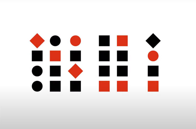
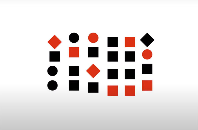
In the example below, you can see objects divided into three groups.
If you add color, you can see that the law of proximity is not violated because the distance is preserved and the objects remain in their places.
The same thing happens if you change the shape of an object. This means that proximity is more important than form and even color.
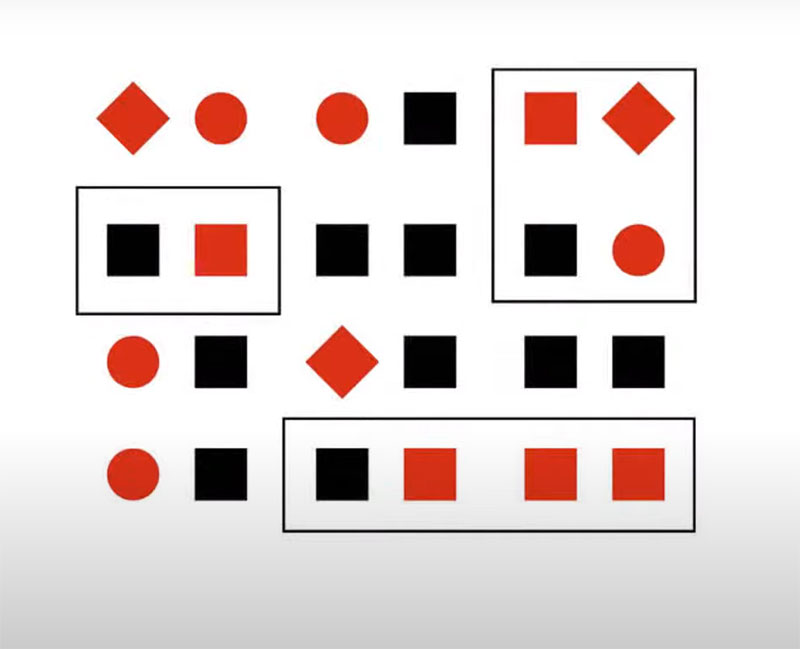
Everything happens differently if objects are located at an almost equal distance.
Here, we see the principle of similarity in color which is close to the proximity principle. In turn, the objects are combined more densely by shape and color. If effects of similarity are based on shape and size, they will simply overlap if objects are similar in color.
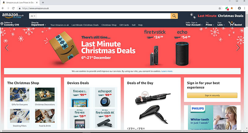
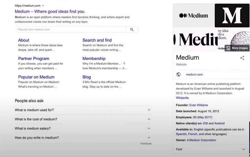
Let’s take Google search results as an example. Elements are laid out clearly and intuitively, and users won’t have questions about performing a search.
The power of the proximity theory: an example
The proximity theory applies to any text. People are used to the distance between letters being shorter than between words, and due to this, a text is readable.
Let’s assume that the spacing between words is equal to the spacing between letters. It’s embarrassing.
Source: office-watch.com
If you shorten the distance between letters, you get a more familiar picture. A problem is easily fixed by simply adding line spacing of the desired size.
Let’s assume that we need to place more text on a plate. In this case, the proximity theory will work like gravity. Small objects are attracted to larger ones, and the border (frame or book cover) acts as a black hole that has an external attraction. To eliminate this, you need to remember that the outer spacing must be greater than the inner indents (between paragraphs).
When adding a heading to complete a picture, you need to place it close to a paragraph and give more space to the outer borders.
This gives a complete picture of the correct use of proximity theory.
The common region principle
This one not only helps to create a set of objects and content but also to separate them. Different features, such as lines, shadows, or background, can be used to combine objects.
Let’s take this picture as an example:
The Von Restorff effect
This is a powerful Gestalt law. From several similar objects, a person remembers the one that is logical and stands out. On the contrary, people tend to forget less noticeable objects.
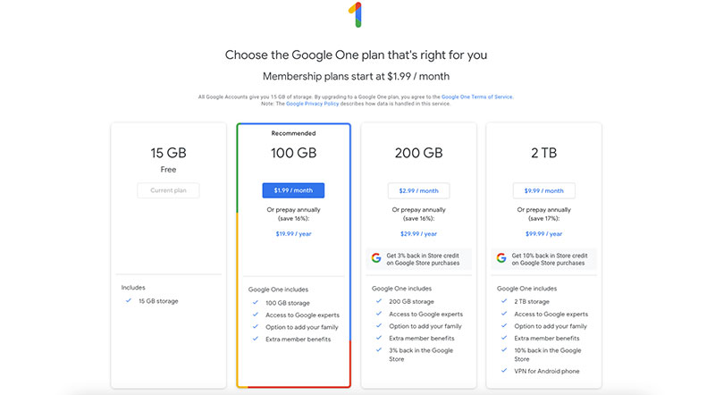
Web design debt and development companies apply this principle on a huge scale. For example, on the rate increase page in Google Drive. It is relevant for each user depending on the amount of space they use.
Source: https://ift.tt/W4K7gGp
Hick’s law
This one is less about Gestalt and proximity but designers find it important. It was discovered by two psychology professors, William Edmund Hick and Ray Hyman. Scientists conducted a series of experiments to understand how much time people spend making a choice.
To do this, they made a special device. It was based on 10 light bulbs to which 10 buttons were connected. As soon as the bulbs lit up, a person had to press certain buttons, from two to ten. Scientists found that the more objects a user sees, the more time they spend making a choice.
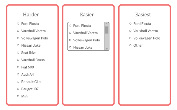
An interface is erroneous if people are given plenty of elements to choose from. It is very difficult for a person to choose what they need.
Therefore, you should limit the number of objects to select. This is where the following rule helps app design studios.
The magical number seven, plus or minus two
George A. Miller specified the previous law by indicating figures. The scientist determined the number of options that is convenient for a person to choose from. He started from such concepts as the economy of the brain when it is looking for the shortest and easiest way to complete a task.
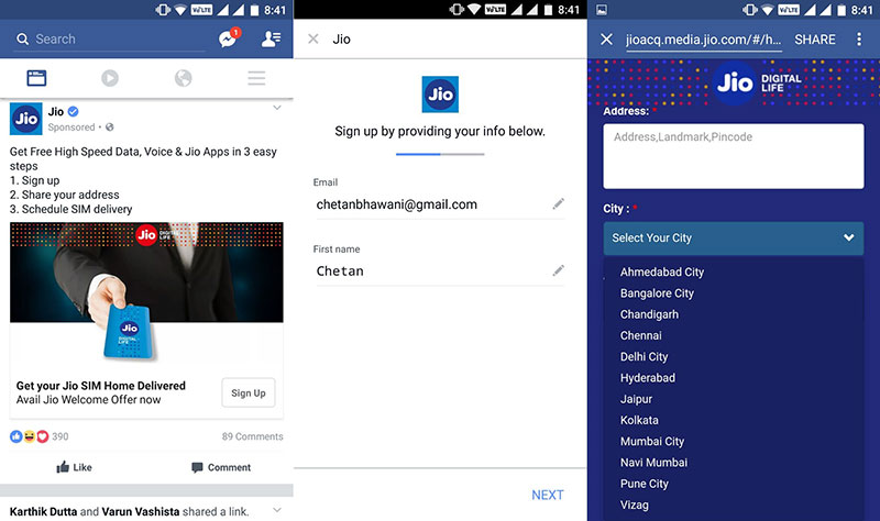
Take, for instance, choosing a delivery city on a site that sells equipment:
Source: gizmotimes.com
At first glance, it seems that the cities are structured alphabetically, and everything is clear. But due to the overabundance of names, it is difficult to make a choice. In this case, a more convenient option is to add a list of the most popular delivery cities, a search engine for settlements by name, and a map with a selection of the desired points.
Conclusion
Enterprise website designers find the psychology of visual perception very important. However, you shouldn’t use Gestalt principles as rigid restrictions or prohibitions. Try to regard them as a useful tool that makes an interface better, more intuitive, and more enjoyable.