Preprocessors are a popular way of simplifying and writing more manageable CSS, as well as making use of frameworks to write better CSS. Let’s take a look at the basics and learn how to create a fully loaded CSS3 button with gradients, shadows and transitions while making use of the Sass preprocessor and Compass framework to do all the hard work for us.
Wait, Prepro-wha?!
I guess if you’re new to this, the sound of ‘CSS Preprocessor’ is confusing! But rest assured, it’s nothing big to worry about. A CSS Preprocessor takes your CSS written in a specific file, compiles it, and writes out your CSS into a separate file. It helps for writing your CSS in a developer-friendly way, but can also help simplify and manage your CSS better.

In this tutorial we will be making a very simple button with 3 states, full of awesome CSS3 features like gradients, box shadows and transitions, while relying on the preprocessor to do the hard work for us. There are a few preprocessor languages out there, but I highly recommend using Sass and the popular framework built from it, Compass. Sass can be used to structure our CSS, while we can use Compass to beef up our styles and provide fallbacks.
What you need and how to get started
The first thing to do is get a program to help compile your code, and while you could install everything by command line, it’s easier to keep control of it using a compiling application. I highly recommend trying out CodeKit for this tutorial, so grab a trial copy and we can get started.

Make a folder for our project, complete with a index.html file ready to put some code in. Next, enter CodeKit, go to the File menu and select ‘New Compass Project’. You will then be presented with a dialog box asking where your project folder is located and where to compile to, and make sure it is set to the following.
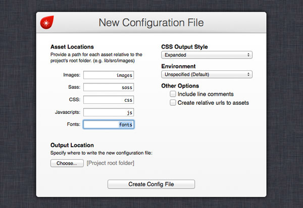
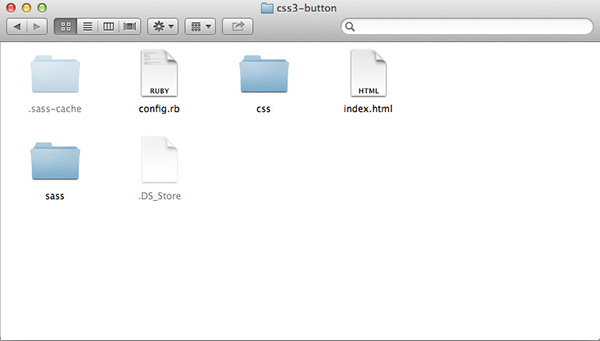
What we’ve set up is where our Sass files are located, where they compile to, and how Compass will write out the CSS. Here, I’ve set it to the expanded view so I can see how my CSS looks, while setting it to compressed will minify the CSS. It’s up to you how you want to organise your project. Compass will then create the project, as well as the location of our CSS and Sass folders.
Getting started with the Sass code
In our HTML file, all we need is some very simple code, and a link to our CSS file in the CSS folder of our project.
<!doctype html>
<html>
<head>

<meta charset="utf-8">
<title>Simple CSS3 Button</title>
<link rel="stylesheet" href="css/style.css">

</head>
<body>
<div id="container">

        <a class="button">Click Me!</a>

</div>
</body>
</html>
That’s all the HTML we need! Now, onto writing with Sass. Enter your preferred text editor, and make a new file, save it into the sass folder, and name it style.scss. We’re going to be writing everything out in SCSS, which Sass can also process, to keep things simple and SCSS isn’t as strict on the beginners. :-)
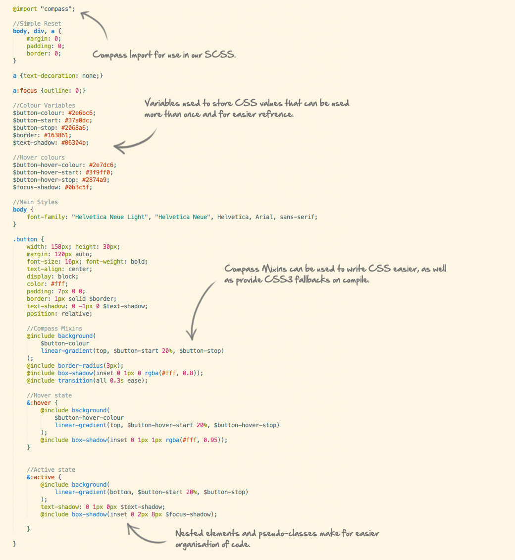
At the start of our file, we will write out a basic reset for the HTML, an import for Compass, and write out our colour variables for the button.
@import "compass";

//Simple Reset
body, div, a {
        margin: 0;
        padding: 0;
        border: 0;
}

a {text-decoration: none;}

a:focus {outline: 0;}

//Colour Variables
$button-colour: #2e6bc6;
$button-start: #37a0dc;
$button-stop: #2068a6;
$border: #163861;
$text-shadow: #06304b;

//Hover colours
$button-hover-colour: #2e7dc6;
$button-hover-start: #3f9ff0;
$button-hover-stop: #2874a9;
$focus-shadow: #0b3c5f;

//Main Styles
body {
        font-family: "Helvetica Neue Light", "Helvetica Neue", Helvetica, Arial, sans-serif;
}
At the top of the file, we’re calling on Compass to be included into the file so we can make use of some mixins for later. We’ve also written a simple reset, and we’ve made use of one feature already: variables. This allows use to store values we will constantly use in our CSS, including colours, font values, and more! Here, I’m using it to store the colours used on the button to simplify writing them out but also for re-use throughout the stylesheet.
Styling the Button
.button {
        width: 158px; height: 30px;
        margin: 120px auto;
        font-size: 16px; font-weight: bold;
        text-align: center;
        display: block;
        color: #fff;
        padding: 7px 0 0;
        border: 1px solid $border;
        text-shadow: 0 -1px 0 $text-shadow;
        position: relative;
}
Onto styling that button! We’ll start off by applying the base styles to the a tag with the class of button. Here I’ve set the base styles for the button, and notice how I am making use of the variables from earlier.
Now, onto the fun part! Remember the Compass import placed at the beginning of the Stylesheet? Here we make use of it, as Compass has a mass library of built-in mixins, which include CSS3 prefixes for browsers that still need prefix support.
.button {
        width: 158px; height: 30px;
        margin: 120px auto;
        font-size: 16px; font-weight: bold;
        text-align: center;
        display: block;
        color: #fff;
        padding: 7px 0 0;
        border: 1px solid $border;
        text-shadow: 0 -1px 0 $text-shadow;
        position: relative;

        //Compass Mixins
        @include background(
                $button-colour
                linear-gradient(top, $button-start 20%, $button-stop)
        );
        @include border-radius(3px);
        @include box-shadow(inset 0 1px 0 rgba(#fff, 0.8));
        @include transition(all 0.3s ease);
}
After the initial styling, we can include some mixins for the background colours, linear gradients, border radiuses and transitions. The best part is it will compile with only the necessary prefixes, and save us from writing them all! The class so far will compile into the following in the style.css file.
.button {
  width: 158px;
  height: 30px;
  margin: 120px auto;
  font-size: 16px;
  font-weight: bold;
  text-align: center;
  display: block;
  color: #fff;
  padding: 7px 0 0;
  border: 1px solid #163861;
  text-shadow: 0 -1px 0 #06304b;
  position: relative;
  background: #2e6bc6 -webkit-gradient(linear, 50% 0%, 50% 100%, color-stop(20%, #37a0dc), color-stop(100%, #2068a6));
  background: #2e6bc6 -webkit-linear-gradient(top, #37a0dc 20%, #2068a6);
  background: #2e6bc6 -moz-linear-gradient(top, #37a0dc 20%, #2068a6);
  background: #2e6bc6 -o-linear-gradient(top, #37a0dc 20%, #2068a6);
  background: #2e6bc6 linear-gradient(top, #37a0dc 20%, #2068a6);
  -webkit-border-radius: 3px;
  -moz-border-radius: 3px;
  -ms-border-radius: 3px;
  -o-border-radius: 3px;
  border-radius: 3px;
  -webkit-box-shadow: inset 0 1px 0 rgba(255, 255, 255, 0.8);
  -moz-box-shadow: inset 0 1px 0 rgba(255, 255, 255, 0.8);
  box-shadow: inset 0 1px 0 rgba(255, 255, 255, 0.8);
  -webkit-transition: all 0.3s ease;
  -moz-transition: all 0.3s ease;
  -o-transition: all 0.3s ease;
  transition: all 0.3s ease;
}
Writing Styles with Nested Elements
Another great feature of a Preprocessor like Sass is the ability to nest elements and appending classes with a parent element you’re styling. This is then compiled into the necessary CSS to make it work.
.button {
        ...

        &:hover {
                @include background(
                        $button-hover-colour
                        linear-gradient(top, $button-hover-start 20%, $button-hover-stop)
                );
                @include box-shadow(inset 0 1px 1px rgba(#fff, 0.95));
        }

        &:active {
                @include background(
                        linear-gradient(bottom, $button-start 20%, $button-stop)
                );
                text-shadow: 0 1px 0px $text-shadow;
                @include box-shadow(inset 0 2px 8px $focus-shadow);
        }
}
After the main button styles, we can nest the pseudo-class selectors for the element’s :hover and :active states, with the ampersand to tell Sass that it’s a nested class appended to the parent element. In the :hover state, we can add a little bit more emphasis to the gradient and inner shadow using Compass Mixins, while the :active state reverses the gradient and changes the box shadow to give the impression that the button is pushed in.
.button:hover {
  background: #2e7dc6 -webkit-gradient(linear, 50% 0%, 50% 100%, color-stop(20%, #3f9ff0), color-stop(100%, #2874a9));
  background: #2e7dc6 -webkit-linear-gradient(top, #3f9ff0 20%, #2874a9);
  background: #2e7dc6 -moz-linear-gradient(top, #3f9ff0 20%, #2874a9);
  background: #2e7dc6 -o-linear-gradient(top, #3f9ff0 20%, #2874a9);
  background: #2e7dc6 linear-gradient(top, #3f9ff0 20%, #2874a9);
  -webkit-box-shadow: inset 0 1px 1px rgba(255, 255, 255, 0.95);
  -moz-box-shadow: inset 0 1px 1px rgba(255, 255, 255, 0.95);
  box-shadow: inset 0 1px 1px rgba(255, 255, 255, 0.95);
}
.button:active {
  background: -webkit-gradient(linear, 50% 100%, 50% 0%, color-stop(20%, #37a0dc), color-stop(100%, #2068a6));
  background: -webkit-linear-gradient(bottom, #37a0dc 20%, #2068a6);
  background: -moz-linear-gradient(bottom, #37a0dc 20%, #2068a6);
  background: -o-linear-gradient(bottom, #37a0dc 20%, #2068a6);
  background: linear-gradient(bottom, #37a0dc 20%, #2068a6);
  text-shadow: 0 1px 0px #06304b;
  -webkit-box-shadow: inset 0 2px 8px #0b3c5f;
  -moz-box-shadow: inset 0 2px 8px #0b3c5f;
  box-shadow: inset 0 2px 8px #0b3c5f;
}
The above is what happens after the :active and :hover states are compiled by Sass; they are written as pseudo-class selectors to the parent element in valid CSS, as well as the desired CSS complete with fallbacks, completing our 3-state button.
View the final CSS3 Button Demo
The style.scss file and compiled Stylesheet
This is all that is written in our whole style.scss file, as we have an organised file which is written simply, as well as carrying mixins and variables that do some of the work for us, which then compiles into the final style.css file Stylesheet.

Learning more about Preprocessors
Hopefully this hasn’t been too much of a headache, and has given you the ambition to write more in Sass and Compass, as well as try CSS Preprocessors. There are many great articles by CSS-Tricks, NetTuts, The Sass Way, and many more on the subject to help you on your way to write more efficient, simple and easier CSS.
Source: http://line25.com/tutorials/getting-started-with-the-sass-compass-frameworks


No comments:
Post a Comment