How to create a minimalist logo design? You would think it’s simple, but you still have to be careful not to create a logo that is just basic.
Simplification and reduction is not a new trend – it has been around for more than a decade, present in all design facets from fine arts to interior design.
The common name of these simplification processes is minimalism.
Rather than a technical approach, minimalism is modern way of thinking that strips and unveils the core of the design subject.
With minimalism in the front plan, all superfluous elements are brought down to bare essentials, so that an observer would not be distracted from the purpose of that design. As practical as it is, minimalism may as well be the leading design movement of the 20th and 21st century.
At the same time, bringing elements down to bare essentials is a very difficult process, as it takes a while for a designer to appreciate the beneficial effects of simplicity. Is it really worth it? Let’s explore.
Is simplicity everything there is to a minimalist design? Yes, but not necessarily. What makes the difference is the definition of minimalism you chose to follow:
- Minimalism: An abstract painting and sculpture school (ABC art) that uses simple forms, basic shapes, and monochromatic, primary-based colour palettes. It is also recognizable for its style anonymity and objectivity, and a strong tendency towards rejective art and reductivism.
- Minimalism: Applying the bare essentials and core elements in design, art, or literature.
- Minimalism: A contemporary music mode popular by simple patterns, rhythms, and harmonies, melodic repetitions and prolonged chordals, as well as a trancelike effect.
Minimalism – meaning
In the simplest way possible, minimalism can be described as a deliberate lack of adornment and decoration in any design faucet.
Minimalism helps designers make their work simpler and more functional, doing as little as to stripe back all elements that are not necessary. In such way, they manage to convey their brand’s message, and encourage potential users to accomplish the exact action they expect.
By ‘minimalism’, we’re not referring to empty spaces and text-free schemes, nor do we encourage users to believe simplicity is the perfect solution. To come up with a masterpiece, you should think the way your audience does, and give them the elements they expect regardless of what the minimalist trends impose.
People must find your information to be relevant and engaging, which means that content, should be purposeful, rather than short.
Designers nowadays advise focusing on the message and the content and leaving all other elements aside.
Minimalism, of course, will be tricky for first time users who often underestimate the difficulty of applying it.
The digital revolution and rise of mobile devices gave minimalism its 5 minutes of fame, and many companies grabbed the moment to enable technology to change our lifestyles.
A short overview on the history of minimalism
Quality examples of minimalist design can be found in almost any art or architecture style and era. Going back to some of them, we’d understand the reasons why designers decided to come back to it.
To examine the emergence of minimalism, we should look primarily to three historical periods:
- De stijl art movement: ‘de stijl’ (a Dutch term for ‘the style’) marks the period between 1917 and 1930, when designers focused mainly on abstract ideas, simple shapes and lines, and primary colours.
- Van Der Rohe – inspired architecture. Van Der Rohe is a popular post WWI architect whose designs are recognizable for simple structural frameworks, clean lines, and lots of open space.
- Traditional Japanese design: Simplicity and Zen are the first and main synonyms of Japanese culture, and belong to a large minimalist movement that appeared everywhere, from clothing to pottery and architecture.
Minimalism nowadays
The essence of minimalism didn’t change much over the years, in particular if we exclude the influence of other design trends, and how it interacts with them. Basically, what makes minimalism refined nowadays is its implementation with card-style elements, full screen headers, and flat and video design.
The core concepts, nonetheless, didn’t change at all. The same as their predecessors, talented designers work with simple black-and-white schemes, use blank spaces around central elements, and often avoid types other than sans serif. These may not be universally accepted rules of minimalist design, but they make it easier for us to identify minimalism when we see it, regardless of its origins.
Designing like a pro – Tips & Tricks
Work around your goals, and make a plan. It comes without saying that a good design requires planning, but instead of rushing into the process, you should devote each and every element the attention it deserves.
Walk in your audience’s shoes. Who is your design supposed to serve? How will you attract potential visitors? The process will likely be more complex than you think, and may require you to give up elements you thought were essential.

Last, but not least, minimalism should be applied on each and every element, including colours, space, contrast, typography, hierarchy, and all other dominant visuals.
- Contrasts: The reason why so many designers use black-and-white schemes is the amount of contrast this scheme can create, but this doesn’t mean you should focus on the classic colours. Instead, you can opt for any high-level contrast, and pair elements with yin-and-yang concepts to benefit from opposing forces. This means: using small and large text and images, placing a single element within a blank and open field, or even bringing two apparently opposing styles under the same roof.
- Palettes: To perfect your minimalist design skills, you should be able to differ between colours and contrasts as separate visuals. Colours are used to create contrasts, so choose them first. Overusing colours is just as dangerous as sticking to a plain black-and-white scheme, and a good way to stay on the safe side is to apply a single colour on a lighter/darker backdrop..
- Dominant visuals: The visuals trap is difficult to avoid, especially for designers who are not exactly sure which element should dominate. Dominant elements are not necessarily the largest or most colourful ones, but they’re easy to recognize as being the most contrasting ones. The ideal centrepiece should be a beautiful image, a block of important text, a welcoming video, or any other element that deserves viewers’ attention.
- Typography: The common choice of minimalist designers is sans serif, and this is the type you should use for a truly minimalist experience. Any other type with simple strokes and clean lines will work, and you can also use bolds and italics depending on the purpose of the text. In case a text block is supposed to be the dominant element, you can consider a more ornate or personalized font.
Is minimalism worth it?
To foresee the benefits of applying minimalism in their design, flowers of this trend must learn to differ between ‘minimal’ and ‘simple’. In short, a blank or very basic form is not necessarily minimal.
Minimalism as a way of life
We can only speak of minimalism as a design trend after the beginning of the 20th century, as it is when it started influencing art and technology. However, minimalism as a philosophy and way of life emerged way earlier, attributed to people who believe they can leave with the bare essentials, and remove everything that is not absolutely necessary.
Minimalist typography
Minimalist designs use straightforward and crisp fonts, and avoid decorations as much as possible. Serifs and ornate solutions are not strictly forbidden, but their usage is very limited.
Tips
- Colours: Give your colour scheme some serious thinking, and opt for bold contrasts that comply with your brand’s theme. For instance, the minimalist logo of an environmental or a health company should always incorporate nature-inspired and earthy tones.
- Simplicity: Make negative space work for you, and create extraordinary graphics with subtle inverts and implied liens.
- Function and form: The shapes should be natural and organic, and the minimalist logo of the company should always be placed within a simple shape form.
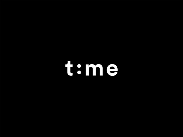
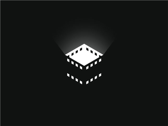
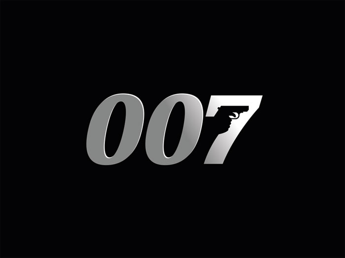
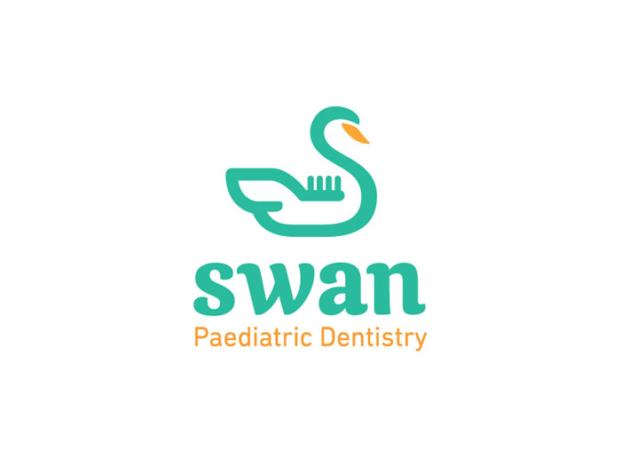
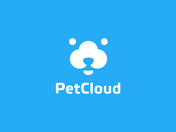
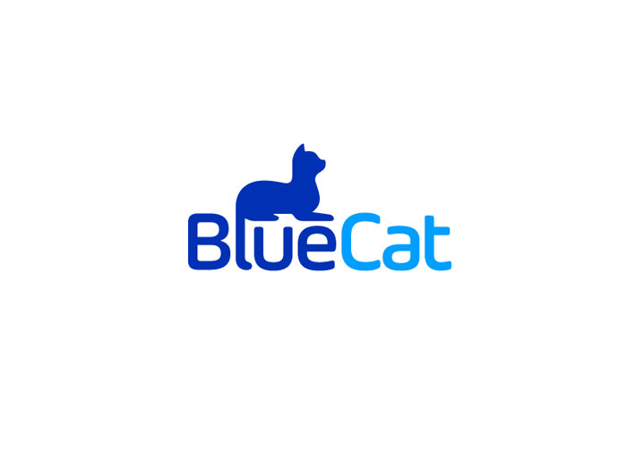
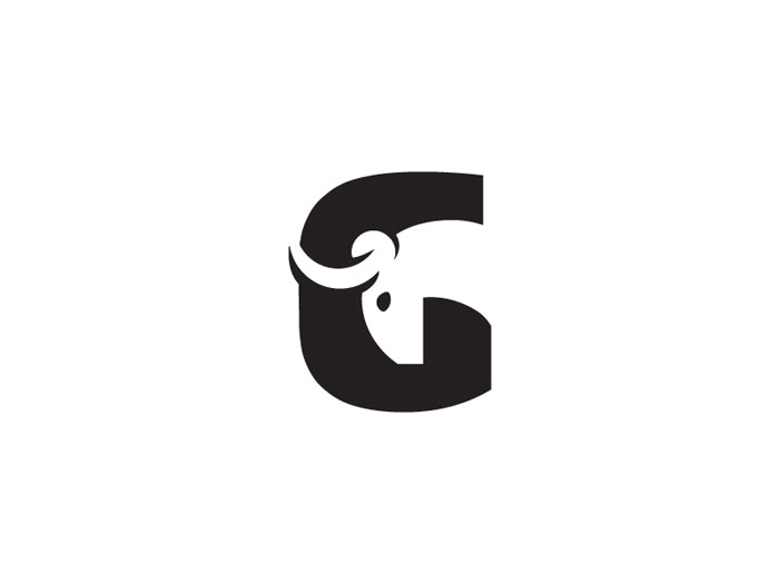
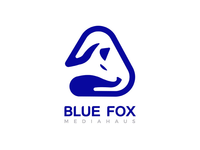
Minimalist logo ideas and why you should consider them

Black and white minimalistic logos
The best minimal logos are black and white. This is why we recommend you to start your project using these colours, and then proceed with other coloured elements. If you have a logo that can’t work without several different colours, you may as well rethink its entire looks.
Other elements to consider for an engaging and catchy minimalist logo are gradients and textures, but you should only think of those once the basic concept is completed.
Experiment with Squiggles
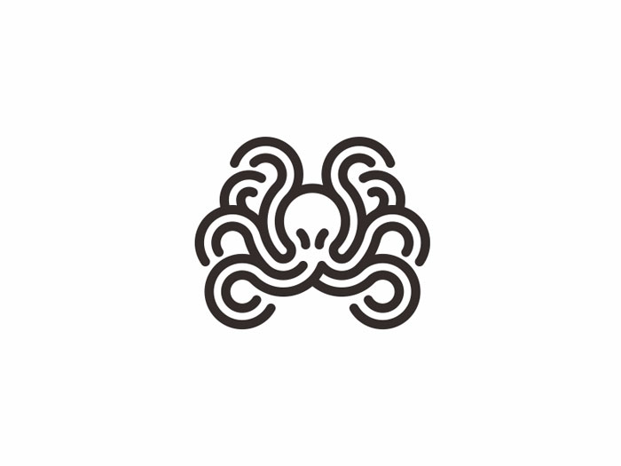
Whimsical design is another hot trend in recent years, and you can make it work for you by crafting a minimal squiggle for your minimalistic logo. Squiggles are, in fact, clusters of crooked lines, but they look so attractive that they easily become iconic parts of a brand’s identity, making it easy for viewers to focus on specific words in the logo. You can develop your own squiggle in many different ways, as for instance introducing a spiral line or any free-flowing shape.
Squiggles are nice because they let you inject a bit of ‘yourself’ in plain and simplistic logos, as you’re basically drawing them by hand. Other popular ideas are stylish sketches and illustrated elements that would look breathtaking against a textured background.
Craft your own logotype
If not sure how your minimal logo should look, work around your brand’s name (even your own), and practice some creative lettering to create a beautiful logotype.
The type should always be readable and friendly, but the style is not limited. You can get something trendy; something more customized, or even bend-and-twist letters in a vintage package. The better your minimalist logo turns out, the longer it will last!

Keep in mind that a solid logotype will be used quite frequently, and applied pretty much everywhere your brand’s being mentioned
Think retro
![]()
As we mentioned several times, minimalism is not a new trend. Instead, its popularity relies on its old glory and classic concepts, and that sets a mood you can use to design a funky and retro logo.
How should a retro minimalist logo look? Most of the retro styles in minimalist design use simplified types and clean line, and surround text with a simple circle. Other details that can indicate this period are sketches and thin strokes.

Once the basic sketch is ready, bring up sepia or neon tones for a distinct 80s vibe. This shouldn’t be a challenge, as you can pull off tricks and ideas from multiple eras, and revive a minimalist hit many have forgotten about.
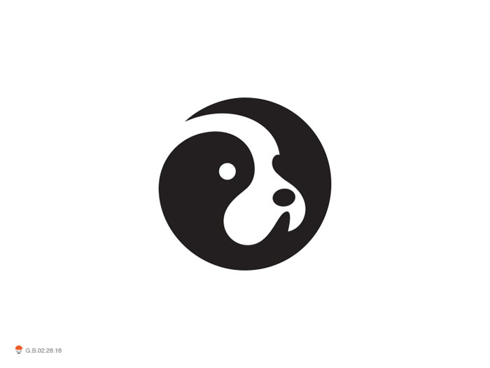
Work with geometric shapes
The trick in minimalism is to make people understand what you’re saying even without words, and geometric shapes are simply irreplaceable for the purpose. People will recognize them instantly, regardless of how you’ve chosen to combine them.
Another important role of geometric shapes is to capture users’ attention, and to indicate the importance of a particular action about to be performed. This is how it works:
- Circles: Circles have no beginning and no end to distinguish, and this is why the eye identifies them with movement. They are also considered to be less sharp and more feminine, and are often used to convey love, power, and energy messages. Harmony is another of their multiple distinctive meanings.
- Squares: Squares are used to indicate a sense of comfort, compactness, and equality. They inspire trust and stability, but using them too frequently may overwhelm users.
- Triangles: Triangles are commonly associated with power, sturdiness, and stability. On the other hand, if you choose to use them upside down, they may cause tension, instability, or even conflict.
- Crosses: Crosses are religious symbols, which is why people associate them with hope, peace, welfare, health, and balance.
Function instead of form
Here comes our cherry-on-the-cake advice – do not embellish your minimalist logo!
A logo can look breathtaking even when it is simple, as long as it accomplishes the purpose it was created for – telling people who you are, and what you do. The moment you decide to adopt a minimalist strategy just because it is trendy, all of your efforts will be in vain. Instead, you should be experimenting with several different mock-ups and sketches to preselect the most beneficial ones.

The key if flatness – a minimal logo is a logo everyone can understand and relate with, and a logo that can be read and memorized right away. Most of the time, this will mean giving up on all extras, and coming up with a truly manual and basic solution.

The more you exercise, the more able you will be to depict the mistakes and inconsistencies in your work, and that’s a good place to start. Think of ways to streamline your minimalist logo design concept, and test the result of your work before you publish it.
It will take time
The less-is-more minimalist logo approach looks simple at first sight, but it takes a bunch of trials, errors, and wrong experiments to create a minimalist logo that works. If not sure, observe the work of successful designers and companies, and learn from their mistakes – nobody designed the ultimate minimalistic logo overnight.
Ending thoughts on minimalist logo designs
Minimalism didn’t, and may never go out of style. Trends appear and disappear all the time, but a minimalist logo will likely be able to work just fine with all of them (think of Nike’s Swoosh mark that didn’t change to this point).
Simple and minimalist logo designs are easy to identify and remember, and viewers understand their purpose as soon as they see them. Designing simplistic logos, however, is an art that takes years to master, so pave the path for your creativity, and enjoy the process!
If you liked this article with minimalist logos, you should check out these as well:
- Badge Logo Design Ideas To Use As Inspiration
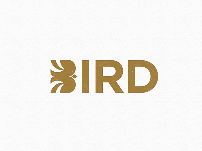
- Bird Logo Design: Examples and Bird Symbolism
- Cool Logos: Design, Ideas, Inspiration, and Examples
- Logos on Pinterest
The post Minimalist logo designs: Inspirational showcase appeared first on Design your way.
Source: http://ift.tt/2n9KhzT


No comments:
Post a Comment