If you are looking for a new job and you want to put your best foot forward, knowing the best resume fonts to use will help you to create a good impression.
There are many different things to consider when applying for a job, such as your experience, skills and how far you are willing to travel.
The salary you earn will be a big consideration. However, using a great resume font will still increase your chance of being seen by a potential employer.
Hiring managers spend a great deal of time each day looking at a resume, and legible resume fonts make a big difference. Nice fonts which make reading easier on screen or print will make your resume more appealing to a potential employer.
The best resume fonts to use
When writing up a resume, you can find good fonts in either the serif or the sans – serif font families. However, the following fonts are considered the best resume fonts by professional in the field.
Cambria
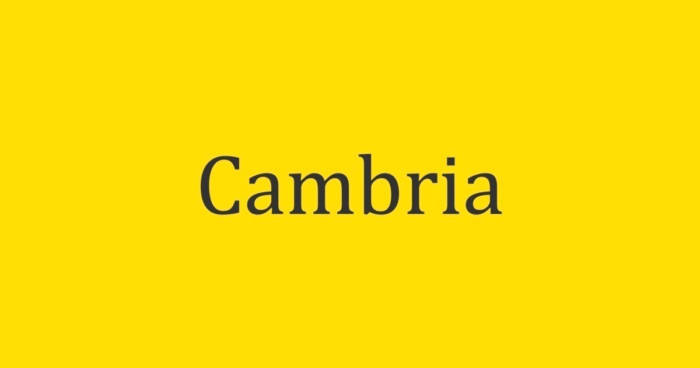
Cambria is a serif font which has been chosen by Microsoft as a staple font. Cambria was chosen because it looks good while reading on screen.
As a resume font it makes an excellent choice because it also looks good printed in small sizes. Cambria makes a great font for resumes because it is seen to be a traditional (and therefore trustworthy) font. It also makes a great cover letter font because it is easy to read.
This font is easy to read and looks great even when printed in small sizes, making it one of the great resume fonts for readers.
As it is a traditional font, it might not be the best font to use for a modern job application.
Garamond
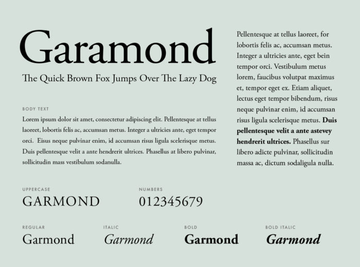
Many applicants use New Times Roman when applying for a job. As a result, it is great to look at other, far less common, resume fonts. If you would like your resume to stand out from the crowd, it is often helpful to explore good resume fonts which will offer something unique.
Garamond makes a great alternative because it is a timeless font, like New Times Roman. Garamond has been around for over 500 years, making it a great classical resume font. Garamond has been modernized and has a sophistication and classic appeal which makes it a great choice if you are looking for a traditional resume font.
Try to condense your resume into a page or two. Garamond can help because it will enable you to fit more text on a page while still remaining one of the easiest to read font choices. You’ll be able to read easily while lowering the size of your font. You will even be able to tighten the spaces between letters without sacrificing readability.
It’s best to use Garamond on your resume if you are looking to apply for a traditional job. It might not be the best choice for modern job applicants as it implies tradition. It is also related to trustworthiness and experience. Academic jobs in particular would benefit from Garamond on the resume.
Garamond is a favourite font for designers and those in the advertising industry. It is easy to use, sophisticated and attractive. It is also one of the coolest fonts to read. It is also unique and will help you to stand apart from the crowd.
Garamond can appear to be old fashioned if you are applying to high tech or very modern jobs. In this case it is often better to choose a modern professional font.
Gill Sans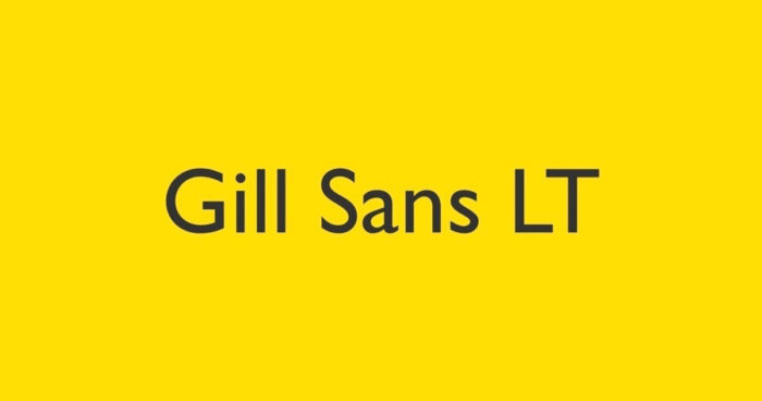
Gill is a great professional font because it is simple and sophisticated. It was created in the 1920’s but still has a modern appearance. It is one of those easy fonts which have been used extensively in the UK.
It has become very popular recently and is seen as one of the coolest fonts to use as it is very similar to the “Keep calm and carry on” posters which have become very trendy of late. Gill has been used by the BBC as well as the British Railways, and is one of the good fonts for resume use.
Calibri
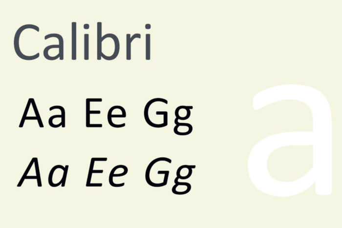
Microsoft has replaced Times New Roman with Calibri as the default font to use. This is because Calibri is highly legible, making it one of the best resume fonts to use if you are looking for a safe choice. Many people describe Calibri as their choice of font.
Calibri is easy to read and will render correctly when your resume is opened by an HR professional. Calibri is also an award winning font which won the TDC2 2005 Type System award, making it good fonts for resume use.
As a firm favorite amongst many, if you use Calibri as a resume font, your resume will blend in rather than standing apart from the competition.
Didot
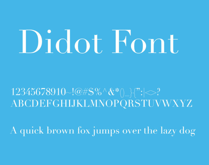
If you are creative, and work in the arts, fashion or photography, Didot is one of the coolest fonts to use for showcasing your work. Didot is, however, more of a header font than a complete resume or cover letter font.
Didot was designed by Firmin Didot around the time of the French Revolution. It is not as old as Garamond, but it’s unique and creative appearance makes it the best font for resume headings, adding a splash of interest and boosting your overall design.
Many fashion designers or creative people use and appreciate Didot. Ralph Lauren uses it on their website, giving it an elegant and sophisticated choice. If you are looking for one of the best fonts to add interest to your resume, Didot makes a great option.
Didot does not come as a free font. Although it is one of the best fonts to use for interest, it will have to be purchased. Although Didot is one of the good fonts to use for headers, you can’t use too much of it in your resume. If you do, your page will become overwhelming.
Constantia
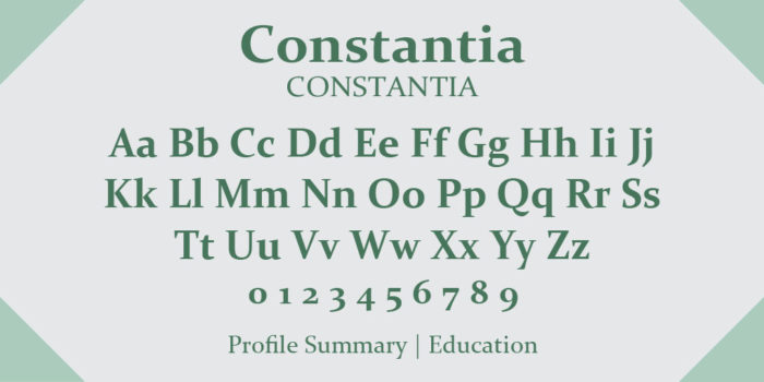
Constantia is a friendly choice out of the professional fonts available. It has rounded letters which make it look easy and approachable. It is also one of the best resume fonts to use for both print and digital documents. This makes it one of the great fonts to use when you have to submit both a printed and digital copy of your resume.
Lato
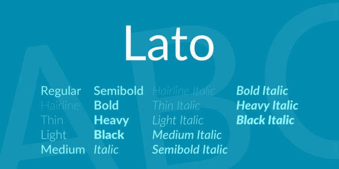
Lato is one of those nice fonts which were originally designed for corporate use. It is sans serif and often has a neutral appearance. It is one of the great choices when it comes to resume fonts because it is both professional and approachable.
It comes in a range of different weights as well as some different style choices. Lighter weight choices will be hard to see in small sizes though, so use a heavier font for resume designs. You can download Lato for both personal and commercial use on Google Fonts.
Lato is one of the more attractive resume fonts and it is free to download. It will work very well on corporate resumes.
Lato is a Google Font rather than a standard Microsoft Word font. This may mean that it may not load when your HR manager tries to download your resume.
Georgia
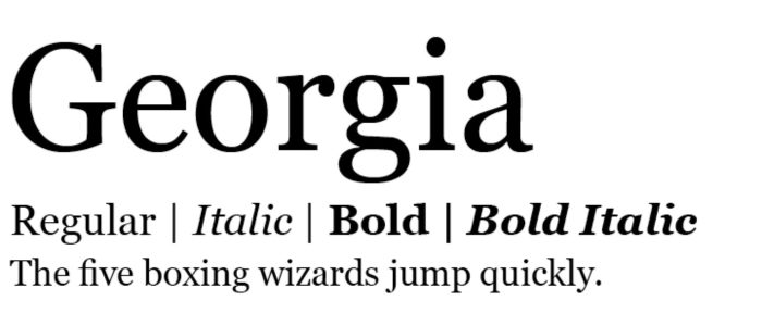
If you want to use one of the best professional fonts without resorting to Times New Roman, you will love Georgia. You will also find Georgia on all computers, meaning that your font will load once your resume is downloaded.
Georgia makes a great alternative to New Times Roman as a resume font. It is available on all computers and has recently been updated.
Although Georgia is one of the best fonts for on screen reading, it is also very popular. When you use Georgia your resume may blend in with the crowd. If you want to stand out you may prefer to use a different resume font.
Helvetica
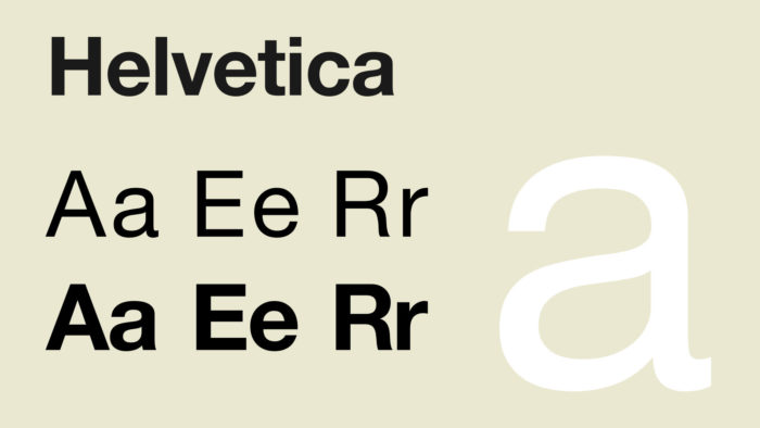
Helvetica is a clean and very modern design which has become a favorite resume font amongst designers. It is also popular in corporate logos. Helvetica is one of those good resume fonts because it is clean, professional and lighthearted. It comes as a standard font on Mac computers.
A favorite amongst designers, Helvetica makes one of the best resume fonts because of its lighthearted yet very beautiful appearance.
Helvetica comes free on Mac but will have to be purchased on a Windows OS.
Arial
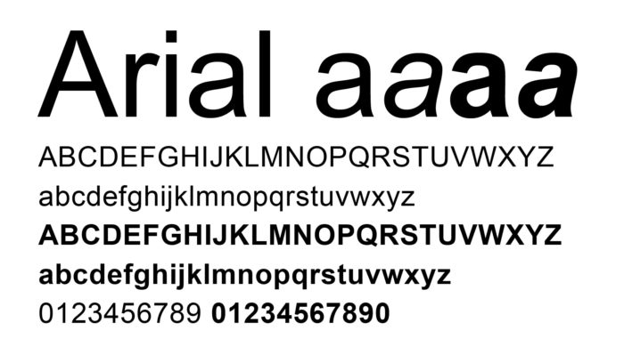
Arial makes a safe, clean and highly professional resume font choice. Many recruiters love Arial because it is easy to read. It also makes a great cover letter font.
However, although it is one of the best fonts to use for resumes, it is also incredibly popular. If you want your resume to stand out from the competition, remember that there are other nice fonts to choose from.
Book Antiqua
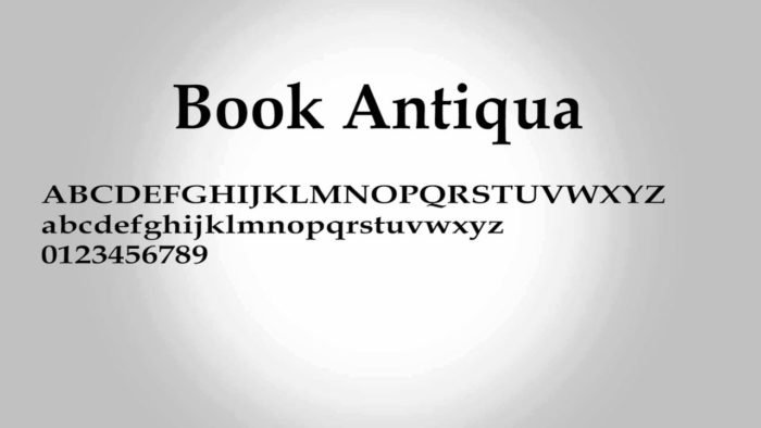
Book antique makes a great resume font because it is “distinctive and gentle”. It makes a great choice for anybody wishing to use a serif style font. It stands out from the traditional Times New Roman. It is also available on all Microsoft machines, which means that it will download easily for recruiters. It will, therefore, be easy for an HR manager to learn all about you.
Book Antiqua is one of those great resume fonts which have been used in modern resume templates, making it one of the more popular professional fonts in resume design. It is a version of Palatino and so is widely available on most Microsoft machines.
Book Antiqua is readily available on most office programs, making it easy to download and represent your resume accurately. It is also one of the leading resume fonts on professional templates.
Antiqua is an old font design, based on Old Italian Renaissance lettering. If you are applying for a modern job, it may come across as outdated.
Trebuchet MS
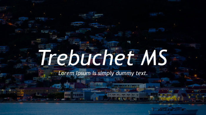
If you are looking for good fonts for resumes, you might love Trebuchet MS. This is one of the more unique resume fonts which will help you to stand out from the crowd. It will also read very well onscreen. It makes a great resume font because it is so easy to read. It has a modern, textured appearance making it one of the best fonts to help you stand out from the crowd.
Trebuchet is one of the core Microsoft fonts and can even be used on Google Docs.
Any extra features on Trebuchet will have to be paid for using Trebuchet Pro.
Verdana
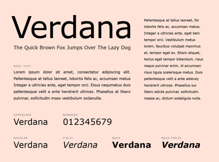
Verdana is a great resume font created by Matthew Carter. It was created to be easy to read using computer screens. It is also one of the best fonts to read in small print. It is one of the very professional looking resume fonts. Created as a sans – serif relation to Georgia, this is an excellent cover letter font.
Verdana is an excellent font to use on resumes as it looks great in both digital and print format.
Verdana is a simple and clean looking font but doesn’t hold the wow factor that many of the best fonts do. In many ways, it is quite similar to Arial, a very common resume font.
What is the best resume font size?
12 pt is the best resume font size. Many programs will only allow you to increase your font size using double digits, but if you can use single digits, 13pt also makes the best font size for resume layouts.
However, if you want to create headings or topic titles on your resume, the best font size would be 4 to 6 points higher. This will ensure your headings stand out while still fitting in with your page format.
Can I use a 10pt format for a resume font?
A 10pt size is too small for professional fonts for resume use. However, you could use it in some areas, such as when your text is merely supportive. Reducing the size of a city where you worked would be fine.
Should I use Italic or bold fonts for resumes?
When you use a bold text, you will draw a lot of attention to your page. Highlighting headers in bold will help them to stand out, giving a natural flow to your page.
It can be helpful to use italics in your supporting text. Instead of reducing the size of some of your text, you could change it to italics.
Keep your text clean and simple looking. Avoid underlining text as it will make your page feel too busy.
Ending thoughts on using these resume fonts
Great resume fonts will keep your page interesting, easy to read as well as professional looking. By adding an interesting font you will help your resume to stand out from the crowd. If you would like to add an interesting text, add this as a heading.
By adding a unique font to headers, you will help your resume to stand out while keeping it legible. Look for fonts which are universal, so that they will download easily no matter which program an HR manager will be using.
When designing your resume, keep your layout simple and clean. Add headings and subheadings so that your content looks clean and professional. Keep headings large and bold, while your font size should be between 12 and 13 pts.
If you enjoyed reading this article about these resume fonts, you should read these as well:
- Free Cute Fonts to Use in Your Thematic Designs
- Google font pairings: Font combinations that look good
- Best free fonts for logos: 72 modern and creative logo fonts
- Retro Fonts: 90 Free Vintage Fonts To Download
- Best Thin Fonts: Free Light Fonts To Download
- The Best Free Smoke Font examples for Creative Designs
- Stencil font examples that you can download
The post Resume fonts to consider using on your CV before applying for a job appeared first on Design your way.
Source: https://ift.tt/2Te2Oy0


No comments:
Post a Comment