Superhero logos are as interesting and important as a logo design for Apple. Superhero symbols instantly identify a hero. A superhero logo is used at the scene of a crime and many hero symbols are drawn into the sky to show that a city is being protected by a powerful being.
Superhero logos are also used to promote a movie or sell merchandise. Fans who identify with a superhero wear hero symbols to show their appreciation.
Whatever a superhero stands for, logos need to be bright enough, bold enough or cool enough for fans to identify. Fans who wear hero logos want to it to represent the power and awe of the character.
How does a crime fighter choose a superhero symbol? Should hero symbols represent the animal a hero has a deep connection with, like the Batman logo? Or should superhero emblems use the letters of a character’s name as a form of easy identification?
When superheroes get their logos right, they become easily identifiable throughout the world. When companies are paid large amounts of money to create great iconic logos, how is it that superhero symbols are created by the supers themselves?
Examples
Is it their superhuman skills which enable our heroes to design superhero emblems which stand out from the crowd? And why are their outfits just so awesome? If you want to create a great superhero logo to express your own superpowers here are some cool superhero logos to draw inspiration from.
Batman Logo Design
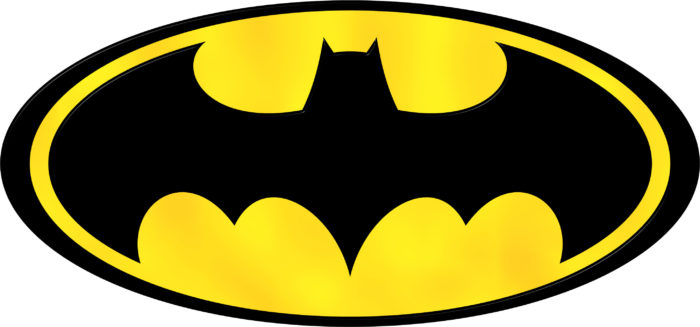
Batman is a mysterious character and his logo shares as much. Although the logo has changed and transformed over time and the media used, the overall concept remains consistent. Batman’s logo is simple and easy to identify. He has a silhouette with pointed ears and outstretched wings. Batman’s logo is as mysterious as our hero himself.
When Tim Burton released his Batman film in 1989, the logo was loved by fans that wore it on their clothing or displayed it on their coffee cups or stationary. Batman’s logo is sometimes displayed in a yellow oval, often against a dark background.
Batman appeals to the fashionable and the cool. His super hero symbol has been used on cars and gadgets and shines from the sky as a warning to criminals.
The Batman story has undergone changes as his story has changed and developed. Nevertheless, he is one of the most loved and adored of the comic book heroes. Like all superheroes, he wears a costume, with his superhero logo shining out from his chest.
Like many comic book heroes he does this to divert his enemies. While enemies fire bullets at the hero logos, the bullets are wasted and the hero emerges as strong, whole and able to disarm his enemies.
Batman has a dark logo which expresses his mystery. Encased in attention-grabbing yellow he also appears to be warm. Our dark hero identifies with the bat in his logo but he does not possess any powers. His logo, a dark symbol in a bright, oval shape, shares his mystique as a man emerging from the darkness to combat crime.
Superman Logo Design
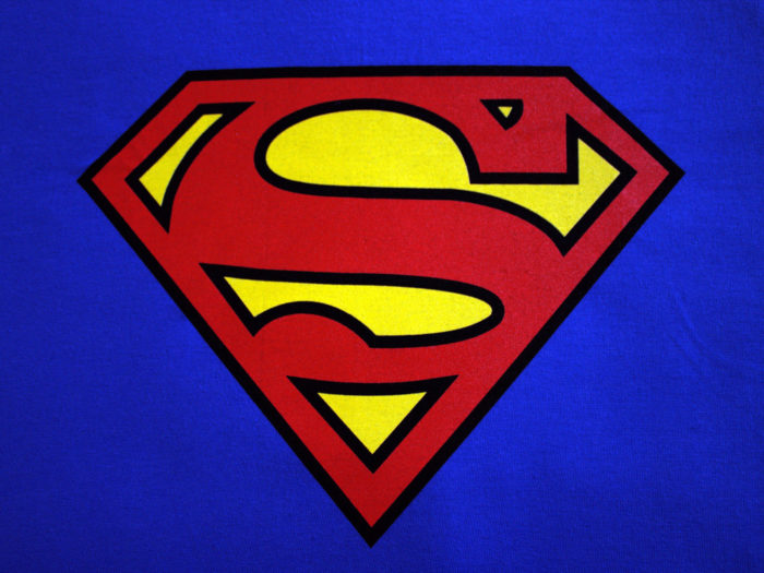
Superman is one of the greatest and most memorable superheroes, and what would he be without his super hero logo. Superman’s super hero emblem has certainly evolved since its first introduction back in 1938. At this time, the “S” was not representative of a super status at all. Instead it was small and no more than a squiggle.
But was it ever meant to be an S? The symbol comes from Krypton and symbolises superman’s original family. If it looked like an “S” on earth, it may have been a coincidence. The symbol was vague and comic artist John Byrne shared that he believed it was two small fishes who were travelling towards one another.
The “S” has changed in this superhero’s logo. The “S” now stands for the name Superman. Placing Superman’s symbol in a shield showed that he had warrior or super hero qualities which would protect him from evil.
Superman’s logo is so easily identifiable that when Bizarro reversed the logo it was easy to spot. Fans knew that any reversal of hero symbols indicated a move towards evil.
Like many effective logos Superman’s super hero logo showed simplicity and an easily identifiable and iconic design. However, this logo was created with a great deal of thought. Strength is shown through the upside down triangular shape but the logo also represents the diamond, the strongest mineral in the world.
Superman’s superhero symbol, placed upon a tight fitting suit which reveals a strong physique, is symbolic of strength and masculinity. The red and yellow colours used in the logo are strong and bold enough to attract attention while displaying passion and vitality.
Captain America Logo Design
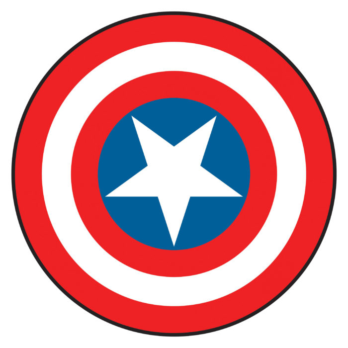
Captain America displays the national red, white and blue colours which symbolise glory. These are the perfect colours for a hero committed to fighting an evil regime. Captain America was designed by the US government as a super hero or solider who would fight the Nazis.
His super hero symbol displays his patriotism as a part of his badge. His shield contains a star which references the American flag. Circles (which bear the colours of the flag) refer to deeper meanings such as power, infinity and energy.
Although many would identify Captain America’s shield as a part of his logo, his shield may not be considered to be a hero logo. Instead, the A featured on his head, like a cowl may be considered to be an alternate logo.
Viewers however may relate to both (or either of the) hero symbols. Both have been carefully thought through and designed to create superhero logos that an audience can identify immediately.
The Flash Logo Design
![]()
The Flash has a bright red and yellow costume which has a lightning bolt super hero logo placed upon the chest. The bold colours and lightening speed give a clear indication of The Flash’s identity.
The Flash is so speedy that he might not even need a superhero logo. After all, he moves as quickly as lightening moves. Would we be able to see it? Without his logo, however, he wouldn’t be as easily identifiable. Creating a simple logo which stands out against the background of his chest is a great way to go.
A bolt of lightning surrounded by a bright circle gives a quick flash of the character in the midst of the action. By using a letter to identify Flash, the symbol would not have as much impact. It may take too long to read. Criminals (and viewers) would no longer understand who had come to the scene of a crime.
The flash has a bold personality which is expressed by the bright red and yellow colours shaping his logo. As a bold bright and passionate superhero, The Flash fights against injustice at a speed which is hard to match. He is as warm and passionate about his community as the colours in his logo. As a result his super hero symbol describes him perfectly.
Green Lantern Logo Design
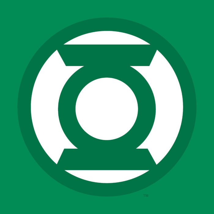
The Green Lantern is easily identified by his green colour. As a unique superhero, The Green Lantern has a super hero logo which is as interesting as he is. A unique looking lantern is featured inside of a white circle. In some ways, this lantern appears to be a bulls-eye.
The Green Lantern has rings present in many super hero logos. However they apply to Green Lantern in particular as he uses a power ring as his main tool. His logo is easily identifiable, simple and iconic, making it one of the perfect superhero logos for fans to relate to.
There are many different Green Lanterns who are on patrol throughout the universe. Using the name ‘The Magic Ring Extension Cords Corps’ all wear the same hero symbols. The logo is very literal and speaks directly to the characters identities.
The Green Lantern corps uses this lantern as a symbol of willpower. Each has a black, white and green costume to identify them.
The simple design of the Green Lantern superhero logo has always been appreciated by comic book fans. As superheroes reach a broader audience and appeal to more and more people, Green Lantern has become a valued superhero logo amongst fans.
Punisher Logo Design
![]()
The Punisher goes to war against crime, using a skull as his superhero logo. This interesting character was seen to be an angel of vengeance, a stitched together Frankenstein style monster and a normal man with a large range of weapons at his disposal.
Regardless of the range of different skills this vigilante possesses or how he has been defined, he is identified by the skull which is symbolic of his fight against crime.
Like many Superhero logos, the Punisher’s iconic skull is placed on his chest. The Punisher has placed his superhero insignia upon his black body armour to give criminals a target to aim at.
Many criminals would naturally aim their weapons at the chest, seeing it as a vulnerable spot. However, by being forced to face the image of a skull, these wrongdoers are now forced to look death in the face.
The Punisher with his deadly super hero’s logo has been around since the 70s. Over time he has grown stronger as both a vigilante and a hero amongst his fans. His skull logo has made a great choice.
Unlike some superheroes, The Punisher is not out to create a bright and friendly image. Instead, he is an unorthodox superhero who has set out to fight organised crime. He is also seeking vengeance for the death of his family.
As a result, the superheroes logo is unfriendly and threatening. Long teeth combined with the deadly skull aim to give a threatening and intimidating impression.
Spiderman Logo Design
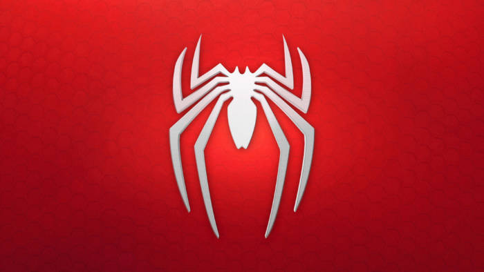
Spiderman’s suits have changed over time as the superhero has evolved. We have learned more about his back story as well as his dark side. And yet his superhero logo, the slender and iconic spider, has remained consistent.
The spider motif symbolises the venom which gave our superhero his powers. The Spider superheroes logo has been used by other heroes of the Marvel world, including as a female superhero logo used by Spider Woman.
Spiderman has one of the coolest superhero logos and one of the most symbolic. Spiderman is depicted by a very simple spider. The spider is black and stands out against a red background. Neutral and strong colours combine to give this classic superhero logo its visual appeal. The logo appears in simple silhouette form which gives it an easily identifiable appearance.
Why did Peter Parker design his Spiderman costume in the way he did? He has a spider in the middle of a blue and green costume embossed with a webbed design. He costume is as intricate as the logo is simple. Perhaps this is why his costume has changed while his logo has been retained over time.
Spiderman has one of the most easily identifiable superhero logos and has retained his popularity. Spiderman’s logo has become increasingly popular with fans. The simplicity of the logo has given it a universal appeal.
Catwoman Logo Design
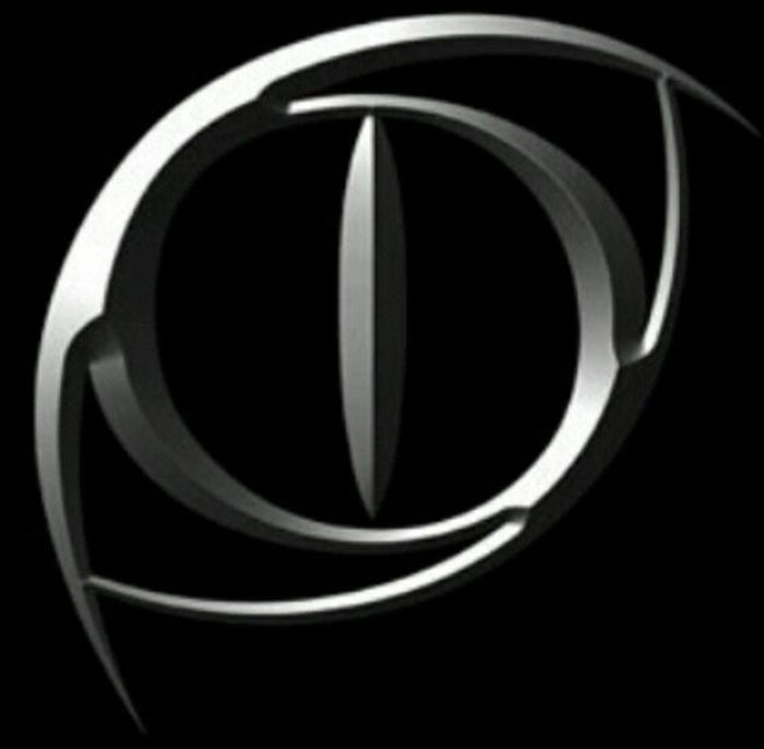
If you are looking for great female superheroes logos, Catwoman’s logo design will appeal to you. This logo combines the sleek and graceful appearance of a cat alongside simplicity of design. This superheroes logo design is black and silver and gives the appearance of a cat’s eye. The different shapes created in off centre position give this logo a great aesthetic appeal.
Like many superhero logos, this one is attention grabbing. Sharp edges, a 3D appearance and sleek colours depict our heroine as graceful and unusual.
Wonder Woman Logo Design
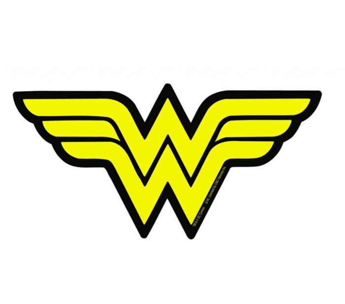
Wonder Woman uses a double W in her logo and is one of those characters where hero logos and names combine. Her logo has a double meaning however. The double W does not only represent our hero’s name but also a bird with wings spread out.
This is a great example of hero’s symbols sharing the superpower behind their characters. Wonder Woman’s greatest power is her ability to fly.
Wonder Woman reveals herself to be a patriotic character with the red white and blue colouring of her costume along with her stars representing her nationality.
X-men Logo Design
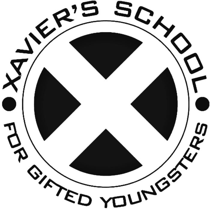
The X-Men are a group who fight crime and these superhero logos are made up of a large X which is surrounded by a circle. This X is symbolic in many ways. Firstly, a mutant X gene is what gives powers to these superheroes.
Secondly, Professor Charles Xavier or Professor X is known for his humanitarianism towards mutant beings. Lastly, many mutant teams have incorporated the letter X into their names including Generation X, the Exiles, Excalibur, and X Factor and X force.
Like many superhero logos, this one is highly symbolic. The light in the middle of the X men logo represents knowledge as the group has created an institute to extend humanity towards mutants. The logo is simple, memorable and easy to identify, making it one of the coolest superhero logos available.
Fantastic Four
![]()
The Fantastic Four logo has been one of the most changeable of the superhero symbols. Yet even though it has been changed or updated throughout the years, it has kept the same simple core.
The Fantastic Four team is dynamic, changing over the years with characters like She Hulk and Wolverine joining the family. The Fantastic Four represent one of Marvel’s first superhero families.
With the death of The Human Torch, the Fantastic Four comics have gone silent. However, when all members of the fantastic four formed part of a group, they were symbolised by a 4. This 4 formed part of the group’s identity from the very first comic book.
The identifiable 4 logo was important for the Fantastic Four because at one time the team wore civilian clothes. This simple and easy shared superheroes logo was shared between team members to symbolise belonging.
Deadpool
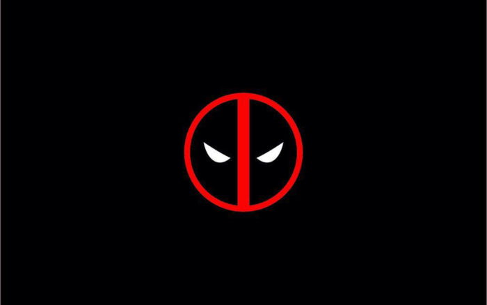
Deadpool has a superheroes logo which appears to be a road sign circled in red, with a straight red line running through the centre. The logo is filled with black and shows two evil eyes shining out from the darkness. The logo became world famous because of the Deadpool film.
Deadpool is otherwise known as Wade Wilson and is considered to be an anti-hero, as shown by his logo. No list of superhero logos would be complete without Deadpool.
Daredevil
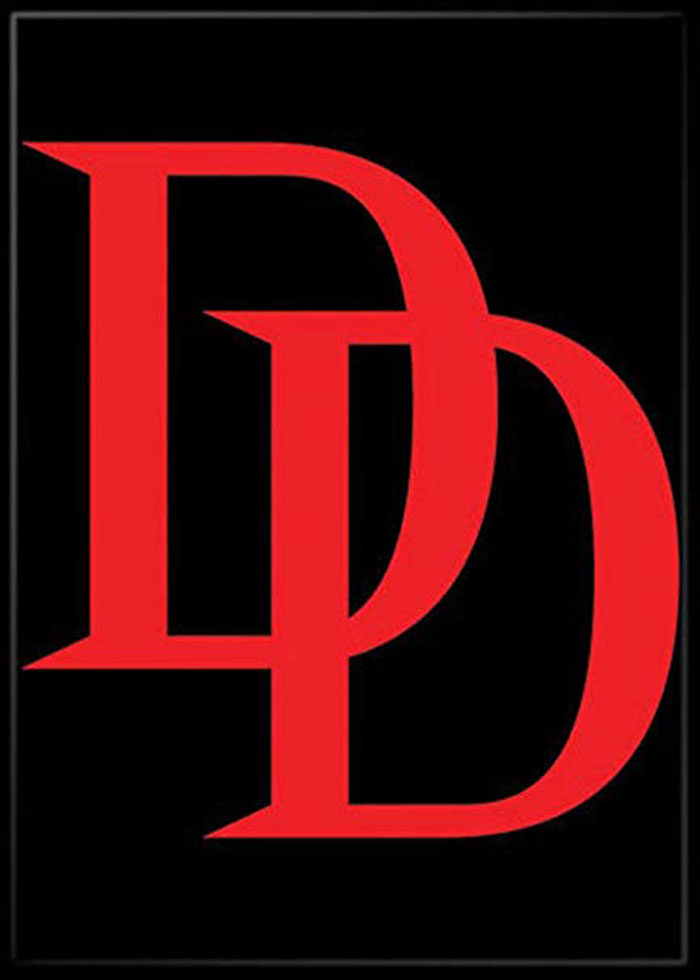
Daredevil’s superhero logo design has changed over time. When he was first introduced by Marvel, his logo contained the simple letter D. With the double D sound as a part of his name however, the logo soon increased to a double D. The Daredevil logo is an example of cool superhero symbols which make use of a character’s name.
Robin
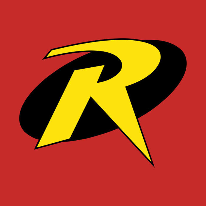
Robin is Batman’s side kick, but the superhero’s logo could not have been more different from that of the mysterious Dark Knight. Robin has always had a bright costume while Batman has lurked in the shadows. While Batman got a logo symbolising mystery and intrigue, Robin got a simple yellow R in a black circle. The most cool superhero symbols were not available to Robin.
Robin’s logo is nevertheless simple and easily recognisable. While its lack of intrigue may show that Robin is the brighter and simpler of the pair, it does identify him. Robin’s logo may not look cool on the side of a car but as second place, his does stand out as a super hero symbol.
Shazam
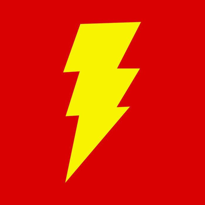
The Flash and Shazam both represent stormy weather within their superhero logos, there is a difference. While The Flash has a sleeker design that gives a rapid glimpse of a lightning bolt, Shazam has a bolder styled thunderclap for him.
Shazam’s transformation process is macho and noisy, as whenever he claps his hands and shouts “Shazam!” young Billy Batson changes into Captain Marvel.
At one stage, Captain Marvel was more popular than Superman. This great logo symbolises his transformation process and makes a great super hero symbol.
Agents of S.H.I.E.L.D.and Hydra
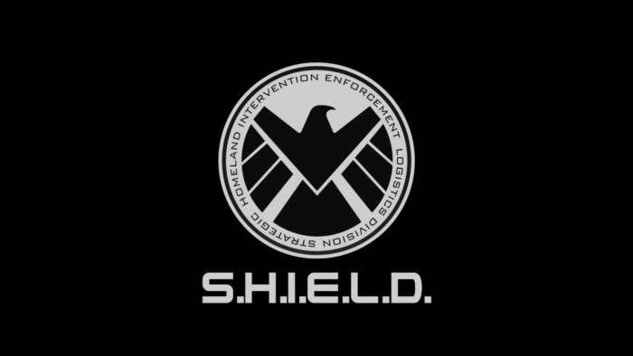
Agents of S.H.I.E.L.D. represent Marvel’s elite crime fighting agencies. Hydra is a devious terrorist organisation which is on the other side of the law. Both rival each other and their superhero logos, like their ideals, are at complete opposites.
S.H.I.E.L.D. uses an eagle as part of its logo. Eagles are associated with bravery, freedom, strength of character and with masculinity. Eagles rise above the earth as vigilant watchers and it is no wonder they represent S.H.I.E.L.D. when it comes to tracking predators.
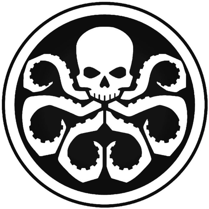
Hydra is portrayed as sinister and uses the serpentine hydra, an underwater monster from Greek mythology, to symbolise its organisation. The flexible serpentine arms symbolise the terrorism and damage Hydra is capable of, as well as the cracks it seeks out in the Agents of S.H.I.E.L.D. team.
These logos and symbols give excellent representation of the values of their organisations. As superhero logos they are also easily identifiable and simple in design.
The Avengers

The Avengers superhero logo is a team symbol which is also representative of excellence, or a call to action. This very cool superhero logo is easy to reproduce, colour and add texture too, depending on where it will be displayed. It is very easy to identify and popular with fans.
Ending thoughts on these superhero logos
If you are passionate about superhero logos, and would love to be viewed as a superhero yourself, take inspiration. The simplicity and meaning behind these great logos makes them both aesthetic and appealing. Better yet, they are easy to identify.
If you view your company as a superhero with an ability to fight on your clients’ behalf, why not design a superhero logo which represents your brand?
The simplicity and beauty of the logos offered up by both Marvel and DC Comics makes them easily identifiable and popular with fans. Explore more logos for further inspiration. This list is simply the tip of the iceberg.
If you enjoyed reading this article about these superhero logos, you should read these as well:
- Music logo design: Tips and examples to inspire you
- Geometric logo design: examples you should check out
- Logo trends 2019: what you should look out for
- Logo colors and why they’re important
- What is a logo and why you need one
- Learn About The Apple Logo: The Tech Giant’s Branding
- Wine logo design: How to create stylish wine logos
The post Superhero logos: The symbols of the comic book universe appeared first on Design your way.
Source: https://ift.tt/2Hz2MdU

No comments:
Post a Comment