Design work is not easy. Agreeing with a client in different aspects is key to achieving an adequate result. However, for this to happen, we must know of all the options we have. A notorious example is that of typefaces.
If you want to save time on a part of the creative process that requires a lot of attention, then we recommend that you see these condensed fonts so that you get filled with knowledge.
Narrow fonts do not necessarily have to reduce the size of your design. With proper use, even a small print can show character. Condensed letters are very common in titles since these attract attention. But before entering the following list, let’s briefly review what a condensed letter is.
What are condensed fonts?
The condensed fonts are characterized by a high size but a reduced width, where the spacing between letters is very small. Many times, they are bold to reduce this separation even further.
We mentioned it previously, but condensed fonts are extremely popular when it comes to headlines since these are very colorful.
However, the body of texts cannot use it, since they take up a lot of space. If we make posters or titles in newspapers and magazines, these letters are our best allies, especially when it comes to free condensed fonts.
Some of the best condensed fonts you can find
Devant Pro – Clean and modern design
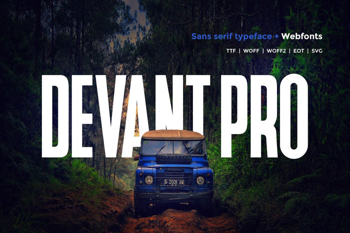
The Devant Pro bet is for a modern and adventurous style. Its clean design makes it perfect for all types of headings and printouts since it is visible and free of unnecessary details.
This typeface is available on the page in both OTF and TTF, in addition to having an option for web pages.
Marisol – Bold Textures
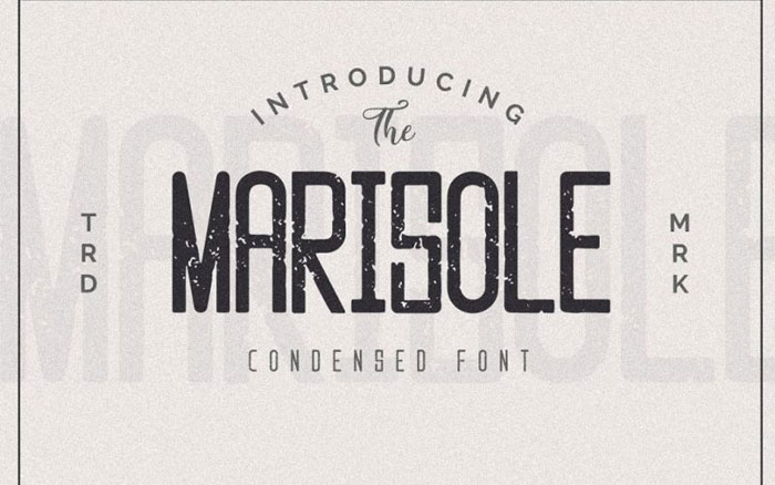
Marisol is a very similar font in the style to the previous one, only that these sans serif letters have an internal texture that makes them gain character.
It has very defined but rounded angles, and closely resemble those used for liquor boxes.
Frontage condensed – A three-dimensional look
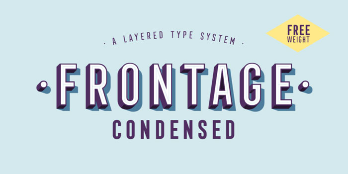
Like many of the letters that serve to signal things, Frontage offers us a striking three-dimensional letter with a vintage look. The font is narrow and has an internal decoration in the form of lines.
Its overall appearance seems as if it were a neon sign. One of the most complete fonts in content, since it offers 339 characters with symbols of 190 Latin languages, in addition to having 52 styles that we can easily change.
The National – Options for all tastes

A condensed font with a wide variety of alternatives is The National. Its base style is a traditional condensed letter, which can include an oblique or rough texture (or we can use it without texture).
Additionally, we can select between thick, thin, filled, inclined letters, etc.
Absolute Pro – A modern sans serif
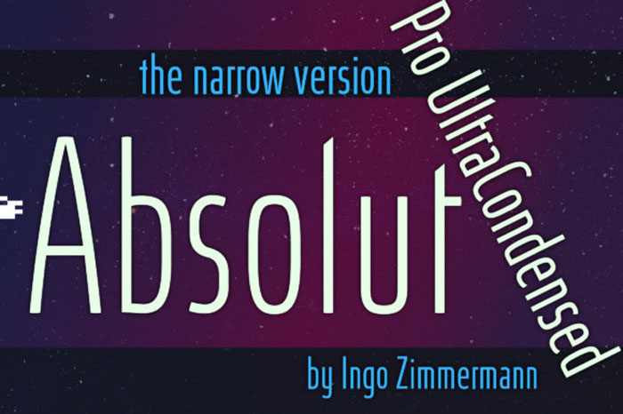
Absolute Pro is simple in design, clean of unnecessary elements. Its different bet is to offer a slight curvature in all the letters, which gives it a modern touch.
If we seek to approach a youth audience, this is our option.
Gorgeous – Direct from a fashion store
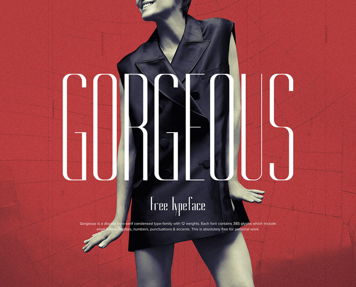
The elegance that Gorgeous achieves is not comparable with anything on the list so far. This super condensed and elongated letter is exquisite as if it were from a fashion magazine or a high-end store.
The only problem with this font is that, although it is free, it is limited only for personal use.
Bebas Neue – An internet popular
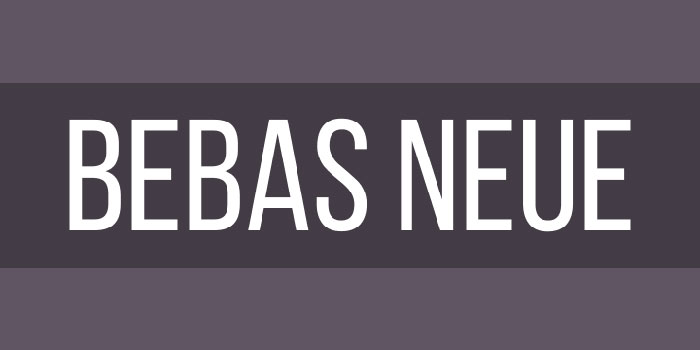
Bebas Neue Google font is one of the most popular on the internet. This is a modernized version of the original font of the same name.
It stays true to the original design, with clean and pure lines. This has always been a popular alternative because of its visibility on web pages, prints, and art in general.
Morganite – A condensed font for every occasion
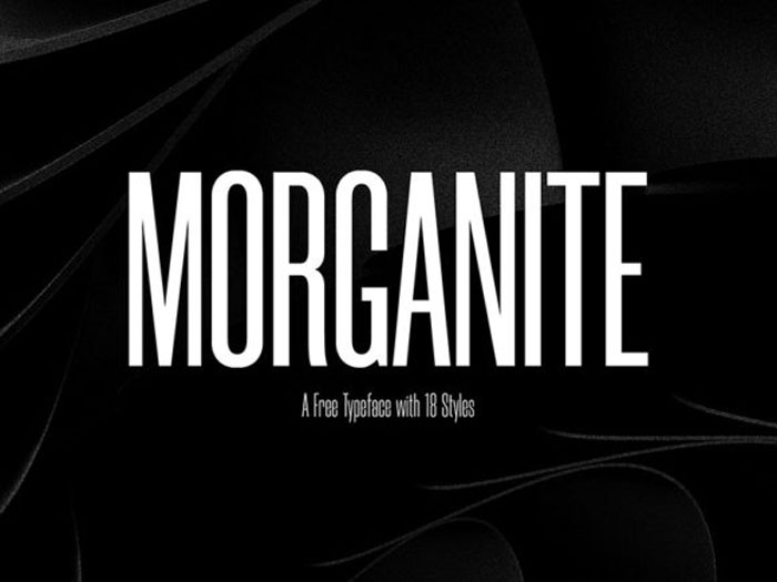
We know that constantly downloading font packages is annoying, especially since sometimes we want to have some order in our designs.
Morganite offers us many options (18) that adapt to every need since it has extremely thin letters to strong bold. The best thing is that it can be used for commercial projects.
Tallios – A retouched idea
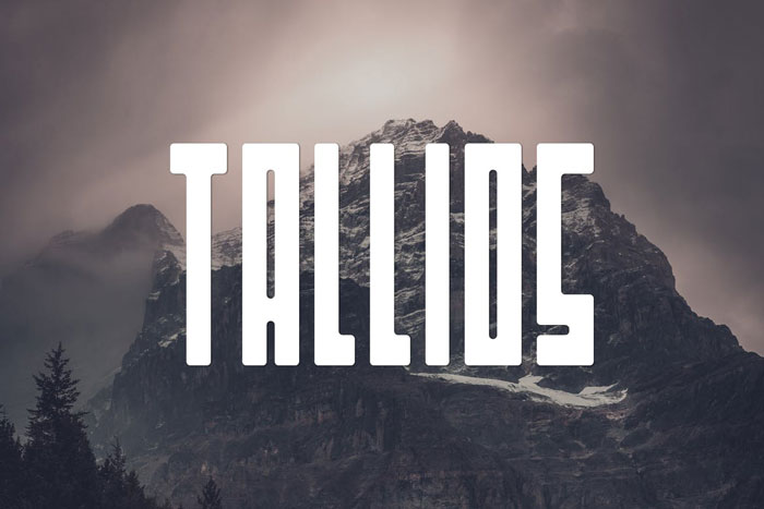
The number of characters included in Tallios, from special to more traditional symbols, makes it a safe option for online publications in any language.
Not only that, but its rounded edges make it have a certain level of detail in the pronounced angles.
Cloud Condensed – Softness in the form of letters
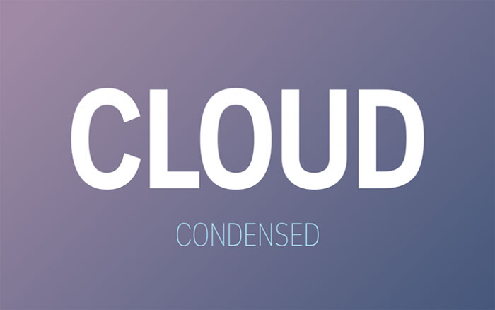
The tender bet of Cloud Condensed makes the writings with this font pleasant.
Perfect for gradient or light colors, the style of the letter limits the number of angles it has, and for additional effects, we can use it in bold, italic or standard.
Config Condense – A traditional bet of sans serif
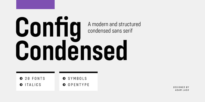
Sometimes we just need something traditional that has many options to enjoy a font package. Config in its condensed version offers us a basic design with multiple possibilities.
A neutral style that can be subtly modified using the 20 font options. The best thing is that having such a simple drawing, they adapt perfectly to all screen sizes and publications.
The Farmer Font – Get carried away by nature
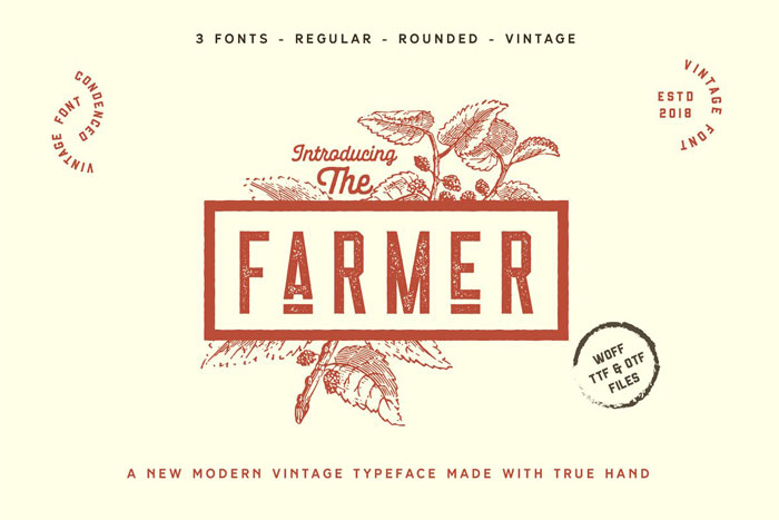
This font offers us some capital letters with a lot of character that clearly show why they are super-condensed. The Farmer applies different textures to create different versions of the letter.
Also, not only the texture changes, since we can also choose between different designs (3 in total, one normal, one vintage and one rounded).
For beverage or store designs where the concepts of relaxation prevail, The Farmer is an ideal alternative, especially if we can afford it.
Nomads – For your vintage logo
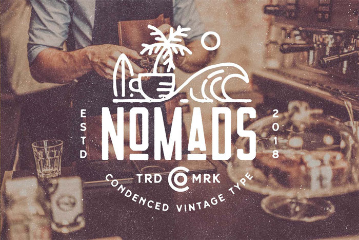
Nomads’ relaxed and informal style makes it one of the best condensed fonts of the day.
Perfect for logos, the uniformity mixed with curves of this font reminds a lot to the engravings that are made on the leather labels of the pants.
Candide – Increasing the possibilities of the family
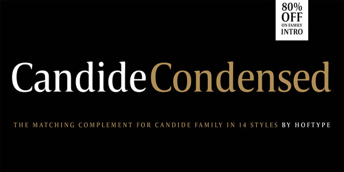
Candide is a letter that is characterized by being elegant and refined. Its style is so striking that it has a whole family of options. Among these, we can find the condensed version, which maintains a sense of sublime proportion by not exaggerating the slenderness of the letters.
The package is very complete since we can get all kinds of special, alternative characters, numbers, arrows, symbols, and more.
Intro Condensed – Readability comes first
When it comes to promoting products, we cannot afford an ambiguous or illegible message. Intro is one of the free clean fonts that allows us to write anything and maintain impeccable clarity.
The best thing is that we don’t have to keep the basic style, since it has some variations to adapt it to shirts, prints, posters, etc.
Augustine – With all the charm of the handmade

Augustine is a very charming and bold handmade bet. Unlike other fonts, it adds separation between characters, which makes it wide in the result.
If we combine it with other bold sources, we will easily get the attention of the public.
GATSBY – For professional design
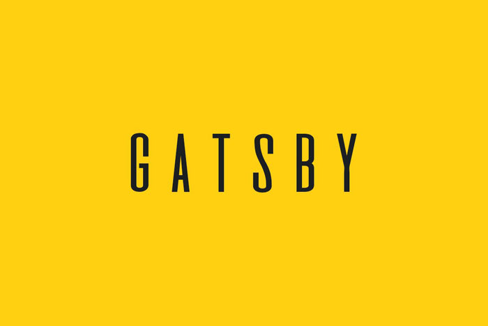
Very similar to the previous one, GATSBY is a tall sans serif font perfect for professional designs (especially for its commercial license). Ideal for luxury brands, jewelry, perfumes, and other fashion delicacies, the great letters make it easy to read in headlines and logos.
This set is completely capitalized and has four different styles, which saves us a lot of editing work but without abandoning good taste.
Nordin – A solid and stylized font
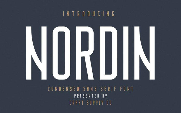
Nordin is a unique design on the list. Although it maintains a compact and solid style, it is bolder to offset some of the strokes, which makes them not symmetrical, but more artistic.
The design is very refined and the curves have soft dimensions, so they are not excessively large.
If we are looking for a letter to sponsor works of art, Nordin is at the forefront, since its modern appearance makes it stand out from other decorative elements.
Kicker – Size Matters
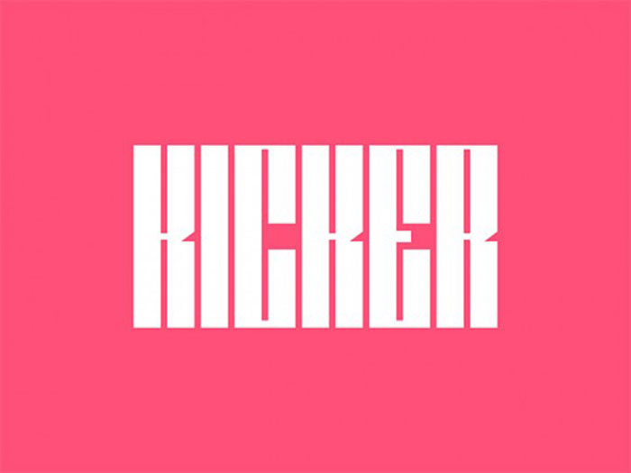
If we want a large print, Kicker fulfills the purpose. This letter almost leaves no free space thanks to its rectangular design. With enough horizontal space, this font can stand out.
Calcio – Another alternative at the midpoint
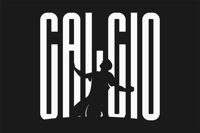
Calcio is neither too big nor too small. It is presented as an intermediate option among those looking for a striking but stylized condensed letter.
Americane Condensed – To show your pride
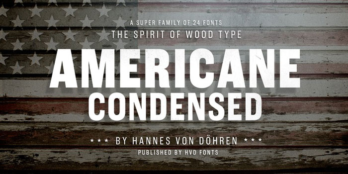
The American style is recognized anywhere in the world. These thick letters that seem taken from a battlefield give us that sense of strength and pride of the nation.
Americane is a font that is inspired by these elements. Not only does it have a condensed version, but also Americane is a whole family of letters.
The set, of course, has from letters to numbers and symbols.
Ending thoughts on these condensed fonts
With this, we finalize this compilation of condensed fonts. Remember that we don’t need to like all these options, but we must take them into account, or at least remember them, to be able to make a design that suits the demands of the client.
If you enjoyed reading this article about condensed fonts, you should read these as well:
- Free Cute Fonts to Use in Your Thematic Designs
- Retro Fonts: 90 FREE Vintage Fonts To Download
- 117 Free Christmas fonts to use for holiday projects
- Cool magazine fonts
The post These condensed fonts were made to impress: Check them out appeared first on Design your way.
Source: https://ift.tt/32zMesI


No comments:
Post a Comment