Geometrical shapes are the foundation of every shape that you can see around you. They are everywhere, and they are widely used in the design field to create basic to advance levels designs. You don’t need to be an expert in geometry to use them in your designs. You can have the necessary knowledge and still create a masterpiece from those easy lines and shapes. Primary geometrical shapes are circle, triangle, lines, square, rectangle, and hexagon, and they all are just simple shapes available for us to use in our creative designs. There are endless possible ways to use geometry in any design to make it unique and stunning. And it always depends on the designer and his or her vision of the design. In this article, we will discuss 14 easy yet helpful ways to use geometry to enhance your designs. You can use any of the ways, or you can also use combinations of these 14 ways to create a great design.
1. Interesting Background:
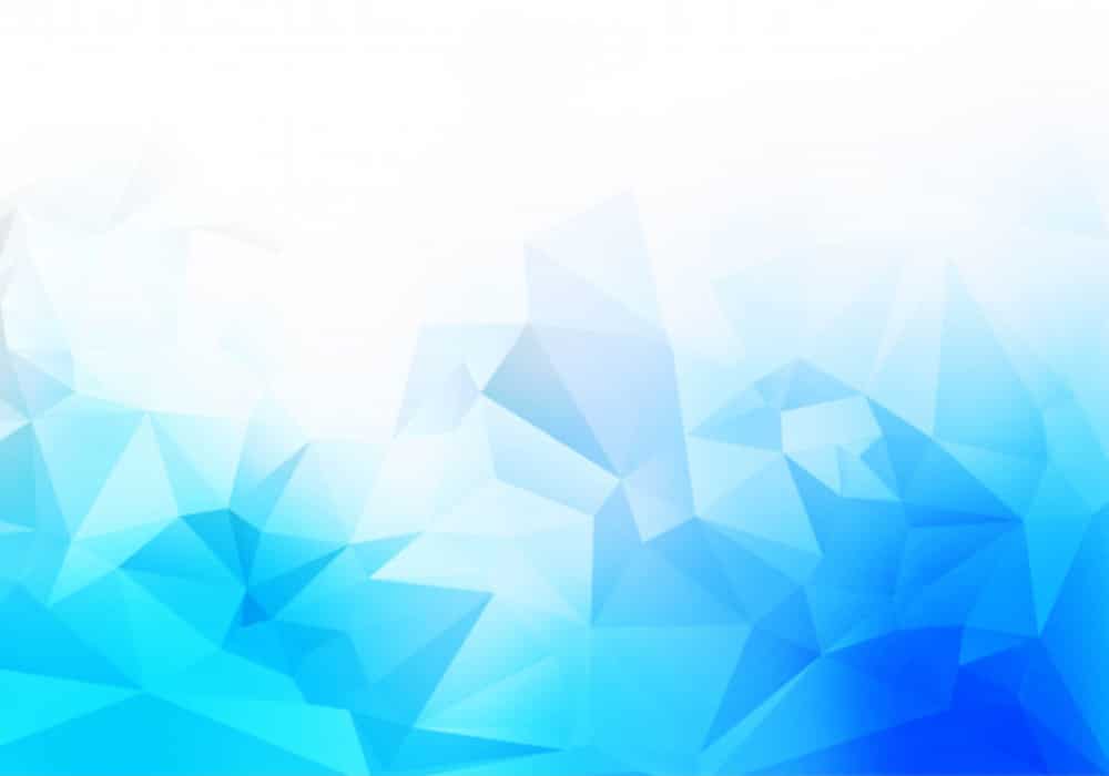
Geometric shapes not only help you to create a center of attention for your design, but they can also help you to create some fantastic backgrounds for your designs. You can pick any shape or couple of shapes to include in your background, and then you can experiment with the size, number, opacity, patterns, and colors. You can create some great backgrounds as per your requirements. You can include filled or just the outlines of circles, triangles, pentagons, and rectangles. You can also use various sizes of shapes, and you can give gradient style to your background and give it a more edgy look. The geometric background creates a dynamic base for your design to make the results even more attractive.
2. Create Unique Patterns with Some Common Loops:
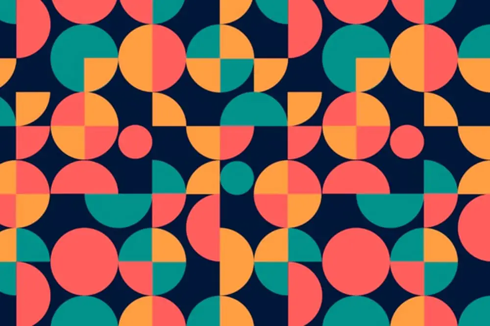
You can create your unique pattern with some geometric shapes and use it in your design for various purposes. There is another exciting way to create eye-catchy designs, and you can take any one of the geometric shapes and create a loop of that shape so that it emerges in a most attractive design. Black and white swirls are widely used in designs to create a fantastic image. You need to use just one shape but in a very calculated and various ways to create that attractive swirls and patterns. This technique can help you create a background, redesign any object, or design a logo.
3. To Create an Image:
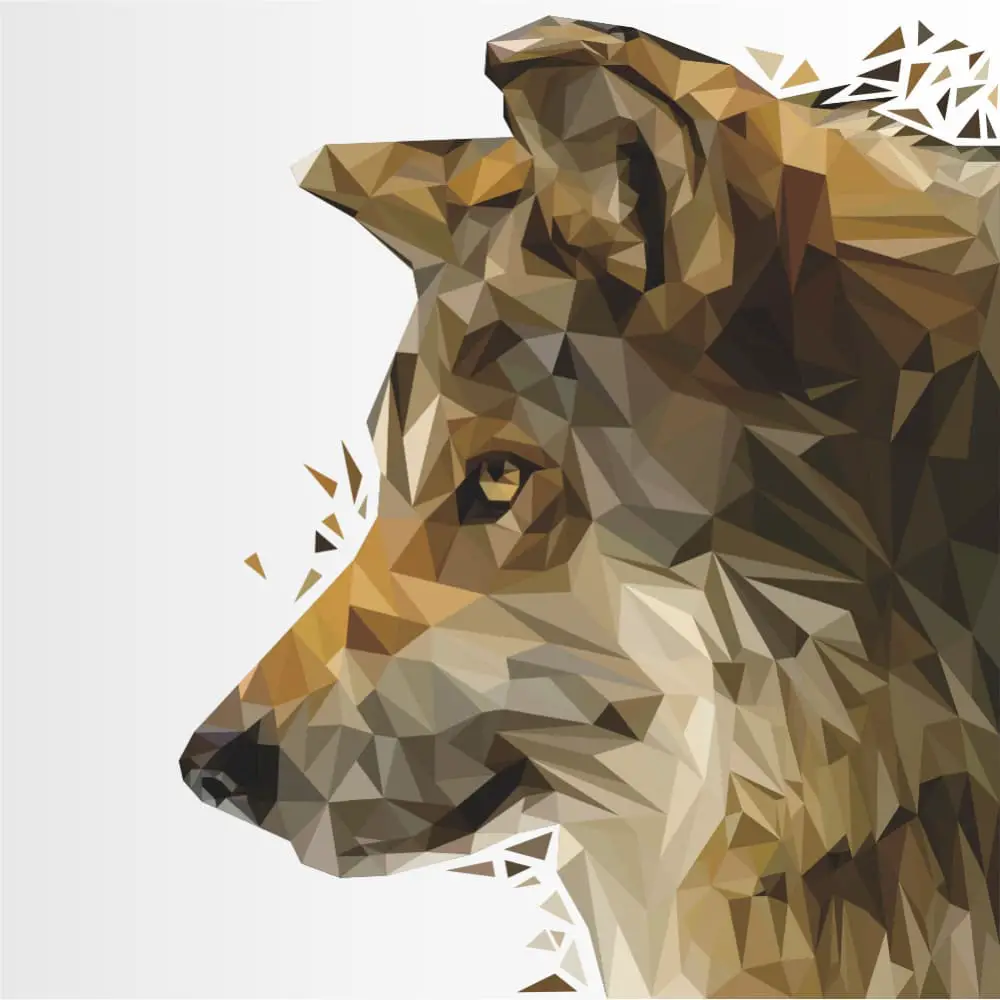
If you want to create an abstract image of some person, animal, or subject, it is merely impossible without geometry. And that is why artists worldwide use various geometric shapes to create unique images with some simple shapes and patterns every day. Your design can stand out beautifully if you can use geometric shapes in the right way. You don’t need to use multiple shapes to enhance your image, but you need to use the minimum shapes to complete your image creatively. You can select one or two and then use gradients, shadows, and sizes to make it 3D or eye-catchy. You can create images from geometry and use them in your design, artwork, logo, or commercial subject.
4. Experiment with Some Mix and match:
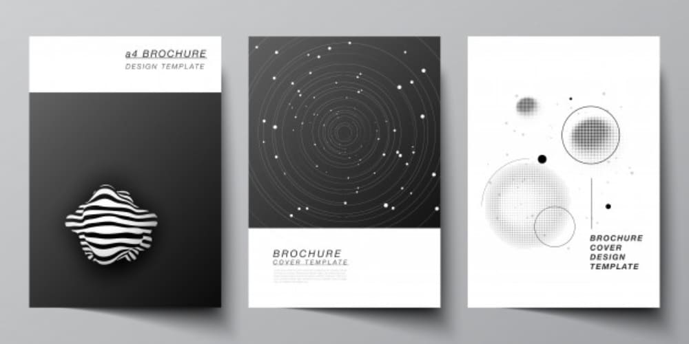
Designing has an attractive characteristic that promotes no rules at all. You are allowed to take things however you want when it comes to creating a quality design. And it is like a designer’s right to experiment with everything he has while creating his design. So, you should create something unexpected through a fantastic mix and match technique with geometric shapes. You can add, subtract, unconventionally manipulate shapes and create some beautiful designs. If you give a little attention, you can see many classic and modern designs with a mix and match of colorful geometric shapes. Designers use them in posters, ads, banners, and websites to create a unique brand image.
5. Use Geometry In-text:
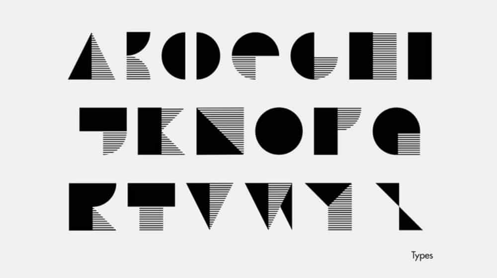
Using geometric shapes in the typography can add a completely new look to your designs. Text is as important as any other designing element in your design, and if you are trying to find an innovative way for your text, then using geometry can be a terrific choice. From formal and decent to modern and trendy, you can give any look to your texts. Using common shapes and lines bluntly or smoothly with some colorful outlines can turn out as a bold and robust choice for the text part in a design. It can help you to convey the message and brand image in a pretty confident manner.
6. Combine Different Images in Geometry:
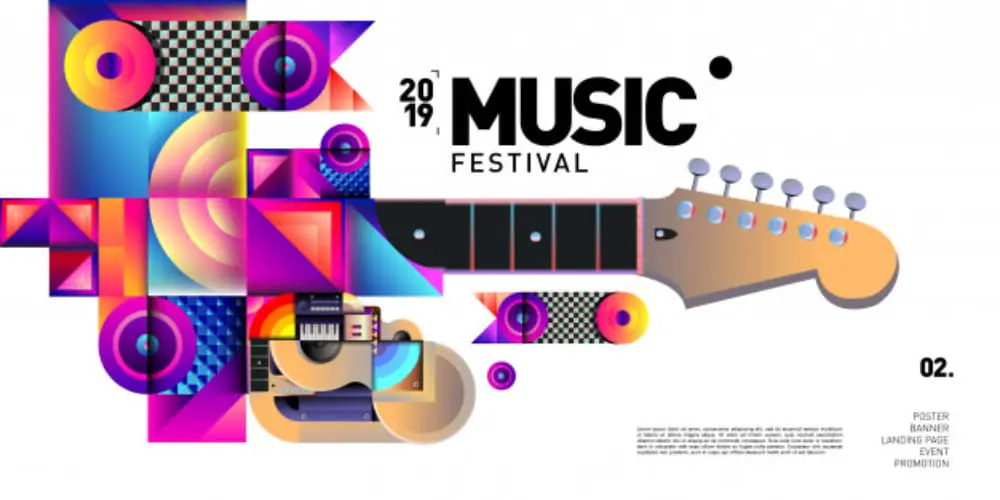
As a designer, you must be struggling to select one image or few images out of a whole bunch for your design every day. You want to add more than you should add but designing limitations don’t let you do that. Well, you can surely do that by adding some geometrical elements. Your design can go flat if you put multiple images directly, but if you combine them nicely in some geometric shape, then it can turn out as a masterpiece as well. You need to be careful with the shape you are choosing. Because there are multiple images, you don’t want to ruin your design by creating haphazardly. So selecting a circle, square, rectangle, or combination of any two can give you enough space for your images, and it can act as a beautiful frame for your images as well.
7. Go Abstract:
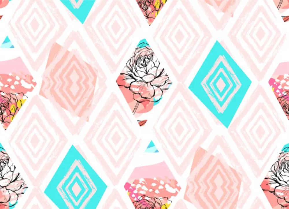
Abstract style is one of iconic style that can make any design classy and attractive with minimum efforts. Geometry has a profound connection with an abstract style. You can easily use circles, lines, triangles, and squares to create an object abstractly. If you want to create a simple yet attractive design, then an abstract pattern can help you make a rich design and help you portray the brand image in a most modern way. Many designers and artists go for geometric patterns when attempting to create abstract designs for any commercial or personal project. Some small shapes, lines, and neutral colors combined with natural or industrial objects can create an outstanding abstract design for any brand.
8. Keep it Simple:
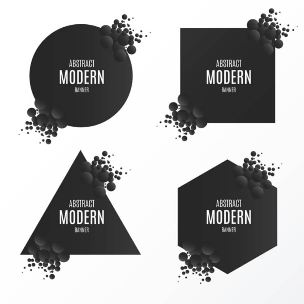
A great design is sometimes not about excellent illustrations, colors, messages, and graphics, but it’s always about the great idea. The main component of your design is your idea so, the execution of it can be complicated or straightforward, but the essence remains the same. You don’t always have to choose the difficult way for your designs; you can choose the more straightforward ways as well. Classic designs are always about simple elements, and that what makes them evergreen. Geometric shapes in a clean format included with your image and text can also make an excellent design. Complicated patterns, intense colors, and multiple shapes are not always necessary. You can also use simple shapes as it is with balanced colors for your designs.
9. Use Unusual Shapes in an Unusual Way:

Geometry can form an end number of different shapes that you can use in your designs with ease. Using some geometrical shapes in such a way that it forms other random shapes is a traditional method of geometric designs. You can use this technique to create some unique shapes with basic shapes for your designs. Geometric patterns with well-designed shapes can help your designs with beautiful grids and appealing mosaics. You can experiment with your own choice of shapes with any different kind of pattern. It can make your design unique, and it can help you find some new elements as well. Unusual patterns emphasize the uniqueness of your design to your viewer’s minds.
10. Make a Collage:
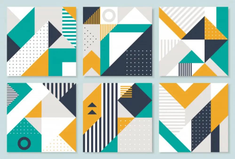
Geometric designs in a collage with some vibrant colors can work as an excellent designing idea. You can combine shapes, objects, and colors to create some exciting mosaic by overlapping them or placing them with each other on top of some great color pallets. Creating a mosaic can be a little tricky if you do not use the right colors and the right elements. Geometry is already playing a significant part in your collage. Another thing for you to take care of is selecting colors, shapes, sizes, and places. No matter what shapes you are using and what idea you are using for the collage but everything should stand out along with every element; nothing should pull down your design, be it colors or shapes. Geometry collage is a perfect designing idea to create a base layer for your designs.
11. As an Element for your Logo:
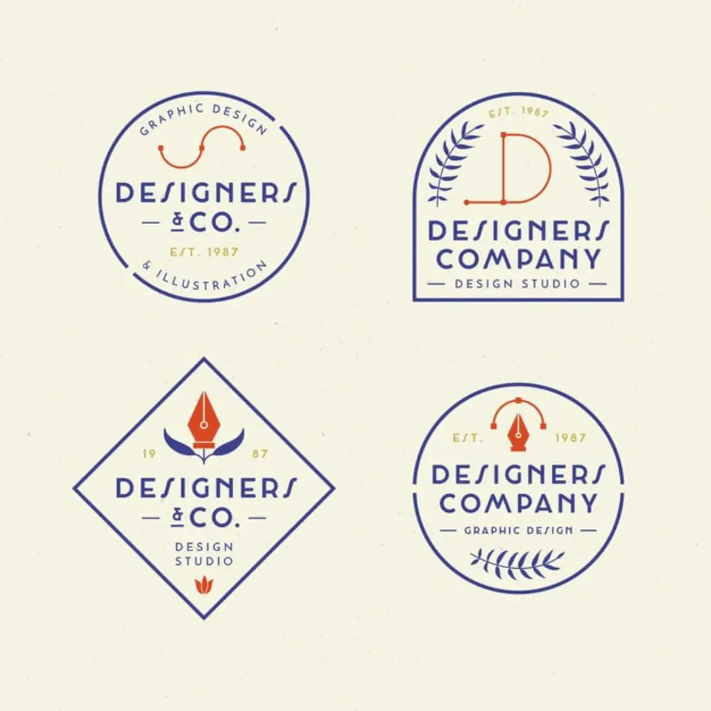
Designers use various creative approaches to design a logo for the brands. Text, brand image, graphics, and colors are the central element for any logo. Apart from text and image, geometry is also an essential element that can make things easy for creating an iconic logo. Circles, lines, squares, and triangles are some of the common shapes in logo designing that you can find in various logos around you. They go perfectly with text and images as an extra element to provide more effectiveness. The circle represents trust, ethics, reliability, and class. Same as that square helps you to represent a strong image with dominance. And just like that, every shape has its representation that any designer can use to make the desirable logo.
12. Create Motion or Animation:
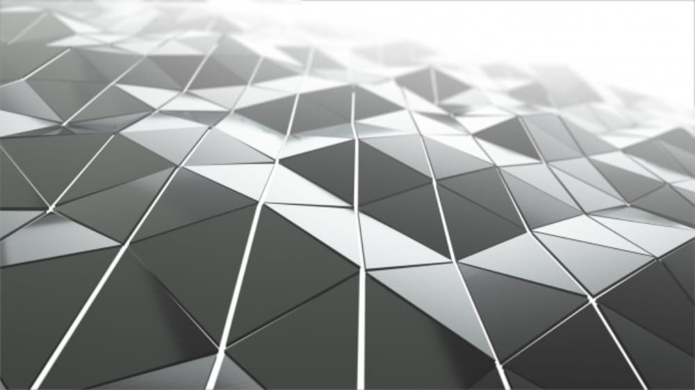
Geometric shapes are beneficial to showcase the animation and motion in the designs. Designers add some geometry along with the image to associate the motion factor with the design. Rings of the circle, square or triangle, parallel lines in graduation, the random placing of shapes with the image, bubbles on the surface, etc. are some of the ways designers use to create animation and motion in the design. Geometrical shapes offer many other possibilities as well to add these factors more creatively.
13. Use with Right Colors:
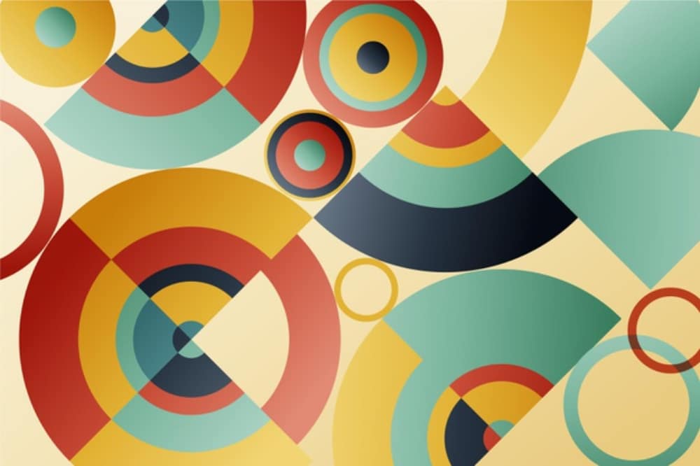
Using geometry shapes for your design is a very unique yet subtle choice for designing. But no matter how creatively you are using shapes whole approach can turn out as a failure if you are not selecting colors wisely. You can do some experiments with colors as well but in a systematic manner. Geometric shapes with monochrome color pallet, vibrant colors, pastel shades, and gradient colors can do magic in a design. Still, you need to understand the purpose of shapes and end motive of your design; then only you can choose various colors and various shapes for your design.
14. Fuse Patterns with Photos:
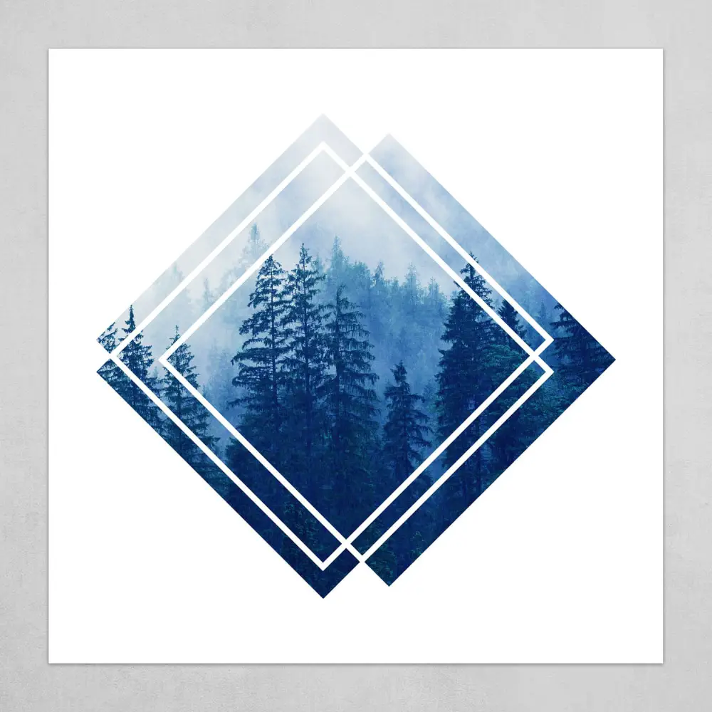
This one is an effortless but very effective way to create a fantastic design with geometric shapes. Any geometry shape or combination of shapes fused with any real-time image can turn out as a stunning designing concept. Real-time images of nature, landscapes, people, cities, and places merged with appropriate geometric shapes can give that image a creative look, and you can use this image as a perfect center point of your design. So that’s how geometric shapes help you create layers of support to all the elements for an appealing and innovative end design. Your photos can make your designs more appealing, and adding them with fused geometric designs can give that eye-catchy and creative look.
If you are confused about where to start for your unique design, then isn’t it a better idea to start from some basics? Fundamental elements like Geometrical shapes, contemporary colors, evergreen themes, and minimal typography are always perfect to start with for any intricate design. Geometrical shapes are basics, but ways of using them in your designs are not that simple. End number of combinations and amazing creative ideas are possible that include geometrical shapes with other elements. You can indeed create your way as well apart from all the mentioned options. You can use them directly in your designs, or you can use multiple options to make your designs better and creative. All the suggested ways are the most commonly used and highly effective ways to open the doors of creativity for your designs. So get inspired and get innovative with these geometrical ways for your next design!
via https://ift.tt/2NaAavl

No comments:
Post a Comment