The internet era is becoming more powerful every day. People usually stay connected to this network 24/7 through either a computer or a cell phone. This causes times to change, so businesses must also do whatever they can to not be left behind.
Many entrepreneurs have understood the great importance of this tool when marketing some type of product or service, especially considering that physical or in-person sales are becoming increasingly anachronistic.
This is why all owners of premises of any kind try to create websites where they can offer their consumers good deals and have their entire inventory well organized. This ranges from designing a fitness or gym website to other types of portals.
Nowadays, with the increasing power of technology and mainly the internet, people spend much more time at home and are sitting without physical activity. This is an excellent opportunity that gyms can take advantage of to offer their services. The best way, ironically, is through promoting the website. After all, there is no way that a personal trainer will be hired if they do not offer their services.
The website for the gym or training center has to be properly designed to capture the audience and thus obtain benefits. Many of those in charge of designing these sites focus only on the most basic, however, small details or even organizational details can make a huge difference, making a web page an excellent place to obtain information about anything.
This is why very few pages manage to stand out and to show you these differences we will present to you what are those small fundamental details for designing a fitness or gym website.
High-quality visuals and fresh content – Shocking to look at
The difference between a good design and an excellent one lies mainly in the quality of the images or audiovisual content that it presents. Unlike text, images and videos manage to capture the public’s attention by being extremely eye-catching, in fact, statistics indicate that videos on websites generally account for 82% of all traffic.
However, that’s not all, because another of the great details that allow the website to stand out from the rest is the constant updating of information, this allows to maintain fluidity on the site and makes people interested in always knowing something new.
However, when working with audiovisual content you should always remember that the weight of the files and the quantity can negatively affect the loading speeds of the web, which will subtract points from your SEO.
Class schedule and bookings – The best way of organizing the time
A fundamental part of designing a fitness or gym website is the scheduling of exercise routines. Each person’s availability to attend the sessions must be taken into account, so having an entire section dedicated solely to this topic can greatly help the site to gain popularity and make it more intuitive.
The more traditional pages make the schedules manually, but today there are many automated options for this task, which even notify customers of their reservations.
A successful schedule is a tool that benefits both the website owner and customers by reducing the headaches of searching for schedules, membership reminders, among many other things.
Pricing – Economic ignorance will not be an excuse
Gyms have several types of training and services, each with different characteristics, resulting in different costs. This is something that should be made very clear on the website, having an exclusive section for prices, which can combine images and text. The intention is that clients have a clear reference of how much it will cost them to hire your services and what you offer in them.
At the same time, the pricing section can be used to sell the different products of big brands that the gym has. From training equipment to healthy recipes, any merchandise you sell can go in a special section that will work as a virtual store.
Make sure your website is professional, informative, and convenient – The professional nature is the best policy
What is the best way to leave a good first impression on a person visiting your website? Having a harmonious and striking combination of colors, up-to-date informative articles, and everything organized to create a professional space.
You must have a web page that reflects all the knowledge of the people who work there, demonstrating the high levels of professionalism that is handled in the gym, always considering the client, avoiding false information.
And speaking of things that keep users, there is nothing more annoying than a bunch of pop-ups and advertising, so, although it seems tempting to put many of these, you should avoid it at all costs.
Marketing of products and more – always show all your products
Now, a person who wants to start an exercise routine in a training center must take into consideration several aspects, including the environment and even the exercise equipment that the gym has.
That’s why one of the best tips when designing a fitness or gym website is to take into consideration the available equipment. In this way, the user knows what artifacts he or she can work with, thus obtaining new clients if the gym has the equipment that this person wishes to use.
In the same way, it can also be used to market these products in case the client does not want to show up at the place.
All these characteristics are the ones that must be taken into consideration when designing a fitness or gym website since these will make a notable difference in users and in the image that is offered to them of the gym. Some websites have managed to obey these rules and have achieved very good results, among these we have:
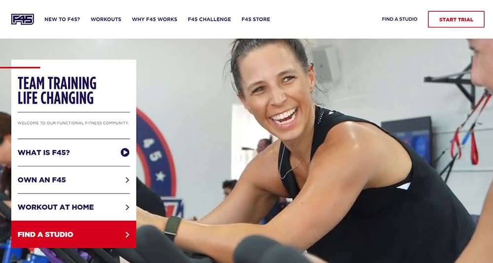
F45 Training – The image of creativity
This website managed to perfectly combine aspects such as text, images, and highly creative templates with which you can easily capture people’s attention. As soon as users enter the site, these are welcomed with extremely clear and concise descriptive texts in conjunction with interesting icons, folding windows, and other interactive elements.
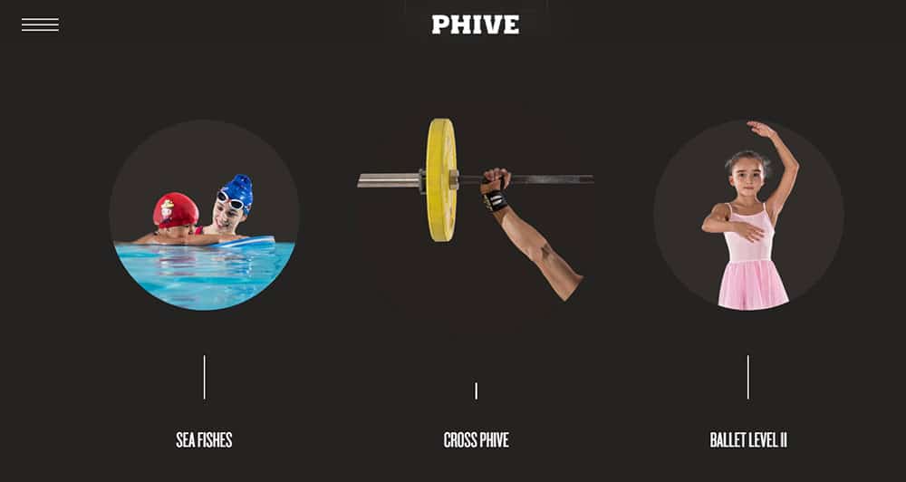
Phive – The Beauty of Movement
Phive is a website where what stands out the most is not its impressive colors or its extremely attractive aesthetics, but the type of transition and movement effects it presents. Originally, you start with a well-defined image on the entire screen, but the further you advance within the page, you discover new and incredible things that are presented with unique effects.
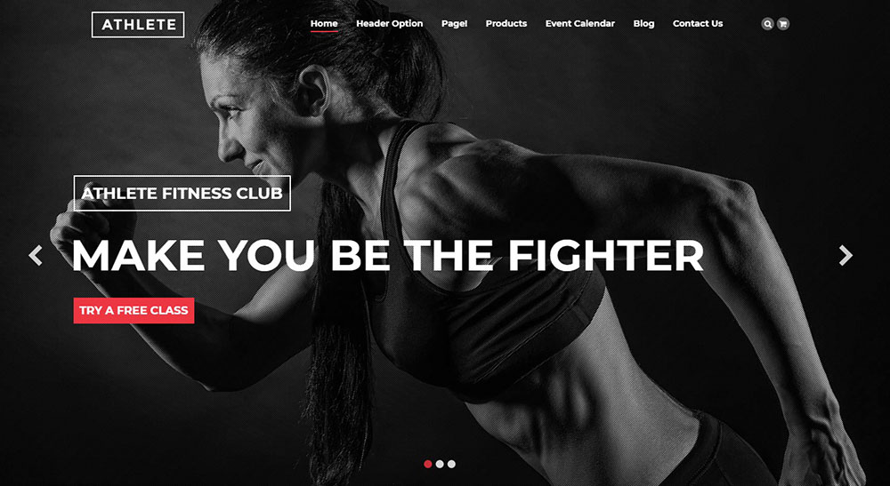
Athlete – The perfect combination
From the same name, you can understand the objective of this template: to talk about exercise with passion. Designed for WordPress, this can be customized thanks to its large number of widgets and plugins. You can even create a blog for sports fans.
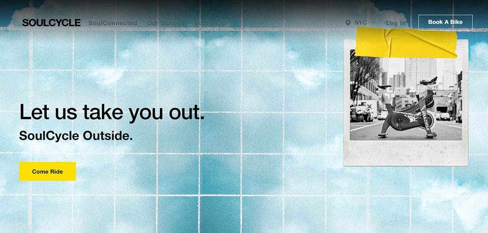
Soul Cycle
“Anyone can be a Rockstar, an athlete, a warrior” – at least that’s what they say on their website. Their riders come to them from all backgrounds, levels of fitness, and experience. SoulCycle is for all.
Orange Theory Fitness
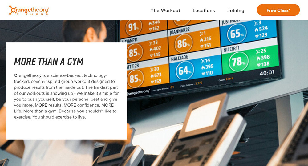
Orangetheory Fitness has some really intriguing science behind it. You can check it on their website if you’re interested in what they do rather than how their website looks like.
It all sounds really sci-fi and it could all be true because it looks like they’re putting an emphasis on their product rather than their website, which has a very old-school vibe.
SoHo Strength Lab
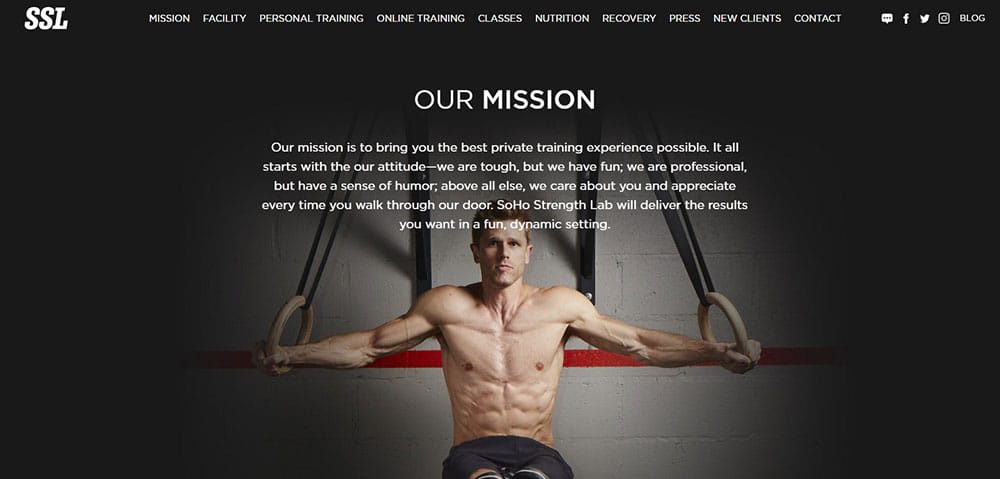
This website presents a rather rough visual style, demonstrating the great robustness of this type of activity. In addition to that, it has an incredible organization, where it is extremely easy to find everything you are looking for.
PureBarre
Pure Barre is quite modern in terms of web aesthetics when you compare it with competing websites. Their branding is top-notch, showing a really lovely but quite simple fitness logo. The color scheme is sharp, and the website gets you where you want quickly.
What I like about it and probably you will too is that they’re using real footage of real people. The same goes for the images on the website. No soulless stock photos, but actual photos of people.
Hot House Yoga
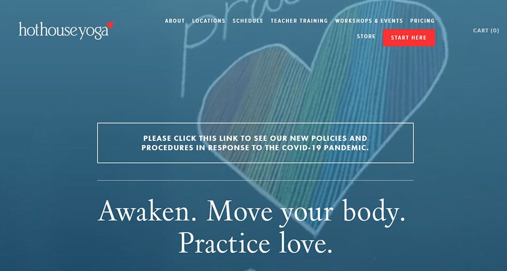
Each one specialized in different disciplines that can be recognized as soon as you enter their portals.
Undoubtedly, the world of exercise currently has great competition. Today’s facilities allow anyone to be able to publish a site, but to stand out requires a deeper understanding.
Customers adapt to new trends and are becoming more and more aware of the content they consume. This is the reason why you must have a website that meets what the market demands since it is these small details that were mentioned above that can greatly vary the result in terms of traffic and popularity of the business.
Healthy competition must be taken into account and ultimately, you must know well how to approach the audience you want to have. No matter how much things change, these characteristics must always be present on the page for it to be successful.
The post Tips and best practices for designing a fitness or gym website first appeared on Web Design Dev.
via https://ift.tt/3eBC1on



No comments:
Post a Comment