The selection of font style for any print design needs a different approach than digital design. Visual appearance, readability, and connectivity play significant roles when it comes to brochures, flyers, hoardings, and catalogs designs. We are here discussing some of the most used fonts for brochure designing.
These are some of the widely used and accepted font styles for brochures. You can take this collection as a guideline to decide which typeface you want to select in your design. This can be for a study reference, inspiration or collection as well. Some are standard and very popular font styles, whereas some are unique and lesser-known ones.
If you want to build a solid brochure design with a great professional and reliable look, this collection has many fantastic font styles. So let’s check out our 20 most used font styles for brochures.
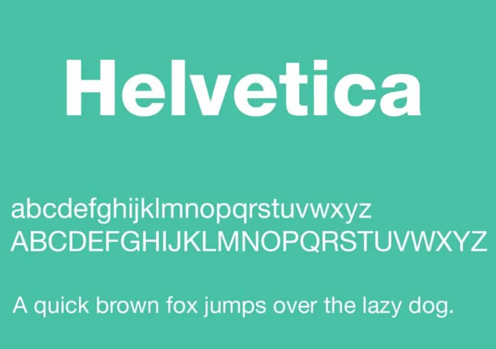
1. Helvetica:
Helvetica is a widely used font style for end number of professional and informal projects. This font style has a clean and basic substance that has given a foundation for a large number of modern typefaces. In addition, designers have used Helvetica for various brochures, flyers, ads, and many other designs. With this classic font style, you can add considerable charm to your design without any exaggerated elements. So overall, it is one of the most recommended font styles for brochures and other print designs.
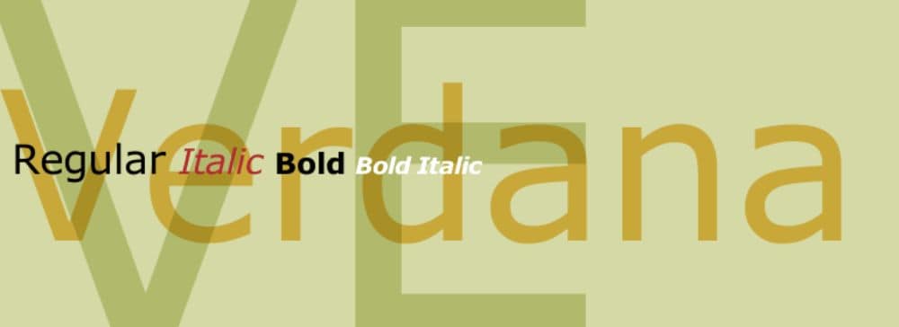
2. Verdana:
Verdana is another excellent font style for a solid and impressive look. It is a bold, straightforward and versatile typeface that can help a number of designs. You get creative flexibility with Verdana to make awesome combinations and various other styles to make your designs even more attractive and practical. It has seven different versions and all the necessary characters serving various industries for many years. So whenever you need a balanced sans serif font style with a minimal personality you can surely choose Verdana typeface.
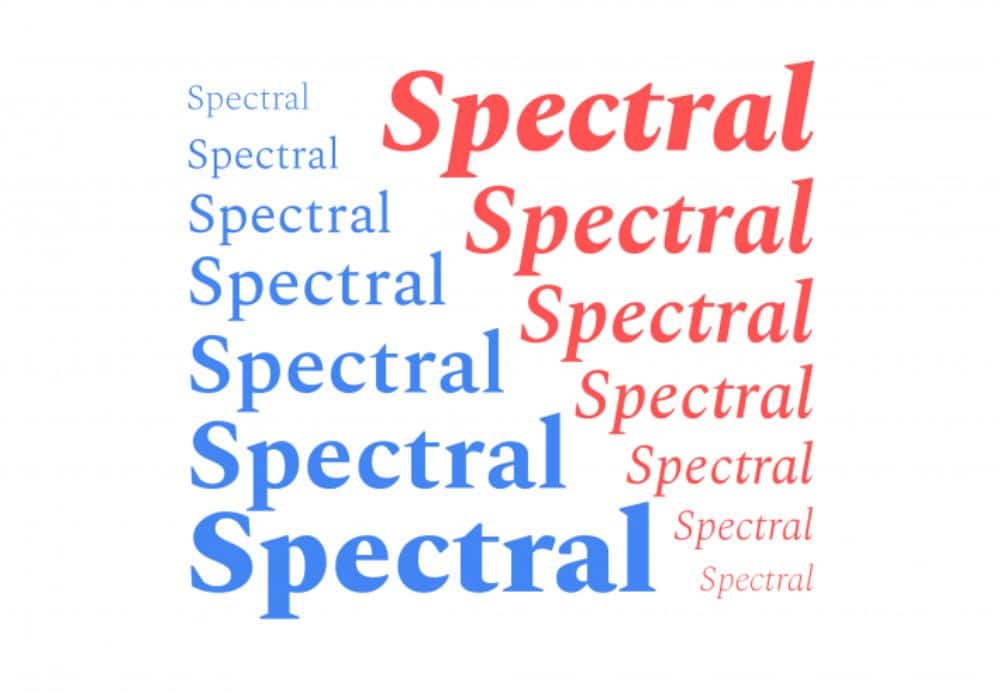
3. Spectral:
It is a beautiful serif font style with the versatility to adapt any concept and requirement. Spectral has a stylish display look and copy essence as well to fit your entire brochure content. You get different versions of italic, regular, and bold styles to benefit your multiple designs. This font style has a perfect calculation of weight and distance, making it one of the most loved typefaces whenever you need a familiar design element to portray class and confidence through creative concept.
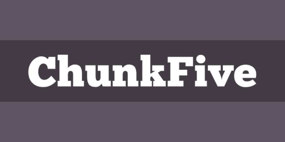
4. Chunk Five:
If you want a bold and subtle serif font style for your creative brochure design, then Chunk Five is a beautiful choice. It is an ultra-bold slab serif typeface that has been in the market for years to make professional headlines, newspaper designs, and many other print designs. Modern, stylish, energetic, and many contemporary concepts can use Chunk Five to present the brand in a more dynamic manner. It has a perfect personality and volume to make your content readable, clean, and impactful.
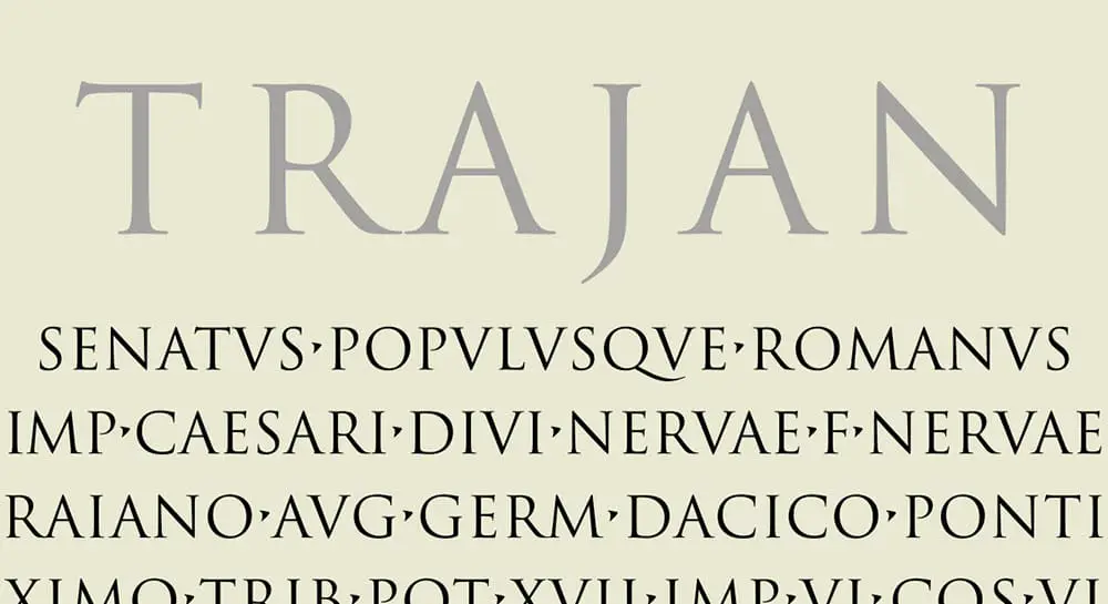
5. Trajan Pro:
Trajan has been one of the most favorite font styles of designers for a couple of decades. It is an elegant, composed, and balanced font style that has beautiful essence for any print design. You get all caps letters and valid characters with this font style alongside elegant strokes and a straightforward look. There are unique logos, headings, cover pages, catalogs, and many other print designs available in the market that represents terrific use of the Trajan Pro font style.
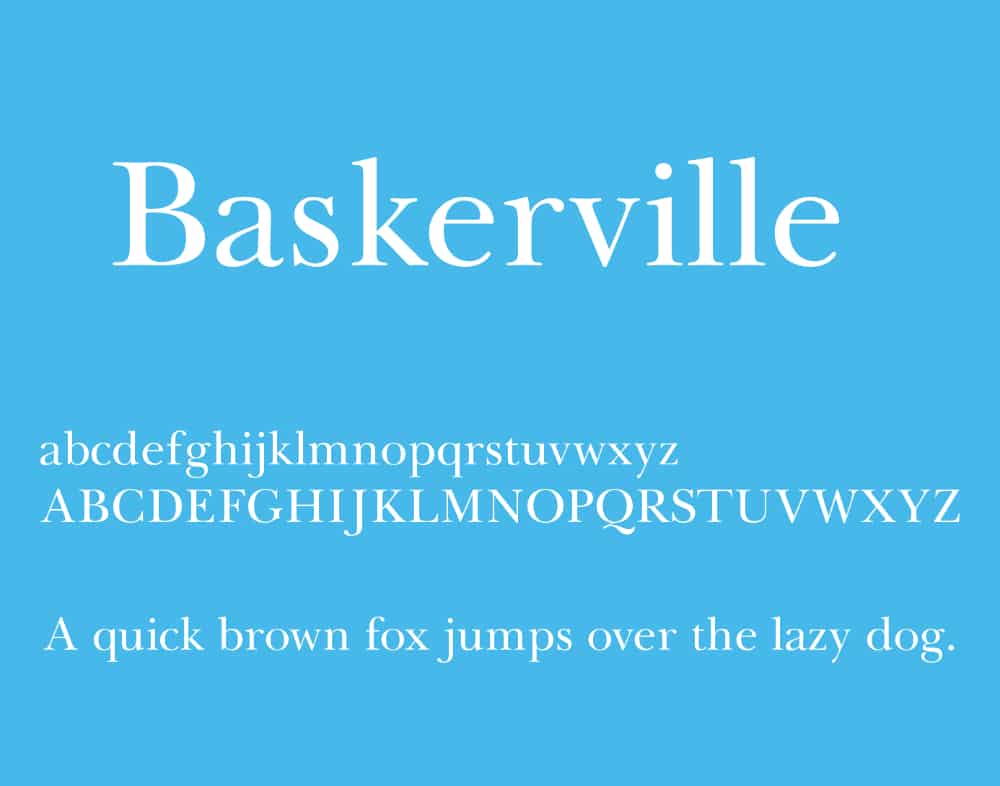
6. Baskerville:
This beautiful serif font style is a contribution of the designer john Baskerville. It is a classic serif font style that has served an end number of designs for decades. It is a bold, attractive, and composed font style that has both uppercase and lowercase letters with many valuable characters. In addition, you get multiple versions of regular, italic, bold, and black styles. So you can quickly try the Baskerville typeface to make your print designs look professional, readable, and convincing.
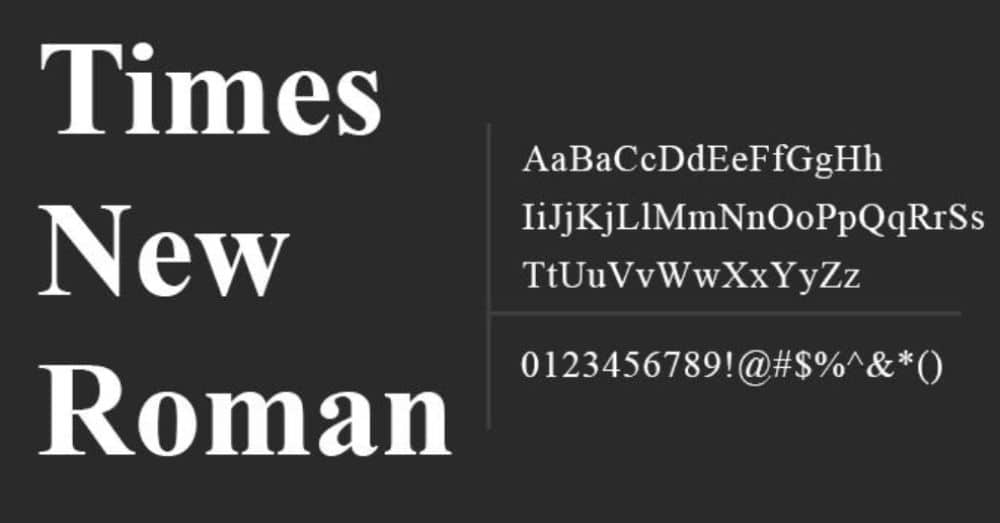
7. Times New Roman:
Times New Roman is given by the designers Stanley Morison and Victor Lardent. It is a beautiful serif font style that can make impressive headings and content copies for your designs. This font style can work very well in combination with some other bold, impactful, and modern font styles. Your content can look professional and smart with times new roman if you want all of your information to look clean and confident. So overall, it is a very helpful typeface for any designer working on smart and creative print designs.
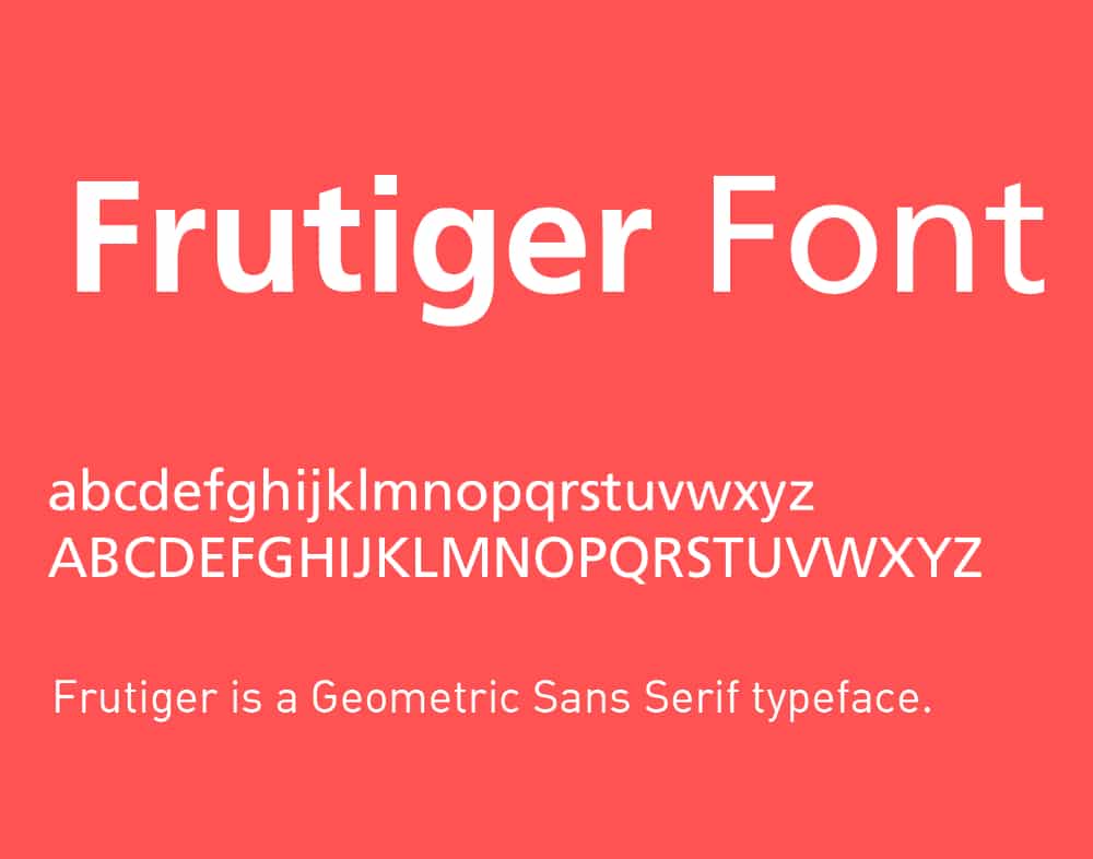
8. Frutiger Font:
Frutiger font style offers a referral framework for a large number of modern font styles. It is a basic and versatile font style that can become your foundation for many creative typeface designs. With this geometric sans serif typeface, you can add bold and subtle-looking content to your design. It has minimal substance and a solid appearance to use in any industrial, artistic, luxurious, and professional design project. You can find Frutiger font style in many designer’s collections for their creative projects. It is versatile enough for your daily use and creative experiments.
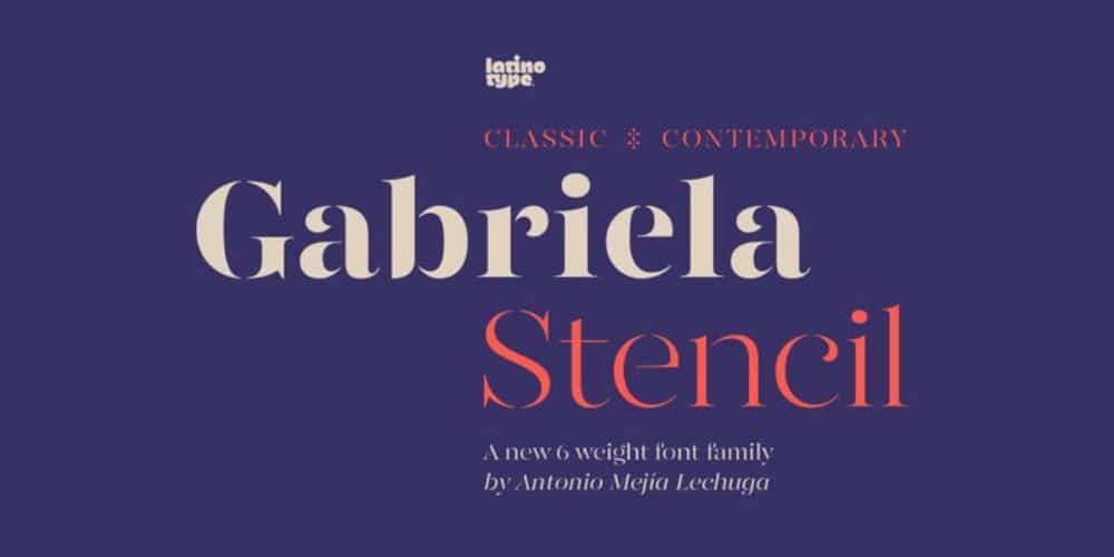
9. GabrielaStencil:
With this stylish, elegant, and bold font style, your brochure designs can look fantastic without any overwhelming element. Gabriela Stencil has classy and confident fonts to offer in a great combination of serif and stencil styles. Many designers consider this typeface as one of the timeless font styles in the market. You can make amazing and vibrant designs with this clean and creative typeface. It has a very polished look and detailed strokes that maintain the right balance and give you a beautiful design.
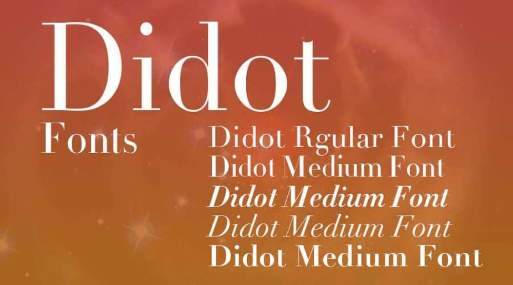
10. Didot:
Didot has beautiful thin and bold strokes to give a fine serif font style. The font style Didot is a group of typefaces, and its name came from the famous French printing and type producing Didot family. You get a bunch of versions in this typeface related to regular, italic, and bold styles. Many famous brands have used the Didot font style for their remarkable logos and other branding accessories. This font style has the unique flexibility to help you with headings and subtexts at the same time. Therefore it is one of the most used font styles for brochures, flyers, hoardings, logos, and other significant designs.
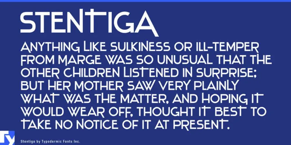
11. Stentiga:
For more sharp and unique options, Stentiga is a suitable font style. It has clean and bold sans serif fonts with irregular strokes and blunt edges. This font style offers all caps letters, punctuations, and numerals to make some awesome brochures, hoardings, and catalogs. Stentiga has a playful approach and straightforward look with display style to help designers with their smart and impactful designs. This typeface has a versatile theme to allow experiments and fusions with many other font styles, which makes it one of the best font styles for professionals.
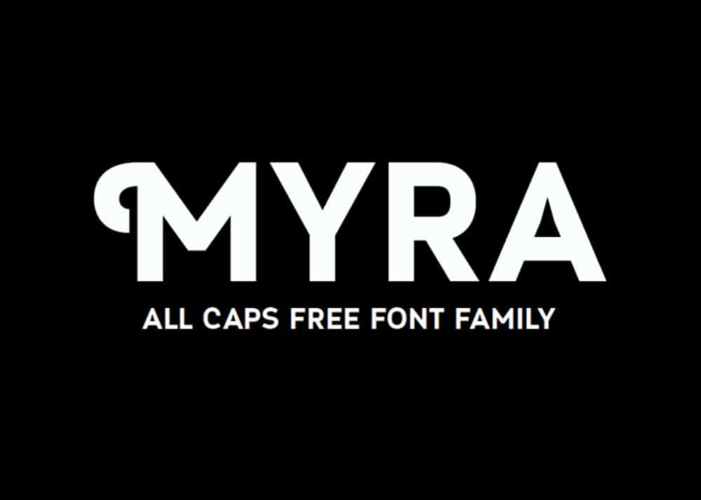
12. Myra font-family:
Myra typeface has beautiful nature to work for retro and modern designs at the same time. Moreover, this font style has a contemporary design fused with classic sans serif style. Thus, it offers creative alternatives for your various creative needs. Unique decorative curls and standard sans serif letters make this font style a wonderfully useful and adaptive fonts package. Overall it’s an excellent typeface for modern and impactful brochures, magazines, and other print designs.
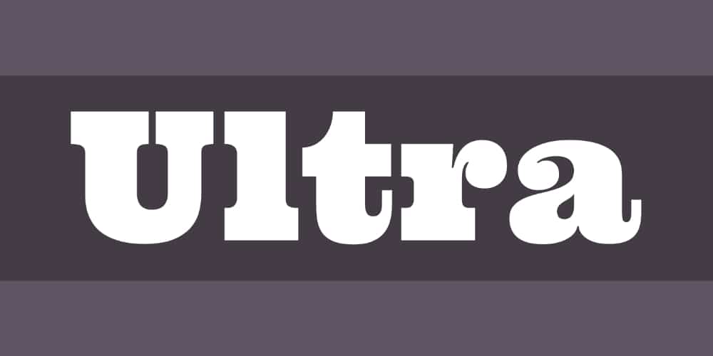
13. ULTRA:
Ultra typeface has a bold and dramatic look with an elegant feeling that makes it a beautiful display font style. You get soft curves and extra bold strokes in an attractive serif font style to make your designs impactful and engaging. Designers have utilized this font style in an end number of creative projects. It has a solid and impressive appearance which makes it ideal for any kind of print design. So you can surely select Ultra typeface for your professional brochures, magazines, and catalogs designs to present your brand elegantly.
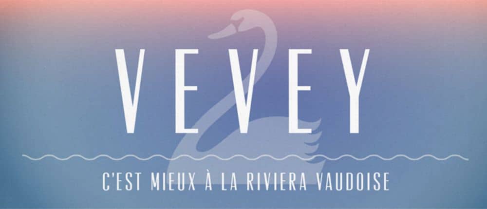
14. Vevey:
With Vevey typeface, you get a unique form of sans serif font style. This classy and powerful font style has balanced strokes and condensed fonts to represent a narrower version of sans seif typeface. This adaptive font style can be a terrific choice for logos, headings, websites, banners, and brochures. It has a clean and sleek approach to add elegance and confidence to your design. That’s why it is one of the most loved and recommended font styles for professionals working on print designs.
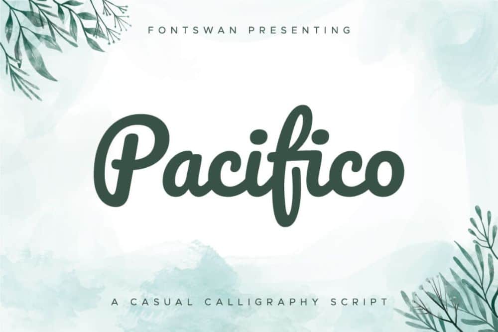
15. Pacifico:
Pacifico font is a brilliant handwritten brush style typeface that was inspired by the 1950s American surf culture. With this freestyle font, you can make some cool designs without adding any over-the-top essence. You can use pacifico for many entertaining, engaging, artistic, and eccentric designs. This typeface has bold and clean handwritten strokes with both uppercase and lowercase letters. It’s been serving the creative industry for years; that’s why it’s a very common and loved font style for many designs.
16. Pricedown:
This typeface is an ideal style for headings and large-scale designs. Pricedown has seamless and extra bold strokes, creating a very professional and robust look. Any cover page, newspaper, magazine, brochure, or flyer can use this font style to give perfect readability to readers. In addition, this typeface’s unique extended strokes make this font style extraordinary and attractive. This font style’s bold, creative, and effortless look makes it one of the most used fonts for brochure designs.
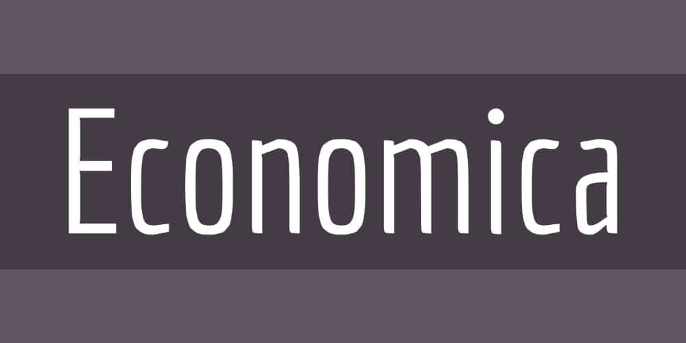
17. ECONOMICA:
Economica has a balanced weight and a slight hint of handwritten style. You get excellent variants in regular, italic, and bold styles, also with 258 glyphs. In addition, this font style has medium bold strokes and a unique but straightforward sans serif design. Economica font has adaptive nature to make perfect headings and other content copies for various effective designs. This typeface can make a stylish and composed impression with multiple digital and print designs.
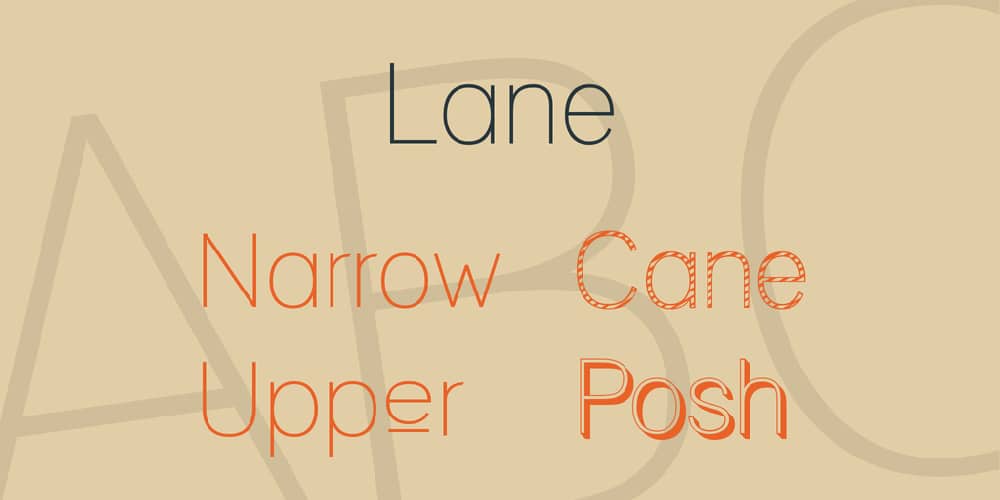
18. LANE:
Lane is another edition for the basic sans serif font style category. It has a straightforward, essential, and minimal appearance with exciting versions to help your elegant, classy, luxurious, and various other professional designs. Moreover, this typeface can provide readability, relevance, and conviction to your designs for effective results. Lane is one of the great foundations for many contemporary designs; that’s why it’s a beautiful font style to collect and utilize.
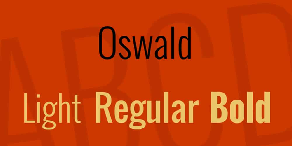
19. Oswald Font Family:
Oswald font family offers both classic and modern looks with its timeless design and attractive strokes. It has a balanced weight and clean fonts fused with the sans serif font category. Oswald has a condensed theme and sharp letters with a beautiful modern feeling. It is a widely used font style by professionals as it is available for free in the market. You can freely use this font style as an inspiration for your next typeface design or any other purpose.
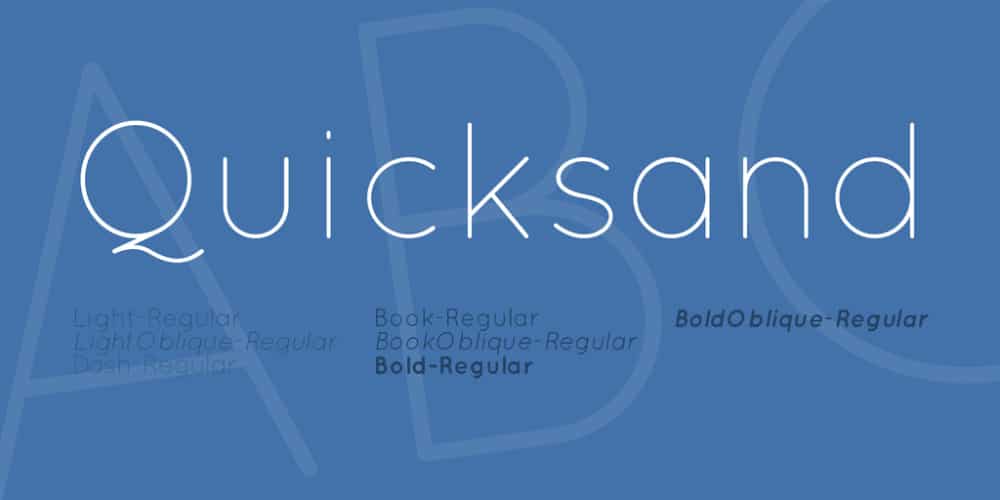
20. Quicksand Font Family:
Quicksand font has a beautiful sans serif style with rounded edges. It has many exciting versions like regular, bold, dash, and oblique. This typeface is designed with soft strokes and a professional look without any extra effort. Your brochures, flyers, and banners can seamlessly look clean, engaging, and readable with this font style. Therefore it is one of the most recommended fonts for print designs.
Brochure designs need a grounded, clean, and impactful font style that helps the reader to understand your brand and services in the way you want them to. The selection of decorative, stylish, and eccentric font styles can be a tricky decision because such font styles are not always ideal for print mediums. Therefore designers across the globe prefer the font as mentioned above styles.
You can find these font styles online or in your software easily. With this collection, you can get an idea of which one you need to pick and font styles that are easily accepted and applied in most places. If you want, you can design your unique typeface as well by taking this list as an inspiration. So benefit your designs before making any wrong choices about the typeface. Select a good, solid, and straightforward font style that reflects your design and brand most professionally and powerfully.
The post 20 Most Used Fonts for Brochure Design first appeared on Web Design Dev.
via https://ift.tt/3AEtSbx


No comments:
Post a Comment