Web design trends don’t just happen. They rise up according to people’s needs, whether those needs are for action, for peace and tranquility, or for something in between.
The marketplace often tries to determine what those needs should be, but more often than not has to adjust to what they actually are.
The digital world is no different. At the present time, it finds itself trying to bring a sense of balance to a world that seems to have become increasingly more chaotic and less predictable. That striving for balance is what we are seeing in web design trends going into 2022.
In this post, we are going to take a look at 5 of those trends. We’ll also be using BeTheme Pre-built sites to illustrate how these trends can be implemented. You can in fact use these sites to quickly and cost effectively implement these trends as you build or redesign sites for your clients.
5 Web Design Trends to Use in 2022
You can lend your clients a helping hand by incorporating the latest web design trends as you design their websites. In doing so you will be making it easier for them to capture the attention of potential customers.
Here are 5 trends you should be knowledgeable of:
1. Immersive image design can inspire consumers to accomplish more this year
According to Statista, people spend more than 2 ½ hours on their smartphones every day, and another ½ hour at their desktops.
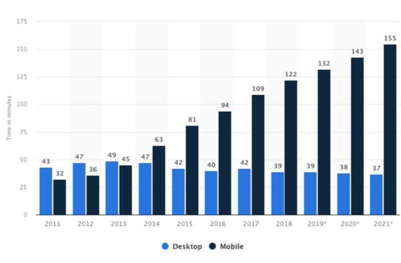
This is a worldwide phenomenon. A portion of this interaction with the digital world is devoted to entertainment – content streaming, social media, and the like. A portion of it is devoted to work or to conversing with another person.
What is the rest of the time devoted to? It is to seek out information on what to do outside of their screens, like shopping for example, which has much to do with what this post is all about.
If you are building a website that promotes a real-world experience or selling a product, the most effective way to sell something is to let the visitor to your site “feel” it.
How do you make that happen?
With products, it isn’t difficult to do since you can display a product from different angles, zoom in on it, or show color options or other variations.
Letting your visitor “feel” an experience is more difficult and calls for a different approach, and that is where immersive design enters the picture.
BeTheme’s pre-built websites offer many examples as to how designers create digital environments that feel real to the observer.
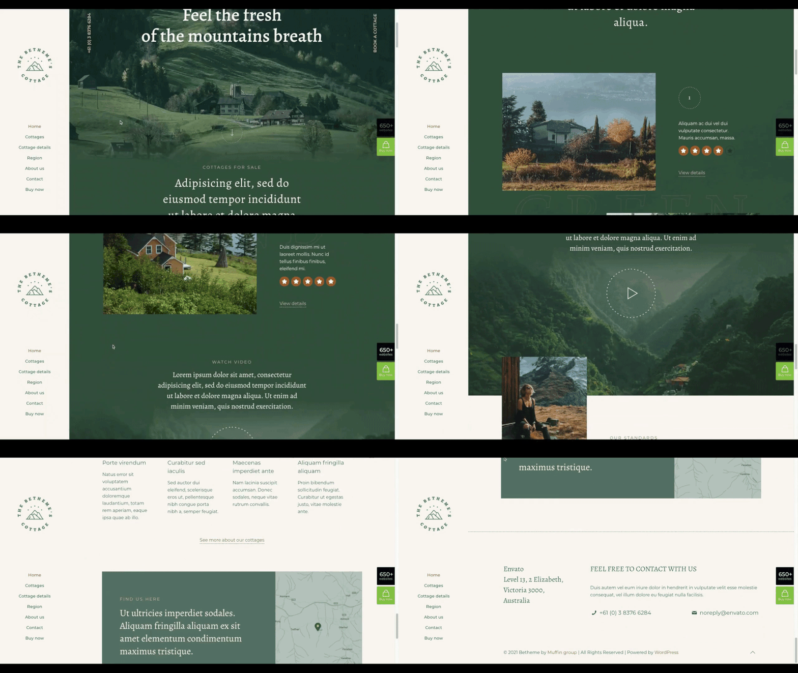
BeCottage2’s use of this immersive design trend involves the use of an image filter together with a blurring effect to cause the landscape images to blend in with the digital content.
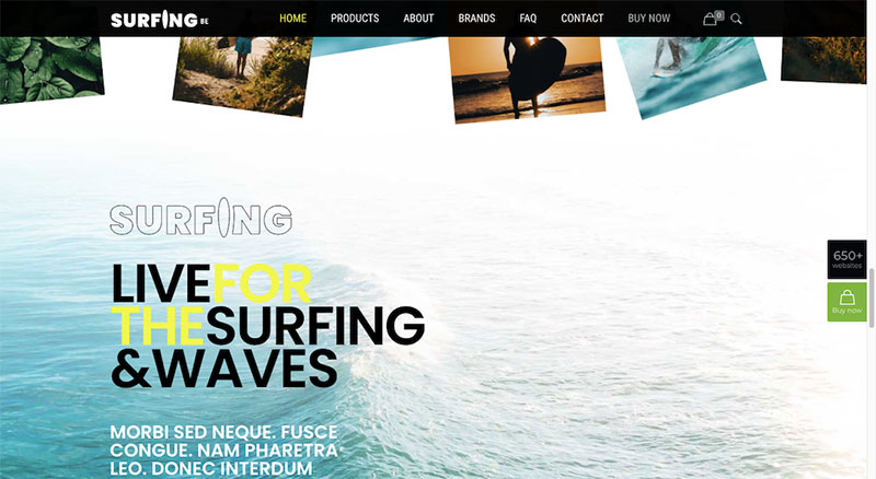
A similar strategy is used in this Surfing2 example. Here, the lighter part of the ocean’s image is allowed to seamlessly blend into the website background.
Instead of jumping from one section to the next, the observer experiences a smooth flow from the digital content into the natural setting.
2. Changing typography to put a spotlight on content
Designers use many different techniques to make website typography more eye-catching. They will change the size, the color, or the style. As you will see, applying motion to the text can have an even more pronounced effect on an observer.
As is the case with almost any special effect, you don’t want to overdo it. Too much of a “good” thing can make a website less user friendly. The single flashing of a light can gain attention. Constant flashing can be irritating or cause confusion.
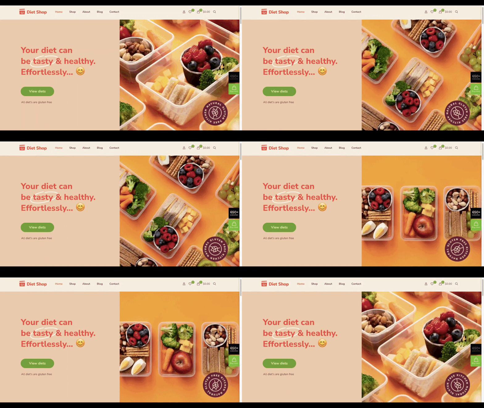
If you want to apply motion to text therefore, you want to do it sparingly, and only apply it to key pieces of content, as is done in calling attention to a unique value proposition in this BeDietShop hero image:
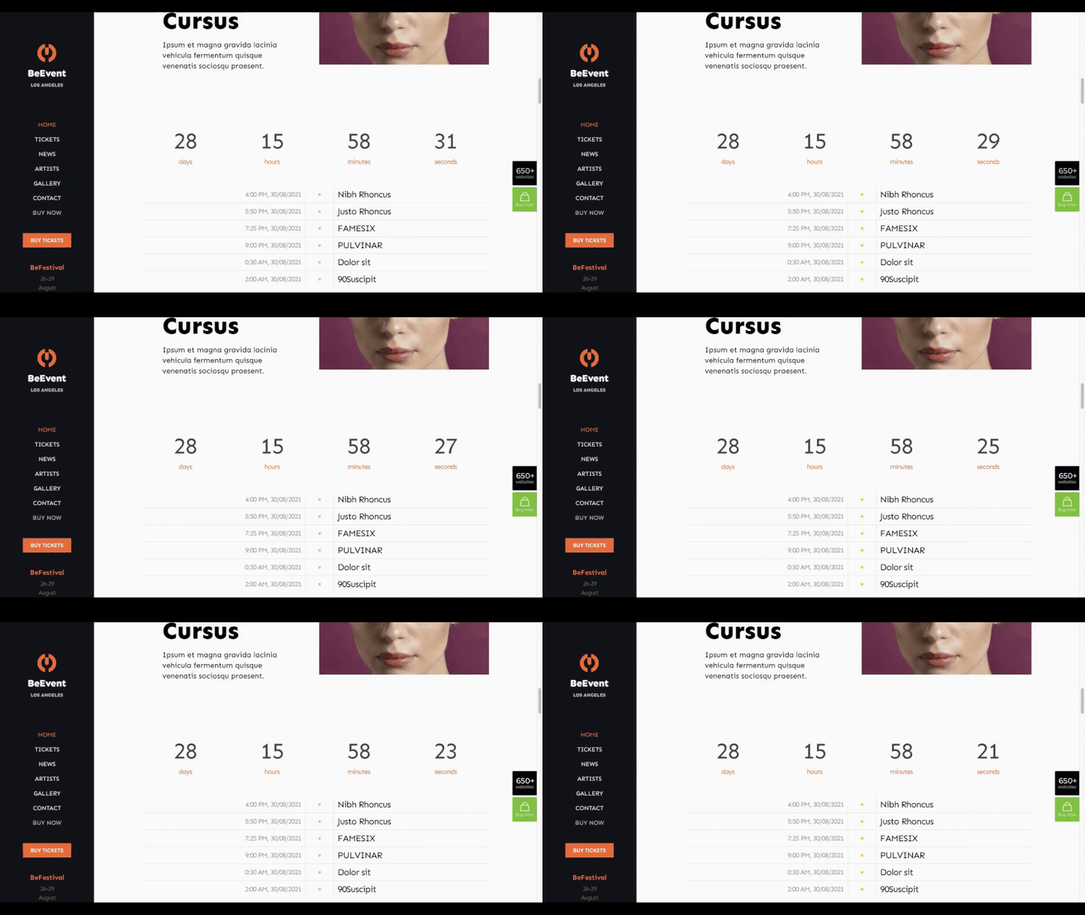
BeEvent7 simulates the ticking motion of a clock as an attention-getting device.
This particular style of moving typography can be put to use in various ways. The motion can be slow, or it can be rapid. It can be counting down or counting up. If the count is approaching a goal or objective, it can be even more attention-getting.
3. Line art backgrounds can also function as useful guides
It seems like just about every year designers are thinking up new ways to create background designs that will make websites more engaging and appealing. Recently, it’s the use of dramatic gradients. At another time it’s been video sliders, and at yet another time dark mode color schemes have captured designers’ attention.
In 2022 the trend is going to be toward a greater use of line art; not only to create visual interest, but to provide visitors with some helpful guidance as well.
Providing guidance should not be confined to the use of pointing fingers or arrowheads. Not much creativity or originality there. Abstract designs can not only provoke the same responses but can be fun to create as well.
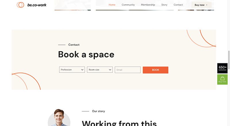
Check out the BeCoworking pre-built for example:
The circles in the two corners in the background of the block serve a couple of purposes. First, they grab viewers’ attention as they scroll down the page. Second, their inward curvature tends to focus that attention on the booking form in the center of the block.
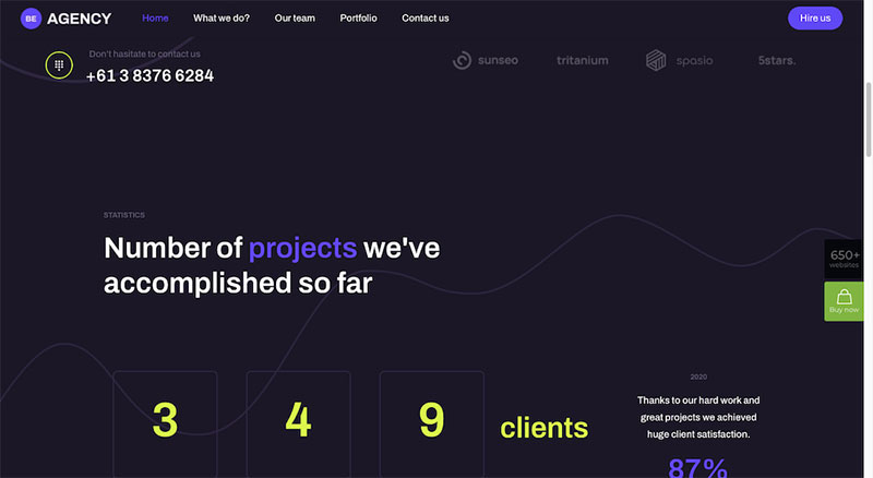
BeAgency6 also makes impressive use of line art backgrounds:
While at first glance the nebulous shapes appear to be purely for decorative purposes, they have in fact the effect of guiding visitors thru the content.
When you stop to consider how many ways there are for people’s eyes to scan across a page, using a subtle approach like this one to keep them focused on the right parts can work wonders.
4. Interactive graphics provide added context for users
The basic goals of any website should be to get visitors to engage with the content to the point where they will take the desired action. If you do it right, it only follows that the more visitors you can attract, the more will take that action – e.g., convert.
How do you get visitors to engage?
One proven web design approach is to make key elements interact with them. An interactive element, a button, for example, is more apt to be clicked if it acts like it wants to be clicked, whereas a flat button on a flat surface may be seen as just that.
You do have to be careful with interactive elements though. Having to many of them may cause a visitor to keep moving along and not stop when you want them to learn something.
Interactive design works. You simply need to be creative when using it.
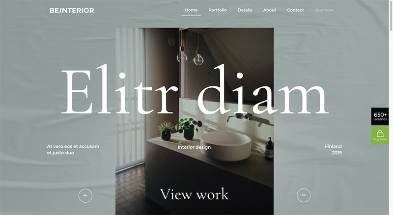
You could, for example, turn otherwise scrollable content into a slideshow experience as BeInterior6 does at the top of its home page:
Scrolling has in fact has become so automatic that you may need to be thinking about some clear controls to stop and let the visitor engage with important content.
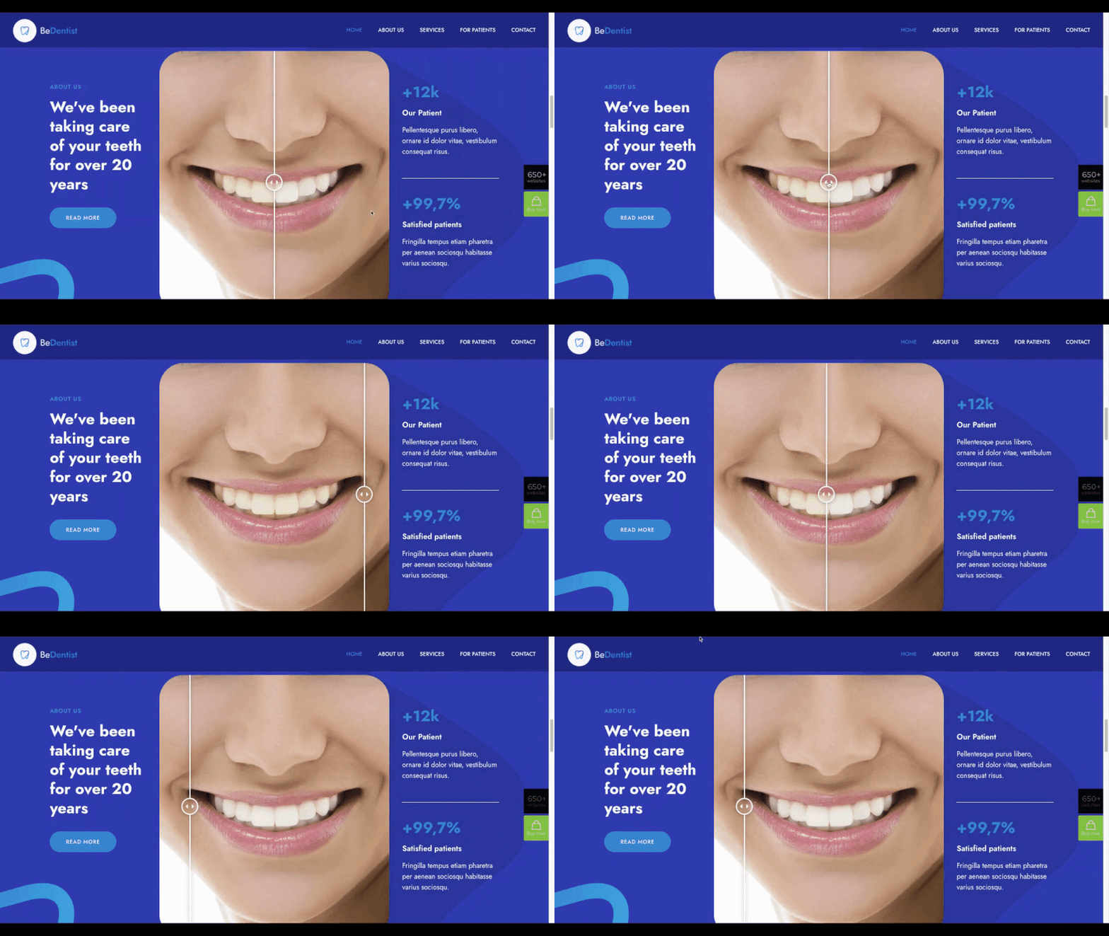
Or you might take a unique approach like that used to illustrate a Before/After relationship on the BeDentist4 site:
In this example, the viewer is encouraged to participate in the action; a lot more fun than simply viewing side-by-side examples.
5. Use positive color palettes to send the right vibes to visitors
A positive color palette is simply one that elicits a desired emotion; in this case it would be a palette that would encourage or compel visitors to click or convert.
What makes colors draw out emotions or elicit a positive response?
It could be the shade, it could be the culture of those looking at it, it could be the context in which it appears. It might even be the way a color contrasts with other colors on the page or on the site.
A splash of yellow could elicit a feeling of happiness but placing splashes of yellow throughout a website could produce a negative impression.
You have to take what is happening in your business niche, or in the world, and how it might be affecting your audience.
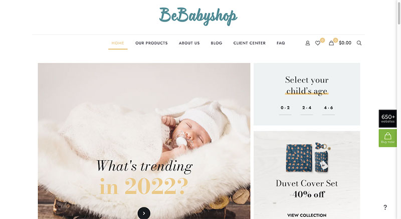
Maybe you need to try and calm everybody down a little by creating a gentler experience by using soft tone backgrounds surrounding the products in the BeBabyShop pre-build website:
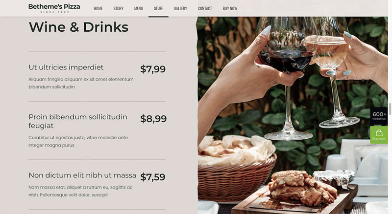
The BePizza5 site does something similar, yet in a very different way:
The colors aren’t as bold or contrasting as what we commonly see in casual restaurant website design. Most restaurant websites tend to rely on bold colors to emphasize the food rather than softer tones to emphasize the ambiance.
Keep up with the times with a little help from BeTheme
Having read this, you will hopefully not be stressed out when facing a new set of design trends.
BeTheme as seen to that.
BeTheme pre-built sites are always designed with the latest design trends in mind. They can also easily be repurposed if and when trends change. Either way, the foundation is there for you.
With BeTheme, you get the total WordPress web design solution. You have 3 different builders and 650+ professional-grade pre-built websites at your disposal that you can use to build customized sites for your clients, quickly and cost-effectively.
The post Best 5 Web Design Trends in 2022 appeared first on Design your way.
Source: https://ift.tt/3DWrSfm

No comments:
Post a Comment