Conversion rate optimization is a task every business needs to tackle at one point or another. Whether your main goal is to sell more products or to sign up more clients, you need to periodically reconsider how you inspire these conversions. There will always be something you can do to improve your tactics.
In this post, we’ll talk about the use of visuals and how the right ones can help you boost your conversions in 2022 and beyond.
Show Real People
Your visitors will have a much easier time identifying with your brand if they can see a bit of themselves in your current customers. If you can show images of them using and enjoying your product or service, your conversion rates are likely to improve.
Using images of real people on your website, even if they are not necessarily your customers, will help humanize your brand as well. It’s also a great way to convey emotions: a smiling or frowning human face can communicate numerous messages, more than any other kind of image can.
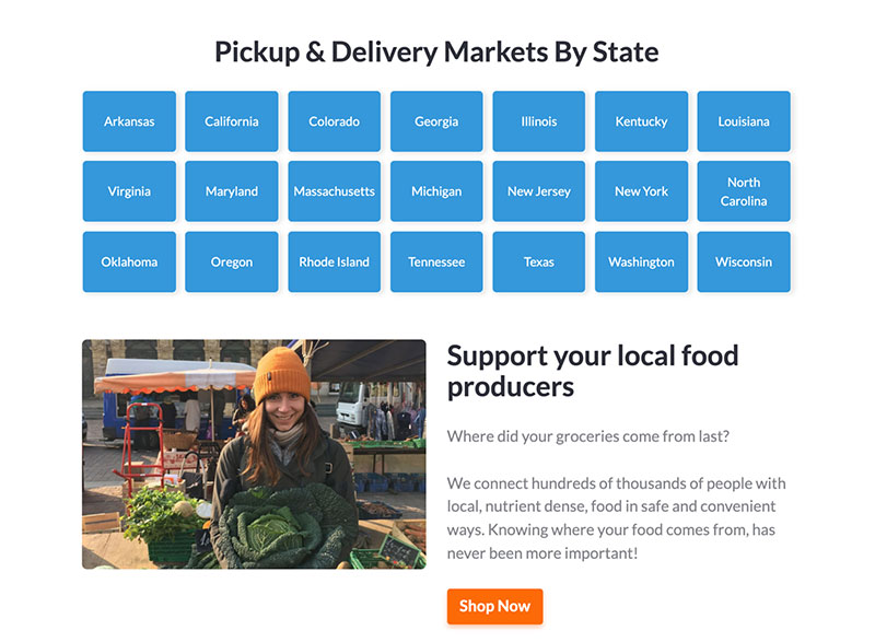
Take a look at how WhatsGood has done it.
Source: sourcewhatsgood.com
They feature an image of one of their farmers, smiling and holding up some of their produce. This is an excellent way of both communicating brand values and adding a human face to the brand. All with a single image!
Show the Product
Showing the product should be a given – if you sell products, that is. You will naturally want to show them off from as many angles as possible and ensure that customers can see exactly what they are purchasing.
Some brands that sell intangible products (like software solutions, for example) choose to omit images entirely. This is always a mistake, even though the product doesn’t exist in the 3D world.
Whatever your product is, make sure to feature plenty of images that are helpful to a customer. These might be stills that clearly show what your product looks like, or in the case of digital products, they can be screenshots. The point is to use images to give customers the necessary information before they choose to convert.
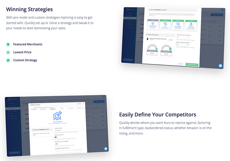
Here’s a digital product that shows their product very well. Aura features plenty of images on their homepage, showing you what their interface is like and what it is you will be spending money on. It really makes converting that much easier.
Source: goaura.com
Illustrate The More Challenging Points
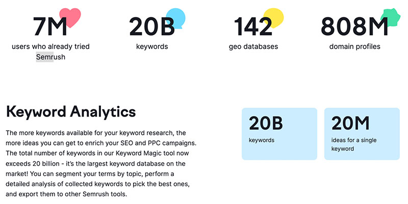
Sometimes you want your landing pages to feature plenty of facts and figures, which will communicate your main selling points better than the best copy in the world ever could. When this is the case, make sure to use a visual aid to show these numbers, rather than just merely throwing them into a table.
Don’t miss out on the opportunity to make your pages both easier to digest and more visually appealing. Take a look at how Sremrush did it. They’ve managed to fill a page with numbers, yet at no point does it look crowded or confusing. We could argue that the background is a bit on the disruptive side, but it’s a matter of personal preference.
Source: semrush.com
You certainly don’t need an entire page of data to improve your conversion rates. Any data you do show, however, should be presented in a similar fashion.
Consider Adding Video
Using video on your landing pages can significantly boost your time on page, as well as your conversion rates. However, utilizing this powerful medium demands special care.
As long as you ensure that it is always accompanied by plenty of copy and other visuals that will convey the same message, the video can be an enhancement. If you were to reserve your most vital selling points for the video, you would likely miss out on a lot of conversion opportunities. Remember that not everyone will be in a situation where they can play a video. In fact, many people will simply not want to play it, for whatever reason.
You can use this format for telling more of your story, for customer testimonials, or for showing your product in action.
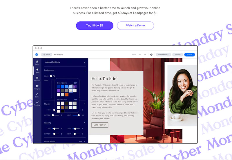
Leadpages did a great job of using video to showcase their product without forcing it on their visitors. If they are interested, they can click through the “watch demo” button and see what the product looks like and what it does.
Source: leadpages.com
If they prefer not to watch it, there are numerous other elements on that same page aiming to still convert them.
Add Some Action
For a page to have a high chance of converting its visitors, it needs to be engaging. There needs to be something on that page that will grab their attention and inspire them to keep scrolling further down or click through to other pages.
What this element is will naturally depend on your target audience. Perhaps they’ll want to see case studies or read testimonials and reviews. They might want to hear from your own staff or read more about your mission and vision.
Sometimes, all you will need to do is inject some action into your landing pages to inspire visitors to stay longer and see what happens. Spores is a great example to look at. Their homepage features a prominent header that links to a landing page that has videos and animations. These showcase their new partnership and are simply fun to watch.
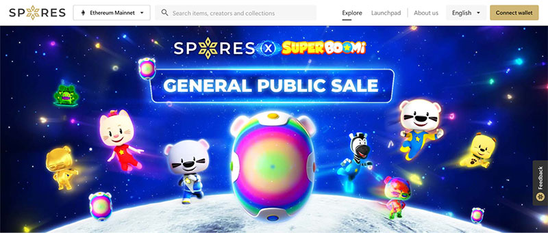
Source: spores.app
You don’t have to come up with an entire animated story, though. Perhaps you can animate your page elements and add some movement that way.
A Cautionary Note on Visual Elements
Pages that have been designed well and that are filled with appealing and compelling visual elements always convert best. However, you need to be mindful of the quality of these visuals and how you use them.
While visitors love to be awed by your imagery, they also want pages to load fast, to have no layout shift, and to be easy to navigate. If your new visual elements are slowing your website down, if they have not been optimized for all screen sizes and different devices, or if they move around while a user scrolls down your page, they will end up doing more harm than good.
Final Thoughts
Remember that every decision you make in the realm of conversion rate optimization needs to be based on your audience’s preferences and interests. Sure, you might feel that an image or a video will work well. But that definitely doesn’t mean your audience will like it or engage with it.
A/B test your new visuals to test your theories. Who knows – you might be surprised and discover some of your leads’ new interests.
The post 6 Tips for Using Website Visuals to Boost Conversions in 2022 appeared first on Design your way.
Source: https://ift.tt/3olmEp5

No comments:
Post a Comment