While homepage design is crucial for making a great first impression, product page design is what will boost your sales.
According to Think with Google, 85% of shoppers say product information and images play an important role for them when deciding which brand or retailer to buy from. On the other hand, almost 70% of customers leave items in their shopping carts and don’t complete their transactions.
These stats illustrate how important it is to get your product pages right and maximize conversions.
Here are a couple of simple product page design hacks that can help you boost your sales.
1. Add Credibility with Social Proof
Lack of trust is a deal-breaker when it comes to ecommerce stores.
Don’t forget your potential customers can’t see your products in person, touch them, or evaluate their quality. They have to take your word for it and rely on the images and videos you provide.
But social proof adds another dimension and a touch of credibility to your product pages.
People tend to trust other customers more than the brands they’re purchasing from. So, to show your store is legit and your products are of good quality, leverage user reviews on your product pages.
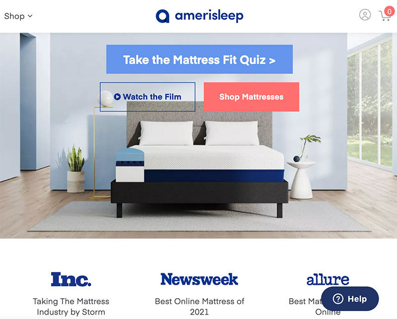
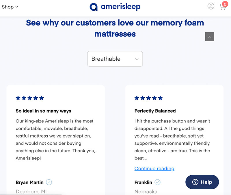
Amerisleep, for example, zeroes in on this tactic by providing not one but two types of social proof. First, there are media references under reputable publishers such as Newsweek and Forbes above the fold. Then, they also offer verified customer reviews below the fold.
Source: amerisleep.com
2. Expand Product Descriptions
Potential customers need as much information about your products as possible.
Avoid bland and generic phrases that don’t say anything other than that your product is fantastic. If you don’t help customers visualize using your product and understand its benefits, you risk losing them to your competitors.
Namely, if your product descriptions leave much to be desired, potential customers will go to Google to find more information. And they’ll easily end up buying from another vendor that offers more details.
This particularly refers to clothes and shoes since it’s difficult to buy these items without trying them on.
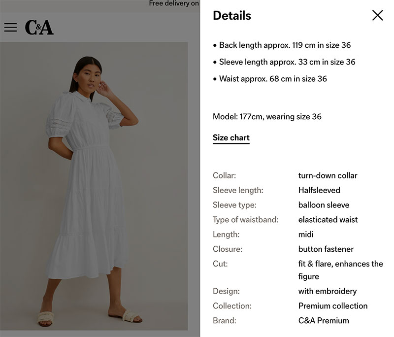
C&A solves this problem by offering exhaustive product descriptions together with detailed size charts. Besides that, the brand shares which size the featured model wears and their height so that customers can make more accurate comparisons.
Source: c-and-a.com
3. Eliminate the Clutter
Once you manage to bring a potential customer to your product page, you need to get them to focus on your offer and add it to the shopping cart.
This means your product page has to be completely distraction-free.
By opting for minimalistic design, you will rest assured that nothing will take potential customers away from what they have come to your product page for – to make a purchase.
So, use a lot of negative space to give your design room to breathe. Cramping your product page with many different elements makes it difficult for customers to find the CTA button and convert.
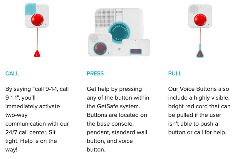
Here’s how GetSafe leverages white space and clean design to highlight the most essential elements of their products:
Source: getsafe.com
4. Leverage FAQs to Handle Objections
It’s natural for customers to have some additional questions and doubts about a product they want to buy online.
One of the best ways to offer them more information and answer potential questions they might have without cluttering your product page is using an FAQ section.
This way, you can speed up resolving a query and, in turn, a purchasing decision. Instead of having to contact customer support or use live chat, customers can instantly find answers to the most common questions.
REI, for example, features a Q&A section on product pages so that people can ask questions and get answers from both the brand and other users. This makes for an extensive resource potential customers can use to get familiar with a product and figure out whether it fits their needs.
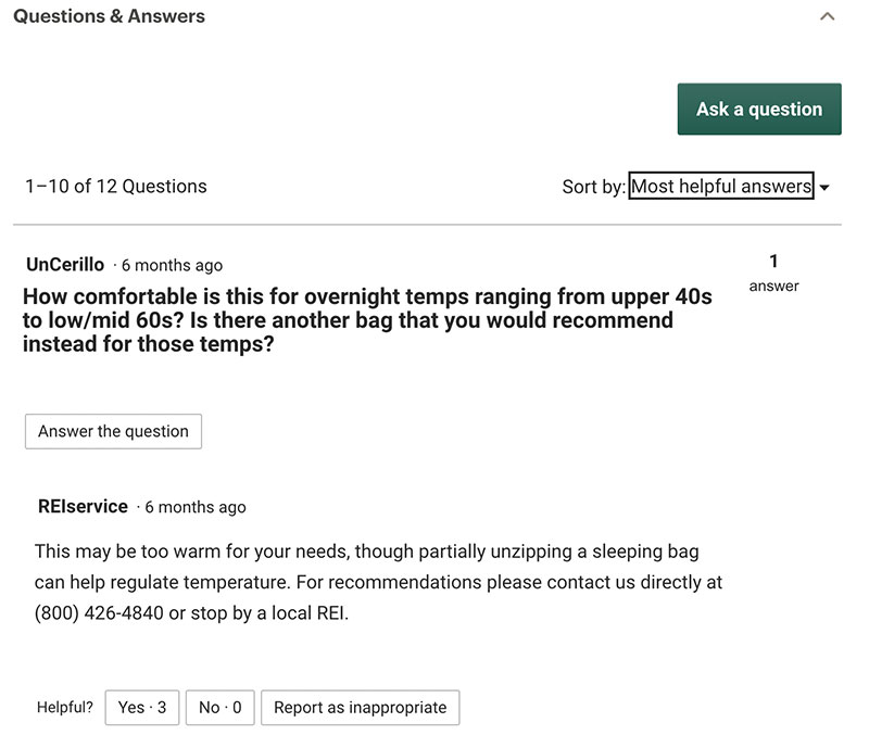
Source: rei.com
5. Use High-Quality Visuals
A study has shown that 94% of first impressions are design-related. This means that your store’s visual appeal is what decides whether potential customers will stick around or bounce off.
Similarly, almost half of all surveyed customers assessed the credibility of websites based on visual design.
In short, if you want your potential customers to trust and purchase from you, make your product page design and visuals stand out.
Using high-quality images and videos can profoundly impact how your store visitors form their opinion regarding your products. Professional photoshoots are expensive, but it’s a worthwhile investment if we bear in mind that exceptional images will boost your sales.
Williams Sonoma product pages feature stunning images that never fail to impress customers.
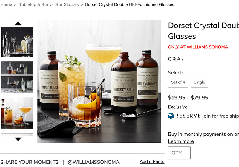
Source: williams-sonoma.com
6. Be Transparent About Shipping Costs
Extra costs and hidden fees are among the biggest conversion killers.
48% of online consumers abandon their shopping cart during checkout because of high extra costs.
Instead of ambushing your customers by waiting until the last minute to inform them how much they will have to pay for shipping, display the total price upfront. Adding shipping cost details to your product pages will allow your customers to come to terms with having to pay more than they expected.
As a matter of fact, 64% of customers look for shipping costs on product pages and admit that these expenses influence their purchasing decision.
This kind of transparency can improve loyalty and drive more sales.
Sephora offers free standard shipping and allows customers to get location-based estimates for same-day deliveries.
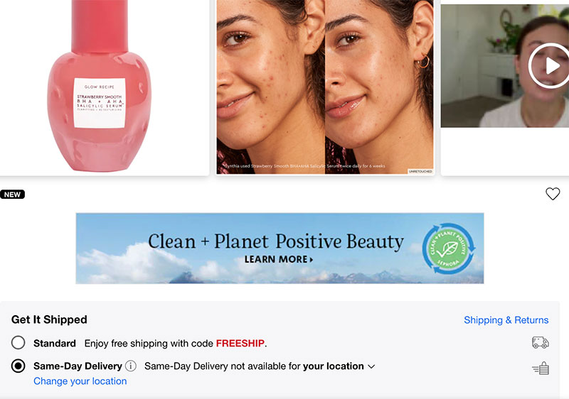
Source: sephora.com
7. Harness the Power of Cross-Selling
Fast food restaurants heavily rely on cross-selling to boost their revenue.
“Do you want fries with that?”
This simple sentence brings McDonald’s millions of dollars annually. Unlike burgers, fries and soft drinks provide high margins of up to 90%, and by implementing cross-selling, restaurants generate huge profits.
But what’s the secret to successful cross-selling?
It’s simple: recommending relevant products that go with the one your customers are interested in.
This way, you’re not only improving your average order value but also doing your customers a favor. Show them accessories they might need with the core product or items that others who bought the product also viewed.
Some fashion retailers even offer entire looks so that their customers feel as if they have their own personal shopper and stylist.
Nordstrom takes its product pages to the next level by including Style Ideas for This Item. Such an approach shows a genuine desire to help customers solve their problems – in this case, pick the best outfit for a particular occasion.
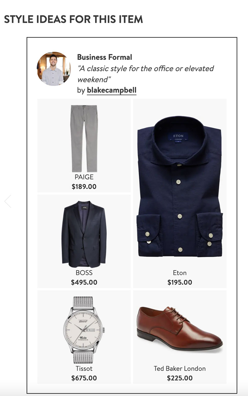
Source: nordstrom.com
8. Take Advantage of FOMO
The fear of missing out is a powerful psychological motivator.
Marketers play on this phenomenon to make people feel an urge to purchase a certain product immediately – that is, before it’s sold out or while a special offer lasts.
FOMO can be best triggered using urgency and scarcity on product pages.
By showing that there are only ten or even fewer items left in stock, you’re implying that the product in question is very popular and that people often purchase it.
Here’s how Amazon capitalizes on scarcity and prompts customers to make up their minds ASAP:
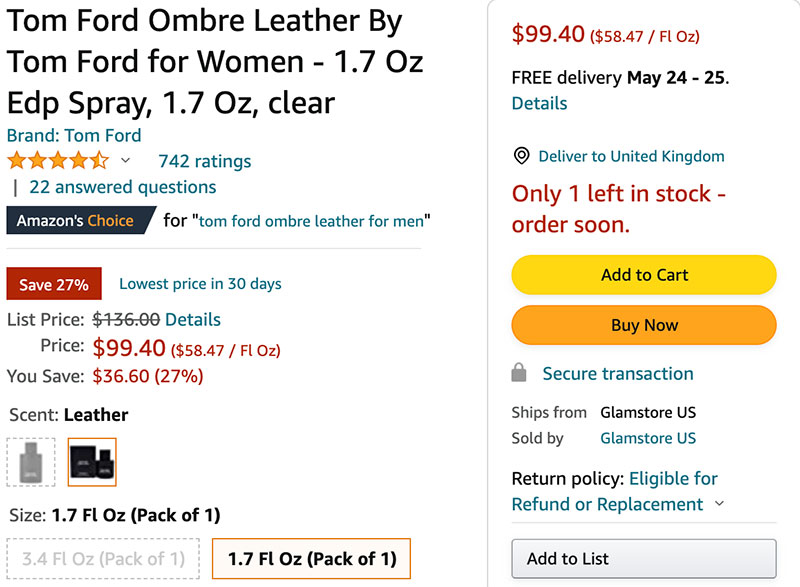
Source: amazon.com
Similarly, leveraging time-limited offers such as “Sale ends tonight” will get your customers to act and grab the product they want right away. You can add an extra layer of urgency by implementing countdown pop ups that will visually illustrate how time is running out for special discounts.
Boosting Sales with Great Product Page Design
Product page design is a make-it-or-break-it factor when it comes to the success of your online store. These pages have to be both attractive and functional. Luckily, you don’t need any complex gimmicks to achieve this. These clever yet simple tune-ups can help you transform your product pages and consequently boost your sales.
The post 8 Simple Product Page Design Hacks to Increase Sales (+Examples) appeared first on Design your way.
Source: https://ift.tt/iZUyNRC

No comments:
Post a Comment