No matter what your brand’s focus is, having a social media presence is vital. With a solid online presence, brands can enable themselves to reach a wider audience than before (inexpensively, to say the least) and understand their consumer base better.
Pairing unique, exciting content with top-notch graphics helps you stand out in a sea of posts. While posting regularly on each platform is essential, it isn’t the only thing you ideally want to focus on.
In fact, users share posts with infographics three times more than any other content, proving that graphics grab more attention than any other type of content. You must ensure your content design is high-quality and generates interest in your brand.
Curious about how you can make it possible? Read on for 10 all-too-common mistakes that marketers make, from ideating to finalising social media graphics, and our tips for avoiding them.
Your graphic isn’t branded
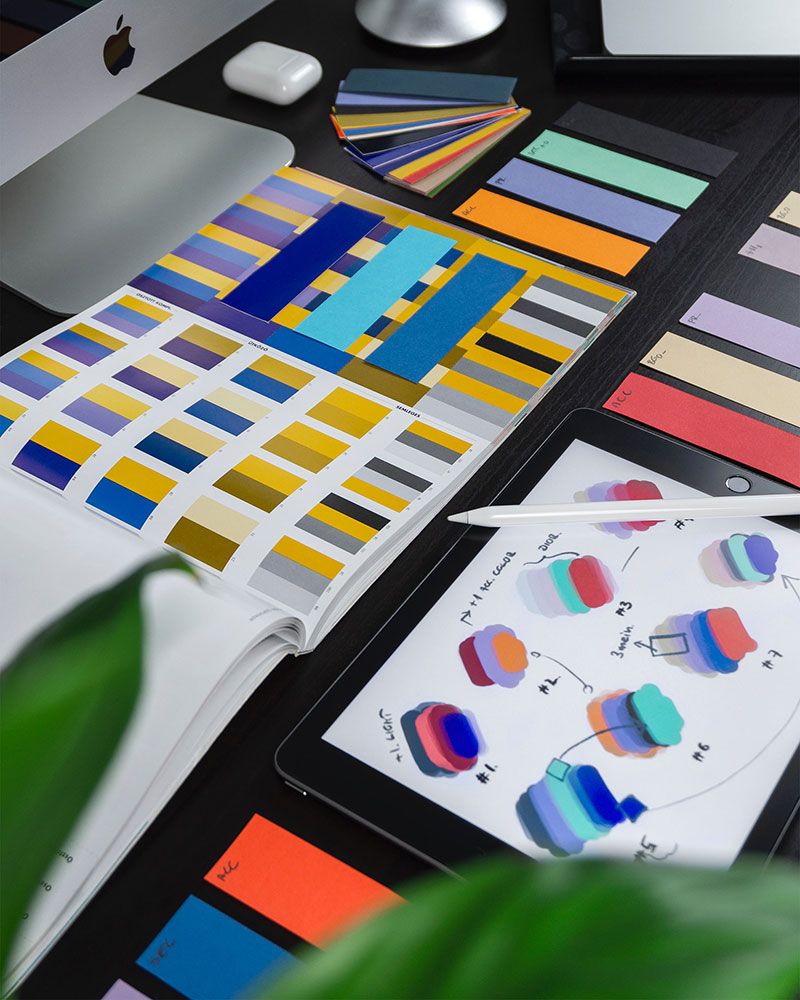
Social media marketing is all about building brand value. If your graphics aren’t branded, you’re missing out. You’ll have to tread the fine line where every design is different from the other yet still contains an element or two that unites it with your other posts.
Think about some of the most iconic brands in history, like Nike. If you look at Nike’s official Twitter account, you’ll notice that most of their posts are videos of success. While some contain animation, some are quotes from athletes. What’s connecting them? The iconic swish at the very end and a victorious tone in every video.
Even if Nike doesn’t include their brand name, you’ll still make out their posts from others, thanks to them constantly displaying their brand logo, just enough for you to remember it.
Good branding is unique, consistent, and recognizable. Choose colors, fonts, and imagery that reflect your brand. Try out a few different looks to see which one fits best, and then stick with it. You may also want to include your brand’s logo on posts to get credit and clicks if they’re shared widely.
Your graphic isn’t suitable for the platform
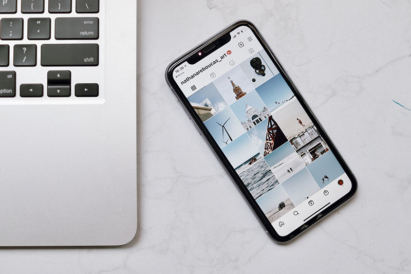
Every social media platform has its image size, orientation, and resolution specifications. You can’t necessarily use the same graphic across different platforms. If you create a landscape graphic for Facebook and then post it on Instagram’s square grid, it’s only bound to cut out mid-way and make a disaster.
Before creating your design, check out the suggested dimensions for each platform where you’ll post. Most design programs and online graphic creation sites have templated sizes for common platforms like Facebook and Instagram — but you should still preview your design before it goes live to make sure it displays correctly.
Your graphic doesn’t speak to your target audience

Rule number one of marketing is knowing your audience, which also applies to social media graphics. People are likely to scroll right past an image that doesn’t appeal to them, so figure out who’s looking at your feed and make sure you’re speaking their language literally and figuratively.
Teleport Watches does an excellent job of posting content that caters to its audience – young/middle-aged men. Every other post that you look at will have a component of elegance, being the kind of content their audience would prefer.
Most social media platforms offer analytics as part of their service. Check out the average age, language, location, and other demographics of your audience and try to speak directly to them. Then, keep an eye on those analytics to ensure your strategy is consistently attracting the right crowd for your brand.
Your graphic isn’t enticing or on-theme
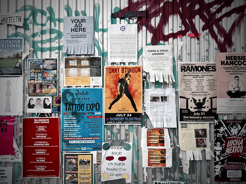
You probably wouldn’t market a rave with a black and white calligraphed flyer without images. That’s an extreme example, but many factors determine how a reader will react to your graphic. This is where you’ll need to learn about color psychology and how our brains react to different colors.
Choose fonts, images, and colors that reflect the mood you’re going for. Then, use those elements to draw the viewer in. Where a light-colored background is more likely to induce emotions of hope and motivation, a darker theme will portray a mysterious, elegant, and more powerful message.
For instance, the brand Califia Farms which sells non-GMO beverages has done a great job on its Instagram page. Since most of their products can be consumed for breakfast, they use a bright color scheme throughout to reflect a morning meal filled with motivation and joy!
Also, keep in mind that your graphic will appear in saturated social media feeds and will have to stand out to be successful. Grab people’s attention with attractive graphics, easy-to-read headlines, and intriguing copy, so they don’t just scroll right past.
You’re using the wrong images
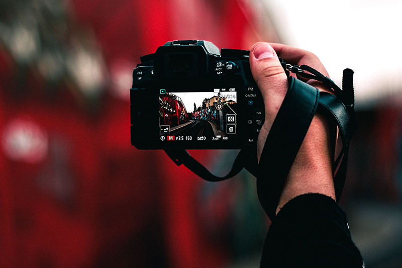
Social media is all about appearances, so make sure yours is up to the standard. People will notice if your graphic features a low-quality or low-resolution image or one that doesn’t look like it was taken by a professional. Ask yourself, have you truly paid attention to a post with a low-quality image?
Fortunately, tons of sites offer high-quality, attractive stock photos, often free. Check out sites like Unsplash or Pexels for free-to-use photographs or sites like iStock for paid images.
No matter where you get your images from, make sure that they reflect your brand’s persona, give proper credit to the photographer and have the appropriate rights to use the photo.
Finally, make sure that you’re using the highest possible resolution, so viewers see a crisp photo no matter what device they’re on. If your brand is well-established, you can consider hiring a professional photographer to do the job for you.
There are typos or mistakes in your copy

If your graphics include text, always double-check your spelling and grammar! A copy that includes mistakes is unprofessional and can make your brand seem less reputable. And unlike a typo in a text post, errors embedded in your imagery are hard to edit after you post them.
Some graphic editing programs don’t include a spell-checker, so always copy and paste your text into a program that does (Grammarly free account is more than enough) before you finalize your imagery. You can use a plug-in like Grammarly to check your work. If your graphic includes statistics or facts, verify and cite those too.
Your text is hard to read

Speaking of copy, if your social media graphics do contain text, making it easy to read is a priority. If your readers have to squint to make out the text, they’ll keep scrolling. Keep in mind what platforms your post will appear on and what devices people will use to view it (this is another thing you can check in your analytics).
You should also choose a font that’s easy to read. As a general rule, avoid cursive fonts in the body text. Sans-serif fonts (like Calibri, Helvetica, or Century Gothic) are good choices.
Readable doesn’t have to mean boring, though — check out free font libraries online for fonts that will make your text pop. Avoid using several fonts at once too, it’ll only make your post more clustered.
Finally, steer clear from resizing images with text in them since they can get distorted, which is why you should use a template that’s the right size and resolution for your target platform.
Your graphic isn’t accessible

No matter what you’re posting about, accessibility is important! A graphic with small or low-contrast text might be impossible for some of your audience to read. Check out the visual design accessibility guidelines for the US to give you an idea of what to aim for.
An easy way to ensure your content is accessible is to include a caption with any graphics. Use the caption to describe what’s pictured or transcribe the text. This will also allow non-English-speaking readers to use the text translation functionality built into most social media platforms.
Your graphic has too much going on

The best graphics are attractive and to the point. Don’t try to cram too much information into one image, or people will be likely to scroll right past it. Using too many fonts, elements, or words can make your graphic look busy and unprofessional.
Try looking at Apartment Therapy’s Instagram page to understand this point better. Their page is the definition of ‘less is more’. With each post, Apartment Therapy gets a point across while also promoting its brand’s mission.
If you want to convey lots of information, consider creating several different graphics that your readers can view as slides. The first slide should include a catchy title that entices people to keep reading.
You’re not taking full advantage of the platform
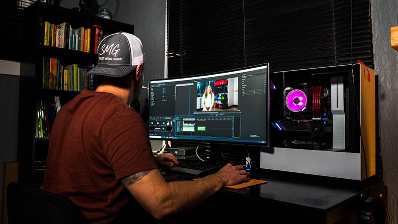
As a social media designer, it’s crucial to stay informed about the latest trends on each platform. You don’t have to limit yourself to static images and text. Each digital marketing channel has its own advantages and you need to familiarise yourself with them to maximize your ROI.
Incorporating animation and video elements in your graphics can help them stand out. Use a service like Superside to help you create top-notch social media graphics that capture your audience’s attention. Explore different ways to incorporate multimedia into your social posts to keep your content interesting and on-trend.
The post Avoid These 10 Common Social Media Design Mistakes appeared first on Design your way.
Source: https://ift.tt/SgmeA6C

No comments:
Post a Comment