A fancy and attractive food ad helps customers notice your restaurant. And the moment they step inside, a combination of various aspects, such as food quality, ambiance, staff behavior, and hospitality, might influence the customer’s decision and improve their customer experience.
But, amid these hustles and bustle, restaurants often overlook one marketing material that influences their overall experience – the restaurant menu.
Shocked?
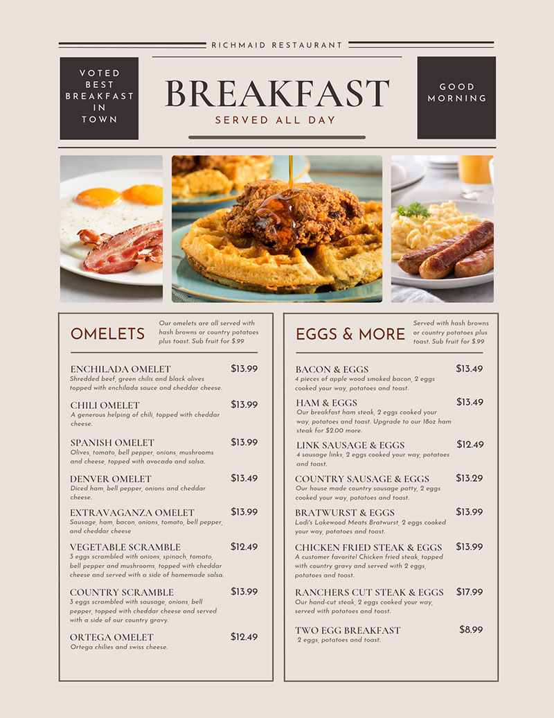
Typically, the restaurant menu is the first tangible asset that customers hold in their hands, making it necessary to give some importance to the design.
Why?
A menu with poor-quality pictures, inconsistent design, and spelling errors will do more bad than good. A beautifully and thoughtfully crafted menu significantly impacts your revenue while leaving a positive impression on your customers.
In this article, we discuss several professional tips to follow when designing a restaurant menu.
9 Professional tips to follow when designing restaurant menu
Here are some professional tips that help you make strategic decisions about how your menu should look:
1. Use a menu template
Did you know most of your customers do not read your menu line by line? They quickly scan and check the areas that catch their interest. Try to establish your menu such that it displays your most popular and profitable dishes.
That’s why restaurants use different colors and typography to attract customers’ attention. Using a free downloadable menu template provides you with many different ideas to play around with colors, designs, and typography.
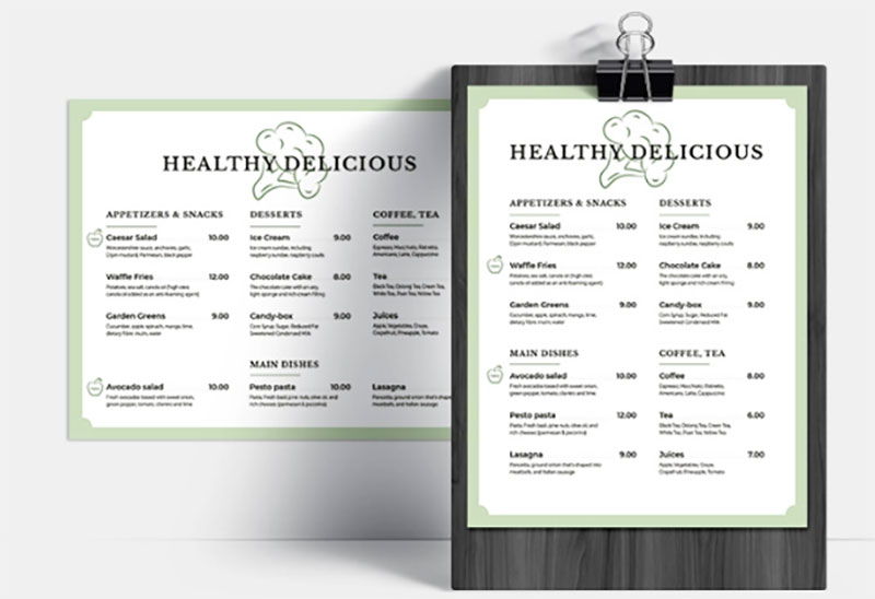
Choose a template that helps design your menu while keeping branding in mind. Whether you need a fine dining, fast-food joint, or café menu, the template should reflect your brand’s voice.
For instance, depending on the brand’s personality, you might want to get creative with the brand’s name and how you describe the dishes.
As the menu is the main communication channel inside your restaurant, it needs to stand out from the rest. This helps in building a connection with your customers.
2. Focus on using the golden triangle
According to various menu engineering specialists, human eyes start seeing from the center of the page and then move to the top right, followed by the top left.
These studies suggest that placing popular menu items in the middle or at the top right helps maximize those food items’ visibility.
Here is an example of how to use a golden triangle in a menu:
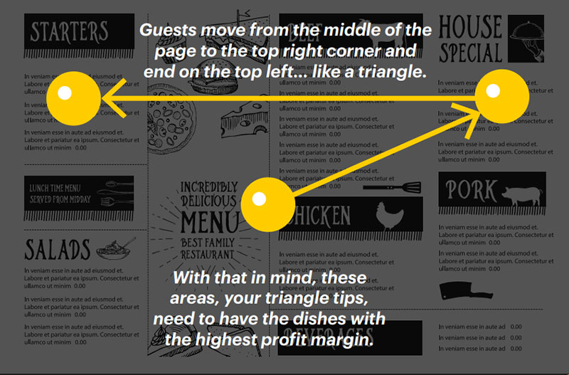
Placing your star and popular items in the golden triangle area increases profitability and revenue.
When using the golden triangle psychology, focus on giving importance to food cost management and list your dishes clearly and as per the psychology.
3. Make the best use of white spaces
Did you know that the human eye hates seeing clutter and prefers to look elsewhere?
According to various studies, properly using whitespaces between paragraphs and in the right and left margins increases comprehension by 20%.
Incorporating the same fundamentals in your menu design makes your food items stand out and increases readability.
Try to leave some negative space for improving the overall aesthetics and ensure that your customers feel safe.
Interestingly, white space contributes to the overall tone of your menu design.
4. Divide the menu into logical sections
Focus on keeping the menu design uncluttered and clear. Focus on dividing the restaurant menu into logical sections using lines and boxes. Often, a restaurant segregates its menu into sections, such as drinks, starters, sweets, pasta, pizza, Chinese and Thai.
The font you choose should be aesthetically pleasing, bold, and visible.
Apart from creating logical sections, ensure that the color of the menu matches the overall restaurant design.
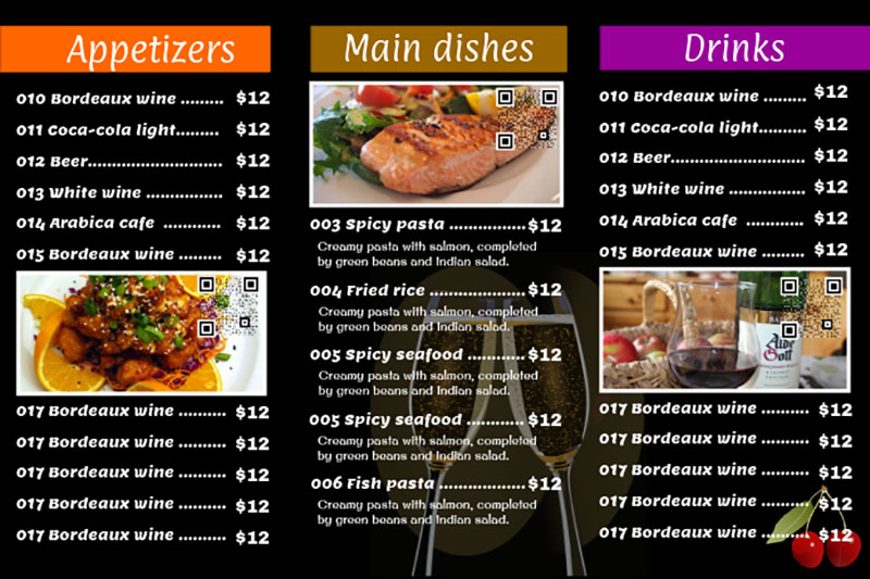
At the same time, remember that using too many graphics might look messy and distract the customer’s attention from the menu item.
5. Limit choices to make the buying decision
While your instinct might force you to provide customers with as many dishes as possible, more choice isn’t always better.
Why?
Too many choices force a customer not to make any choice at all. It even hinders the purchasing decision of the customers.
According to research, shoppers with 24 choices of jam were one-tenth less likely to purchase than shoppers who were given only six choices.
Even when you visit a restaurant, you’re less likely to come across a menu with an extensive list of food items. This decreases your ability to make a choice, and you’re likely to order something you have already tried.
Your customers are similar to you. So, focus on limiting your choices by offering a comprehensive menu that encourages them to try your chef’s special and popular dishes.
6. Focus on the content of your menu
You might feel tempted to share the story of your restaurant with every single customer walking in and incorporating your story into the dining experience is a great way. Though it’s an excellent idea, it speaks to the uniqueness of your restaurant and gives a personal feeling.
However, the problem might crop up when the story becomes too long. As a result, the story gets ignored while the customers sift through the menu pages, frustrated, looking for their favorite drinks on Happy Hour.
Many restaurants include their story at the back of their menu design. Even you can follow this tactic, if it fits your menu design.
Remember that the primary content that requires attention in your menu is the food items, not your brand’s story.
7. Use photos sparingly
The effectiveness of photos depends largely on the type of restaurant. Pairing a photograph with every food item is a tactic used by low-quality restaurants.
As a result, high-end and fine-dining restaurants avoid using this practice.
Interestingly, using one photograph per page on your restaurant menu increases sales for that item by 30%.
Try limiting one photo per category or page and using brackets to highlight the food items you display.
This technique is all about making a menu item more appealing to customers. So, ensure you place a high-quality and appealing photo to encourage customers to order the food or beverage.
If you’re not too keen on using photos, try using illustrations.
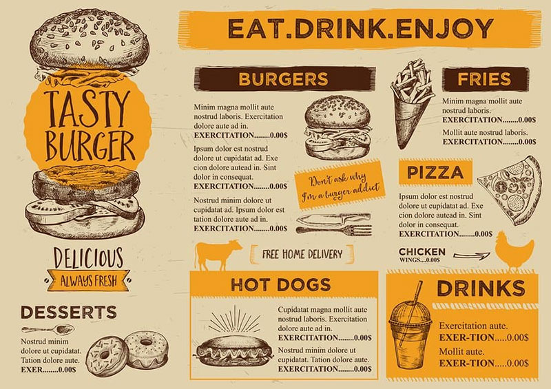
Fine dining restaurants and eateries prefer illustrations over photos. They use one graphic or illustration per section.
8. Connect it with the test of your marketing channels
Many restaurants focus only on the quality of the food they serve. Successful restaurants are the ones that focus on both promotions and building a strong rapport with customers.
Communicating and connecting with customers on social media is essential for building long-lasting relationships.
If your menu focuses only on the food items and provides no information about your social media handles or contact information, you miss out on a good opportunity.
Adding your social media handle is sufficient if you use it as a table menu. If it’s a takeover menu, it’s essential to provide contact details, including the phone number, email address, and social media details.
9. Use the right color contrast
Would your customers prefer a reading menu that strains their eyes? Do they prefer an easily readable menu?
The difference between the above two menus is the color contrast.
Sometimes, this might happen when a menu designed for color printing gets printed in monochrome.
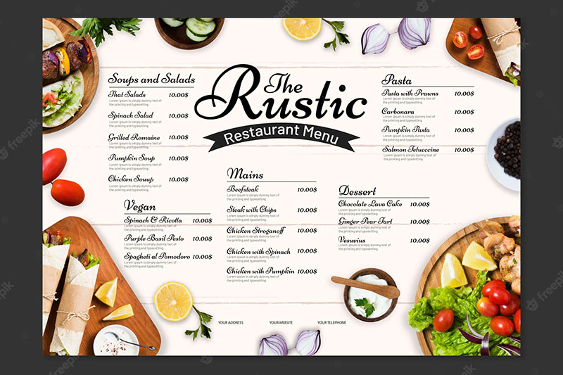
Poor design leads to a lack of legibility in the text. This might occur because font colors do not stand out from the background colors or a patterned background. This decreases the visibility of letters printed on the menu.
As hungry customers are less likely to spend too much time figuring out the words written on the menu, having contrast in your restaurant menu uplifts the spirit of dining and increases readability.
Restaurant designs that speak for themselves
Intelligent and thoughtful restaurant design is a successful component of a restaurant strategy.
Only when your menu reflects your style and your food, it’s likely to have more impact on your customers.
Creating a restaurant menu is both an art and a science. Truly understanding what it takes to design a menu and incorporating these tips helps you create ones that attract customers’ attention.
When you design a menu mindfully, it’s likely to impact your bottom line.
While creating a menu, remember that your menu sells the dishes you serve, and it helps you achieve the sky while increasing customer loyalty.
Menus are crucial components, so ensure you touch upon every design element that delivers the ultimate guest experience and makes your restaurant a huge success.
Focus on designing catchy customer-centric menus that deliver the intended result.
The post 9 Professional Tips to Follow When Designing Restaurant Menu appeared first on Design your way.
Source: https://ift.tt/BRyTgsL

No comments:
Post a Comment