I do a fair bit of trend spotting while I’m browsing for cool website designs to feature in my Sites of the Week roundups. One popular design trend I’ve noticed is becoming more and more popular is the split layout, where the page is divided vertically into two halves to display separate areas of content. Often these two halves are contrasting with light and dark colour schemes and allow the user to make a decision on the type of content they want to see. This post rounds up 10 great examples of websites boasting this vertical split layout. I wonder if we’ll start to see it become more common in the near future.
Mission Motorcycles
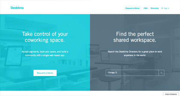
Desktime
Greats Brand
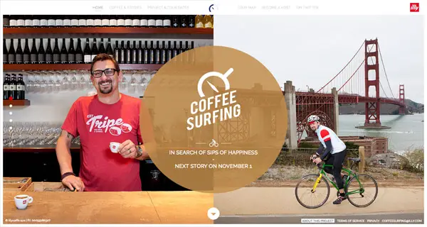
Coffee Surfing Illy
The Mealings
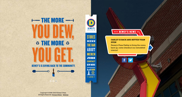
Dewey’s Pizza
Rick & Drew
fifty-five
Peugeot
Blueprint: Split Layout (Tutorial)
Source: http://line25.com/articles/interesting-web-design-trend-vertical-split-layouts








No comments:
Post a Comment