A retro logo can be just what you, your organization, or your client need. Retro logo design is incredibly popular right now.
Even modern logos can benefit from retro logo elements, adding in a nice dose of nostalgia, something that’s never been more in vogue than it is right now.
Retro logos aren’t just throw-backs to 1950s diners or 1980s arcades.
A retro logo can draw on a number of influences, evoking certain tones and memories of the past. Often, they incorporate vintage typography. These vintage logos really pop, especially on websites where a clever one can make it stand out since its being used in a modern context.
Retro logos quickly evoke a feeling from a certain era thanks to the emotional associations with the kind of visual styles you’re using in the logo. They can look cool and smart, relaxing and welcoming, or even action-packed, all based on the time period and place you’re drawing your retro logo inspiration from.
A quick look through popular internet sites and many brands reveals a lot of creative vintage logo design. Creating one on your own can seem like an intimidating task.
How can you hope to make an original logo that has that vintage feel yet stands out from the crowd? You’ve seen the kind of thing you want to make, but now you have to add your own personal twist. This can be quite a challenge.
To create retro logo designs, you need to keep a few things in mind. For one, your logo is going to be around for a long time. You need to create a logo that you like seeing for years to come.
Also, know that you may only need a few touches to turn a contemporary logo into a retro logo. Not every element of the logo has to have a vintage touch in order to get across the feeling you’re looking to create.
This guide to retro logos can help you get an idea of whether or not one of these logos is right for your organization. It will also give you tips and tricks for designing a vintage logo.
We’ll break down some of the thought processes that need to go into retro logo design, as well as offer suggestions for retro logo design elements that can help you out of a creative rut.
Why Are Retro Logos Popular?
First, let’s look at what we mean by ‘retro’ or ‘vintage’ design. These designs capture the feel of a time yet transcend it. Logos with retro designs remind people of certain time periods or elements of pop culture, yet can also stand on their own as logos for those who don’t get the references. A well-made retro logo balances old schools styling with modern design sensibilities.
What makes this really work with people is that we all tend to associate “value” with older things, especially if they’re withstood the test of time. With retro logo design, organizations want to utilize this tendency to their advantage.
This sense of value, however, is only part of what you need to do when making a vintage logo. You need to integrate modern design to make the most of the value evoked by the retro elements. It allows the logo to still feel relevant.
One of the other reasons for the popularity of retro logos is that they have brought a romantic touch into the world of web design.
These logos remind people of simpler, less stressful times, often during childhood or college. This is not only a selling point for potential customers, but also for designers, since they miss those times, too.
Retro Logo Design Basics
Don’t get too locked into a certain style with your retro logo designs. While the 1980s are very popular these days, feel free to explore other styles from other periods.
Look into the sharp angles used in the 1920s or the wholesomeness of designs created in the 1950s.
Create something that is recognizable almost instantly and truly makes your target audience feel the emotions you want. You want something that will stand out.
Similar to other forms of logo design, creating a vintage logo involves using common sense, knowledge of your brand, understanding of your product, and a clear overall concept.
Start off with a rough outline of the retro logo. This is usually the stage where some designs get weeded out, which can be hard to do. Here are some steps to help you through the vintage logo design process:
- Create a brief outline; feel free to make a sketch or write more abstract ideas.
- Research popular design trends, your niche, and the logos of your competitors.
- Start conceptualizing with more detailed sketches.
- Take a step back and reflect on the logo design.
- Revise, smooth, and polish the logo design.
- Get feedback prior to finalizing.
This six-step process is the same whether you’re the retro logo designer yourself or you’re working with a design to create one. Remember, this is just an outline to go off. Your vintage logo design process may go different due to an almost limitless number of factors. This outline, however, gives you a general picture of what to expect as you create a great retro logo.
What are Good Colors for a Retro Logo?
Colors are incredibly important for logos. Color is one of the most evocative things in the world around us. They grab our attention and call to mind all kinds of feelings, especially when used in context.
Your retro logo’s colors will make it stand out to your audience. They also need to complement the overall design. You should avoid selecting any color scheme that makes your logo boring or makes it look overdone. Also, think about the layout of the retro logo vector to make sure you have smooth visibility.
Think about the psychology of colors. Remember that certain colors evoke certain feelings, thoughts, and even impulses. You can use the right color choices to inspire people or lead your market along the path you want.
Fortunately, you don’t have to guess at the feelings evoked by colors. There is a lot of well-established study on this topic. A quick rundown of common colors and their commonly associated meanings:
- Yellow: optimism, warmth, and clarity
- Orange: friendly, confident, approachable, and cheerful
- Red: Boldness, youth, passion, and excitement
- Purple: creativity and imagination
- Blue: trust, strength, and dependability
- Green: peace, health, growth, and environment
- Grey or black and white: balance, neutrality, and calm
Colors also can take on different meanings depending on the era you’re drawing your retro logo drawing from.
For a 1960s and 1970s vibe, use bright primary colors to remind people of flower children. 1950s-inspired designs can also use bright primary colors, too, but in a different way. Look at vintage sports logos for some good examples. For a 1920s vibe, use softer shades of color and pastel nuances.
Remember that complimentary colors can add an extra pop to your retro logo. A common color combination used in vintage logos is turquoise used with red. This is a very vibrant look that’s sure to grab people’s attention.
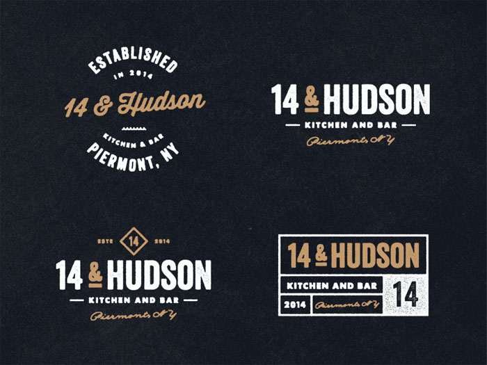
What Typefaces are Good for a Retro Logo?
![]()
The font is very important for a retro logo. Using the wrong font can destroy the vintage feeling you want. You want to find the perfect match.
Avoid anything too sleek or modern, like Helvetica or Century Gothic, no matter how classic they seem. You also don’t want to go too old-fashioned by using typefaces like Baskerville Old Face or Times New Roman. They simply don’t stand out enough and are easy for people to skip over because they’re so old.
Stylized fonts are good fits, but they should be easy to read. It’s easy to end up with a logo that uses a pitch-perfect stylized font yet have no one know the organization’s name because the font is just too stylized. Avoid going to fancy or frilly because it rarely projects the attitude you want.
A true retro look call for a mix of typefaces. Avoid being too messy or too busy with your font selection. You need to remain bold, however. Mix cursive font with cleaner retro fonts for a nice complementary design choice.
More often than not, the best choice is to either design or personalize the font yourself. With the internet, it is very easy to find a typeface that is already a good fit, but by customizing it you can make sure it really ties in with your retro logo very well. It may not take a lot of tweaking to do this, so don’t panic!
A few popular fonts used in vintage logos include:
- Matchbook
- Bazar
- Hill House
- Riesling
- Upper East Side
- Park Lane
- Blessed Day
- Candy Inc.
- Playball
These are only a few of the typefaces out there that work well for various retro logos. Take look around at t-shirts or business signs for some great retro logo inspiration.
Those examples will often use combinations of fonts, using one font for the title of the business, band, album, or what-have-you, will using another for a slogan or title. As you’ll see, feel free to mix clean lines and bold design choices.
More Tips and Tricks for Creating Retro Logos
Deciding on Details
The details you add to your retro logo will add to its sense of charm. Regardless of the style you’re going for, they should be classical, bold, and eye-catching. This seems like a tough thing to achieve, but it is completely doable.
Fade the retro logo a bit by either making it more transparent or using a speckle or scratch filter. Add some sepia tones if the color scheme can manage that well. You could also make the logo predominately black and white, throwing in a few vivid pops of color to highlight the details nicely.
Look at Top Retro Logo Trends
If you’re hard up for inspiration, take a look at genuine logos from the era you’re trying to evoke. Look at logos for popular restaurants, sports teams, beer, candies, or stores of the time. Vintage gas station signage is also a fun set of examples to look at. This can help reorient your retro logo design to get it on the right track.
Also, take a look at modern logos that translate the retro look well. Some great examples are Walker Tire, the Lavender Fastener Company, Charlie’s Catering Experience, The Astor Theatre, and Tokyo Bicycles. They have blended modern needs with retro styling to create vintage logos that look great and fit their businesses.
In all of these examples, you’ll notice that they make great use of contrast. This is especially true in the case of color and typeface. Look at how these retro logo designs use shades, spectrums, image sizes, element positions, and element orientations. Notice how all of these factors work with layout and font.
A lot of retro logos use framing techniques. These include lacy details and geometric shapes. These framing devices draw the eye to the logo itself. They help focus viewers’ attention on the most important part of the image.
Consider How the Logo looks in Grayscale or With Color Variations
Your logo may see a lot of use in very different places. It may be used as a part of a company letterhead, repeated as a background pattern on a website, or be used on variations of the same product (think flavors). If this is possible, remember to design your logo so that color is not crucial to making sense of it.
The lines of the logo elements should allow viewers to be able to identify it and what it stands for. Don’t overcommit to a certain color scheme. Your client or company will probably want some flexibility so that the logo can look good anywhere.
Essential Elements of Retro Logo Design
Retro logo design utilizes themes, styles, and tastes that were found before commerce became as globalized as it is now. The possibilities are nearly endless. There are many millions of templates for vintage logos available online.
Figuring out which one to choose, or what your own completely original retro logo design should look like, can be very hard. It can be a stressful decision to make. However, having a clear understanding of what you need to incorporate into the vintage logo is very helpful. It gives you a baseline to go off of.
Here is our guide to some of the major elements you need to consider when creating a retro logo:
1. Illustrations and Shapes
Retro logo designs can have a lot of variations depending on the time period you’re drawing from, but they all share one thing in common: simplicity. Geometric shapes, like circles and triangle, are the most common.
They are also very effective at capturing the desired retro feel. Feel free to add bright bold floral patterns or broad colored parallel lines. This work very well for retro logo backgrounds, bringing in some catchy, fun detail.
2. Select Palate of Colors
Full-color printing was difficult and expensive for a long time until recently. This means that the use of nude shades or dull tones are often associated with the retro look. A retro logo design tends to use a fairly limited set of colors.
This is helpful in narrowing down what color palate you use, as well as keeping your retro logo design from becoming too busy. A lot of designers of vintage logos use two-toned shading. Select one color as the focal or primary color Blend it with another color to create a unique shade that looks good with the primary color.
3. Typography
Font is often the thing that really sets a retro logo apart. There are a variety of fun and unique retro fonts out there from almost any era, location, or subculture you can think of. Using these does run the risk of looking too similar to other retro logos.
You can also make your own. If you don’t feel like doing that, consider using simple techniques of repositioning the typeface, adding pixel strokes to it, or duplicating elements of the font. This will help give your vintage logo a truly unique look.
4. Use Textures and Noise Filters to Create a Rugged and Aged Look
If you use noises and other textures for your background, you can really secure the retro feel. These filters add a worn look to your logo, softening its edges and making it seem like something truly from the past.
You can create the feel of old poster artwork if you use vintage shapes and borders with some stained accents and inclusions. Throw in a few shadows to add a dramatic look. Remember to use these elements wisely, as they can easily overwhelm the simplicity of your retro logo. That simplicity is one of a retro logo’s best assets, so accent it, don’t drown it out.
Ideas for Retro Logos
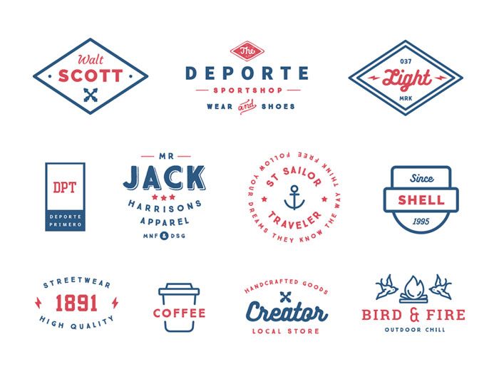
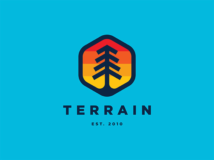
Badges
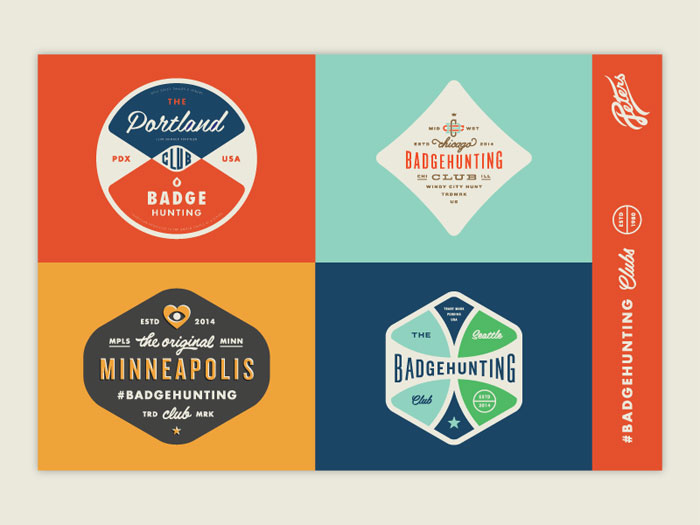
Badges are, in many ways, the essence of retro logo design. Badge designs are typically simple shapes that can be stamped on anything. Circles are the most common, but you can also find shields, hexagons, and diamonds.
These kinds of retro logos are what you see on stickers, business cards, and even, well, badges. If your retro logo can fit into this category, it’s probably on the right track. It’s simple, smart, and eye-catching without needing too much space.
Hand Drawn
These days, hand-made, carefully crafted items are very popular in every category, from flower pots to scarves. Retro logos are the same way. Vintage logo designs with a hand drawn or sketchy look will fit very well into the retro aesthetic. There are some really amazing examples on the internet with a lot of talent behind them. They always manage to impress.
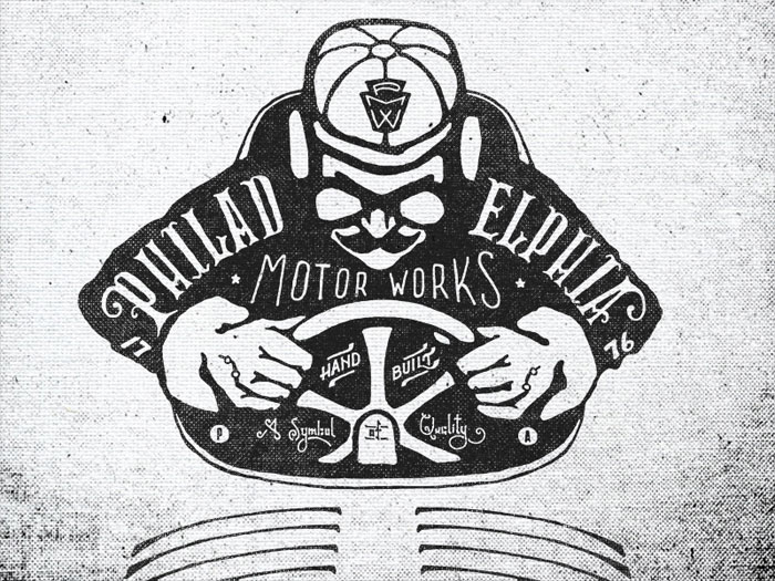
Industrial
Looking back on the mid-20th century, you’ll see a number of designs that don’t use gradients, feathered shadows, or 3D renders. These logos still make bold and clear visual statements, however. These logos were industrial in theme and style, using axes, wrenches, hammers, and factories. The modern look with its use of clouds and Wi-Fi signals is a big leap away.
These industrial visuals have a grounded feel, with a lot of weight to them, and draw in many people from the modern tech-savvy generation. Those industrial logos are tied to the men and women who built the things that gave us the modern world, so they have respectful connotations.
Earth and Sea
A lot of retro logos feature animals with antlers, including deer, elk, moose, and even the occasional antelope. There’s an overall outdoors theme in many others. They often feature trees, tens, mountains, even map iconography. Nautical variations on this theme that use fish, ropes, anchors, and boats are pretty common as well.
Coffee and Beer
Coffee makes the world go round, a fact that has been true for generations now. There’s something about coffee that has become timeless.
Likewise, beer is also timeless, though its history goes back much, much further, to ancient Egypt, and there are a lot more recognizable ways to represent it. If you depict either beer or coffee (or both, if that fits your niche somehow) you’ll likely make an instant positive connection with a lot of people.
Logos on Photographs
If you take a look back at the past decade, you’ll notice that many logos were displayed on solid backgrounds or maybe gradient ones. This old internet logos were too bright, colorful, and complicated to be displayed well on anything else.
Retro logos, on the other hand, are much simpler and much more monotone. They can be displayed on just about any background, including photos. Placing your retro logo on a photo looks really great and communicated what you’re all about very well. It’s a great way to display your logo in your store or on your website.
Line Art
Recent vintage logos have been relying a lot on online art in the past few years. This is a part of an overall trend towards flat design. This kind of line art often uses thin lines and very simple illustrations. It can be elegant or wild, sophisticated or sketchy.
Identifying the Retro Design Style
What looks old varies from person to person, almost, or at least generation to generation, region to region. Someone born in the 1990s will have a different idea of old-fashioned than someone both in the late Aughts, for instance. How we decide that something looks retro is based on three factors: nostalgia, perception of age, and visual style.
Nostalgia
80s nostalgia is very popular right now because so many adults with disposable incomes were children during that time. This is a similar idea for those who were born in the 70s. We remember the times of our childhood fondly in a lot of ways. It was a more carefree time when we experienced a lot of treasured experiences for the first time ever.
A lot of brands have realized the power of this nostalgia. They’ve begun tapping into nostalgic marketing for their products. Adding a stylistic reference to the target market’s nostalgic period is a really great way to increase sales.
It lends products that same carefree feel from those treasured days. You even see it in movies, music, and television. It is a proven marketing technique.
What’s interesting is that lately a lot of brands have begun to orient towards the Millennial market by utilizing the styles and design of the 90s to capture Millennial nostalgia. This is something to look into as that demographic is going to start becoming larger spenders in coming years.
Perception of Aging
Everything gets older and age can seriously affect how something looks. Items that are shiny and sleek tend to look newer. A good example is shiny modern digital print.
You can tell that it’s been made recently. If a print were to have a bit more pixelation or a duller color, it will look like it was made in the 1950s or 1960s. Yellowing, ripper, or curled edges, along with elements of decay or damage look even older than that, perhaps dating back to the early 20th century or even the 19th century.
Figuring out how to recreate these retro styles can help make your logo look truly vintage in an intriguing way. Know what era you want your logo to look like it came from and how time would affect the way it would look if it really was that old. People greatly appreciate this dedication to detail and authenticity.
Visual Style
Retro looks are also almost immediately identifiable thanks to their visual style. Every era had its own hallmark aesthetics. You can easily tell something created in the 1920s from something designed in the 1940s just by the way it looks. These visual styles have found their way into our culture in a number of ways. Utilizing them is one of the key ways to achieve a retro logo design.
Retro Style Guide
Because visual style is so important to creating the right retro logo design, here’s a brief guide to identifying some common vintage visual styles. Few logo designers simply reproduce these old-fashioned visual styles, instead mixing them with modern elements or even referencing multiple visual styles in one logo design.
The key to pulling this off is getting the right balance and understanding what elements matter most in a style—as well as experience. Here are a few retro styles that don’t see as much use in our current 1980s trend:
Victoriana
This style is derived from the designs of the Victorian period, which spanned about 60 years. This means that the Victoriana style is very board. Some people think of it in terms of circus typefaces or text-heavy layouts meant to look like real Victorian posters.
Other might prefer to include period-style military elements like medals and uniforms. Some variations are quite heavy and grunge-like, while others are frothy and colorful. A lot of what we think of as vintage nowadays comes from this visual style. There are a number of ‘spinoff’ styles from it. Here are some variations of the Victoriana style.
- Letterpress
Letterpress is among the oldest printing techniques. It uses a form of relief printing to create an engraved color effect. It looks really good with many vintage layouts. Enhance it with muted colors.
- Steampunk
Industrial, detailed, and fun, steampunk draws inspiration from 19th-century industrialism and technology. It often merges them with science fiction and even post-apocalyptic ideas and cultural references. The result if off-beat and distinctive.
Retrofuturism
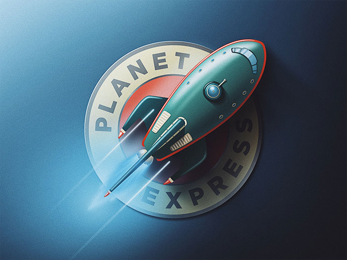
This mashup of a word means that this visual style is basically how people in the past thought the future would look like. It can have elements of Victoriana in it, though the retrofuturism of the 1950s and 1960s is also very popular, as typified in the retrofuturistic rocket.
Gothic
Gothic visuals are drawn from the architecture and decor of the mid-to-late medieval period. It’s a very board visual style that can be seen in many countries, art, and buildings from the time. These days, it’s often seen in medieval typefaces, simple colors that mimic a dark natural atmosphere, and aged textures.
Baroque
Baroque is ornate and detailed. It is derived from the 17th and 8th centuries. It has grand and exaggerated features. There’s a lot of ornate gilding and detailed decorative elements. Elaborately stylized natural elements like plants and shells are often used in Baroque designs.
Art Nouveau
This style was popular at the turn of the 20th century. It used a lot of curved liens meant to mimic natural forms. It uses a lot of fluid borders with ornate details, symmetrical layouts, and optimistic warm colors.
Art Deco
![]()
Glamorous and luxurious, art deco was at its height in the 1920s and 1930s. It uses strong geometric forms and a lot of symmetry with rich colors and metallic finishes.
It looks much more modern than many styles, so it can be used to add a luxurious twist to a modern piece of work. You can use it easily for masculine and feminine target audiences. There’s something nicely balanced about this style.
Ending thoughts on a retro logo
A retro logo can achieve a timeless feel. It’s an easy way to endear your company to your target audience and stand out from the rest of your industry.
If you enjoyed reading this article about retro logo, you should read these as well:
- Badge Logo Design Ideas To Use As Inspiration
- Minimalist logo designs: Inspirational showcase
- Retro Fonts: Free Vintage Fonts To Download
The post Retro logo design: Vintage branding best practices and inspiration appeared first on Design your way.
Source: https://ift.tt/2KP0LZn


No comments:
Post a Comment