As a UI designer, it takes a lot of hard work to design a website that is interactive and pleasing to the eye, along with accomplishing the website’s goal. But while designing certain websites, often the creativity takes a back seat along with the website readability, and the websites look like they are not very interactive. Websites should have designs such that the visitor wants to your site more often, just to experience the delight of using the website and interacting with the webpages.
Gone are the days when users used simple websites that accomplished more. Now, the goal is to make the user use the site by increasing interaction and keeping them engaged. Your website is an asset to your organization if the user keeps coming back for more interaction with your website in the future.
This blog looks at such websites that are interactive and have out-of-the-box creativity.
1. Cyclemon:
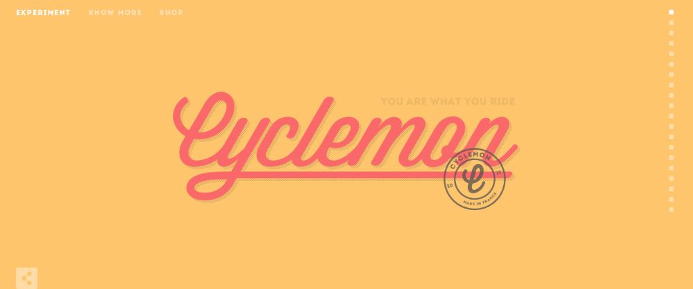
Cyclemon is a website that has various designs of bikes for you that you can order and ride. This website uses scrolling to give you a glance at their products. You just have to keep scrolling to see all the product designs. The company’s slogan says, “You are what you ride!” And this makes the user scroll down to the bottom of the page to find a suitable bike design for himself. Hence, you compel a user to keep scrolling until all the models appear.
You can order the bike that you think matches your personality. It has applied human psychology behind the design. The website has all the models, and they make you scroll until you “feel” that you have found the model that suits you.
2. Alex Buga:
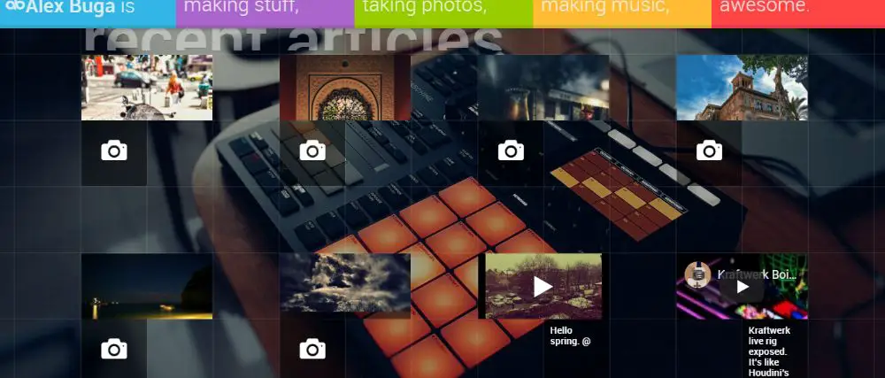
Alex Buga is a designer from Bucharest in Romania and has his website that works as his portfolio. When you open the index page of the site, he has designed tiles across the screen where individual tiles have images that he has taken, and certain tiles have the YouTube video links. Apart from designing websites, he is also a photographer and a musician.
He has worked as a creative director at MB Dragan who has extensive work experience of 7 years in web designing. The website he has developed has out of the box design.
3. Evans Halshaw – Bond Cars:
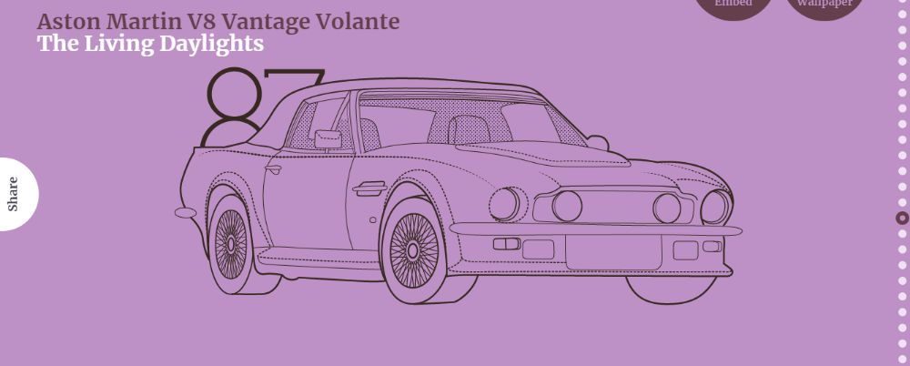
Evans Halshaw is a portal of new and used cars. They have worked with 130 locations across England, Scotland, and Wales. Their website is similar to the Cyclemon website. The difference is, they have used different car models that were present in James Bond movies. Every image has a year, the model of the car, and the name of the film in which it appears. As you scroll down the home page, it will show you the different vehicles that zoom out from the previous image.
The design will keep a car lover entertained for a few moments. In addition to this, a James Bond movie fanatic will keep on scrolling the website to see all the cars used in Bond movies. Along with the images, they have a short description based on the film, on the right bottom corner of the screen for each car.
4. Play dot-to-dot:
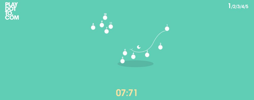
This website is the most interactive for gamers. It features a game that involves joining the dots from their numbers in descending order. It makes use of a timer. You have to connect the given dots in a stipulated time window, and it proceeds to the next game. It is bound to keep you busy and can prove to be a favorite among the kids too.
The level of interaction with this website is the highest, as we all get obsessed with joining the numbered dots in descending order. The interface is straightforward, yet can keep you engaged for hours.
5. Kick My Habits:
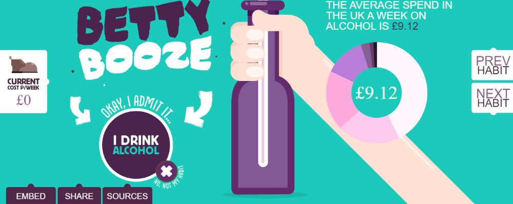
Kick My Habits is a website that helps you calculate your expenditure over certain things like beauty kits, eating out, smoking, drinking alcohol, and partying. It tells you how much money goes into these bad habits per year and this all in a very interactive way.
It asks you about how much money goes into bad habits per week. Once you feed all the data for one practice, it takes you to the next pattern. You can choose “I don’t have this habit” if you don’t have that habit. After analyzing every practice that you feed data for, it examines the amount of money you spend in a year chasing these habits. Anyone can calculate these expenditures they invest in, every year. But the interactive user interface of the website has the most beautiful design, which is of the greatest significance here. In the end, it shows your total savings yearly and weekly, along with the amount that would show up after you put that money in the bank account.
6. Zervice:
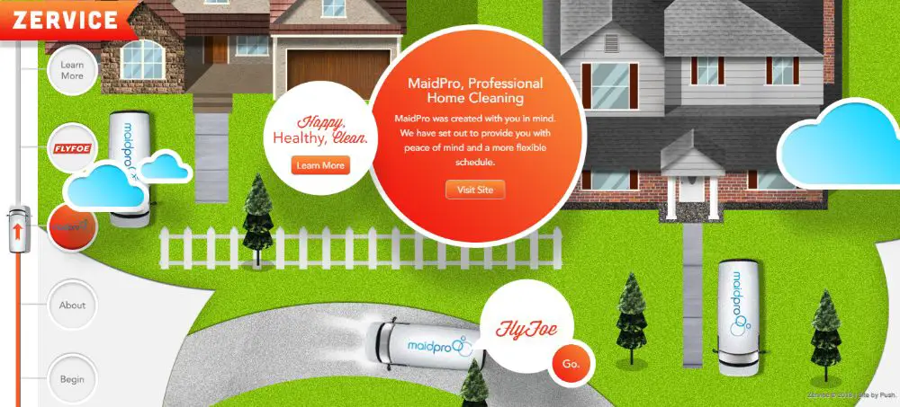
Zervice is a group with several different franchise brands that lead the way. It is a smart and creative website design, and it was one of the most awarded websites. The website begins with traveling through the city. The site has used pictures and an SVG path that the vehicle moves on. The clouds make an appearance for interaction like quizzes and questions. The website looks like a 3D model when the car passes over and beneath some aspects of the website.
The page opens with a thought bubble, a welcome message, and a view of the city. Also, it has a “Go” button that drives the vehicle to the next point. Another screen is a sophisticated screen with a floating marquee and a building where the car goes through. With a few stops and quizzes along with them, you learn about the Zervice’s services. Winding roads, construction, and the best part being a moving train beneath which the vehicle drives is a sight to behold. Even if you don’t need to know their services, you should visit it once to experience the description above.
7. Future of Car Sharing:
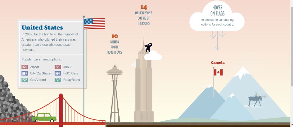
This website talks about sharing a car rather than buying it. This website is very interactive in a different way. As you land up on the site’s home page, you see a green car that can navigate forward and backward by pressing the left and right arrow keys. The landing page shows the type of car sharing and its statistics. As you press the right-hand key, the car starts moving ahead towards the right side, where the classification of the car-sharing and its description makes an appearance.
The first classification is P2P, meaning the Peer-To-Peer car-sharing concept. It defines a group of cars owned by a certain number of people. These owners of the cars rent out the cars to the drivers. Another category is B2C, which means Business-to-Consumers. Here, a company owns a set of cars that they share amongst the members of the company. They include auto manufacturers, rental brands, and car-sharing brands. The third category is NFP, which means Not-for-Profit. A local community shares the car to make a change in the driver’s driving habits instead of renting the car to earn the profit for it.
As we navigate further, the green car seems to move through the mountains, even though the road appears linear. The green car then starts to run over the bridge while it passes through a massive heap of trash and then crosses the pole that holds the USA’s flag. There are potent graphics across the page, and there are multiple things a user can do to explore. Like when you hover the mouse over the tower, you see the mouse cursor turn to a hand, suggesting that it is a hyperlink.
While you navigate more through the page, you see clouds floating, and a chimpanzee hung up on the tower. You see great car-sharing options when you hover the mouse over the flags of the country. As you move further, you find that more and more cities and states have opted for car-sharing options. The website has a design in a way that you have to scroll the screen horizontally, which shows different facts in the form of animations.
8. Robby Leonardi:
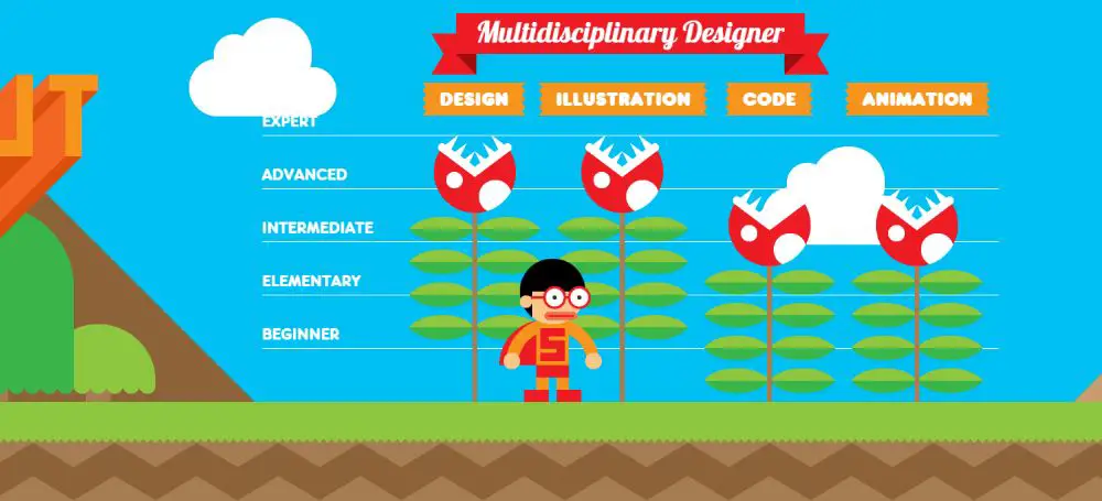
Robby Leonardi is a graphic designer that offers expertise in graphic designing, illustration, animation, and front end development. He has a lot of experience while working with the entertainment industry. He developed this website to present his resume in a very creative way.
This website is similar to the Future of Car Sharing websites and scrolls horizontally, yet the scroll bar in the website is vertical. You can navigate through the site using the up and down arrow key. When you press down arrow key, the guy in specs, wearing a cape starts running. The first section you encounter is the “About” section, where he has four fields Design, Illustration, Code, and Animation. And he shows his level of expertise by flowers blossoming according to the levels. For example, he has expertise in design, and then the flower blossoming will reach up until it reaches the “Expert” line showing that he is an expert at it.
When you move ahead, the guy jumps across the obstacle and shows that he works and lives in New York City, where the towers and the Statue of Liberty show a demon sitting inside of them. Moving ahead, the guy again jumps across the obstacle and shows that he is an NBA football team fan. Here, a player seems to come up and throw a basketball through the net.
Going ahead, you encounter a skills section where the numbers of the fishes declare the level of the expertise he has, in each section. In the same part, there is another subsection where he highlights his expertise in programming languages, where the crabs show his level of knowledge.
Moreover, the next subsection is about his expertise in video and 3D software, where the turtles show you his levels of expertise in each field. Next comes the section where he highlights his work experience in the form of octopus and other water vehicles. The second last section shows his awards and publications that he has received so far in the form of labels. The guy jumps in the parachute and flies by the tags that define his awards while he keeps on flying. As you keep flying, you reach the end of the webpage, where you give your contact details and drop a message for him.
9. Polish Christmas Guide:
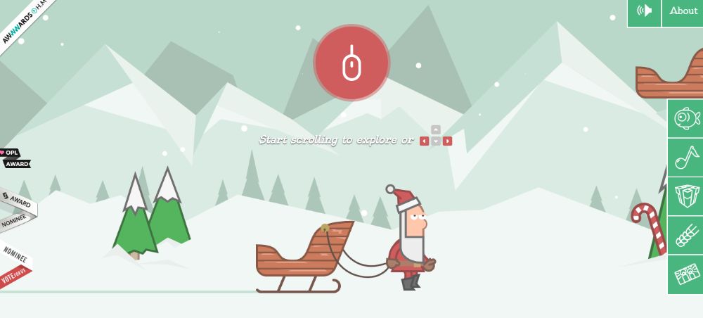
Polish Christmas Guide is a website that helps people of all ages know about the Polish Christmas and how they celebrate it every year. It begins with a cute Santa Claus with a sled to carry the things he requires to celebrate Christmas in Poland. The children would love this website as Santa goes on collecting items in his sleigh while presenting the facts and information about the things collected and other things.
Christmas in Poland represents the tradition of sending and receiving gifts from each other. It also maintains a culture of sharing the meal with other people who may visit you without prior notice on Christmas Eve. This website works out on illustration and musical background. When you browse through the website, the experience resembles that of playing a game.
At the end of the website, there is a message that spreads awareness about abused children and their calling to help those kids and protect them.
10. Climber:
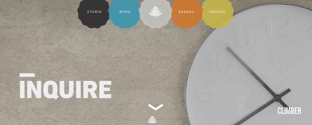
The climber has developed its interactive website that tells you everything about the creative company, called Interactive Production Company, which produces some of the fantastic digital products and user experiences. It begins with a unique theme based on forests and woods. With various elements that allow you to interact with them, you can go through their portfolio in a very creative manner. It shows its designing projects in the form of different animations through scrolling and a mere click of the mouse.
In one of the screens, the text appears by moving the mouse, which is a sight to behold. When the screen changes, it breaks down into different squares, falls off the screen, and lets you in into another screen. If you are looking to build a website for your company irrelevant of what it deals with, you should take inspiration from the graphics inspired Climber website.
Conclusion:
It is our representation of websites that inspire a graphic designer to bring out his creativity and put his best foot forward while designing the website. These types of sites are not only a delightful sight, but it also helps the owner of the website to keep the visitor engaged and intrigued. There are so many design ideas on all the sites, as mentioned above, that you can adopt. These include animation, game screen, cartoons, and more from which you can take ideas.
via https://ift.tt/3gtFaVo


No comments:
Post a Comment