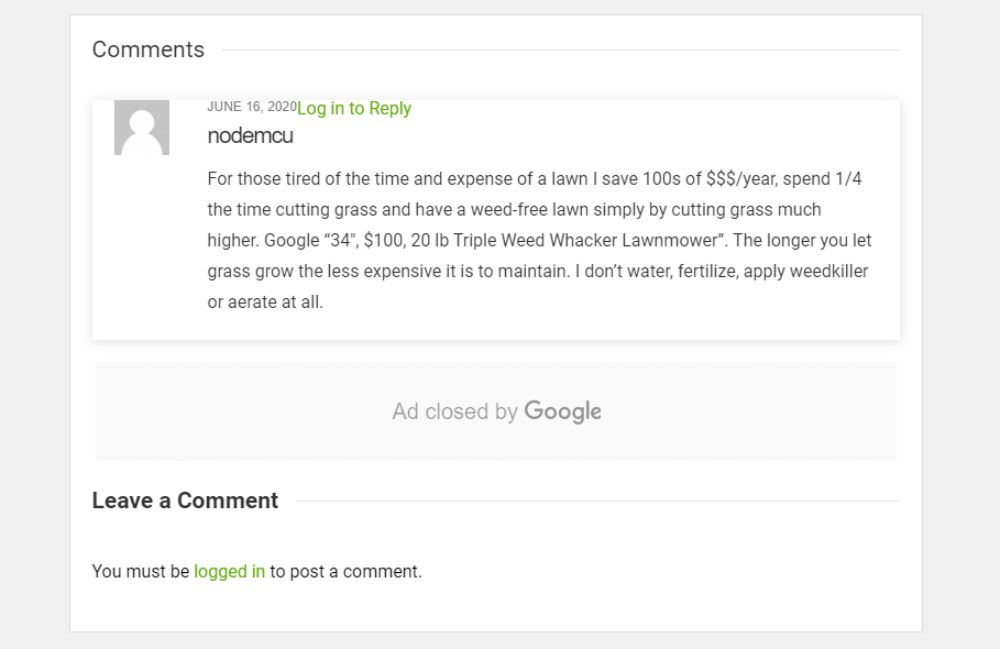
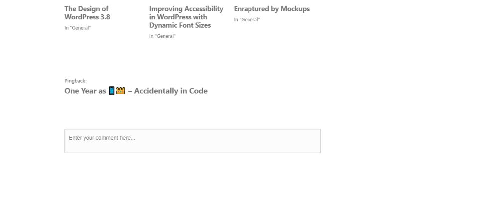
A blog is a forum where people discuss certain concepts. The posts on a blog are displayed in reverse order so that the latest post appears first and the first post will appear last. A blog is helpful in marketing to a point where it caters to your target audience’s specific needs. And the audience can reach you through the commenting section. Initially, the commenting section was dull with a box that would receive the comments of the blog readers. But now, the commenting section can be well designed to encourage user feedback and comments.
Blog comments are a great way to enhance conversation between the writer and his or her audience where they can share facts, ideas, concepts, and more. This blog focuses on the blog comment designs that you can use on your blogs that are eye-catching, minimalistic yet aesthetically appealing.
1. Earth911:
Earth911 is a website that talks about environment-friendly things and systems. It has various blogs that have titles like “list of -eco-friendly gifts”, “10 books to counter consumerism,” and more. The website has taken the initiative to create an awareness of our planet Earth. Hence, the name Earth911 suggests that they want to talk about the world and its conservation. They feature a straightforward blog comment design in the form of a box structure. The image of the user displays on the left side of his comment. You need to have an account to write a comment on their blog.
2. Matt Miklic:
Matt Miklic is a designer who runs a blog platform that talks about many causes, including the recent George Floyd murder. He talks about social issues like racisim and suppression of minorities. . On his website, he has a beautifully designed comment section. It has a hierarchical design. A user writes a comment, and Matt Miklic, the website owner, answers the feedback that displays on a step-down. The reply to a comment is also aligned slightly to the right indent to make it look like hierarchy.
3. Particle Tree:
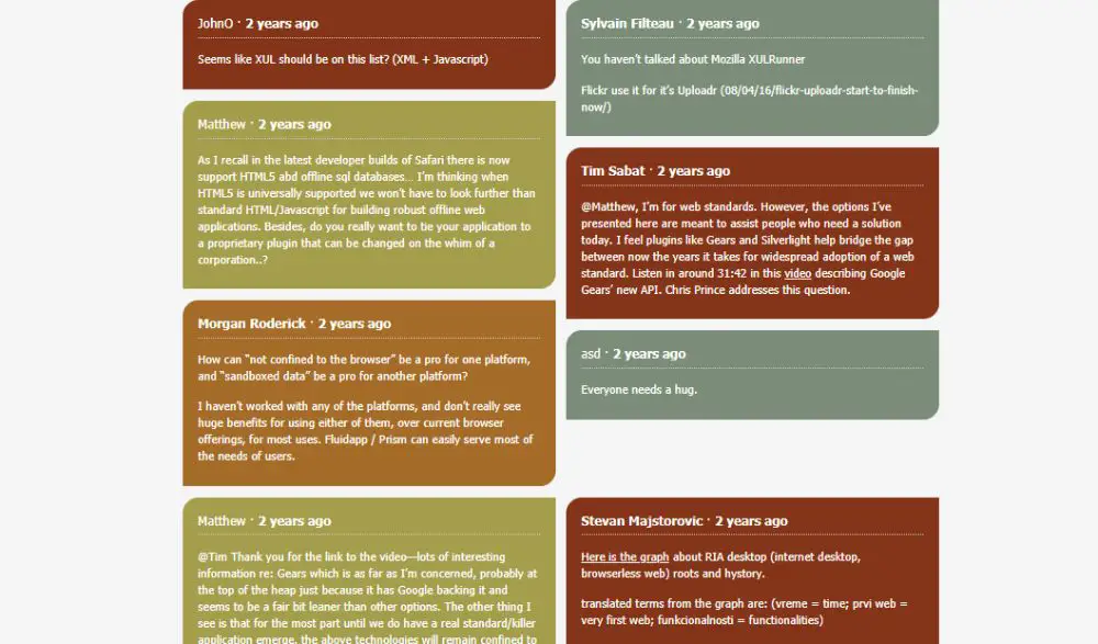
The website, Particle Tree, talks about website design and development. They provide sources of information for website development that are authentic. The site has a list of experts in different subjects like UI design, database management, marketing, and more. On their blogs, their comment section seems very interesting. If user A comments, it appears on the left side in a leaf-shaped structure with color. And the user B’s reply to user A comes opposite the comment that user A wrote, in a different color. Apart from anything else, they have a well-designed, aesthetically appealing comment section.
4. Make a website hub:
Make a website hub is a website that talks about popular genres for writing blogs. It shows various subjects and influential blogs on those subjects like motherhood, travel and adventure, food, and more. They have a simple comment design where the comments and reply to them appear in a hierarchy. If the user comments, it appears in a simple-looking box. And, the response to that comment appears in another box beneath it, in a hierarchical arrangement. That signifies that which comment’s reply displays in which section.
5. Miss Thrifty:
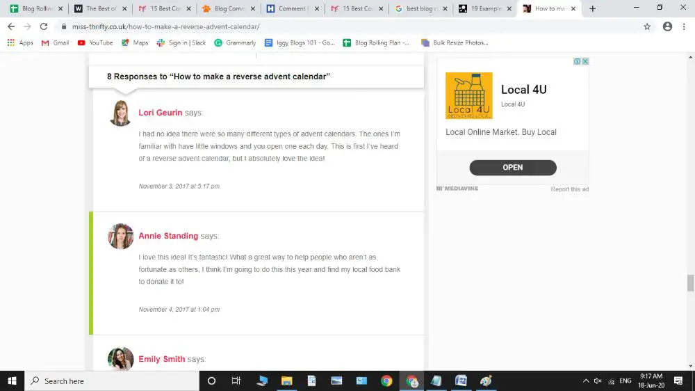
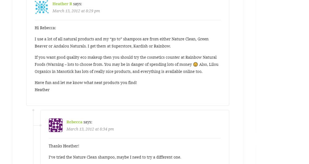
Miss Thrifty is a website that talks about thrift ways to establish some of your regular tasks. It focuses on how not to spend money where you can put your brains to use. The website teaches you to tackle and handle all the problems that appear when you are running low on cash. Her comment section design is as unique as her website’s purpose. When a user writes a comment under her blog, his image appears on the left side of the comment. Also, a vertical green line appears alternatively to every comment that ever appears on her blog.
6. Side Hustle Nation:
Side hustle nation is a website that talks about having a second or third source of income while you earn through a full-time job. It talks about all the side hustles that you can have and escape the cut-throat competition era. The owner of the website is an entrepreneur of various projects. He encourages his readers to have a second source of income and talks about how to make it permanent. The comment section has a minimalistic design where the name of a user who commented, appears on the top and his comment beneath it. A reply to comment appears in a hierarchy.
7. My Wife Quit Her Job:
She talks about the side hustles and strange ways to have a healthy and constant income. The website talks about how the wife from the couple escaped her 9 to 5 job and how they have a stable income source without having a full-time job. Their comment section has a simple design with no fancy things. A comment separates from another comment by a horizontal line. The name of the commenter appears along with their comment beneath it.
8. Cup of Jo:
Cup of Jo is a website from a blogger who regularly writes about style, designing, food, travel, relationship, and more. She started this website as a hobby, and the site went on to grow into a massive website. She has hired full-time writers to have blogs on her blogging platform. The blogger has a very simplistically designed comment section. It has replies to a comment appear on the same level of the hierarchy. The comments are very well structured and have a clean appearance.
9. Bit of Mom Sense:
Bit of Mom Sense is about a blogger and her life that revolves around her husband, kids, and other things like food, travel, parenting, and more. She is a full-time blogger and has a strong following that she enjoys. The comment section on her website under her blogs is fascinating. Each comment has a user’s name and an image assigned to that user that has a specific design attached. The comment appears in a hierarchical structure with replies to a comment, a step beneath the actual comment.
10. Adventure Blog:
The Adventure Blog is a website that talks about traveling to unusual places, places that were never discovered, and the experiences around it. It also covers various travel stories that other people have talked about but never were under covers. The creator of the blog has traveled a lot to many places that many people don’t have an idea of their existence. The comment section of the website has an image of the commenter that appears on the left of the name of the user in square shape. A reply to that comment seems beneath it.
11. Pinch of yum:
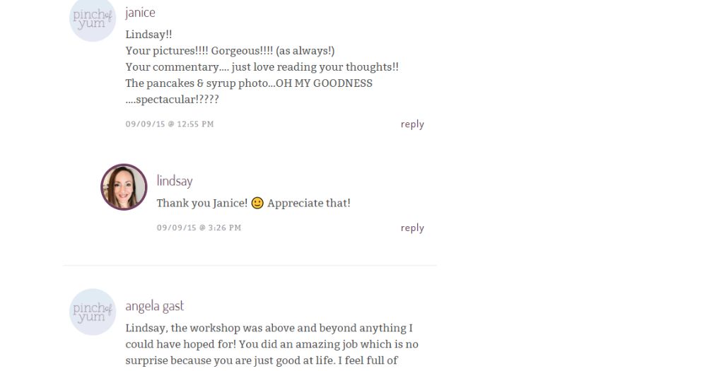
Pinch of Yum is a website of a blogger that talks about healthy recipes. She makes and tries the recipes and then writes about them. Her full-time job is blogging about recipes and trying out new and different food combinations. The blog’s writer claims to be a food lover and has some fantastic recipes on her blog. The comment section of her website is attractive, where reply to the comment appears beneath it hierarchically. The image of the commenter appears in a small circle on the left of the name of the commenter.
12. Cookie and Kate:
Cookie and Kate is a website about a blogger who loves to upload recipes of salads, soups, breakfasts, desserts, and much more than that. She makes sure that her recipes are vegetarian, which are also healthy and tasty. The comment section on her website is very simple similar to her website. The comments appear in a hierarchical structure. When a comment has an answer, a vertical gray line appears beside the reply-comment. It signifies that the comment with a gray line is the reply.
13. I am a Food Blog:
I am a Food Blog, as the name suggests, is everything about food. The author of the blog has hundreds of recipes that can help you recreate her recipes at home. She also talks about cooking basics, purchasing guides, and city guides. Her recipes categorize under various sections like DIY Chinese take out, mains, quick and easy, among others. The comment section of this website has a hierarchical structure and has a design that looks like a collapsible structure. The date and time of the comment appear at the right bottom corner of the comment box.
14. Tiny Buddha:
Tiny Buddha is a website that talks about peace of mind, meditation, and spirituality. The site helps its readers to simplify their lives by pausing and taking time to introspect and find simple solutions to complicated problems. With spirituality as its central concept, the ideas and thoughts are based wholly on concepts of Buddhism. They focus on talking about love, relationships, happiness, peace of mind, and other similar domains. The comment section on their website aligns with the goals of the site, where the image of the user appears beside the comment. But if the commenter doesn’t have his picture, a small Buddha image appears beside his comment.
15. WP Tavern:
Mainly focused on all things WordPress, the website also covers about BuddyPress, bbPress, and Automattic. The website allows members from all over the world to discuss everything about WordPress. With an exciting community on the site, their comment section is also enjoyable. The user’s image appears in a circle beside their comment. There is also an option to press a like button beneath the comment. If a comment has a reply beneath it, it appears in a hierarchy.
16. Gaps:
Gaps is a website that talks about a blogger’s story about exploring opportunities to conduct business online. The blogger talks about various business opportunities that you can explore. It talks about how spending money on a domain name uncovered multiple opportunities for the blogger. The comments on the blog appear in a gray background alternatively. If a user has commented, then it appears in gray. And a reply to it seems without the gray background.
17. Reddit:
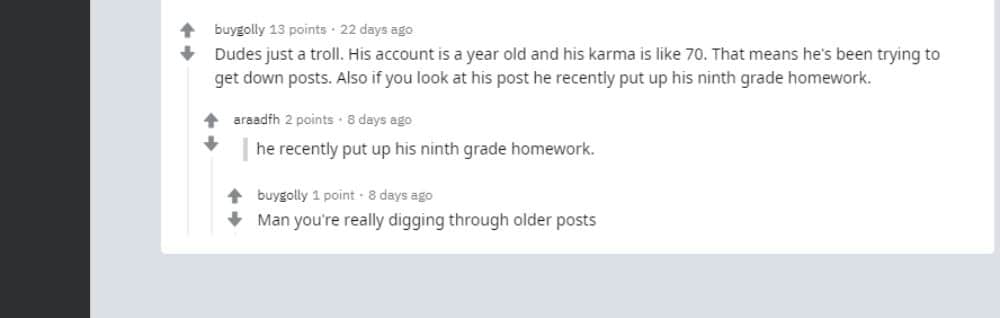
Reddit is a very great forum to share ideas, concepts, and conduct discussions. It has a massive number of nerds using the platform, and they talk about various topics like philosophy, languages, and many others. The website has a typical comment section that has up and down arrows beside the comment. You can press these arrows to bring the comment up or down on the platform. The comments appear in a hierarchy, and there is no icon or image for the user ID.
18. Pro Blog Design:
Pro Blog Design is a platform where the owners discuss web designing and everything about WordPress. They write articles and blogs to help online businesses achieve more from their websites and digital platforms. The website owners are also a pro at creating sites from scratch. The comment section of this website has a minimalistic structure. The user that writes a comment has an image in a square shape besides the image with no background color. The reply to a comment is in the gray background in a similar format.
19. QN5:
QN5 is an independent record label for hip hop music genre that bases in New York, USA. It is known to give a chance to newcomers and market their music digitally. They innovate their digital marketing strategies every little while. The owner of the website runs a “new hip-hop movement” that assembles all the hip hop artists under it. Their comment section on the website is aesthetically straightforward. Every user who comments on their blog has a square-shaped image with blue stripes in it. The comments appear as a message box.
20. Result First:
Result First is a technology website that focuses on web development, SEO performance, Google Adwords, Content Marketing, and Social Media. They specialize in creating digital marketing experiences for their customers. Result First has an attractive comment section that is visually appealing to the users. The user that comments on their blog appear beside a vertical gray line. The image of the user performs on the right-hand side of the comment in a square. The default image is of a square that consists of various geometrical patterns in the picture if the user profile doesn’t have a picture. A comment has the date and time of its upload beneath the name of the user.
Conclusion:
Very few people pay attention to the comment section of a blog on any website. The designers and programmers work hard only on the look of the site and its functionality. But, you should also focus to the section where a user is going to interact with the content of your website. You should also add a like button or a star to let the users vote for the comment that they like the most.
via https://ift.tt/3hrhgtZ


No comments:
Post a Comment