Brochures are one of the best marketing tools that have established a strong position in industrial operations. Brochure design has evolved into many different versions due to technological advancement, but the main objective and purpose are still the same.
Brochures help your customers to get complete information about your brand and the products. You are not only passing information, but you are presenting brand identity and increasing the conversion probability through your brochures. So when you are designing a brochure, you need to take care of each and every detail to create a successful brochure design. But there are high chances that if you are not enough knowledgeable and careful, you might ruin the end product while attempting to create it.
So, while you are considering what to do and how to do it, we are here discussing what not to do when you are designing a brochure for your brand. These are general mistakes that people tend to make without realizing. So let’s understand 13 things that you should not do while creating a vital brochure.
1. Over Cluttered Theme:

Designing a brochure is a great responsibility to showcase products and brand image in a correct way to attract and retain customers. It involves many elements related to content, design, and end motive. So, if you have too much information that you want to put in your brochure, then it can be a little tricky point. A brochure design has some limitations, and it can only consume a certain level of content, graphics, images, and layouts. Excessive images, words, pages, and graphics can take down the whole brochure design. It can not effectively deliver the information and hold the viewer’s attention.
So instead of creating an overcrowded brochure design, try to include only the most important content and images so that you allow the viewer’s eyes to rest and absorb the details.
2. Confusing layout:

The layout is an essential subject for any extended design. In brochure design, every element’s synchrony and alignment are well balanced then you can not expect your customers to follow your lead. If every page has different layouts and the whole overall brochure is looking absurd, it can be a massive loss of money and effort. So the flow of your content should lead your customer to take the necessary action as you want without creating any confusion or disturbing them with your hard-to-follow design.
Make sure you give enough time and thought to decide the layout of each page, and as per your target audience, you design it while keeping their behavioral and knowledge aspects in mind. If you want maximum conversion and interaction, then it must convince them with smooth and comfortable layouts.
3. Too Many Colors:
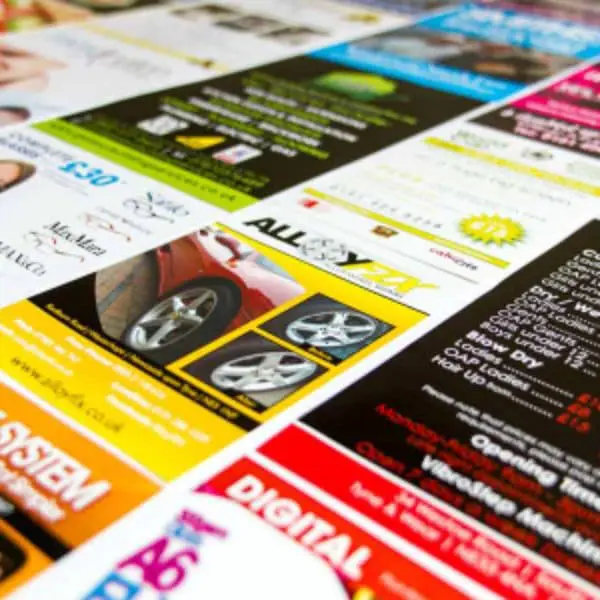
As you know, colors play a vital role in designing. You can really trick your customers for the intended action if you know using the right colors at the right place. So in your brochure design, where you are trying to portray so many things to create a strong impact, you have to be a little more smart with colors. If you think adding multiple strong and attractive colors can make your work easier and brochure more impactful, then you are making a huge mistake. Brochures with no specific color scheme can distract your customers about your brand image.
Imagine a look at the brochure with multiple different colors on different pages. It doesn’t look decent and convincing, and moreover, it can not help to create a strong visual hierarchy. This mistake can make your brochure design distracting and confusing as well.
4. Various Different Font Styles:
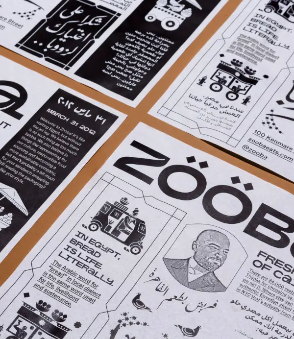
Typography is one of the significant elements of design. In your brochure design, you are including so much content and titles, so to make it more exciting or attractive, if you are choosing more than two or three font styles, it can create the reverse effect. Designing is a smart art that involves consistency and synchronization of elements. Using different font styles is not forbidden, but since it can not fulfill the purpose, it is not advisable either.
It can distract the vision and drain the essence of the content. In the end, you want to educate your customer about your brand and products so that they take action confidently, but overwhelming typography of various font styles can fail your design to leave a mark.
5. Low-Quality Images:

Images help your content for validation, and they also help viewers to understand it with ease. Generally, brochure design involves real images of the products, services, location, and relevant people. As per your requirement and design, you can decide on the crucial images for your brochure. Since images provide a better visual experience, you should not compromise on them. Only high-quality and decent images that can complement the design and support your content should take place on the final brochure design.
Low quality and low-resolution images can finish every other element’s beauty. They do take a lot of space, and most of the time, it is your customers’ primary focus. So, if they are not appropriate and effective, your customer might not even take a look at other elements.
6. Too Much Empty Space:
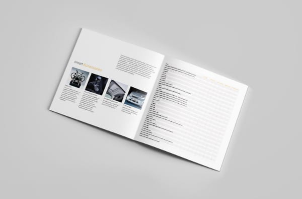
Now, this is a fundamental thing but necessary as well. If you are leaving too much empty space in your brochure design to manage layout or to manage pages and content, it can break the viewer’s interest chain. On the other hand, you should also not cover every little space with content because that again can harm the design. So ideally, you need to manage layout and content with the correct spacing amount so that readers can rest and understand it well without getting overburden.
7. More Than Required Information:
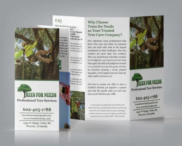
A brochure is to introduce your brand give out highlights of your company and products. It should only include information that is necessary to know about and which can lead customers towards CTA. In the end, they should come forward and reach you so that, from that point, you can get involved and deal with them better. If your brochure has too much information that has no relevance to the core content, then you are more likely to lose your customers.
Suppose your content is consuming a lot of time and making your reader’s experience unpleasant. In that case, no matter how good your brochure design is and how good your products are, they would not get impressed with the oversaturated content.
8. Forget To Focus On The CTA:

A call to action is the essential part of a design. When you are designing a brochure, it is highly important that you put a call to action feature on the essential pages or at the end of every section. You don’t have to overdo it; just smartly place this with your content to remind your customers what they need to do after going through the respective content and images. So by any chance, if you are designing a perfect brochure but forget to focus on the CTA part, then you are influencing your customers in a way that you should.
While deciding layout, content, colors, headlines, images, and everything, it is crucial that you do not forget about the call to action feature. It has to be present in your brochure to make it complete and practical.
9. Design Keeping Printing in Mind:
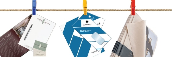
A design can look amazing when you are looking at a computer screen, but things can look different when they land on physical paper. And this subject highly depends on the printer and the quality of the material that you choose. For a high-quality brochure, you must choose the high-quality material; otherwise, selecting cheap or not optimum level material can turn down the whole design.
Customers can judge the quality of your brand’s products and standards based on the quality of the brochure they hold. That is why to represent the best quality and high standards, your every marketing element should adhere to strict quality analysis as well.
10. Forgetting The Basics:
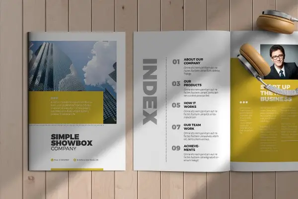
You must be dealing with so many things at the same time while designing a brochure. You don’t want to miss out on any essential element or even a word to deliver the best brochure design successfully. And while concentrating on the significant essentials, you also need to remember the importance of basic elements in a design. Standard rules of layout, structure, and cover page are some of them. Contact details, every critical link, easy and straightforward index, credits, and important dates are also in that list.
Apart from these, all the other basic things that don’t require your strong attention but holding immense importance must be included in the design. So, make sure you don’t forget them because they are necessary for the design, customers, and brand.
11. Long Headlines:

This is a very common mistake that you can make in your brochure design. The struggle between unique headlines and maintained layout is inevitable. You might want to include headlines that are interesting, crisp, and informative, and in that regard, sometimes you overlook the ideal word count for titles and headings. No one wants to read long headings in the brochure because they already get detailed content for each topic.
So, no matter how convinced you are with your headings but if they are taking more than a few seconds to read then, you have to get rid of them for the sake of design and layout. It can also create unnecessary clutter and frustration for the viewers, so it is better to keep the titles short and tight.
12. Disclosing or Hiding the Pricing Subject:
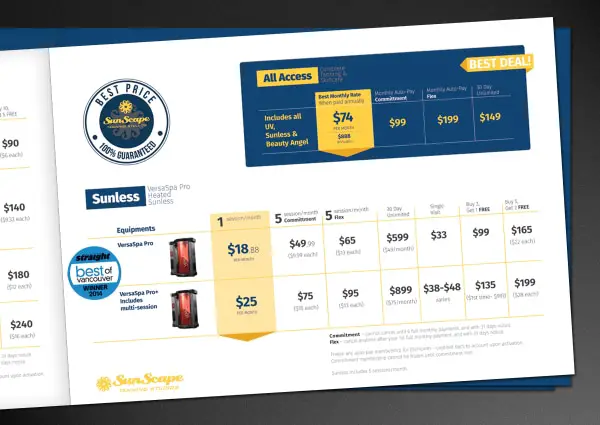
It is a very tricky point. Many people get confused about whether to discuss pricing in the brochure or not. Since it is a crucial and sensitive object, you must give a deep thought. As per your industry, product, and brand, you need to decide about including pricing the brochure design. For instance, if you are a service provider and your prices rely on so many factors, and you mention some pricing structure, then you can create serious problems.
Like that, if you have an extensive product category and the pricing of your product in your industry doesn’t change that often, and you do not include prices in your brochure, then it can frustrate your customers. So hiding and disclosing prices should be smartly implemented that can benefit you and your customers as well.
13. Copying Design from the Competition:

If your brochure design is inspired by your competitors to a certain extent, it’s fine because It can serve some benefits as well. But if your design has too many similarities with your competitor, then it can cause some issues. Your customers can confuse you with the other brand, they may get diverted to your competition instead of you, and they can misjudge your brand and products as well.
If you want to create a unique brand image in your customer’s mind, your brochure design also needs to be unique. It should reflect your brand image and showcase how different and better you are than your competitors. Because then only it can serve the purpose in the long run.
Every element you put in your brochure design should align with your brand design and your end purpose. With brochures, you get enough space and opportunity to showcase things however you like, and because of this privilege, sometimes designers overlook the small mistakes they are making. These mistakes might not look influential on the design, but they can surely change things in the print version. And eventually, you may notice the result from a clearer perspective. Here to help you with the precautions, we have tried to cover all the necessary don’ts that can harm your designs, so you know what to avoid beforehand while designing one.
The post 13 Things Not to Do While Designing Brochures first appeared on Line25.Source: https://ift.tt/3cAanWI

No comments:
Post a Comment