The eCommerce market has expanded the horizon for the customer as well as businesses. Every business has an opportunity to reach any market and any customer they want by taking their business online along with their offline presence.
When you are designing a logo for your brand, you consider many aspects related to the market, business, and customers. In addition to that, it takes a little bit more when you are designing a logo for your online business. Nowadays, you can see so many unique logos from well-known brands that have become the eCommerce industry benchmark. If you are highly focused on your logo and want to stand out against your competitors, then the easiest way is to represent the target message in the most simple yet unique way through your logo. Here, we have collected the 16 most amazing online shopping logos that can help you take inspiration for your own brand. So let’s go through the list:
1. Amazon:
Amazon logo is an iconic logo for all designers. The latest logo of amazon is clearly stating their message through that orange arrow. An arrow from a to z states that they sell everything from a to z under their brand name. That is why this logo’s minimalism and smart conceptualization is an excellent example of a perfect logo. For your inspiration, you can take the idea that you can deliver the exact message and image of your brand with fonts and simple objects.
2. SkullCandy:

Skullcandy is a famous brand for music accessories. They deliver the best quality products through various online portals. The logo of Skullcandy is exciting and unique. There is a small illustration of a skull before the title Skullcandy, which creates an extra impact on the name. There is no smart concept or hidden message in this logo; there is just an exact representation of their brand name. You can take this idea to create a logo with a strong reflection of the brand name itself.
3. Bunaai:

Bunaai is an online portal of ethnic womenswear, and It is an emerging brand of India. The logo of this portal is very lovely and feminine. The word ‘bunnai’ means knitting, and here with this logo, there is a yarn ball on top of the ‘i’ letter and a needle in the ‘b’ letter. Lastly, to add more justification, the whole typography is under a circle illustrated as threads. So, this logo has beautiful elements and a delicate touch. From this, you can understand how to represent the brand name through the related elements, illustrations, and colors without adding any hidden message or intricate designs.
4. Purplle:
Purplle is an online cosmetic and skincare selling platform. The name of this brand and the nature of their business are highly focusing on their female customer group. Therefore, you can see several pretty shades of purple color in their logo. Again, in this logo, they only represent the name of their brand through a creative idea. Each letter has a different shade of purple, and they are beautifully sitting with an overlapping pattern. This logo can be a good idea to create a unique and fun logo for your brand.
5. FedEx:
Federal Express is the complete name of this well-known delivery service brand. The FedEx logo is a great example to study when you understand logo designing concepts; It has a beautiful color combination and simple text format. There is a hidden arrow as well in this logo to represent their fast and assured delivery at any location. This logo is simple, classic, and engaging with a hidden message, bright colors, and easy fonts. You can consider this to take inspiration while creating your unique and memorable logo.
6. Lenskart:
Lenskart is an online eyewear store. They sell different kinds of products related to the eyewear category only. Surprisingly, they have used this characteristic of their business smartly in their logo as well. You can see a vibrant colored frame in their logo and their brand name beneath the logo design. The design of the brand’s logo and the name are clearly stating what they are selling without any confusion or detailed message. They have used gradient colors of green, blue, and yellow shades to make it more attractive. So it is a fantastic logo design to inspire you for your logo concept if it is about a particular industry or product.
7. Chumbak:
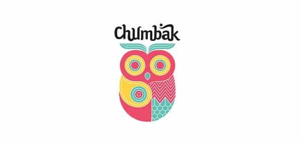
Chumbak is a leading home and lifestyle products selling brand. They provide fantastic designer, unique and colorful products with a cultural hint. In their logo, they have used a personalized font style where every letter is connected to each other and a big colorful owl. This owl is the main element of their logo; it is fun, attractive, full of different patterns. This is a beautiful representation of the nature of their core personality and brand identity. You can take this as an inspiration to add some unique object in your logo which can reflect the exact message and brand image without any direct association.
8. Alibaba:
Alibaba is a worldwide famous name as a procuring and supplying goods platform. The logo of this brand is making sure the universal identity of the brand. The global identity should be acceptable and understandable globally, and this logo is a perfect example of it. It has a single orange color with block letters and on the man’s face. The illustration of the face is smart, neat, and easy to follow. You can take this as an inspiration if you want to make a global identity logo and want to create it with safe elements.
9. FizzyGoblet:
Fizzygoblet is a women’s footwear brand. Talking about their logo, it is a beautiful design with minimalism and creativity. There is an icon of the cup, which has several indirect elements. There are letters f and g on both sides of the cup, and the image is coming out as a classy glass or victory cup. An excellent concept to showcase the luxury of the brand with minimum effort and classy black color. This can work as an inspiration for designers who are designing a logo for any luxurious or global brand. It can help you to place the meaning, message, and concept perfectly in your logo.
10. Read-Only Memory:
It is a UK-based brand that sells and publishes books related to video games. The concept of their business and website is very unique and attractive. And that is reflecting in their logo as well. This logo is not a straightforward or sophisticated one; they have used their brand name’s initials in an abstract icon shape related to their core business category. The letters are not easy to identify because of their design, and that is why this logo can be a great example to create a unique, strong, mysterious, and attention-required logo.
11. Port of Mokha:
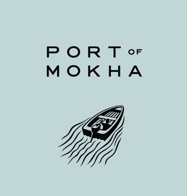
It is a website that sells coffee from Yemen. The story of this brand is quite exciting, and so is their logo. Here, this logo is a beautiful illustration of what this brand is about. A man leading this boat and leaving waves marks behind is an exact representation of what the owner of this brand has done. He actually went back to his land and started selling coffee from his own culture to the world. So it is an excellent example for those who want to tell some story or showcase the brand’s root and personality through their creative logo design.
12. Flipkart:
Flipkart is another famous name in the eCommerce industry. This giant eCommerce player’s logo is simple and easy to remember because they are targeting almost every person as their customer. They have used bright colors and causal font style; there is a yellow shopping bag illustration with the striking letter ‘f’. The use of initials and illustrations is an essential subject in logo designing. Because they help you create the brand positioning in your customer’s mind, you can add illustrations, objects, and initials to make an exciting logo according to your requirement and idea.
13. The Tie Hub:

This online portal is into the men’s accessories segment. The brand name and logo is representing the whole category with simple elements. In this logo, they have used their business title with a simple bow tie on the above line. They are not trying to make it healthy or bold they have kept it soft and pleasing with subtle fonts and a clear icon of a bow tie which shows the elegance and quality standards. This logo can be a great example if you want to create an impactful logo uniquely. It is not necessary to go for your industry’s basic standards; you can try some not-so-explored way and bring out something exceptional.
14. IGP:

It is an online gift store, and in their logo design, they have kept the name of their portal with a gift box illustration. The typography is straight, and the icon of a gift box is also complementing that. Emerging letters from gift box strands is a smooth and friendly way to showcase the brand name and what it’s about. You can take this as inspiration to make a logo look like a single stroke and to establish a seamless and comfortable brand image.
15. Miniso:
Miniso is a Japanese brand selling a various home, lifestyle, and beauty products through their offline and online stores. Their products are affordable, sustainable, and attractive, and that is why this brand’s logo is straight, adaptable, and casual. There is a bright red shopping bag with Miniso written on the center part. The smile icon, shopping bag design, and attractive red color provide a perfect design based on their product category and brand positioning. You can create something like this for your brand by keeping global behavior and brand category in mind.
16. Newegg:
Newegg is an international brand for online electronics shopping. The logo of this brand is beautiful and straightforward. There are three eggs, and the middle one is in a different color which is an excellent justified representation of the brand name. You can also see the blue spotlight effect behind the name placement. This logo is the right combination of traditional values and young concepts. You can take this as an inspiration for creating a unique and classic logo with modern adaptability. With this design, you can learn how easy and effective it is to reflect the logo design’s brand name without any extra elements.
Logo designing is a brilliant and creative subject for designers, and It is crucial and exciting at the same time. With a logo, you have certain limitations; you need to use minimum elements and place to create a strong brand representation. A wrong design of a logo can harm your brand and brand identity in no time. Because of the nature of the online market, any brand’s logo is excessively visible to the customers. That is why it must be clean, comfortable to understand, easy to remember, and conflict-free. We have included some awesome logo ideas here to help you with current trending themes, creative ideas, and smart concepts. You can take inspiration from these and make your unique logo or take some elements as well and use them as a combination for your concepts.
The post 16 Best Online Shopping Logos for Inspiration first appeared on Line25.Source: https://ift.tt/3bdEvYB

No comments:
Post a Comment