As important as small and light fonts are, strong and bold fonts are equally essential to a web designer. No designer can solely work with light fonts, as that limits their creativity and means of communication.
Bold fonts help to attract the viewer’s attention and draw them towards your product or service. From newspapers to magazines to websites, bold fonts are used in all modes of visual communication. To help you in that process, here are some of the best strong fonts that you, as a designer, should have.
1. Mohave
An all-caps typeface, this elegant font has a very smooth appearance. Giving your text a more creative feel, Mohave is available in 3 different weight sizes – regular, semi-bold, and bold. The availability of multiple weights makes it easy for you to creatively use just one font in different ways while creating a design. It also adds a synergy to your design which makes it more appealing.
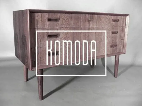
2. Komoda
This unique box-like font is a classic sans serif display font. What sets it apart from other fonts is its narrowness and elongated structure which efficiently embosses the text. It is a very compatible font that can go with a versatile range of designs and other fonts.
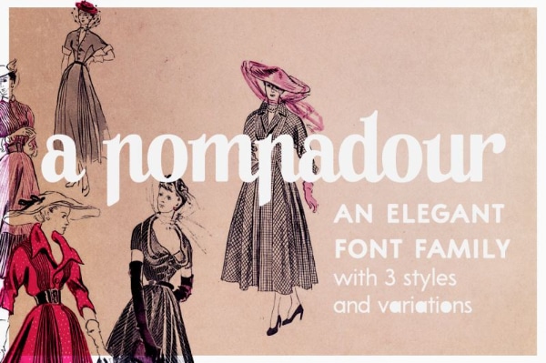
3. A Pompadour
A highly sophisticated and flamboyant font, A Pompadour has a retro feel which gives a distinct character to your text. It is available in two styles, along with letters, numbers, symbols, and accents. Adding this font to your design will give it a timeless quality that stands out from the rest. Be it a mere header text or magazine profile, A Pompadour is a font you need to spew your design with elegance.
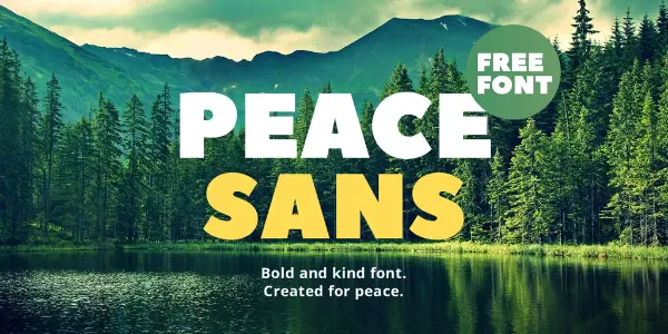
4. Peace Sans
Providing a peaceful personality to your text, Peace Sans is a very bold and kind font. It has beautiful curves and composition which makes it pleasing to the eyes, without compromising on the readability of the text. It makes your typography more peaceful and relaxing. It is available with a variant of different languages which drastically increases its applicability. You can use it for creating logos, posters, even for branding applications.
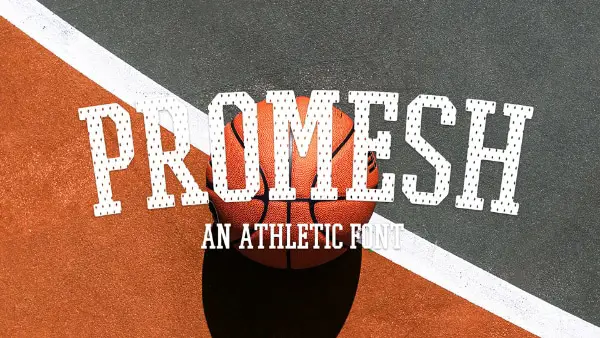
5. Promesh
Widely popular as an athletic font, Promesh is a strong, bold, and sharp serif font. It has a jersey-inspired mesh texture which is the unique quality of this font that gives it the athletic appeal. You can use this font for sports promotions, or athletic ads. And in case you don’t want your font to have too much of an athletic feel, Promesh also comes with a mesh-free version that will be perfect for you.
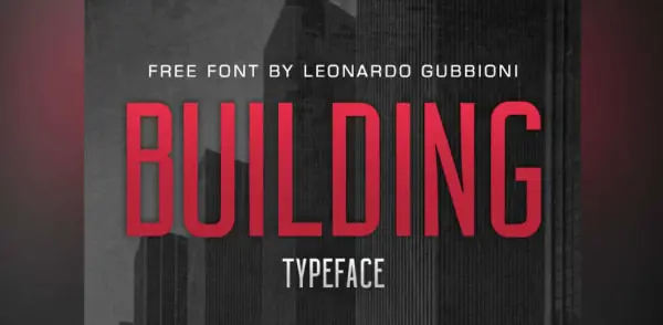
6. Building
A classic sans-serif font created by the famous Leonardo Gubbioni, Building has a bold appeal that can be ideal for a video title or a movie title. The font was inspired by the Art Deco movement which draws designs from the use of metals in architecture. The careful shadows on the border of the text give it depth which grabs the attention of your viewer.
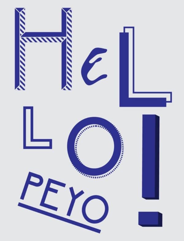
7. Peyo
Giving fun and playful spin to your text, Peyo is a sans serif typeface that has an exuberant personality. It has a geometric, yet rounded feel which gives a light-hearted vibe and an undertone of happiness. Available in a wide range of styles and interesting effects, Peyo can really grab the attention of your viewers.
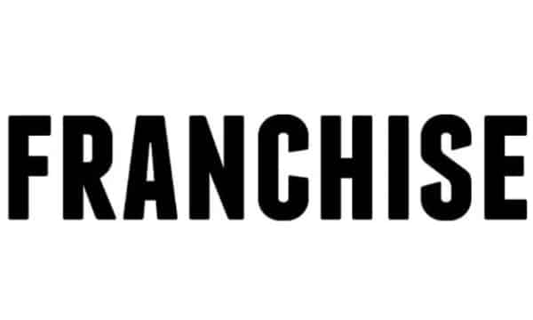
8. Franchise
Franchise is one of the cleanest, bold, and easy-to-read fonts that you will find. It gives off a certain sense of power and strength which makes it an ideal font for headlines and posters. With its subtle details, it grabs the attention of your target audience. The spacing between the letters is so thin, yet well designed. That it compresses the text, without making it feel cluttered and jumbled.
9. Gabo
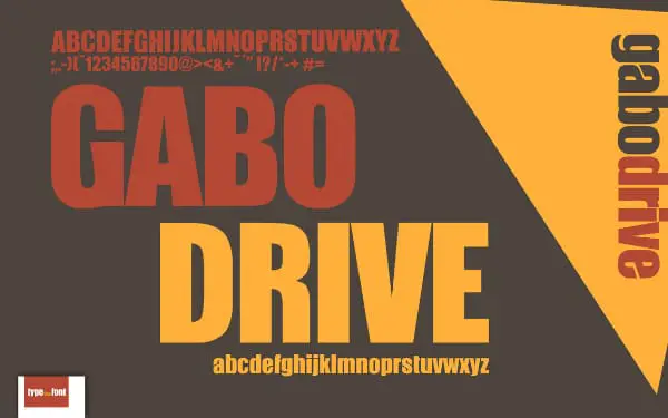
To give your text a spaghetti-western-movie feel, choose Gabo font. It is a thick sans serif typeface that has a bold and energetic appeal. It is the subtle nuances and graphic element of this font, as the inward tilt in ‘G’, which makes this font so attractive. From movie titles to headlines, this font has wide applicability. Along with a broad range of color options, its collection of fonts includes lowercase characters, uppercase characters, numbers, and symbols.
10. Knewave
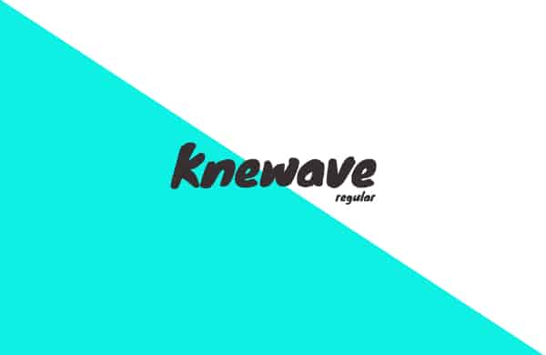
Giving your text a more ’graphite’ feel, Knewave is a bold typeface that mimics the quality of being painted. The real charm of this font is in its finesse and finely-designed brush strokes that make it seem so real and life-like. It has a wide range of applicability, as it can be used in web designing, social media creatives, and fun poster headlines. It gives off a carefree vibe which can be helpful in attracting millennials.
11. Paralines
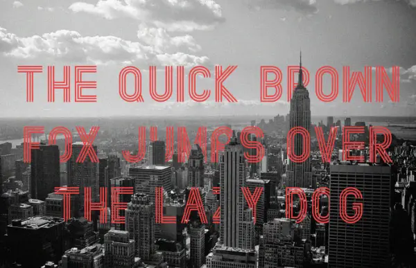
With a unique combination of retro and futuristic feel, Paralines is a unique font that should be in your arsenal. While the basic structure of the fonts suggests a retro style, the gaps and lines in the font give it a futuristic feel. It has a wide applicability range but mostly used in titles, web designs, posters, and social media designs. You can also use it for logos, brand names, banners, and other sorts of applications.
12. Cosmoball
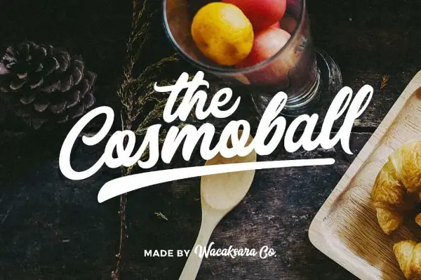
Cosmoball is a uniquely stylish and attractive font that emits flamboyance. You can amplify the appeal of your design and give it a contemporary look with this font. The best part about this design is how it balances the bold and fluid elements. While having bold and wide strokes, it still gives off a soft vibe with its curviness. You can use it for making logos, banners, billboards, and a wide range of other applications that need a dramatic feel.
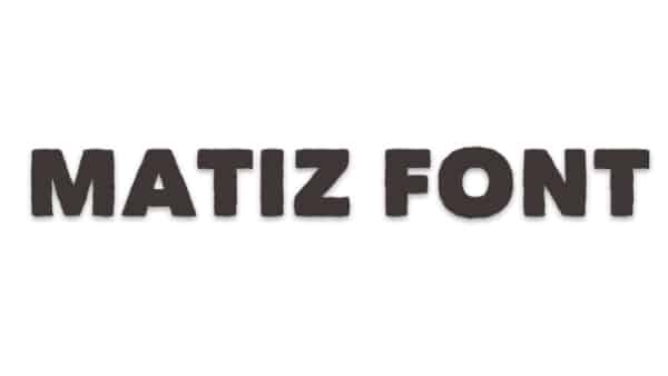
13. Matiz
This block-like font instantly grabs the attention of your target audience. Matiz is a sans serif font which has an interesting twist. The shacky lines on the border give it an edgy texture that looks as if it is handmade. It has a fresh vibe that is pleasing to the eye and gives a light-hearted feel. You can use this font to make posters, headlines, or even titles.
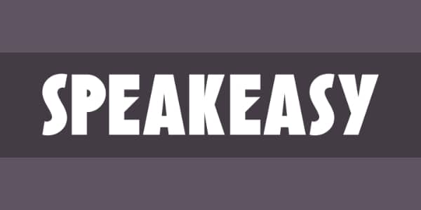
14. Speakeasy
A yet another Art-Deco-inspired font, Speakeasy has a comical feel to it. The sharp edges of ‘E’, the incredibly rounded ‘c’, and elongated ‘s’ give a fun element to the design. While maintaining the boldness of the letters, the dimensions of the fonts still make them seem very sleek and sharp. You can use this font for a myriad of things, like banners, logos, posters, and titles.
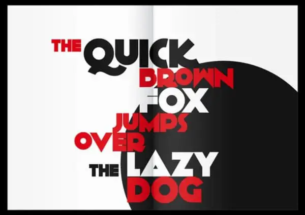
15. Kilogram
Inspired by Nick Curtis’ font Anagram, Kilogram is an energetic and complex font that carries a strong attitude. It is a sans serif font which has some interesting details and nuances. The sharp and curvy structure makes it very sophisticated, making it seem like a text out of James Bond film’s title. Along with that, there are a lot of variations within the font, like the triangular ‘A’s and long ‘Q’s, which give it a playful vibe. You can use it to make movie titles, headings, posters, or even logos.
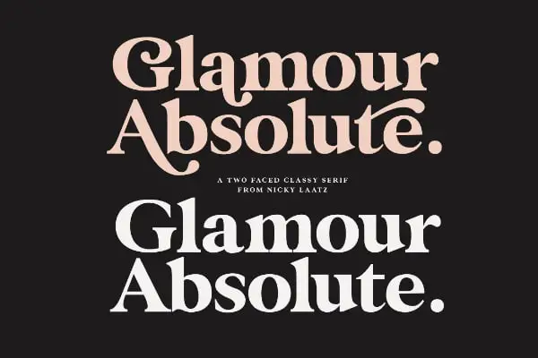
16. Glamor
As the name suggests, Glamor is a glamorous, modern, and elegant font that is ideal for fashion-related designs. Each letter and character on this font oozes of class and standard like none other. It has a wide variety of style options, including 24 different weights ranging from light to bold. You can use this font for fashion magazine covers, beauty industry products, branding, or any other application where you need to emphasize elegance.
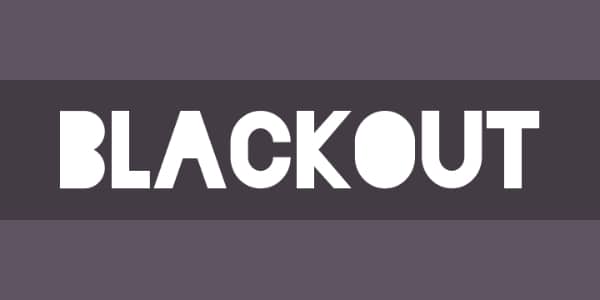
17. Blackout
Do you use to fill in the round boxes that are created by fonts when you were a kid? Well, Blackout gives you that same effect. It is an interesting font that is often used for newsletters and posters. It is a sans serif typeface where the holes you would normally find in letters, such as ‘B’, are filled out. This creates a somewhat unsettling and confrontational feel to the design which grabs your viewer’s attention. You can use it for signboards, logos, newspapers, headings, and a lot of other applications.
18. Sniglet
Sniglet is an adorable and child-like font that is very playful. Majorly used to kids related products and designs, this rounded typeface has a soft and tender visual appeal with colors that are soothing to your eyes. The carefree and playful appeal of this font makes it useful for writing carefree headlines. You can also use it to design children’s books, toys, brand logos, and a lot of other children-related applications.
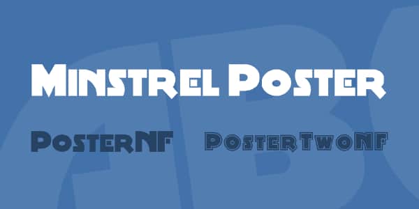
19. Minstrel Poster WHG
The unique curvature and simplicity of this font is the real deal. Giving your text a futuristic feel, the boldness of the Minstrel Poster’s letters and characters are very captivating and draws your viewer’s attention instantly. The block-like structure also gives it a serious vibe that is hard to neglect. This font will prove to be very useful when it comes to making graphic designs, web pages, social media posts, headlines, covers, and logos.
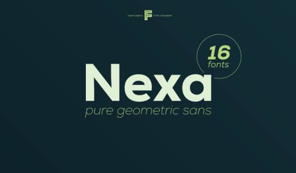
20. Nexa
Not to be mistaken for the car, Nexa is a simple, yet elegant sans serif font which is very commonly used by designers. It has a wide versatility range, with fonts available from light to bold. The light and bold versions complement each other, making them desirable for being used in the same design. The ideal applications of this design are logos, advertisements, headings, titles, and visual graphics.
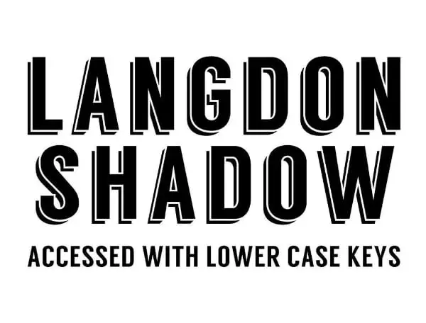
21. Langdon
Langdon is a bold and double-layered fond that organically brings a 3-D effect to your design. The real beauty behind this font is in its shadowing which gives a great amount of depth to your text. It provides the perfect amount of boldness without overpowering other elements on the design. You can ideally use this font for signages, billboards, logos, branding, titles, and lots of other applications.
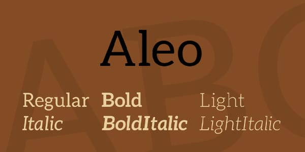
22. Aleo
One of the most important and useful slab serif typefaces, Aleo has a very delicate and pleasing nature. While the fonts are not too bold, the board and sharp edges of the characters are the real reason behind its visual appeal. The font has a soft roundedness, yet it emits a strong personality. They are very easy to read and give a soft tone to the design. You can use it for web designing, posters, apps, headlines, billboards, and a lot of other uses.
With so many attractive options and possible usages, your imagination is the limit as to what can you do with strong fonts. From giving your design a personality to attracting potential customers, strong fonts can help you deliver your message loudly and clearly.
However, choosing the right font for your design is a very tricky job, one which requires years of experience and dedicated research. So, try out all the fonts and pick out the ones that you like the most and then use them whenever they feel appropriate.
You can mix and match and collaborate different fonts to see how it looks.
We hope that this blog helped to answer your questions and gave you a deeper understanding of strong fonts.
The post 22 Free Strong Fonts All Designers Should Have first appeared on Line25.Source: https://ift.tt/3dAXygm


No comments:
Post a Comment