Even though people struggled to cope with isolation and an anti-social lifestyle in the past year, creative individuals never ceased to dazzle the world with their innovative ideas. From musicians to illustrators, everyone channelized their energy to create something new. And web designers were no different.
By exploring different mediums of visual communication and creating layouts that can enhance user experience, they created some exceptional designs which have the potential to become pioneering trends in the near future.
Here are some popular blog page design trends that will rule digital platforms in 2021.
1. Parallax Animation
Have you seen those web pages where a page’s background moves slower than the actual content in the front? Like when you are looking through the side mirrors of a moving car and the objects in the far distance seem stagnant, while the objects in front are moving rapidly. This effect, when converted into a digital form, is known as parallax animation.
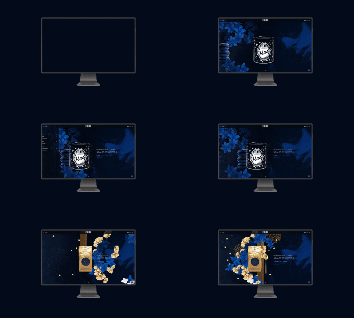
Parallax animation is one of the most popular web-based animation trends that focuses on separating the forefront and background elements of a page, creating a parallax effect. This gives a greater depth to the webpage, which makes the user experience more immersive and surreal. It also gives it a more theatrical feel which makes it more entertaining.
2. Retro Design & Fonts
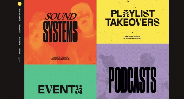
Popular old designs and lost trends have a tendency to make a comeback. Be it afro or pencil jeans, there always comes the point where trendsetters are inspired or influenced by an old trend that resurges over time. And the same goes for websites.
Many artistic web pages flash bold and bright fonts with loud designs that instantly catch our eye. Such designs are prominent with web pages that embody pop culture or artistic endeavors. One of the popular examples of it is Spotify.
3. Horizontal Scrolling
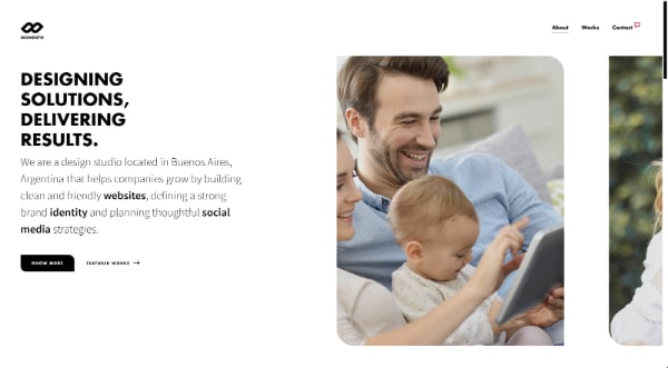
While industry pioneers have been skeptical regarding this feature, the verdict is out. People love it!
With the advent of touch screen technology, scrolling has become totally different gameplay, where people can quickly scroll up and down, left to right, even diagonally. Moreover, the design of smartphones and tablets has made it even more feasible for people to scroll sideways.
A well-designed horizontal scrolling layout helps you stand out from other web pages as viewers will remember having gone through a different and unique experience.
The most optimal usage of horizontal scrolling is when you use it to:
- Display images
- Display discrete sections on the web page
- Display information in a large visual space, like maps
- Display catalogs and brochures
4. 3D images and visuals
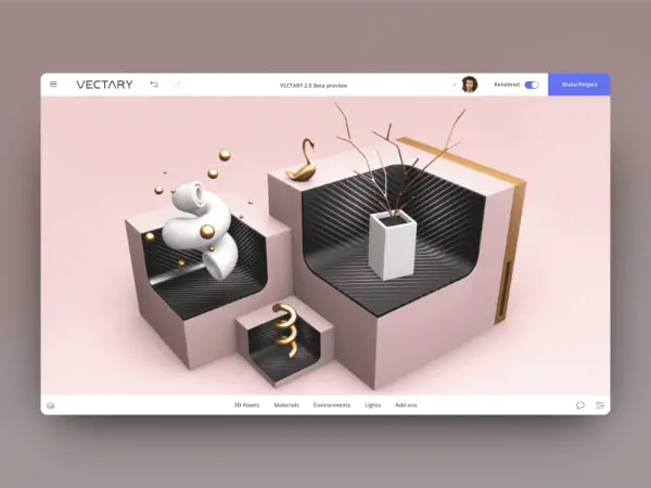
In this day and age, technology has advanced to a level that anything that you imagine can be transformed into a digital format. Even the most basic model of a smartphone will have the proper specs to support and play a 3D image. So, why not use it?
3D images leave a higher impact on the viewer and help to build a more complex persona of the web page. They give a sense of uniqueness and individuality to your webpage.
We have observed that various blog pages that have incorporated 3D visuals to their webpage either use it to explain the content with infographics or give gravity and better visual appeal to the content. It accentuates the impact of the message while increasing the recall value for the visitors.
It also enhances the user experience, and when it is paired with a minimalist design, you will definitely succeed in impressing your viewer.
5. Neumorphism
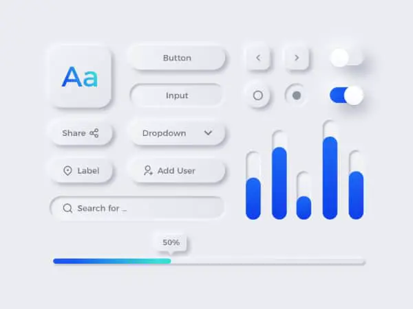
Giving a whole new dimension to minimalism, Neumorphism is an ingenious design style that digitally mimics physicality with the help of selective drop shadows and color contrasts. It creates an illusion that the icons or buttons on a web page are merged with the background but only distinguishable because they are protruding from the background.
This unique style is said to have evolved from skeuomorphism which was popular in the 2010s. It was heavily used by leading tech companies to design icons that seemed to pop out from the background and create an embossed effect.
In contrast to modern/material design upgrades, Neumorphism extrudes a particular aspect of the webpage from the background, which creates an illusion that it is ‘floating’. As intricate and aesthetically appealing as it seems, it is very easy to master this style. All you need to do is make sure that the light and dark shadows are appropriately positioned around the element which you want to emboss.
6. Abstract Art Graphics
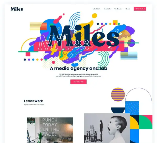
While in the past abstract art was only available in exhibition galleries, they have made their way into the digital realm with more and more designers incorporating themes and principles of abstract art. This is equally true for websites.
Abstract art can instantly give a dynamic visual appeal which makes your web page attractive and distinct. It gives individuality and a youthful vibe to the page, which has proven to be quite effective with millennials and Generation Z. It also builds a more expressive and energetic persona of the webpage, which stands out from the rest.
Not only does abstract art help to make a web page look more colorful, it also evokes emotions in the viewers. It helps to create a deeper connection with the subject which leaves a stronger impact and increases the recall value.
7. Incorporating Augmented Reality (AR) Experience
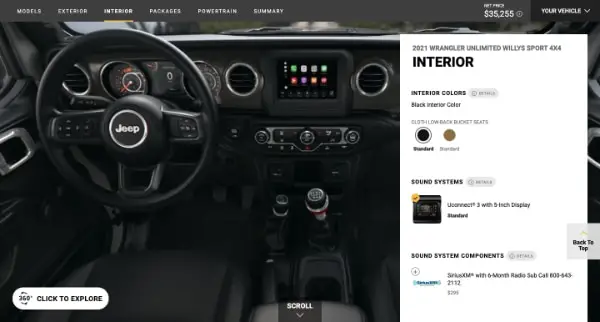
Augmented reality (AR) is one of the most advanced and thrilling innovations in digital and visual experiences. Augmented reality helps to create an artificial and digital version of the physical world. This can be achieved with the help of visual elements, sound, and various other sensory stimuli.
With AR, you can provide a more comprehensive experience to your viewers, which is way more interactive and explorable than traditional graphics or photographs. It also gives creative freedom to the viewer to change certain aspects of a product and try out different colors.
While the technology seems very advanced, it is comparatively very easy to incorporate AR in your webpage. You can quickly get access to simple plug-in tools for WordPress, which will help you upload 360-degree videos and other unique applications.
8. Comfortable and simple colors
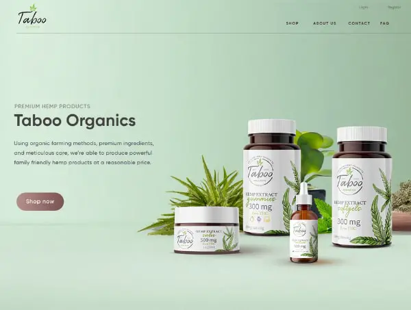
It is safe to say that a major demographic of people who are a part of this digitally-driven market spend most of their time in front of a computer. And watching at the computer screen for long hours can strain your eyes.
Fortunately, designers have started to take this aspect into consideration which has motivated them to incorporate more comfortable colors that are easier on the eyes. They incorporate a subtle and soft-colored palette which includes pastel colors and warm browns.
This also includes the ‘Dark Mode’ trend that can be observed on various apps like Twitter, 9gag, and many others. Furthermore, various companies have started to provide ‘Dark Mode’ as an in-built feature on their websites.
9. Scrolling Transformations
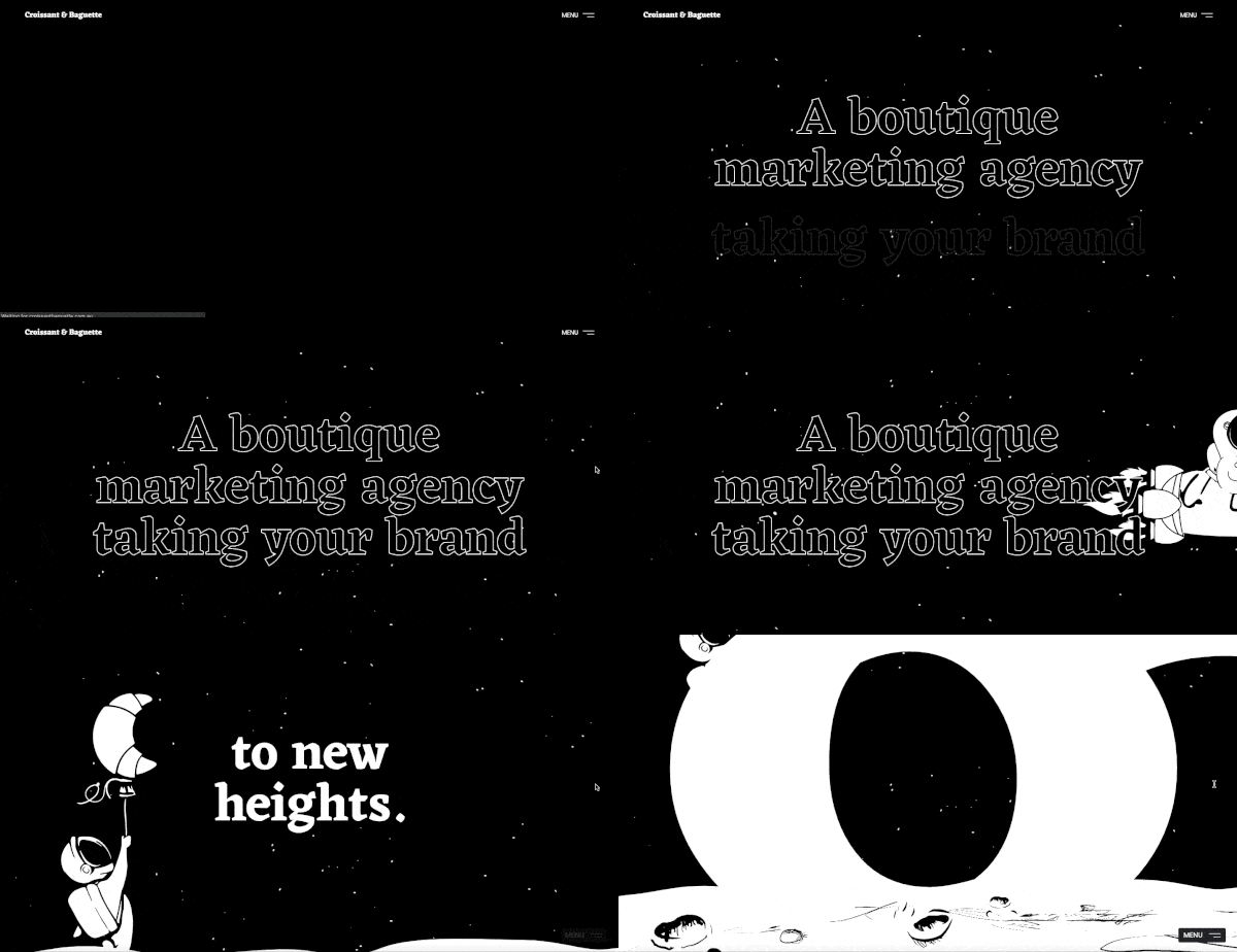
One of the most efficient methods to make your UI more interactive is by adding some creative scrolling transformations. This adds a certain degree of complexity to your web page, which exudes an intelligent design.
With this fantastic feature, you can not only curate a unique viewing experience for your visitors but also lend it a storytelling-like vibe. Moreover, if your web page is more interactive with the viewer, it increases their participation and engagement.
However, designers often tend to overdo it. To prevent that, here are a few points to keep in mind:
- Keep motion restricted to a small area
- Provide controls to users so that they can control the interaction
- Don’t derail from the crux of the message
10. Three-dimensional Colors
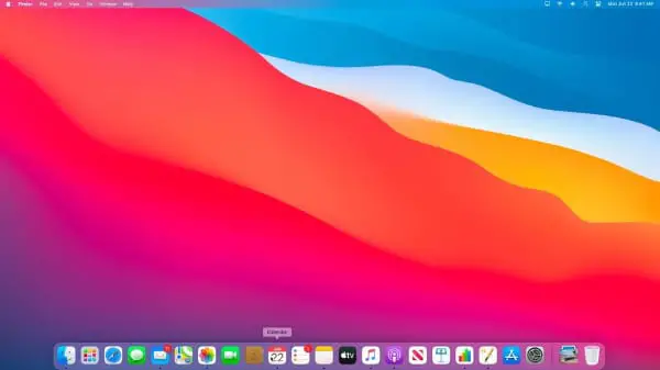
As discussed earlier, a lot of web developers are concentrating on soothing and calm colors. However, there is another trend of color schemes that are becoming popular.
With Apple launching its Big Sur OS, a new phenomenon of three-dimensional colors is sprouting amongst designers. Shifting from the transitions of gradients that create imperfect images, they are choosing three-dimensional colors that make your images seem more life-like and build a more aesthetic personality of the web page.
You can efficiently incorporate three-dimensional colors to your web page with the help of fine shading and proper color contrast. With these two aspects, you can create high-resolution images that give off a realistic vibe.
11. Multimedia Experience
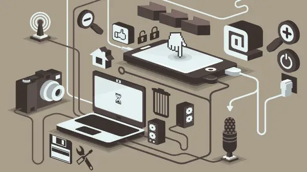
Providing your users with an eclectic multimedia experience is a great strategy. It makes your web page more dynamic and gives it a certain degree of gravitas. And with the latest advancements in technology, it has become exceptionally easy to incorporate these elements into your web page.
It also helps you cater to wider demography and increase your audience base. While some people understand better with visuals or videos, others prefer reading textual content at their leisure. Also, adding an option for audio files can be helpful for those who like to listen to podcasts on the go.
Giving your viewers a multimedia experience increases their interaction with the web page, which can lead to possible lead generation and sales.
12. Gaussian Blur
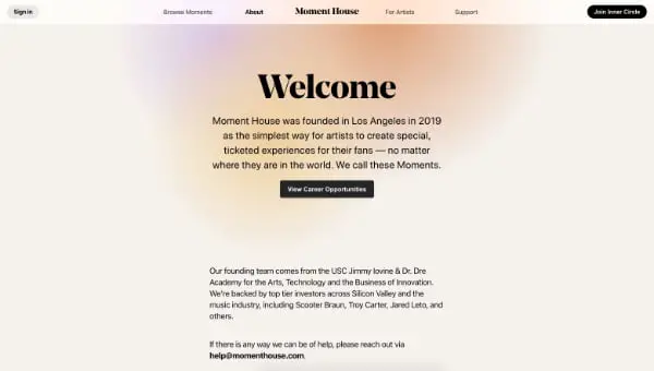
Gaussian Blur is one of the most aesthetically pleasing features that you can add to your web page layout or images. It gives a different texture to your web page, which decreases the brightness of your visuals while making it lighter on your eyes.
Named after the famous mathematician Carl Friedrich Gauss, the Gaussian Blur works on a mathematical function that gives more weight to the pixels that are nearest to the center than those which are far away. It replicates the effect that an image would get when it is layered with a translucent material, like vellum.
It is a kind of low-pass filter that softens the tone and contrast of the image. This expands your horizons of visual representation by helping you make a text or another particular element pop out.
You can customize the blurring effect according to your will. From giving depth to the field to highlighting your focal point, there are endless possibilities and applications of this feature.
13. Custom Made Cursors
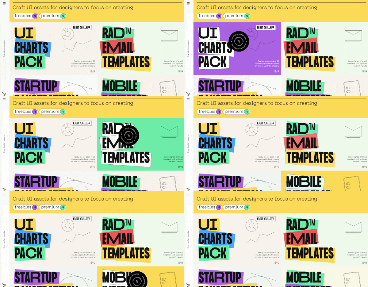
Customized cursors have also gained a lot of popularity last year. More and more web pages have started to incorporate unique images and functions into their cursors, in contrast to the dull and plain old arrows.
They can also add a lot of functionalities to your web page. While making your interactions more personalized and alluring, you can also add some helpful features like a magnifying glass, which can instantly zoom in or zoom out images, or a hand that can help you grab the image and move it as per your will.
Having a customized cursor also gives your web page an enticing personality. It emits individuality and makes the user interface a lot more fun.
While it might be overwhelming to process all these web trends at once, this just illustrates the potential and creative freedom that comes with today’s advanced technology and creative conceptualization.
You can calibrate the web page as per your imagination and add multiple features that can improve the browsing experience for your users. And with happier users, you can increase your digital traffic, as well as sales.
To make the most appealing and attractive web page, you should cleverly use these trends to your advantage and create a platform that appeals to a versatile audience. From integrating a multimedia experience to adding alluring visual effects, you can harness these trends and create a web page that truly signifies and advocates for your company.
The post Blog Page Design Trends of 2021 first appeared on Line25.Source: https://ift.tt/2RvEfwv

No comments:
Post a Comment