The minimalist design allows a designer to find many stunning and unique examples. It includes organizing and presenting social media content, creating a landing page or logo.
How does minimal design appear?
Well, a minimal design is simple and classic. But, as with all designs – it is the same process that includes problems to solve.
Minimalist design not only looks good but there’s more. Minimalist designers see simple, sleek, and sexy, where we see complicated, cold, and boring. We see this type of design everywhere today. It is around us.
In this article, we will discuss some of the specific minimalist design principles essential to follow:
Clean Lines
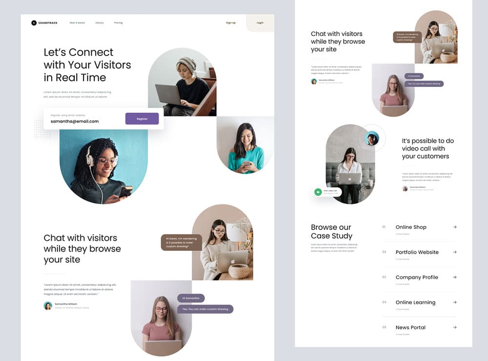
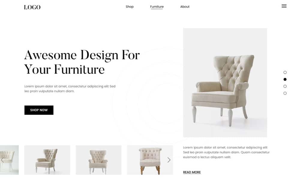
Clean and simple design is fundamental in a minimalist website.
Therefore, there are open design layouts that feature clean and straightforward lines. It is the reason why a palette of white and black colors is often typical in minimalist design. Clean lines look professional, but they are far from easy to create.
Images
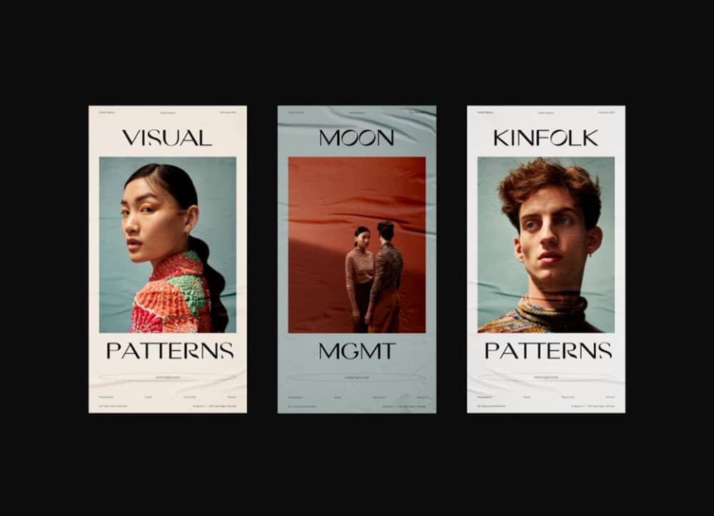
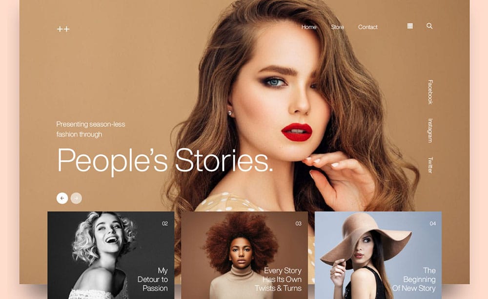
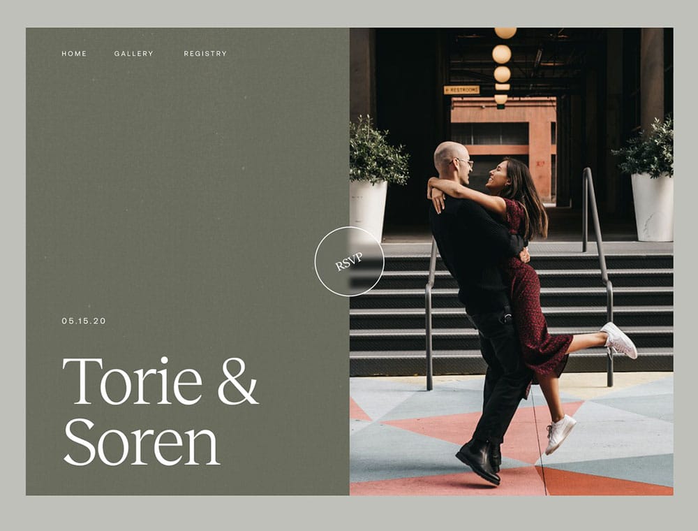
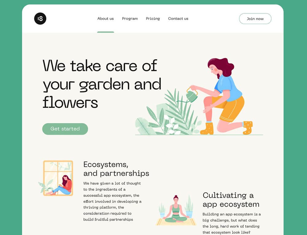
Many designers think that minimalistic design doesn’t need images. With images, the design can still be sleek and have a minimal copy and inform and present to users everything they want to know. When choosing a minimalistic graphic design, it’s not removing every illustrative element. It is about choosing and placing images carefully and strategically.
Why?
Because they are a great way of communication.
Color with Purpose
A minimalist web designer keeps a website simple with just a few colors. When using colors, a designer should choose them intentionally for users.
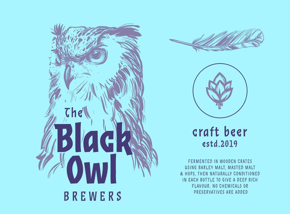
It doesn’t matter if a designer wants to impact users to feel something or evoke; colors are essential. Plus, colors are brand reflection and the point is to build a strong brand with big and bold colors.
Visual Hierarchy
Make these questions clear to your user: Where to start from? What info is significant? What’s the main point? Simplify user experience and create contrast while using design elements such as color, typography, composition, and contrast. It’s foreseen that many businesses want a minimalistic web design, and it’s because minimalist designs are user-friendly and appealing.
Simple Navigation
Simple navigation is crucial. It allows users to get what they are searching for quite an easy way and know what they will get. The navigation serves as a guide for the visitors and brings a sense of organization and structure. Navigation buttons that are important for minimalism make a tremendous user experience. Users want it simple and easy to use.
Keep It Simple
The monochromatic color palette doesn’t have many color variations as every color has a limitless number of shades, tints, and tones. It only uses variations needed for different design elements.
For example, a text color, background color, and an accent color. The quote “less is more” appears quite simple to reach, but many more elements are considered in this long process. Simple things give the look of simplicity, but the process is much more complicated than it looks.
Art domination
Even if it may seem against minimalist design rules, choosing a single supersized piece of art in a room and letting it dominate is modern. Adding color to a masculine space with splendid feminine art and contemporary furniture around it will showcase creativity while keeping it simple. The same is valid on websites.
Let it shine
The main idea of a minimal design is that the content gets the focus. Avoid drowning your content with design elements. Give special attention to your content, and be ready to not go full throttle on designing. Nevertheless, a designer should avoid too much of anything.
Prints, patterns, and textures
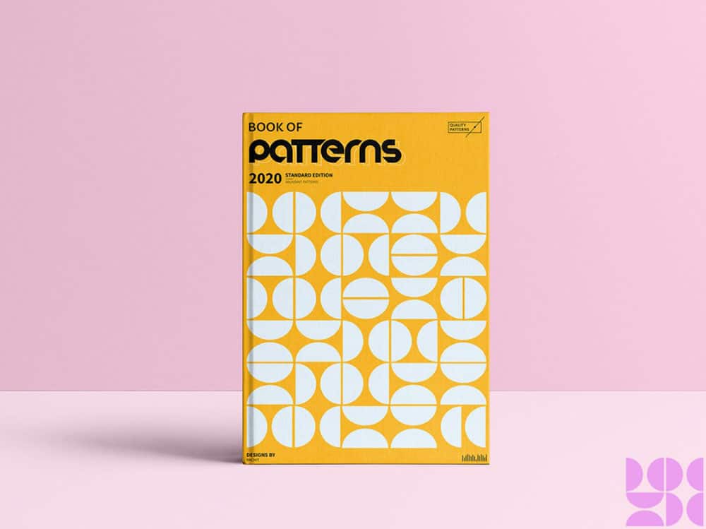
Designers often use the monogramming style. Still, people frequently confuse the use of monochrome designs. They recognize monochromes in black & white patterns only. In reality, it’s about color tones graduation to achieve the texture appearance. It can keep the design clean and simple and bring a modernistic style.
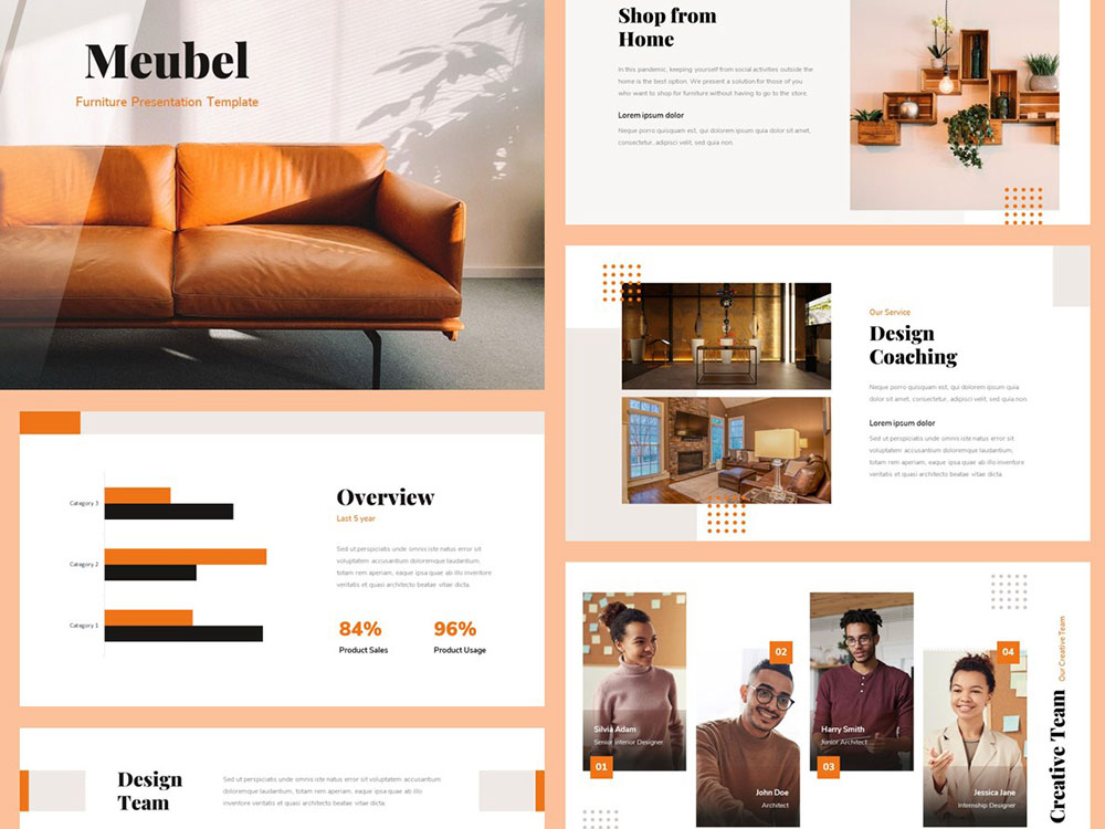
Minimalism in interior design
A minimalist room is chaos-free. Color schemes in minimalism have light or neutral colors and textures like pillows, blankets, and rugs are in the same tone. A minimalist interior isn’t empty of color. There are standout pieces with an added explosion of colors to create a crucial point. The open space, thus, is vital, so quality should be a priority. This is similar to how white space operates in web design.
Beautiful Contrast
Did you know that using a white background is really popular among designers in minimalism? Well, It’s perfect for contrast.
Plus, white and black backgrounds in minimalistic design are often complemented by colorful elements.
Texture and Surface
It is crucial to use a limited number of zero patterns. The use of varying textures creates a great visual flow and more interest in the design by users.
In both web design and interior design, designers can use different types of textures.
Typography
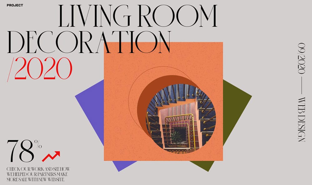
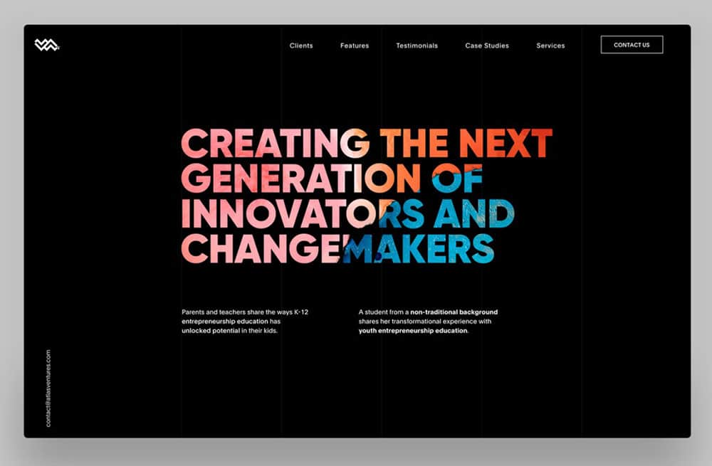
Sites cannot exist without words. Sharp, beautiful, and custom typography can be essential in a minimalistic design. Big and powerful typography is crucial in minimalist design. The choice of fonts, colors, positioning, and textures, work to provoke users’ emotions, build a unique brand and evoke a response. The typography tells the story of the design, both visually and textually.
The crucial for a minimalist design is to be clean and straightforward. People are bored with endless content on the walls without any breaks. They are more interested in being visually drawn in through an appealing and sleek design. Minimalism’s art design appears everywhere, from home design to a lifestyle. This art means many benefits, more freedom, and less stress.
The post A Quick Guide to Minimalist Design You Need to Follow first appeared on Web Design Dev.
via https://ift.tt/3voNHAw



No comments:
Post a Comment