You know what’s been grabbing my attention lately? The Iron Man font! I’m telling you, it’s like a marvelous blend of innovation and style. I can’t wait to dive into the world of this font with you!
Picture this:
- Iron Man? Totally iconic!
- Typography: Our creative lifeblood!
So, let’s outline what we’ll be tackling in this amazing article:
- The origin of the Iron Man font
- The distinctive features that make it a design superhero
- Examples of the font in action, saving the day
- How to suit up your designs with the Iron Man font
Are you ready to embark on a thrilling typography adventure inspired by one of the most legendary superheroes of all time?
About Iron Man
The fictional superhero Iron Man first appeared in the American comic book series Marvel Comics. It was authored by editor-writer Stan Lee, screenwriter Larry Lieber, as well as Don Heck and Jack Kirby. He made his debut in Tales of Suspense in Issue 39, which was published in March 1963. In a May 1968 magazine, the superhero was given the name Iron Man.
A fictional superhero movie called Iron Man was made in the US, and its plot was adapted from Marvel Comics. The movie had its world debut in Sydney in 2008, when it made a whopping 600 million dollars for the producer.
Nearly everyone is familiar with this film, and every country displays its marketing poster. Because of this, many type designers consider more than just the poster while creating their work.
The Iron Man Logo: Meaning And History
![]()
A straightforward yet memorable superhero insignia is the Iron Man logo. Although the Iron Man emblem is used differently in the Marvel Cinematic Universe and Marvel Comics, they both have a distinctive element. While the logo for the Marvel Cinematic Universe is an outline of the arc reactor on Iron Man’s suit, the insignia for Marvel Comics is a thick outline of Iron Man’s helmet.
1968 – 1969:

The capitalized nameplate on the Iron Man comic book’s poster was visible in the first issue. It was written in large, dark red characters with black outlines. The caption “the invincible,” which was likewise in full capital letters, appeared above the text.
1969 – 1984:

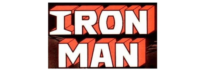
The Iron Man superhero’s emblem was changed by the 1964 design update, but it was carried over for 15 years. Three-dimensional red and blue letters were used, with the fronts being red and black and the sides being all blue. The additional word mark “The Invincible” was presented in the same font as the earlier design and was written in light blue.
1984 – 1985:

The Iron Man image was added to the left of the wordmark in 1984, and the logo’s color scheme was altered to white, yellow, and red. The “The Invincible” portion of the insignia was entirely erased, and the word “Marvel” was positioned above the image in a bespoke black typeface.
1985 – 1987:

They then made another alteration to the lettering style. This time, it had a fresh font. Each symbol was presented from a slope and using volumetric capitals. Compared to the earlier logotypes, the letterforms were larger and narrower. They had a black rectangle with several strokes as their background.
1988 – 1996:

The Iron Man logo redesign of 1988 updated the color scheme of the emblem to blue and yellow, with its big letters in a chunky white outline placed against a black backdrop. Each letter’s white outline and dots stood in for the “Iron” in Iron Man, giving the sign a distinctive and powerful appearance.
1997 – 2002:

In 1997, the wordmark “The Invincible” was added back to Iron Man’s logo. The words “Iron Man” were written in rounded yellow letters, and “The Invincible” was added above it in smooth blue. The two visual identity elements were placed against a calming gradient background that was green.
2002 – 2009:

The bespoke bold text was placed in a gradient red outline on a white background in the 2002 makeover of the logo. Light yellow lines and dots were used to accent the light yellow letter bodies.
2009 – 2013:

Bold, shining silver letters with a black outline and gradient shading made up the Iron Man inscription, which seemed like a genuine metallic insignia. The lettering had a soft grey shadow that added some volume and made the sign appear airy and three-dimensional.
2013 – 2014:

The wordmark is shown in the latter logotype, which features another change. Each letter in the unique typeface is a bold capital. The letter “o” resembles an octagon with what appears to be a spreading fire inside of it. The lower tip of the letter “m” extends beyond the boundaries of the inscription due to the symbol’s inclined diagonal bars and sharper central bit.
2014 – today:

In 2014, the Iron Man logo’s design underwent another update, this time using the arc reactor in the character’s chest as the “o” in “Iron.” Many components from earlier versions, such as the geometric typography and the red and yellow color scheme, were still present in the image. A sharper tip in the “M” and intriguing shape in the letters “R” and “A” were two other striking features of this typeface.
The Iron Man Font
Although there are many fonts that look somewhat similar, the typeface used in the Iron Man logo looks to be a bespoke creation.

The most recent iterations of the Iron Man emblem are typically displayed in a strong sans-serif font. It resembles the “Stark” sans serif font in terms of design. It was created by the author Neale Davidson and released on April 19, 2012, through his Pixel Sagas design firm. This font family has six different styles: Regular, Italic, Bold, Outline, and Bold Italic. It should be noted that this typeface is only offered in capital letters. The font’s robust and blocky style serves as a perfect metaphor for the character’s assurance and tenacity.
You can notice how closely the Iron Man movie poster’s font resembles the Stark font. The Stark font is a well-known Sans Serif typeface that was created by the book’s creator, Pixel Sagas.
This typeface works great for elegant headlines, haute couture designs, and the fashion industry. Both Latin and Cyrillic characters are supported by the Stark typeface.
Fonts Similar To Iron Man Font
Avengero font by Gene Buban

Gene Buban created the techno-science-fiction font Avengero. The font can be used for free for private purposes. The font Avengero has 71 distinct glyphs and 72 defined characters.
Avengeance font by the Fontry

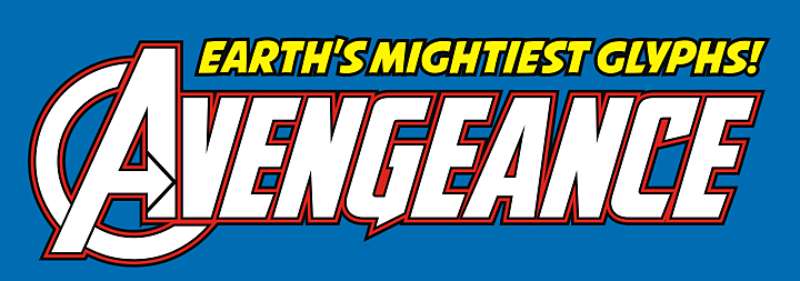
The Fontry released the Avengeance Font Family, which was created by Michael Gene Adkins. There are four types and family package options in Avengeance.
American Captain font by the Fontry

The font family known as American Captain was created and released by The Fontry. There are 12 types and family package options in American Captain. With the exception of a few countries, the United States has a strong presence across the Middle East and North Africa. Small capitals, fractions, style sets, glyph substitutions, and other capabilities are available in OpenType.
Heroes Assemble Dingbats font by Iconian Fonts

Iconian Fonts created the dingbats, a TV-movie typeface known as Heroes Assemble Dingbats or Avengers Characters. The font can be used for free for private purposes. The Heroes Assemble Dingbats font has 158 distinct glyphs and 161 defined characters.
IRON MAN OF WAR font by the Fontry

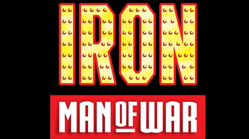
The elegant, eclectic font Iron Man Of War 001 was created by Fontry. The font can be used for free for private purposes. The Iron Man Of War 001 typeface has 212 distinct glyphs and 389 defined characters.
CGF Arch Reactor font by Chris Garrett

Chris Garrett developed the free font Cgf Arch Reactor for usage in publications. The fancy typeface Cgf Arch Reactor is compatible with all platforms, including PC, Mac, Linux, iOS, and Android. There are 1 styles for this typeface (Cgf Arch Reactor).
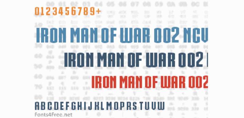
IRON MAN OF WAR 2 NCV font by the Fontry

Iron Man Of War 002 NCV, sometimes referred to as the Iron Man typeface is a straightforward, eclectic font created by Fontry. The font can be used for free for private purposes. The Iron Man Of War 002 NCV typeface has 213 unique glyphs in addition to 393 defined characters.
FAQs about the Iron Man font
What is the Iron Man font?
The Iron Man movies and comics both feature a font called Iron Man. This futuristic and bold font was chosen to complement the character’s high-tech outfit and accessories.
Where can I download the Iron Man font?
Since Marvel Comics owns the rights to the Iron Man font and will not allow anyone else to use it, you won’t be able to download it.
However, there are a number of similar typefaces that can be used as substitutes and are either freely accessible or can be purchased.
Is the Iron Man font free to use?
The Iron Man font is not public domain because it is a Marvel Comics property. The usage of this font calls for a license and approval from the manufacturer.
Can I use the Iron Man font for commercial projects?
Marvel Comics’ Iron Man font is protected property and requires a license in order to be used commercially. Before putting any font to commercial use, be sure you understand the license requirements.
What are the characteristics of the Iron Man font?
The Iron Man typeface has a sleek and contemporary look with a bold, futuristic style. The typeface, which is adaptable to a wide range of creative applications, was inspired by the hero’s futuristic getup.
How can I install the Iron Man font on my computer?
Since the Iron Man font is Marvel Comics’ property, you cannot download it and use it on your computer.
What file types are available for the Iron Man font?
Since the Iron Man font is a Marvel Comics property, it can only be downloaded in one specific file format. The company’s preferred format is the only one accepted.
Does the Iron Man font support multilingual characters?
Since it was created with English text in mind, the Iron Man typeface does not incorporate international characters.
Are there any similar fonts to the Iron Man font?
The Titan One font, for example, has a similarly bold and futuristic appearance to the Iron Man font and can be used as a suitable substitute.
Can the Iron Man font be used for merchandise or branding purposes?
Marvel Comics’ trademark and license terms and conditions apply to any commercial usage of the Iron Man typeface. Before putting any font to commercial use, be sure you understand the license requirements.
Ending thoughts on the Iron Man font
The success of the movie is influenced by a variety of elements. Good scripts, competent direction, unique logos, and catchy slogans all help to give viewers an engaging experience. Additionally, the font used for the Iron Man movie poster has a lot of personality and character. The fonts used by well-known, large brands attract the attention of many designers. Therefore, the font used on the movie poster is no different.
This well-liked font is ideal for creating logos, book covers, photographs, watermarks, banners for special occasions, movie titles, and many other uses. Rational thought is also present. It would also be a good idea to use it for creating website content or video games.
If you enjoyed reading this article about Iron Man font, you should read these as well:
- These are the coolest superhero fonts out there
- Interesting Official and Rejected Iron Man Logo Designs
- Awesome movie fonts to create posters and movie titles
The post What’s The Iron Man Font And Can You Use It In Your Designs? appeared first on Design Your Way.
Source: https://ift.tt/Q2qZhp3

No comments:
Post a Comment