I only recently heard about the term “Flat design”, but I’ve definitely noticed lots of website and interface designs springing up with this design style. Flat design is a label the community has adopted for designs leaving behind drop shadows, subtle textures and gradients in favour of solid colours, clean layouts and sharp typography, somewhat similar to the design of Windows 8 and the Metro UI. This post showcases 20 great website designs that all exhibit popular traits of the flat design trend.
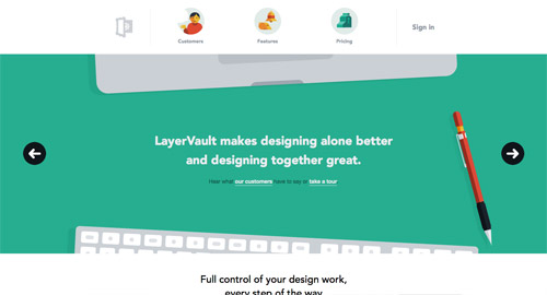
LayerVault
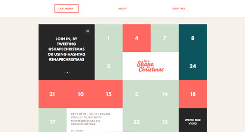
It’s a Shape Christmas
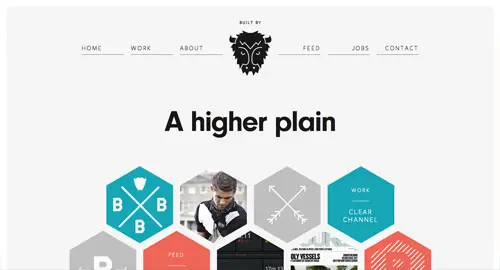
Buffalo
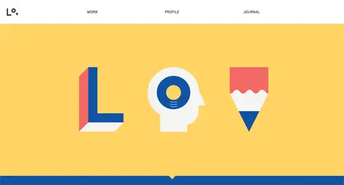
Lorenzo Verzini
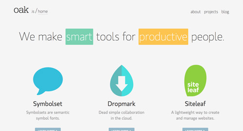
oak.is
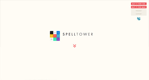
SpellTower
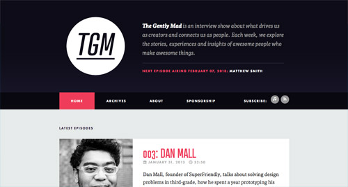
The Gently Mad Podcast
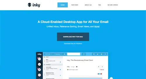
Inky
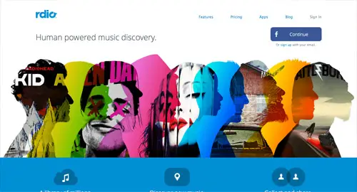
Rdio
Data Driven London
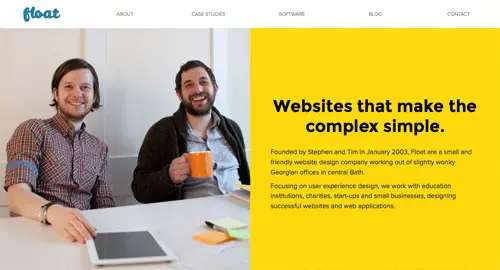
Float
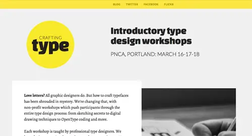
Crafting Type
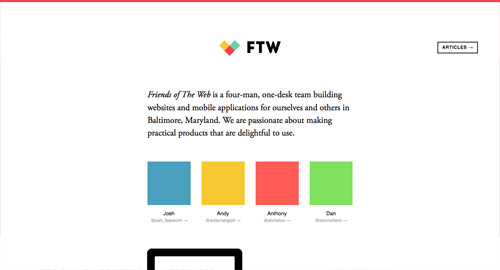
Friends of the Web
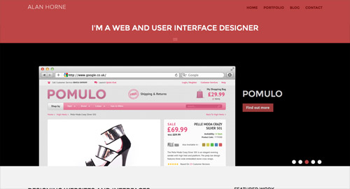
Alan Horne
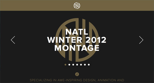
NATL
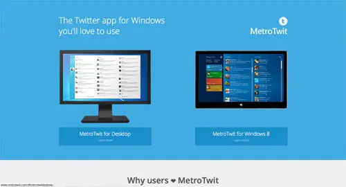
MetroTwit
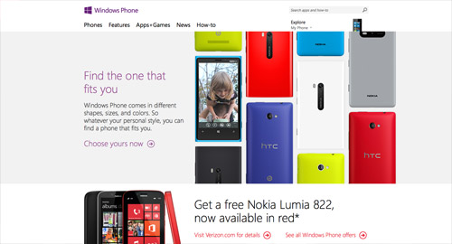
Windows Phone
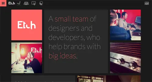
Etch
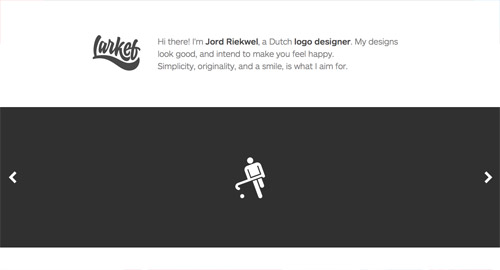
Larkef
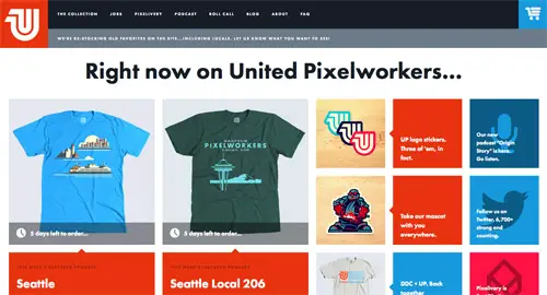
United Pixelworkers
Source: http://line25.com/articles/20-great-examples-of-the-flat-trend-in-web-design


No comments:
Post a Comment