With all the progressions of CSS and CSS3 over recent years we’ve reached a point where many of the old coding techniques that involved background images can now be created entirely with CSS. In this tutorial we’ll look at creating a series of breadcrumb navigation links in a flat design style without the need for the previously popular “sliding doors background image” method.
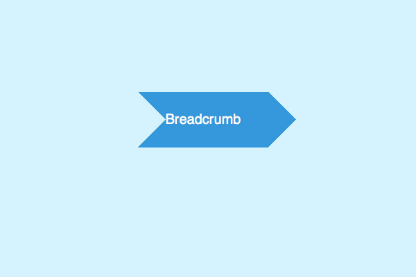
The breadcrumb links we’ll be creating are styled with chevron shapes to support the idea of drilled down content. Previously a background PNG image would be used to create this chevron shape, but with the help of clever border techniques the same effect can be created purely with CSS.
View the CSS breadcrumb links demo
<div id="crumbs">
        <ul>
                <li><a href="#">Breadcrumb</a></li>
        </ul>
</div>
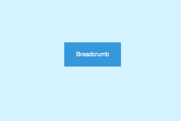
We’ll begin by quickly fleshing out the breadcrumb navigation links as an unordered list. Each breadcrumb link will appear as an <li> with a nested anchor element.
#crumbs ul li a {
        display: block;
        float: left;
        height: 50px;
        background: #3498db;
        text-align: center;
        padding: 30px 40px 0 40px;
        position: relative;
        margin: 0 10px 0 0;

        font-size: 20px;
        text-decoration: none;
        color: #fff;
}
The initial CSS code styles up each list item anchor as a neat blue rectangle. The text is positioned centrally within the space and equal padding is added to either side. In order to position elements absolutely later, position: relative; is added so those absolutely positioned objects will display relative to this parent element.
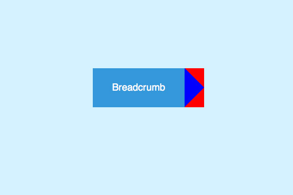
#crumbs ul li a:after {
        content: "";
        border-top: 40px solid red;
        border-bottom: 40px solid red;
        border-left: 40px solid blue;
        position: absolute; right: -40px; top: 0;
}
We’ll now recreate the chevron effect in CSS that would previously only be achievable with a background image. Use the :after selector to create an extra element that can be styled up individually. The triangle shape is generated through the use of various CSS borders, so as you can see in the initial demo a single blue triangle can be created by applying top and bottom borders to intersect the overlap. These are currently coloured red for demonstration, but making these transparent will produce a single blue triangle. This border effect is then moved into place through absolute positioning.
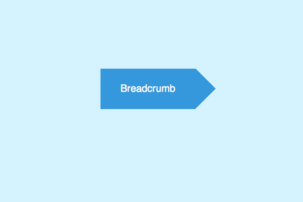
border-top: 40px solid transparent;
border-bottom: 40px solid transparent;
border-left: 40px solid #3498db;
The border effect with the correct colour values will produce the desired triangle which gives the breadcrumb link the popular chevron shape.
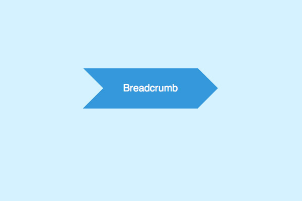
#crumbs ul li a:before {
        content: "";
        border-top: 40px solid transparent;
        border-bottom: 40px solid transparent;
        border-left: 40px solid #d4f2ff;
        position: absolute; left: 0; top: 0;
}
Using the same principle another triangle shape can be applied to the left of the breadcrumb link. This time the border colour is set the same as the page background to disguise parts of the blue link background colour.
padding: 30px 40px 0 80px;
This additional triangle before the link affects the appearance of the text, but a simple padding adjustment will quickly rectify its appearance.
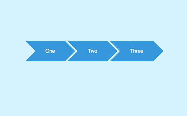
<div id="crumbs">
        <ul>
                <li><a href="#1">One</a></li>
                <li><a href="#2">Two</a></li>
                <li><a href="#3">Three</a></li>
                <li><a href="#4">Four</a></li>
                <li><a href="#5">Five</a></li>
        </ul>
</div>
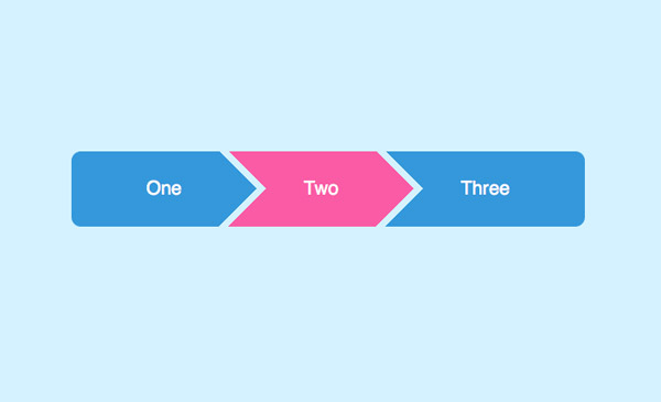
As more links are added to the HTML the series of breadcrumbs increases, each separated by the cool chevron shape thanks to the CSS border triangle effect and a touch of right margin.
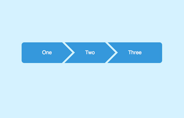
#crumbs ul li:first-child a {
        border-top-left-radius: 10px; border-bottom-left-radius: 10px;
}
#crumbs ul li:first-child a:before {
        display: none;
}

#crumbs ul li:last-child a {
        padding-right: 80px;
        border-top-right-radius: 10px; border-bottom-right-radius: 10px;
}
#crumbs ul li:last-child a:after {
        display: none;
}
The full breadcrumb navigation list can be further styled by removing the triangle effect on the first and last items with the help of the :first-child and :last-child selectors, then given subtle rounded corners with border-radius.
#crumbs ul li a:hover {
        background: #fa5ba5;
}
        #crumbs ul li a:hover:after {
                border-left-color: #fa5ba5;
        }
All that’s left is to apply a hover effect to the links. Don’t forget to change the border-left-color on the hover state of the triangle effect so the whole breadcrumb link changes colour.
View the CSS breadcrumb links demo
Source: http://line25.com/tutorials/how-to-create-flat-style-breadcrumb-links-with-css


No comments:
Post a Comment