In this article, you will find a selection of free thin fonts that you can download and use in your projects.
When you’re creating a design, you can portray a specific mood or make a statement with the design elements you choose, as well as the fonts you use with them.
When you’re going with thin modern fonts, your design gets a more inviting vibe, and your viewers are lured into the message you’re trying to sell.
You do, however, have millions of thin fonts, from thin serif fonts, to thin sans-serif fonts, and choosing the best thin fonts for your specific project can be a bit of a problem.
You will notice a rise in the use of thin fonts nowadays, and many designers would agree that using a thin font in their project will complement ideally their idea.
What are the light fonts, or thin fonts we’re discussing?
The basic answer to “what is a light font” would be a font that is lighter than the Roman version of the typeface, whereas the Roman version is plain, book or normal.
Seeing as this is a fairly big spectrum, a light font is considered one that uses less weight than a normal font would, and if used incorrectly, this makes such a font hard to read. However, when used correctly, it can be a very good thing. The potential to be misused scares away many of the designers who opt not to use them.
Thin fonts examples
OPEN SANS CONDENSED

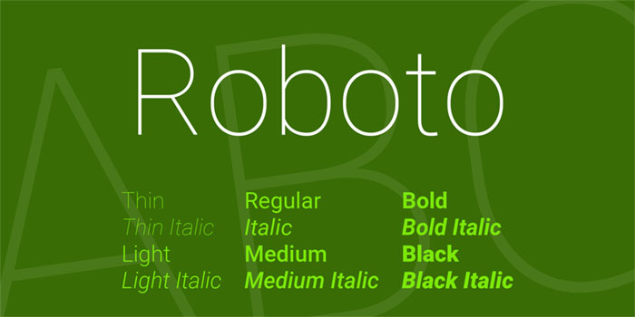
Roboto Font Family
EXO

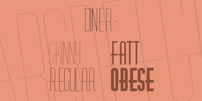
Diner- Font Family
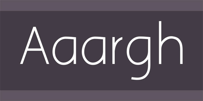
Aaargh
Aspergit Font Family
DISCO

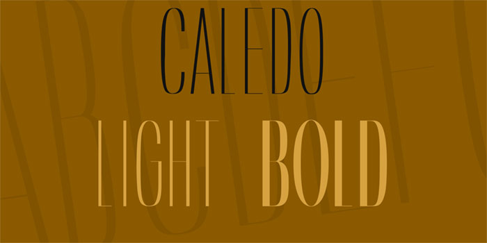
Caledo Font Family
ARSENAL

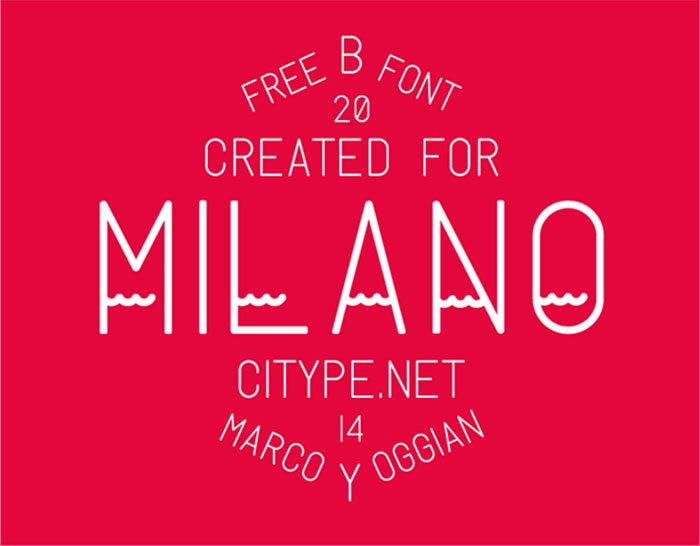
Milano
AFTA SANS

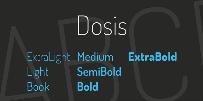
Dosis Font Family
EXISTENCE LIGHT

Quarterly BRK Font Family

CICLE

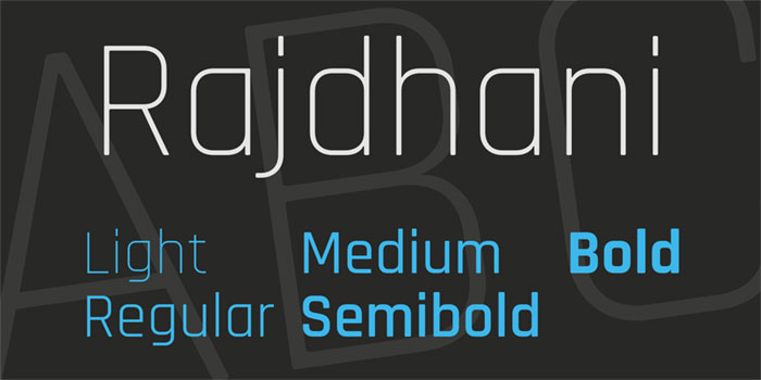
Rajdhani Font Family
RALEWAY

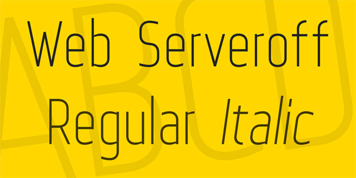
Web Serveroff Font Family
LANE

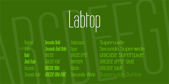
Labtop Font Family
PRINT CLEARLY

Drugs Font

QUICKSAND

Tartlers End Font
WALKWAY

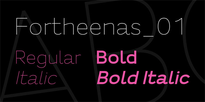
Fortheenas_01 Font Family
CAVIAR DREAMS

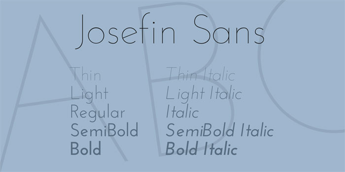
Josefin Sans Font Family
SOFIA PRO

Titillium Web Font Family
What is considered good use?
A light font, or thin font, can be of great benefit, and you can get free thin fonts on the internet, there are plenty. When they’re used properly, they give you a sharp, clear visual, but if only one thing is off, the text is pretty difficult to read, making it even worse for potential viewers who may have eyesight issues.
Pros of using light fonts
A light font can provide contrast which differentiates your headings from the rest of the text. When you don’t have this differentiation, it is very easy for a conflict to arise between the two. Changing the size of the heading and text isn’t always enough, and you might need to change things further.
Here is where a light font steps in, which lets you have more of a contrast, and the readers can easily distinguish between the heading and the body text. Without the contrast, the headings and content tend to blend with each other, thus losing individuality.
Sure, you could go with a lighter text color, but what happens to potential color blind readers who see no difference? For subheadings, you can get away with a lighter color or lighter font, and improve the difference between the three things, and you can adjust contrast as much as you want, until everything looks good.
A light font can also make headings look much easier on the eyes, in contrast to typical headings, which are often bold, and bright, even though the creator didn’t intend them to be like that. With a light font, those bright colors can be freely used, because they don’t get into the viewer’s face, and you can keep using your fun heading, without feeling guilty about it.
A thin or light font can also give your website a modern look. It is a pretty big trend nowadays, and you will put your readers at ease, as well as retaining that new and fresh vibe. However, don’t use the light fonts on everything, because that makes them lose what makes them special. And, it does the opposite – makes things harder to read instead of easier.
You can also use them to save ink if you’re printing. Sure, this may not be related to websites, but it is a pro of using a light font. If you have to print something off a website, you can save ink by going with a thin font. This also applies for anything that you have of your own, and need to print, and it saves you a bit of money.
What are the cons?
On the opposite end, if you use them for small body text, that spells disaster. The words look faint and ruin the text completely. If you a light font, use medium sized text, at the very least. You should also go with a strong color contrast, to make sure it pops out. Sure, you want it to be aesthetically pleasing, but it’s much more important for it to be readable.
A light font and light colors, with a light background, doesn’t look that good. If you’re going for a light font, it is already light, don’t push things further. This just spells trouble for your readers, and you should ensure there’s a high color contrast, or be prepared for your readers not to be able to read absolutely anything on your website, which isn’t that good, is it?
If you use light fonts with a small text size, it completely destroys any readability. While some fonts only come in a light typeface, you may also find a thin, or extra light with some.
Never use these when you have text that should be kept small. If you do, as mentioned above, you will make it very hard to see, and have readers leave your website because they can’t read your content.
A light font can also be tricky to get right. Using them everywhere makes the website look bland. You should only use them if you want to enhance certain bits and pieces of the website. It’s like using spices with cooking.
Too much, and the flavor is overpowering. Using just right amounts enhances everything. Balance is key, otherwise you will get a pretty undesirable look on your website. For best results, use different typefaces.
Thin fonts: Are they good or bad?
There is, unfortunately, no specific answer to this. When you use the light fonts in situations where you follow the rules, you can add a visual appeal that is unachievable in any other way. However, many people don’t follow the basic rules, and the fonts quickly become hard to read, and users leave your website, frustrated.
If you want to use them, be careful. Until you know you have mastered them, and you’re sure you’re not sacrificing readability, you might want to ask someone to take a look at the website, so you can be sure that your readers won’t be having problems reading it.
Your primary concern should be the ability of the user to read the text. You shouldn’t sacrifice this because a font looks pretty, even if it’s hard to read. Sure, you can fix readability, by playing with colors and sizes, or just changing the font.
A light font can really be a good thing. Due to the growing trend, more people are going to invest time into making sure their website is readable. Even with the negatives if used incorrectly, they actually have quite a few things going for them.
If you know how to use them, they create a good differentiation between the text, and the visual appeal can be stunning. Make sure not to overuse them, and always check how readable things are before uploading.
For people who take their time and learn how to use them, the end result can be very attractive. However, if misused, they can be terrible. Below, you will find a couple of basic tips that you might want to pay attention to, to avoid disaster.
Less is sometimes more
The basic rule is that you shouldn’t overuse them. When you have a lot of text in a light font, things look cluttered and are hard to read. Keeping things short makes sure light fonts stand out, and draw attention.
Use them for the titles
The body of the text is most easily readable when it’s in a regular serif font. When a light font is serif as well, it becomes difficult to read. And, using light fonts in large quantities breaks the rule above, that less is more, and makes things look cluttered. However, they may look stunning in a title, subtitle or navigation buttons.
Larger is better
Thin, curved lines look beautiful, if they’re large enough. Generally, a font smaller than 14 pt. is difficult to read online. You may get away with it on a business card, but not online. Larger text shows the light font design much better.
Contrast is your friend
White on black, and black on white, are the best combinations for a light font. This also stands for business cards, as high contrast makes things easier to read. If you decide on colors, go with dark ones on a light background, or light on a dark background.
Use it to differentiate headings from body text
Headings and body text not having enough contrast, often leads to them clashing. They can contrast in size, but if you want to make things readable, that isn’t enough. A light typeface for the heading can give you that extra oomph in contrast, and make them easily distinguishable.
Not having enough contrast can lead to them blending. Sure, you could play with colors, but a color blind user may not notice a difference here. In this case, a light typeface is pretty handy.
If you have subheadings, the lighter font weight can be also used to emphasize the contrast between the three. A lighter color on one, light typeface on the second one, and a regular typeface is enough. Play around to see which one fits what best.
Use it to make your headings look less garish
A heading in a bold or regular typeface can look garish, mostly due to the high color intensity surrounding the letters. A light typeface can diminish that intensity, and as a result, you get a colorful heading which won’t be into the reader’s face, making things more pleasant.
Use it to modernize your website
If you’re looking for a way to show your users that the website is up to date with the trends, a light typeface may be the way to go. The users who visit the website will be under the impression that your brand is trendy. However, going crazy and using it everywhere will have the opposite effect, and ruin your readability.
Use it to save ink
If your user needs to print a document, such as a contract, or ticket, a light typeface will make sure they don’t use too much of their printer ink. Using a light typeface on your documents is also another way to save ink.
Don’t use it for small text
Small body text with a light typeface looks faint. If you want to go ahead with a light typeface, make sure you at least have a medium size text, and the color contrast with the background is strong enough. Yes, you want it to be appealing, but you don’t want to sacrifice readability, that is always more important.
Don’t use a light color on a light background
They’re already light. Using it with a light color, especially on a light background, can spell disaster for readability. Make sure you achieve high color contrast, because it is very important with light typefaces.
Don’t use thin, or extra light, if text is medium or small
Some fonts may also come with a thin, or extra light typeface. If your text is small or medium-sized, you shouldn’t use them, because it will look very faint. You should only use it in large sizes, so user can read the typeface without struggling.
Don’t use it everywhere
Mentioned this above as well, but it is of utmost importance. Light typefaces are like a spice, you only need a certain amount to make things much better, but going overboard and you’re going in the opposite direction. Balance it out with typefaces for the best results.
Ending thoughts on thin fonts
When used right, a light typeface can give you incredible clarity and beauty. Regardless of the typeface, your text should always be easy to read. Some elderly users may have problems seeing it, and if you aren’t following these guidelines, you’re just making things worse.
Make sure everything is readable, and you can have your users adjust the size if they feel the need to. Bad readability is a serious problem, and do your best not to have it happening on your site.
If you liked this article with thin fonts, you should check out these as well:
- Japanese Graphic Design: Beautiful Artwork and Typography
- Typewriter Fonts You Need To Create Classic Designs
- Classic Fonts For Designers That Will Rock Your Designs
- Signature Font Examples: Pick The Best Autograph Font
The post Best Thin Fonts: Free Light Fonts To Download appeared first on Design your way.
Source: http://ift.tt/2GV3Mp2


No comments:
Post a Comment