You need to agree, building a one-page website would be 10 times easier than building a 10-pager. Or not? Almost the exact opposite is true, however. The reason? It’s not all that easy to make a one-pager visually appealing and at the same time user-friendly.
Just settling on a design can take up to 10 times the effort you would put into a multi-pager. It takes superb planning to stuff all the information you believe is important on a single page. Too much information and you’ll start to lose visitors by the third scroll.
According to the ancients, and the less-informed, nature is made up of air, fire, water, earth, and spirit. One-page website design is also characterized by 5 critical elements.
Follow them, and you will significantly reduce the bounce rate. Extensive scrolling-induced carpel tunnel syndrome will decline as well.
5 Critical Elements that Will Make or Break Your Design
#1 The GOAL: Identify the Goal of the Website & Work Towards It
You may be super-enthusiastic to get going. But that’s the #1 website design mistake you can make. It is starting out without first having a clear understanding of what your website is to achieve.
You need to have a single goal in mind. One that drives the user journey, before you place your first design element on the canvas.
Is the purpose of your website:
- to sell something?
- to display your portfolio?
- to announce an event?
- to provide information?
Now, let’s say you’ve identified the purpose of your site. It’s time to think about ways in which your design might chase visitors away before responding to your CTA.
An example is using parallax effects. While they can be engaging, they typically slow down page load speeds. This is a situation that will cause lots of users to bail out.
Here are several examples of techniques used to avoid load speed issues:
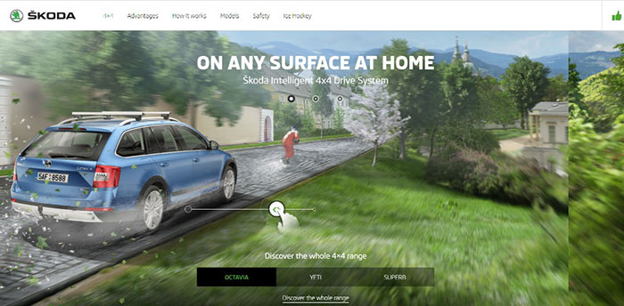
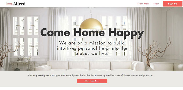
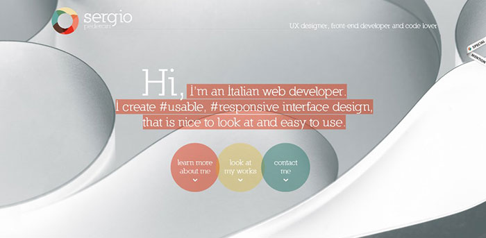
This website’s interactive effects above the fold don’t drag down its load speed.
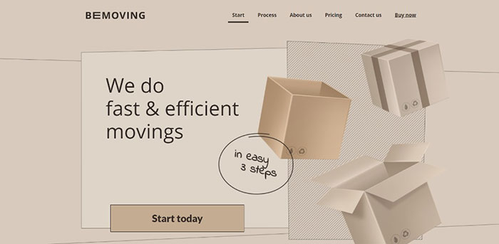
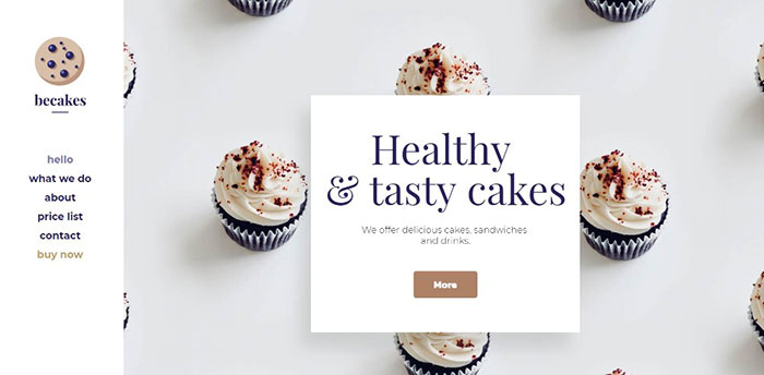
The image on this BeTheme pre-built one-pager appears to be dynamic; it isn’t.
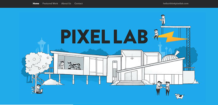
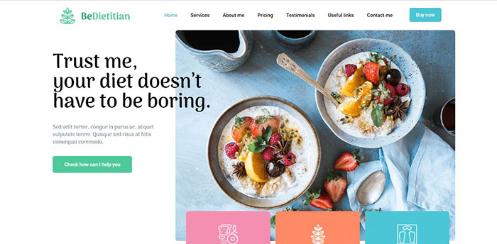
Tiny animated items add to this page’s illustration without slowing down page loading.
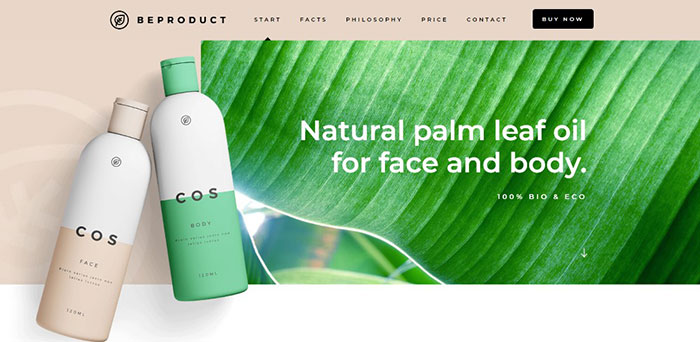
Here’s an example of where a page’s fresh look is all that’s needed.

Here’s an outstanding example of how large images and sliding panels contribute to engaging site visitors.

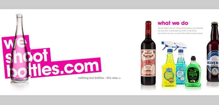
You don’t need a long list of technical details to promote an app. Vivid colors, neat effect, and a genuinely cool presentation will generally suffice.
#2 TEXT: Keep It to the Minimum & Make It Easy to Read
Avoid clunky blocks of text on a one-pager. They will turn off a user almost immediately. The remedy? Use bold headlines, short paragraphs, and bullet lists.
You need to totally avoid blocks of text. Use easy to follow sections and visuals to keep users entertained.
You might like to bookmark some of these examples to use as references:

This one-pager is about as entertaining as it gets.

An example of what neat organization can accomplish.
Key information is kept above the fold; and bullet lists aid in keeping the message concise.
An illustration of how large attractive images help do the selling when accompanied by astutely placed paragraphs of text.
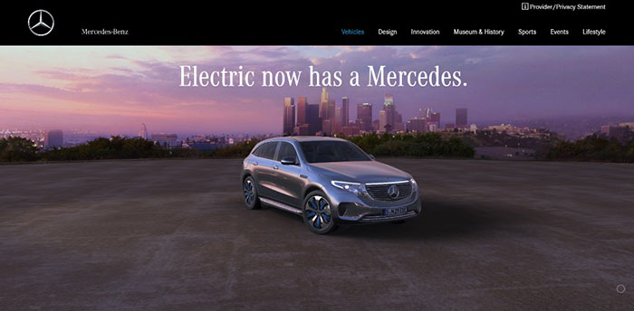
When a vehicle has the stature Mercedes-Benz does, focusing more on high quality images than on text is usually more than sufficient.
#3 VISUALS: Identify the Right Patterns & Use Negative Space Wisely
The “way” people read is important to take into account. Most read text in an F pattern and scan visual elements in a Z pattern. Being aware of this should help you maintain a nice flow as you mix elements. This flow leads people to the critical stuff and away from things of lesser importance.
White space is useful here. You can use it to separate sections and make the text more readable. It can stoke reader’s curiosity about what they’ll find lower on the page, and help them avoid visual fatigue.
An example using white space to create a sense of order.
A wildly creative website using white space for its canvas.
The white space in this pre-built one-pager maintains a sense of order and makes the different sections stand out.
Here’s an example using a mix of design principles to create an amazing visual sensation.
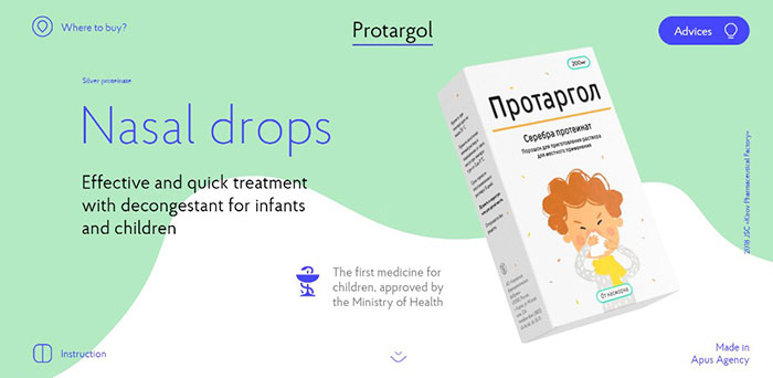
You would naturally expect a page promoting nasal drops to be dull. This page, with its ingenious mix of slides, white space, and animations is anything but.
#4 NAVIGATION: Make It Easy to Navigate & Entertaining to Scroll
If you’re not careful, navigation can cause problems on long-form one pagers. Users can get hung up, sent to somewhere they didn’t intend to go, or simply leave.
An alternative navigation scheme is a good practice for a one-pager. It could consist of either a classic horizontal sticky menu or a sidebar menu. As long as it enables users to quickly jump to a section of interest to them with a single click, it’s good.
Auto-scrolling nav links can also be extremely helpful. This is if you let the visitor watch the page scrolling rather than jumping directly to the new section.
You might find these examples of user-friendly navigation helpful:
This website features 3 different auto-scrolling links.
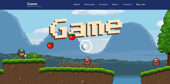
Be Game offers a navigation experience that’s more entertaining than most.
Three things stand out, the layout structure, the color scheme, and the use of 3 mouse scrolls to scan the page.
A menu on the top and one on the left provide a sure-fire way to help you navigate this site quickly.
#5 CALL TO ACTION: Identify the Correct CTA & Don’t Be Afraid to Use It
Don’t be afraid to use CTA buttons. The CTA is the introduction to the endgame of your website’s raison d’etre. The beauty of a one-pager is that you’re typically directing people toward a single action.
For this reason, it’s preferable to have the CTA button above the fold. This is especially if you’re presenting a portfolio. If, however, you’re selling several products or a range of services, you may need to use several CTA buttons.

In this example the CTA button is above the fold along with one in the menu.

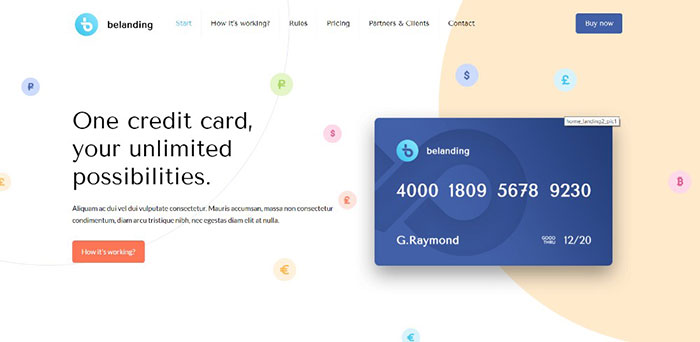
The two CTA buttons above the fold allow users to choose where they want to go.

This site employs a simple opt-in form with a bold CTA button.
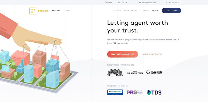
Reneza uses CTA buttons judiciously, with an optimum choice of colors and text sizes.
Wrapping It Up
5 critical elements? Maybe we should add “spirit”. Great designers seem to have it in abundance.
Learn and master the 5 elements discussed here. They are key to providing engaging one-page website user experiences. They look simple, but once you try applying several or all 5 to a design, the going can get tough.
You can also take a shortcut by using pre-built websites. These have incorporated these basic elements.
Be Theme is a great resource for pre-built websites with its huge library of 60+ one-pagers to choose from. It has 400+ pre-built websites of all kinds to fit your needs.
The post 24 Stunning Examples of Top Quality One-Page Website Designs appeared first on Design your way.
Source: http://bit.ly/2SKcrUb


No comments:
Post a Comment