The number of people using their mobile devices to surf the web is growing and if your site is not optimized to work on a mobile device then you are run the risk of losing potential customers and clients. Practically every client these days wants a mobile version of their website. It is almost impossible to keep up with the growing need of making your website compatible with endless new resolutions and devices. Is there a way around? This is where responsive web design comes in. Responsive web design responds to the behavior of the user, their needs and different devices they are using. Using a mix of flexible grid layouts, grids, images, and CSS queries you can get your designs to respond to different screen resolutions, and widths.
There are a few ways to create a fully responsive UI. In this article, we will be exploring 2 different ways to accomplish this task. Using Sketch’s built-in group resizing functionality and using the Auto-Layout plugin. As we learn more about both Group resizing and Auto Layout, it is important to keep in mind that Group resizing feature is best suited for smaller, conceptual ideas while Auto Layout works better for bigger projects.
To understand these two functionalities better, let us start by creating a low fidelity prototype. This would mean that you will be able to test out your responsive layout ideas before even clearly defining your aesthetic choices or even accepting feedback on your design choices. Mobile first approach will help eliminate any setbacks that you may encounter during later stages and helps validate your design ideas and deliver responsive solutions to your web page.
1. Group Resizing
To help explain this functionality better, let us start by creating a low fidelity prototype. It is always a good idea to test out your concepts before moving forward with the final design.
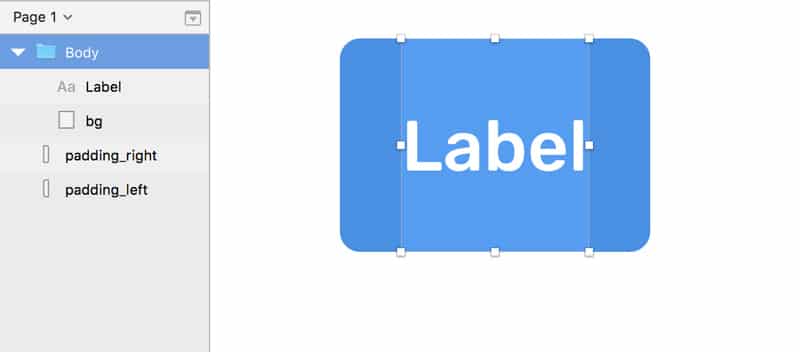
- Start by designing a logotype that you can place on the left-hand corner of the page. It doesn’t have to be anything fancy, just a simple rectangle with a letter should do.
- Do the same thing for menu buttons and add a centered text combination.
- Group the logotypes together, followed by menu bar buttons and the text combination.
- Finally, group all these into a single group file.
- Once you have your canvas elements, its time to define a position and pin them to its place. For example, the logotype will remain in the top left corner. Repeat this step for the other elements in your canvas. Be sure to use ‘float in place’ functionality when resizing your elements. This will ensure that your layers are aligned and are especially useful when centering elements horizontally and vertically.
- Its time to resize the groups to test for responsiveness. After you have resized a group, it might reach a point where the text and the elements within the group start to overlap. This means that it has reached a breaking point and you would need to adapt to match the layout.
- Select artboard and check ‘resize to fit’ and change the artboard to the next available screen size.
Autolayout Plugin
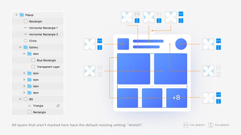
You are going to be familiar with Auto Layout features simply by using Group sizing. You can pin an element to a corner, align it vertically or horizontally, and specify the width of the element in percentages using the icons in the small box to the right-hand corner of your screen. What sets Auto Layout apart from other plugins and group resizing is that you are able to toggle between landscape and portrait mode. Now, let us take a look at how auto layout enables responsive design between different devices by examining some of the best practices that you can apply to your own IOS app. There are a lot of points to consider when designing an interface with Auto Layout. This article doesn’t cover all them but here are a few really useful tips to consider when using this Plugin.
1. Grids
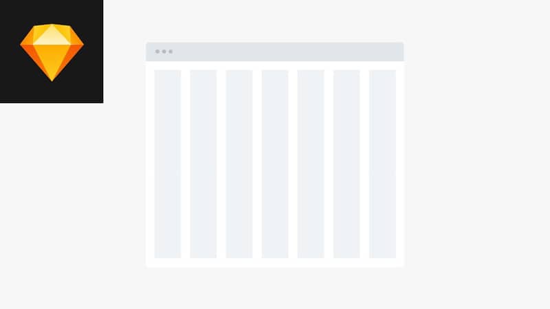
Normally without the Auto layout plugin, you would have to manually create squares and move them horizontally to create a gutter width and a grid system. With auto layout, after you have duplicated the first square and gutter width, you are able to create a stacked layout simply by clicking on the stacked option from the right-hand corner of your screen. You can create a grid with the desired spacing by dragging the second square over to the right and it will automatically create a grid with the right spacing. Now if you want to change the spacing between them, go back to the stacked option and change the spacing to create a grid system with a different gutter width.
2. Navigation
This feature is especially useful when creating and implementing the navigation bar. With auto layout, you can select the spacing between each link on the bar without having to adjust every time you update the text. The same rule applies every time you add a section or move a link over to the right. The plugin accounts for all the changes and spaces the text evenly between different sections.
3. Buttons and Icons
Start by creating a button with an icon and the text. Adding a stacked layer will ensure that the distance between the two remains the same at all times. Now create a symbol and pin it horizontally and vertically. Now if you were to change the text within the button. It will automatically resize the button to accommodate the text within.
Both group resizing and auto layout plugin are incredibly useful when designing fluid layouts. Auto layout is best suited for in-depth mockups that can be tested on a variety of devices. It is a flexible and nondestructive solution for designing fluid layouts and to test the responsiveness of a webpage. Test your concepts using both and create device optimized layouts and significantly improve your workflow.
The post Making Your UI Fully Responsive in Sketch appeared first on Web Design Blog | Magazine for Designers.
via http://bit.ly/2GxjngX


No comments:
Post a Comment