How to make optically balanced icons, correct shapes alignment, and perfect corner rounding. An illustrated guide.
Our eyes are weird organs that often tell lies to us. But if you know the peculiarities of human vision, you can construct more approachable and clean designs. Not only do type designers utilize optical tricks for creating readable and well-balanced fonts, but it’s also helpful for interface designers, who build user-computer interaction.
In the 1920s the Gestalt theory of visual perception was developed. It explains how our eyes process different images and how our brain interprets them. You might have already heard about such things as the principle of proximity or the common fate rule. This article refers to some points of the Gestalt theory and highlights practical aspects rather than scientific research. There is a list of recommended materials on the topic at the bottom.
1. Measured and optical size
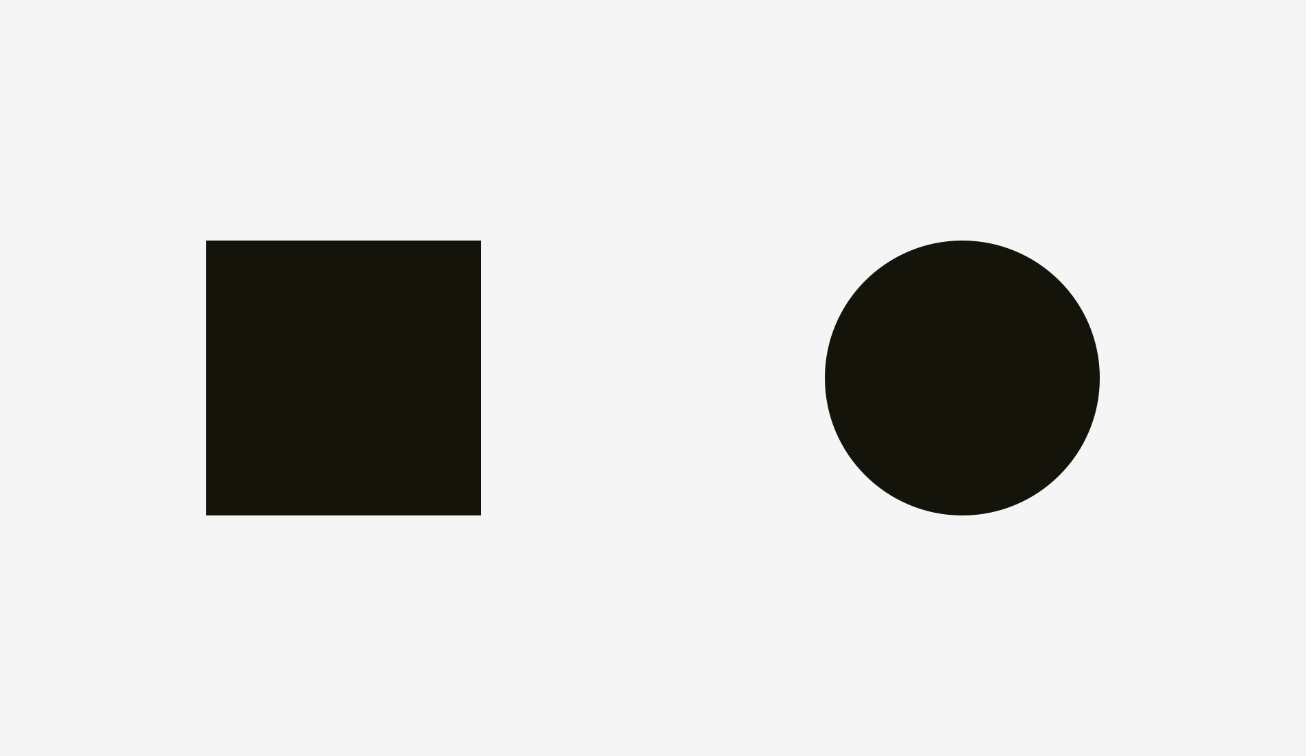
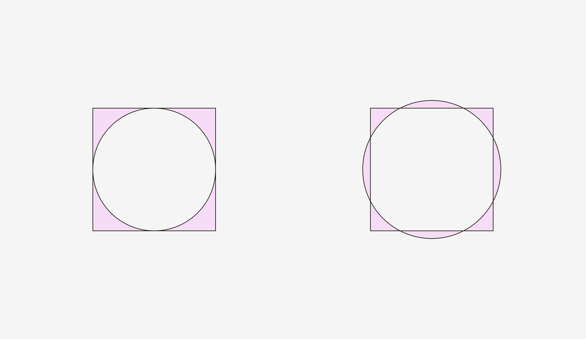
What is bigger: a 400-pixel square or a 400-pixel circle? Geometrically speaking, their width and height are equal. But look at the picture below. Our eyes immediately detect that the square outweighs the circle.
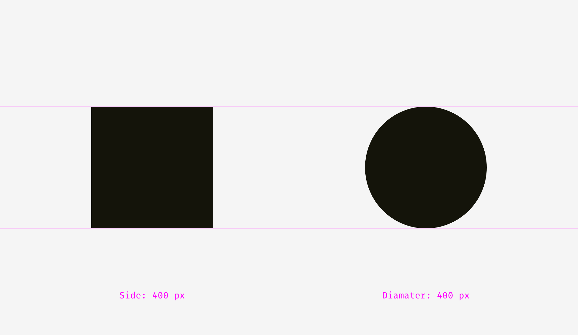
Here is the version with guides.
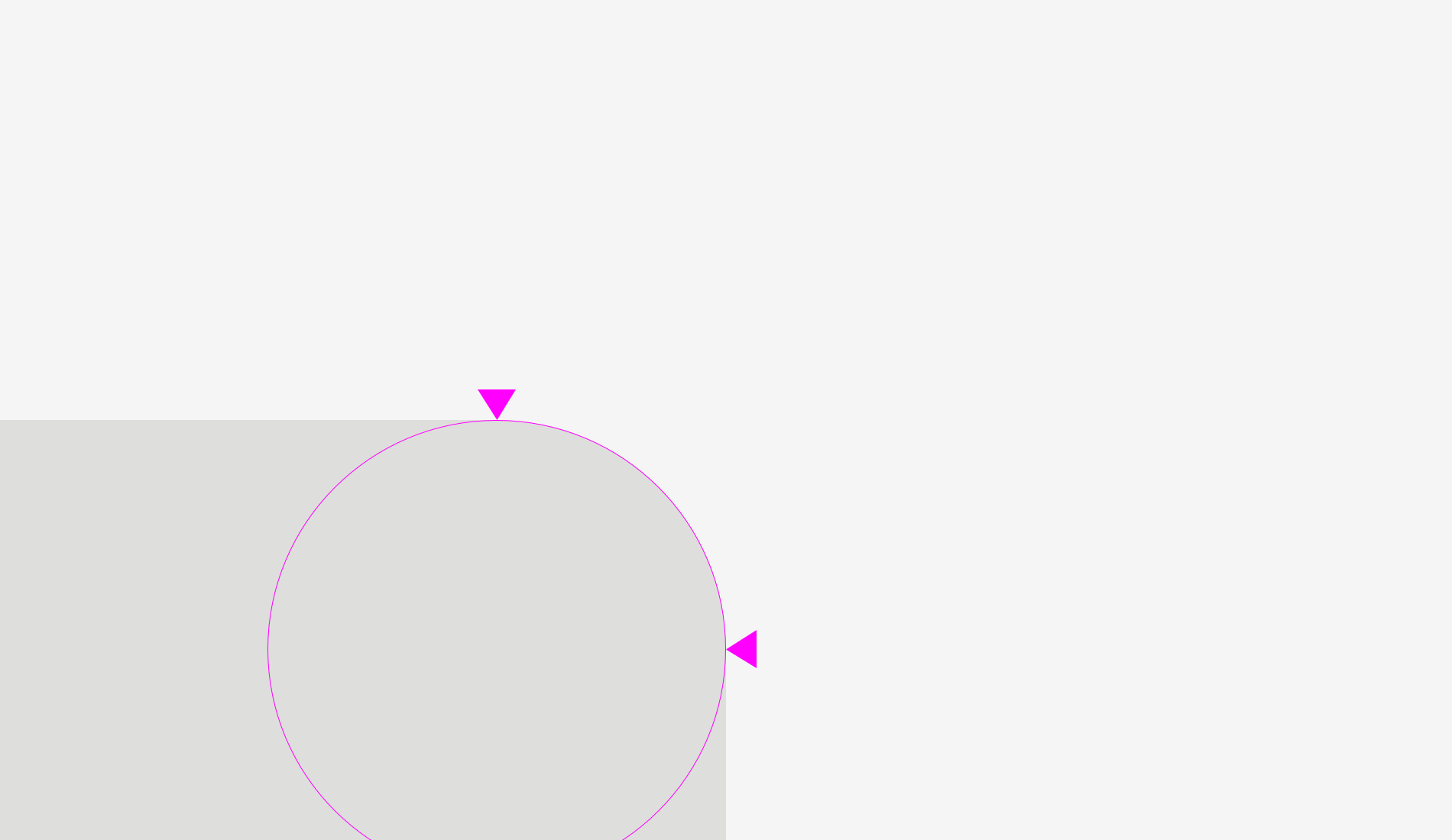
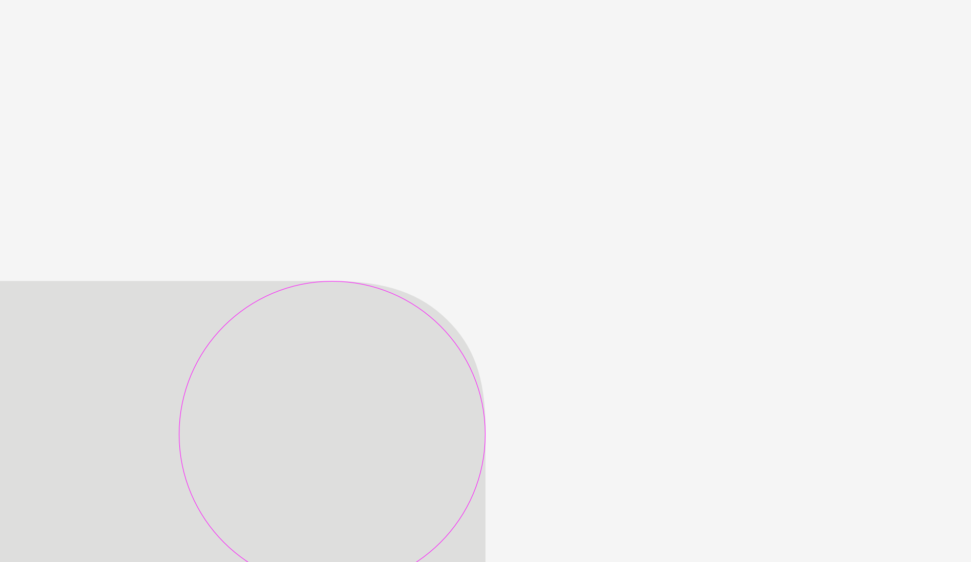
Let’s take a look at one more picture with a square and a circle. In terms of visual weight, are they equal to you?
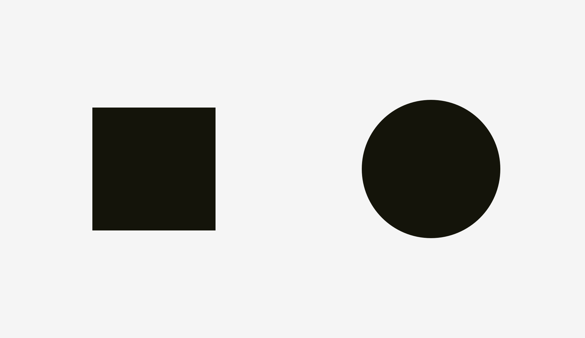
At least it’s hard to tell immediately, which one outweighs the other. Not surprising because I increased the diameter of the circle.
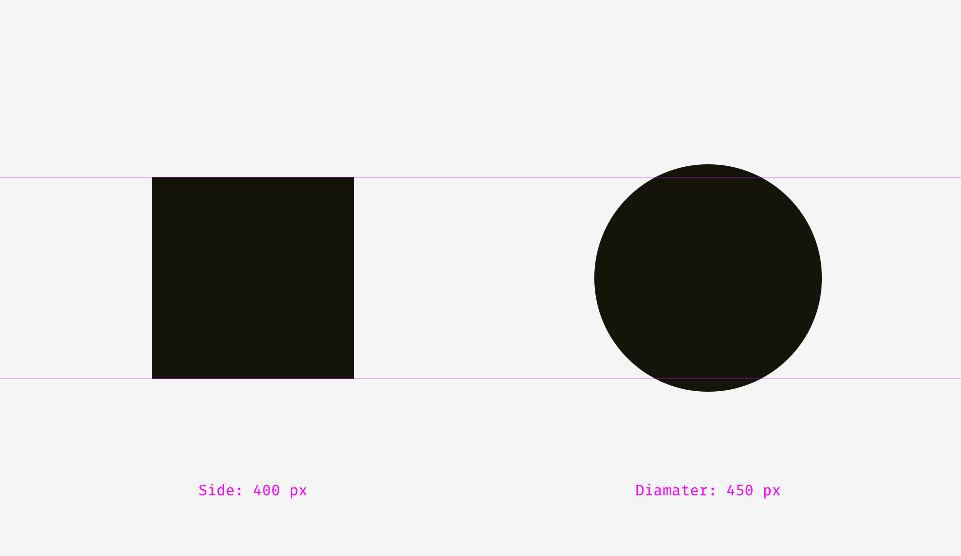
I overlapped the shapes from the first and the second examples. On the left, the 400-pixel square has bigger area than the 400-pixel circle. That’s why we see it visually larger. On the right, the circle and the square are balanced. Basically, they have similar area while their width and height are different.
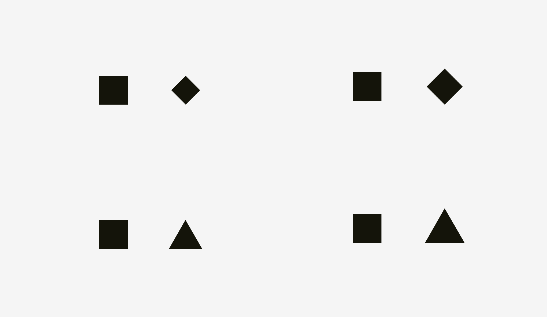
We can witness the same effect with diamonds or triangles. To be balanced visually with squares, they should be wider and higher, so that their areas are similar. Area-based approach works perfect with the simplest shapes.
How can one use this feature in interfaces? For instance, when you are creating a set of icons, it’s important to make them all well-balanced, so that no icon stands out too much or looks too tiny. If we directly inscribe icons into square areas, the more square-like icons will look larger.
I recommend compensating the weight of differently shaped icons by allowing visually smaller icons to hang beyond the icon area and by leaving some space between visually heavier icons and the icon area.
And now some real icons balanced optically.
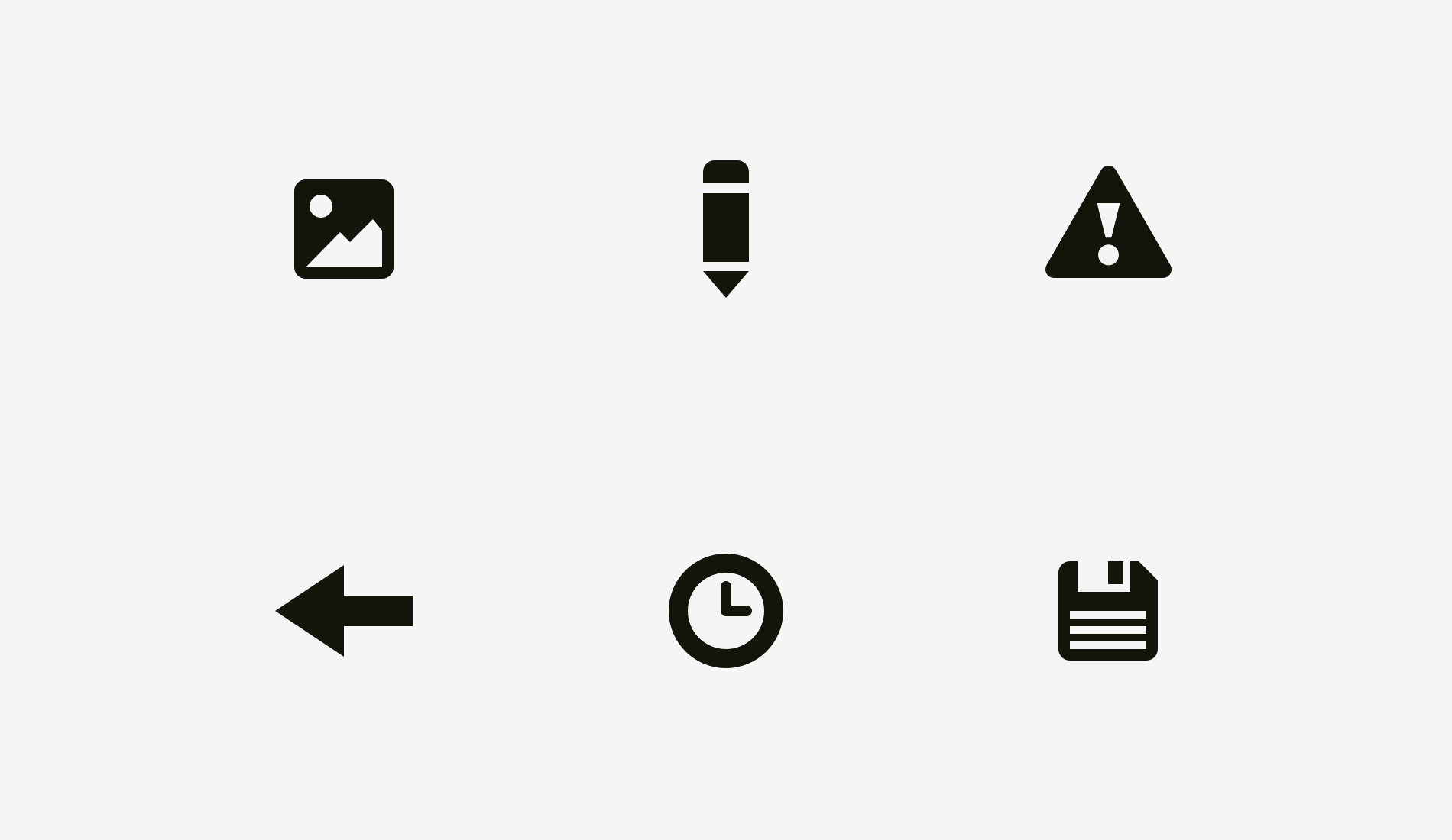
Now it’s clear why an icon area is always larger than an icon body — just to allow non-square icons fit it and look not smaller than square icons.
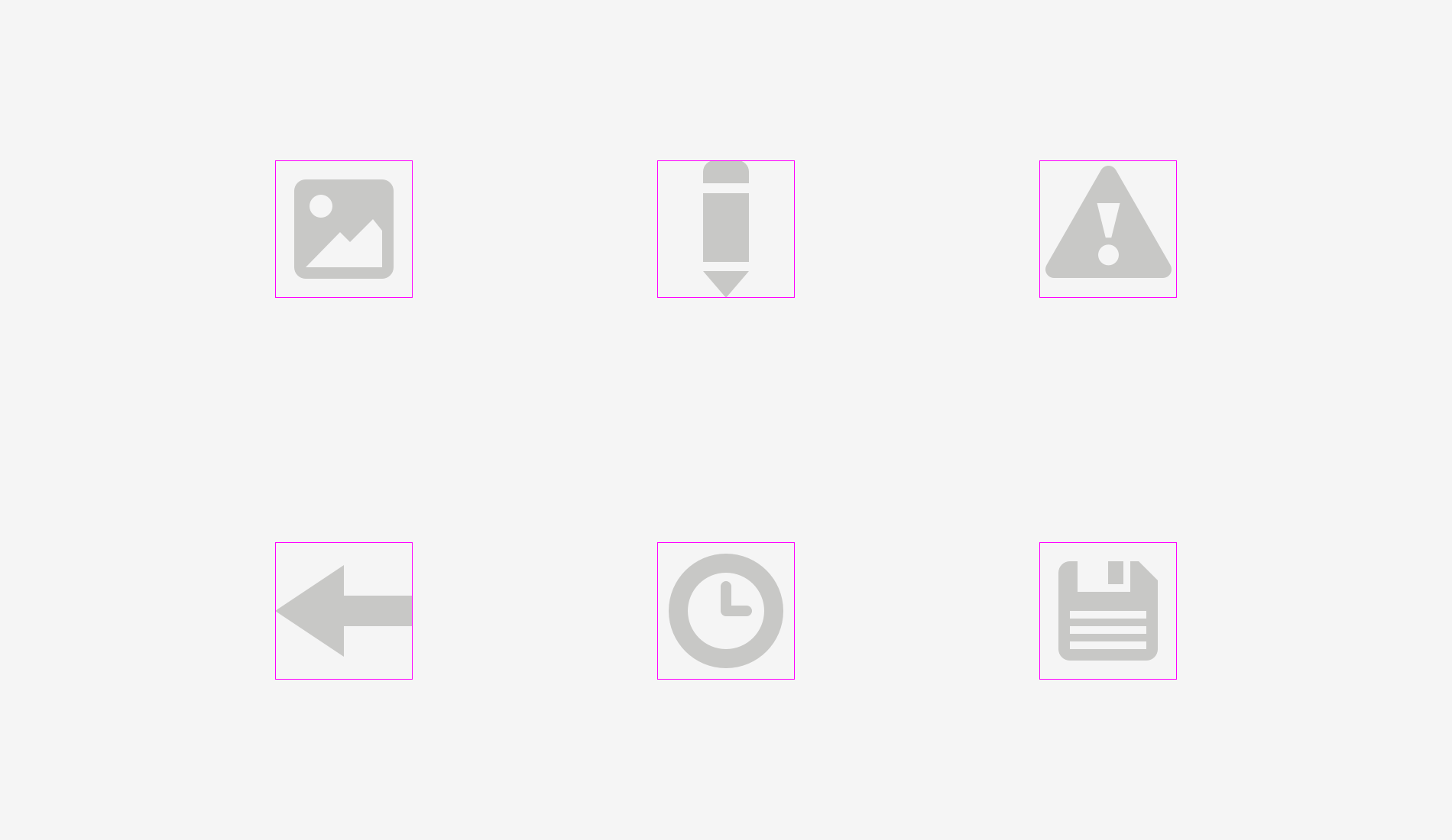
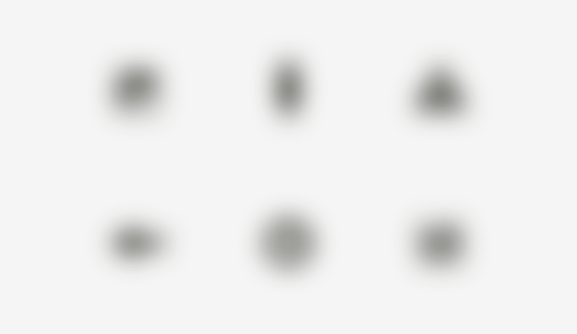
The easiest test to check visual balance is blurring the items. If your icons turn into more or less similar blobs, they have the same optical weight.
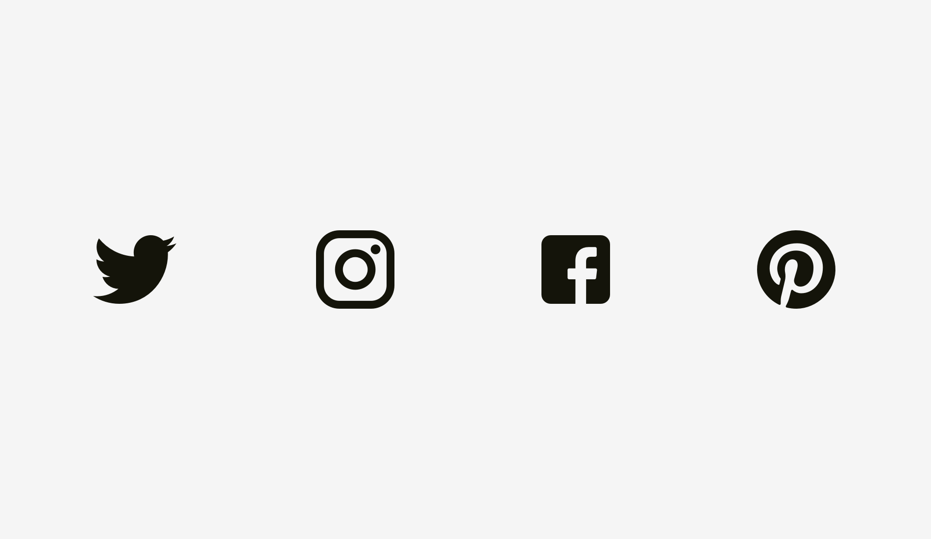
But sometimes we work with already existing graphics, for instance, social network logos used as sharing and liking buttons. Facebook and Instagram icons are square, whereas Twitter is represented by a bird silhouette and Pinterest by an encircled “P”. That’s why Twitter and Pinterest icons are a bit larger, so that they look balanced with Facebook and Instagram icons.
Another example of an optical balance issue is a textbox placed together with a round button. If the button diameter equals the textbox height, the button will seem smaller to our eyes. When you enlarge it a little bit, the whole construction will become better balanced.
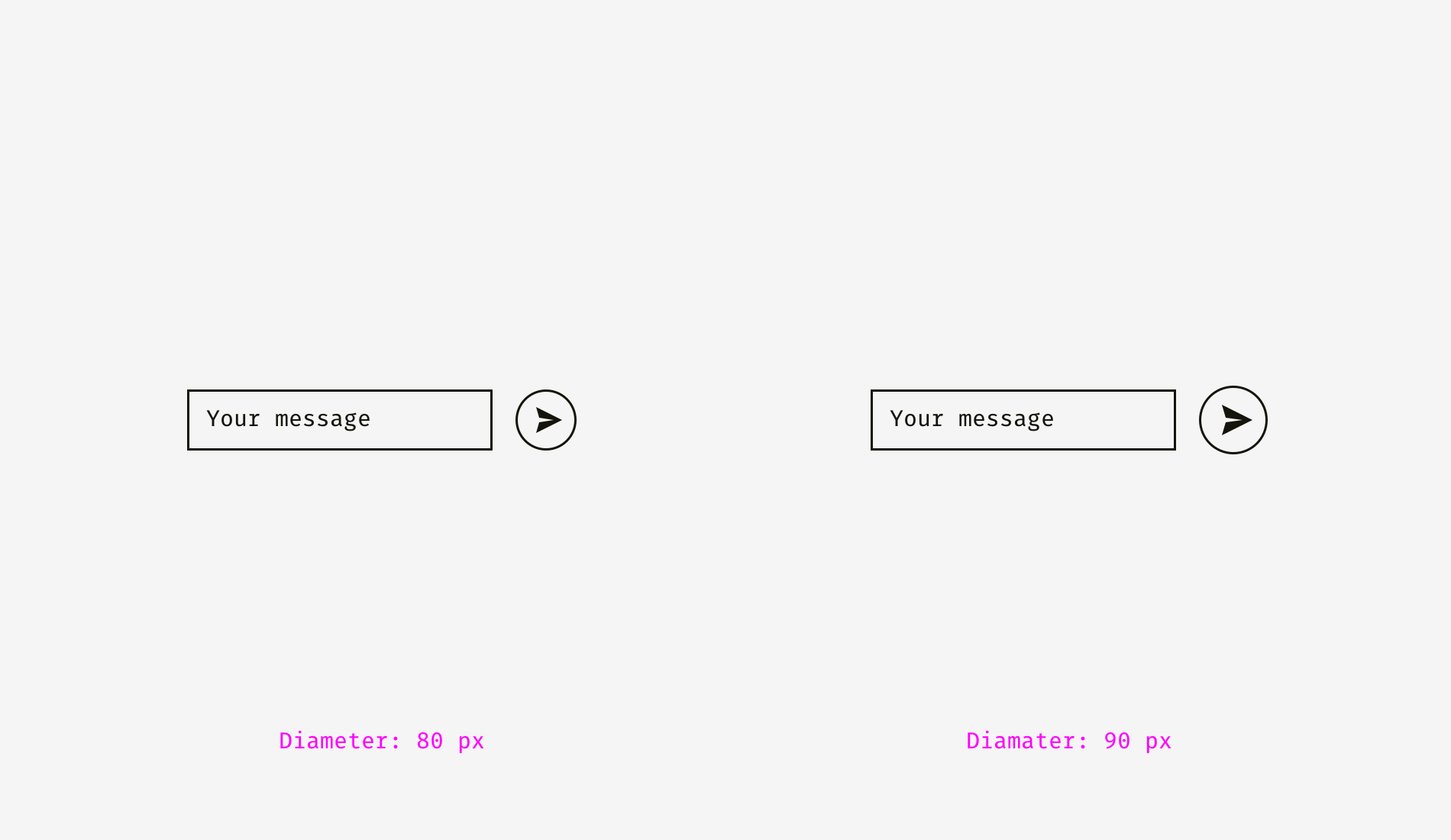
But if you change the style of the button, enlargement won’t be needed. On the picture below, the button and the textbox are 80 pixels high, but the button on the right doesn’t look “lost” owing to the strong black fill.
Things to remember
- Optical weight is how human eyes perceive the size and significance of an object, and it doesn’t necessarily equal its pixel size or area.
- Circles, diamonds, triangles, and other non-square shapes need to be higher and wider to be optically balanced with squarish shapes.
- Areas for icons should have some space reserved for optical balancing. It’s crucial for sets of icons, which should look consistently.
2. Alignment of different shapes
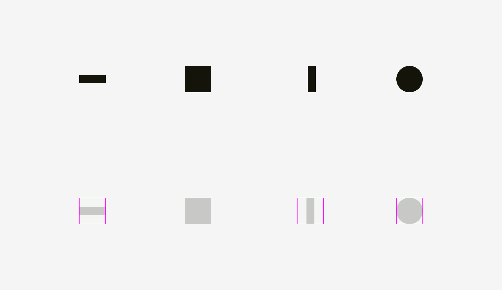
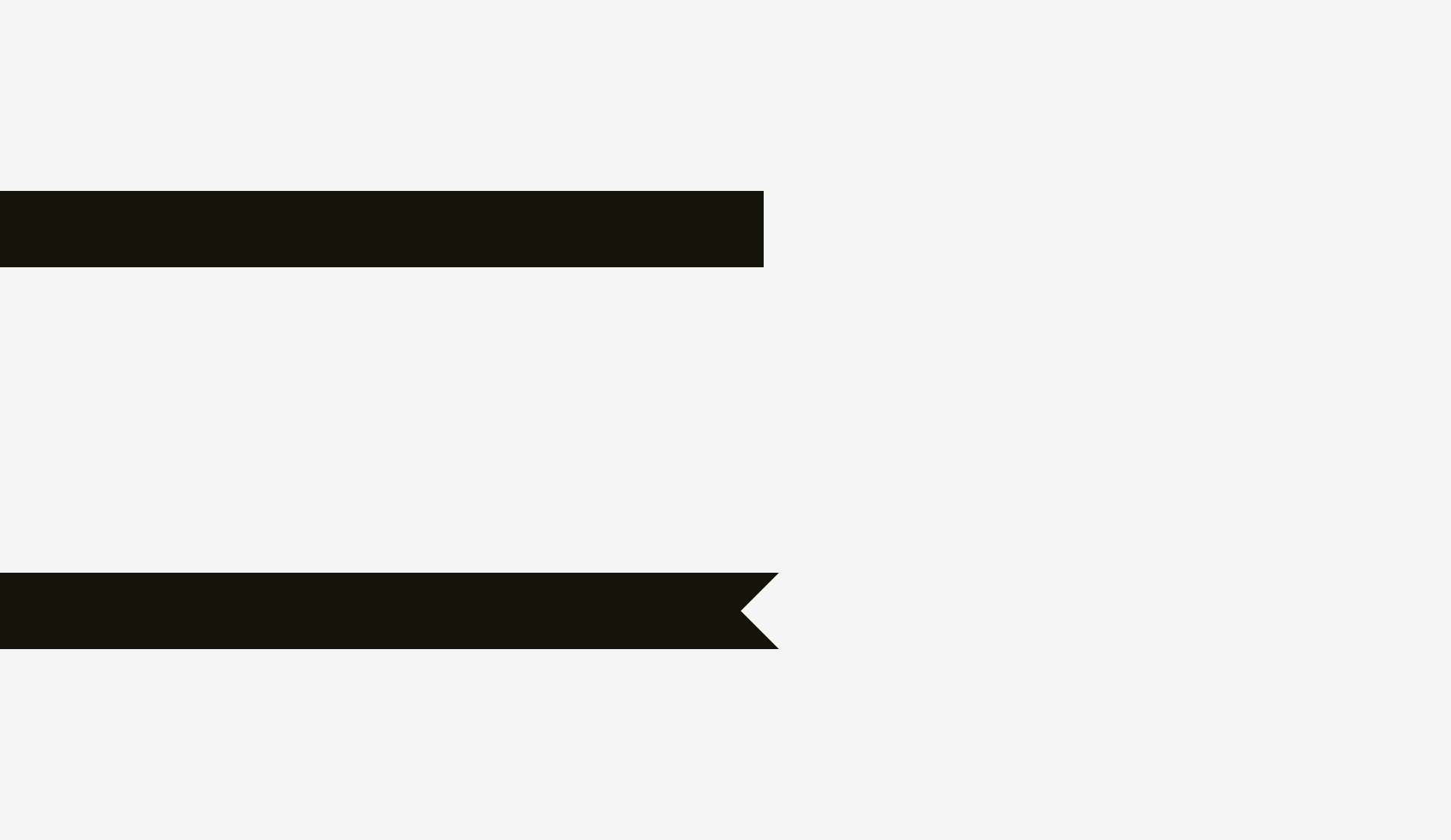
Optical alignment is a logical continuation of the optical balance topic. Take a look at the stripes below. Do they look as if they are of the same length?
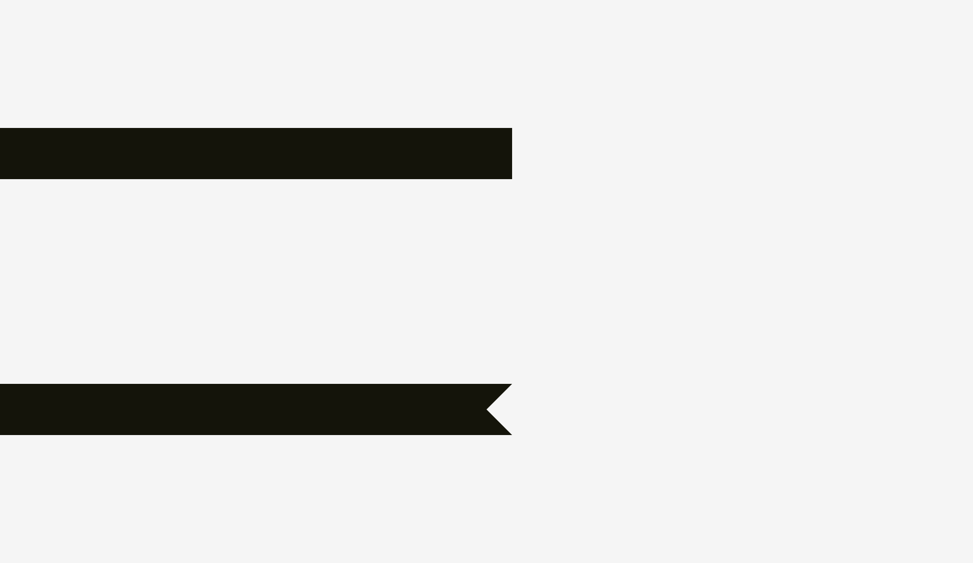
Pixelwise, the answer is a firm “yes”. However, at first sight, the lower stripe looks shorter than the upper one.
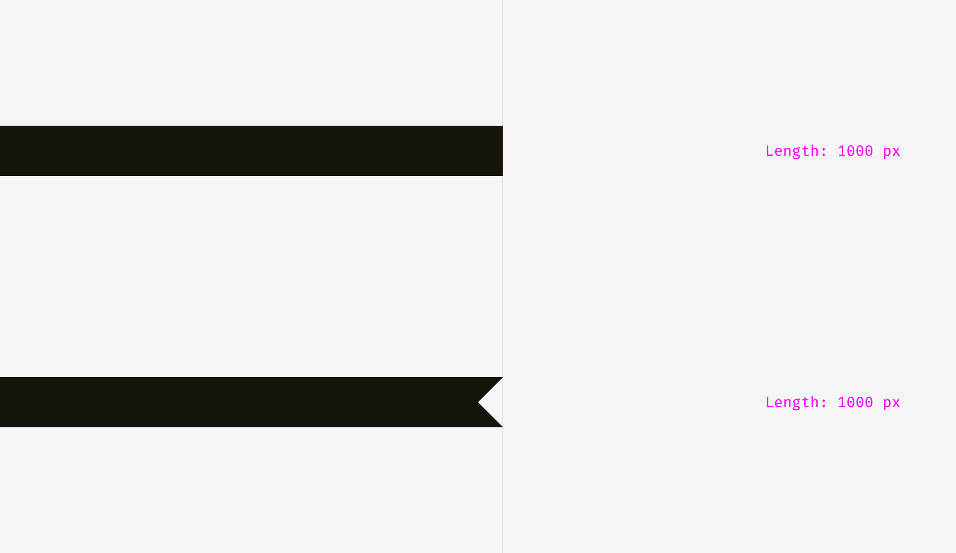
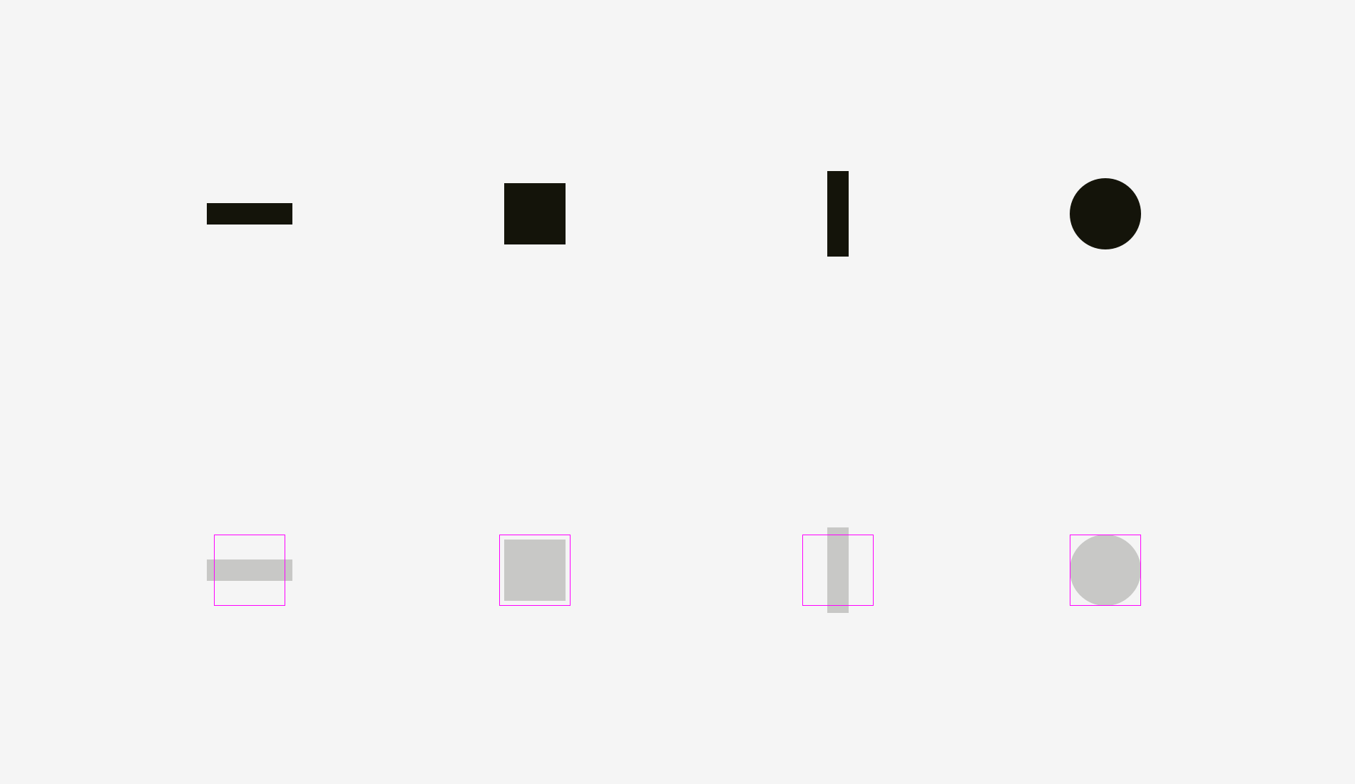
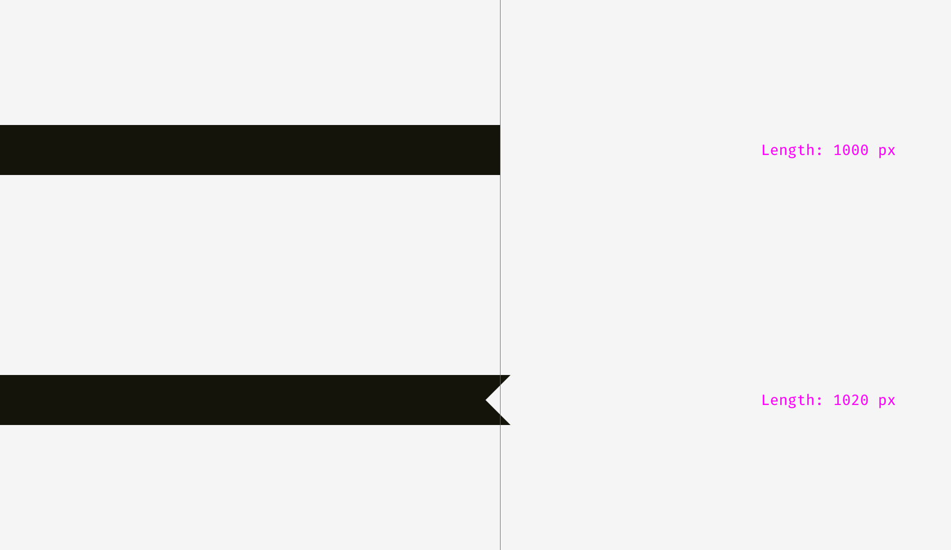
One more picture of the two stripes. Has anything changed?
I applied optical compensation for the lower stripe. Allowing the spikes to go 20 pixels beyond the length of the upper stripe is the way to compensate a gap between the spikes and make both shapes optically equal.
And now some more sophisticated examples of differently shaped stripes.
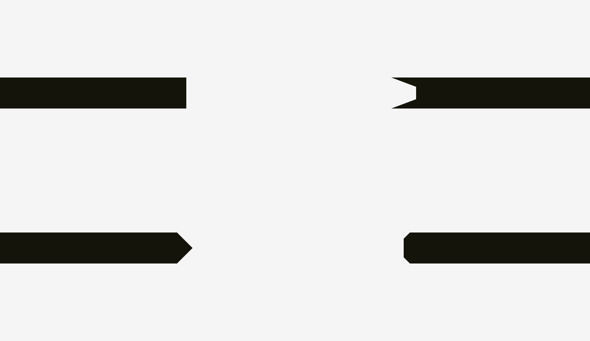
So, if you are creating a poster with folded stripes and text on them or you are putting a bright “discount” stripe on a product card of an online store, mind making them optically balanced. Sharp edges should go a bit beyond the rest of the shape, especially if it’s a rectangle.
And what about aligning plain text and paragraphs that have a background? It depends on the visual density of the background. If it’s light, you can align the highlighted paragraph with the rest of text.
Since the background is light, it doesn’t interrupt the usual text flow.
A different approach can be utilized for a dense background. On the picture, the black background is aligned with the rest of text while the white text inside of it is placed with indents.

Unlike the case with the light background, the black one has substantial optical weight, and if the goal is to insert a paragraph seamlessly, it’s better to align it the way shown below.
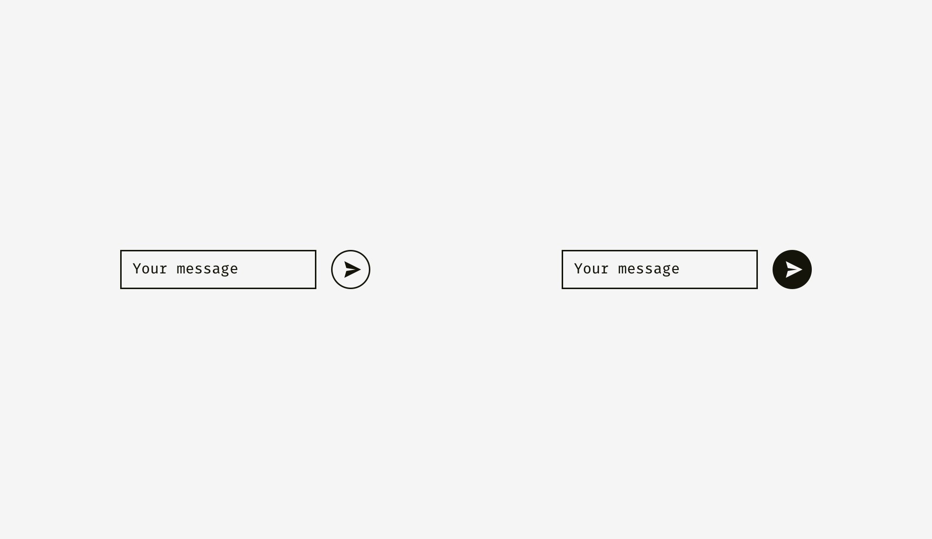
The same principle will work with buttons and input fields. Of course, it’s not a dogma, just a recommendation based on human visual perception.
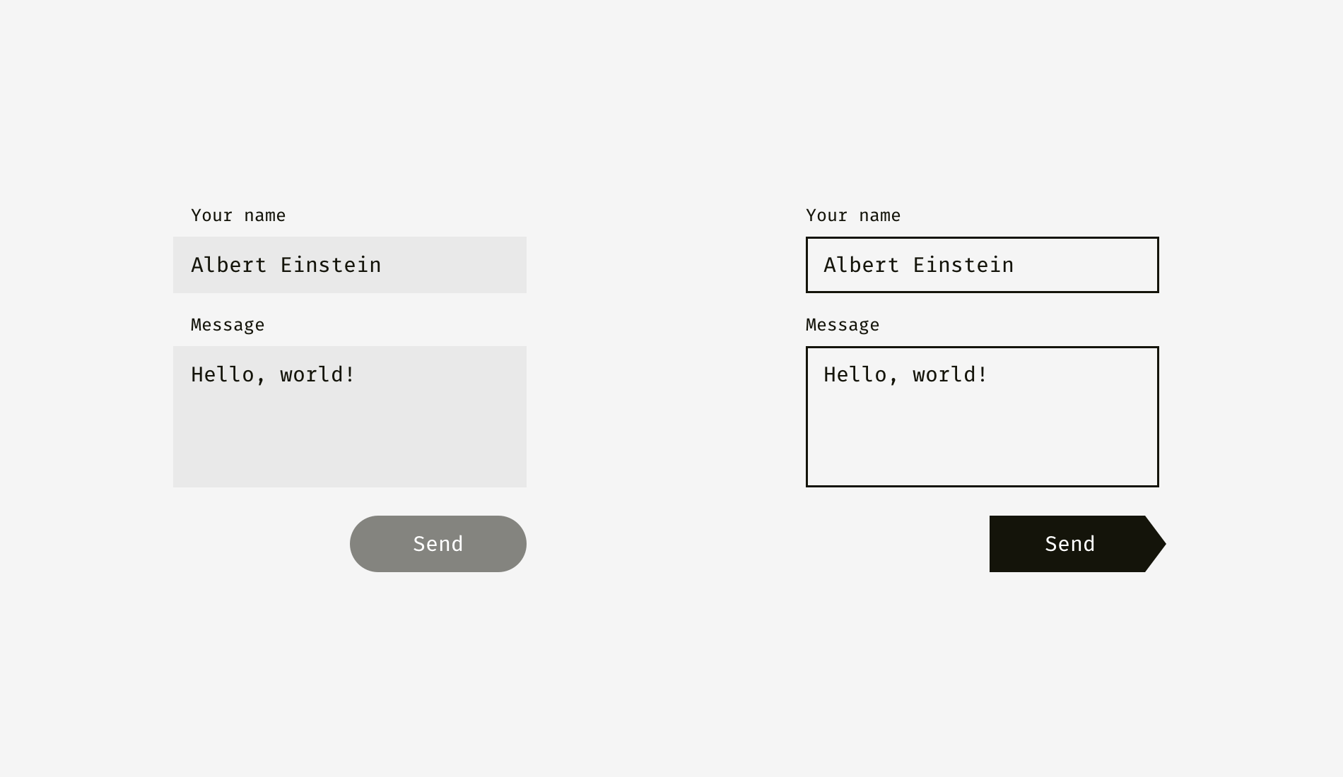
The light background of input fields on the left can go beyond input labels and user’s input. The right edge of “Send” button is not fully aligned with the right edge of input backgrounds since the button is darker and looks heavier from visual perspective.
On the right, inputs have solid borders, and I aligned them with the labels while user’s input has indents inside of the boxes. “Send” button has a triangular side. The button is moved a bit rightwards to look balanced with the rectangular input fields above.

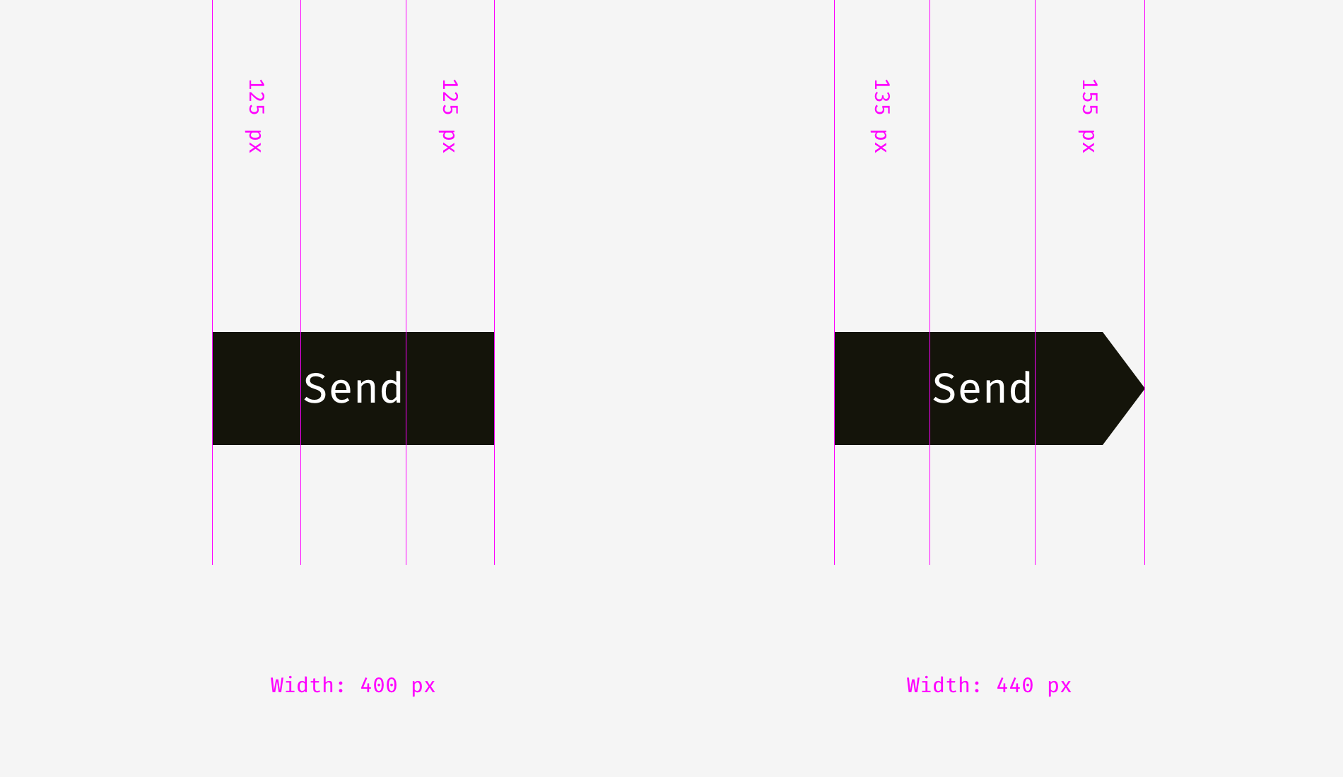
And here we are approaching to one more aspect of alignment — the alignment of text and icon buttons. Look at the buttons below. The text looks centered, doesn’t it?
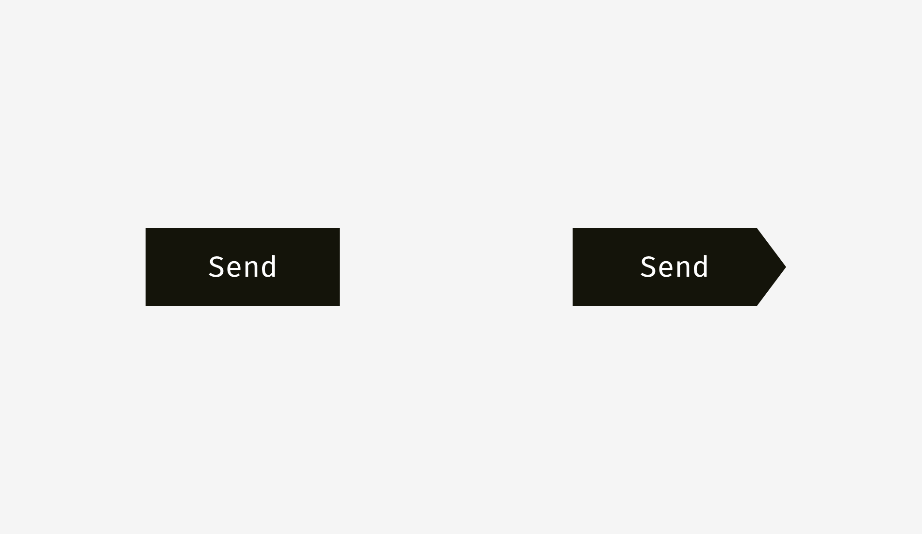
The trick is that on the right button I moved the word a bit to the left, since the right edge is triangular. Moreover, the arrow-like button is 40 pixels wider to look optically equal to the rectangular one.
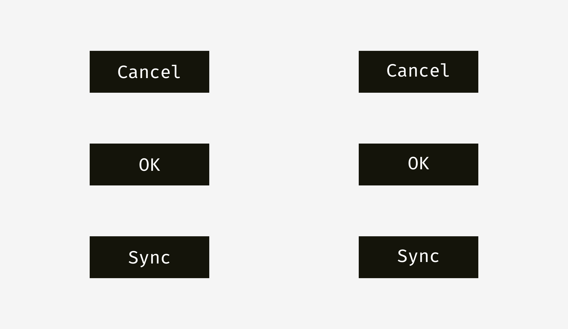
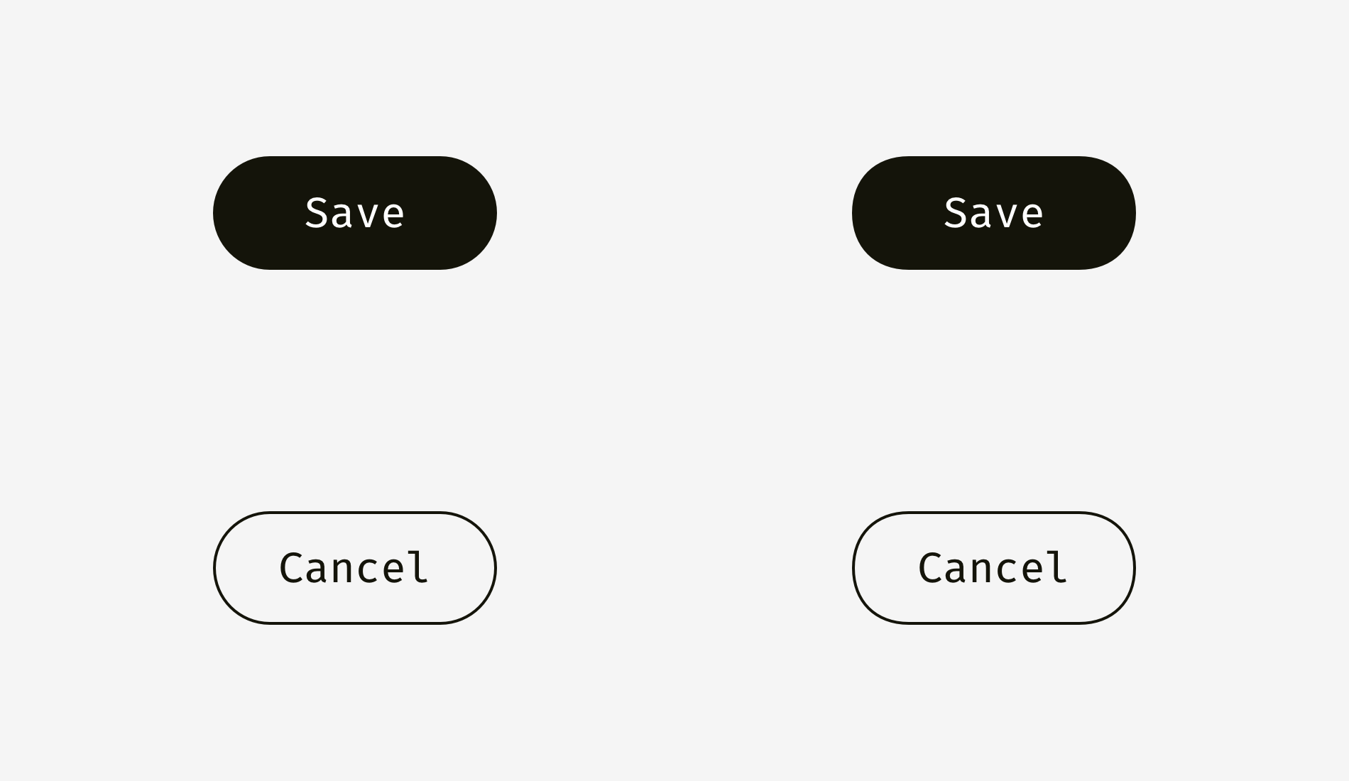
Not only do text buttons have horizontal alignment, but also they have vertical alignment of a word and a background. The first approach I’d like to tell about is used in the interfaces of various operating systems, sites, and applications. It’s the alignment based on the height of an uppercase letter of a font (so-called cap height). It equals the height of either “H” or “I”.
Basically, the space above and below an uppercase letter and the edge of a button is equal. It makes sense because command names usually are written in title case and English letters have more ascenders, upper sticking out parts (l, t, d, b, k, h), than descenders, lower hanging parts (y, j, g, p).
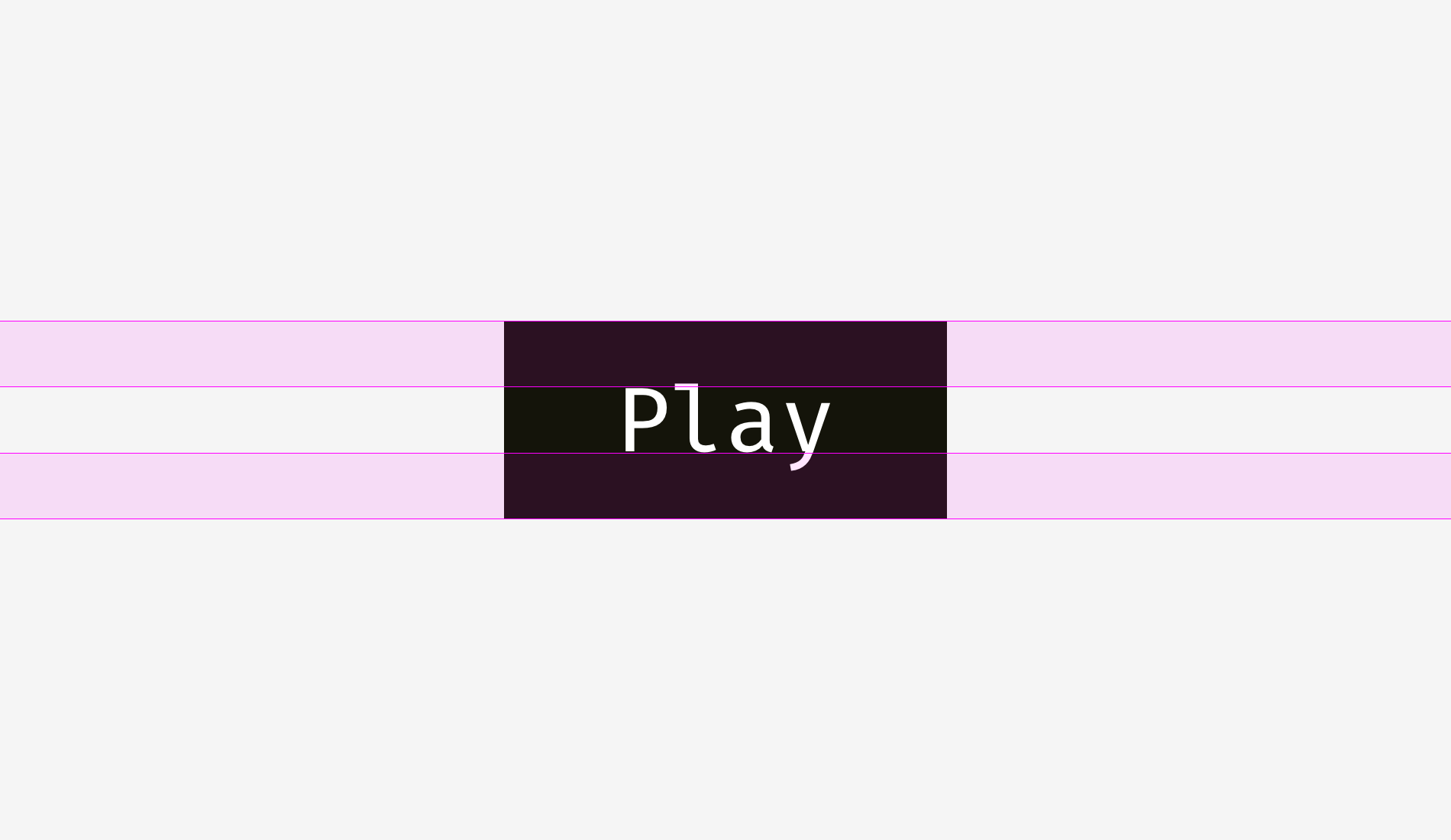
Another approach is to align a name and a background using the height of a lowercase letter of a font (so-called x-height). In sans and sans serif interface fonts, it equals the height of — not surprisingly—the letter “x”.
This approach also makes sense because the main optical weight of a text is concentrated in the area where lowercase letters are placed.
Is there any difference between these approaches? Yep, there is a difference. And it’s not that big.
More examples for comparison below. The cap-height approach represented by the left column is definitely better for “Cancel” and “OK” — so widely used buttons — because “Cancel” has no descenders and “OK” is all capitals. The x-height approach shown in the right column is better only for “Sync” button, the name of which has both an upper and a lower sticking out elements; “Cancel” and “OK” words seem to be placed too high.
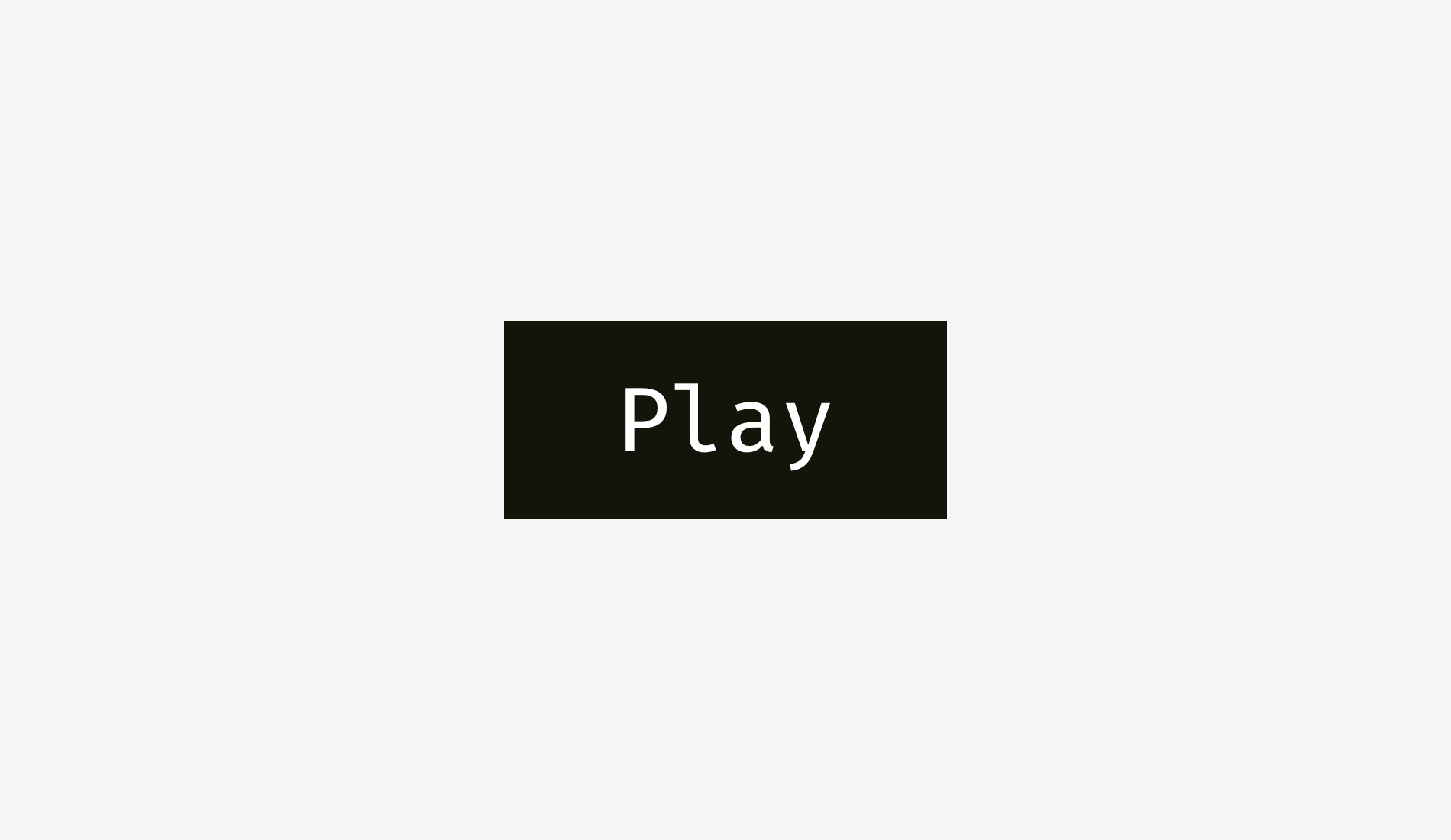
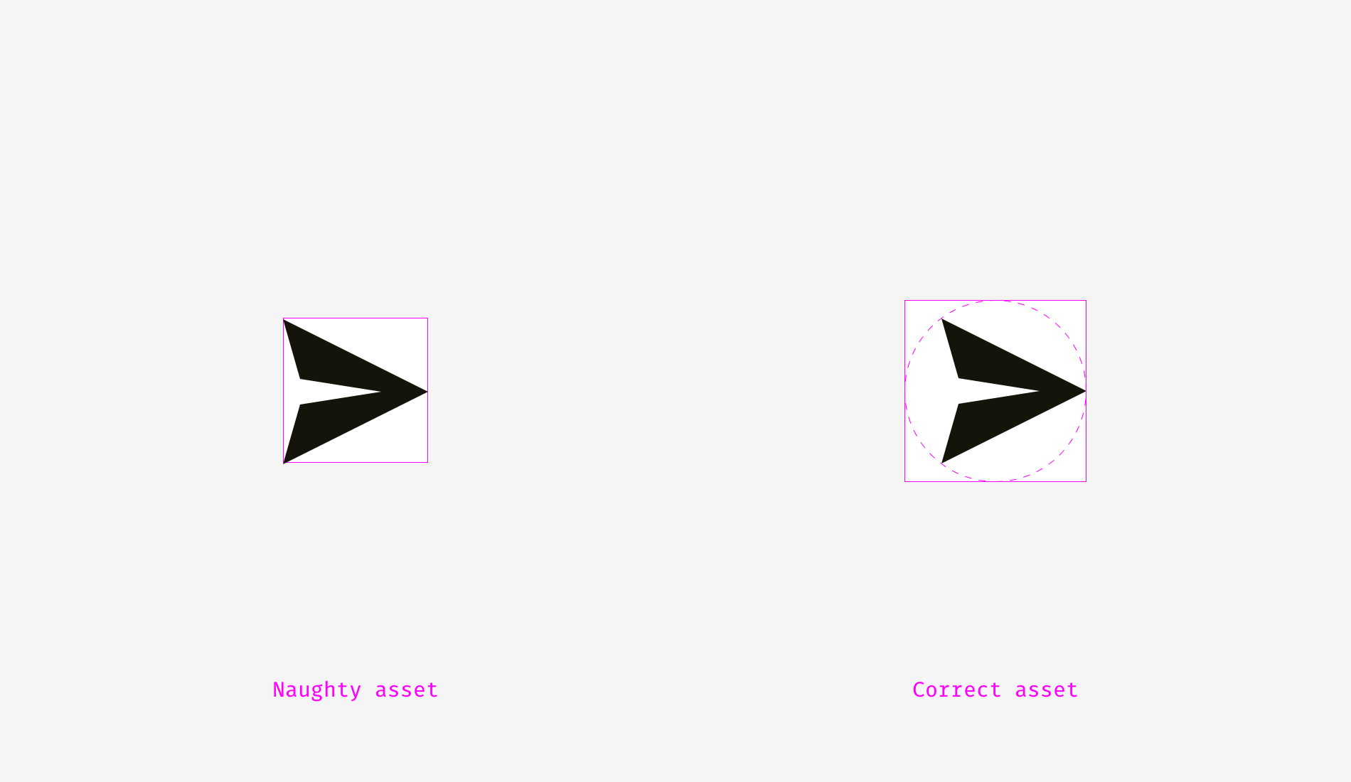
The situation with icon buttons is slightly different from text buttons. Let’s put a popular “Send” icon on a round button background. Which variant looks more visually balanced?

Hope you’ve noticed that something is wrong with the left one. It happens because of different alignment methods. The first option treats the icon if it was a rectangle. To a certain extent that’s right because when you send an SVG or PNG file to a developer it’s a rectangular sheet with a paper plane art on it. The right variant shows the icon placed the way all its sharp edges have equal distance to the circular button background.

If you prepare a file for a developer, you need to reserve some area, so that they can center the icon on the background optically right.
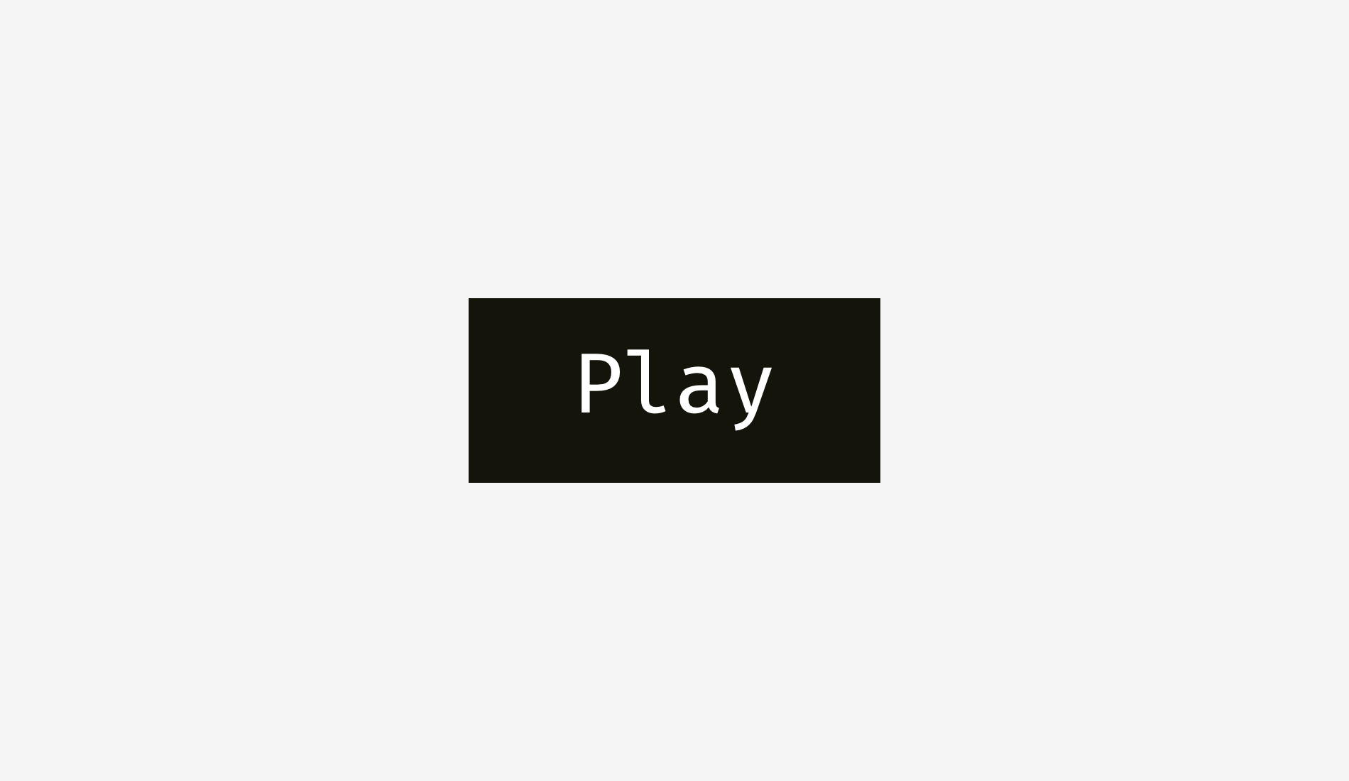
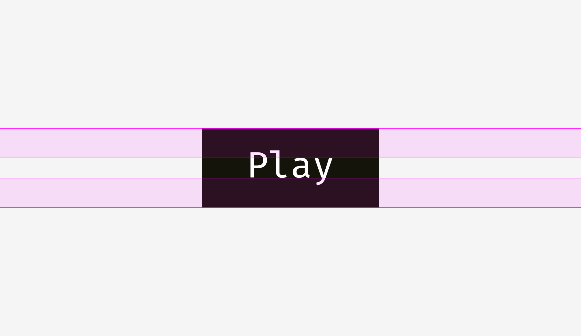
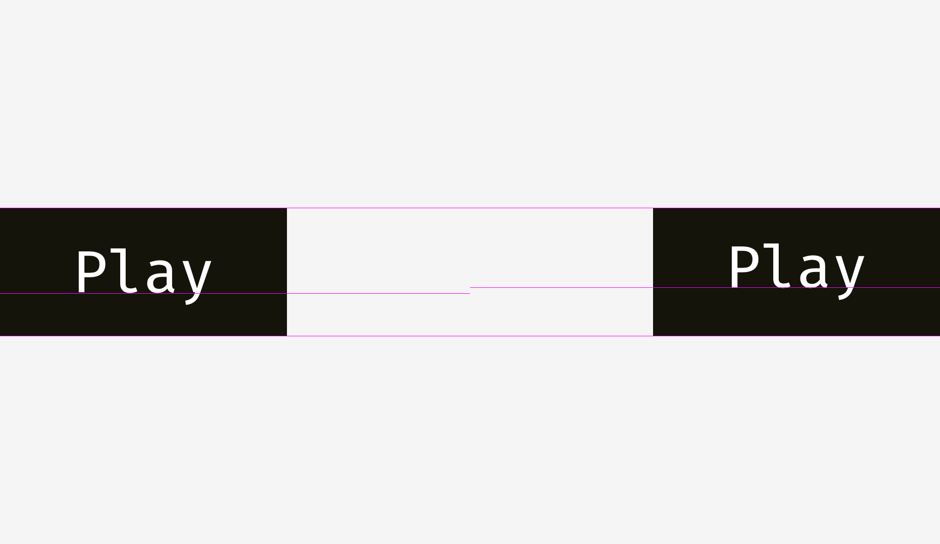
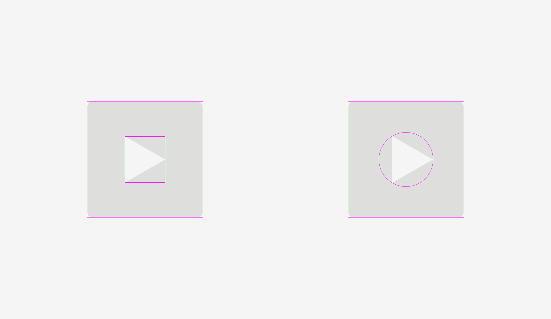
The same story with “Play” buttons. If you directly align these shapes — a rounded rectangle and a triangle — they’ll look odd.

If you want to position the triangle optically better, encircle it and align this circle with the button background.
Things to remember
- Shapes with sharp edges should be larger or longer to look balanced with the neighboring rectangular objects.
- Cap-height alignment is an effective method of positioning button names on button backgrounds.
- One of the effective ways to correctly position a triangular icon on a button is to encircle it and align the circle with the background.
3. Optical corner rounding
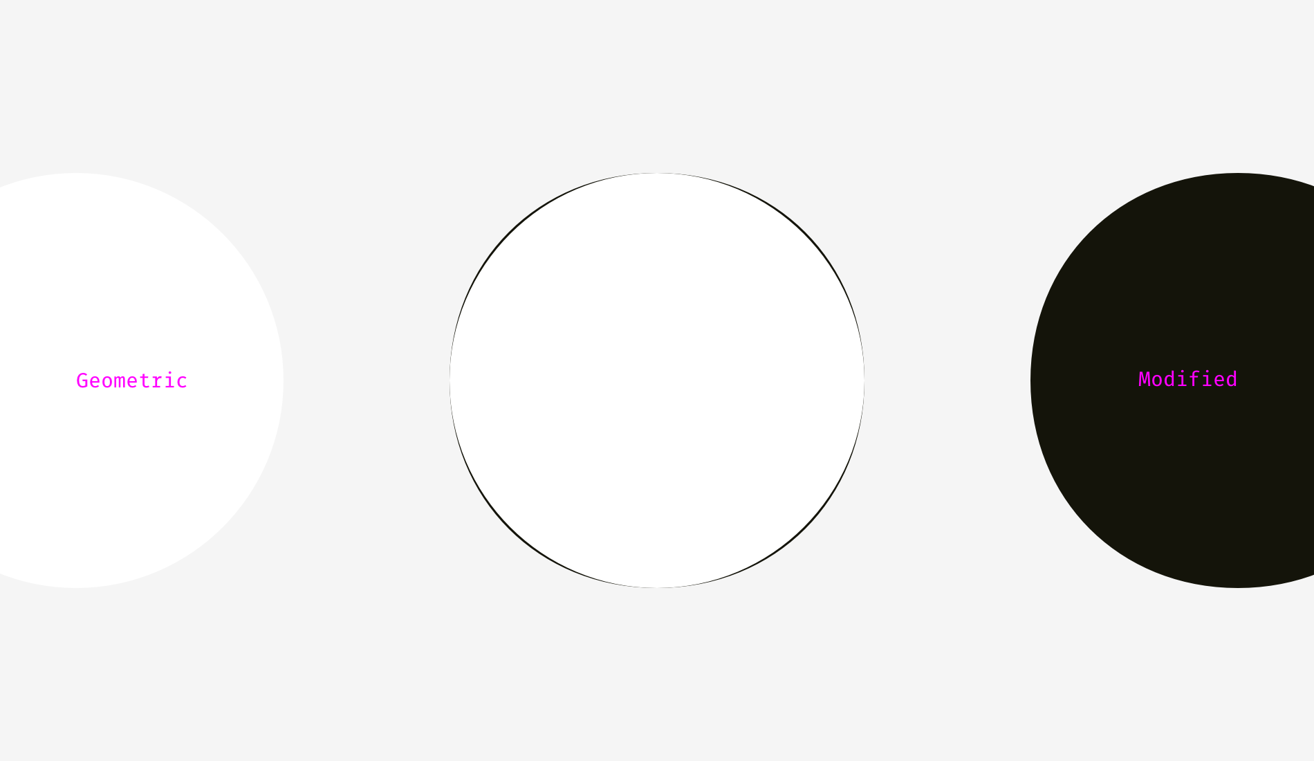
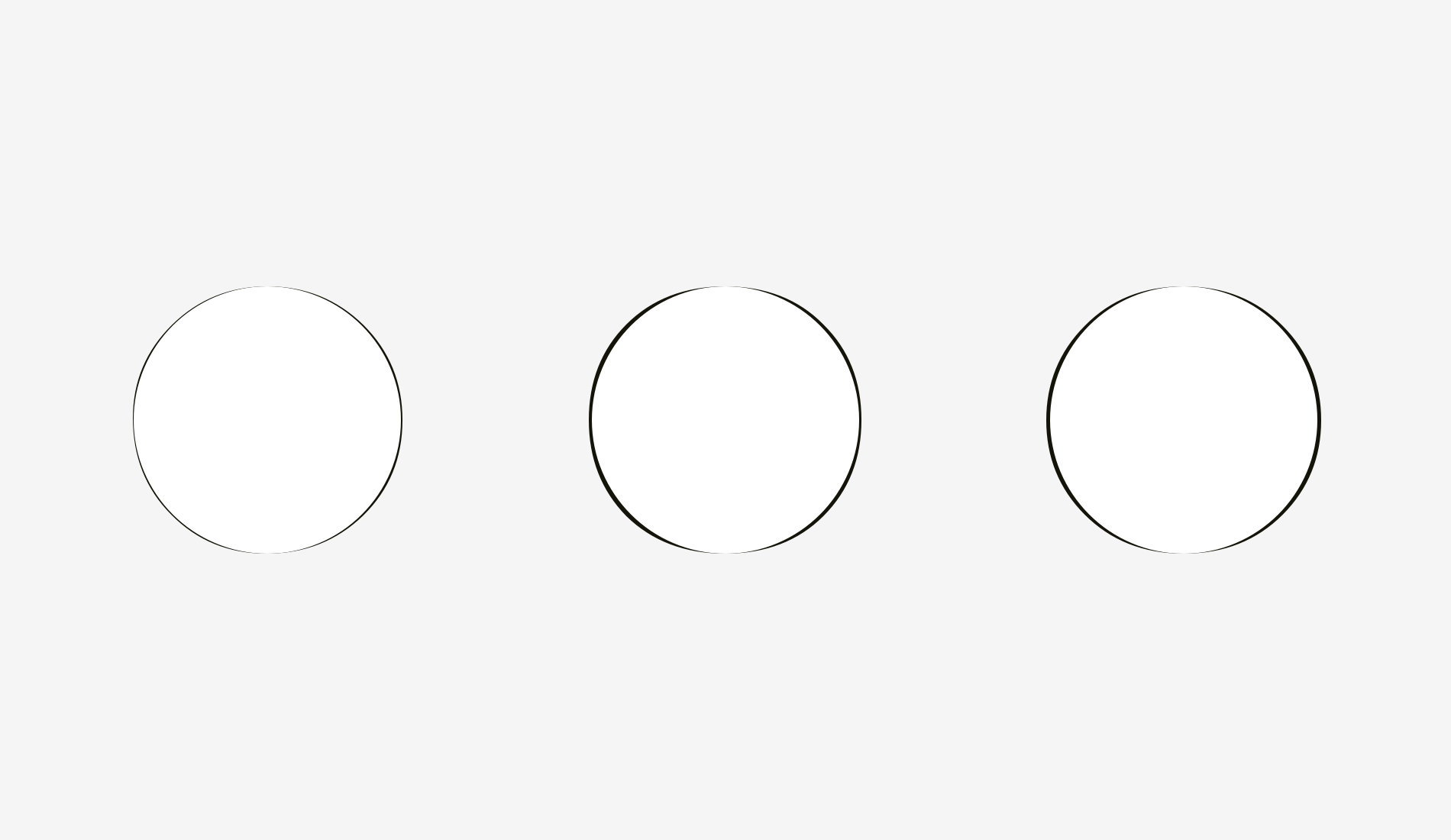
What can be more circular than a circle? I used to think that nothing, but as I said at the beginning of this article, our eyes are weird and sometimes perceive things not as we expect. So, which circle on the picture below looks the most smoothly circular?
People who I asked before were choosing between numbers 3 and 4. Numbers 1 and 2 are definitely too skinny, 5 is too plump. If we overlap the third and the fourth variants — a geometric circle and a modified circle — we’ll find out that the latter is a trifle heavier than the first one and, consequently, more smooth to our eyes.
To show what I mean I took letters “o” from three famous geometric fonts — Futura, Circe, and Geometria. Given that high-quality fonts are built based on human visual perception and use a sophisticated system of optical construction, I suppose their circular shapes look more circular than geometric ones. Aren’t these letters pleasant to your eyes?
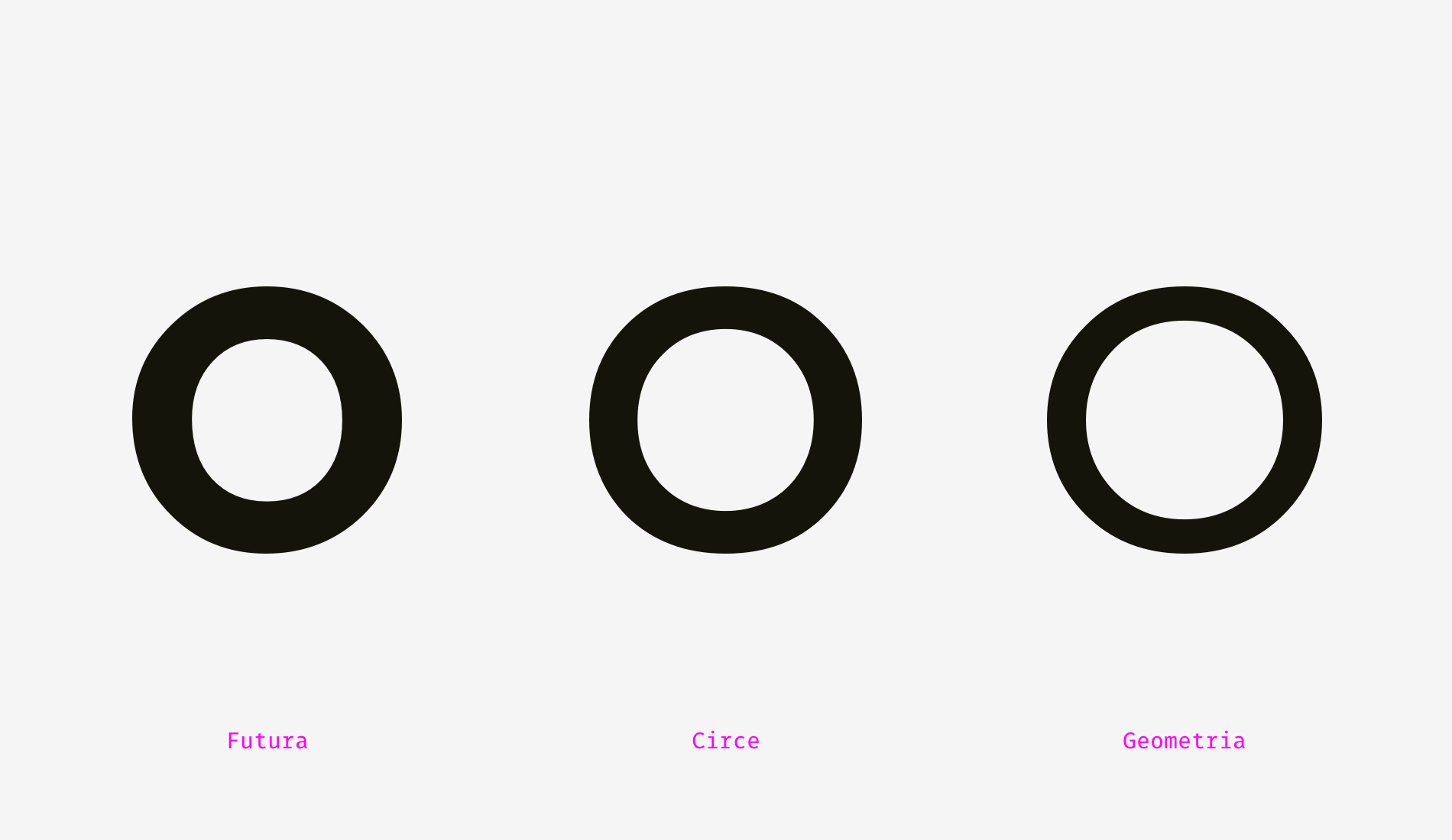
Let’s overlap them with geometric circles. Even the most geometric Futura’s “o” has four sticking out parts. Circe’s and Geometria’s letters are, in addition, wider than circles, but even if they had equal height and width, we could see these four “bellies” as if they were hungry and overate.
So, optically speaking, a modified circle (on the right) can look even more “circular” than a geometric one (on the left).
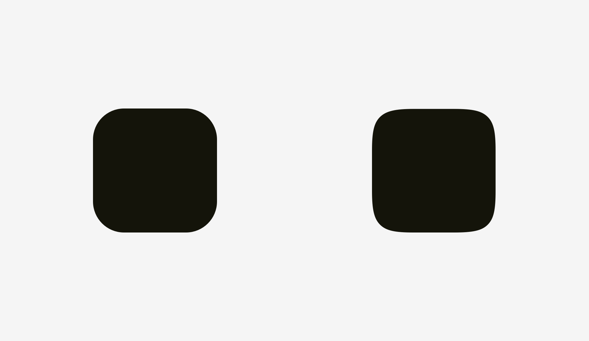
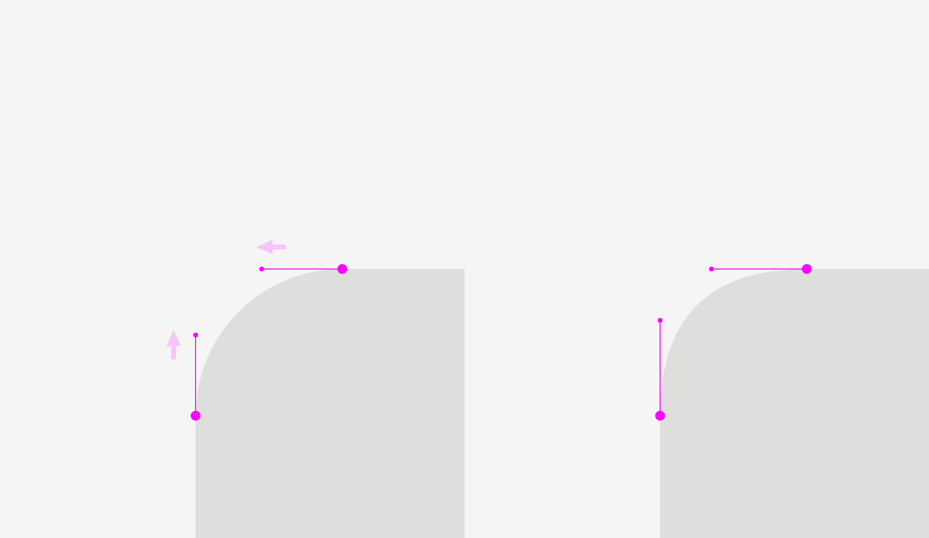
How can we use this phenomenon? For corner rounding, of course! If you utilize the embedded rounding feature in popular graphics editors, the result will be not optically good.
Human eyes immediately detect the point where a straight line suddenly turns into a curve. And this rounding doesn’t look natural.
I fixed this issue taking into account our visual perception.
This kind of rounding has an extra area beyond the geometric circle making the point where a line meets a curve unnoticeable.
Just try to feel the difference between these rounding methods.
Now we can apply this approach to rounded buttons.
You might have noticed that the buttons on the right have more smooth corner rounding and it is more pleasant to your eyes.
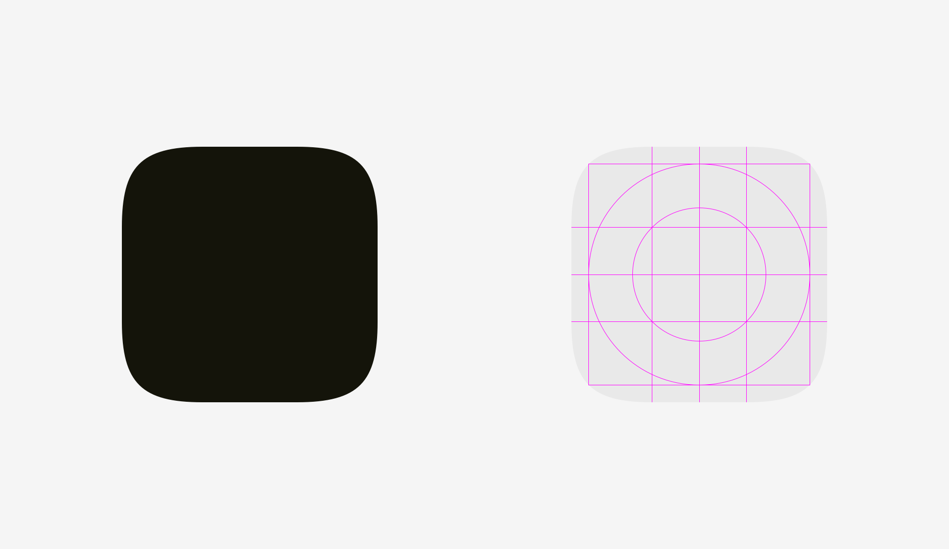
The same story with app icons. One doesn’t simply use standard corner rounding to reach a perfect result. But before we dive into this topic let’s take a look at two differently rounded shapes.
The first one is a rounded rectangle, which I created in Sketch. The second shape is a superellipse, also known as Lamé curve. It was discovered by a French mathematician Gabriel Lamé and depending on the formula can vary from something like a four-pointed star to the shape looking practically as a rounded square.
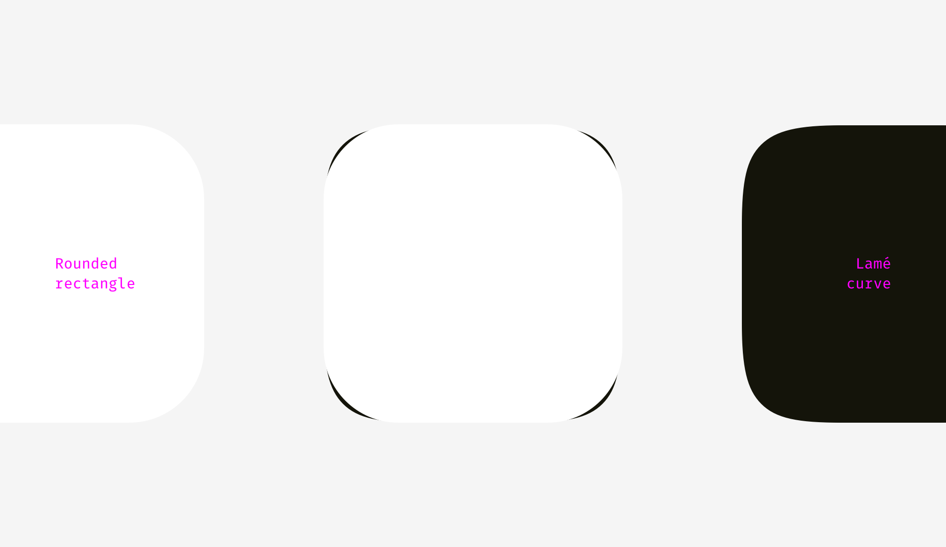
Marc Edwards proposed the formula of Lamé curve that resulted a smooth and optically perfect shape. Icons starting from iOS 7 are based on it.
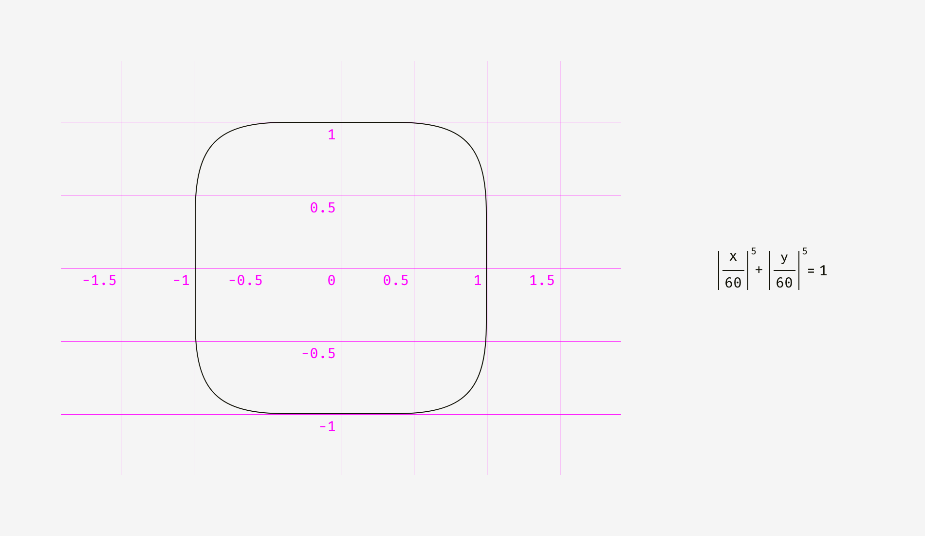
Later this shape was modified by adding golden ratio proportions and a grid for guiding the designers of new icons but that’s a different story.
The main benefit of using shapes like superellipse is their smooth appearance. On the other hand, these non-standard shapes are difficult to insert into a real interface. One should either combine multiple SVGs, include special formulas or scripts into the code or use PNG masks like Apple does for its app icons.
As for design process itself, there is a simple fix for rounded corners. You need to convert revertible rounding effects into an outline, enter the shape editing mode and manually move curve handles closer to each other.
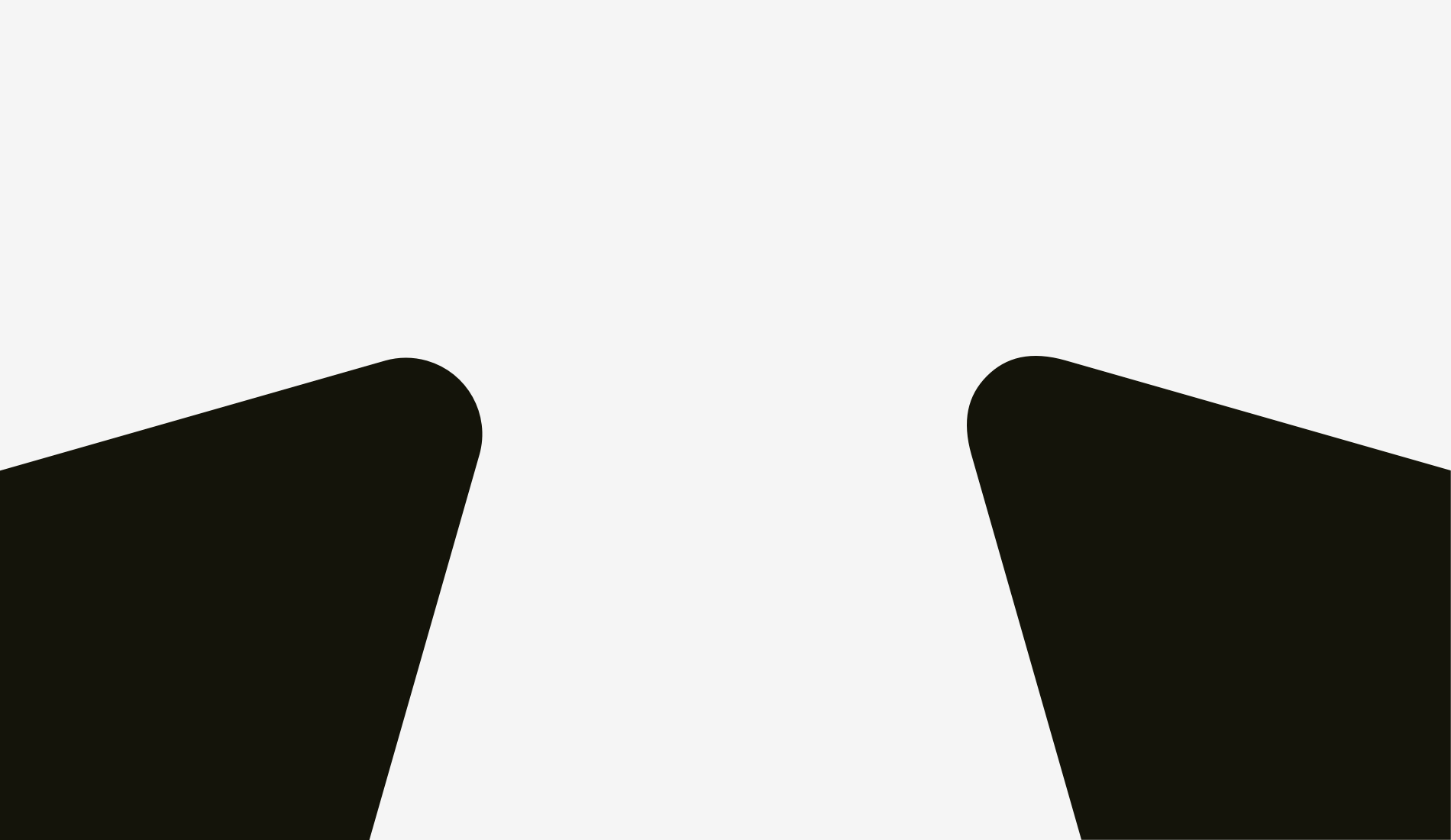
The difference is even more vivid with acute angle rounding, which is important for drawing road or metro schemes.
Things to remember
- Geometrically rounded corners look artificial because you can easily see the points where a straight line suddenly turns into a curve.
- Optically correct corner rounding needs special formulas or manual adjustment of a shape.
Bonus
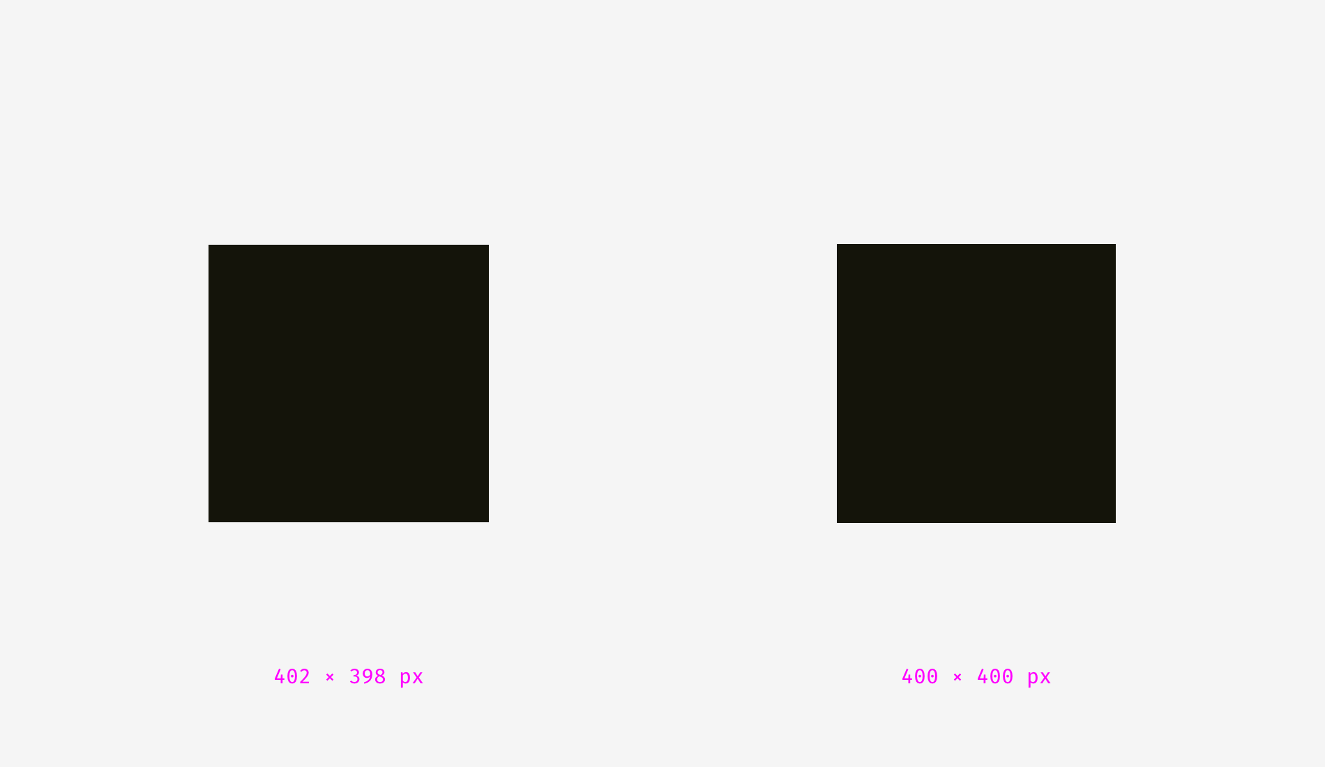
Sometimes a not ideally geometrical square looks more squarish. You might think, “What a ridiculous nonsense?” So, what do you think about the squares below? Which shape looks more squarish?
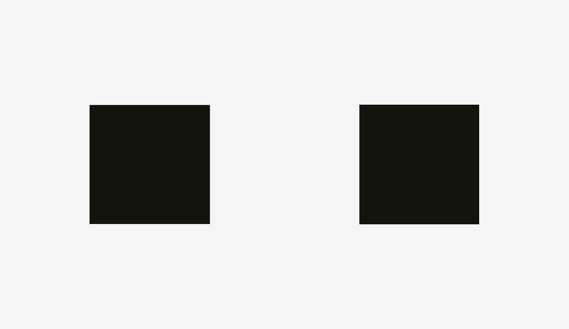
If you’ve chosen the left shape, you’ve managed to hear the voice of your unbiased visual perception.
I personally was surprised when learned that our eyes are more sensitive to the height of an object than to its width. It explains why even in geometric fonts, letters “o” are always wider than geometric circles, and the vertical stems of letters “H” are always thicker than the horizontal ones.
Recommended reading
This essay provides a limited understanding of the topic, so I encourage you to keep on exploring it. Here is a list of articles and books about the origins of Gestalt psychology and its initial ideas.
- Barry Smith, “Gestalt Theory: an Essay in Philosophy”, 1988. A profound study on the Gestalt theory origin and the philosophical and psychological aspects of human perception.
- Steven Lehar, “The World in Your Head: A Gestalt View of the Mechanism of Conscious Experience”, 2002. This book explains how people perceive reality. It turns out that we see not the real world but its reflection in the brain. (Chapter 1 is available online.)
- James J. Gibson, “The Perception of the Visual World”, 1950 (a scanned copy, some images are low-quality). The book shows how the physical processes in our brain affect the way we see the world.
- James J. Gibson, “The Ecological Approach to Visual Perception”, 1979. (A same-titled article with key ideas is available online.)
- George Boeree, “Gestalt Psychology”. A brief history of Gestalt ideas.
- Biographies of the founders of Gestalt psychology: Max Wertheimer, Kurt Koffka, and Wolfgang Köhler.
The post Optical Effects in User Interfaces (for True Nerds) appeared first on Design your way.
Source: https://ift.tt/2GGtSiD


No comments:
Post a Comment