You’ll probably agree that the Apple logo is one of the most identifiable brand logos in the world. The logo distinguishes Apple Inc products from those of its competition by an easily recognisable bitten Apple.
The original apple logo was developed over three decades ago. Since then the logo has changed and evolved while maintaining its place in the minds of customers.
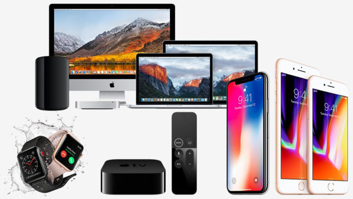
Apple is known for the exquisite and almost Zen like design of its computer hardware. From computers to tablets, mobile phones to watches, the company provides attractive products created by an exceptional team.
Apple’s client base can easily identify the brand based on the Apple logo as well as the attractive products.
The company does not only have a history of creative product designs. The brand logo itself also has an interesting history. From the original apple logo design to the latest logo, the design has transformed and changed while maintaining a clear and easily recognised identity.
The Apple logo history
![]()
When the original Apple logo was created, designer Rob Janoff probably didn’t know this would become one of the most easily identifiable brands in the world. The symbol and company name fit together perfectly and the bite helps to identify the brand industry. Let’s have a look at the apple logo history. From the old apple logo to the current designs, the apple logo evolution makes an interesting story.
What about the bite?
We mentioned that the apple symbolises the company name while the bite symbolises the industry. What does this mean? Rob Janoff shared that with a company named after a piece of fruit, the most logical decision would be to use an image of that fruit in the logo design. However, deeper and incredibly interesting stories linger behind the design and development Apple’s logo.
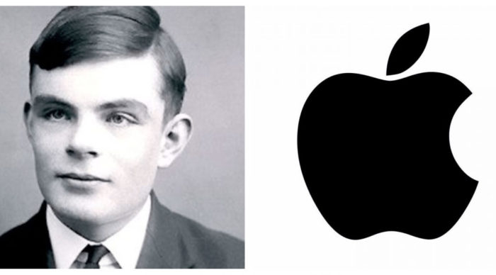
Indeed the first story of the Apple logo begins with a man named Allan Turing. Alan Turing was a genius who helped to establish the world of artificial intelligence as a means of breaking military codes. Turing died a decade after the Second World War ended. Sadly, Turing’s work went largely unrecognised. Instead, he was persecuted for his sexuality. He faced jail because social stigmas present at the time. He felt very humiliated by the oestrogen injections meant to impose heterosexuality upon him.
Legend tells that he bit into an apple laced in cyanide. He died on June 7th 1954 ten years after the Normandy landings. Although his ability to crack German war codes helped the allies tremendously, he died in obscurity. Myth has it that when Apple computers were looking for a logo for their brand, the story of Alan Turing served as inspiration.
A different beginning
![]()
An alternate story behind Apple’s corporate image shares that the Apple was created by Steve Jobs and Ronald Wayne in 1976. The men remembered that Isaac Newton discovered gravity after being hit upon the head by an Apple which fell from a tree. The men remembered Wordsworth’s quote.
“Newton… a mind forever voyaging through strange seas of thought”
This quote was later inscribed into the company logo. The image of an apple felt appropriate for their newly emerging computer company.
Touraj Saberivand’s story
Touraj Saberivand, design partner of Rob Janoff who created the apple logo, explains that the company designed the logo to look like an apple, after the name of the computer. The bite out of the apple was placed there to increase the likelihood that the logo would be associated with the fruit.
![]()
He explains that when he was designing the logo, he wanted the fruit to look like an apple rather than any other round fruit. Taking a bite out of the apple achieved this result. The apple logo has become immediately recognisable in different parts of the world.
Features of the Apple logo design
Apple’s logo, one of the most identifiable logos in the world, has a number of different features.
Shape
The shape of the logo is very distinct. The logo looks look an apple with a bite out of the right side of the fruit. A tear shaped leaf leans towards the bite side of the apple.
![]()
Colours
The very first apple logo used rainbow colours in the image of the apple. This has changed and current logos are usually chrome, giving a stylish feel to the logo.
Fonts
Apple doesn’t use any typography and as a result, the iconic image stands alone, representing the beauty and creativity associated with Apple products.
The apple logo evolution process
Apple’s logo has changed over time. The initial Apple logo was created by company founder Ronald Wayne when the company began in 1970. Although the logo did still look like an apple, it is distinctly different from the iconic design we know today.
As mentioned earlier, the first image was based on Isaac Newton’s discovery of gravity. Newton made a significant contribution to the field of science. However, he was able to make a massive contribution because of the apple which fell on his head while resting under a tree. The apple itself therefore played a crucial role, just as Apple computers make a contribution to the life and work of their users.
![]()
Apple’s very first logo design had a frame which included the words:
“Newton… a mind forever voyaging through strange seas of thought.”
The first Apple logo design was easy to recognise but it didn’t make a large impact. As a result, the founders decided to create a new Apple logo. Steve Jobs believed that the logo was not iconic enough and needed clarity.
Jobs wanted a logo which would be easy to use, would look effective even in a small size, and would be far more modern. Apple computers are renowned for their beautiful designs and Jobs wanted a beautiful logo to match the style of his computers. An Apple company logo would need to be impressive.
Jobs wanted both the company name and logo to be seen in combination. Understanding that he needed a design team to create the simple, iconic and easily identifiable Apple logo, Jobs approached Rob Janoff to come up with a logo design.
Janoff drew on the name of the fruit, quickly coming up with the modern and very recognisable apple with a bite on one side. This quickly replaced the old Newton logo.
Apple’s logo quickly changed, with the new iconic Macintosh logo quickly replacing the old Newton logo design.
The rainbow coloured apple logo design
When Steve Jobs approached Rob Janoff to design the apple symbol, the company was still very small and nowhere near the large corporation it is today. Apple had only been operating for a year and consisted of three partners. These were Steve Jobs, Steve Wozniak and Mike Markkula.
Rob Janoff decided that when a company was named after a piece of fruit, the very best thing he could do was create a logo which replicated that fruit. As a result, he set out to create a logo which looked distinctly like an Apple.
![]()
He created an illustration of an apple. The bite out of the side ensured that the apple could not be mistaken for another piece of fruit. It also represented the byte of the computer industry.
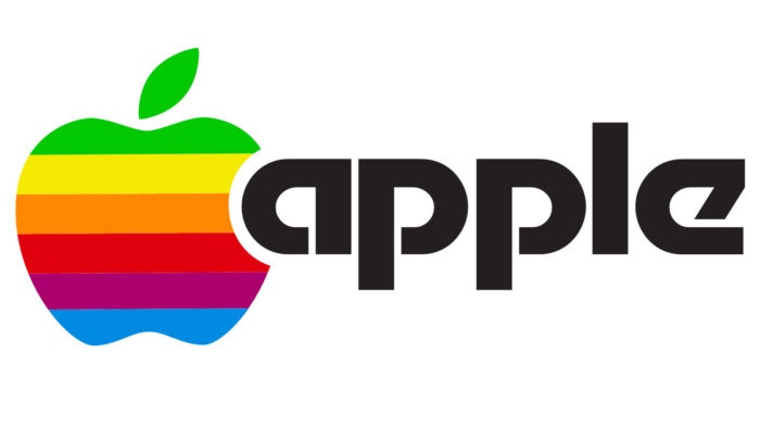
The original Apple logo was rainbow coloured. The colours represented the Apple II computer which was the only computer with a colour display monitor. Jobs was so delighted with the logo that he began using it a little before the launch of the Apple II.
Rob Janoff explains that there was no real reason for the colour arrangement within the logo. He shared that from his perspective, the rainbow colours were also a sign of the times. The green colour was placed at the top because it connects with the right leaning green leaf.
![]()
Once Steve Jobs launched the new Apple logo, customers became curious. There was a lot of speculation about the new logo and people began to wonder about the apple logo story. As mentioned earlier, some people thought the bite on the side of the Apple was a tribute to Allan Turning.
The colours in the Apple logo image were attributed to the new colour monitor in the Apple 2 computer. This logo was so popular with computer users that it remained a firm favourite for over two decades. Even after Apple changed the logo, redesigning the use of its colours, the original iconic apple with a bite out of it has remained the same.

Although many people wonder why the Apple logo is half bitten, many stories exist. This speculation has not stopped the logo from becoming increasingly popular. At present the Apple logo is known all around the world. The bitten apple is so immediately recognisable that the company does not use any form of lettering or font to accompany its famous logo.
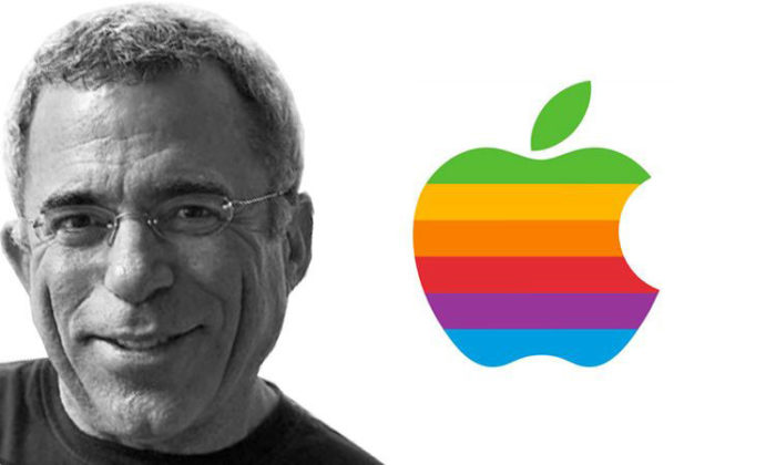
Apple executive Jean Louis Gassée once linked the story back to the original tree of knowledge, declaring the bitten apple to be a symbol of lust and knowledge. Like this tree, our computers are a source of knowledge, curiosity and continually evolving intelligence. This enables them to create a knowledge revolution which will transform the human race.
Moving to monochrome: Apple’s logo 1998 to 2000
![]()
Steve Jobs left Apple in 1985 but returned again in 1997. The first thing he did was update the official Apple logo. During 1997, Apple was struggling financially. Steve Jobs wanted to simplify Apple’s products and designs.
This began with the iMac in 1998. Jobs wanted to work at creating products which were immediately recognisable. He aimed to use the Apple logo to the company’s advantage. If the logo was well liked and easily recognised, it made sense to display it where people could see it.
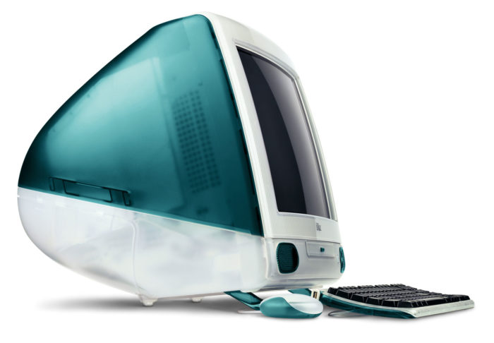
Apple released its very first iMac, known as the Bondi Blue. This computer was sky blue in colour and simple and elegant in design. The Apple logo rainbow would have looked silly on such a beautiful and streamlined machine and was released in monochrome.
By streamlining and simplifying the designs of Apple products, Steve Jobs created a new brand personality.
![]()
Apple’s computers moved to metallic casing and the new logo was created in a solid colour to compliment this casing. This monochrome logo was approved by Steve Jobs and from this time onwards, the elegant apple emblem has become a symbol of beauty, creativity and simplicity. It remains one of the most appreciated and recognised logos in the world today.
The current Apple logo: stylised and sleek

Although the monochrome logo made a great impression, the evolution of Apple logo designs was not yet complete. In 2001, Apple introduced the new millennial logo design.
This logo comes in three colours: silver, white and black. It is slightly different to the original logo, having been tweaked a little to make it more stylised.
![]()
The logo was released with a glassy effect, with light shining through the surface. It has also taken on a metallic appearance, which enables it stand out against the background.
The current Apple logo is so famous that it has become as familiar, throughout the world, as the MacDonald’s arches. The decision to hire Janoff and to create a flat logo has gone so far as encouraging companies around the world to incorporate ‘flat’ logos into their branding or marketing concepts. Steve Jobs consistently lead the way in creative branding, encouraging innovation in his product designs.
![]()
The newest Apple logo has a glassy appearance and a slight gradient. The newest logo comes in two different colours: silver and chrome. Silver is used on the company’s hardware while chrome is used on software products.
Looking to the future: new Apple logo opportunities
Apple’s logo has a long and interesting history. Throughout the decades, the Apple logo has been simple, sophisticated and iconic. The origins of the Apple logo began with Isaac Newton’s designs.
There was then an evolution of Apple logo designs, leading up to the current logo. With each change and each new improvement, Apple has adjusted to the times. Every step taken has created an iconic image of beauty. Apple has certainly made the most of every new design change.
Considering the iconic nature of the Apple logo, looking into the future means envisioning new and wonderful logo ideas. Apple has a history of working with beauty and simplicity and the future will be no different. As the previous logos have attracted increasing amounts of attention, Apple is set to continue the development of their attractive, popular and iconic logo.
Speculation on the iconic nature of the logo has not stopped. Apart from analysing the meaning of the Apple logo, people have also speculated on why the logo has become so iconic.
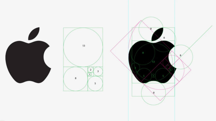
ThiagoBarcelos, a graphic designer, applied the golden ratio (or Fibonacci sequence) to the Apple logo. He explains why the logo has such a universal appeal. The golden ratio would provide a reason as to why the Apple logo has been appreciated throughout the decades. Despite the way the world has changed, the Apple logo has been able to stand the test of time.
Becoming iconic
Although the Apple logo has changed over time, logo creator Janoff explains that the colour changes are effective. He also argues that Steve Jobs had an excellent team of designers who made subtle changes to the original logo.
Over time, the logo has become more geometric. Updated software, not available for the original logo design in 1977, has assisted to improve the Apple logo. The logo has also become more symmetrical. Janoff explains that the simplicity behind the logo design is key to its success. The logo looks great when expanded or reduced. It is also easily recognisable, giving the company a clear identity.
Despite the great number of myths which have been created about the Apple logo, there is no denying that the company has created a logo of great value. Clients can identify the Apple brand at a single glance. The logo has lasted for a period of over four decades with only subtle changes and adjustments to Janoff’s original design.
![]()
Steve Jobs worked towards simplicity and he achieved this with Apple’s logo. The company have never needed to use words or typography to display their brand. Apple’s iconic logo has been more than enough to identify the brand. From the very start, this little Apple logo has been a huge success.
It is incredible how well Apple have done, emerging as leaders in the computer industry after a humble beginning in 1977. Few companies are as recognised or valued as Apple. It is the company’s visual design skills which have enabled them to emerge as leaders in the field. Their technology designs have transformed the industry. The tiny Apple logo has accompanied their technological gains, helping to identify the brand as they evolve and progress.
Apple Inc. And the right to a name

When the name Apple was chosen for the newly emerging computer company, the name was similar to Apple Records, a label owned by 70s rock band The Beatles. As these names were both so similar, the two different companies entered into a lawsuit which would last 28 years.
The result was that Apple.Inc owned all the rights associated with the name Apple. This ruling took place after the company had already spent $500 000. The rivalry between the two companies subsequently ended.
Ending thoughts on the Apple logo

A logo is at its very best when it helps to identify a brand. Apple’s logo timeline has grown along with Apple’s industrial design. As the company has grown and evolved, so has the iconic Apple logo.
Over time, the Apple logo, along with the Nike Swoosh, Disney’s fantasy castle and McDonald’s golden arches, has become one of the best known logos in the world.
Apple owes a great deal of its success to the perfectly proportioned, simple and very attractive logo which has accompanied its development. Each step of the way, new product developments have been accompanied by a sleek and sophisticated logo.
As Apple as launched its new iPhones, iPads, Apple watches, laptops and computers, they have been accompanied by a professional looking logo. As new products emerge, the logo offers substance, creativity and beauty to the designs.
Anyone who notices the Apple brand approaches it with respect and sometimes even awe. This has made a huge impact on a generation of people throughout the world. Apple has become a household name associated with high quality and creative products. Apple’s logo is associated with trust, dependability, beauty, creativity and innovation.
As a designer, we hope that you have been influenced by the story of the Apple logo. Understanding how the logo has changed and evolved offers insight into how a brand can subtly adjust to the times. The quality and fascination associated with the Apple emblem is both intriguing and inspiring.
The current Apple logo is enough to inspire any designer to work towards an exceptional design. After all, the thought and effort which goes into identifying a brand can stand the test of time. Not only has the Apple logo design stood the test of time. It has also changed and evolved, leading the field as it does so.
The innovation, simplicity and sophistication behind a logo can transcend a product, offering a deeper and more human meaning which extends beyond a product. Apple’s iconic logo has done just that.
If you enjoyed reading this article about the Apple Logo, you should read these as well:
- Logo trends 2019: what you should look out for
- Logo colors and why they’re important
- Some logo design ideas that you should use for branding projects
- Logo Design Cost: A look at the logo design prices
- What is a logo and why you need one
The post Learn About The Apple Logo: The Tech Giant’s Branding appeared first on Design your way.
Source: http://bit.ly/2TUbIgt


No comments:
Post a Comment