The well-known Suzuki brand is a Japanese multinational corporation that has its headquarters in Hamamatsu, Japan. It specializes in creating compact vehicles and 4×4 automobiles offering a full range of motorcycles as well.
Suzuki is the 4th greatest automobile manufacturer after Toyota, Nissan and Honda and the 9th largest one in the world when we look at its production volume.
The Suzuki logo is something that we all recognize and people know it even if they are in India, America or other zones around the globe. Suzuki is also producing many motor parts for other brands like Nissan, Fiat, General Motors, Mazda and Volkswagen and Mitsubishi.
Suzuki logo is also quite an old one because it was introduced in 1958 four years later after the first car was built. The emblem has a stylized “S” letter and it has become an icon.
The Suzuki logo
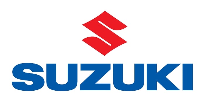
The Suzuki logo combines a bright red emblem with a blue wordmark. At the base of the logo, you can spot the word “Suzuki” that shows up in capital letter. The letter is of the exact same size and the font used is a Helvetica one.
This logo has stood the test of time for many decades now and you can consider the logo an ideal example of a simple, clean and consistent yet visually appealing symbol. A lot of times it is considered one of the most known and easily recognizable logos in the car world.
Logo Description
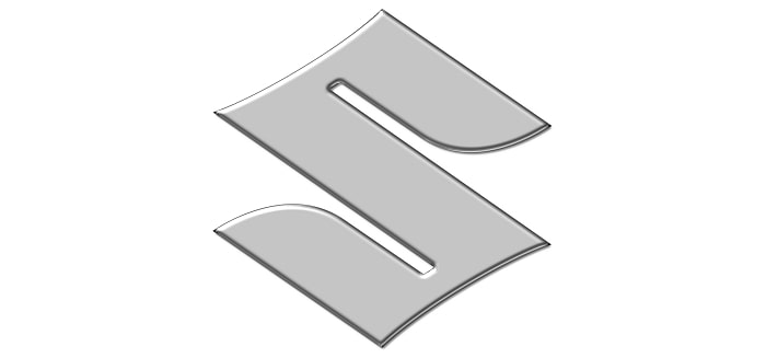
The shape of the Suzuki Symbol
At the start, the Suzuki company had a simple logo that showed the founder’s name in the traditional Japanese text. Actually the S-shaped Suzuki symbol was first used in 1958 when the automobile product took off in the well-known post-world war II automobile boom.
They did keep the company name under the S using some small letter. After that, it was moved to the right side to look like a horizontal line. The last change to the shape of the Suzuki logo was moving the wordmark under the emblem and making it bigger compared to the S.
Suzuki logo is simple and complex at the same time. It is quite hard not to recognize where the S letter is coming from. The sharp edges that you see and chopped forms are for sure associated with the Japanese culture and remind us of the samurai heritage and heiroglyphs that Japan is very well known for.
The Color of the Suzuki logo
The first color that was used in the Suzuki logo was bold black. Afterward, the company decided to change it to the red and blue color scheme. The older version has a more indigo blue and the new ones have a navy blue shade instead.
The current Suzuki logo that we can see on their models is made using red and blue colors. The red stands for passion and tradition and the blue stands for excellence. The emblem you will see it has a silver color on it.
The Font
Suzuki has used the same font since they moved to the new English version of the logo and that is the classic Helvetica font.
Influences/Inspiration
The Suzuki logo is inspired by the need for reaching the Japanese and English audiences together. Because the brand name sounds good in English, they also wanted an emblem that would be easy to recognize in Japan as well. So, they went for curves and lines that are very similar to the Japanese kanji characters while also keeping the English S alive.
The Suzuki logo Meaning
The shape of the S is also connected to the innovations that they brought in the automotive industry. They decided to give the logo four different corners to represent the four-stroke, engines and four-wheel drive that is used in their vehicles. The colors do a great job and make it stand out so we can say that the Suzuki logo is a really cool one.
The Suzuki logo History
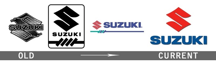
Suzuki was first established in 1909 and it did not have a logo until the year 1958. In its first 50 years of activity, it focused on producing looms for weaving silk and cotton. The need for a logo appeared after the company started to make four-stroke engines and when they presented the first car in 1955.
In 1955 the Colleda COX 125cc was launched and the name of the company was changed to Suzuki Motor Co., Ltd. A few years later we can see the logo being introduced and the design was completed with four strokes that represented wheels and showed the company started in the auto industry.
Later the logo was replaced with the “S” that we know today and it was a bigger success towards customers.
What types of vehicles bear the symbol?
The Suzuki symbol can be found for sure on all the vehicles that they produce. Besides that, the company also makes motorcycles and outboard marine motors. So, we really have to appreciate this company because it expanded not only to vehicles but also other machines that are useful for humanity.
5 Reasons the Suzuki Emblem Is Successful
The Suzuki logo is not a complex one and you can’t say it brought something revolutionary in terms of design but there are still a lot of reasons why it is successful:
- It comes from the company’s name and when you see the big “S” you know for sure the brand that we are talking about. The company identity is strong and people relate to it.
- It’s been the same in the last 60 years, and the corporate “S” emblem was probably the best choice they made back in 1958.
- It connects you with a company that has an old history, the original business was founded in 1909 by Michio Suzuki and they produced looms. If we look at it today for sure you wouldn’t have expected such a turnover.
- The edges reflect Japan and the influence that has been brought from the culture into the logo.
- The colors are powerful each one representing a set of values that connects with the brand.
In conclusion, the Suzuki logo is an interesting and minimalist one that has stood the test of time. It is recognizable to both Japanese and English speakers so we considered it a real success.
If you enjoyed reading this article on the Suzuki logo, you should read these as well:
- Free Disney fonts: Enter the Mickey Mouse club with these quirky fonts
- Fonts similar to Times New Roman: Alternatives to use
- A collection of heavy metal fonts for that awesome band cover you wanted
The post The Suzuki logo (symbol) and why the emblem is successful appeared first on Design your way.
Source: https://ift.tt/2UqsXZD


No comments:
Post a Comment