Creating a logo for any brand requires time, focus, and lots of brainstorming for any designer. Since the brand’s identity, image, and core value are so important, everyone wants to make their logo eye-catching, impactful, and informative. Several tools and design elements are available to achieve the goals mentioned above for an experienced or new designer.
Creativity always comes from inspiration. According to the latest trends, we have collected some of the fantastic 3d logos for design inspiration. Here is the list of our favorite top 10 3D logos:
1. Jazz School Online:
This one is featured in the design inspiration. On this website, they feature the best collection of artworks, and from here, you can get to know about the artist, but they do not allow you to download or edit either. This logo is a beautiful example of simplicity and creativity. From its first look, we get to know that it is about music.
The text is information that tells us that it is an online school for jazz music. The designer has used one of the classic effects to make this one, and that is the monochromic effect. Jazz music is a fun and energetic kind of music but look at this logo. It is not giving out that kind of flashy vibes, which is why it is unique. A simple cool teal blue color with the black shadow is making this one classy and eye-catchy.
2. Brandany:
This logo is available on the Dribbble site, and here you can check out the artist and his work. You can hire them as well. With this, one is for web/app service for photo and video editing. Brandany is the brand name, and this logo contains its first letter, which is the traditional and classic method of logo designing. Any aspiring graphic or logo designer knows that service or product is one of the main pillars of the brand’s logo.
Since the service is about photo and video editing, one of the safe and exciting ways is to make a logo fun and colorful. Its font style is also complementing this theme as it should. The colors, style, theme, and fonts sync together in order to give out a perfect logo, and that’s what the designer is portraying here. A lovely combination of colors is used in this with a gradient style, which quickly gives a 3d effect. This can be an excellent idea for any photo or video editing based service or product.
3. Crytivo:
This beautiful chameleon logo is by Maria Grønlund for game development studio, and it is featured in Behance. The entertainment industry offers a vast horizon for creativity, and it gives all kinds of freedom to experiment and explore. Gaming Company belongs to an entertainment and fun background, and that is why an artist prefers to make the logo fun, colorful, vibrant, robust, complicated, or confusing. Here using a chameleon is a great idea to make a logo fun and creative.
As chameleon shifts its colors according to mood and environment logo is also mimicking that ideology. This fascinating logo is full of vibrant colors, and it is following the golden ratio rule as well. What a perfect balance! Below this company’s logo name is mentioned in the font style, which is entirely suitable for a gaming brand. It is bold and edgy, which adds a bit more fun to this logo. This one can be a great inspiration to create a logo in the entertainment industry.
4. 3D Architect:
This logo is featured in Dribbble by the designer Aiste. The website here allows you to check out and hire the artist. This logo is attractive and straightforward. It is not at all difficult or time taking to perceive what it’s about. This logo is for architecture, construction, or real estate Company which anyone can tell by just looking at it.
Simplicity never goes out of style, and it applies in all areas and all subjects of life. It is a 3d logo, and two surrounding rings are giving the illusion of an aerial view to viewers. That’s a smart move to give this logo an even more 3d look. It can be an excellent idea to make a logo unique yet straightforward!
5. Ideabox:
This logo is on the brand crowd website. The website allows you to buy different logos from different artists. You can connect with them, and you can ask them to customize your wish. This logo is giving out straight information about the brand name about its meaning, and definitely what the company is trying to convey. Another simple method in logo making and this one can never go the wrong type of creativity.
Ideabox’s name is suggesting its meaning that the box from which idea is coming out. And that’s it. That is precisely what this illustration is telling. The colors are one of the main parts of any logo design, and this logo contains only one color, and that is red. It is a 3D logo, so there are shades of red and red colors warmest and eye-catching. Viewers are more likely to see a red color logo than any other color. Another idea we can perceive is that company is trying to showcase how creative they are as per the illustration and name and how much hard-working and aggressive approach they have in order to fulfill the creative needs of clients.
6. Eagle Logo:
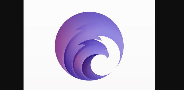
This logo is from the designer yoga Perdana, and it’s available on the website dribbble. In this design, there is one geometrical object used, and that is a circle. A simple logo design can have end numbers of ways, and this one is one of them. It is a logo that contains any one basic shape, be it circle, square, rectangle, or triangle. Here circle shape is giving out unity, strength, foundation, and more grounded kinds of vibes. Here within a circle, there is an illustration of an eagle. Choosing a natural element or subject is another most significant decision.
Moreover, picking eagle shows that a company shows its determination, leadership, healthy practices, and keen approaches towards business. This logo is very decent and sincere, yet it has calm and robust shades of blues and violets, which show depth and composed nature. The wings of the eagle have a 3D effect, which makes it even more attractive and impactful. It makes for a beautiful inspiration for any graphic or logo designer to enhance creativity.
7. Security:
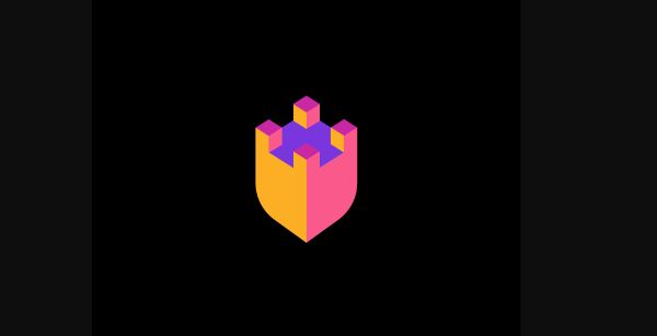
This logo is on the Logopond website. From this site, you can check out different artworks from various artists, and you can buy their creations. This logo has no text in the image, but the illustration is enough to tell what the company is all about. It has a simple image of the giant four pillars that we know old royal forts and castles used to have.
This is talking about security and protection, so any company which is into any security services or products can use this. It has sharp colors and an illusion of light, making it even more aesthetic and beautiful.
8. 3D Film Lab:
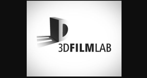
This one is on the brand crowd website, where you can checkout numbers of logo artworks, and you can buy them as well. The website provides a domain name also so you can check below every logo whether the same domain name is available. Coming back to this logo, this is a fantastic creation with a perfect illustration, text, colors, and font style. Here only the D letter is enormous and in 3d effect with shadow, but the shadow of this letter is in the shape of number 3 by which the viewer can read this as a ‘3D’ word.
And below this, there is the name of a brand, which is the 3D film lab. Now here, there are three different views available. One is a flat 2d image with black and white color, and another is in grey background with white fonts. The last one is in black and white color with the 3d effect. The word ‘film’ is in bold letters that emphasize the whole meaning of the brand name. This one is a great inspiration to make a logo of any 3d film making company or 3d-animation institute.
9. Vidabox:
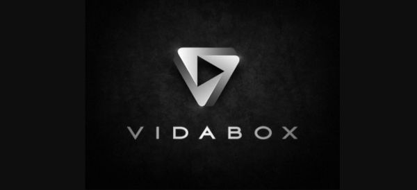
This creation is featured on the Dribbble website. As mentioned earlier, you can follow the artist and hire them as well here. So, the first impression of this logo is strong, cold, and thrilling. Black and rough-textured background with silver text is always giving out a decent and edgy look. Metallic texture in the text is used for decades in logo making, and it can never lose its charm. Here triangle shape is used with a combination of play buttons inside, which is a perfect illustration for the audio/video or music related industry.
This triangle has a 3d effect in the form of the letter ‘v,’ which is the first letter of the brand name. This company’s product is a technology that allows you to play any movie, song, or video in any room at any time. Moreover, this logo fulfills all information and impact for this brand. In the end, the real name is mentioned in simple block letters, which completes the whole artwork.
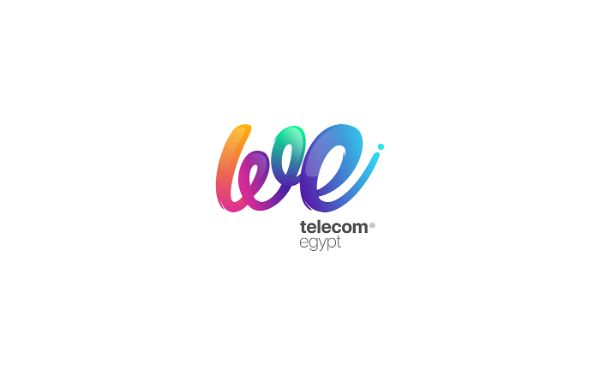
10. We Telecom:
This logo is from designer Moe Slah, and it is available on the Behance portal. Here the brand is trying to redesign its logo for its new service, which is called ‘we telecom,’ and it is a mobile cellular network service. Since the brand is coming up with a completely new service, the logo demands to showcase the change.
Here, Moe Slah has mentioned this new logo’s main idea in detail, which is quite impressive. The shape of the telephone wire is used in this logo with the word ‘we.’ The letter, concept, and meaning make a perfect combination for this logo. Even the colors are also very vibrant and exciting. Beautiful colors are used with a gradient effect to make this logo attractive, fun, and 3D. Message and brand name both are enhanced perfectly. This can be another great inspiration to create a logo with a shape that defines that industry or company.
Conclusion:
Logo making can be a challenging process, and any artist can feel a lack of creativity sometimes. Here we have made this collection of various 3d logos of various styles to make a gift box full of creativity. Anyone can read this blog and get some ideas about how different artist from your community is working and from which perspective. We have tried to showcase our analysis of possible aspects and ideas that they have used while making these fantastic logos. So enjoy and expand your creativity with a little bit of help from this ocean of creativity.
The post 10 Creative 3D Logo Designs for Inspiration first appeared on Line25.
Source: https://ift.tt/3nnDAs6


No comments:
Post a Comment