Web design and graphic design are two fields that continuously change and witness new movements and trends. Generally, with web design, the trend has always been to develop a hi-fi fantasy theme approach with impressive animations and fluid transitions. However, now that we are so close to 2021, the trend seems to be changing. All web design trends seem to be shifting towards sharing a new standard theme – to achieve realism as much as possible.
Web designers are no longer trying to create websites out of reality by providing you absolute fantasy. They are blending elements of the ordinary and digital like never seen before, which shows how websites have become an everyday part of our lives. Let us look at certain website design elements and movements that will shape the coming year of 2021 for web design. Here are the 21 top design trends to watch out for 2021:
1. Use of comfortable colors:
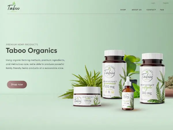
Earlier using the internet used to be more about leisure time and activity when not working. However, with the rapid rise of digital-dependent jobs, more and more people spend most of their work and leisure time behind screens. This certainly does lead to problems like eye strains as users are constantly exposed to screens, be it their desktops or smartphones. Web designers seem to have noticed this and are now focusing on colors that are easier on the eyes than bright or high contrast colors that strain the user’s eyes.
Last year also we noticed a new design trend that was in support of this concept. The introduction of ‘dark mode’ was to counteract the overall overwhelming whiteness spread across most social media platforms. Approaching 2021, web designers seem to be finding a middle ground between the two extremes – light and dark. They are making use of soft color palettes like pastel blues, light pinks, and wholesome greens.
2. More scrolling transformations:
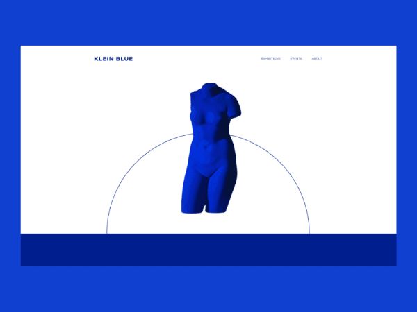
Users scroll through the website they visit; they do more than navigate. Scrolling is not merely a navigation feature, but it is also a point of interaction. When a user manually flicks their finger over the mouse, it causes a response on the screen. Hence this action becomes a form of participation. If you create engaging content on scrolling, their interest levels and user experience will improve significantly.
Scrolling is one of the subtle forms of interaction. Web designers are working towards creating appealing visual feedback users get when they scroll. There can be complex animation based transitions, full-color schemes, and wholesale shifts in the layouts. Scrolling animations break from the monotony of user experience.
3. Parallax animation:
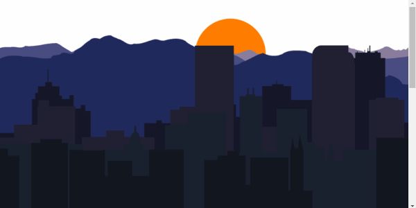
Parallax animation has always been an essential tool for web designers. They have used this design trend from particle backgrounds to the tiniest of interactions so far. By 2021, the animations are getting more complicated. They separate page elements into background and foreground extremes that create a parallax effect. Parallax is known as the optical illusion that happens when the objects nearer to the viewer seem to move faster than the objects that are farther away. You experience this in your daily life when seeing the window of a car and the way the scenery looks. The same effect is brought down to web design that comes across as equally surreal and real. The depth that is created using the background and the foreground helps give an immersive user experience. It makes the computer screen feel like a theatre stage.
4. Make use of abstract art compositions:
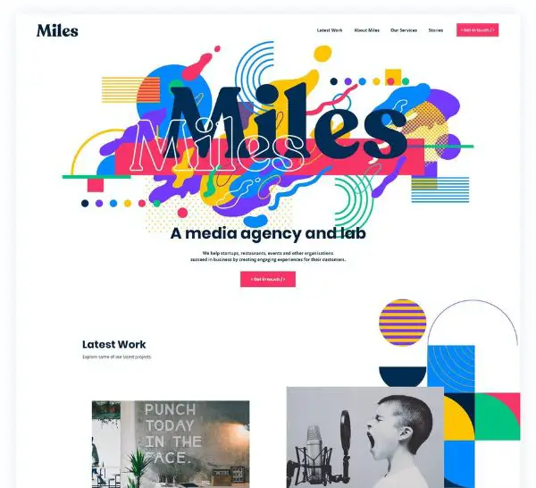
Abstract art has seen a lot of acceptance and relevance in digital and graphic design uses. Those with geometric primitives such as circles and squares often come across as restrictive, minimalist, and straightforward. Web designers use fundamental shapes but incorporate them into more complexes. This thought-provoking composition breaks the restrictive feel of such defined shapes and gives a sense of freedom.
Most websites are using these abstract art compositions in the form of figure illustrations and stock photography. Web designers have learned the art of invoking emotions in users without including images of people. The web pages feel alive and expressive.
5. Digitally interpreting physical products:
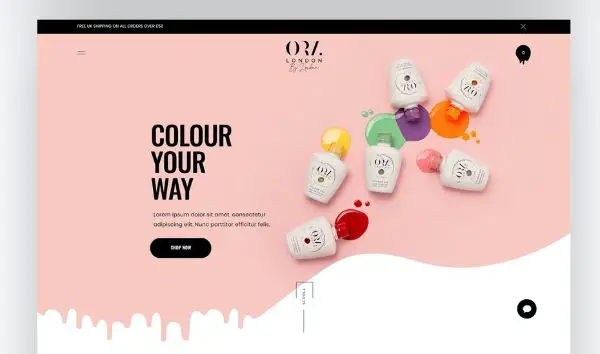
Products are usually the heart of any brand. And with 2021, products also appear to be becoming the heart of the websites. Physical products are becoming the design inspiration behind design elements in terms of creatively interpreting physical media. For instance, some websites have color smeared across the page like a spilled bottle of nail polish would look like in real life.
Or some websites that make use of rounded cornered rectangles to create the visual look of a smartphone. Such an approach creates a visual story between the products and the website. Moreover, it makes the site look more authentic and unexpected.
6. Focus on creating captivating questionnaires:
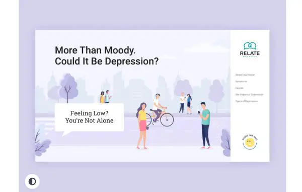
Any web designer or website owner knows that the moment of truth for them always is the window of time when a user visits your website’s landing page and then either clicks back or navigates through your website to learn more about your services. The quality of their experience would determine which side they topple on.
This is known as the onboarding process. Many web designers have started realizing that leaving users to read product descriptions and make their own decision would leave them bored and uninterested most times. Hence they are shifting to creating questionnaires for creating a more engaging interactive experience. Such quizzes help users stay engaged. Website designers collect information about the users’ preferences, likes, and dislikes that help them cater to a tailored list of products and services.
7. Make use of three-dimensional colors:
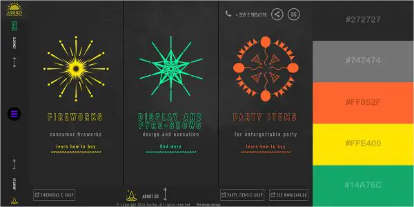
Web design has been making use of gradient colors for a while now. This seems to be changing and moving on to the next evolution with color transitions coming to play in website design. Saturated and three dimensional colors are most likely to take over the website design aspect of most websites. For achieving this, designers are making use of fine shading that gives the flat icons a rounded feel. Such a design trend would also gradually take on to app icons. Web designers also seem to be opting for more natural and imperfect color blended backgrounds than blocks of structured color gradients. With this step forward, the web design trends in 2021 are inclining more towards realism.
8. Helping the world through web design for causes:
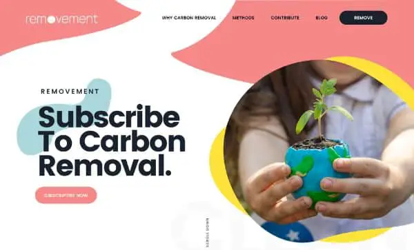
We have already established that websites are deeply woven into our daily lives and have become an inseparable source of information, earnings, and entertainment. Even with the COVID-19 pandemic and shelter-in-place orders that subsequently followed, the internet became a refuge space. Businesses shifted their conferences on virtual platforms such as Zoom, Skype, and more. Many brick-and-mortar stores started selling their services online, the streaming on popular streaming websites increased significantly.
Web designers so far have been up to the mark for accommodating all of this with excellent and meaningful designs. With 2021 approaching, we are likely to see web designers continue to play their part in helping the world through any troubled times. Brands who work for a certain cause would focus on their website design to reflect the virtues they value. This means that brands that would continue relying on stock images would reflect real and diverse customers. This would also lead to a lot of motivation and interest in DIY web designs that would make website production accessible to everyone.
9. Neumorphism:
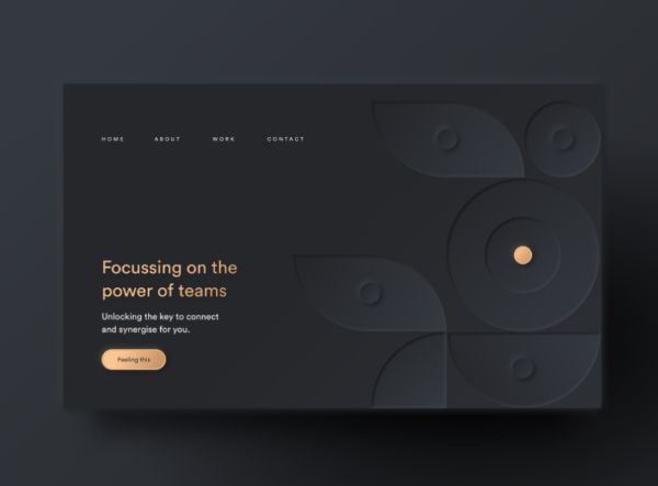
Neumorphism is a new design trend that has got a lot of buzz around web design lately. It is a trend that would transcend to 2021 and many more years to come. It follows a paradoxical age of minimalist realism. The predecessor of this style was skeuomorphism. Skeuomorphism was a design trend that would make use of outdated materials into current designs. Neumorphism is going to represent both trends coming together. The designs would mimic physicality by using selective drop shadows overlaid with semi-flat colors. This effect resembles debossing and embossing. Using this design trend, the designers would reintroduce the tactile experience that got lost during the flat design era. Since a user would have a tactile experience, their connection with the design he interacts with would increase significantly.
10. Voice user interface:
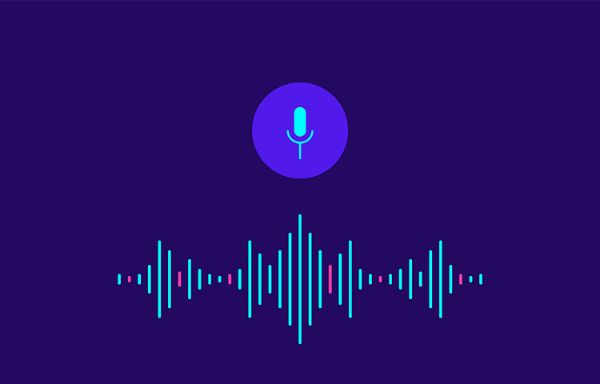
The method of assessing information keeps changing with time. These days, most people ask questions or make demands using voice commands compared to typing down a search query. This has come to the notice of web designers as well. They would eventually adjust to keep up with the emergence of virtual assistants and voice chatbots. Many websites are going to explore the possibility of voice-based navigation and interaction in addition to traditional click-based navigation.
11. Blending graphics and photography:
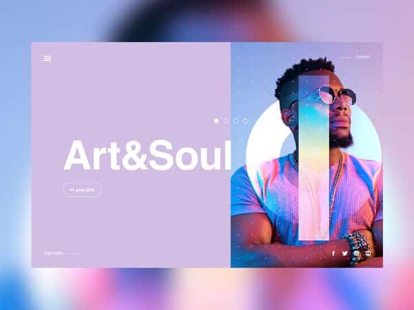
A big design trend for 2021 is going to be overlapping photography and graphics. High-quality hero images engage visitors as it is when they enter a new website. If these immersive images have some cool graphics that complement them, it would show the website owner’s creative flair and create stunning visuals. Doing so would add extra personality to the web design. It also can be used for reinforcing the company’s branding. You can make use of the shapes and colors used in the company’s logo, for instance. When web designers would blend this design trend with the client’s brand identity, it would create promising results.
12. Use of large, attention-grabbing titles:
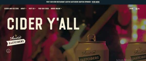
With the rushed lifestyle we have today, users don’t have time to spend hours on websites. This is why design trends are turning towards fixes and solutions that catch the users’ attention for the longest time possible, soonest possible. For this, web design in 2021 will see bold titles, shortened content, and crisp content to capture the audience’s fast and decreased attention span. This would help increase converts. The larger header tag will be paired with a smaller sub-text if additional information is needed.
13. More elaborated use of footers:
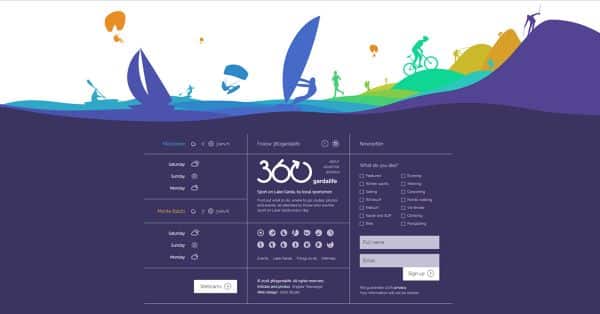
Website footers in web design are one design element that has often left underutilized throughout all these years. Earlier footers were used for providing contact information or a signup form. Now we see them transition to include additional elements of the homepage and other important aspects of the website. This is similar to how Apple has made use of its command center in their smartphones.
14. Hand Drawn Elements:
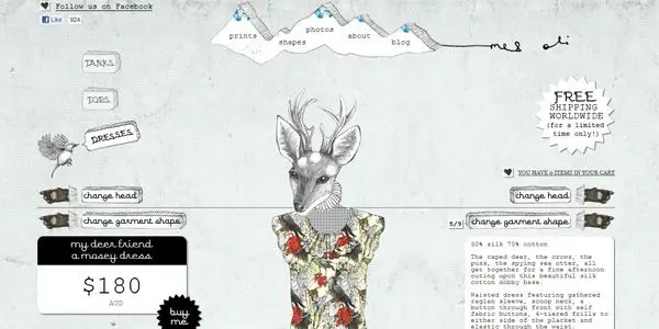
To stay unique in your website design is becoming alarmingly tricky with the passing years. Using hand-drawn elements helps a website show their uniqueness and help create positive emotions in their visitors. The incomplete elements made using hand-drawn elements help break from the websites’ rigid looking structure, which makes it feel more authentic. The little design elements significantly impact users as the incomplete visuals generally add humanity, character, and a sense of uniqueness to the entire design. This design trend can help a website get a layer of human touch as it gives it a refreshing new approach to web design. This helps grab the attention of new users and keep your existing users entertained as well.
These were the 14 top design trends to watch out for in 2021. Make sure to use these trends to keep your website up-to-date with the trends. Doing so would help you stay relevant with the times and be the pioneers in adapting the new website design guidelines in your website that would give you the initial edge over your competitors. Make sure not to lose your authenticity by changing too much of your website’s core design aspects of brand identity.
The post 14 Top Design Trends to Watch Out For in 2021 first appeared on Line25.
Source: https://ift.tt/3m5zFyJ

No comments:
Post a Comment